Upgrade Your Analytics With These Dashboard Design Inspirations
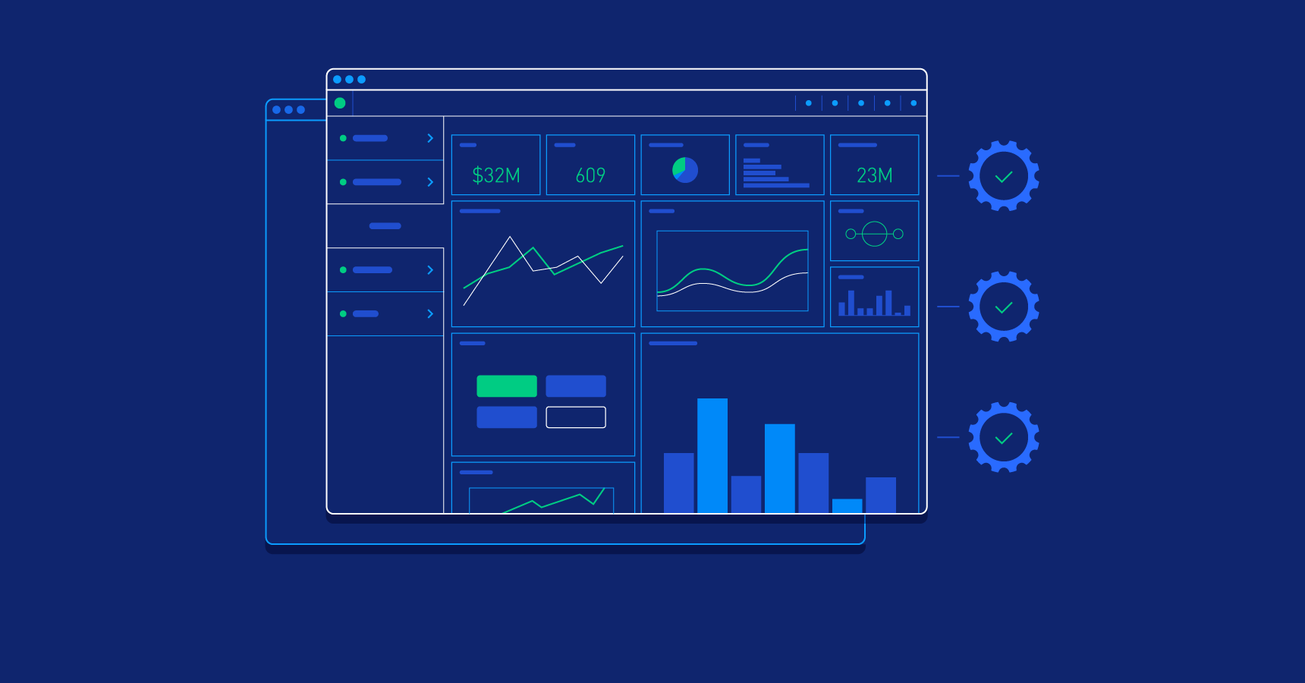
Dashboard analytics are used by engineers, product teams, and executives because they offer valuable insights into the success of digital products. We’ve collected the web’s most impressive examples.
Dashboard analytics are used by engineers, product teams, and executives because they offer valuable insights into the success of digital products. We’ve collected the web’s most impressive examples.
Santiago is a UX/UI designer with experience crafting websites and digital products that successfully draw new users and paying customers.
PREVIOUSLY AT

When you’re running a business, you need to make decisions accurately and quickly by analyzing complex datasets. This is hard, but it can be made easier.
Instead of continually needing to run the same analyses, well-built dashboards let you visualize your data in exactly the views you need to make well-informed decisions. But building an effective dashboard is not trivial.
To design an effective dashboard, designers must precisely understand how the data will be used and by whom. Users want “analytics,” but to do their jobs, they actually need insight. Since there are so many possible uses for dashboards, it can be difficult for organizations to get a proper understanding of which solutions best fit their needs.
To get you started, I’ve put together this collection of dashboards to give you a few ideas of how you can tailor your dashboard designs to fit the operations of the organization you’re working with.
Mixpanel

Mixpanel’s mobile app allows you to create a dashboard of your most important metrics, so you can easily check in on your business anywhere you go. By easily adding key metrics to your dashboard, your data is available instantly for when you need it on the fly.
Dashboard Job Summary Web App

This is an administrative dashboard that displays analytics for an open job position at an organization. The most important data is seen both relative to one another, as well as over time, to give an organization insight into the success of a job posting.
Dribbble Stats Dashboard

A great dashboard is easy to read at a glance and Ante Matijaca’s experiment with a Dribbble profile is a good example of this. Only the essential information is shown, and the minimal color palette allows Matijaca to indicate values on the graph without additional labeling.
Plasso Dashboard

Many organizations generate some sort of revenue online, so understanding the analyses on conversion rates is essential. This dashboard provides daily and weekly performance insights, such that users can quickly understand the financial consequences and benefits of their actions.
Industrial Analytics Sensor Map Overview Dashboard

Some organizations don’t just require numerical analysis but rather information that can be visualized geographically. This type of dashboard could apply to a range of businesses from the localized contracting company keeping tabs on city-wide projects to a regional industrial supplier tracking installed products.
Intercom: How Busy Are We?

The way that Intercom asks questions about its data analytics shows that they are much less concerned about aesthetics, and much more interested in what insights their data gives their users. This basic bar graph shows easy-to-scan bar charts for new conversations and median response times. These graphs can be viewed by date to view trends (does that spike correspond to our big feature launch?), and by day of week (how busy are we on Fridays?), and time of day (do we need cover when Asia and Australia are online?) to understand your support patterns.
Smart Alerts

It’s no longer a tech secret that apps are slowly becoming obsolete. This data dashboard follows that trend and pushes the most important information to users as a notification that can be read at a glance.
InsightsPro - Agent & Supervisor Dashboard

This is a more technical dashboard for administrative personnel, who might take more time with their dashboard, and therefore benefit less from the minimalist aesthetic. In this case, the dashboard is for a ticketing CRM, which you as a company get a ticket/problem report that is sent out to your techs on the field. The main function is for you to see open tickets/claims and arrange for it to be fixed. As a supervisor, you are able to see all the reports on how your company is handling any unresolved issues.
Skillshare Teacher Stats App

Teaching classes is becoming an increasingly popular revenue stream for digital designers and the relatively new teacher Vasjen Katro thinks that the products to manage your own performance could be better. The teacher can easily see their classes individually ranked against one another as well as their revenue totals.
Storefronts Dashboard

In this dashboard, you can view the analytics of one (or all) of an organization’s storefronts, as well as adjust its settings and appearance. The dashboard provides a robust range of data from geographic analytics to specific product performance. This dashboard might be too complicated for the small business owner, while it can handle the range of needs of a bigger organization.
Know Your Data
There might not be an analytics tool out there that perfectly fits your organization or client because each tool pulls data differently and often specializes in different metrics. But understanding what each tool offers will help you pull the right insights for your team or client to get started.
Further Reading on the Toptal Blog:
Santiago Baigorria
Buenos Aires, Argentina
Member since December 17, 2013
About the author
Santiago is a UX/UI designer with experience crafting websites and digital products that successfully draw new users and paying customers.
PREVIOUSLY AT


