Designing an Intuitive Mobile Dashboard UI: 4 Best Practices
Use these tips for navigation, tables and charts, button UX, and interactivity to create a smooth mobile dashboard experience that will keep users coming back.
Use these tips for navigation, tables and charts, button UX, and interactivity to create a smooth mobile dashboard experience that will keep users coming back.
Andris is a UI/UX designer who specializes in creating apps, websites, and dashboards for fintech, healthcare, and data recovery companies. He has worked with well-known brands around the globe such as Halfords, Roche, and Xapo Bank.
Previous Role
Senior Web DesignerPREVIOUSLY AT


In the first quarter of 2023, mobile phones drove 58% of global website traffic. Even as mobile user experience continues to improve and users complete more and more tasks on their phones, there’s at least one activity in which the screen real estate of desktop has an advantage: parsing complex information on dashboard displays.
Mobile dashboards are valuable for on-the-go users who need to stay up to date on evolving, data-based intelligence and respond to time-sensitive information quickly. Unfortunately, many mobile dashboards are poor imitations of desktop web apps and they frustrate customers rather than serving as effective visualization tools that stand on their own.
A mobile dashboard may not offer the full functionality of its desktop counterpart, but it can still provide users with a scannable view of top-line data and statistics to let them make informed decisions. It can also give managers and executives the necessary tooling to quickly approve orders, contracts, and procedure and policy documents.
In this article, I draw from my experience designing dozens of dashboards across industries including insurance, healthcare, IT, and data recovery to explore four fundamental aspects of responsive dashboard design: navigation, tables and charts, button design, and interactive states. These insights can help designers create the intuitive mobile experience users expect.
Smooth Navigation
Let’s start with navigation as this is how users will get acquainted with your dashboard and find the information they’re looking for. If the navigation for your mobile dashboard is clumsy or disjointed, or your search bar or navigation menu isn’t well suited to touch-based interactions, you are likely to turn off users.
Visual prioritization is key. Responsive mobile dashboards should communicate information quickly and prioritize it in a clear visual hierarchy. Another dashboard design best practice is using the principle of progressive disclosure to reveal information only when the user needs it.
Coinbase offers an example of an effective mobile dashboard. Comparing the desktop and mobile versions reveals additional insights.

This mobile dashboard effectively uses space to prioritize the most essential options. Crucial buttons from the left-hand panel on desktop become the bottom navigation bar on mobile, a standard for mobile menus as the position falls into the “Z” page scanning pattern where users’ attention tends to land.
The top navigation bar preserves key functions like search and notifications, as well as a hamburger menu that users can tap for more options. Notably, though, Coinbase doesn’t simply collapse everything into a hamburger menu. Rather, the mobile dashboard prioritizes the essentials on first view and lets users make preliminary selections before new screens are opened to offer more extensive choices.
These mobile navigation strategies enable users to take important actions but don’t overload the small screen with information and options.
Responsive Tables and Charts
Designing responsive mobile tables and charts can be a challenge, but in my experience, the customer satisfaction it provides is worth it.
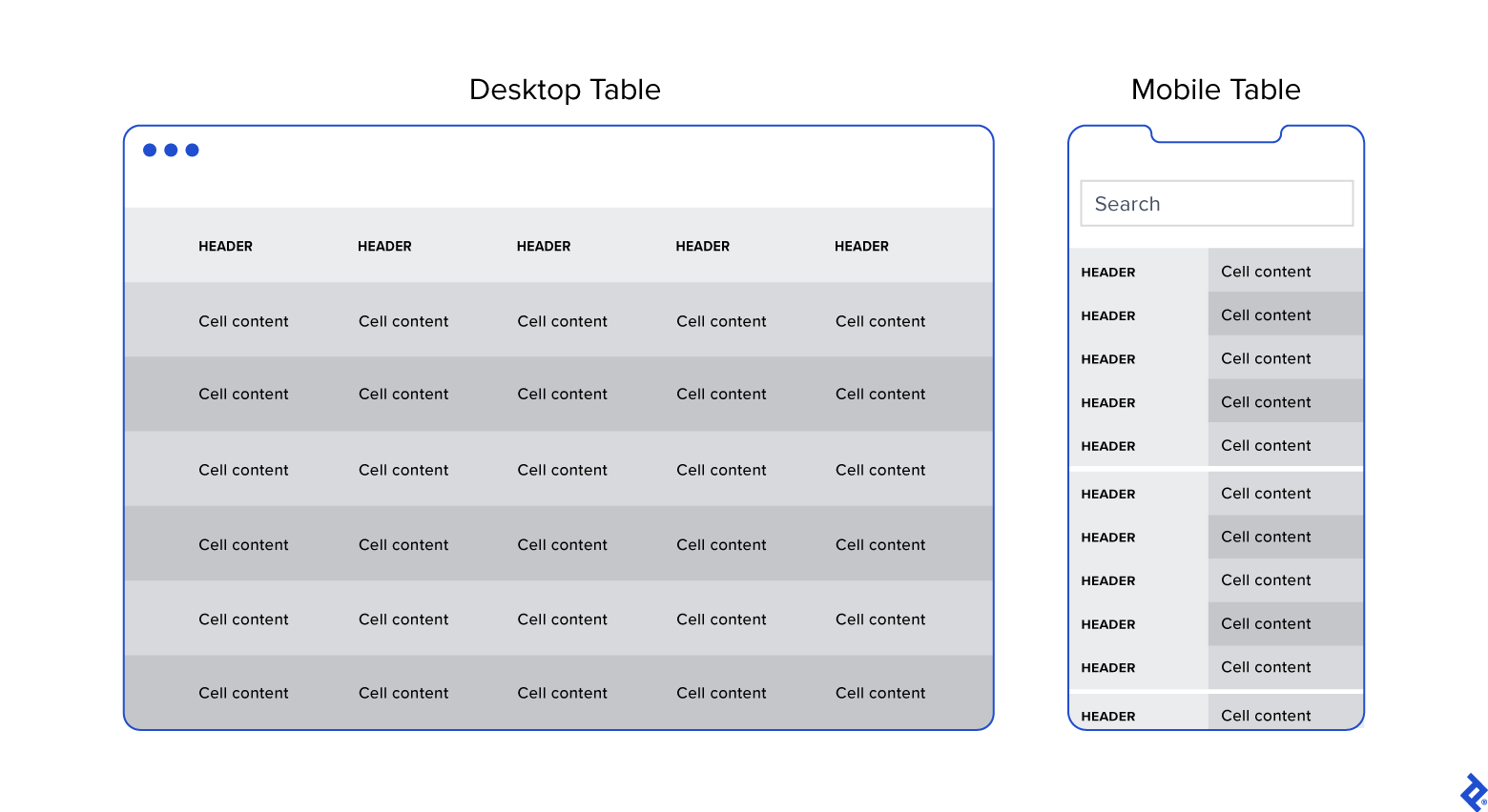
Generally, I advocate for responsive web designs that send a single code set to all devices but use fluid grids and media queries to change the appearance of elements based on a device’s size and orientation. This common and effective method is used in mobile dashboards to collapse table row headers into column headers in a set of stacked, standalone cards that can be scrolled through vertically. The approach offers an elegant mobile presentation that avoids squishing cells, while allowing the user to quickly peruse large amounts of data.

But stacked cards have their disadvantages too. Say you would like to compare a long list of SaaS companies by key performance indicators such as annual recurring revenue, average contract value, and customer acquisition cost. Assigning each company its own card means the user may only be able to view one or two companies’ performance indicators at a time, which can make comparison difficult (unless the user has an excellent short-term memory). But for use cases in which users don’t need to compare columns, such as an IT equipment order summary table, the vertical layout works well.
There is no one-size-fits-all solution: The context of your data table and how users will interact with it should dictate what strategy you choose.
Michał Jarosz, a Warsaw-based UX designer, outlines several smart approaches to designing responsive data tables, each with its advantages and drawbacks. One method is what he calls a “moveable” solution, in which only part of a table or chart is in view, and a user must swipe horizontally to see what’s hidden. Cost effective and easy to develop, this approach can work well for short, wide tables and for keeping content above the fold, but it atomizes what the user can see at any one time, making it hard to compare rows. (Worse, it can have a dizzying effect.)
Steven Hoober, a mobile UX design consultant who is critical of responsive mobile tables, writes in an article for UXmatters that simplifying tables by leaving out extraneous columns, using abbreviations and icons in place of text, reducing font size, and applying alignment rules to differentiate text hierarchies within a column are all strategies that can save space and improve table presentation. Depending on the use case, replacing a table with a data visualization might even be the best approach.
Landing on the best strategy requires assessing your users’ needs, collaboration with a knowledgeable developer, and likely a fair bit of trial and error: Test breakpoints on various devices, see how they look, and iterate until you find the sweet spot.
Button Design
Arguably, one of the biggest challenges in creating a responsive mobile dashboard is sizing and arranging buttons. Why? Because, unlike on desktop, you touch them, rather than select them with a cursor or keyboard command. They need to be big enough and spaced out enough to be tapped comfortably, and, due to the limited screen space, some will have to be collapsed into sub-menus or even hidden.
Standard button design principles should apply to your mobile designs. I tend to divide button design into two main principles: You should present buttons in a range of styles (sizes, colors, and shapes) that denote their relative importance through visual cues; and the text label or icon associated with a button should connote its semantic meaning and intended function—for instance, whether the button affirms an action, selects a tool, navigates to a new page, or cancels an action.
Most users are familiar with the visual iconography of buttons: They recognize that a right-facing triangle will play a song on iTunes, or that the letter B in the upper-level toggle menu of a Google document, once selected, will allow them to type in boldface. What’s tricky on mobile is that Apple and Google have their own design guidelines specifying mobile touch target sizes (44x44 pt for iOS and 48x48 pt for Android). To be safe, it’s best to create buttons 48 points tall.
Adhering to these guidelines may mean you can’t fit all the buttons that users need on the mobile display. Let’s say you have multiple buttons along a horizontal plane that are too small to be easily manipulated with a finger or thumb when placed in close proximity on a mobile display. Instead of simply shrinking the distance between the buttons and increasing the risk of user error—no one likes to hit the wrong button—you might swap in a three-dot ellipsis-like icon (a “kebab” or “meatball” button) to open a pull-down menu where users can make their preferred selection.
But you may have important buttons that can’t be hidden. As an alternative to the kebab menu, you could simply increase the button size to meet the mobile guidelines and then stack them vertically. Another alternative would be to leave the most crucial buttons at full size and make secondary buttons smaller by replacing the text label with an icon. When considering which technique to use, decide which buttons are most essential on each page.
More often than not, you’ll need to apply several strategies at once. In all cases, proper spacing, screen legibility, and the touch-based requirements of mobile devices should be your guide.
Interactive States
Interactive states provide valuable signals to help users predict the outcomes of their actions and assure them that those actions are having their desired effects. For example, if a button is tapped and there is a processing delay, the button may become disabled and display a spinner to show the user that the action is underway. Without this feedback, the user might close the page in frustration, thinking the button has failed. Unfortunately, interactive states are very easy to overlook or misapply in mobile dashboards.
Google’s Material Design guidelines offer a comprehensive description of interactive states to consider on Android, and Apple has similar guidelines for iOS. One of the most significant takeaways from these guidelines is that enabled states (visual cues that let users know they can engage with text, menus, animations, buttons, or other interactive elements) or disabled states (the “grayed-out” interactive elements that users can’t manipulate until enabled) need to be preserved on mobile platforms.
Certain dashboard functionalities can’t be replicated on mobile devices because of the touch-based interactivity of their screens. One of the most common is the so-called “hover state,” a type of interaction that lets a user hold their cursor over a screen element to see it react or view more information. For example, when you hold your cursor over the gear icon in the upper right-hand corner of the Gmail display a shaded circle appears, along with the word “Settings.” But you can’t hover on a mobile device as there is no cursor.
This is not a new problem, and there are a few ways around it. By far the easiest is to remove descriptive hover text and tooltips altogether. Most mobile dashboard users are familiar with icons borrowed from desktop—they know that tapping a small house icon returns them to the home screen of an app. However, in some instances even experienced desktop users need a refresher on the more obscure symbols and functionality on a mobile device. One simple solution is to add a tooltip button that provides more information when tapped. Tooltips are particularly indispensable for charts, which are typically built using pre-existing libraries or frameworks (imposing limitations).
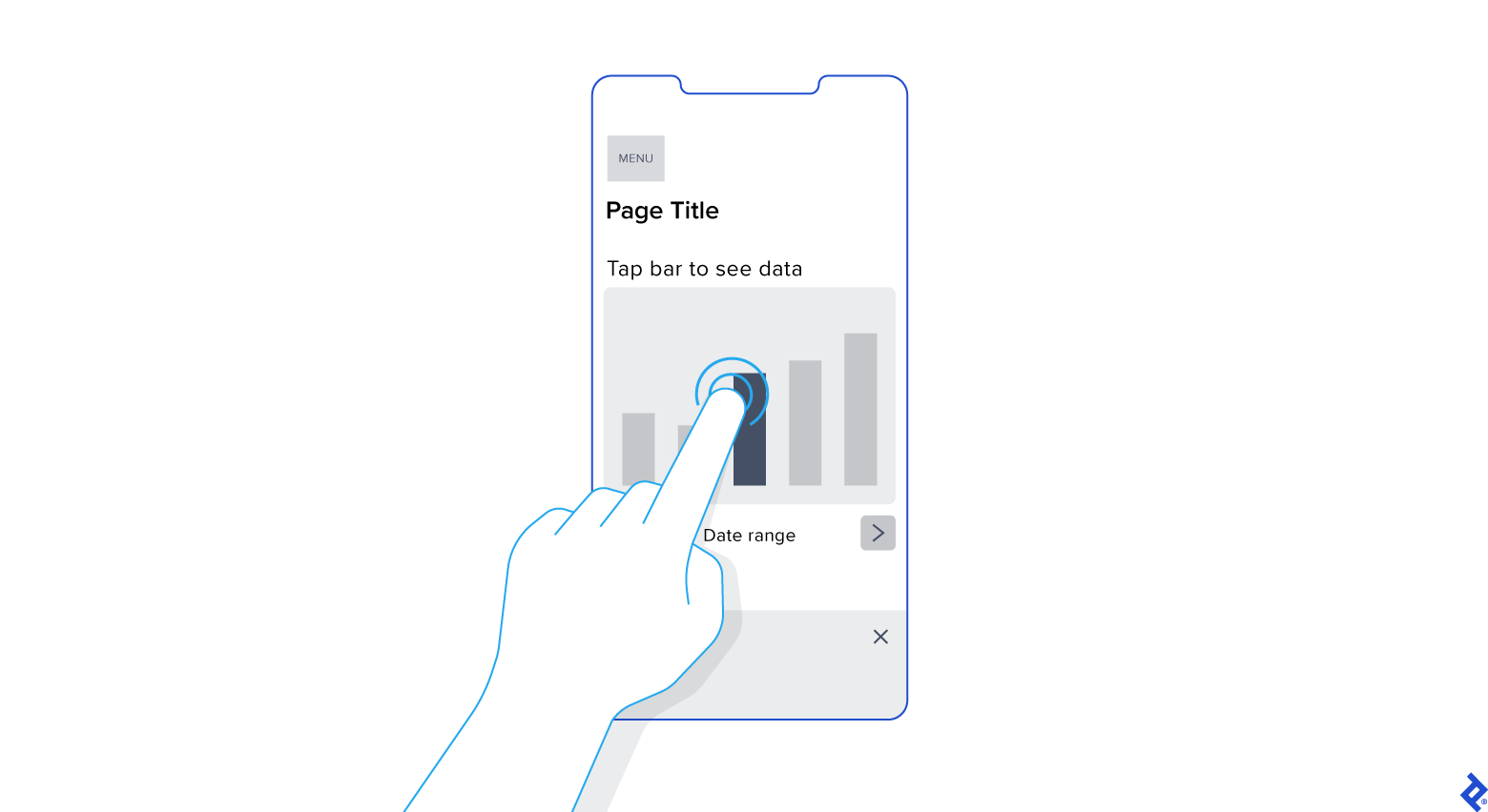
During a recent project for a healthcare client, I developed a chart that included several bars and detailed tooltips that appeared as hover states on desktop. On mobile, I designed the bars to display the tooltips only when users physically tapped on a bar. I also decreased the number of bars visible at any given time to ensure the touch targets were large enough for users to comfortably interact with them. Finally, I added instructions at the top of each chart that read “Tap bar to see data.”
The main takeaway? Each interactive state should be clearly decipherable on mobile and have a predictable response triggered by the user’s gestures.
Mobile Dashboard UI Design: Not an Afterthought
When the project scope and budget allow, it’s most efficient to consider how a responsive mobile dashboard will look and function as you’re building out the desktop version. This will save time and development costs later in the product life cycle, and it will also help ensure brand consistency across devices. It’s also paramount to recruit a skilled developer to assess the feasibility of various design approaches, and, where needed, define CSS rules for reconfiguring tables and charts. Above all, try to faithfully recreate as much of the desktop experience as you can: You may have to eliminate some features and functionality, but it’s important not to dumb down the design and to follow the UX design process.
Mobile dashboard UI shouldn’t be an afterthought. If designed with care and foresight, mobile dashboards can provide significant value to users.
Further Reading on the Toptal Blog:
Understanding the basics
What is a mobile dashboard?
Mobile dashboards present data, such as analytics, performance indicators, or business insights, so that users can monitor metrics and make informed decisions. Intuitive mobile dashboard UI optimizes user engagement through these key design aspects: navigation, tables and charts, button design, and interactive states.
Why is a dashboard important in an app?
Dashboards centralize an app’s information, enabling users to navigate the app, monitor important data, track progress, and make informed decisions. A well-designed dashboard enhances user experience, improves efficiency, and increases engagement by intuitively presenting relevant information.
How do you structure a dashboard?
There are five key tips for intuitive mobile dashboard design: Identify key audiences and their metrics; group information in a visual hierarchy; use clear and concise labels; utilize charts, graphs, and data visualization techniques to present information; iterate based on feedback and evolving needs.
Riga, Latvia
Member since July 3, 2020
About the author
Andris is a UI/UX designer who specializes in creating apps, websites, and dashboards for fintech, healthcare, and data recovery companies. He has worked with well-known brands around the globe such as Halfords, Roche, and Xapo Bank.
Previous Role
Senior Web DesignerPREVIOUSLY AT


