Multilevel Menu Design Best Practices
Navigation can be a UX minefield. Apply these guidelines to design intuitive multilevel menus that increase findability and offer a consistent experience across devices.
Navigation can be a UX minefield. Apply these guidelines to design intuitive multilevel menus that increase findability and offer a consistent experience across devices.
Andris is a Google and UXQB-certified design professional with a decade of experience in healthcare, fintech, data recovery, insurance, and other industries. He’s designed products for Android, iOS, Windows, and Mac platforms.
Expertise
Navigation and findability are central aspects of user experience design. If users can’t get where they want to go or find what they need, they’ll grow frustrated and may decide to look elsewhere. On websites with especially complex information architecture, multilevel menus are an effective way to improve navigation and findability, thereby offering efficient web experiences that promote product trust and boost conversions.
Because products and the devices on which they’re used vary widely, there’s no one-size-fits-all solution that will yield the perfect multilevel menu. However, there are rules of thumb that will help you build multilevel menus that enhance navigation and findability across any screen size.
Design Tips for Any Size Screen
A good multilevel navigation menu should get users where they need to go quickly by presenting information in a clear, intuitive manner. Before we get into size-specific guidelines, let’s look at some practices that apply to all menus.
Use no more than two levels of submenus. Any more than two levels of submenus will likely confuse and overwhelm users. Keeping navigation relatively flat improves findability for users and reduces the cognitive load it takes to remember where they are. If the site’s page structure is deep, consider adding a local navigation menu to the top of closely related pages. For example, Zoho, which designs complex business support products, has placed a product-specific local menu at the top of each product page, just below the main menu. While the main menu at the top enumerates Zoho’s core offerings, the local menus provide access to pages with more detailed information, such as use cases and pricing.
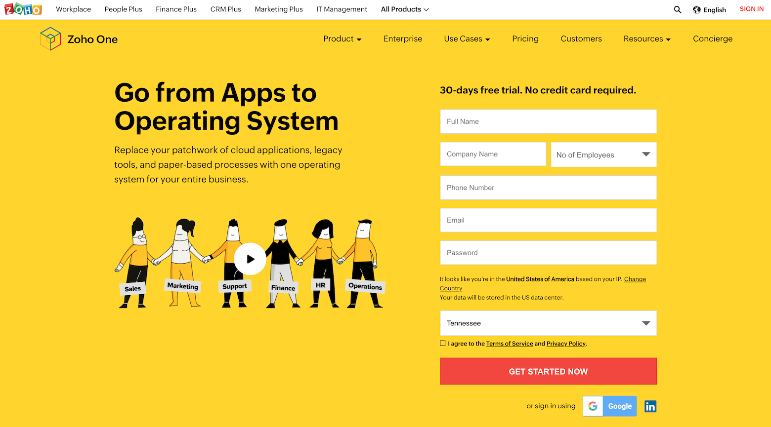
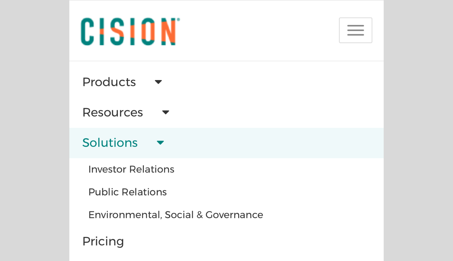
Flag submenus with icons. Manage users’ expectations by always making it clear when there are submenus available. Familiar choices include a small down angle icon or a triangle icon. Also, consider flipping pointer icons when submenus are open.
Organize information intuitively. Make sure the hierarchy of the information aligns with users’ mental models. On an e-commerce site, for example, consider whether a shopper is more likely to expect items to be organized by brand or item type. If a user clicks the “Shoes” category, will they expect the submenu to present options for sneakers, sandals, and boots? Or will they expect to see a submenu listing every brand of shoe the store carries? Looking at both your user research and your competitor research will clarify this.
Make sure users know where they are at all times. Always highlight the link on the main menu that corresponds to the page the user is on. If the current page is in a submenu, highlight the submenu link and the parent item on the main menu as well. For example, if someone using a government website to renew their driver’s license were to navigate from the “Residents” link on the main menu to the “Driver Services” link on the submenu and then to a page with a renewal form, both the “Residents” and “Driver Services” links would remain highlighted.
Keep copy simple. A menu isn’t the place for clever wordplay; make sure link labels have a strong information scent. This means keeping label names straightforward and descriptive so users will know right away what they’ll find when they click through. The clearer the copy, the more quickly users will find what they need.
Prioritize readability. Use a simple sans-serif typeface and ensure adequate spacing around items to avoid clutter. Make sure the background is opaque enough to block out whatever lies behind the menu. But don’t ignore the site’s overall branding. While readability comes first, ensure the menu’s styling complements the rest of the site’s look and feel.
Make clicking and tapping accessible. To make the menu accessible for users with fine-motor-control impairments, follow Google’s Material Design guidelines and format clickable elements to be at least 48 x 48 pixels in size.
Design Tips for Desktops
Even with a growing trend toward mobile, there are still plenty of reasons clients may require fully featured desktop sites. For instance, they might need to make more information available online than is feasible for a mobile site—like a website for a university or a financial institution. Or their research may show that their users simply rely more on desktops.
A desktop menu should be easy to scan, offer clear interactions, and, of course, be responsive. It should also be as consistent as possible with the mobile site in order to make the experience intuitive for returning visitors.
Menus should open on click, not hover. One of the most foundational decisions you’ll need to make is how users will access the site’s menu. Will simply hovering the pointer over the parent item—the category name—be sufficient to trigger the menu’s appearance or will users need to click on it?
The hover approach is popular but click-to-open is the best way to ensure the menu works reliably and intuitively across all devices. The click approach enables websites to work more consistently across traditional computer monitors and touchscreens alike, and avoids many frustrations that occur with the hover approach, including:
- Narrow hover tunnels. A hover tunnel is the path a mouse must take to navigate while keeping the menu open. If it’s too narrow, the menu may disappear before the user reaches the link they want.
- Accidental opening. A hover menu is prone to opening inadvertently if a user tries to navigate across it on their way to another location on the page. Setting a brief delay solves that problem but can cause frustration when the user does want to open the menu.
- Inconsistent UX on touchscreens. Hover menus don’t work on touchscreens. They require a code fix to detect touchscreens and switch to tap-to-open; as the line increasingly blurs between laptop and tablet, those workarounds may become obsolete.
- Questions about what’s clickable. With hover menus, users don’t always know whether or not the parent link is clickable until they try clicking. That’s the opposite of intuitive.
- Accessibility. Hover menus can present problems for users who use screen readers or navigate via keyboard.
Choose the right layout: Drop-down vs. Mega menu. If the desktop site uses a traditional menu layout (a horizontal menu bar situated at the top of the page), there are two types of submenu designs you can consider: a standard single-column drop-down or a multicolumn mega menu.
Consider using a drop-down if the parent category contains fewer than eight links. If the drop-down menu is long enough to require a vertical scroll, you should consider organizing the information differently—perhaps as a mega menu or by refining the parent categories.
A mega menu is a type of nested menu that typically uses a wide layout that can extend the width of the browser. You should use this type of menu if the submenu designs contain many different links that can be grouped in columns. Typically, you see menus like this on large e-commerce sites.
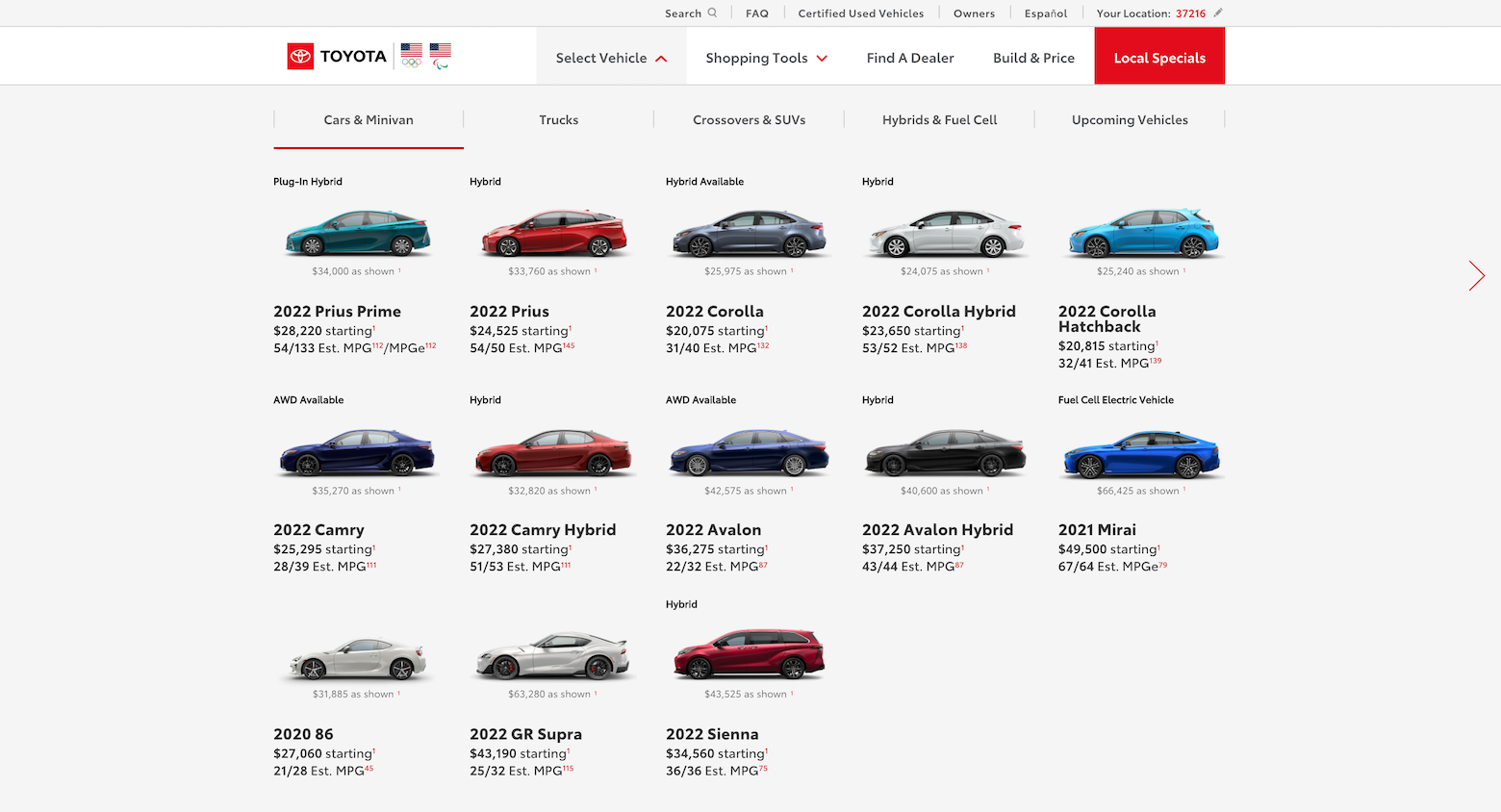
When designing a mega menu, consider the following:
- Add images or icons to make the information easier to scan.
- Add headlines to group related pages.
- Add descriptions if the category names are not self-evident.
Mega menus can be difficult to read and navigate on mobile, but sometimes the improvement in UX on a larger screen makes it worth doing the extra work to reconfigure the information for mobile devices.
Add clear hover states. Even with click-to-open menus, including clear hover states for all clickable elements makes interactions satisfying and reassures users that the links are active. You can make the background of the clickable area slightly darker to indicate a hover state. Just be sure the hover area matches the clickable area. If testing shows that users need more guidance or context, consider adding more descriptive label names or a tooltip, as long as it doesn’t block anything important.
Click to close submenus. Keep things intuitive by closing menus when users click elsewhere or when they open another submenu. This is how drop-down input fields work in forms, so most users will find this familiar.
Enable keyboard navigation on desktop. Not everyone uses a mouse to navigate, so the menu should allow users to navigate using only a keyboard. This means that all links should have distinct focused states so users can see where they are at a glance. Typically a darker-colored frame works well to indicate the focused state.
Design Tips for Mobile Screens
If you’re not already designing mobile-first, you’ll need to optimize the menu for a handheld device. Traditional menu layouts rarely work well on very small screens—if you simply shrink the desktop menu bar, no one will be able to read it. These guidelines will help you successfully transition to the small screen.
Simplify the main menu. Because smartphone screens are so small, much of the information you’d find in a desktop menu will have to be hidden initially. The main menu bar will have to be very simple, but it’s a good idea to surface the most important links to improve findability. You can affix the menu bar to the bottom or top of the screen.
Add a menu trigger. Since all or part of a mobile menu may be hidden, users will need a way to find it. Adding a hamburger icon to the menu bar or in an easy-to-reach floating button is a popular solution, one many users will recognize. However, the hamburger menu isn’t the only choice. If you’re designing for older users, it might be better to use a box with the word “Menu,” for example. Or, if you want to make the site’s features more prominent, you may want to display them in a tabbed menu at the top or bottom instead.
Put the menu in a sidebar. There are many different ways you can design a mobile menu. You can use a full-width layout, which works in any situation; a bottom drawer, which is best when there are only a few links; or a circular corner menu, which is a futuristic-looking option for a small menu with no submenus. A good option is to use a sidebar with a dark, translucent background that blocks out the page contents, thus removing distractions, and allows users to easily tap off it to close it. Also consider using a slide-from-left animation to avoid a jarring experience. For sidebar and bottom-drawer menus, make sure the menu is vertically scrollable so nothing gets cut off on smaller screens or in landscape mode.
Allow users to close the menu easily. Users may intuitively tap off a menu to close it, but consider adding an X button as well. You can turn the hamburger icon into an X or add one to the top right corner of the menu.
Use expanding sections for single submenus. Consider using expanding sections if the menu has only one level of submenus. You can expand them below the parent item and use a different background color for clarity. You can also allow users to expand multiple submenus at the same time. Consider using a down angle or a triangle icon on the right side of the parent item to indicate that a submenu is available.
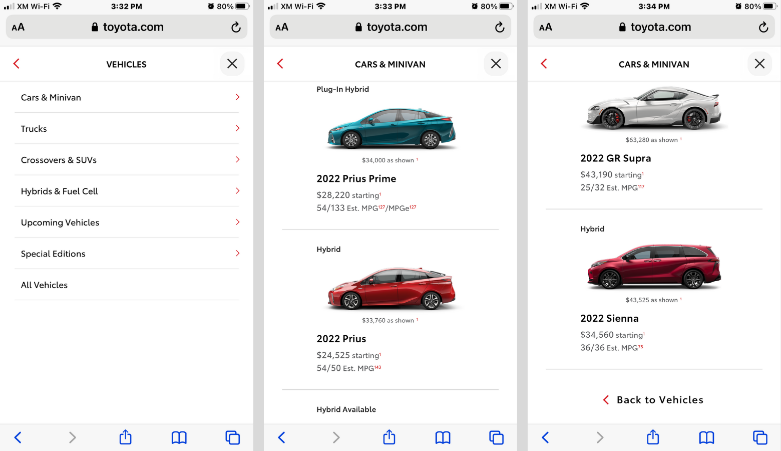
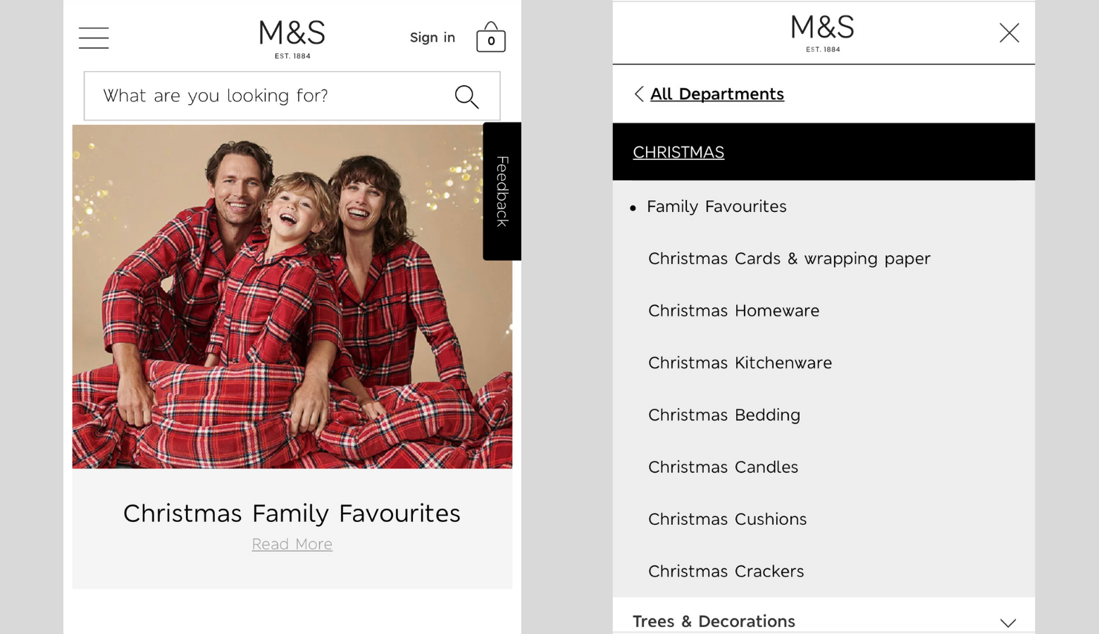
Replace mega menus and multiple submenus with overlapping menus. If you need to expand more than one submenu or reconfigure a mega menu, opt for an overlapping approach: Instead of expanding a submenu below or beside the parent, have the submenu replace the parent. With this approach you will have to include a “Back” link on all panels except for the first level. For the top-level menu, consider using a right angle icon or a right arrow for parent items.
Pre-open submenus. On desktop, it’s helpful to highlight the current page and its parent. On small screens, consider taking this a step further. If a user taps to open the main menu and the page they’re currently on is within a submenu, consider automatically opening the submenu too, so the user understands where they are relative to the rest of the menu items.
Keep It Clear and Consistent
Navigation is a crucial component of the customer experience. Users don’t want to go on a scavenger hunt or spend more time making their way through menus than they have to. If they can’t easily find what they need, they may tie up your client’s resources with a support call or, worse, take their business elsewhere.
A well-designed multilevel navigation menu is a key component of any website with a complex information architecture. While these guidelines should never replace user research and testing, they will serve you well across a wide variety of use cases.
Further Reading on the Toptal Blog:
Understanding the basics
What makes a good website menu?
A website menu should be intuitive and easy to navigate. It should contain links that are relevant to users, as well as to the business’ priorities. The main menu should display the most important links, but you can use submenus to display additional pages quickly.
How should my website menu be ordered?
The hierarchy of a menu should match the mental models of the users. A multilevel navigation menu should organize information by increasing levels of granularity. You want to display the broadest categories first and use submenus to allow users to narrow their choices.
What should a website menu include?
A website menu should feature links within the site that are relevant to users’ needs and match the business’s priorities. Multilevel menus can help users reduce their choices to find what they need quickly.
Riga, Latvia
Member since July 3, 2020
About the author
Andris is a Google and UXQB-certified design professional with a decade of experience in healthcare, fintech, data recovery, insurance, and other industries. He’s designed products for Android, iOS, Windows, and Mac platforms.

