
The Super Simple Guide to Iconography
Digital icons replace descriptive words and sentences and optimize visual space, usability, and aesthetic. Learn to create 10 custom icons in less than 10 seconds each (we promise).

Digital icons replace descriptive words and sentences and optimize visual space, usability, and aesthetic. Learn to create 10 custom icons in less than 10 seconds each (we promise).

Tidjane Tall
Tidjane is a UX/UI design leader who connects user’s needs and goals to deliver strategic solutions for companies like Adobe and Google.
On average, how long does it take you to design a custom icon?
A couple minutes? Ten minutes? Longer? What if we showed you how to make 10 great icons in less than 10 minutes?
Iconography is a form of communication that adds to a brand’s visual language, so a custom icon set is more meaningful and engaging than a simple, generic one. Most designers don’t ever bother to learn how to create custom icons, mainly because that’s yet another course to add to our learning queue.
So I set out to create a super simple guide to help you learn the basics of iconography in less than 10 minutes (I mean it).
Being able to create custom icons will open up a whole new world for you to start creating intricate shapes for your projects, which will distinguish you from the rest of the crowd, giving you a competitive edge as a designer.
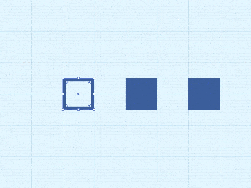
Originally, I was inspired to create this guide by this GIF from Morgan Allan Knutson showing how to create a location services icon in a few seconds. I found it refreshing, smart, and quick. It demystifies the process of creating custom icons and shows how simple it can be. An icon is in fact a geometric shape that can result from a combination or deformation of basic shapes, such as squares, triangles, or circles. A rule of thumb in logo or icon design is to keep things simple.
The goal of this article is to create 10 icons within 10 seconds each, using only simple shapes.
Important Note: The GIFs in this post use Adobe Illustrator, but the same shapes and operations are available in Figma and Sketch. Throughout the article, we’ll note Figma equivalents where tool names differ. In Illustrator, adding and removing anchor points uses the Pen Tool (P), and selecting or moving individual points uses the Direct Selection Tool (A). In Figma, double-click any shape to enter Edit Object mode, then drag points directly.
Working on a Grid
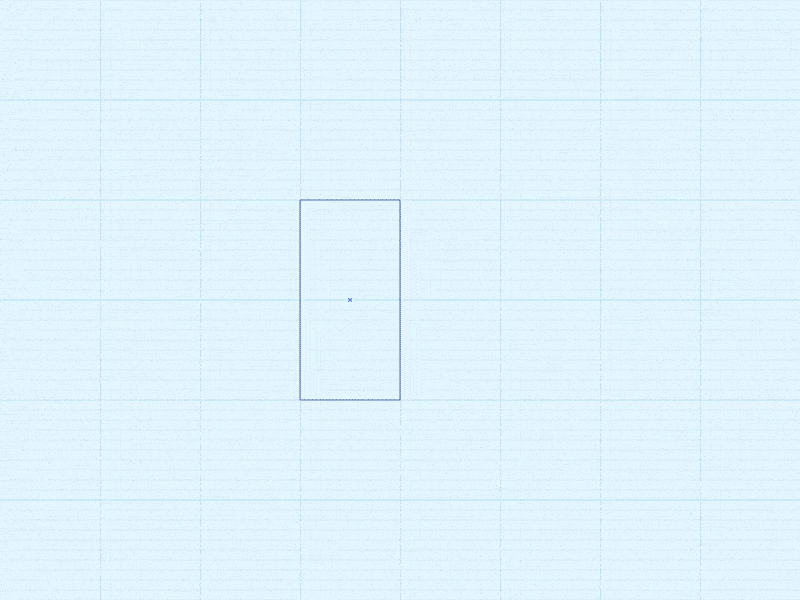
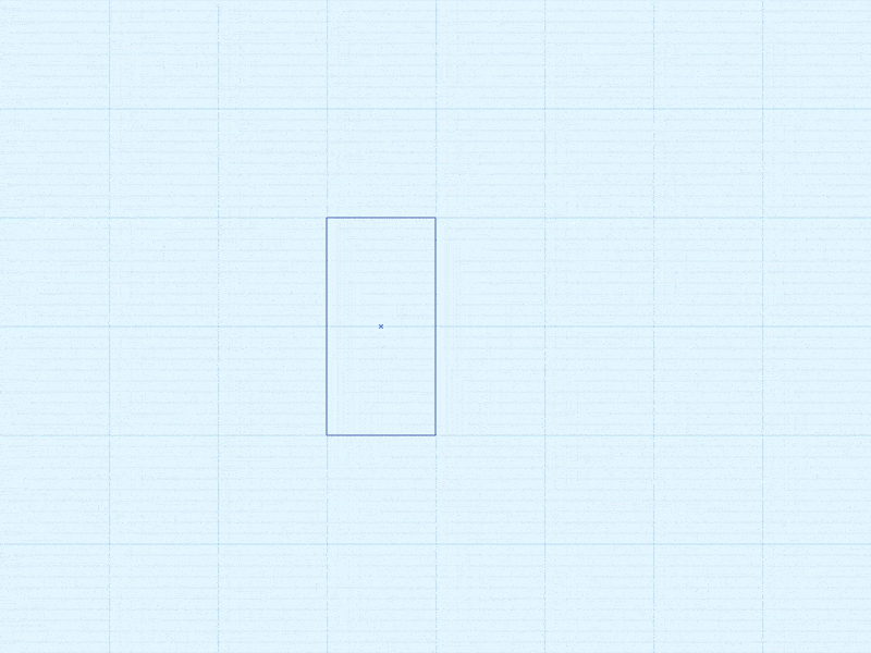
Before drawing your first icon, set up a consistent frame. The industry standard is a 24x24px frame with 2px padding on each side, leaving a 20x20px live area where your icon content lives. In Figma, create a 24x24 frame and add a 20x20 rectangle centered inside it as a guide layer. In Illustrator, use a 24x24 artboard with guides at the 2px boundary on each edge.
Within that live area, use keyline shapes as reference templates to control visual weight across the set. The four standard keylines are a 20x20px square, a 20px circle, a wide rectangle (roughly 20x16px), and a tall rectangle (roughly 16x20px). Icons built to fit within the appropriate keyline will feel optically balanced even when they have different silhouettes. Lock the keyline layer before you start drawing.
Eye Icon

Center-align four circles, going from largest to smallest with altering colors, as shown. On the largest circle, toward the back, pull the left and right points away from the center. Finally, move the smallest, inner circle to the edge of the following one to create a lighting effect on the iris.
Tip: Instead of using a white circle, subtract the two circles from the circle beneath each of them. In Illustrator, use the Pathfinder panel. In Figma, select both shapes and use Boolean Groups > Subtract.
Arrow Icon

It’s all about where you add those extra points on the edges of the initial square. Tip: As an alternative, you can simply draw a thin line shaped like an arrow.
Battery Icon
Using one square with a stroke and two with fill. Simply play with proportions, while including one filled square into the stroke shape and keeping the second one outside to form the battery tip.
Tip: Play with stroke thickness and padding to maintain a good visual balance.
Bullet List Icon

Start with a simple square; duplicate it once to its right; and reshape it as a long rectangle. Select the entire thing, and duplicate twice while keeping one square size space in between.
Tip: Replace the square with circles to create a softer look.
Cloud Icon

Draw three different size circles. Bottom-align the two smallest circles to have a base, and put the biggest circle in between, at a higher position. Create the base of the cloud by deforming one of the small circles.
Tip: Use different circle sizes to get a more organic-looking cloud.
Forward Play Icon
Draw a long rectangle. Add a point to the left edge center, and remove the top and bottom point. Now that you have one triangle, simply duplicate that shape once to the right to complete the icon.
Tip: To do this even faster, simply start with a triangle instead of a square.
Funnel Icon

Begin with a long rectangle. Add a point to the center of the left and right edges. Now, horizontally stretch the top edge, and you’re done.
Tip: Place two squares edge-to-edge, and simply stretch the upper most edge horizontally.
Play/Pause Icon
Start with three long rectangles in parallel. Reshape the widest rectangle to a triangle.
Tip: Alternatively, simply draw one triangle, followed by two parallel rectangles.
Position Arrow Icon

This one is a remix of Morgan’s location service icon. Simply draw one square, then pull the bottom left point in a diagonal direction, moving upward until you pass the opposite point.
Tip: Holding Shift while dragging the point keeps the angle constrained to 45-degree increments. This works in both Illustrator and Figma.
Position Pin Icon

Knock out a circle inside a bigger one. In Illustrator, use the Pathfinder panel. In Figma, use Boolean Groups > Subtract. Drag the lowest point straight down, and sharpen the formed angle. In Illustrator, switch to the Pen Tool (P) and Shift-click the point. In Figma, select the point in Edit Object mode and set the corner type to None in the design panel.
Tip: Add a slight corner radius to that tipping point to soften the look. In Illustrator, adjust the corner radius in the Transform panel while the point is selected. In Figma, drag the corner handle inward in Edit Object mode.
Sound Icon

Just like the funnel icon but at a 90 degree rotation.
Tip: Simply copy and paste the funnel icon, and rotate it clockwise.
Wave Icon

Draw a straight line, and add points at an equal distance over its length. Drag down altering points, and round out every corner to the max, until it’s all smooth.
Tip: Round out the line tips for an even smoother look.
Toptal Icon

This is the bonus icon.
Draw a square with a thick enough stroke. In Illustrator, use the scissors tool to cut the top right and bottom left points. In Figma, enter Edit Object mode, select those two points, and delete them to open the path at those corners.
Tip: Pay attention to the thickness of the lines, and the white space formed inside the logo.
An Icon is Worth 1,000 Words.
We often hear that an image is worth a thousand words. Well, this applies very much to icons, which replace long sentences and words to optimize visual space, usability, and aesthetic. Knowing how to craft a set of simple and effective icons can go a long way. And we just saw how quick and easy it can be by observing and utilizing a basic set of shapes.
In summary, the 10 main rules of iconography are:
- Make it symbolic and meaningful.
- You’ve heard it: Keep it simple. Style should not compromise legibility.
- Be intentional and thoughtful. Think before you create.
- Make sure it works in different sizes. Test at 16px minimum, and ensure any interactive icon has a touch target of at least 44x44px.
- Keep uniformity in mind. A shared grid and keyline system makes this automatic.
- Vectors only, please. Flatten all strokes and expand fills before handing off, so your SVG contains no live effects or dependent styles.
- Only use colors when necessary, and do so carefully. When an icon conveys meaning without a text label, its color must achieve at least 3:1 contrast against its background (WCAG 2.1 SC 1.4.11); aim for 4.5:1 when there is no label at all.
- It helps to know basic geometry.
- Think “affordance” to make sure the designed icon will help the overall design.
- Iconography is a language that should be universal. Before export, remove unnecessary nodes, delete hidden layers, and round coordinates to whole pixels. Figma’s SVG export handles most of this automatically.
- Bonus: The alphabet is just a set of 26 icons.
Play along, and see what you can come up with in under 10 seconds.