
4 UX Tips to Reduce Users’ Cognitive Overload and Burnout
Knowledge workers spend most of their workdays using digital tools. These low-friction UX strategies help reduce techno-stress and increase healthy user engagement.

Knowledge workers spend most of their workdays using digital tools. These low-friction UX strategies help reduce techno-stress and increase healthy user engagement.

Rodrigo is a product designer who specializes in creating early-stage digital products and services for companies in fintech, healthcare, and insurance. His contributions to Yerbo, a healthcare product whose clients include Nubank, Gitlab, and Pandadoc, improved user burnout scores and helped the platform achieve a 20% exercise activation rate. Rodrigo holds a bachelor’s degree in graphic design and an MBA.
Expertise
Record numbers of workers are experiencing stress in their jobs and personal lives. More than one-quarter of Americans say they’re so stressed by global and domestic crises that they are unable to function most days, according to a nationally representative 2022 survey by the American Psychological Association.
This ongoing threat to mental health means designers should be wary of saddling users with unnecessary cognitive loads—a UX issue that can be especially detrimental to knowledge workers who spend most of their time using digital tools. But if a single error message can send stress hormones soaring, how can designers of enterprise products protect their users?
In 2021, I began working with Yerbo, a burnout assessment and self-help tool for tech workers. Through close collaboration with Yerbo’s psychologists, I learned how burnout works and how designers can ensure they don’t contribute to it.
Designing an App that Fights Burnout
Designing a burnout assessment tool posed several interesting challenges. The Yerbo platform aims to keep workers in high-pressure jobs healthy. It’s free to individuals, but companies can subscribe to an enterprise plan that collects team burnout scores so that managers can anticipate morale and workload issues. (To protect user privacy and ensure authentic answers, Yerbo anonymizes and aggregates these scores before sharing them with managers.)
Users are more likely to benefit from their assignments if they complete them in a calm, reflective state, so we created a minimal UI that is clean and aesthetically pleasing. The product team wanted to make content easy to find and promote focus for burned-out users, so we reduced the notifications we sent, created a dedicated, immersive page for each task, and ensured all language was easy to read.

After their initial assessment, users at risk of burnout begin a program that consists of self-guided exercises tailored to specific symptoms. Exercises last from one to 15 minutes and are intended to be completed during the workday, when users are most vulnerable to burnout-inducing habits and stressors.
For example, one exercise to improve confidence prompts users to counter negative beliefs about themselves. Another, to help manage rumination, asks users to reflect on the benefits of working faster and making deadlines versus striving for perfection and working overtime.
Once users complete the first module, they receive weekly reminders to move on to the next one. If checkup surveys indicate their burnout is under control, users can still revisit the activities to maintain their results or alleviate emerging symptoms.

Positive messages appear at the end of each module to motivate users to stick with the program, but the messages praise users’ effort, not their outcomes (“Keep up the good work!”, “You finished your journey!”). A message forcing positivity (like “You’re feeling better already!”) would diminish difficult experiences and encourage workers to ignore burnout symptoms, which makes them worse.
Of course, creating a healthy UX is easier when the application’s sole purpose is to enhance mental well-being. But the principles that Yerbo designers and psychologists established can serve a wide range of enterprise products.
4 UX Principles to Prevent User Burnout
Prevention is the best medicine for burnout. Fortunately, there are UX strategies that you can use throughout the design process to ensure that your product doesn’t overwhelm users. Not every principle will apply to every enterprise application, but incorporating as many as possible will contribute to healthier workdays for your users.
1. Reduce Product Complexity
A busy UI can make users feel like they’re falling behind. Offer fewer and higher-quality features, hide lesser-used functions to give core content more space, and aggregate notifications to avoid constantly interrupting users.
If a user’s first interaction with your product is easy, they’ll probably continue using it. For example, Slack users creating a new workspace only need to complete three steps, and each step appears one at a time. This immersive, focused experience ensures that users complete the setup and don’t get lost in a sea of form fields.

2. Reward Small Steps
Impart a sense of progress without adding friction. Think one-time messages of encouragement (“Good job! You completed your first task.”) rather than an ecosystem of points and badges that can add more stress.
For example, the Asana project management platform randomly deploys celebration creatures when users complete a task. This feature rewards incremental progress that might otherwise go unnoticed and helps users feel more effective at their jobs.
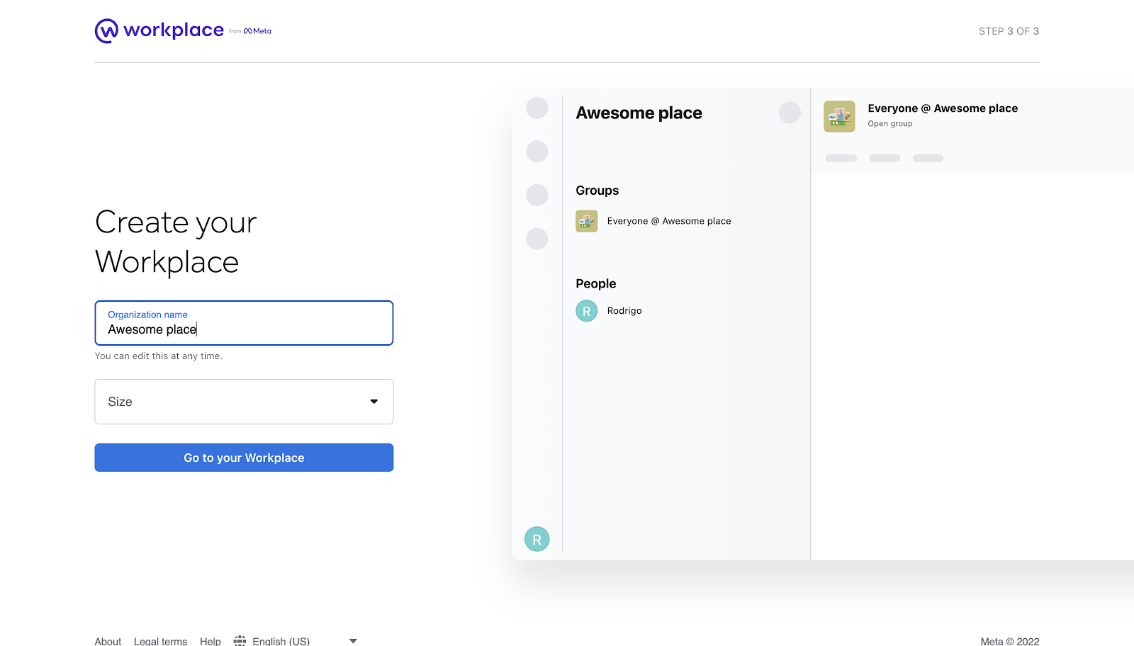
Likewise, Meta’s business communication platform links effort to outcome and promotes a sense of progress by instantly customizing Workplaces as users enter information into form fields.
3. Earn Users’ Trust
Burned-out users are cynical users. There are many ways to build trust, depending on what type of application you’re developing. For example, HR applications should have UX data security features—such as multifactor authentication, automatic timeout, and trust badges—that let users know that the sensitive information collected from applicants and new employees is protected. The HR survey tool Officevibe, for example, creates trust by building its UX around the company’s value proposition of total privacy. Officevibe only shares anonymous written feedback with managers if there are five or more respondents, and it also allows managers and employees to engage in anonymous chats to discuss issues in more detail without fear of retaliation.
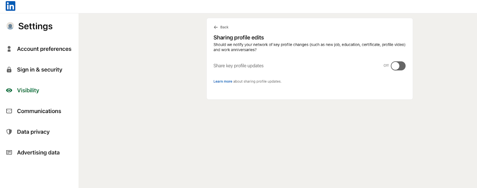
Likewise, LinkedIn protects users’ work relationships with multiple privacy settings, including one that lets users conceal their profile viewing history. Another setting pauses notifications that would otherwise broadcast a user’s profile edits to managers and colleagues.
4. Use Specific Language
Stress can cause us to disconnect from our bodies and feelings to cope. This action, called depersonalization, also disconnects us from other people’s feelings, making us harsher and putting our relationships or work culture at risk.
To help prevent depersonalization, give users frequent system status updates and use specific language when there’s a problem instead of frustrating classics like “Payment Error,” “Bad Request,” and “Something went wrong.” Google Docs’ “trying to connect” pop-up notification is a good model for specific status updates because it cues users to network issues as they occur. Likewise, Dropbox’s account creation page offers instant, actionable advice on resolving form field errors.

Adjust Your UX as Necessary
Users' real-world experiences trump principles when reducing burnout risk through UX design.
The pressures contributing to burnout will vary by industry, so make sure to recruit research participants in the field you’re designing for and involve them in the UX design process. What stressors do they most often face? What is the quit rate for their industry? How do they feel about the UX of the enterprise tools they use daily?
For example, if I were designing an enterprise ticketing platform, my users would be a team of engineers. Because I’ve worked with and designed for engineers before, I could begin with a few assumptions about their needs and team structure.
- The ticketing platform must track and prioritize bugs.
- The user-engineers will use a squad structure with a team lead overseeing individual contributors (ICs).
- The ICs will take turns handling support requests.
From this work structure, I would infer that an influx of time-sensitive requests would be one of the primary sources of user stress and might lead to technical debt—the accrual of faulty or inadequate code over time that hinders future upgrades or fixes.
Next, I would validate or disprove my assumptions through UX research. If most of my assumptions proved true when I consulted the engineer research participants, here’s what my burnout-prevention approach for a ticketing platform might look like:
- Ensure that only the IC user owning the support role on a given day receives alerts.
- Reduce and prioritize notifications to help users know where to focus their efforts. This can be an automatic feature or something each user may adjust manually. For example, an IC might elect to receive notifications for only urgent tickets.
- Disable notifications outside the user’s work hours except for critical issues.
In this example, my goal as a designer is to create a work environment where users feel they are making progress on mission-critical tasks and have time to implement high-quality solutions. As I refine my UX design, I’ll keep testing features on engineers, collecting their feedback, and noting their attitudes toward the new ticketing platform.
Users will always tell you what they need—through direct critique or by displaying signs of stress or burnout. These signs will look different from person to person. For some, burnout may manifest as aggression, while others may become subdued and disengaged.
Remember that working conditions, health status, and social trends affect how users experience your designs. Conducting interviews and testing prototypes will ensure that your UX respects the broader pressures your users face.
Further Reading on the Toptal Blog:
- The Tried and True Laws of UX (with Infographic)
- The Allure and Impact of Minimalist UX Design
- Heuristic Principles for Mobile Interfaces
- UX Design Trends Retrospective 2019
- Heuristic Analysis for UX: How to Run a Usability Evaluation
- Why Design Teams Need Psychological Safety
- Elegant Healthcare UX: A Missing Piece in Medical Product Design (With Infographic)
Understanding the basics
Design is important for health because UX affects mental health. Design principles are rooted in behavioral psychology: A well-designed UX can reduce friction and stress, or encourage healthy habits such as saving money or taking breaks to exercise.
Designers can prevent burnout by implementing UX best practices like reducing product complexity, giving frequent positive feedback, building psychological trust, and communicating clearly and honestly—especially when describing problems or errors.
You can reduce cognitive load in your design by introducing essential features first and presenting secondary features progressively. This aligns with Hick’s Law, a design principle that states that memory retention degrades when too many items are introduced at once.
A clean UI, limited alerts, and easy access to core features further reduces the mental load required to use the product.

Barcelona, Spain
Member since January 10, 2022
About the author
Rodrigo is a product designer who specializes in creating early-stage digital products and services for companies in fintech, healthcare, and insurance. His contributions to Yerbo, a healthcare product whose clients include Nubank, Gitlab, and Pandadoc, improved user burnout scores and helped the platform achieve a 20% exercise activation rate. Rodrigo holds a bachelor’s degree in graphic design and an MBA.