Heuristic Analysis for UX: How to Run a Usability Evaluation
What is a heuristic analysis? How do you run one effectively by employing a group of usability experts to dramatically improve a product’s UX?
What is a heuristic analysis? How do you run one effectively by employing a group of usability experts to dramatically improve a product’s UX?
Miklos is a UX designer, product design strategist, author, and speaker with more than 18 years of experience in the design field.
Expertise
PREVIOUSLY AT

Design is an investment, not an expense. At the risk of stating the obvious: It’s not enough to design a nice-looking product; it also has to be usable, and if you are to extract the largest ROI from a product, its usability—which generally refers to ease of use—takes on a vital importance.
Well-designed products have excellent usability, and because usability is a significant contributor to product quality, it elevates the user experience.
There are a few ways a product’s usability can be tested: an inspection method called a heuristic analysis is one of them. This usually means running a heuristic evaluation on a product, whether it already exists or is brand new.
What Are Heuristics and What Is a Heuristic Analysis?
A heuristic analysis is used to identify a product’s common usability issues so that the problems can be resolved, consequently improving the user’s satisfaction and experience and raising the chances of a digital product’s success overall.
Focusing on usability, a heuristic analysis is an evaluation method in which one or more experts compare a digital product’s design to a list of predefined design principles (commonly referred to as heuristics) and identify where the product is not following those principles.

A specific set of heuristics contains empirical rules of thumb, best practices, standards, rules, and conventions that have been tested or observed over long periods of time. Sticking to these heuristic standards produce UX designs that simply work better.
Heuristic evaluation involves having a small set of evaluators examine the interface and judge its compliance with recognized usability principles (the ‘heuristics’). — Jakob Nielsen, The Nielsen Norman Group
A heuristic evaluation is not a one-on-one moderated test. Neither is it a cognitive walkthrough, which is a usability inspection method. With cognitive walkthroughs, the emphasis is on tasks. The process involves identifying the user’s goals and coming up with a task list to achieve those goals. Evaluators then flag problems users may have as they use the product.
A heuristic evaluation expert—the evaluator—is ideally a usability testing expert who has deep understanding of the chosen set of heuristics. They would typically come from the disciplines of human factors, interaction design (IXD), HCI (human-computer interaction) and/or UX design, with complementary backgrounds in disciplines such as psychology, computer science, information sciences, and commerce/business.
During the evaluation, individual evaluators assign a “severity rating” to each of the usability issues identified. As a rule, UX designers work their way down from the most critical issues on the backlog to the least critical. (In order to get the biggest UX bang for the buck from a heuristic evaluation, it is typical for the design team to give issues with the highest severity rating the most attention.)
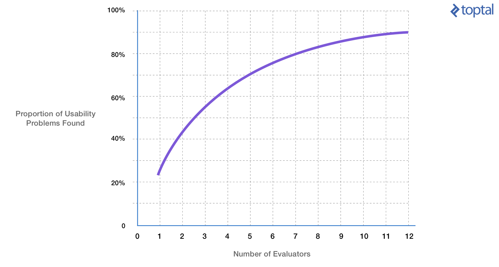
It’s useful to note that even though a single experienced UX pro is usually adept at identifying the most critical usability issues, a group of evaluators is generally the best option. Between 5 and 8 individuals is the sweet spot: They should be able to flag over 80% of usability problems. However—as the graph below demonstrates—using more than 10 heuristic evaluators will not yield better results.

Why do it?
The core reason to perform a heuristic analysis is to improve the usability of a digital product. Another reason is efficiency (in this context, “efficiency” is the speed with which a product can be used as a direct consequence of better usability). “Usability” refers to quality components such as learnability, discoverability, memorability, flexibility, user satisfaction, and the handling of errors. A product’s UX is greatly improved when these components are delivered at a high quality.
When to do it?
There are no hard and fast rules. A heuristic analysis can be performed at any advanced stage of the design process (Obviously, it would not be productive to do it too early). With new products, a heuristic analysis is usually performed later in the design phase—after wireframing and prototyping and before visual design and UI development begins. Do it too late and making changes will become costly. Existing products found to have poor usability will often have a heuristic analysis run on them before a redesign begins.
What is the expected deliverable?
As with other usability tests or inspection methods, the typical deliverable is a consolidated report which not only identifies usability issues, but ranks them on a scale from severe to mildly problematic. For the most part, a heuristic evaluation report doesn’t include solutions—fortunately, many usability problems have fairly obvious fixes, and once identified the design team can start working on them.

Advantages and Disadvantages of a Heuristic Evaluation
Advantages:
- Uncovers many usability problems and significantly improves a product’s UX
- Cheaper and faster than full-blown usability tests that require the recruitment of participants, coordination, equipment, running the test, recording, analyzing, etc.
- Heuristics can help the evaluators focus on specific problems (i.e., lack of system feedback, poor discoverability, error prevention, etc.)
- Heuristic evaluation does not carry the ethical and practical issues/problems associated with inspection methods involving real users
- Evaluating designs using a set of heuristics can help identify usability problems with specific user flows and determine the impact on the overall user experience
Disadvantages:
- Experienced usability experts are often hard to find and may be expensive
- The value of issues uncovered by evaluators is limited by their skill level
- At times, a heuristic analysis may set off false alarms: Issues that would not necessarily have a negative effect on the overall UX if left alone are sometimes flagged to be fixed
- Unlike cognitive walkthroughs, heuristic evaluation is based on prejudged notions of what makes “good” usability
- If the evaluators are not part of the design or dev team, they may be unaware of any technical limitations on the design
How to Run an Effective Heuristic Analysis
Preparation is key to running the analysis well. Following an established set of steps ensures that a heuristic analysis will run efficiently and yield maximum results. Here’s a heuristic analysis checklist:
- Define the scope.
- Know the business requirements and demographic of the end-users.
- Decide on which reporting tools and heuristics to use.
- Evaluate the experience and identify usability issues.
- Analyze, aggregate, and present the results.
Step 1: Define the scope.
On both large and small projects, budgets may be limited. This may be especially the case on large eCommerce sites: For example, it may not be feasible to examine the entire site, as it could take a very long time and therefore become too expensive.
This is where scoping the heuristic analysis comes in.
Parameters may be set to examine only the most crucial areas of the site. The limited scope may only have the capacity to focus on specific user flows and functionalities, such as log in/register, search and browse, product detail pages, shopping cart, and checkout.
Step 2: Know the business requirements and the users.
First, the evaluators should understand the business needs of the product/system. Second, as with any typical user-centered design process, it’s crucial to know the users. To facilitate heuristic analysis, specific user personas must be established. Are the end-users novices or experts? What are the user demographics?
For example, although heuristics were meant to work as universal usability standards, perhaps special emphasis needs to be placed on accessibility for an older audience—or maybe diverse, multicultural audiences need to be kept in mind.
Step 3: Decide on which reporting tools and heuristics to use.
It’s incredibly important to decide which set of heuristics the evaluators are going to use. A selected set of heuristics will provide common guidelines against which each of the experts can make their evaluation, as well as ensure that they are all on the same page. Without it, the heuristic analysis process could fall into utter chaos—produce inconsistent, conflicting reports and ultimately become ineffective.
As part of the heuristic evaluation plan, a system, a format, and which tools to use should be agreed upon. This could be Google Docs, Sheets and Slides, or some other common reporting tool that everyone can use and to which the “observer” will have easy access. (More about the observer later.)
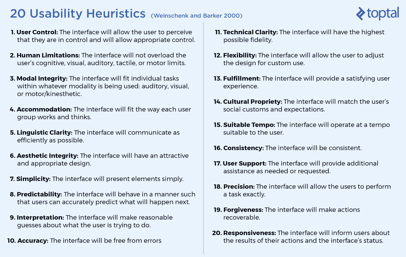
Jakob Nielsen’s 10 Usability Heuristics for User Interface Design are probably the most commonly used set of usability heuristics. There are others such as the list of six Design Principles for Usability by Don Norman, and the 20 Usability Heuristics by Susan Weinschenk and Dean Barker listed below. There is even a set that contains no less than 247 Web Usability Guidelines by Dr. David Travis.

Step 4: Evaluate the experience and identify usability issues.
When a heuristic evaluation is performed with a group of experts, each individual evaluates the UI separately. This approach to the expert review is done in order to ensure the evaluations will be independent and unbiased. When all the evaluations are complete, the findings are then collated and aggregated.
In order to run the evaluation efficiently, it’s well advised to use an “observer.” It may add a little overhead to the evaluation sessions, but is definitely worth it as there are many advantages. The observer participates in every session and handles taking the notes, so is able to deliver one consolidated report at the end of the evaluation process, rather than there being a separate set of documents from each evaluator.

During the inspection, the observer may also help answer questions from evaluators with limited domain expertise (for example, in the case of a specialized enterprise UI targeting expert users). They may also assist in guiding the session when a prototype with limited functionality is being evaluated.
In order to help the team move toward design solutions, findings must describe the issues precisely. Vague notes such as “this layout will slow down the registration process” are not at all productive or of any value. Notes need to be specific and clearly identify the heuristic that the issue violates. For example: “During registration the UI layout is confusing, inconsistent and violates the rules of user control, feedback and consistency (#1, #20, and #16 respectively).”
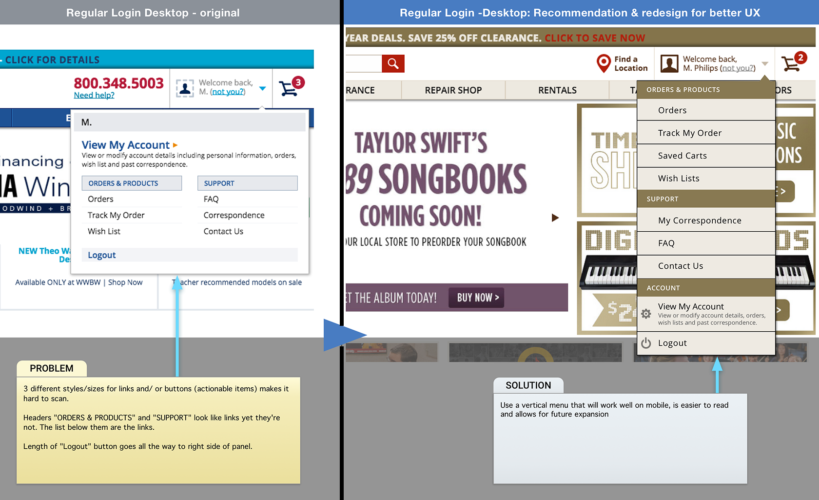
For the sake of speed, UIs may be marked up visually with notes that can be consolidated later (see the one below). This method helps to quickly aggregate the expert’s final notes, and the observer doesn’t have to search for the UI components being addressed. They can also be coded for easy identification by the design team.

Step 5: Analyze, aggregate, and present the results.
At the conclusion of a heuristic analysis, the evaluation manager—or observer—carries out some housekeeping and organization such as removing duplicates and collating the findings. The observer’s next step is to aggregate the heuristic evaluation reports and build a table that includes the severity ratings of usability issues and from which the design team can prioritize.
For usability testing to be valuable, study findings must clearly identify issues and help the team move toward design solutions. – The Nielsen Norman Group
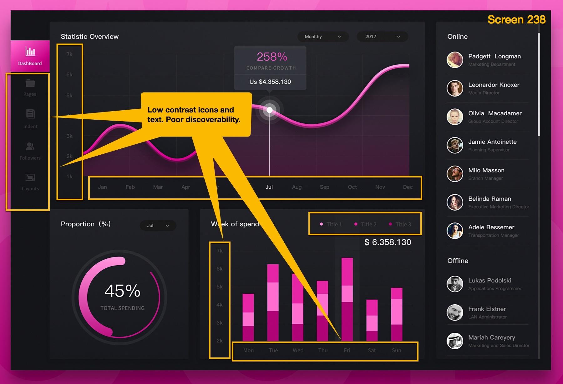
The output from a heuristic analysis should be a list of usability problems that not only identify specific problems, but reference the usability heuristics the problems violate (preferable a code number for easy reference). For example, the above screen points out that using low contrast text in the UI violates the heuristics of “visibility” and “discoverability.”
Using reference codes from the chosen set of heuristics will help build a data table which can then be sorted. When the design team sees that a large number of issues reference a small number of violations (identified by code), they can focus their energies on improving them. For example, there may be widespread issues of visibility and discoverability as in the example above.
Heuristic analysis doesn’t necessarily provide fixes to usability issues, nor does it provide a “success probability score” if the design improvements are to be implemented. However, because a heuristic evaluation compares the UI against a set of known usability heuristics, in most cases it is remarkably easy to identify the solution to a specific problem and come up with a more compelling design.
Wrap-up
Some new apps in development and many mainstream products suffer from poor usability. Most of them would benefit from a dose of heuristic analysis performed by experts and, as a consequence, see a dramatic improvement in their UX without breaking the budget.
A single experienced UX expert can uncover a substantial number of usability issues during a heuristic analysis. However, if time and money allows, between 5 and 8 experts seems to be the sweet spot—this option should uncover most usability issues and offers a significant ROI. This ROI would be based on the increase in user productivity as well as estimated on the expected increase in product sales due to higher customer satisfaction, better ratings, and an uptick in positive reviews.
Please Note
It must be mentioned that even though heuristic analyses are definitely a solid way to identify usability problems regarding digital products, they should not be relied upon as the only source of data. Studies show limitations to expert review because of psychological reasons such as cognitive bias.
If possible, in order to achieve optimal results, heuristic analysis should be combined with cognitive walkthroughs and one-on-one user testing. And that should produce awesome product designs.
Further Reading on the Toptal Blog:
Miklos Philips
London, United Kingdom
Member since May 20, 2016
About the author
Miklos is a UX designer, product design strategist, author, and speaker with more than 18 years of experience in the design field.
Expertise
PREVIOUSLY AT


