Enhance User Flow: A Guide to UX Analysis
Conducting UX analysis as part of an iterative process provides valuable, actionable insights into enhancing and optimizing a product’s user experience.
Conducting UX analysis as part of an iterative process provides valuable, actionable insights into enhancing and optimizing a product’s user experience.
Arvand is a UX/UI designer who has worked on a variety of apps for high-profile startups and companies such as Microsoft and Deloitte.
Expertise
PREVIOUSLY AT

UX analysis is a set of tactics and guidelines that improve a digital product’s ease of use and overall user flow. A successful UX analysis will result in an actionable list of tweaks and enhancements that, once implemented, will show a measurable improvement to the product’s user experience. These may be conversion rate improvements and higher user engagement and retention.
Like many facets of a good UX design process, the key to a successful UX analysis is empathy: empathy with users, their wants, desires… the context in which they use a product (on-the-go mobile devices or desktop machines at work), what their expectations and perceptions are of the product, and so forth.
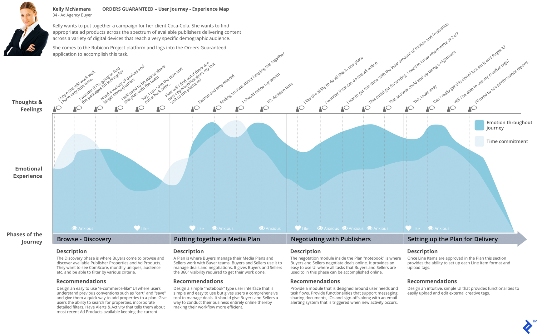
Though thorough user research forms the foundation of the design process early on, connecting with users’ needs should be ongoing. The best way to gain and maintain empathy is to engage with users as much as possible—whether it’s through user testing, handling customer support as a founder, or regularly engaging with users in some other way. This becomes especially important when attempting to improve the usability of a digital product well beyond initial launch.
Typically, a UX analysis is triggered when a product receives negative feedback from users. Some examples of adverse feedback are negative reviews on the app store, suboptimal data in user analytics, bad results from a usability analysis, or poor performance from a round of user testing. These may point to problems that exist with the user flow, and performing a UX analysis will uncover possible solutions.
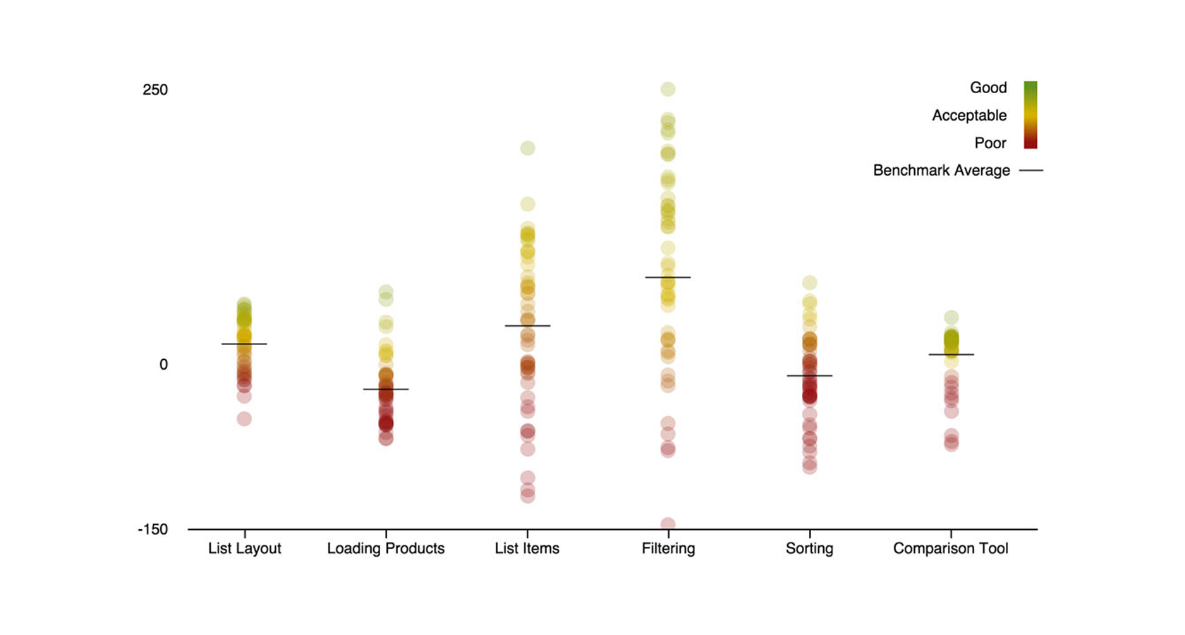
Ideally, teams should conduct UX analyses regularly. This will help the team monitor changes in user behavior and find opportunities for improvement. UX analysis should be routine, especially after a big product update, in order to be sure the overall user flow was not impacted negatively.
This usability regression testing resembles regression testing done as a software test after a release to ensure the features that already existed are working as they should.
Preparation
The first step is to consider which user segments within a flow to analyze—typically comparing the two common segments of new users and returning users. List out each segment’s unique goals, use cases, and preconceptions. This step should be backed by some other user research, such as observing data analytics results or a previous usability study.
Choose a Success Metric
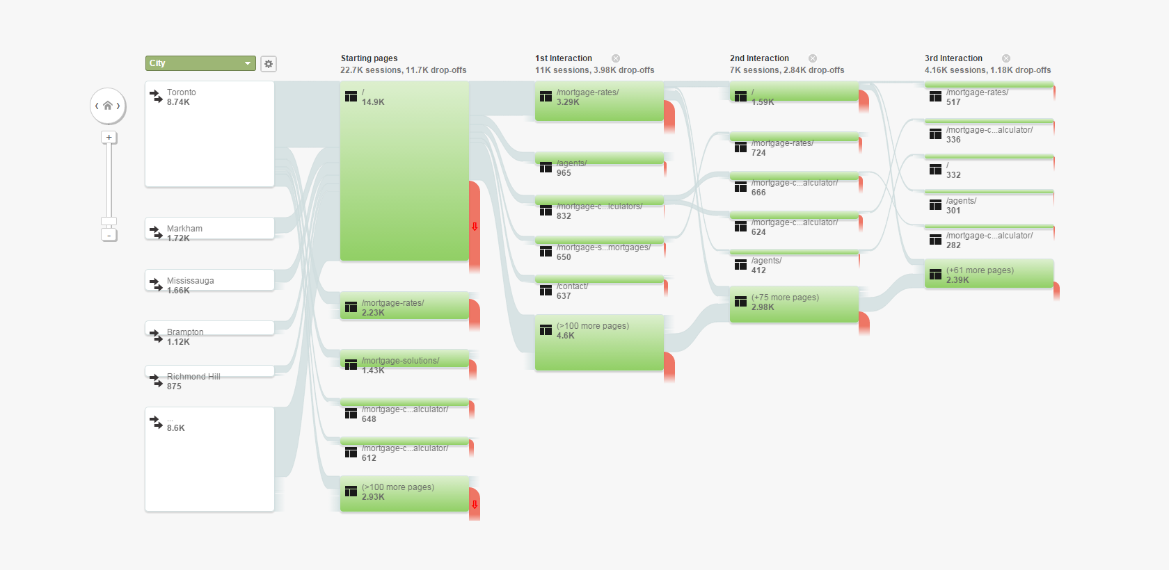
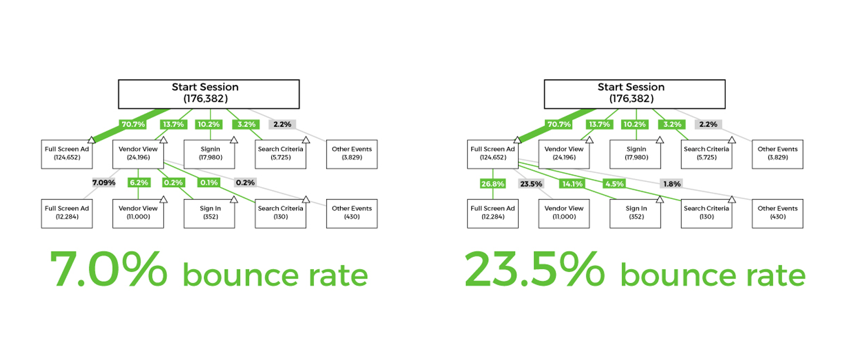
Decide on the success metric to analyze. Leverage any user analytics data available, typically from MixPanel or Google Analytics. Evaluate the conversion rates from one step to the next. Look for obvious “bounce” or drop-offs from one screen to the next.
Whether it’s lower form abandonment or a higher click-through on ads, make note of the desired outcome vis-a-vis the existing analytics data. Conversion/drop-off rates can be written out between each screenshot to reveal the biggest opportunities for improvement within the user flow. This metric will help the design team validate any hypotheses formulated through the UX analysis process.
Prioritize Primary Use Cases
Give greater weight to common use cases rather than edge cases. One way to apply this principle is to consider which user segments are most valuable for the overall performance—such as the overall revenue or user retention. An alternative is to define which user segment would require the least effort resulting in the most positive impact on the product’s overall performance.
Consider where the change occurs in the user flow funnel and which change will have the highest cumulative impact on the product’s overall health. Typically, earlier in the funnel results in the highest impact.
“Walk” the User Flow
With each segment, go through the user flow by creating a brand new account (if the segment is a new user), ideally on a new device. In some cases, this is best done by going through the user flow after clearing the cache in the browser (for web apps), or removing the app from the phone and reinstalling it from scratch (for mobile apps). Record each step with a screenshot, even if it seems extremely subtle, such as when an app prompts a user to allow notifications.
Lay out the screenshots as they happen in the user flow on a Sketch Artboard (or equivalent), making sure to include the subtle steps, or print them out and sequentially tape them on a wall. The latter is recommended, as it allows the team to look at it more holistically and with a fresh set of eyes.
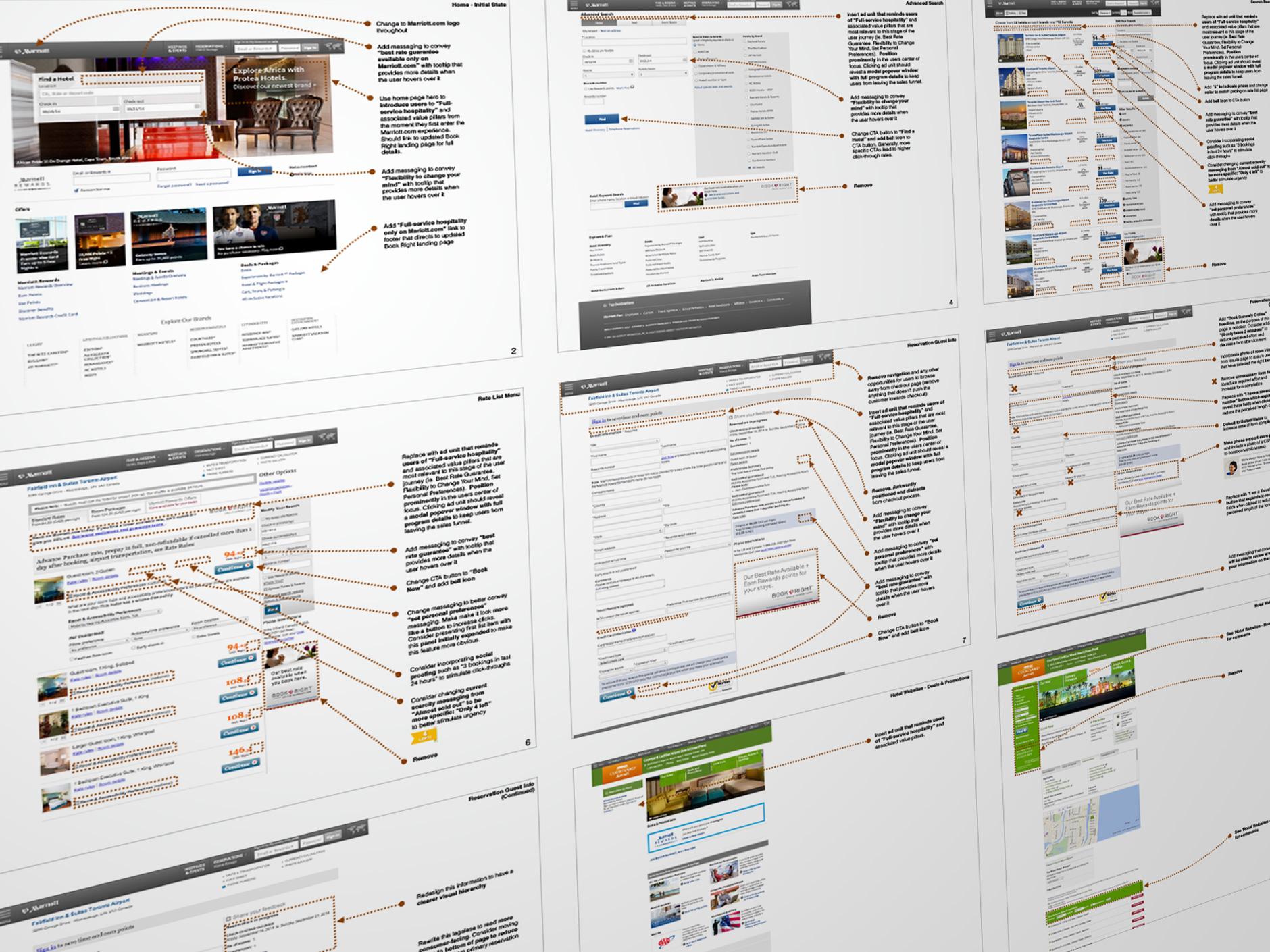
Depending on how different each segment’s goals and use cases are, this layout may be different for each segment. The most important thing to consider is laying out the flow from the perspective of a new user and again for a returning user.
UX Analysis
Now comes the fun part: picking apart the user flow while looking at it holistically and considering each segment. The key to doing this successfully is to question everything.
Consider User Expectations
Consider what the user perceives and what they expect. Does each step and screen communicate what it’s supposed to? Is the onboarding experience helpful? Is it obvious to the user what is being asked of them in order to accomplish their goal?
User Satisfaction = User Expectations - Product Reality
Sometimes, what a designer or engineer thinks is obvious may be confusing or go unnoticed by the average user. For maximum usability, buttons, menus, and icons should leverage common visual metaphors and cues that users are used to seeing. Match elements on the screen to places in the data that show significant spikes so as to verify the UI clarity.
Evaluate Usability Heuristics
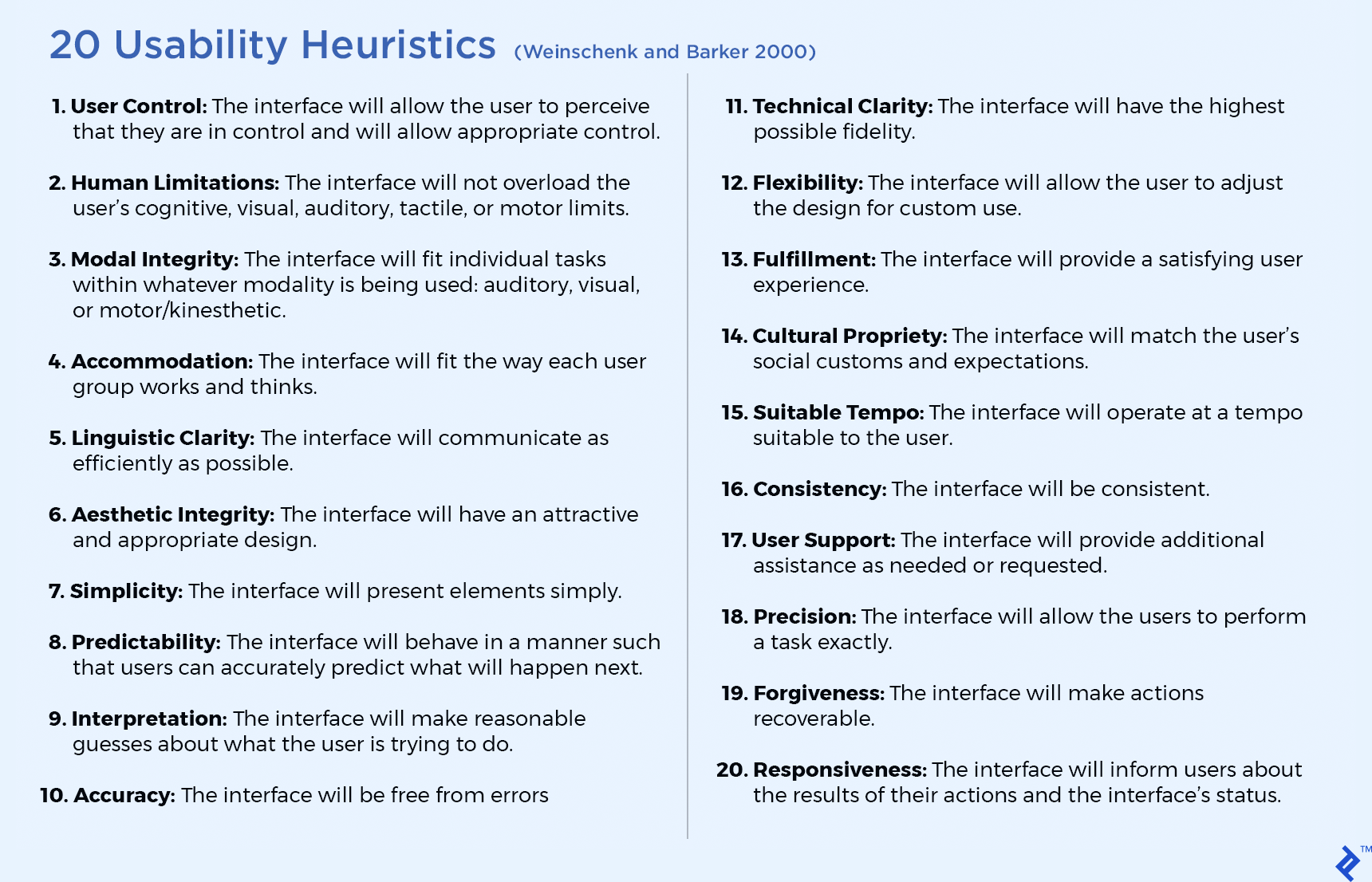
Consider the basic heuristics in a heuristic evaluation. A heuristic evaluation is a list of design rules of thumb that rely on conventions, standards, and best practices to improve a product’s overall usability. These design principles include such things as error prevention—minimizing the opportunity for users to make slips or mistakes. The goal is to make sure that, taking the many usability heuristics in mind, the core ones were considered.
Analyze the Number of Steps in User Flows
Count the number of interaction steps it takes to achieve each goal previously defined for each segment (each swipe, tap, and hover should be counted as a step). Consider how the number of steps and complexity of the task affects the user. Nothing is a given and everything should be questioned. “Does the user really need to tap into this field before filling it out?”
Evaluate the App Structure
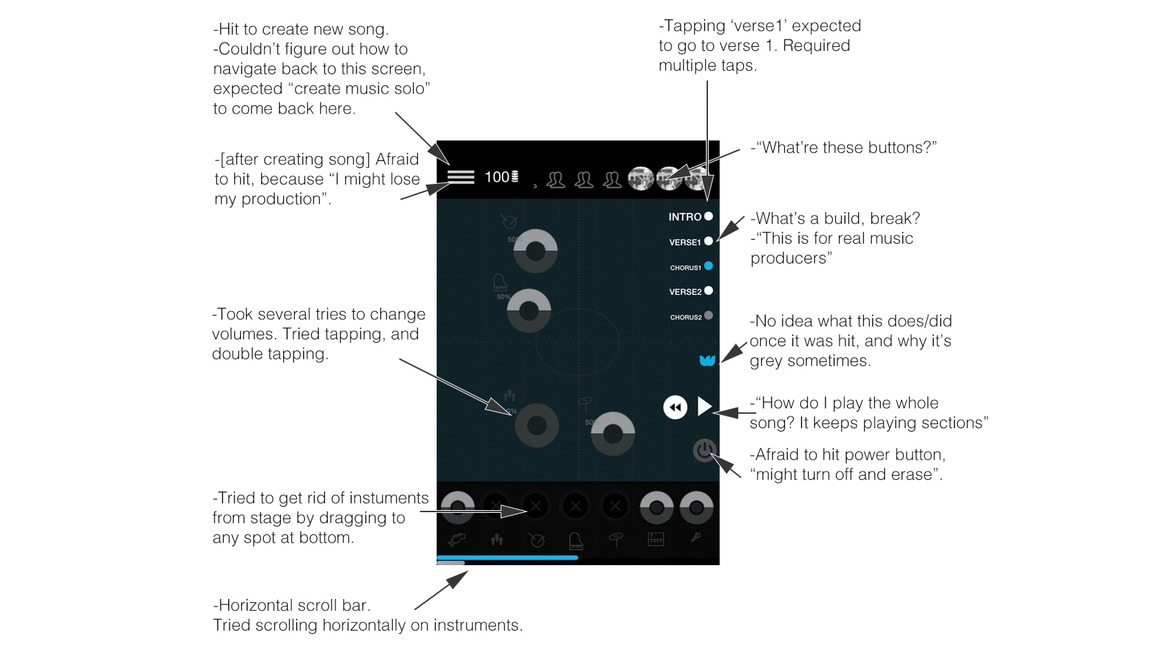
Consider where features live in the app and how easy it is to switch between one feature and another. This is especially relevant for some user segments and their goals. For example, whatever users engage with in the app may live in two or more sections, even if switching between the two is infrequent.
Take note of how data objects, such as items in a cart, system preferences, and notifications are handled across various areas within the product. Are users spending a lot of time in one section of an app and missing important notifications from another? Are users losing cart items when they hit the “back” button and then abandoning their cart in frustration? Leveraging a customer journey map may help align data analytics findings across multiple touchpoints within a product.
Measuring Success
A UX analysis should reveal problem areas that can be rethought and influence future design updates. The success of these updates can be measured by comparing changes in user data and running subsequent UX analysis.
Improve the Data
Consider the success metric the team analyzed and formulate a hypothesis on how to improve it. An example could be, “streamlining the signup process and reducing the number of steps in the flow will result in a higher conversion rate.” The number of steps a user must take to complete a task often corresponds to their satisfaction with the quality of the experience.
Based on this hypothesis, the designer would redesign the signup process to have fewer steps. Compare the number of steps in the original flow to the revised user flow. The team can then validate the hypothesis by analyzing any change in conversion rates with the newer flow.
Simplify the Design
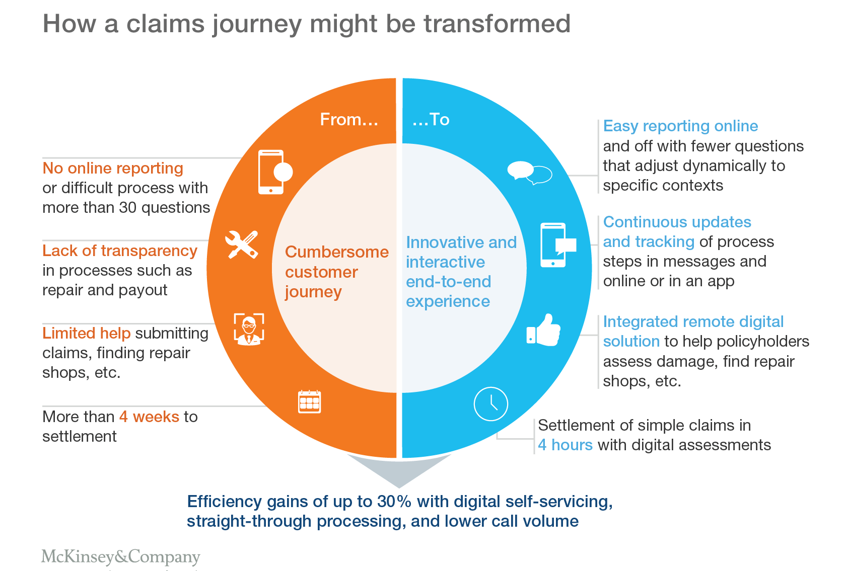
Another way to gauge success is to consider whether more elements were removed than added, such as text or entire screens. A simpler interface is generally clearer and easier to understand and use.
Perfection is achieved not when there is nothing more to add, but when there is nothing left to take away – Antoine de Saint-Exupéry
Adjust the Data Tracking
The ultimate goal of UX analysis is to discover opportunities that will make measurable improvements to the product. As the design is updated, it’s important to reconsider user interaction events being tracked in the team’s data analytics tool, such as clicks and conversions. When appropriate, add any new events to the tool so it can properly measure conversion and overall user retention differences once the changes are live.
Conclusion
The purpose of re-tackling a product’s user flow through a UX analysis is to quantifiably improve that product. This should be done on a regular basis, especially after big releases, in order to avoid waking up one day to a product that is cluttered and hard to use.
The most effective means of doing this is to identify key user segments and gain empathy with those users. As a designer, it’s easy to get lost in a product and lose perspective. Empathy breaks through natural limitations and a designer’s cognitive biases. Remember the old adage: “You are not the user.”
There are many angles to consider when doing an actual UX analysis, but at its heart, it’s about simplifying everything as much as possible and reducing the number of steps it takes for a user to reach their goal.
Analyzing the product’s user flow and overall UX will allow designers to discover many pain points and frustrations—to walk a mile in the users’ shoes—and uncover opportunities that will improve the product’s user experience overall.
Further Reading on the Toptal Blog:
Understanding the basics
What is the user flow?
A user flow is a step-by-step visualization of the user’s needs and expectations as they use a digital product.
What is UX and usability?
UX is all aspects of a system (website, app, product, service, community, etc.) as experienced by users. Whether a product is useful is defined in terms of utility as well as usability. Utility provides the features people need; usability is how easy and pleasant those features are to use.
What is involved in usability testing?
Usability testing resembles regression testing done as a software test after a release to ensure that the features that already existed are working as they should.
What is user experience testing?
Analyzing the product’s user-flow and overall UX will allow designers to discover many pain points and frustrations—to walk a mile in the users’ shoes and uncover opportunities that will improve the product’s user experience overall.
Arvand Alviri
Vancouver, BC, Canada
Member since August 3, 2016
About the author
Arvand is a UX/UI designer who has worked on a variety of apps for high-profile startups and companies such as Microsoft and Deloitte.
Expertise
PREVIOUSLY AT


