
Improve the Product Development Process With This Simple, But Powerful, User Flow Analysis
Apply the four steps in this user flow analysis method to make your product development process more efficient—and improve UX for activities like app onboarding and checkout.
Apply the four steps in this user flow analysis method to make your product development process more efficient—and improve UX for activities like app onboarding and checkout.

Khatia is a product designer and researcher who has created and enhanced user flows for banking, fintech, and e-commerce products. Her clients include the Bank of Georgia, the payment processing software HitPay, and Mymarket, the largest e-commerce platform in the country of Georgia.
Expertise
Previous Role
UI/UX DesignerPreviously At

After creating a revised onboarding flow for a fintech app, my design team had just three days to test and fine-tune it for our client. Because we didn’t have enough time to gather user feedback, I needed another way to quickly refine the flow and demonstrate its impact.
I developed an analysis method to streamline the onboarding steps and quantify how much simpler they had become. When I presented the updated flow to the client, they approved our design, and we immediately implemented the changes.
Since then, I’ve used the same technique to strengthen existing user flows for more clients. It’s a simple method that saves time, improves usability, and shows the effectiveness of your design decisions to stakeholders.
User Flow Analysis in 4 Steps
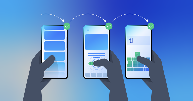
User flows map out the path a user must take to complete a task, such as onboarding, subscribing, and checkout. Designers may make user flows during the product development process or as part of regular UX analysis after a product has launched (especially when updates and new features are implemented).
A product’s user flow is critical to UX, and it should be used alongside user research and user path analytics. The Interaction Design Foundation underscores its importance: “The better you facilitate the user moving from start to finish on a particular process—the easier the product is to work with and the more likely that you are to deliver an awesome user experience.”
Any designer or design team can employ this four-step flow analysis to enhance UX and help users complete tasks that support business goals. To illustrate, I’ll apply the technique to an app onboarding example.
Map the Current Process
The first step is to examine the user path by noting each action required to complete the task, such as gestures, face scans, or viewing updates like snackbars. Here’s the onboarding flow example labeled with each step the user takes. In this case, the flow utilizes five actions: wait, scroll, tap, type, and follow an external link. Whether you create a digital user flow or a physical one with boards and sticky notes, it’s helpful to place the action labels near the related screens (or screen representations) to visualize the steps.

This example flow entails many steps across several screens, and it’s clear that it needs to be streamlined. But the number of actions isn’t the only measure of how demanding a process is for the user. Some steps are more taxing than others. For example, it takes more physical effort to type than to tap. To evaluate the user flow, we need a way to quantify each action.
Rank Actions by Complexity
The next step is to consider the time and mental or physical effort each step requires. For example, deciding between two options demands mental energy, even for seemingly small decisions. On the other hand, typing takes physical effort (particularly on mobile). Other actions may only take mental effort with no physical movement, such as waiting for a snackbar to disappear. The combined mental and physical effort that users must take to reach their goals is the interaction cost.
I recommend developing a simple hierarchy for the actions in your user flow, from easiest to hardest. Determining an action’s difficulty is similar to rating the severity of usability issues: Because subjectivity is involved, you need consistent criteria (in this case, time and mental and physical effort) when comparing the actions against one another. (If you have the opportunity, observe users working with the prototype to help confirm your rankings.)
Next, assign each action a color and a point value. I prefer red for the most challenging and gray for the simplest. The more difficult an action is to complete, the higher its point value should be. Here’s how I broke down the actions in our user flow example:

There may be variable complexity even with the same activity. Scrolling will usually be a simple task, but what if a user is scrolling to read a complicated legal document? In that case, you could create a label that reflects the complexity better, such as Read.
If you’re working with a team in person, try putting the screens up on a board and using colorful sticky notes for the action labels. This is a fun way to visualize the user flow as a group and see the process from a new perspective. For remote collaboration, try online whiteboard tools like FigJam or Miro.
Once you’ve labeled each action, multiply its assigned value by the number of times it appears in the flow. You can then add the points for each action together to create what I call an “effort total.” (We’ll talk more about what this number means later when we measure impact.)

Streamline the User Flow
Once you’ve calculated a baseline effort total, go back through the user flow and identify places you may be able to combine or simplfy steps. Focus on decreasing the number of actions or replacing complex actions with simpler ones. For instance, you can often reduce tapping by combining screens. That said, it’s best not to merge screens that contain complex information. For example, users may get overwhelmed if you have payment and user information fields on the same screen. That’s why it’s better to aim to decrease complexity rather than focus on reducing the number of screens.
You can also incorporate automation to ease the user’s burden. For instance, an app could automatically fill in a security code sent via text or detect the user’s country so they don’t need to type it.
In our user flow example, screens two through five are marketing microcopy and a welcome message. There’s no need to use multiple screens for that information, so we can combine them. You could also make the keyboard automatically open whenever there’s a screen with an input field so the user doesn’t have to tap before typing. Some input fields can be combined into one screen, such as the username and email address. While not applicable in our example, another way to make onboarding more efficient is to include advanced features, such as allowing users to scan payment cards instead of typing the credentials.

Reducing this flow from 15 screens to seven makes it easier for the user to complete the essential task of account setup. Most apps don’t need extensive onboarding processes or explanations. Instead, it’s best to keep onboarding brief and focused on necessary steps.
Calculate Impact
You may need to prove to your client or other stakeholders that the streamlined user flow you’ve created is worth implementing. For example, the client could be hesitant to remove onboarding screens that showcase the app’s many features. If you receive pushback on your proposed changes, it’s best to support your case with numbers. Highlight the number of users who leave the app before completing onboarding, or who download the app and don’t use it again. You can also share examples of apps that have more seamless onboarding flows with the client to demonstrate the difference in experience.
Even further, with this user flow analysis method you can quantify the impact of the improved flow. To do this, calculate the total effort score of the new version, and compare it to the original score.

Knowing the effort scores of both user flows, we can quantify a change in usability between the two versions and use the outcome to support our design decisions to stakeholders. To do so, simply divide the difference between the new and original flows (29 points) by the first score (78 points) and multiply by 100. In the case of our example, the new onboarding flow is 37% simpler than the original.
I like to share the changes with clients in a presentation to underscore the impact of the updates and the logic behind removing actions or steps. Testing the flow with a few users can help you validate the outcomes of the design process. If needed, you can repeat all four steps to further streamline the flow.
A More Efficient Product Development Process
After using this method, confirm that the flow equips users to successfully navigate the product and achieve their goals by gathering feedback. In addition, analytics will show where users leave the product or fail to complete a task and any changes in the bounce rate due to the updates. With the fintech app I first tried this technique on, we determined through qualitative testing that users were satisfied with the new onboarding process and didn’t experience interruptions when the product was updated.
I have found that this four-step user flow analysis technique is a quick, effective way to improve UX and maximize efficiency in the product development process. Use it to simplify tasks for users and to quantify the impact of your design decisions.
Further Reading on the Toptal Blog:
Understanding the basics
A user flow maps out the user path for completing a task on a mobile app or website. User flow examples include onboarding, subscribing, and checkout. User flow in UX should be straightforward and easy to navigate to support both user and business goals.
Good user flow design efficiently guides the user to their goal from beginning to end, delivering a positive experience. If users are dropping off before completing a task, user flow analysis can help designers identify improvements.
Designers can evaluate user flow by employing flow analysis methods. In the technique described in this article, you identify each action a user must take and assign it a value based on the time and mental or physical effort it takes to complete. Evaluating the user flow enables designers to then streamline and simplify steps.
Tbilisi, Georgia
Member since November 11, 2021
About the author
Khatia is a product designer and researcher who has created and enhanced user flows for banking, fintech, and e-commerce products. Her clients include the Bank of Georgia, the payment processing software HitPay, and Mymarket, the largest e-commerce platform in the country of Georgia.
Expertise
Previous Role
UI/UX DesignerPREVIOUSLY AT