A Tutorial on Drill-down FusionCharts in jQuery
When dealing with data analysis, most companies rely on MS Excel or Google Sheets, but dealing with data presented this way isn’t very eye-catching or intuitive. It’s once you add visualizations to this data that things become a little easier to manage. That’s the topic of today’s tutorial by our guest author from Adobe, Rohit Boggarapu. Join us as he guides us though the process of making interactive drill-down charts using jQuery and FusionCharts.
When dealing with data analysis, most companies rely on MS Excel or Google Sheets, but dealing with data presented this way isn’t very eye-catching or intuitive. It’s once you add visualizations to this data that things become a little easier to manage. That’s the topic of today’s tutorial by our guest author from Adobe, Rohit Boggarapu. Join us as he guides us though the process of making interactive drill-down charts using jQuery and FusionCharts.
Rohit (BTech) is a software engineer at Adobe and exceptional front-end programmer. He specializes in React/RN, Ionic, and Angular.
Expertise
Visualizing Data Makes It Easier To Read
When dealing with data analysis, most companies rely on MS Excel or Google Sheets. While those are powerful tools, it’s difficult to notice trends, much less make any sense out of large rows of spreadsheet data. Dealing with data presented this way isn’t very interesting, but once you add visualization to that data, things become easier to manage, and that’s the topic of today’s tutorial - making interactive charts using jQuery.

I will use FusionCharts’ JavaScript chart library for this project as it offers a large library of 90+ charts, is compatible with every browser, and is pretty easy to work with. It also offers a dedicated plugin for jQuery that will make our job easier.
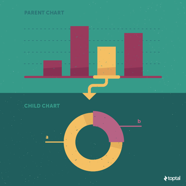
I will start by making a basic chart using FusionCharts’ core JavaScript library and its jQuery charts plugin, then I will add the drill-down capability to it. Drill-down allows you to go from one chart to another by clicking on a data plot.
The term ‘data plot’ is contextual; it refers to a column in a column chart, lines in a line chart, pie slices in a pie chart. By clicking on a data plot from the parent chart, you are presented with a child chart, showing the relative data one level deeper.

Understanding FusionCharts
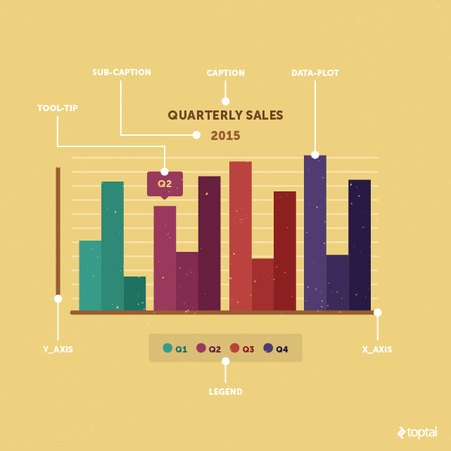
Before we start the tutorial, let’s cover the basic anatomy of FusionCharts. Every chart is composed of these key elements:
- Caption: The title on the chart. It explains what is being charted.
- Sub-caption: The text beneath the caption specifying additional chart information, oftentimes it states a timeframe from which the data was collected.
- Legend: This displays a symbol for each data plot on the chart. A particular plot can be enabled or disabled by clicking on its respective legend icon.
- Data plot: These are data representations on the chart. A data plot can be a column in a column chart, lines in a line chart, or pie slices in a pie chart.
- Tooltip: Text that appears when you hover over a data plot, used to convey additional information about that particular data plot.

Making a Drill-down Chart
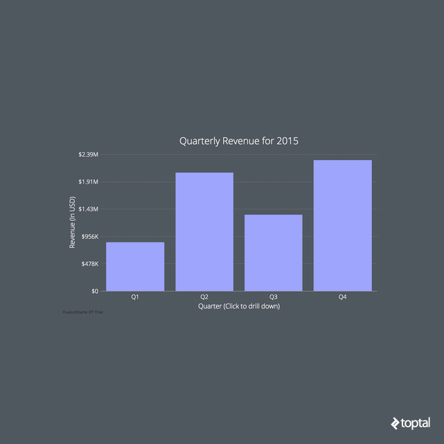
Before we start, here’s a screenshot of the chart we will be making in this tutorial. You can see the JSFiddle here or access the full source code of the project on my GitHub repo.

I have divided the process of making a drill-down chart into five steps, so let’s get started.
Step 1: Including JavaScript Files and Creating the Chart Container
First, we need to include all the JS files that our project is dependent on by using the <script> tag. If the page does not already exist, please create a blank HTML doc and include below files in the <head> section. Now we need the following four files:
- Minified jQuery
- FusionCharts’ main JS library (include both
fusioncharts.jsandfusioncharts.charts.js) - FusionCharts’ jQuery plugin
Our <head> section will now look like this:
<!-- jQuery -->
<script type="text/javascript" src="jquery.min.js"></script>

<!-- FusionCharts JS file -->
<script type="text/javascript" src="js/fusioncharts.js"></script>
<script type="text/javascript" src="js/fusioncharts.charts.js"></script>

<!-- jQuery charts plugin -->
<script type="text/javascript" src="js/jquery-plugin.js"></script>

<!-- custom theme file (optional) -->
<script type="text/javascript" src="js/toptal.js"></script>
Now that we have all the dependencies included, it’s time to create the container <div> for the chart and embed it in our page with the following HTML code:
<div id="drill-down-chart">drill-down chart will load here</div>
Now, we can select it using jQuery’s $ selector inside the code:
$("#drill-down-chart")
Note: If you have more than one chart on your page, you will need a separate container for each chart with a unique id.

Step 2: Getting and Structuring Data
FusionCharts accepts data in both JSON and XML formats, but I’ve chosen to use JSON as it’s become the standard format for data exchange across web apps. The JSON data array for a basic chart contains an object for each data plot, and inside each data plot object we define its respective label and value. That structure looks like:
"data": [{
  "label": "Q1",
  "value": "850000",
}, {
  "label": "Q2",
  "value": "2070000",
},...
// more data objects ]
As we plot our drill-down chart, its JSON gets more complex. The link between parent and child charts requires one more key-value pair inside each object of data array. The new key (unsurprisingly, called link) will contain the id of the child chart that you will get when its parent data plot is clicked.
The format for defining the child chart id is newchart-dataFormat-childId. Since we’re using JSON, we know that whatever we link will look like newchart-json-childId. Here is how we define it for our chart:
"data": [{
  "label": "Q1",
  "value": "850000",
  "link": "newchart-json-q1"
}, {
  "label": "Q2",
  "value": "2070000",
  "link": "newchart-json-q2"
}, ...
// more data objects]
Step 3: Inserting Chart Data
Once you have the data ready, it’s time to insert the chart on your page using the insertFusionCharts method provided by the jQuery plugin:
$("#drill-down-chart").insertFusionCharts({
  type: 'column2d',
  id: "mychart",
  width: '100%',
  height: '450',
  dataFormat: 'json',
  dataSource: {
    "chart": {
      "caption": "Quarterly Revenue for 2015",
      "paletteColors": "#9EA5FC",
      "xAxisName": "Quarter (Click to drill down)",
      "yAxisName": "Revenue (In USD)",
      // more chart configuration options
    },

    "data": [
      // see step-2 for explanation
    ],

    "linkedData": [
      // explained in step-4
    ]
  }
})
Let’s break down the above code snippet:
-
typedefines the type of parent chart we are plotting. In this case,column2d. Every chart in the FusionCharts library has a unique alias. You can find the alias for the chart you want to plot on FusionCharts’ list of charts page. -
idsets the unique id for the chart, not to be confused with the id of the<div>element containing our chart. A chart’sidis used to select a chart for applying event handlers and calling methods. We will make use of this in Step 5. -
widthandheightset the dimension of the chart in pixels or percentage. 100% width tells the chart to occupy the full container width. - We define the data format using the
dataFormatattribute. We are using JSON for our example but there are other acceptable data formats as well, such as an XML URL. To learn more about data formats, refer to FusionCharts’ official documentation page. -
dataSourcecontains the actual content of the chart, and thechartobject inside it contains the chart’s configuration options, such as caption and subcaption. Thedataarray should look familiar since we made it in Step 2 (it contains the data to be plotted), andlinkedDatacontains the content for the child-chart (the chart you get after you click a data plot on the parent chart).
Step 4: Creating the Linked Data Array for Child Charts
Now that we have the parent chart defined, it’s time to create a child chart for each data plot, a process very similar to creating the parent chart.
The linkedData array, created in the ‘insertFusionCharts’ method, will define a separate object for each child chart. Here’s what the data for the first child chart looks like:
"linkeddata": [{
      "id": "q1",
      "linkedchart": {
        "chart": {
          "caption": "Monthly Revenue",
          "subcaption": "First Quarter",
          "paletteColors": "#EEDA54, #A2A5FC, #41CBE3",
          "labelFontSize": "16",
          // more configuration options
        },
        "data": [{
          "label": "Jan",
          "value": "255000"
        }, {
          "label": "Feb",
          "value": "467500"
        }, //more data]
      }
    }, //content for more child charts
id is the id of the individual child chart that we defined in Step 2. linkedChart is similar to dataSource from Step 3 in that it contains the actual content of that chart.
There are numerous other attributes that go inside the chart object, which I cover in detail in the later section, “Improving Design with Chart Attributes”.
Step 5: Custom Drill-down Configuration
Diverse Chart Types
So far, our sample code has both the parent and the child charts sharing the same chart type. If you want to drill-down to a different chart type (from column to pie, for example), you do so by binding the fusionchartsrendered event.
$('#drill-down-chart').bind('fusionchartsrendered', function(event, args) {
  FusionCharts.items['mychart'].configureLink({
    type: "doughnut2d",
    overlayButton: {
      message: 'BACK', // Set the button to show diff message
      bgColor: '#FCFDFD',
      borderColor: '#cccccc'
    }
  });
});
In the code above, the fusionchartsrendered event will call the configureLink method, which defines the type of all child charts plus any overlay button options. You can also specify separate chart types for each child chart.
There are a lot of options available in the configureLink method, so you might find it useful to review its API reference documentation from FusionCharts.
Rendering Charts in Different Divs
Another cool thing you can do is to render the child chart in a different container rather than the same one as its parent. For this, define a separate HTML <div> container after the parent chart container and pass its id to renderAt attribute as shown below:
$('#chart-container').bind('fusionchartsrendered', function(event, args) {
  FusionCharts.items['mychart'].configureLink({
    type: "doughnut2d",
    renderAt:"chart-container2",
    overlayButton: {
      message: 'BACK', // Set the button to show diff messafe
      bgColor: '#FCFDFD',
      borderColor: '#cccccc'
    }
  });
});
The value given to the renderAt attribute specifies the id of the <div> in which the child chart will render (chart-container2).
Improving Design with Chart Attributes
Following this tutorial you’ll get a functional chart, but it’ll be somewhat ugly if you leave it at that. For a more appealing presentation, you’ll need to make use of cosmetic “chart attributes.” Chart attributes are defined inside the chart object and used to customize rendering options. You might find it useful to refer to the FusionCharts explanatory graphic when reviewing these key configurable attributes:
-
paletteColorsdefines the color of the data plots. If you give a single color here, all the columns will be that color. If you give multiple colors, the first column will take the first value, second column will take second value, and so on. -
plotSpacePercentcontrols the space between the columns. The default value for this is 20 (the value is an int, but the unit is a percentage) and the allowable range is 0-80. A value of zero will make the columns bunch up and stick to each other. -
baseFontdefines the font family of the chart. You can use any font you like; I used Google’s Open Sans in my chart. Simply include the external font file in your HTML page in order to use it in your chart. -
plotToolTextlets you customize the tooltips. By using macros such as$labeland *$dataValue, you can show specific information on a particular data plot from inside a<div>, then style that<div>using inline CSS. Here is what I have done in our example:
"plotToolText": "<div style='font-size: 16px; text-align: center;'>$label: $dataValue</div>"
-
themeallows you to define your chart attributes in a different file and apply them once here instead of cluttering your chart object with numerous chart attributes. You can find the theme file for this tutorial -toptal.js- inside the JS folder of project’s GitHub repo.
That’s all I’m going to cover, but there are more than a hundred attributes for a chart, so if you want to explore further, please visit the FusionCharts’ chart attributes page and search for your particular chart type.
More FusionCharts and jQuery Resources
Although I have covered the most important elements in making a drill-down chart using jQuery, there is a good chance that you will need some help when you try to do it on your own. For that moment, here are some additional resources:
- jQuery charts plugin: For inspiration, visit the official jQuery charts plugin page to see some live examples.
- Documentation: If you’re unable to figure something out, documentation is the first place you should look. Here are handy links for the jQuery plugin and the drill-down chart (also known as linked charts).
- Demos: Every charting library offers live samples to showcase its capabilities, and FusionCharts is no different. Head over to its demo gallery of more than 800 live samples, with full source code if you need some ideas. There is a good chance that whatever you are trying to make is already available. No need to start from scratch; just fork the fiddle and proceed from there!
- More extensions: If you don’t use vanilla JavaScript or jQuery, then you can explore more plugins and wrappers offered by FusionCharts on this page. They have dedicated plugins for a variety of libraries and frameworks such as Angular, React, Java, ASP.NET etc.
PS: I will be hanging out in the comments section below, so feel free to post any questions you might have about my article. I’m happy to help!

