Sass Mixins: Keep Your Stylesheets DRY
Nowadays, front-end development workflows involve many modern tools and preprocessors that not only streamline the whole process, but also allow you to spend less time on common web tasks, giving you more time to focus on other aspects of the project that require more careful and skilled insight. Sass, the scripting language for syntactically awesome stylesheets, comes with robust and built-in support for mixins - an essential feature for keeping your stylesheets DRY.
In this article, Toptal Freelance Software Engineer Justin Brazeau shows us 10 useful Sass mixins that help keep your stylesheets manageable by breaking them into smaller reusable bits, each with its own focus.
Justin is a front-end website developer with a background in graphic design. He focuses on HTML, CSS, JavaScript, and WordPress.
One of my favorite benefits of using Sass is that it makes automating front-end design workflow a breeze. There are many JavaScript tools for working with files and automating other tasks, but Sass’s built-in mixin capabilities allow one to write modular front-end style code. In this article, I have listed ten of my favorite Sass mixins for automating the writing of web styles.

These are the Sass mixins that I use for just about every web project I work on. There are many interesting articles with some useful Sass mixins throughout the web. There are also a few good Sass mixin libraries that are great for smaller tasks, like Bourbon. Another great mixin library which I have derived some of the mixins below from is Andy.
The mixins I will go over in this article deals with the following:
- Media queries
- Color themes
- Centering elements
- Clearfix
- Consistent font sizes
- Animation transitions
- Retina images
- Quick gradients
- External fonts
- Quick padding/margins
Media Queries
Media queries allow you to easily add custom break points to your stylesheets, and quickly add custom responsive behavior within an element for different break points. However, littering stylesheet media queries can quickly become a cause for headaches, especially when it comes to maintaining them down the road. With Sass mixins, all that can change.
$breakpoint-small: 600px;
$breakpoint-med-small: 960px;
$breakpoint-med: 1175px;

@mixin screen($size, $type: max, $pixels: $breakpoint-small) {
  @if $size == 'small' {
    @media screen and ($type + -width: $breakpoint-small) {
        @content;
    }
  }
  @else if $size == 'med-small' {
    @media screen and ($type + -width: $breakpoint-med-small) {
        @content;
    }
  }
  @else if $size == 'med' {
    @media screen and ($type + -width: $breakpoint-med) {
        @content;
    }
  }
 @else if $size == 'large' {
    @media screen and ($type + -width: $breakpoint-med) {
        @content;
    }
  }
  @else if $size == 'custom' {
    @media screen and ($type + -width: $pixels + px) {
     @content;
    }
  }
  @else {
    @content;
  }
}
With these defined, the mixins can be used as follows:
.foo {
  @include screen(large) {
    width: 20%;
  }
  @include screen(med) {
    width: 40%;
  }
  @include screen(med-small) {
    width: 60%;
  }
  @include screen(small) {
    width: 80%;
  }
  @include screen(custom, max, 400) {
    width: 100%;
  }
}
It works great standalone, or with other grid frameworks like Bootstrap.
The if statement will emit a media query tuned to a particular screen size depending on the size name provided to the mixin. This will allow you to easily adjust the behavior of your CSS attributes accordingly. You can also customize the point in which you want to adjust your CSS attributes. Usually, the most responsive layouts will stick with 3 or 4 defined screen width dimensions to adjust the content to. The variance of screen sizes, devices, and applications is always expanding, but there is a popular trend many web developers will use for their layouts; small screen sizes for phones, medium for tablets, large for laptops, and extra large for desktop computers.

For reference, the media points used in Bootstrap v3 are:
- max-width: 767px (any screen up to 767px wide)
- min-width: 768px (any screen more than 768px wide)
- min-width: 992px (any screen more than 992px wide)
- min-width: 1200px (any screen more than 1200px wide)
Color Themes
Defining a color theme to use throughout your site helps save time on having the same colored portions of CSS on the same HTML elements. If you want all your div buttons to have a 1px solid dotted border, then you can easily add this to your theme. This Sass mixin will allow you to set as many color variables as you want, and to affect as many classes as you would like. This can be a useful tool to provide color options for something, or any time you have a feature that affects the color of many elements at once. There is a great article here with more information on working with color themes in Sass.
@mixin theme($name, $color) {
  // Define colors in your theme
  $primary: $color;
  $secondary: lighten(adjust-hue($color, 20), 10%);
  // Add your classes with css colors added
  .#{$name} {
    .element {
      color: $primary;
    }
    .other-element {
      background: $secondary;
    }
  }
}
Once you set up an in depth color theme, you will eliminate 70% of your color related styling if done right. I would also recommend separating this .scss file from your other .scss files, and including all your brand color variables in the same file.
A line as simple as:
@include theme(theme-banana, yellow);
will emit:
.theme-banana .element {
  color: yellow;
}
.theme-banana .other-element {
  background: #bbff33;
}
Centering Elements

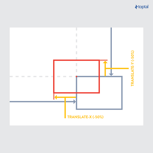
Depending on your layout, there are many different ways to center align an element in your styles. The below method uses absolute positioning and will allow you to define vertical, horizontal, or both centered elements. The parent element will need to have position: relative. This allows you to easily define the centered position of an element in a short 2 lines of code.
@mixin center($position) {
  position: absolute;

  @if $position == 'vertical' {
    top: 50%;
    -webkit-transform: translateY(-50%);
    -ms-transform: translateY(-50%);
    transform: translateY(-50%);
  }
  @else if $position == 'horizontal' {
    left: 50%;
    -webkit-transform: translateX(-50%);
    -ms-transform: translateX(-50%);
    transform: translate(-50%);
  }
  @else if $position == 'both' {
    top: 50%;
    left: 50%;
    -webkit-transform: translate(-50%, -50%);
    -ms-transform: translate(-50%, -50%);
    transform: translate(-50%, -50%);
  }
}
.foo {
  @include center(both);
}
.foo-parent {
  position: relative;
}
This mixin is one of the most versatile ways to center content, but it’s worth noting that there are many different ways to center your content, and this might not always be the best solution. Depending on your layout style and allowance for browser compatibility you might want to center your content in a different way. Flexbox is another popular and very useful tool for alignment, although right now it isn’t fully supported by old browsers. Simple text and container alignment can be done easily without this mixin, using simple css properties. This one will help you more when creating layouts and working with containers inside of other containers.
Clearfix
Apply the clearfix css property quickly and effectively to elements. There are lots of clearfix solutions around the web, and this one seems to work the best. It’s also easy to use once the Sass mixin is created.
This mixin will benefit whenever you have content floating right or left, and want to clear the space below the floated element to insert new content below.
%clearfix {
  *zoom: 1;
  &:before, &:after {
    content: " ";
    display: table;
  }
  &:after {
    clear: both;
  }
}
.container-with-floated-children {
  @extend %clearfix;
}
Consistent Font Sizes
Set a rem font size in your document, to use for all your text elements. This is a better way to scale up and down fonts instead of em. Using em will compound based on the other CSS attributes, but rem will only scale up or down based on the size you define in your HTML document. Separating a .scss file for all your typography and using the below mixin to define your default font sizes will drastically automate your typography coding workflow.
@function calculateRem($size) {
  $remSize: $size / 16px;
  @return $remSize * 1rem;
}

@mixin font-size($size) {
  font-size: $size;
  font-size: calculateRem($size);
}
p {
  @include font-size(14px)
}
This mixin also creates a pixel fallback for browsers that don’t support rem (IE8 and below). When the browser doesn’t support rem sizing, the mixin will calculate the pixel equivalent of the initial rem size you set and output both pixel and rem values for an element.
Animation

Quickly define animation properties and add them to your elements. Currently, the animation CSS property still needs vendor prefixes, so this will also add that to the mix.
@mixin keyframes($animation-name) {
    @-webkit-keyframes #{$animation-name} {
        @content;
    }
    @-moz-keyframes #{$animation-name} {
        @content;
    }
    @-ms-keyframes #{$animation-name} {
        @content;
    }
    @-o-keyframes #{$animation-name} {
        @content;
    }
    @keyframes #{$animation-name} {
        @content;
    }
}
@mixin animation($str) {
  -webkit-animation: #{$str};
  -moz-animation: #{$str};
  -ms-animation: #{$str};
  -o-animation: #{$str};
  animation: #{$str};
}
The first part of the mixin will add the proper vendor prefixes needed for browser compatibility. The next section sets it up to input your custom strings and properties. The final section of the mixin is where you would create your mixin name (in this case: fade-out) and define what you would like to happen at each keyframe in the animation. This example setup is very basic, and you can add changes to any percentage of the animation duration.
// Define animation name, and properties
@include keyframes(fade-out) {
  0% { opacity: 1; }
  90% { opacity: 0; }
}
// Add animation to element
.element {
  width: 100px;
  height: 100px;
  background: black;
  @include animation('fade-out 5s 3');
}
The example here will take the targeted element at 0% of the animation (beginning), and transition the property from full opacity (opacity: 1;) to having no opacity and essentially disappearing (opacity: 0;) at 90% of the animation. So if I set the animation to have a 5 second timeline, the element will disappear after 4.5 seconds (90% of the 5 second animation). The last property I define in the usage of the mixin (the “3”) is the number of times the animation will repeat.
Retina Images
Add high resolution images to your site, with a fallback for devices that aren’t displaying high resolution images. When using retina images I would recommend compressing as much as possible without destroying the image. A good tool for this is TinyPNG (supports PNG and JPG).
@mixin image-2x($image, $width, $height) {
  @media (min--moz-device-pixel-ratio: 1.3),
         (-o-min-device-pixel-ratio: 2.6/2),
         (-webkit-min-device-pixel-ratio: 1.3),
         (min-device-pixel-ratio: 1.3),
         (min-resolution: 1.3dppx) {
    background-image: url($image);
    background-size: $width $height;
  }
}
This mixin will allow you to add a rule in the same spot as the CSS property defining the original image.
div.logo {
  background: url("logo.png") no-repeat;
  @include image-2x("logo2x.png", 100px, 25px);
}
Previously, the only CSS solution to this was to use media queries, and this solution is much cleaner and easier. For more thoughts and ideas about this mixin, check out this article.
Quick Gradients
Easily add gradients defining only start color, end color, and gradient type. Add all the gradient properties and you can choose as needed. The gradient type allows you to choose from a vertical gradient, horizontal gradient, or a radial (sphere shaped) gradient.
@mixin background-gradient($start-color, $end-color, $orientation) {
    background: $start-color;

    @if $orientation == 'vertical' {
      background: -webkit-linear-gradient(top, $start-color, $end-color);
      background: linear-gradient(to bottom, $start-color, $end-color);
    } @else if $orientation == 'horizontal' {
      background: -webkit-linear-gradient(left, $start-color, $end-color);
      background: linear-gradient(to right, $start-color, $end-color);
    } @else {
      background: -webkit-radial-gradient(center, ellipse cover, $start-color, $end-color);
      background: radial-gradient(ellipse at center, $start-color, $end-color);
    }
}
No longer will you have to remember the various vendor prefixes and parameter orders for implementing gradients.
.foo {
  @include background-gradient(red, black, 'vertical');
}
External Fonts
Using the CSS font-face property, we can easily add fonts in a directory and include all font types. When using font files, different browsers have different compatibility with file types. This mixin helps solve that by using any relevant font file in a directory.

Simply include any font files in a directory, and add the “@include” tag in your styles, which will grab all the files from your chosen folder.
@mixin font-face($font-name, $file-name, $weight: normal, $style: normal) {
  @font-face {
    font-family: quote($font-name);
    src: url($file-name + '.eot');
    src: url($file-name + '.eot?#iefix')  format('embedded-opentype'),
         url($file-name + '.woff') format('woff'),
         url($file-name + '.ttf')  format('truetype'),
         url($file-name + '.svg##{$font-name}')  format('svg');
    font-weight: $weight;
    font-style: $style;
  }
}
This mixin will take care defining alternate font format URLs, including odd workarounds necessary for backwards compatibility.
Quick Padding & Margins
The main reason I use this is because I will omit a specific padding property, like padding-left at times, and I don’t want to define it. Using the Sass property null, you can omit padding properties. The same rules apply for margins.
//Padding mixin
@mixin padding($top, $right, $bottom, $left) {
  padding-top: $top;
  padding-right: $right;
  padding-bottom: $bottom;
  padding-left: $left;
}
//Margin mixin
@mixin margin($top, $right, $bottom, $left) {
  margin-top: $top;
  margin-right: $right;
  margin-bottom: $bottom;
  margin-left: $left;
}
The mixing can then be used to replace a bunch of padding-* and margin-* properties throughout your stylesheets. You can quickly include this mixin in any element and define only the sides of padding/margins you want to include. Padding and margins are one of the most used CSS styles added to elements, and a small time saver like this will quickly add up.
// Usage definition
@include padding(top, right, bottom, left);
@include margin(top, right, bottom, left);

// Usage 1
@include padding(1px, 2px, 3px, 4px,);
@include margin(1px, 2px, 3px, 4px);

// Output 1
// padding: 1px 2px 3px 4px;
// margin: 1px 2px 3px 4px;

// Usage 2 (with null properties)
@include padding(1px, null, 3px, 4px);
@include margin(1px, 2px, null, 4px);

// Output 2
// padding-top: 1px;
// padding-bottom: 3px;
// padding-left: 4px;
// margin-top: 1px;
// margin-right: 2px;
// margin-left: 4px;
Wrap Up
Using Sass mixins like the ones outlined in this article are a great way for making your workflow more efficient. Theses specific mixins will help you spend less time on common web tasks, giving you more time to focus on other aspects of the project that require more careful and skilled insight.
Installing and working with Sass can be done a number of ways, and will involve using the command prompt to install some libraries in your project. One way to install Sass is to use Ruby - as outlined on the main Sass website here - and another popular way is to use Node.js.
The benefits of Sass extend beyond automation, and can help to easily create and manage your project stylesheets. Even some of the most basic web projects can have thousands of lines of CSS code. Sass is a great way to break this code up into more manageable bits, each with their own focus.
Toronto, ON, Canada
Member since March 25, 2016
About the author
Justin is a front-end website developer with a background in graphic design. He focuses on HTML, CSS, JavaScript, and WordPress.

