Theming with Sass: An SCSS Tutorial
When it comes to theming; that is, changing the look and feel of your website while maintaining the same layout, Sass’ features—like mixins or functions—can feel like taking a plane instead of walking! In this tutorial on SCSS, we’re going to create a minimal theme and use SCSS to give our CSS programming some superpowers.
When it comes to theming; that is, changing the look and feel of your website while maintaining the same layout, Sass’ features—like mixins or functions—can feel like taking a plane instead of walking! In this tutorial on SCSS, we’re going to create a minimal theme and use SCSS to give our CSS programming some superpowers.
Fernando has 10+ years of experience in front-end development, first working for his own company, then as a freelancer and an employee.
Stylesheet development with Sass, even when using its most basic features, like nesting properties or variables, saves valuable time and makes life easier for front-end developers. It’s not surprising that CSS pre-processors have been widely adopted as the de facto way of creating styles for websites and applications; we simply can’t live without them anymore.
When it comes to theming; that is, changing the look and feel of your website while maintaining its layout, Sass’ features—like mixins or functions—can feel like taking a plane instead of walking! In this SCSS tutorial, we’re going to create a minimal theme and use SCSS to give our CSS programming some superpowers.
A Basic Mixin Approach
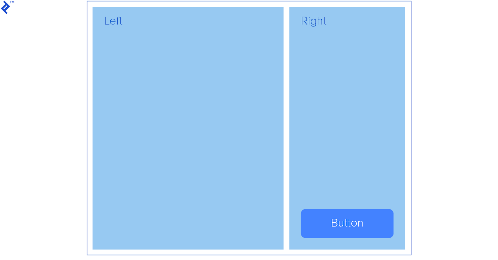
Let’s say we have the following layout:
<body class="theme-1">
   <div class="container">
       <div class="left">
           Left
       </div>
       <div class="right">
           Right
           <button class="button">Button</button>
       </div>
   </div>
</body>
</html>

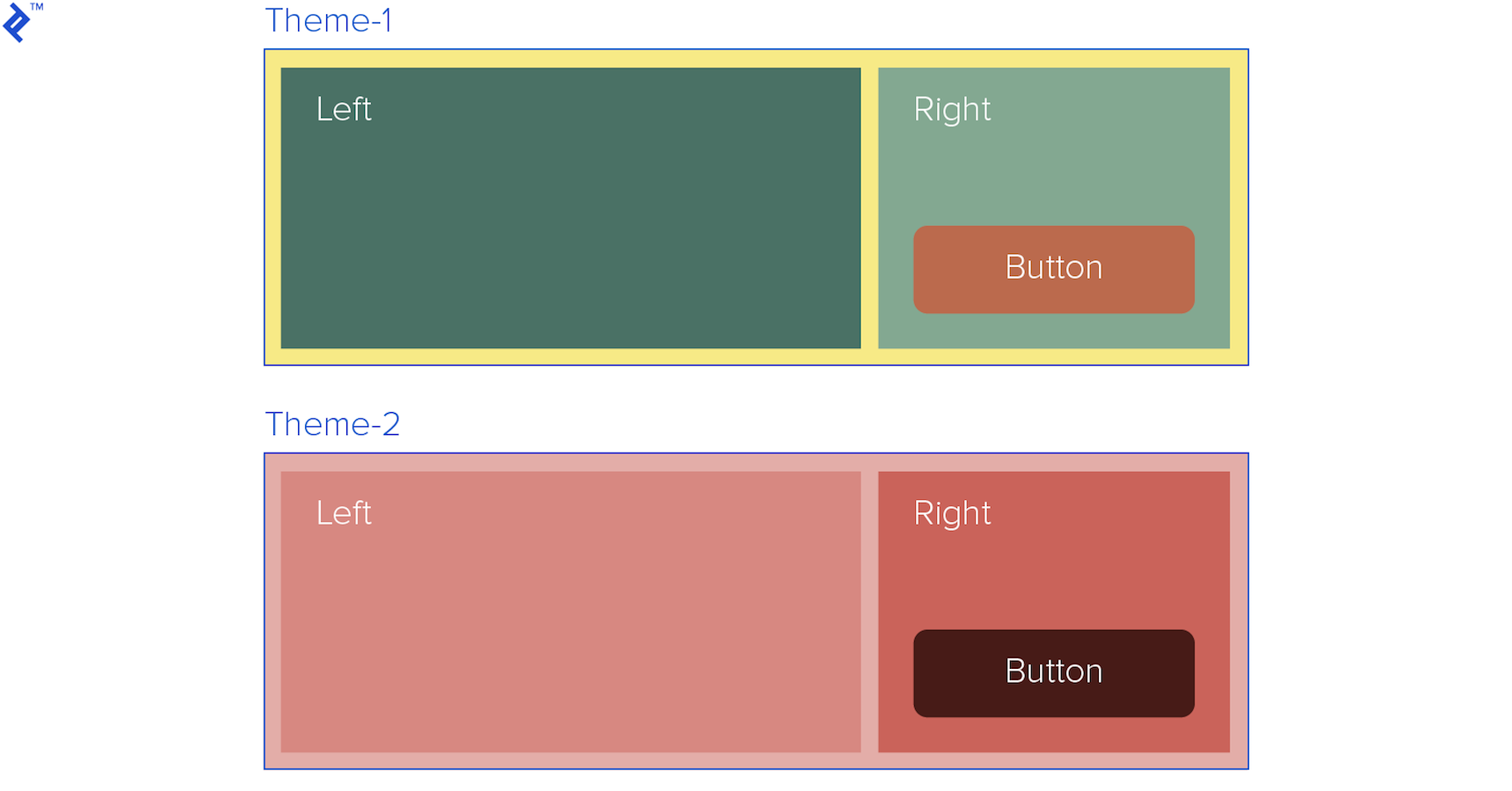
We’ve been asked to create multiple themes for it. The theme has to change colors for all containers (including the main container) and the button, and the theme will be determined by a class in the body, or it could be an “outer” container as well:
<body class="theme-1">
Let’s build a mixin named “themable” which will contain our color scheme as parameters.
@mixin themable($theme-name, $container-bg, $left-bg, $right-bg, $innertext, $button-bg) {
   .#{$theme-name} {
       .container {
           background-color: $container-bg;
           border: 1px solid #000;
           display: flex;
           height: 500px;
           justify-content: space-between;
           margin: 0 auto;
           padding: 1em;
           width: 50%;

           * {
               color: $innertext;
               font-size: 2rem;
           }

           .left {
               background-color: $left-bg;
               height: 100%;
               width: 69%;
           }

           .right {
               background-color: $right-bg;
               height: 100%;
               position: relative;
               width: 29%;
           }

           .button {
               background-color: $button-bg;
               border: 0;
               border-radius: 10px;
               bottom: 10px;
               cursor: pointer;
               font-size: 1rem;
               font-weight: bold;
               padding: 1em 2em;
               position: absolute;
               right: 10px;
           }
       }
   }
}
Then use it to generate our themes:
@include themable(theme-1, #f7eb80, #497265, #82aa91, #fff, #bc6a49);
@include themable(theme-2, #e4ada7, #d88880, #cc6359, #fff, #481b16);

At this point, we’ve already saved a lot of time, but there are some problems with this approach:
Themes normally have lots of different properties beside colors. For example, if we wanted to modify the Bootstrap theme, writing a mixin following the previous “recipe” would be hard to maintain and the code hard to read. Plus, we’re not really following Sass best practices—for example, entering hex color codes directly into the mixin.
Design a Styles Scheme with Sass Maps
With the help of maps, which are mainly like key indexed arrays, we can build a more semantic, meaningful set of styles for our theme, which will be easier to maintain and understand by our colleague developers. We could use lists as well, but, personally, I find maps more suitable for this purpose. Lists do not have keys while keys are self-explainable.
The map for our new approach will be a nested map:
$theme-1: (
   container: (
       bg: #e4ada7,
       color: #000,
       border-color: #000
   ),
   left: (
       bg: #d88880,
       color: #fff,
       height: 100%,
       width: 69%
   ),
   right: (
       bg: #cc6359,
       color: #fff,
       height: 100%,
       width: 29%
   ),
   button: (
       bg: #481b16,
       color: #fff
   )
);
If we wanted to access each section of our scheme theme-1 and its sub-maps, we use the @each directive to loop through each of them:
@each $section, $map in $theme-1
$section will return the key of the current section, and $map will return the nested map that corresponds to that key.
Then, we can access the properties of each map, let’s say the background (bg) property, using the map-get function:
map-get($map, bg)
Finally, combining our new mixin, based on our map structure, we can create as many themes as we like:
@mixin themable($theme-name, $theme-map) {
   .#{$theme-name} {
       .container {
           .left, .right {
               font-size: 2rem;
           }
       }

       .container .right {
           position: relative
       }

       .button {
           border: 0;
           border-radius: 10px;
           bottom: 10px;
           cursor: pointer;
           font-size: 1rem;
           font-weight: bold;
           padding: 1em 2em;
           position: absolute;
           right: 10px;
       }

       // Loop through each of the keys (sections)
       @each $section, $map in $theme-map {
           @if ($section == container) {
               .container {
                   background-color: map-get($map, bg);
                   border: 1px solid map-get($map, border-color);
                   display: flex;
                   height: 500px;
                   justify-content: space-between;
                   margin: 0 auto;
                   padding: 1em;
                   width: 50%;
               }
           } @else {
               .#{$section} {
                   background-color: map-get($map, bg);
                   color: map-get($map, color);

                   @if ($section != button) {
                       height: map-get($map, height);
                       width: map-get($map, width);
                   }
               }
           }
       }
   }
}

@include themable(theme-1, $theme-1);
@include themable(theme-2, $theme-2);
…
…
Note that we are also using the @if directive to differentiate properties for sections that are not buttons.
                   @if ($section != button) {
                       height: map-get($map, height);
                       width: map-get($map, width);
                   }
This way, we can add different properties for some sections to create specific properties or even rules, or we can distinguish between a key with a single value from another with a nested map.
Our theme could also consist of many maps used by several mixins, applied in different parts of our stylesheet. It all depends on the complexity of our base layout and, of course, our personal approach.
Further Optimization
Sass offers useful built-in functions to save us even more work; for example, the hsl functions like lighten or darken to calculate, for example, the color of a button when hovering over it.
We can modify the button code to lighten its background when hovering, regardless of the original background color. This way, we don’t have to add another color for this state.
@if ($section != button) {
   height: map-get($map, height);
   width: map-get($map, width);
} @else {
   &:hover {
       background-color: lighten(map-get($map, bg), 20%);
   }
}
Also, with the use of Sass modules, our code can be even more legible and scalable; each theme map can be contained in a module and then imported into our main stylesheet.
@import 'theme-1';
@import 'theme-2';
@import 'theme-3';
…
…
@mixin themable($theme-name, $theme-map) {
   .#{$theme-name} {
       .container {
…
…
This would require the modules to be placed in the project as:
/
├── _theme-1.scss
├── _theme-2.scss
└── _theme-2.scss
If you’re interested in learning more about using Sass to DRY your CSS, fellow Toptaler Justin Brazeau and Sass enthusiast discusses just this in his brilliant article Sass Mixins: Keep Your Stylesheets DRY.
Understanding the basics
What is Sass?
Syntactically Awesome Style Sheets (Sass) is a CSS superset that gives you programming type features and pre-compiles into CSS.
What is the difference between Sass and SCSS?
Since Sass 3, the new Sass syntax and file extension are called SCSS.
Sitges, Spain
Member since August 8, 2017
About the author
Fernando has 10+ years of experience in front-end development, first working for his own company, then as a freelancer and an employee.

