
A New Brand With an Edge
Today is an exciting day at Toptal: We are announcing a new logo to complete our new brand!
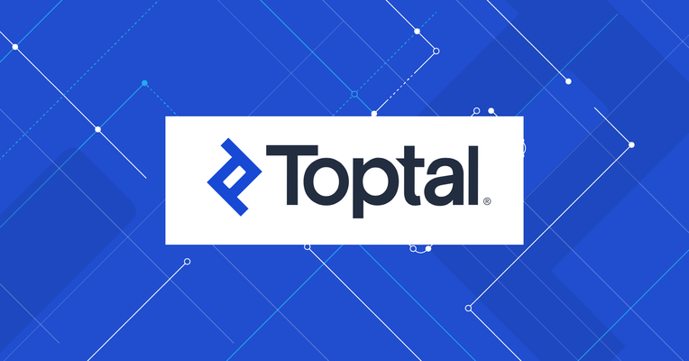
Today is an exciting day at Toptal: We are announcing a new logo to complete our new brand!

As CEO, Taso has led Toptal to become the largest high-skilled, on-demand talent network in the world. He serves on the board of multiple organizations, advising on talent strategy and innovation, and has guest lectured at Harvard Business School, Wharton, and Oxford on talent management and entrepreneurship.
Expertise
Today is an exciting day at Toptal: We are announcing a new logo to complete our new brand!
Overview
As we enter our 10th year, headstrong into 2020, and become a more resilient company both financially and technologically, it’s time for a new brand and logo to reflect that.
With any brand and logo redesign, one must take into consideration many aspects of the brand that exist today and work to uplevel those aspects both conceptually and visually.
As with many brands, Toptal has many strong connotations that connect to it today: trust, quality, integrity, excellence, top talent, and exclusivity.
Our brand also has four distinct key characteristics that we call BASE, which we must adhere to: Bold, Authentic, Serious, and Energetic.
Furthermore, Toptal has an emblem that is not only original, though meaningful. The emblem, which represents a combination of two T’s (for top tal), is used everywhere throughout our site, t-shirts, backgrounds, images, marketing, and has been emblematic of the Toptal brand in the truest sense.
Given all of these high-level factors, we needed to ensure the next evolution of our brand and logo accentuated all of these elements and brought them to the forefront, with elegance and simplicity.
Problems
While our previous logo has been in use for more than five years now, it’s had some flaws that were difficult to smooth out during its creation. Those flaws are listed below:
- The emblem did not match the style of the font. The emblem was sharp and jagged while the font had smooth edges and, simply put, a different feel to it.
- People always asked what “Toptal” means (or sometimes, “What’s a Toptal?”). There was no visual distinction between the “top” and the “tal” that alluded to the fact that these represent two separate words, nor assisted in explaining this fact to someone.
- The two lowercase t’s gave a less serious feel to the logo, which was in contrast with our BASE standards.
- There was a slight though meaningful visual discrepancy within the emblem itself.
- Our logo was “toptal” while we’ve always told everyone to spell it “Toptal” (and sometimes, people would even call it “TopTal”).
- Our new color palette was simply thrown on top of our previous logo without consideration for how the colors and logo would work together.
With the goals clear and the problems with the current logo defined, it was time to get to work on creating a new, excellent logo.
Solution
The solution took two long years to find. We first engaged with external resources, only to find that everything created was not to our standards. We went through many brand designs and concepts, though at the end of the day, it was a major setback.
We were told that everything we desired was too much. Too much attention to detail, too many requirements, too many specific asks, and too high of quality standards. To me, this was absurd. We fired the agency and used absolutely none of their work.
After pausing our redesign for a couple of months, we then looked internally to create some concepts that achieved the goals that we needed to achieve and fixed the problems, with elegance and simplicity.
This was more difficult than it seemed. Many of the iterations simply didn’t accomplish the goals of merging the emblem and wordmark together cohesively. Either the emblem was very elegant and veered too far away from the wordmark, or the wordmark was too elegant in comparison to the emblem. It was a never-ending balancing act of trying to get the two to gel together.
After nearly a year of working together, the group finally came up with a complete logo that I personally felt was excellent:

To us, it was simple, elegant, and represented a near objective step up in terms of visual appeal. It was absent, however, of a very crucial element: the emblem. While it all worked together, it seemed to be missing the history and originality of the emblem. The problem was, however, that every time we introduced the emblem, it clearly violated the vibe of the logo as a whole.
After showing the new logo around to various executive team members, it was confirmed that their perspective was congruent with my initial impression: Where’s the emblem?
We needed a logo that had the emblem. However, the wordmark from the chosen logo was perfect. We needed to figure out a way to fit the emblem with the wordmark that had been chosen.
I asked the group to put the emblem and wordmark together and try various combinations of smoothing the edges of the emblem, as the wordmark had smooth elements to it and the emblem did not. After months of combinations, there was no success.
Finally, in early December, the design team presented the following:

After looking at these variations, it was instantly clear what was wrong with the emblem in its original form: the inner corners. By smoothing the inner corners, the inner white space would match the inner white space of the wordmark. Furthermore, the outer edge would remain sharp, which keeps the character of the original emblem and of some of the letters in the wordmark.
With this in mind, the team went to work, and after many variations, on December 30th, 2019, we had our new logo:
Conclusion
It took trying out a completely new logo to bring back the original character and feel of the Toptal brand, with an updated feel to it.
With that, we were able to create a list of all of the incredible points that make the new Toptal logo fit perfectly with our new brand identity.
Here’s the list:
- The emblem and the wordmark now fit together and have the same feel.
- “Top” and “tal” are now separated via the edge on “tal,” allowing one to see that there is a distinction between the two words.
- The edge on “tal” is a quadruple entendre:
a) It separates the two words.
b) It allows one to know that talent is our edge.
c) The edges on our talent cards are now backed up by a clear and symbolic reference: Talent is our edge. It’s in our name, and our talent. Literally and metaphorically.
d) It gives the logo energy. - The logo is Bold, Authentic, Serious, and Energetic, fitting to our BASE standards.
- The wordmark “Toptal” is now spelled the same as “Toptal.” It achieved the goal of spelling it one way and one way only.
- We’ve turned a weakness into a strength. Now when someone asks “What’s Toptal?,” we can respond, “top talent, and our talent is our edge.” Further, we can show this is embedded not only in our logo, though throughout everything that we do, highlighting that it’s core to everything we do.
- It’s visually appealing, as an emblem and wordmark together.
- It fits with the entire brand story and completes the end of a very lengthy rebrand, tying together the logo, the brand, the story, and everything about what we stand for at Toptal.
- It’s simple and elegant.
- Lastly, the process and story of creating the logo in and of itself plays into the Toptal brand identity. The process of creating this logo is symbolic of the attention to detail, creativity, and extreme lengths that we’re willing to go to achieve extraordinary outcomes. A story which defines our identity.
I never thought we would have such a meaningful logo. I searched for it with the team and worked endlessly with them to ensure we had the perfect logo. Through many years of working with them, we achieved the goal.
We now have one of the best logos I’ve personally ever seen, especially for how it ties directly into our brand.
Now, we can move forward with a word that captures the idea, meaning, and story of everything that we stand for: