Mining for Data Clusters: Social Network Analysis With R and Gephi
Explore X (formerly Twitter) data clusters to uncover user behaviors (e.g., repost and reply patterns) within online communities. This guide focuses on a politically charged data set to illustrate the process of visualizing and analyzing social data.

Explore X (formerly Twitter) data clusters to uncover user behaviors (e.g., repost and reply patterns) within online communities. This guide focuses on a politically charged data set to illustrate the process of visualizing and analyzing social data.

Juan is a developer, data scientist, and doctoral researcher at the University of Buenos Aires where he studies social networks, AI, and NLP. Juan has more than a decade of data science experience and has published papers at ML conferences, including SPIRE and ICCS.
Expertise
Previous Role
Chief DeveloperPREVIOUSLY AT

This is the final installment in a three-part series on X (formerly Twitter) cluster analyses using R and Gephi. Part 1 analyzed heated online discussion about famed Argentine footballer Lionel Messi; part 2 deepened the analysis to better identify principal actors and understand topic spread. In July 2023, Twitter rebranded as X and no longer uses the terms “tweet” and “retweet” to describe posting and reposting, respectively. The data science and strategy discussed here are still applicable.
Politics are polarizing. When we find interesting communities with drastically different opinions, Twitter messages generated from within these camps tend to densely cluster around two groups of users, with a slight connection between them. This type of grouping and relationship is called homophily: the tendency to interact with those similar to us.
In the previous article in this series, we focused on computational techniques based on Twitter data sets and were able to generate informative visualizations through Gephi. Now we want to use cluster analysis to understand the conclusions we can draw from those techniques and identify which social data aspects are most informative.
We will change the kind of data we analyze to highlight this clustering, downloading United States’ political data from May 10, 2020, through May 20, 2020. We’ll use the same Twitter data download process we used in the first article in this series, changing the download criteria to the then-president’s name rather than “Messi.”
The following figure depicts the interaction graph of the political discussion; as we did in the first article, we plotted this data with Gephi using the ForceAtlas2 layout and colored by the communities as detected by Louvain.

Let’s dive deeper into the available data.
Who Are in These Clusters?
As we’ve discussed throughout this series, we can characterize clusters by their authorities, but Twitter gives us even more data that we can parse. For example, the user’s description field, where Twitter users can provide a brief autobiography. Using a word cloud, we can discover how users describe themselves. This code generates two word clouds based on the word frequency found within the data in each cluster’s descriptions and highlights how people’s self-descriptions are informative in an aggregate way:
# Load necessary libraries
library(rtweet)
library(igraph)
library(tidyverse)
library(wordcloud)
library(tidyverse)
library(NLP)
library("tm")
library(RColorBrewer)


# First, identify the communities through Louvain
my.com.fast = cluster_louvain(as.undirected(simplify(net)),resolution=0.4)

# Next, get the users that conform to the two biggest clusters
largestCommunities <- order(sizes(my.com.fast), decreasing=TRUE)[1:4]
community1 <- names(which(membership(my.com.fast) == largestCommunities[1]))
community2 <- names(which(membership(my.com.fast) == largestCommunities[2]))

# Now, split the tweets’ data frames by their communities
# (i.e., 'republicans' and 'democrats')

republicans = tweets.df[which(tweets.df$screen_name %in% community1),]
democrats = tweets.df[which(tweets.df$screen_name %in% community2),]

# Next, given that we have one row per tweet and we want to analyze users,
# let’s keep only one row by user
accounts_r = republicans[!duplicated(republicans[,c('screen_name')]),]
accounts_d = democrats[!duplicated(democrats[,c('screen_name')]),]

# Finally, plot the word clouds of the user’s descriptions by cluster

## Generate the Republican word cloud
## First, convert descriptions to tm corpus
corpus <- Corpus(VectorSource(unique(accounts_r$description)))

### Remove English stop words
corpus <- tm_map(corpus, removeWords, stopwords("en"))

### Remove numbers because they are not meaningful at this step
corpus <- tm_map(corpus, removeNumbers)

### Plot the word cloud showing a maximum of 30 words
### Also, filter out words that appear only once
pal <- brewer.pal(8, "Dark2")
wordcloud(corpus, min.freq=2, max.words = 30, random.order = TRUE, col = pal)

## Generate the Democratic word cloud

corpus <- Corpus(VectorSource(unique(accounts_d$description)))
corpus <- tm_map(corpus, removeWords, stopwords("en"))
pal <- brewer.pal(8, "Dark2")
wordcloud(corpus, min.freq=2, max.words = 30, random.order = TRUE, col = pal)
Data from previous US elections reveals that voters are highly segregated by geographical region. Let’s deepen our identity analysis and focus on another field: place_name, the field where users can provide where they live. This R code generates word clouds based on this field:
# Convert place names to tm corpus
corpus <- Corpus(VectorSource(accounts_d[!is.na(accounts_d$place_name),]$place_name))

# Remove English stop words
corpus <- tm_map(corpus, removeWords, stopwords("en"))

# Remove numbers
corpus <- tm_map(corpus, removeNumbers)

# Plot
pal <- brewer.pal(8, "Dark2")
wordcloud(corpus, min.freq=2, max.words = 30, random.order = TRUE, col = pal)

## Do the same for accounts_r
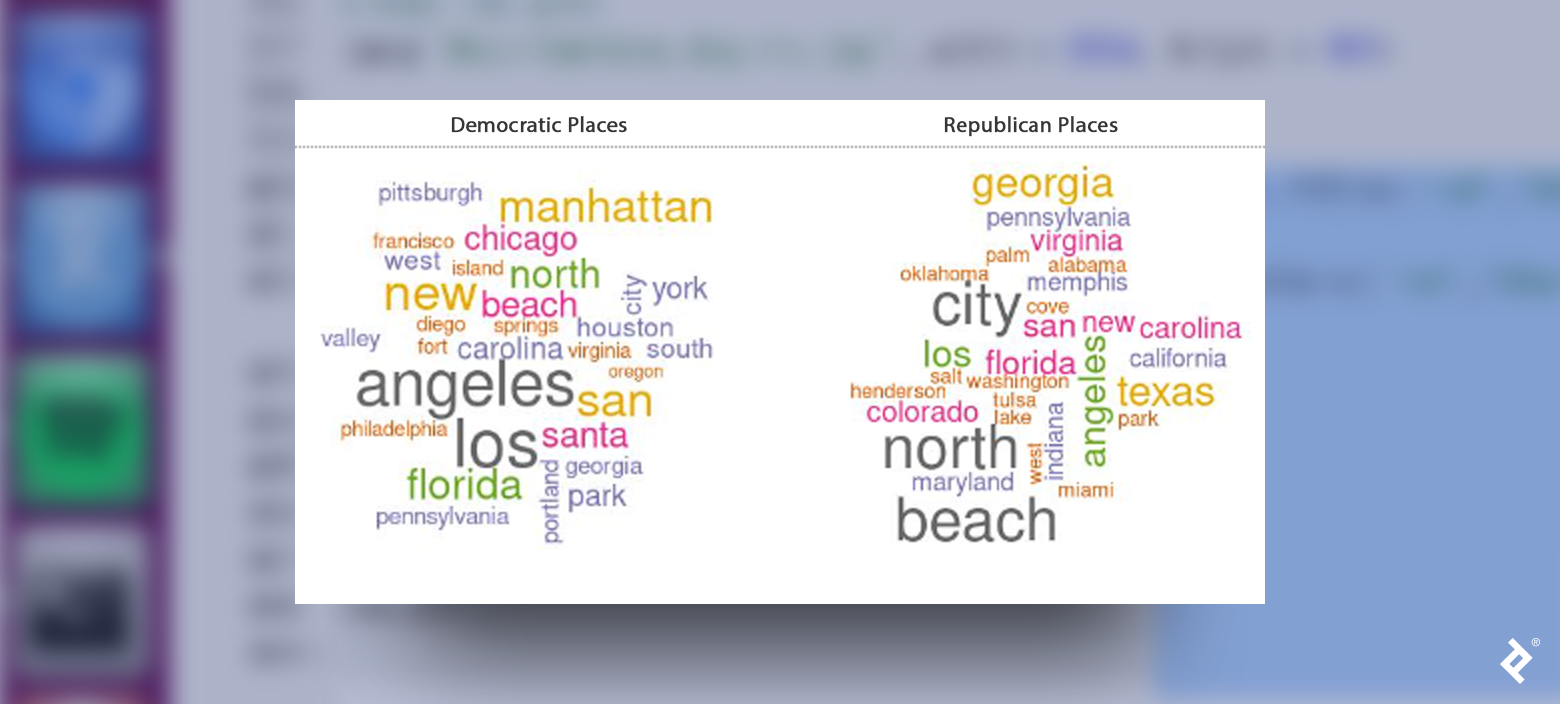
The names of some places may appear in both word clouds because voters in both parties live in most locations. But some states, like Texas, Colorado, Oklahoma, and Indiana, strongly represent the Republican party while some cities, like New York, San Francisco, and Philadelphia, strongly correlate with the Democratic party.
Behaviors
Let’s explore another facet of the data, focusing on user behavior and examining the distribution of when accounts within each cluster were created. If there is no correlation between the creation date and the cluster, we will see a uniform distribution of users for each day.
Let’s plot a histogram of the distribution:
# First we need to format the account date field to be effectively read as Date
## Note that we are using the accounts_r and accounts_d data frame, this is because we want to focus on unique users and don’t distort the plot by the number of tweets that each user has submitted

accounts_r$date_account <- as.Date(format(as.POSIXct(accounts_r$account_created_at,format='%Y-%m-%d %H:%M:%S'),format='%Y-%m-%d'))

# Now we plot the histogram
ggplot(accounts_r, aes(date_account)) + geom_histogram(stat="count")+scale_x_date(date_breaks = "1 year", date_labels = "%b %Y")

## Do the same for accounts_d

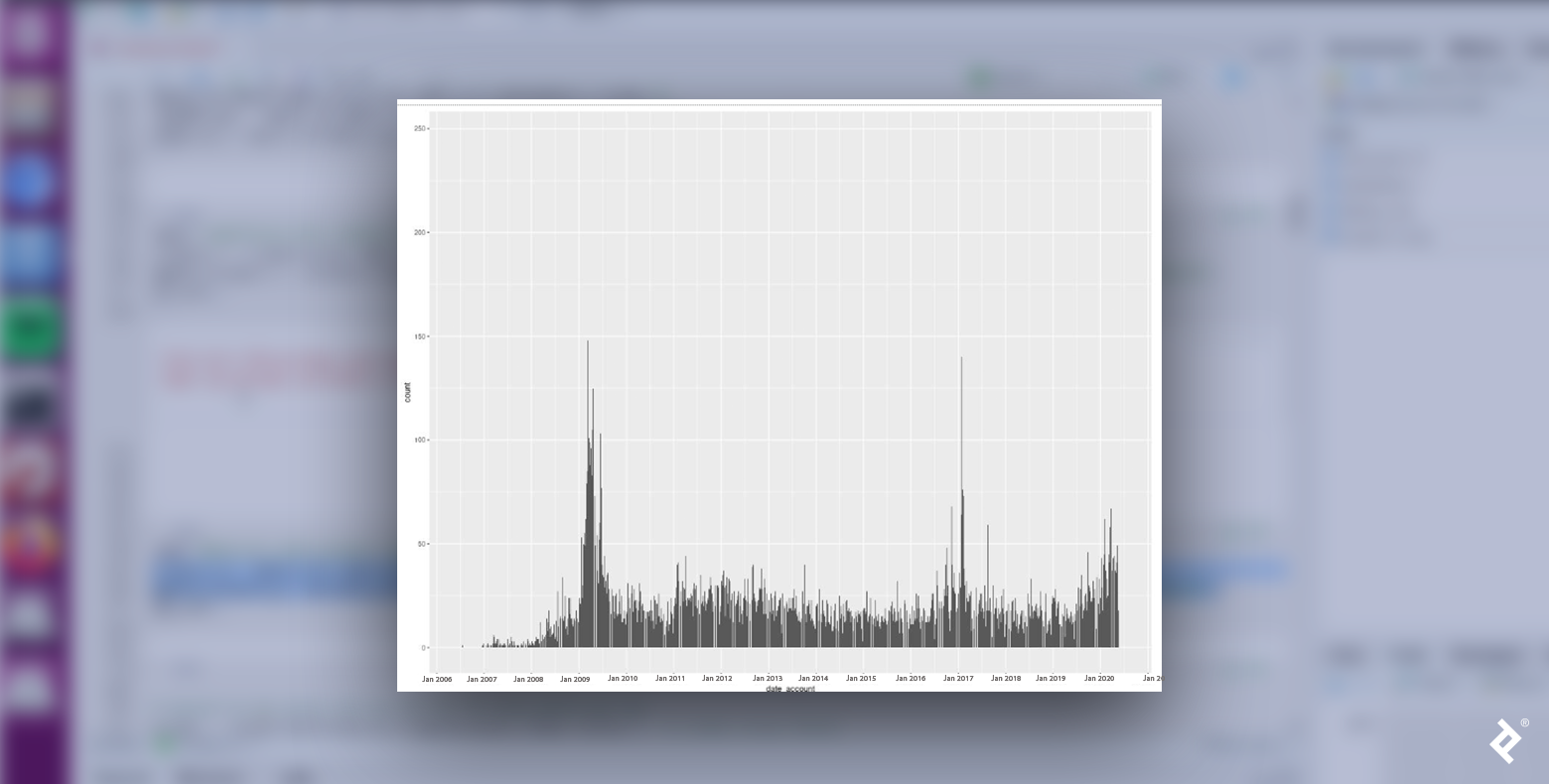
We see that Republican and Democratic users are not distributed uniformly. In both cases, the number of new user accounts peaked in January 2009 and January 2017, both months when inaugurations occurred following presidential elections in the Novembers of the previous years. Could it be that the proximity to those events generates an increase in political commitment? That would make sense, given that we are analyzing political tweets.
Also interesting to note: The biggest peak within the Republican data occurs after the middle of 2019, reaching its highest value in early 2020. Could this change in behavior be related to digital habits brought on by the pandemic?
The data for the Democrats also had a spike during this period but with a lower value. Maybe Republican supporters exhibited a higher peak because they had stronger opinions about COVID lockdowns? We’d need to rely more on political knowledge, theories, and findings to develop better hypotheses, but regardless, there are interesting data trends we can analyze from a political perspective.
Another way to compare behaviors is to analyze how users retweet and reply. When users retweet, they spread a message; however, when they reply, they contribute to a specific conversation or debate. Typically, the number of replies correlates to a tweet’s degree of divisiveness, unpopularity, or controversy; a user who favorites a tweet indicates agreement with the sentiment. Let’s examine the ratio measure between the favorites and replies of a tweet.
Based on homophily, we would expect users to retweet users from the same community. We can verify this with R:
# Get users who have been retweeted by both sides
rt_d = democrats[which(!is.na(democrats$retweet_screen_name)),]
rt_r = republicans[which(!is.na(republicans$retweet_screen_name)),]

# Retweets from democrats to republicans
rt_d_unique = rt_d[!duplicated(rt_d[,c('retweet_screen_name')]),]
rt_dem_to_rep = dim(rt_d_unique[which(rt_d_unique$retweet_screen_name %in% unique(republicans$screen_name)),])[1]/dim(rt_d_unique)[1]

# Retweets from democrats to democrats

rt_dem_to_dem = dim(rt_d_unique[which(rt_d_unique$retweet_screen_name %in% unique(democrats$screen_name)),])[1]/dim(rt_d_unique)[1]

# The remainder
rest = 1 - rt_dem_to_dem - rt_dem_to_rep

# Create a dataframe to make the plot
data <- data.frame(
  category=c( "Democrats","Republicans","Others"),
  count=c(round(rt_dem_to_dem*100,1),round(rt_dem_to_rep*100,1),round(rest*100,1))
)

# Compute percentages
data$fraction <- data$count / sum(data$count)

# Compute the cumulative percentages (top of each rectangle)
data$ymax <- cumsum(data$fraction)

# Compute the bottom of each rectangle
data$ymin <- c(0, head(data$ymax, n=-1))

# Compute label position
data$labelPosition <- (data$ymax + data$ymin) / 2

# Compute a good label
data$label <- paste0(data$category, "\n ", data$count)

# Make the plot

ggplot(data, aes(ymax=ymax, ymin=ymin, xmax=4, xmin=3, fill=c('red','blue','green'))) +
  geom_rect() +
  geom_text( x=1, aes(y=labelPosition, label=label, color=c('red','blue','green')), size=6) + # x here controls label position (inner / outer)

  coord_polar(theta="y") +
  xlim(c(-1, 4)) +
  theme_void() +
  theme(legend.position = "none")

# Do the same for rt_r

As expected, Republicans tend to retweet other Republicans and the same is true for Democrats. Let’s see how party affiliation applies to tweet replies.

A very different pattern emerges here. While users tend to reply more often to the tweets of people who share their party affiliation, they are still much more likely to retweet them. Also, it appears that people who don’t fall within the two principal clusters tend to prefer to reply.
By using the topic modeling technique laid out in part two of this series, we can predict what kind of conversations users will choose to engage in with people of their same cluster and with people of the opposite cluster.
The following table details the two most important topics discussed in each type of interaction:
| Democrats to Democrats | Democrats to Republicans | Republicans to Democrats | Republicans to Republicans | ||||
| Topic 1 | Topic 2 | Topic 1 | Topic 2 | Topic 1 | Topic 2 | Topic 1 | Topic 2 |
| fake | people | trump | americans | news | biden | people | china |
| putin | covid | news | trump | fake | obama | money | news |
| election | virus | fake | dead | cnn | obamagate | country | people |
| money | taking | lies | people | read | joe | open | media |
| trump | dead | fox | deaths | fake_news | evidence | back | fake |
It appears that fake news was a hot topic when users in our data set replied. Regardless of a user’s party affiliation, when they replied to people from the other party, they talked about news channels typically favored by people in their particular party. Secondly, when Democrats replied to other Democrats, they tended to talk about Putin, fake elections, and COVID, while Republicans focused on stopping the lockdown and fake news from China.
Polarization Happens
Polarization is a common pattern in social media, happening all over the world, not just in the US. We have seen how we can analyze community identity and behavior in a polarized scenario. With these tools, anyone can reproduce cluster analysis on a data set of their interest to see what patterns emerge. The patterns and results from these analyses can both educate and help generate further exploration.
Also in This Series:
Further Reading on the Toptal Blog:
Understanding the basics
What is the purpose of data clustering?
Data clustering identifies groups within a data set.
Why is cluster analysis used?
Cluster analysis identifies topics and data dimensions around which communities cluster.
What is the concept of homophily?
Homophily is the principle of people tending to interact with others who match their traits and opinions.
What is homophily in social media?
Homophily describes individuals gravitating toward others with the same demographics and thoughts. These users also exhibit these tendencies when using social media.
How is homophily measured in social media?
Social media data analysis can identify keywords and topics on which user groups focus. These focal points can demonstrate homophily within these users.
Ciudad de Buenos Aires, Buenos Aires, Argentina
Member since November 6, 2019
About the author
Juan is a developer, data scientist, and doctoral researcher at the University of Buenos Aires where he studies social networks, AI, and NLP. Juan has more than a decade of data science experience and has published papers at ML conferences, including SPIRE and ICCS.
Expertise
Previous Role
Chief DeveloperPREVIOUSLY AT