Social Network Analysis in R and Gephi: Digging Into Twitter
Thanks to rapid advances in technology, large amounts of data generated on social networks can be analyzed with relative ease, especially for those who use the R programming language and Gephi.
Thanks to rapid advances in technology, large amounts of data generated on social networks can be analyzed with relative ease, especially for those who use the R programming language and Gephi.
Juan is a developer, data scientist, and doctoral researcher at the University of Buenos Aires where he studies social networks, AI, and NLP. Juan has more than a decade of data science experience and has published papers at ML conferences, including SPIRE and ICCS.
Expertise
PREVIOUSLY AT

This is the first installment in a three-part series on Twitter cluster analyses using R and Gephi. Part two will deepen the analysis we start today to better identify principal actors and understand topic spread; part three uses cluster analysis to draw conclusions from polarized posts about US politics.
Social network analysis was born in 1934 when Jacob Levy Moreno created sociograms, abstractions of social interactions. Specifically, a sociogram is a graph in which each node represents a person and edges represent interactions between them. Moreno used sociograms to study the behavior of small groups of people.
Why small? Because in the era in which he worked, it was difficult to get granular information on a large number of personal interactions. This changed with the advent of online social networks such as Twitter. Nowadays, anyone can download voluminous Twitter data for free, which opens the door to interesting analyses, driving us to new understandings of how we behave and the impact of various behaviors on society.
In this first part of our social network analysis series, we demonstrate how to perform some of these analyses using the R language to obtain and pre-process the data, and Gephi to produce amazing visualizations. Gephi is an open-source application specially designed to visualize any kind of network. It enables users to easily configure visualizations through several criteria and properties.
Downloading Twitter Data for Social Network Analysis in R
If you don’t have a Twitter developer account, create one, and apply for Essential access. Then, to download Twitter data, create an app in the Twitter Developer Portal. Next, select your app in the Projects & Apps section and go to the Keys & Tokens tab. There you will have to generate your credentials. These will be used to access the Twitter API and download the data.
Once you have generated your credentials, you can begin the analysis. We will use three R libraries:
- igraph, to create the interaction graph.
- tidyverse, to prepare the data.
- rtweet, to communicate with the Twitter Dev API.
You can install these libraries with the install.packages() function. For our purposes, we’ll assume that you have installed R and RStudio, and that you have a basic understanding of them.
In our demonstration, we will analyze the heated online discussion about famed Argentine footballer Lionel Messi during his first week with the Paris Saint-Germain (PSG) Football Club. It is important to note that with the free Twitter API you can download tweets for only seven days prior to the current date. You won’t be able to download the same data we cite, but you will be able to download current discussions.
Let’s start with downloading. First, we will load the libraries, then create an authorization token using the credentials, and finally set the download criteria.
This code block details how to implement all three steps:
## Load libraries
library(rtweet)
library(igraph)
library(tidyverse)

## Create Twitter token
token <- create_token(
  app = <YOUR_APP_NAME>,
  consumer_key = <YOUR_CONSUMER_KEY>,
  consumer_secret = <YOUR_CONSUMER_SECRET>,
  access_token =<YOUR_ACCESS_TOKEN>,
  access_secret = <YOUR_ACCESS_SECRET>)

## Download Tweets
tweets.df <- search_tweets("messi", n=250000,token=token,retryonratelimit = TRUE,until="2021-08-13")

## Save R context image
save.image("filename.RData")
Note: Replace all the tags between <> with the information that you created in the previous credentials step.
With this code, we queried the Twitter API for all tweets (up to 250,000) that contained the word “messi” and were posted between August 8, 2021, and August 13, 2021. We set a limit of 250,000 tweets because Twitter requires a quantity value and because the number is big enough to allow for an interesting analysis.
Twitter’s download rate is 45,000 tweets per 15 minutes, so downloading 250,000 tweets took more than an hour.
Finally, we saved all the context variables in an RData file to be able to restore it if we closed RStudio or shut down the machine.
Creating the Interaction Graph
Once the download has finished, we will have the tweets inside the tweets.df dataframe. This dataframe matrix contains one row per tweet and one column per tweet field. First, we will use it to create the interaction graph in which each node represents a user, and edges represent interactions (retweets or mentions) between them. With tidyverse and igraph, we can create this graph quickly and in only one statement:
## Create graph
filter(tweets.df, retweet_count > 0) %>%
  select(screen_name, mentions_screen_name) %>%
  unnest(mentions_screen_name) %>%
  filter(!is.na(mentions_screen_name)) %>%
  graph_from_data_frame() -> net
After executing this line, we have a graph in the net variable that is ready for analysis. For example, to see how many nodes and edges are present:
summary(net) # IGRAPH fd955b4 DN-- 138963 217362 --
Our sample data yields 138,000 nodes and 217,000 edges. That is a big graph. We could generate visualizations through R if we wanted to, but in my experience, they take too long to compute and are not as visually appealing as Gephi visualizations. Therefore, let’s proceed with Gephi.
Visualizing the Graph With Gephi
First we will need to create a file Gephi can read. This is easy, as we can generate a .gml file using the write_graph function:
write_graph(simplify(net), "messi_network.gml", format = "gml")
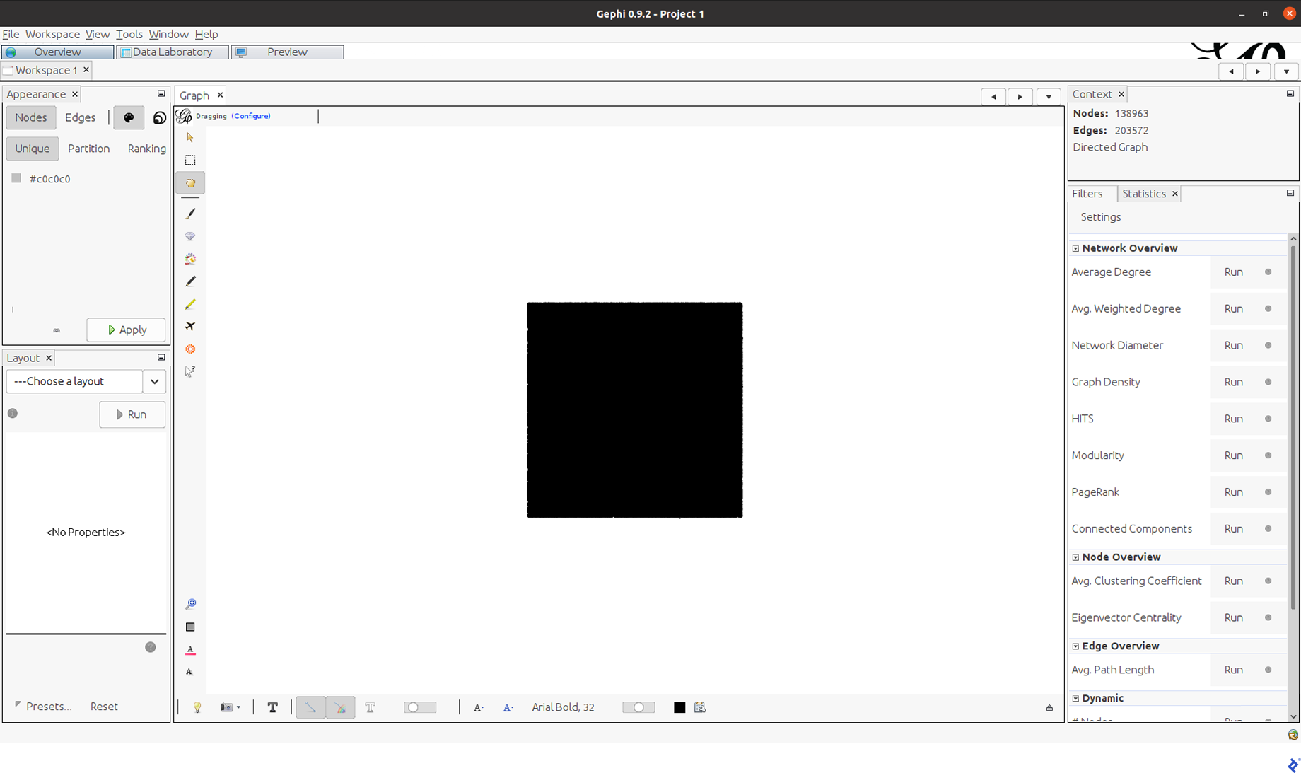
Now, open Gephi, go to “Open graph file,” search for the messi_network.gml file, and open it. It will throw a window that summarizes the graph information. Select Accept. This will appear:
Needless to say, this is not very informative. That’s because we haven’t applied a layout yet.
Network Layout
In a graph with thousands of nodes and edges, positioning the nodes in the graphic is vital. This is the purpose of layouts. They place nodes in positions set by defined criteria.
For our social network analysis tutorial, we will use the ForceAtlas2 layout, which is a standard option for this kind of analysis. It positions the nodes by simulating physical forces of attraction and repulsion between them. If two nodes are connected, they will be in closer proximity to each other; if they aren’t connected, they will be farther apart. This layout yields an informative graph in terms of communities, because users belonging to the same community will be grouped together while users from different communities will be in different regions.
To apply this layout to our case, we navigate to the Layout window (in the lower-left corner), select ForceAltas 2, and click Run. When you do this, you will see the nodes begin to move and form many “clouds.” After a few seconds, you will have a very stable pattern and you will be able to click Stop. Please note that it could take a lot of time to stop automatically.
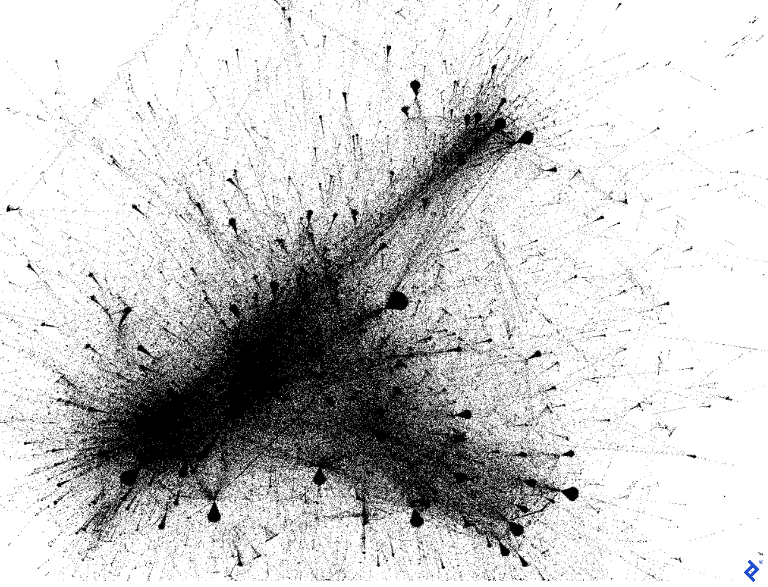
As this is a stochastic algorithm, you will have slightly different outputs in each run. Your output should be similar to this:
The graph is starting to look appealing. Now let’s add some color to it.
Community Detection
We can color nodes using several criteria; the most standard approach is by community. If we have four communities in our graph, we will have four colors. Through color, it is easier to understand how the groups interact, given your data.
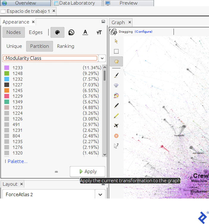
To color the nodes, first we have to identify the communities. In Gephi, click the Modularity button in the window under the Statistics tab—this button applies the popular Louvain graph cluster algorithm, one of the fastest available algorithms, considered state-of-the-art due to its high performance. In the window that appears, click Accept. Another window will appear, containing a scatter plot of the communities distributed by size. Now we have a new attribute in each node named Modularity Class, which contains the community owned by the user.
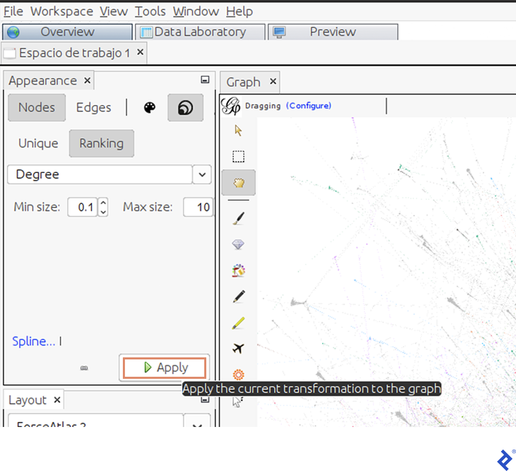
Having completed the previous steps, we can now color the graph by clusters. To do that, in the Appearance tab, click Apply.
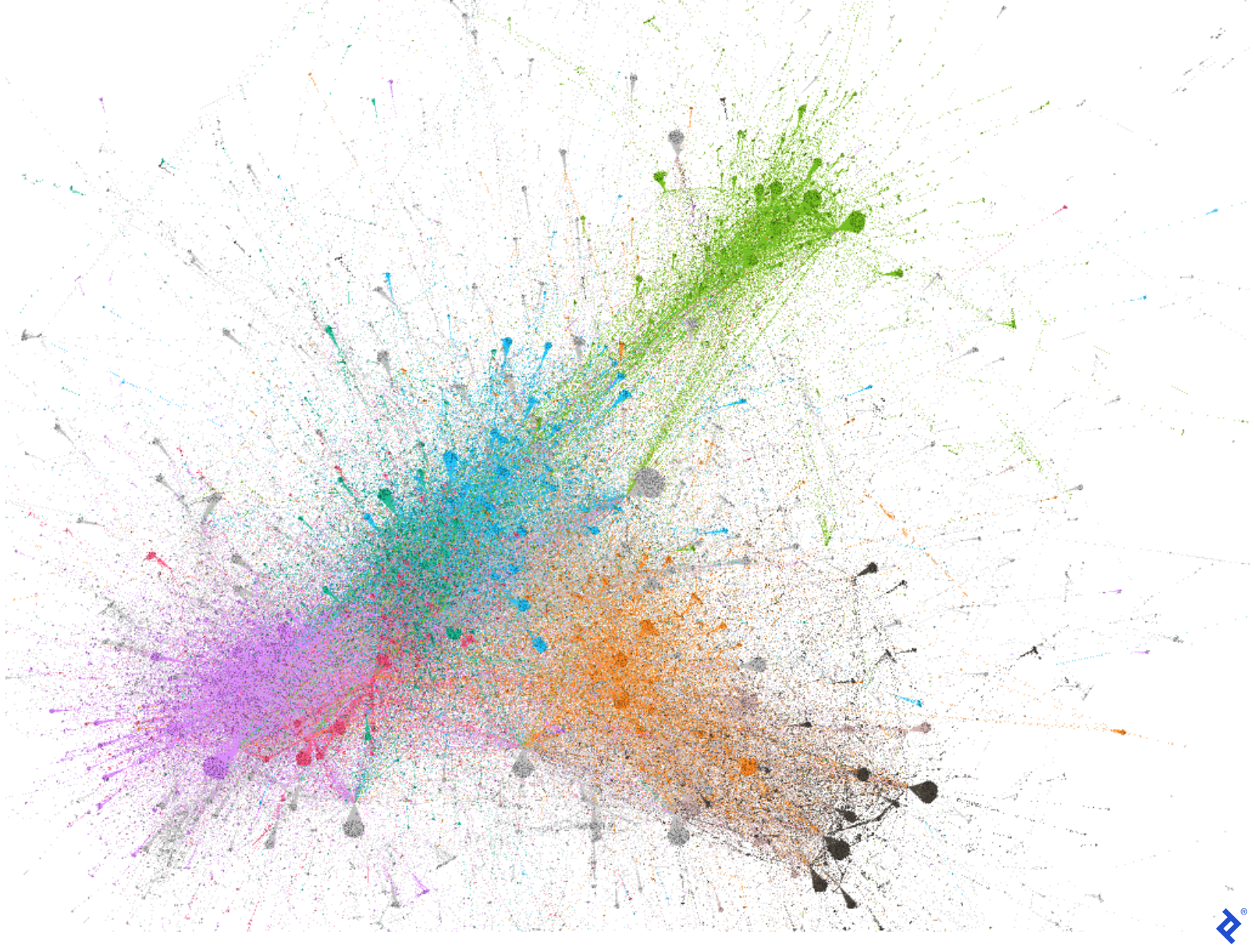
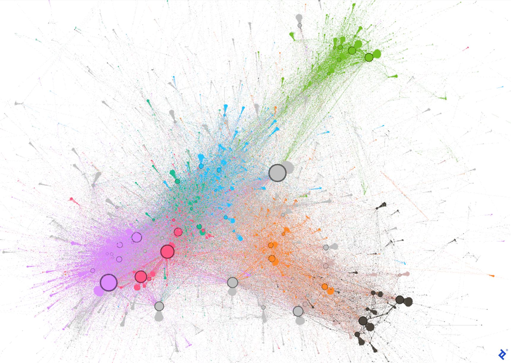
Here we can see the size (in terms of user percentage) of each community. In our case, the principal communities (violet and green) contain 11.34% and 9.29% of the total population, respectively.
Using the current layout and palette, the graph will look like this:
Twitter Influencer Detection
Finally, we would like to identify the principal participants in the discussion to understand, for example, who belongs to which community. We can measure the influence of each user by different properties; one of them is by their degree. This indicates how many users have retweeted or mentioned them.
To highlight users with a lot of interactions, we will change the size of the nodes using the Degree property:
The graph will now display influencers as nodes represented by larger circles:
Now that we’ve identified the users with a high number of interactions, we can reveal their names. To do that, click on the black arrow in the bar at the bottom of the screen:
Then, click on Labels and Configuration. In the window that appears, select the Name checkbox and click Accept. Next, click the Nodes checkbox. Small black lines will appear in the graph. These are the names of all the users. But we don’t want to see all of them, just the most important ones.
To define them, change their size by node degree using the same window we used for the node size. We increased the minimum size from 0.1 to 10 and increased the maximum size from 10 to 300.
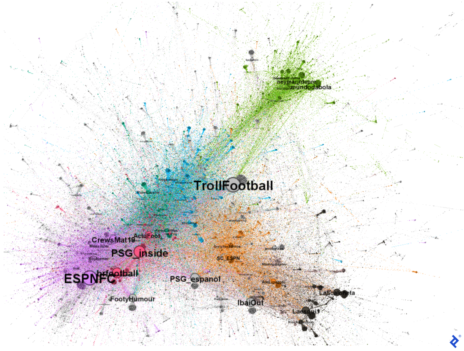
With the addition of names, the graph becomes significantly more informative, as it displays how different communities interact with influencers:
We now understand a lot more about this particular Twitter discussion. For example, the green community’s inclusion of accounts like mundodabola and neymarjrdepre reveal its Brazilian locus. The orange and gray communities contain Spanish-speaking users like sc_espn and InvictosSomos. Particularly, the gray and black communities appear to be Spanish-speaking as they have users like IbaiOut, LaScaloneta, and the popular streamer IbaiLlanos. Finally, the violet and red communities appear to be English-speaking as they feature accounts such as ESPNFC and brfootball.
Now we can better understand why these users comprise different communities in terms of sociology and not only graph computation: They speak different languages! They are all tweeting about Messi and his new team but it makes sense that Spanish speakers interact more with other Spanish speakers than with Portuguese or English speakers. Moreover, we can also understand that even though the gray and orange communities speak Spanish, they do so from different perspectives. The gray community uses a more humorous approach that explains why they interact more with each other than with official football or journalist accounts.
Unlocking the Potential of R and Gephi
Had we not used Gephi to graph, we could have used R’s Ggplot library. However, from my point of view, that library is much more limited in terms of network graphing. It is not dynamic like Gephi, it is more difficult to configure, and the resulting display is less clear.
In the rest of the series, we take this analysis further. We perform some topic modeling text analyses to see how much users are talking and what topics are of interest to them; we will conduct a sentiment analysis to see if they are being positive or negative; and we will do a deeper graph analysis to analyze Twitter’s biggest influencers.
You can use these steps to analyze new Twitter discussions and see what insights you can gain from your plot graphs.
Also in This Series:
Further Reading on the Toptal Blog:
Understanding the basics
What is the R language for?
R was originally designed for statistical analysis and academic researchers. However, nowadays it is widely used for many more purposes, such as machine learning development or dynamic report design.
Is Python better than R?
It depends. Both of them are great languages with huge communities supporting them. Some functionalities have better libraries in R and others in Python.
Is the R language easy?
Yes, R is a high-level language that was originally intended for users without extensive programming knowledge, such as mathematicians and physicists. That is why it is a very user-friendly and easy-to-learn language.
What is social network analysis used for?
Social network analysis is used to understand how people interact and the nature of their interactions. It can be used to find new clients, markets, partners, or even investors.
What are the basic steps in social network analysis?
First, you obtain the data from online social networks, then you construct an interaction graph and start analyzing network behavior.
Is social network analysis qualitative or quantitative?
It can be both, depending on your background. Engineers can perform quantitative analysis while sociologists may perform qualitative analysis.
What are sociograms?
Sociograms are graphs in which each node is a person and the edges represent interactions between them.
Why are sociograms important?
Sociograms are important because they give us an abstraction (and illustration) of how people interact in huge groups. They are simple but quite meaningful. They help us understand societies from many perspectives, such as user centrality, information spread, community identification, and more.
Juan Manuel Ortiz de Zarate
Ciudad de Buenos Aires, Buenos Aires, Argentina
Member since November 6, 2019
About the author
Juan is a developer, data scientist, and doctoral researcher at the University of Buenos Aires where he studies social networks, AI, and NLP. Juan has more than a decade of data science experience and has published papers at ML conferences, including SPIRE and ICCS.
Expertise
PREVIOUSLY AT


