
The Ultimate Guide to E-commerce Website Design
Designing an e-commerce site is not just about building a website to sell products but designing a pleasant online shopping experience. This comprehensive guide walks us through the best practices.

Designing an e-commerce site is not just about building a website to sell products but designing a pleasant online shopping experience. This comprehensive guide walks us through the best practices.

Yej Lee
Yej is an award-winning app designer with multi-platform experience spanning iOS, Android, wearables, responsive web, and more.
Previously At

US e-commerce sales continue to reach new heights in 2018. Worldwide, e-commerce will continue to post solid gains to the tune of $2.3 trillion. But what makes one e-commerce web design triumph over another?
Several factors determine the overall success of an e-commerce website including product quality, brand recognition, shipping costs, return policies, trustworthiness, and customer service. However, thoughtful user experience design is also key to providing customers with a satisfying, friction-free experience. It will not only convert potential clicks into actual e-commerce transactions but make customers come back time and again.
Here is a comprehensive ecommerce web design guide to creating great e-commerce websites, complete with examples.
Design e-commerce for Trust And Security
First and foremost, it is important to design a website that shoppers feel they can trust. Most shoppers are concerned about privacy and whether the site will protect their personal data by providing a secure transaction. If the website does not feel trustworthy, they will simply choose to shop elsewhere.

Here are some methods that will communicate trustworthiness:
-
Include an overview of the business:
- Provide general information
- Photographs of people behind the business
- Contact information
- Links to social media
- A Frequently Asked Questions (FAQ) page
-
Publish store policies and make sure they are not too difficult to find:
- Shipping and return policies
- Outline the return process and what products can be returned
- Provide easy access to a privacy policy that covers shoppers’ personal and financial information (this is crucial)
Write in plain language and avoid legal or internal policy jargon.
- Share product reviews. Provide product reviews to help shoppers understand more about the product; this will help alleviate any concerns they may have and provide great e-commerce UX. Take it a step further by offering product reviews along with additional information about the reviewers, or by summarizing the reviews. This step can help make it easier for shoppers to get the full benefit of others’ opinions.
- Use a secure server. Shoppers expect that their personal information will stay secure while they purchase online. SSL (secure sockets layer) certificates authenticate the identity of a website and encrypt information that needs to remain safe. It is an essential sign that indicates checkouts are secure. Assure shoppers that their data is protected by implementing SSL and displaying SSL certificate badges.

- Add recognized trust seals. A trust seal verifies the legitimacy and security of a website. Some trust companies even add an extra layer of protection by offering some insurance if the transaction turns out to be fraudulent. Using recognized trust seals assures potential shoppers of a secure transaction process, which leads to increased sales and provides better e-commerce UX.
- Show attention to detail. Make the website look legitimate and professional by avoiding typos, missing images, broken links, 404 errors (page not found), or other e-commerce UX-killing mistakes.
Ecommerce Website Design Considerations
The look and feel of a website is the main driver of first impressions. Research concludes that people will determine whether they like a website or not in just 50 milliseconds.
Here are some essential ecommerce design tips:
- Follow the brand identity. The branding should be apparent throughout the website. Choose colors that reflect the brand, and set the style in order to make clear what type of products are sold. Ensure brand experience is consistent across all channels—whether online, in-store, or on a mobile device. This will help build a strong brand-customer relationship.
- Adopt visual hierarchy. The most critical content should be displayed above the fold. In some cases, using less white space to bring items closer together is better than pushing critical content below the fold.
- Do not over design. Limit font formats such as font face, sizes, and colors. When the text looks too much like graphics, it will be mistaken for an ad. Use high-contrast text and background colors to make the content as clear as possible.
- Stick to known symbols. Use icons or symbols that are easy to identify. Unfamiliar icons will only confuse the shoppers. A good way to avoid any possible confusion is to provide labels for icons.
- Avoid popup windows. Popup windows are a distraction. Even if they contain valuable information, shoppers are more than likely to dismiss them immediately—once gone, even if they want to, it’s hard for shoppers to find the information again.

The Importance of Frictionless E-commerce Site Navigation
Friction-free is the way to be. Navigation is about how easy it is for people to move around the website, find what they’re looking for and finally take action. The e-commerce shopping experience should be seamless so shoppers don’t drop off halfway through the process.
Here are some ecommerce website designing tips for easy navigation:
Well-defined Product Categories
The top level of navigation should show the set of categories that the site offers. Group products into categories and subcategories that make sense. Category labels work best as single words that describe the range of products, so shoppers can scan through them and instantly understand what they represent. It’s best to user-test site navigation as much as possible for great e-commerce UX as it’s a key make-or-break feature of the site.
Product Search
Simply put, if shoppers cannot find the product, they cannot buy the product—build a search function that helps them easily find what they are looking for:
- Make search omnipresent. Put the search box on every page and in familiar locations. The box should be visible, quickly recognizable, and easy to use. Standard positions to implement the search box are the top right or top center of the pages, or on the main menu.
- Support all kinds of queries. Searches need to support all types of queries such as product names, categories, and product attributes, as well as customer service related information. It’s a good idea to include a sample search query in the input field to suggest to shoppers the use of the various functions.
- Have a search auto-complete functionality. Auto-complete functionality makes it easier for shoppers to find what they are looking for and increases sales potential by suggesting things within the area they are already searching.
- Allow sorting and filtering of results. Let shoppers sort search results based on various criteria (best sellers, highest or lowest price, product rating, newest item, etc.) as well as eliminate items that do not fit within a certain category.

Filtering Products
The more choices given, the harder it is to choose. Help shoppers find the right products by implementing filters. It will help them narrow their choices and jump to their desired product range directly.
Product Quick View
A “quick view” reduces the time it takes for shoppers to find the right product by eliminating unnecessary page loads. Typically, the product details are displayed in a modal window over the viewed page. Do not try to show all the product details, instead, include a link to the full product page to view complete details. Also, be sure to include a prominently positioned “Add to Cart” button as well as a “Save to Wishlist” functionality.

Special Offers
Shoppers always look for special offers, discounts, or best deals. Make exclusive offers visible so shoppers know about them. Even if the price differences aren’t that great, the psychological sense of saving some money creates an illusion of having an upper hand.

E-commerce Product Page Design
For outstanding e-commerce UX when shoppers successfully find the product they want, let them find out about the product. Design a product page that creates an experience that is as similar to an in-person shopping experience as much possible, by including lots of images, detailed descriptions and any other useful and related information about the product. Let’s take an in-depth look at what this means.
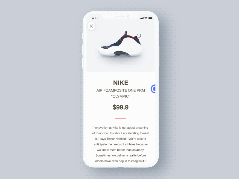
Provide Great Product Images

With e-commerce, shoppers cannot touch, feel, or try out the product. Instead, everything depends on what they see online. This is why providing product images that clearly exhibit all aspects of the product is critical. Here is a checklist for perfect product images:
- Use a white background. The background for product images should not distract or conflict with the product itself. A white background works best because it allows the product to stand out, and works with almost any style or color scheme.
- Use high-quality, large images. Good images sell the product. High-quality images catch shoppers’ interest and show them exactly what they are buying. Having large images lets shoppers zoom up and examine a product in fine detail.

- Use a variety of images. Display the product from a number of different angles and include close-ups in order to provide a more complete sense of the product. A 360-degree view, where they can move the product around, is a good way to provide an experience close to physically going into the store and engaging with it. VR e-commerce is the next wave of this experience.
- Use video. Videos have the ability to deliver a lot of information in a short amount of time. Use a video to show the product in use, and to provide as much functional information as possible.
- Be consistent. Use images that are consistent across multiple pages, and are also in line with the look and feel of the rest of the website. This will keep everything looking clean and uncluttered. The main product image should be the same across all areas of the site, such as product highlights or in the featured items section.
Give Just the Right Amount of Product Information
Give shoppers detailed information about the product so they can make an informed purchase decision. Show availability, options for different sizes or colors, dimensions, a size chart, materials used, total cost, warranties, and more. The fewer remaining questions they have about a product, the more likely they are to make a purchase.

Employ Persuasive Design
According to the scarcity principle, humans place a higher value on an object that is scarce, and a lower value on those that are abundant. Create a sense of urgency in the sales process by showing scarcity—display how many products are left, grey out sizes that are out of stock, or show sale deadlines. Scarcity will motivate potential buyers to take action.
Increasingly, companies are using advanced psychological research, and in order to drive more engagement and purchases, have turned what used to be an art into a science. Persuasive design in e-commerce is a very effective way to garner more purchases.

Show Related and Recommended Products
Display similar products that shoppers might also like that work well with the current product, or products, that others have purchased. This can be displayed on a product detail page or in the shopping cart and will help guide shoppers to the products that meet their needs, potentially encouraging them to continue shopping—a great way to cross-sell related products.

Shopping Cart Design
The shopping cart is essential as it is where shoppers review their selected products, make the final decision, and proceed to checkout. The primary goal of the shopping cart is to lead shoppers to checkout. Below are tips on designing a shopping cart that is user-friendly, and will encourage shoppers to purchase further.
- Use a clear call-to-action (CTA). The primary call to action on the shopping cart page should be the checkout button. Use bright colors, plenty of clickable areas and simple language to make the checkout button visible, straightforward and easy to use.
- Provide adequate feedback. Make sure when a product is added to the shopping cart it is immediately and clearly confirmed. Shoppers get confused by inadequate feedback, such as showing inconspicuous confirmation text. A good idea is to use animations, as movement attracts the human eye.
- Use a mini cart widget. Allow shoppers to add products to their cart without leaving the page they are on, by using a mini cart. It also allows them to navigate, discover, and add more products. Mini cart widgets should always link to the full page shopping cart.

- Display product details. Displaying details like product names, images, sizes, colors, and prices in the shopping cart helps the shoppers remember each product, as well as compare products. Link products in the cart back to their full product pages, so shoppers can review more details when necessary.
- Make the cart easily editable. The ability to remove, save for later or change details like size, color, or quantity should be easy to access.
- Avoid the surprise of unexpected shipping costs and taxes. Unexpected shipping costs are one of the leading reasons shoppers abandon their shopping carts. Place shipping options and taxes with precise calculation of the costs, and an expected delivery date up front.
E-commerce Checkout Design
A stylish and trendy design does not determine a successful e-commerce website nor does it necessarily provide great e-commerce UX. e-commerce success is only measured by the number of completed purchases. Here are a few ways to build a well-designed checkout page, which will contribute to a successful conversion:
- Offer various payment options. Different shoppers have different preferences when it comes to making payments. Cater to as many payment options as possible (contingent on the target audience) to expand the customer base, and to make it easy for shoppers to complete their order.
- Keep it simple. Minimize the number of fields and steps to complete the purchase. Using shipping address as billing address by default is a good way to minimize the number of fields—ideally, design a single page checkout where shoppers can view their cart and enter delivery and payment information.

- Make registration optional. Forcing shoppers to create an account prior to their first purchase will drive the shoppers away. Give them an option to register after the purchase is complete, and highlight the benefits of registration when asking them to register. Benefits include faster checkout thanks to personal information like saved shipping address or payment information and access to exclusive offers that are only available to registered members.
- Use clear error indications. There is nothing more frustrating than not being able to make a purchase or figure out why. Instead of showing the errors after a form is submitted, make error notifications come up in real time. Place clear and concise error messages directly above, or next to the item that requires correction, so shoppers will notice and understand them.

- Keep people on track. When using a multi-page checkout, include a progress bar that shows how many more steps are left to complete the purchase. This will eliminate any ambiguity, and assure shoppers they are on the right track. When the purchase is complete, display an order confirmation and order status with shipment tracking.
- Offer support. Include a live chat or contact number throughout the checkout process, so when shoppers have questions, they can quickly get answers rather than having to leave the site and go elsewhere.
Summary
Online shoppers expect frictionless experiences no matter what. When designing an e-commerce site, it is not just about building a website but creating an online shopping experience that will convert passive shoppers into paying customers.
Hopefully, this e-commerce website design guide will help you make essential design decisions in order to build great e-commerce UX that is professional, attractive, user-friendly, and makes shoppers come back for more time and again. Fast growth plus relatively low market share means that there is still enormous opportunity for new players to outpace traditional industry leaders.
Further Reading on the Toptal Blog:
Understanding the basics
E-commerce, aka online shopping, is a form of electronic commerce which allows consumers to buy goods or services directly from a seller over the Internet using a web browser.
A “Call to Action” stands for something on a website or in an app that induces customers to perform an action (usually beneficial for the business) such as signing up for a newsletter, getting more information, download sales material, or to complete an e-commerce purchase, etc.
E-commerce (aka online shopping) is the sale and purchase of services and goods over the Internet. It’s convenient, available 24/7, searchable, global (wide customer reach), cost-effective for sellers and customers, and doesn’t require much (if any) physical space.
A website’s navigation structure refers to how the website is set up, i.e. how the individual subpages are linked to one another. When a website has a number of subpages, they must be linked to its homepage so that visitors can use the site’s navigation to browse the website’s content.
Customer conversion rates vary across industries. What’s good for one, may not be for another. However, the current average conversion rate of shoppers worldwide as of Q4 2016 is 2.95%.