
E-commerce UX for the Mobile Experience
The explosive growth of e-commerce has created a need for online stores to adapt to mobile experiences. This post outlines the many aspects that make a successful mobile e-commerce experience.

The explosive growth of e-commerce has created a need for online stores to adapt to mobile experiences. This post outlines the many aspects that make a successful mobile e-commerce experience.

Stelian is a UI designer with more than seven years of experience in designing and building projects of different scales from the ground up.
Expertise
The term “mobile commerce” was introduced 20 years ago by Kevin Duffey when he suggested that a mobile device could function as a retail outlet in a customer’s pocket. Considering the technological limitations of the time, who would have thought that we would one day be able to easily explore, review, and purchase goods on a small pocket-sized device?
I can’t overstate how mobile is changing how we interact with our consumers; we have to embrace these changes. – Joel Anderson, CEO of Walmart
The astounding growth of e-commerce has also fueled the growth of mobile e-commerce, now worth nearly $700 billion. Mobile e-commerce is currently the biggest slice of the giant online market. More than 80% of Americans have made a purchase in the last month online—three years ago, the number was only 11.6%.
A report from Business Insider Intelligence suggested that mobile commerce will increase up to 45% by 2020. ComScore research agreed and, in 2016, reported a 44% increase in spending via mobile devices compared to 2015.

Despite the high sales numbers, more than 60% of users still feel concerned about having their financial information hacked when using a mobile phone. Nevertheless, customer satisfaction is still fairly high, with mobile retail giants like Amazon and Apple both receiving a satisfaction rating of more than 80%.
Mobile E-commerce UX Best Practices for Success
Support Image Zooming by Pinching and Double-tap Gestures
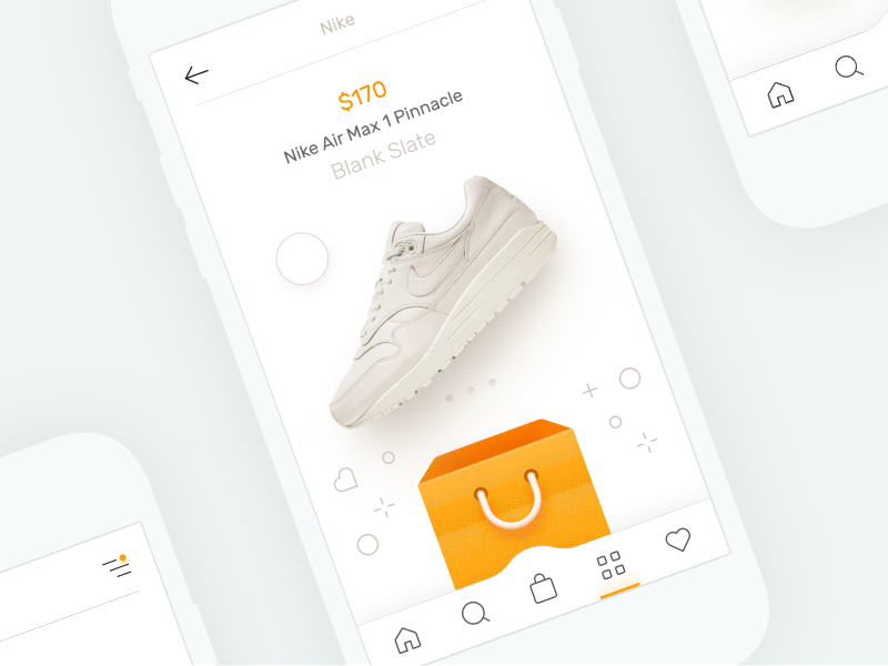
People are familiar with gestures like double tapping and pinching in order to zoom in to images on mobile. During a mobile e-commerce usability study, the Baymard Institute found that, quite naturally, shoppers want to be able to inspect the product thoroughly and are concerned about the small details. Users who were interested in purchasing a product but couldn’t explore it by zooming in didn’t feel comfortable buying it and often didn’t commit to the sale.

It’s quite surprising that of the 50 top-grossing mobile e-commerce applications, more than 40% didn’t support zooming gestures. Even sites that offered close-up versions of images experienced similar bounce rates, which suggests that support of product image zooming gestures in a mobile e-commerce app is fundamental.
Considering the small screen size of mobile devices, this is a platform-specific issue. Supporting at least one of these features will put an app in the company of the top 50% of e-commerce applications, i.e., the top-grossing list.
A few factors to consider:
- Low-resolution images are the equivalent of no-zoom images. Users are interested in seeing the details of a product clearly and need high-resolution images to do so. The option to zoom in on a low-quality image is pretty much useless, as it doesn’t allow the user to see details.
- The Baymard Institute discovered that 50% of apps do not indicate to users that they can pinch or double tap on product images. Indicating the availability of image zooming is important. Although these gestures are commonly known to mobile users, it still needs to be shown that they are available. The use of icons or visual representations is recommended in order to do this.
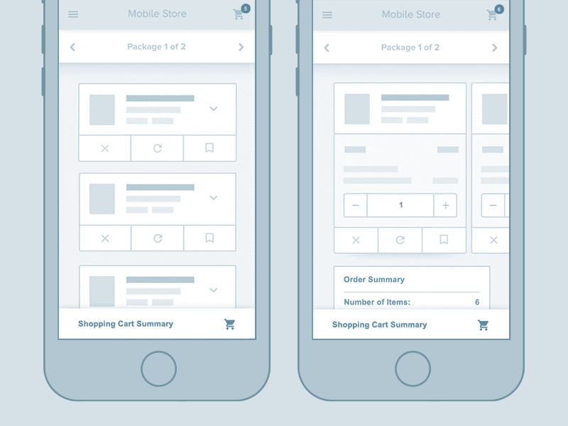
Provide a “Save” Feature for the Shopping Cart
As mentioned earlier, the small screen size of mobile devices is a primary roadblock when it comes to mobile e-commerce. The Baymard Institute observed that more than 61% of mobile users will often use their desktops to complete a purchase rather than their phone.

A “save shopping cart” feature reduces the number of cart abandonments and enables shoppers to save items for a later purchase. Persistent shopping carts allow customers to continue their shopping without the need to search for the desired product on their return—a feature that 55% of shoppers would make use of.
Here’s how to retain these customers:
- Make the cart work as a wishlist by saving items added to the cart.
- Create an option to allow shoppers to receive emails with saved items. Display reminders that they can use their desktop to finalize the purchase.
Use Descriptive, Well-labeled Forms
Applying best practices for mobile forms is another consideration. It’s important that the UX design of an e-commerce app or site, while eliminating any confusion, allow users to complete forms as quickly as possible.
Here are the best practices for mobile form usability:
- Place form labels above the form to improve readability, ease of use, and clarity. Explaining why certain information is needed will reduce user anxiety when filling out forms on their mobile.
- Match the text inputs with the appropriate keyboard. Display a dial-pad when inputting phone numbers and credit card digits, and a text-pad when inputting addresses and text. This will reduce user mistakes and accelerate form completion.
- Limit the number of input fields to reduce typing effort. Fewer input fields will generate a less loaded form and will improve the UX checkout flow.
- Automatically advance each field up the screen when completed. Doing this will not obstruct any view of the incomplete fields.
- Use steppers instead of drop-down menus to reduce shopper effort. Steppers are used to increase or decrease value by a constant amount and are a solution that’s faster to work with and more appealing to the eye.

Provide Intelligent Auto-suggestion, Auto-detection, Address Lookup, and Errors
The main purpose behind auto-suggestion is to make it easier and faster for users to fill out forms. Auto-suggestion predicts common search queries and helps shoppers find products more easily.
Mobile usability can be further improved by using credit card type auto-detection. Auto-detection streamlines the purchase process by providing immediate feedback for supported card types. Automation of as many data entry processes as possible—preferably with visuals—improves the user experience and will positively affect conversion rates.

Address lookup and validation accelerate the checkout process—various APIs (such as Google Places and the USPS) enable easy implementation of this feature.
Providing inline input validation for errors is also a best practice in mobile UX design. The lack of speedy performance is a major frustration for e-commerce shoppers. This can be helped by providing users live feedback on their progress (during checkout, for example), especially when they make an inadvertent mistake. This allows users to fix their mistakes immediately, which affects usability in a positive way.
Use Microinteractions to Improve Mobile Shopping UX
Microinteractions are details in a product’s interface meant to accomplish a single task while improving the natural product flow. Liking and rating a product, picking a color and size, and swiping down to refresh data are all examples of microinteractions.

Considering how common they are, microinteractions can make or break the UX of a mobile e-commerce application.
Microinteractions can be used to:
- Guide the user through the application in a more intuitive way;
- Convey a better sense of trust, reduce shopper anxiety, and boost overall psychological comfort due to smoother, more natural interactions;
- Prevent future errors and provide immediate feedback to users based on the activities they’ve completed; and/or
- Improve user interaction with the app by responding to notifications.
Provide Easy, Thumb-oriented Interaction
Understanding the most common ways shoppers hold their mobile devices improves mobile e-commerce user experience and usability. In 2013, Steven Hoober asked “How Do Users Really Hold Mobile Devices?” and observed how people interact with and hold their smartphones, and noticed three main behavioral patterns that should guide mobile UX design.

Adapting interfaces to how people naturally use mobile phones will increase user comfort and reduce shopper anxiety. Mobile devices and screen sizes vary, yet the “thumb zone,” a critical aspect of the design and user experience, remains the same.
Designing around the “thumb zone”:
- Solves potential problems with navigation and exploration
- Improves interaction by better accommodating gestures and finger reach
- Converts better and improves usability by placing important elements in “easy-to-reach” zones
Considerations for Conversion-oriented Mobile E-commerce Design
Convey a Feeling of Security in Mobile E-commerce Applications
Security is one of the biggest concerns for users while shopping on mobile devices. Communicating that their transactions are secure adds a lot of value to the positive perception shoppers have towards a store.

Here are some UX design techniques that communicate security to users and reduce user anxiety:
- Make button labels suggestive and clear as to where shoppers are going. Words like “proceed,” “secure,” and “encrypted” will strengthen the psychological comfort of users.
- Use lock symbols to provide assurance to shoppers that their transactions are secure.
- Use trust badges by security providers like McAfee Secure and Norton. This helps users perceive a website positively (Baymard Institute study).
- Apply principles of color psychology in design for an even better perception of trust by shoppers. Some of these principles include audience-oriented and gender-specific colors.

Prioritize Search (and Keep It Above the Fold)
Shoppers use a mobile e-commerce site or app to explore products or to purchase a particular product; consequently, a well-designed search takes on critical importance for a mobile e-commerce application. eBay believes its site search is one of the most important features for mobile shoppers and emphasizes it by placing it in the center and above the fold on the interface.

Important considerations for mobile search:
- Make sure it is visible! Keeping the search bar easy to access and above the fold gives shoppers a way to search for products effortlessly.
- Provide look-ahead search by using data acquired from common search patterns, and display related products on search results pages.
- Provide advanced filtering options that allow customers to find their desired products quickly and effortlessly.
An important aspect to consider when displaying search forms is that they are only valuable at the first stages of a user’s interaction with the application. Users typically search the application at the beginning of their shopping journey, and there can be instances when displaying a search form later in the journey may harm the UX.
For example, during the checkout process, search is no longer useful and will only distract because it could make users lose focus and forego their commitment to the purchase.
Provide Smooth, Easy, and Speedy Checkout
Studies have shown that the checkout process is the most stressful part of completing a purchase online. The Baymard Institute reports a rate of 35% for cart abandonment because of the requirement to create an account before purchasing. In order to decrease cart abandonment rates, it’s important to design an easy, fast checkout process that doesn’t ask shoppers to register first.

Usability studies have found that more than 60% of users had difficulty in finding the guest checkout option; ergo, the guest checkout option must be clearly visible and easy to access.
Here are a few suggestions for an improved e-commerce checkout flow:
- To promote user engagement, label each step of the checkout process by numbering and displaying the currently active step.
- Use visual representations like progress bars to display advancing forward in the checkout process.
- Provide an option to register and log in during the checkout process, but make it a choice.
- In order to reduce anxiety and bounce rates, suggest that users log in or register after checkout if they have checked out as a guest.
- Apply progressive disclosure techniques to improve user focus and load content 30% faster.
In Summary: What Are Some Key Characteristics of Successful Mobile E-commerce Design?
- Provides fast and easy sign-up and checkout process flows
- Instills a sense of security and trust by displaying appropriate icons, badges, reviews, and testimonials
- Provides interaction designed around thumb-friendly zones
- Uses consistent and condensed navigation
- Incorporates fast search and easy filtering of products
- Understands the direct link between user stress, anxiety, and conversion rates for mobile applications
- Provides fast-loading, responsive experiences of mobile sites
- Supports gestures for product image zooming
The Mobile E-commerce Space Is Only Going to Get Bigger
Mobile e-commerce trends show that the mobile e-commerce market is growing exponentially and the growth of the industry has created a multitude of benefits for sellers. However, with that came many best practices and standards for mobile e-commerce design that sellers must follow if they are to be successful.
Shoppers expect a mobile application that works well, looks beautiful, and is adapted to their behaviors. Although every application is different with its own limitations and goals, following the fundamental principles outlined in this article will help create successful mobile e-commerce applications.
Download a mobile e-commerce UX improvement cheat sheet
Further Reading on the Toptal Blog:
Understanding the basics
The third quarter of 2017 had 53% of traffic that originated from mobile devices. This number increased 10% compared to last year.
eCommerce online shopping is the process of buying and selling goods online that are purchased using desktop computers or mobile devices.
Mobile design refers to the design of interfaces focused on mobile devices and wearables by employing UX and UI design principles.
A mobile-first strategy is an approach to design that aims to design for mobile devices first, then progressively add more functionality for bigger screen devices.
Bucharest, Romania
Member since August 31, 2017
About the author
Stelian is a UI designer with more than seven years of experience in designing and building projects of different scales from the ground up.