
Don’t Always Champion the User: How to Balance Business Priorities and UX
Designers who advocate for the user without showing an awareness of business objectives are at risk of being ignored. These strategies will help you communicate the value of UX to stakeholders.

Designers who advocate for the user without showing an awareness of business objectives are at risk of being ignored. These strategies will help you communicate the value of UX to stakeholders.

Damir is a digital designer who has created payments systems at Booking.com, open-data portals for Australian state governments, and the search experience at Envato Market. He has also facilitated design sprint workshops at Harvard University, been a lead UX instructor at General Assembly, and led AR/VR design at Archimedes Digital.
Expertise
Previous Role
Lead Product StrategistPreviously At

You’ve received a design request from an employer or client that opposes UX best practices. What do you do?
Some designers believe that pushing back and championing the user at all costs is the answer. Of course, UX designers should advocate for users by default: Their role on product teams includes identifying bugs that make interfaces frustrating to operate and flagging dark UX patterns that don’t serve users’ best interests.
Yet designers’ perspectives may be ignored–or their jobs put at risk–if they fight for users without showing an awareness of business objectives. And the best UX strategy in the world won’t make a difference if key stakeholders don’t adopt it.
A more nuanced understanding of what is critical when it comes to UX, as well as a communication approach that focuses on both business and user needs, can better persuade leaders to value your recommendations.
Dark or Gray(ish)? UX Patterns and Where to Compromise
Not all bad UX is created by evil clients aiming to exploit people. Unreliable and poorly designed products are more common than intentional dark patterns.
Dark UX is a spectrum. Most UX “battles” between designers and product teams are waged in the gray areas. For example, a decision-maker may require that a “Notify me about updates” checkbox on an email sign-up form be selected by default. Users can opt out by unchecking, which takes extra effort. I consider that a gray pattern. If I were on the project, I would explain the potential of eroding trust at a key point in the user journey, and how this tactic could hinder the conversion rate.
More Examples on the Dark Pattern Spectrum:
- Companies that collect emails—and vow not to spam users—but have no process for managing their email lists. This practice doesn’t necessarily violate trust, but it does open the possibility for spamming down the road. (A light gray pattern)
- Development teams that write semantic code (which is essential to screen readers used by people with visual impairments) but don’t test or optimize their products for accessibility. (Slightly darker)
- Sign-up forms that promise not to spam users, but automatically add their email addresses to multiple marketing lists. (Darker still)
- Hotel booking sites that claim to have “one room left” when many rooms are still available. (The deepest gray)
- Social media and other apps that snoop on users’ clipboards even when the app isn’t open. (Put on your Darth Vader mask: You’ve officially joined the dark side.)

A rule of thumb: Fight against the extreme end of the spectrum. Counter dark patterns like hidden costs, disguised ads, and bait-and-switch with solutions that won’t leave customers feeling frustrated or deceived.
When it comes to gray areas, sometimes designers need to compromise. You may not want to wear a T-shirt that reads “Don’t Always Champion the User” at the next design conference, but understanding the differences between dark and gray patterns helps designers tackle the worst UX offenses.
There aren’t objective rules for drawing the line, especially in a changing technological landscape. Individuals must make their own judgments, which may shift depending on personal and professional circumstances like financial stability and job availability.
Frame UX Problems as Business Risks
Framing good UX as an ethical imperative can get designers labeled idealistic or even anti-business. Stakeholders are often more receptive when designers pose UX problems as business risks.
Even if dark patterns boost engagement for a few months, the long-term repercussions of poor UX—hemorrhaging customers, bad reviews, even potential lawsuits—stifle growth. As designer (and creator of darkpatterns.org) Harry Brignull told Fast Company in 2016, “If your business depends on dark patterns to succeed, you’re just leaving yourself open to being disrupted.”
There are several ways designers can connect the dots between business and UX when communicating with leaders. One is to provide evidence demonstrating the financial consequences of substandard design. For example, highlight the likelihood of negative reviews because of buggy features, or show examples of lawsuits against companies that implement dark patterns or ignore accessibility needs.
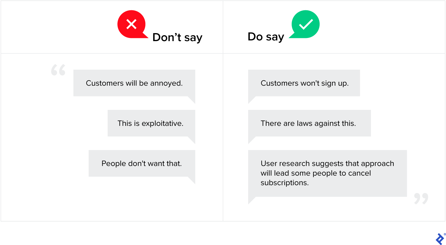
Underscoring risk also mitigates gray patterns. If a client requires people to enter nonessential personal information to sign up for an app, informing them that the requirement will annoy customers won’t get you very far. To highlight the business consequences, try: “This is a risky move. I expect a certain percentage of users won’t finish signing up because of this mandatory information. Why don’t we make the fields optional and allow users to customize their profiles later?” To illustrate the point, show them an app that handles personal information well. The client is more likely to change their mind when they see a successful product’s elegant UX.
Another strategy is to encourage user research whenever possible. Customers aren’t usually shy about their experience with a product. Sharing their input with stakeholders enables designers to act as messengers: “Don’t take my word for it—read what these customers said.” Aim to shorten the customer feedback loop and assess products using Lean UX principles. Then recommend a solution. It’s up to business leaders to choose the path forward, but first they need the insights to make an informed decision
Become the Person Product Managers Turn to for Advice
Designers who compromise and frame problems as business risks may find that product teams start turning to them for advice or to bounce around ideas—before problematic solutions move forward.
By implementing these strategies, you will develop a reputation for decreasing risk for the company while improving products for the user. As a result, leaders and product teams will come to view you as an asset and will be more open to your insights. When a business-minded designer stands up for the user in future conversations, it sends a strong message to the team: We’ve wandered too far into dark patterns.
Because so much public discourse about design promotes championing the user’s every need, junior designers may feel uncomfortable taking a business-minded approach with their clients or employers. But doing so builds trust with collaborators and avoids alienating product teams, an outcome that would make advocating for the user all but impossible.
What If the Problem Is Bigger Than Bad UX?
Companies may resist user-friendly design principles and ethical business practices. In such cases, it’s important to remember that design has limitations.
Design can’t…
…change a company’s culture
Design teams that want to make a company more empathetic and less exploitative often recruit people to act as user champions in a corporate environment where dark patterns are the modus operandi. Be wary of those jobs, and expect them to come with a lot of tension. With persistence, corporate cultures can be nudged toward the lighter end of the UX spectrum. But attempting to change a company’s culture with design is an uphill battle, even for designers who enjoy a challenge.
…fix a broken business model
Good UX may compete with business objectives, such as demonstrating rapid growth ahead of an investor meeting. For better or worse, it’s the short-term key performance indicators that keep management up at night. This reality shouldn’t stop designers from pushing for excellence, but they must be aware that most business structures favor easily quantifiable short-term profit over longer term sustainability.
…improve practices by cleaning up the company image
Some corporations and startups implement privacy half-measures—changes that benefit users but aren’t comprehensive. This action fosters a public appearance of protecting users, even if the company prioritizes short-term growth over providing value to customers.
For example, it sounds positive when social media platforms allow users to adjust settings for increased privacy. But if those platforms don’t make privacy the default, users must first be aware of their settings and then navigate and tweak complex options in order to benefit. The other problem? We don’t know what’s missing from a company’s privacy statements. Splashy public announcements may shroud questionable practices by making users feel like they’re controlling their own data when in reality, they’re not.
Seek Opportunities at Value-Aligned Organizations
It’s easy for experienced designers with financial security to demand that others never compromise. But being the staunch user champion isn’t realistic for many—especially those building their careers or freelance businesses. Besides, it takes a team, and the right culture and leadership, to create excellent products.
Most people want to be proud of the work they do. Designers who find themselves constantly putting out dark UX fires should continue to build their skills until they are able to join companies that align with their values. Whether or not designers align with a company’s values, they can use the strategies I’ve outlined to communicate with stakeholders and mitigate poor design choices. By reframing the conversation and assigning business value to good UX, you can convince stakeholders that user-centric products are indeed worth championing.
Further Reading on the Toptal Blog:
Understanding the basics
A user champion prioritizes users’ agency and privacy in product design. UX designers should champion the user by default, since their role includes identifying bugs, avoiding dark patterns, and creating a positive experience.
Social media and other apps accessing users’ clipboards even when the app isn’t open is an example of a dark pattern. Other common examples include hidden costs and bait-and-switch.
In addition to equipping themselves with technical strategies for avoiding dark patterns, designers often need to persuade business stakeholders to adopt their recommendations. Compromising where appropriate and framing UX problems as business risks can help designers communicate effectively with business leaders.
Melbourne, Victoria, Australia
Member since January 13, 2020
About the author
Damir is a digital designer who has created payments systems at Booking.com, open-data portals for Australian state governments, and the search experience at Envato Market. He has also facilitated design sprint workshops at Harvard University, been a lead UX instructor at General Assembly, and led AR/VR design at Archimedes Digital.
Expertise
Previous Role
Lead Product StrategistPREVIOUSLY AT