In the Spotlight: The Principles of Dark UI Design
Dark themes can be dramatic and elegant, but crafting them comes with many hurdles and potential pitfalls. Following the principles of dark UI design will help designers achieve successful results.

Dark themes can be dramatic and elegant, but crafting them comes with many hurdles and potential pitfalls. Following the principles of dark UI design will help designers achieve successful results.

Miklos is a design leader, author, and speaker with more than 18 years of experience in the design field.
PREVIOUSLY AT

Dark UI designs are seen far and wide, from mobile screens to massive TVs. A dark mode UI can express power, luxury, sophistication, and elegance. However, designing for dark UIs presents multiple challenges and won’t meet expectations if implemented poorly. Before diving into the “dark side,” designers should look before they leap.
Physicists say black isn’t really a color; it is the absence of light. In his experiments shining sunlight through prisms, Sir Isaac Newton didn’t even include it on the spectrum of colors.
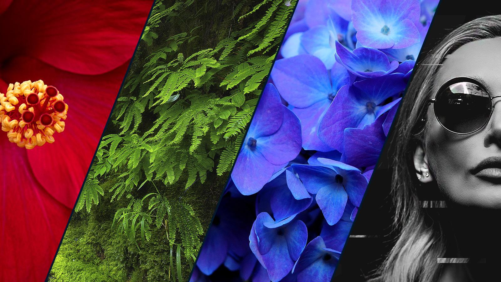
In color psychology, most colors represent different things for different people. In Western cultures, black is often associated with death, mystery, and evil. Green is often associated with growth because of nature. Blue is almost universally calming because it’s associated with sky and water. Color is emotional.
Other effects are cultural. Purple, for example, is still associated with luxury because in many ancient cultures, purple dye was expensive and rare—only royalty could afford it. It was a significant part of the cultural zeitgeist for long enough to become a part of the human psyche.
Digital products with dark UIs—associated with power, elegance, and mystery—are a formidable trend. While it’s often said that dark mode UI design can reduce eye strain, there is no evidence that this is true. Under certain circumstances, it’s also supposed to save battery life. Still, more often than not, dark themes are an aesthetic choice.
Dark UI vs. Light UI
Not all interfaces are suitable for a dark theme. Designers should look at brand fit, cultural suitability, and color psychology and consider the emotional impact before choosing to go with one. It’s a tricky balancing act.
Whereas a financial app targeting millennials may achieve the cool factor with a dark theme, it may be inappropriate for a big bank’s website aimed at the general population. Too rich, too dark, and too stylish may become more frustrating when all people want to do is check their balances and pay a bill.
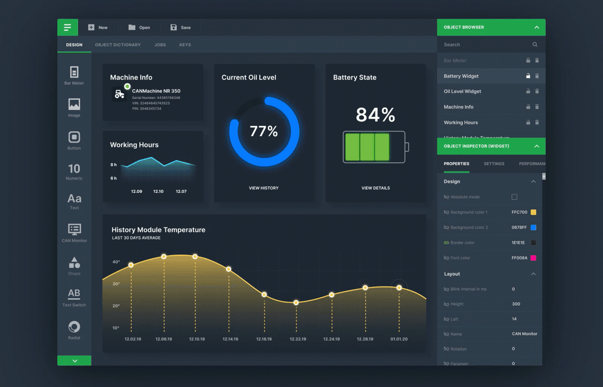
B2B SaaS application dark UIs are notoriously difficult to design. Standard web UI components such as data tables, widgets, forms, and dropdowns can look odd on a dark UI. Because many color schemes don’t work well with dark UIs, certain brands and products—depending on type, context, and environmental factors—are not a good fit and may prove an insurmountable challenge.
Designers who have not worked with dark UI design before and decide to jump in with both feet might find themselves in rough, uncharted waters. In the oceans of dark UIs, norms are bent, rules are changed, and pitfalls are aplenty.
That said, there are many good reasons for using dark UIs:
- When the design is sparse and minimalist with only a few content types
- When it is appropriate for the context and use, such as nighttime entertainment apps
- To create a striking, dramatic look
And, there are scenarios when it’s not recommended:
- When there is a large amount of text (reading on a dark background is difficult)
- When there is a lot of mixed content types
- When the design calls for a wide range of colors
Contrast in Dark UI Design
A dark theme UI is not a black theme. It would best be thought of as a “low-light” theme. One of the main concerns with dark UIs is achieving enough contrast so visual elements have separation and text is legible. Most designers would think using black would be optimal to achieve strong contrast. However, it’s best not to use true black (#000000) for backgrounds or surface colors. Black is best reserved for other UI elements and used sparingly. For example, true black can be used for small UI elements or a surrounding bezel.
Google’s Material Design dark theme recommends using dark gray (#121212) as a dark theme surface color “to express elevation and space in an environment with a wider range of depth.” In addition, many designers recommend adding a subtle dark blue tint to dark grays when defining the dark mode color palette. It tends to create a better dark tone for digital screens and a more pleasing dark them color palette.
An advantage of using a range of grays is that it gives designers latitude because a broader range of colors can be expressed. A gray palette also helps create depth because drop shadows can be more easily seen against gray vs. black.
Particular attention needs to be paid to text contrast in dark UIs.
Web Content Accessibility Guidelines (WCAG) call for “the visual presentation of text to have a contrast ratio of at least 4.5:1,” except for large-scale text, which should have a contrast ratio of at least 3:1. Therefore, designers need to ensure that content remains comfortably legible in dark mode.
It’s also a good idea to test for proper contrast between other UI elements, such as cards, buttons, fields, and icons on various displays and devices. If there is an imperceptible separation between UI elements, the design blends too much and risks becoming dull.

Focusing Attention: Color
Color stands out in dark UIs. It’s best to use schemes with lighter, unsaturated accent colors. Avoid using saturated colors in dark UIs, as they can visually vibrate against dark surfaces. What’s more, as a best practice, colors need to pass the WCAG’s AA standard of at least 4.5:1 when used with text.
When defining a color scheme for a dark UI, Google recommends a limited number of color accents to keep most of the space available for dark surfaces. Using split complementary colors can help. The scheme has one dominant color and two colors adjacent to the dominant color’s complement. Doing this provides the needed contrast without the tension of the complementary color scheme.
The right color scheme can help create good contrast. Colorable is a helpful tool for selecting accessibility-compliant color combinations of text and background colors.
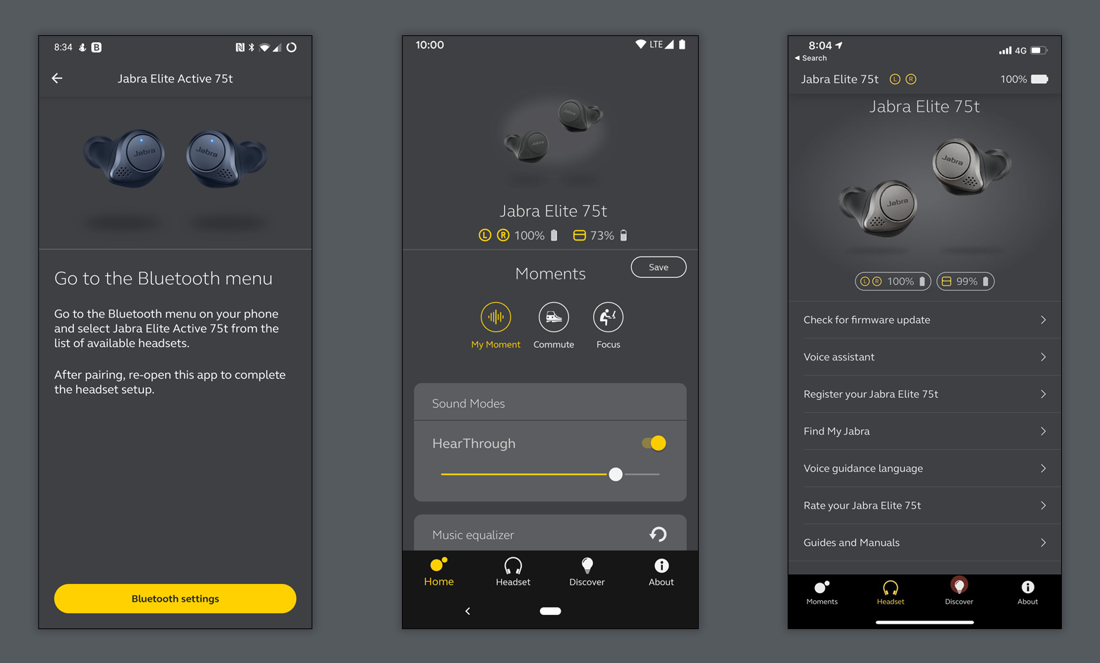
Text and essential elements, such as buttons and icons, should meet legibility standards when appearing on dark backgrounds. As seen in the Jabra Sound+ app above, colors other than white can be used for text and icons.
Google’s Material Design site has a useful color palette generator (under “Tools for picking colors”) with which designers can create and apply color palettes to a UI. The accessibility level of color combinations can also be measured with a companion Color Tool.
“Use strongly contrasting colors to improve readability. Many factors affect the perception of color, including font size and weight, color brightness, screen resolution, and lighting conditions.” Apple Human Interface Guidelines
Less is More: Leveraging Negative Space
One of the fundamental elements of successful dark UI design is the adroit use of negative space. If designed poorly, dark UIs can make digital products appear heavy and overbearing. To counterbalance, designers can make dark UIs more lightweight by taking advantage of negative space within sparse, minimalist designs. Minimalist design is just as much about what isn’t there as what is. When used skillfully, negative space will make a dark UI more scannable and allow people to absorb information more easily.
The French composer Claude Debussy once said, “Music is the space between the notes.” The same sentiment is true for scannability—negative space between elements is what makes a layout work. A liberal amount of negative space around UI elements is what gives them definition. It emphasizes important content and provides the necessary breathing space to ensure the design doesn’t feel dense and cluttered. Without breathing space, the human brain is less likely to scan points of interest and more likely to wander.
Interfaces crammed with too many elements and text are the bane of high-quality dark UI design. By carefully considering the visual hierarchy in dark UIs, designers can make their creations more easily scannable, thus elevating the user experience.
Styling Words: Typography
Every piece of text in dark UIs requires scrutiny. The concern is twofold: legibility and contrast. First, it’s about the size. Text needs to be large enough for good legibility (small text on dark backgrounds is harder to read). Second, there needs to be enough contrast between the text and the background.
The availability of thousands of digital fonts makes it easy to display messages with impact for headers and hero messages. Designers can mitigate readability issues by increasing the contrast and adjusting the font size, character spacing, and line-height for smaller text.
The W3C AAA recommendation for regular-sized text (less than 18 point if not bold) is to have a contrast ratio of at least 7:1. This also applies to other UI elements: icons, images of text, and text labels, such as button labels. It’s incumbent on designers to ensure that all digital products are accessible to everyone. It not only improves usability, and therefore UX, it’s the law in most countries.
There are countless options available for designers to source excellent typefaces that work well in dark UIs. Google Fonts, Font Library, and Adobe Typekit are a few that offer easy app or site integration and a wide range of choices.

Communicating Depth: Elevation
A dark theme doesn’t mean flat. With light themes, illumination, shading, and shadows create a sense of depth. With dark UIs, it is more challenging because they contain predominantly dark surfaces with sparse color accents. Still, designers can use three or four levels of elevation with corresponding color schemes for text to convey depth.
Why depth? Most modern design systems use a system of elevation levels to communicate depth. A sense of depth corresponds with the natural world. Our vision has depth perception, and we live in a 3D world. Depth helps to emphasize the visual hierarchy of an interface. Elements in the foreground, for example, draw attention to themselves, such as a warning dialog.
The surfaces are illuminated differently to signify different elevation levels. The higher a surface’s position in the elevation stack (closer to an implied light source), the lighter the surface. A brighter surface makes it easier to distinguish elevation between components, and it helps to see shadows, making the edges of each surface more apparent.
Devising each level’s surface color requires care. It’s best not to have more than four or five levels. Designers need to account for text contrast as surfaces go higher in the stack and get lighter. If the background color is not dark enough to meet a contrast level of at least 15.8:1 between white text and the surface, text at the highest (and lightest) elevated surface won’t pass the 4.5:1 standard. In some instances, it might be best to specify an element’s text color as true black (#000000) in the design system to achieve good contrast on a light gray background.
Dark UI Design Inspiration
Reflecting on the principles outlined above, here are some excellent examples of dark UI design:
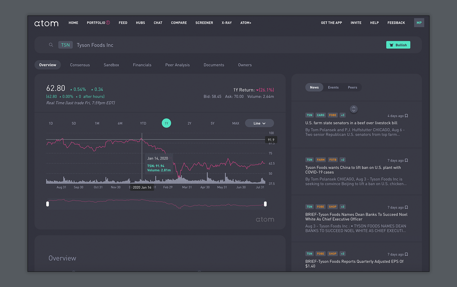
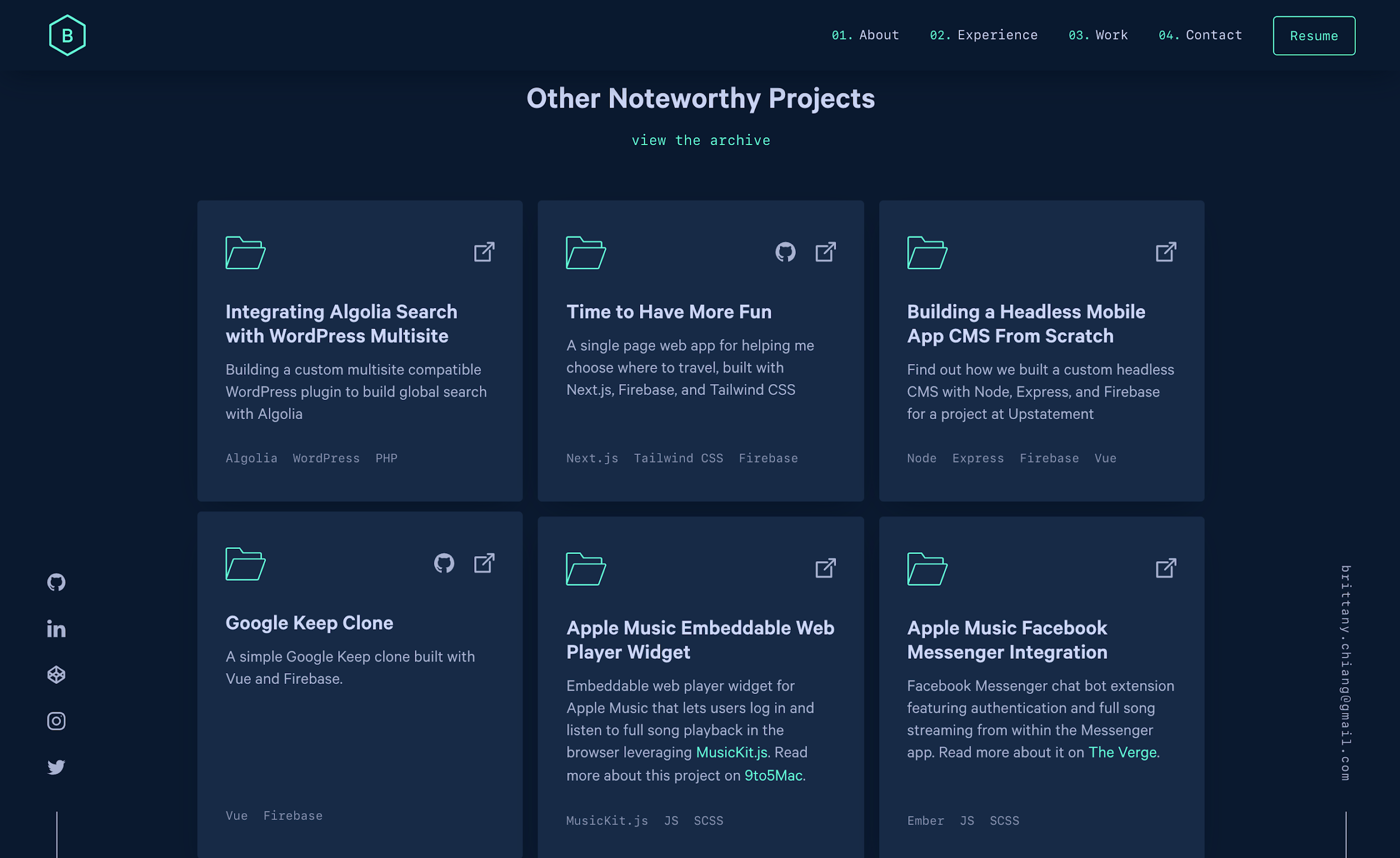
Atom Finance leverages a dark theme for a sophisticated look and limits its accent colors to three. The layout uses negative space and a sparse, minimalist design for a complex financial website. The site uses subtle shading well to indicate different component elevations in the UI.

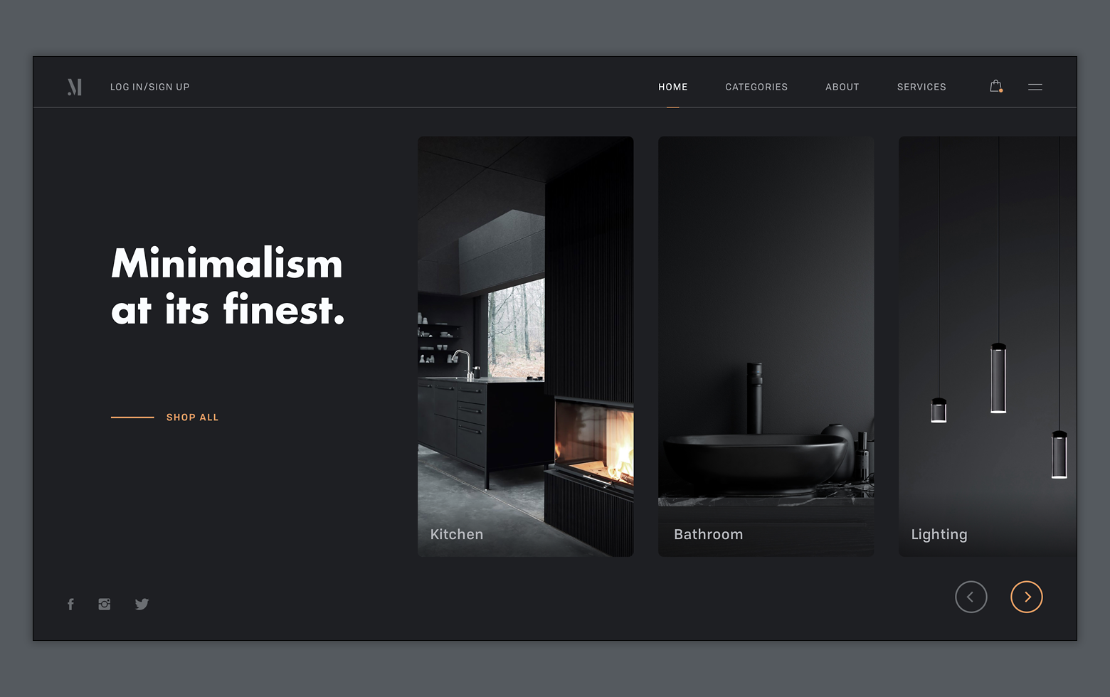
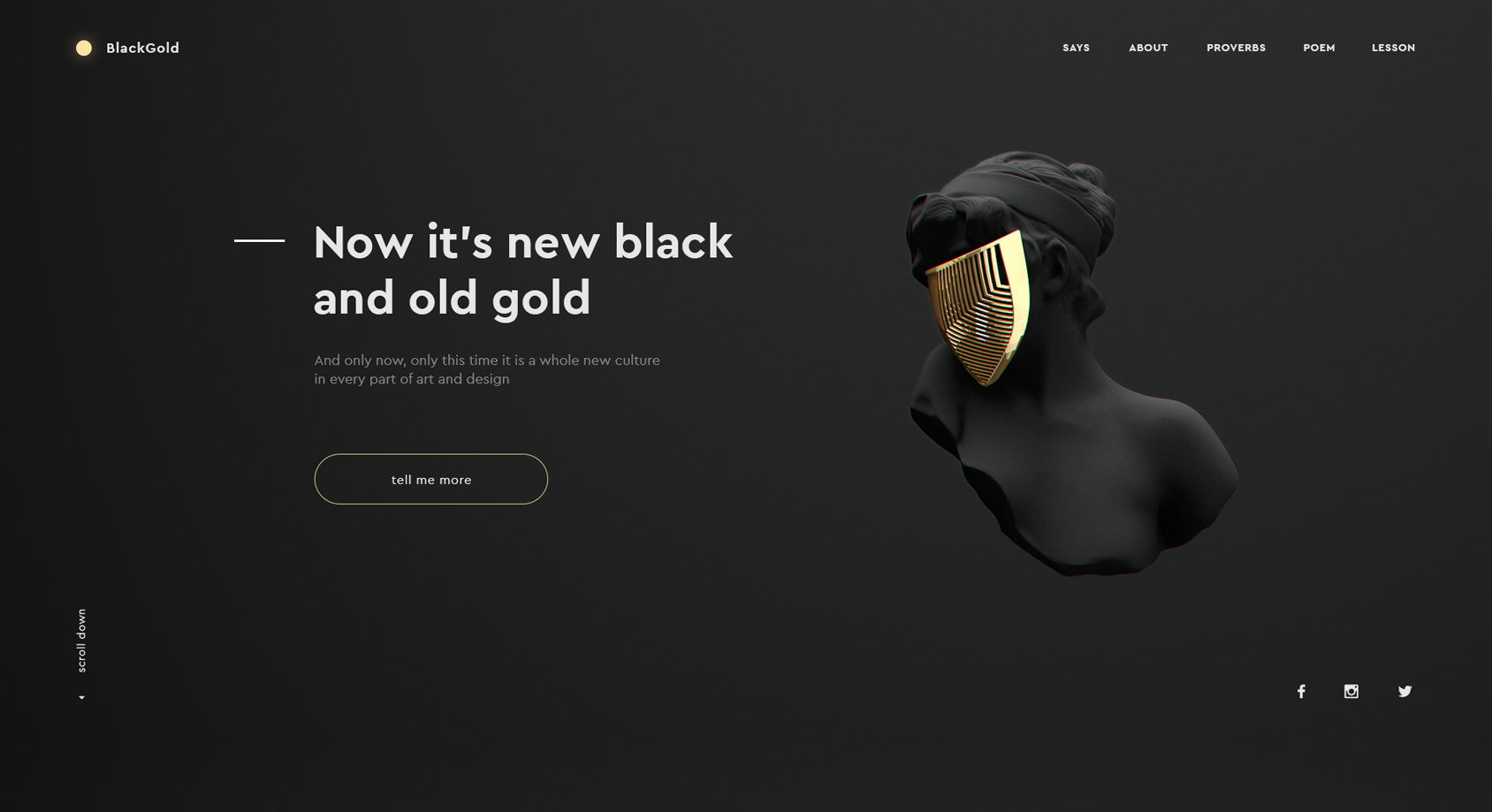
Both of these minimalist dark theme websites use bold typography. Careful shading with a single accent color is used in alignment with dark UI design best practices.
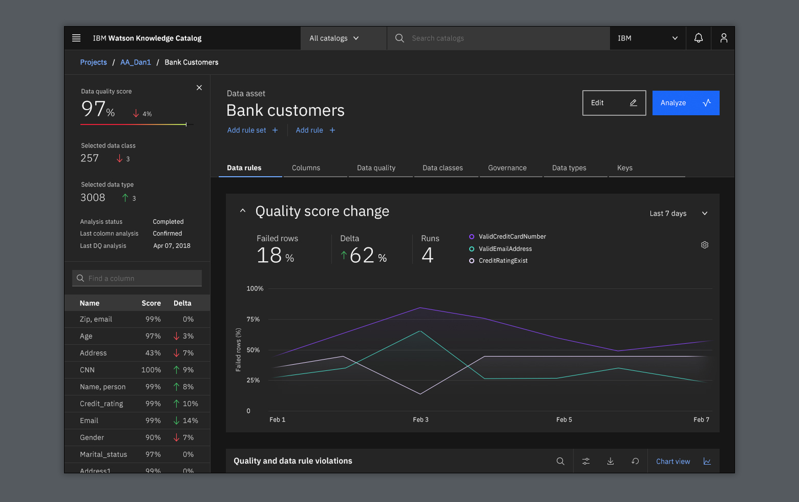
Despite the challenges of working with dark themes for SaaS applications, this data visualization dashboard for IBM is exemplary. The number of accent colors is kept to a minimum, and the site uses subtle shading to show different UI elevations.
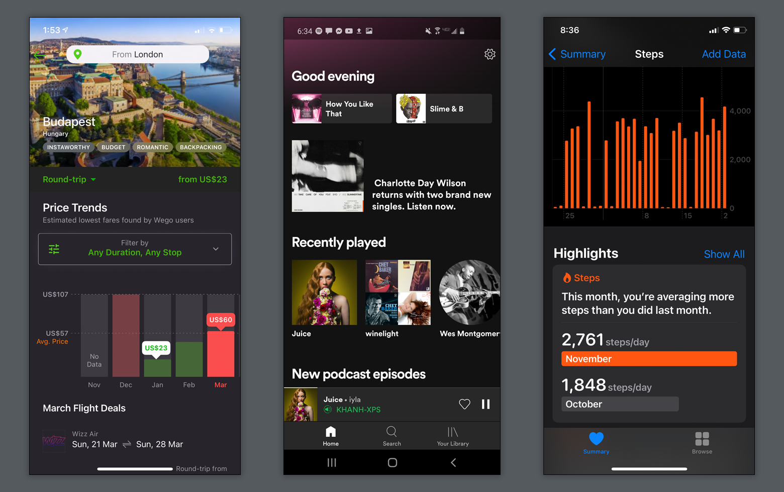
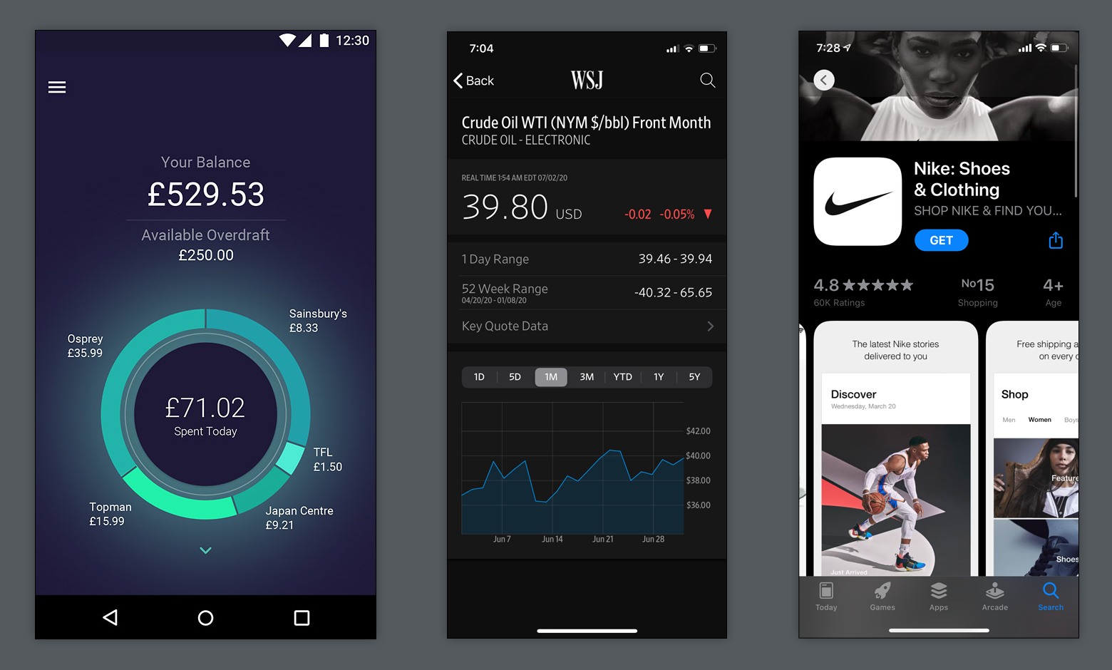
These mobile apps observe dark UI design best practices by using true black for bezels only, proper shading of elements for different elevation levels, and a limited number of accent colors.
Summary
The decision to use a dark UI design over a traditional one needs to be approached with discretion. It shouldn’t be chosen for the wrong reasons—to be hip, different, or mimic someone else’s design. Designers should have a strong rationale for their choice and consider the content, context of use, and the device on which the design will appear.
Dark themes are suitable for some digital products but a real struggle to implement for others. Simplicity is key. They’re great for presenting minimalist content, data visualizations, media sites, and entertainment platforms. They’re a poor fit for complex, data-heavy B2B platforms, text-heavy pages, and lots of varied content.
For courageous designers ready to cross new stylistic frontiers and explore dark UIs through an emotional and aesthetical lens, they offer an exciting playground of infinite possibilities—on the “dark side.”
Let us know what you think! Please leave your thoughts, comments, and feedback below.
Further Reading on the Toptal Blog:
Understanding the basics
How do you make a dark UI?
When designing a dark UI, a set of dark grays needs to be established as a foundation for the dark UI color palette. Second, two or three unsaturated primary accent colors need to be determined. Third, designers should keep designs sparse and minimal and ensure that all text has good contrast for legibility.
Is dark mode good or bad?
Digital products with a dark mode are not necessarily good or bad but need to be carefully considered for cultural suitability, brand fit, and emotional impact. For example, a dark UI color palette—often used by luxury brands—can work well because it represents power, sophistication, style, and elegance.
What are UI colors?
An interface’s color palette contains colors determined by the UI designer to serve a particular design best. They’re an aesthetic as well as a user experience design choice. Known as the UI color scheme, UI colors are typically designed to highlight UI elements such as buttons and define text colors.
What is the main role of color in UI design?
As used in a dark UI color palette, the primary role of UI colors is to give UI elements definition and contrast to make an interface aesthetically pleasing. Colors in UI design can be assigned to text, buttons, icons, and other UI components. This color system is known as the UI color palette.
What is the proper way of choosing and using color for UI design?
Colors for UI design are typically chosen according to the brand color scheme, aesthetic, and stylistic needs. Color psychology is also considered, as it plays an influential role in UI design. For example, for a dark UI color palette, a set of dark gray shades are chosen along with two or three accent colors.
Miklos Philips
London, United Kingdom
Member since May 20, 2016
About the author
Miklos is a design leader, author, and speaker with more than 18 years of experience in the design field.
PREVIOUSLY AT