Leveraging Mental Models in UX Design
Users form mental models around how products should work through use. In order to design for maximum usability, designers need to understand and leverage users’ mental models.
Users form mental models around how products should work through use. In order to design for maximum usability, designers need to understand and leverage users’ mental models.
Scott has more than a decade of experience in UX/UI design and front-end development and is a Google Analytics certified professional.
PREVIOUSLY AT

Whether it’s innovating a new product or optimizing an existing one, UX and UI designers should leverage their product users’ knowledge of familiar products and interfaces. The payoff is smoother interactions, faster adoption rates, and better overall usability.
Users know how your product works and how to use it even before you design it. At least, they should. Designers want to be exciting and original, but users will always approach new products and features based on what they’ve used before (it’s called a “mental model”) and for this reason, designers should work with user expectations.

What Is a Mental Model?
A mental model is based on belief, not facts: that is, it’s a model of what users know (or think they know) about a system such as your website. – Nielsen Norman Group
Through the habitual use of the multitude of products that exist today, a user’s brain develops mental models for how products function. These mental models are formed through the regular use of a system (such as a website, app, or even a more tactile user interface as in the car seat example above), and knowledge of how a system works.
Users will transfer expectations they have built around one familiar product to another that appears similar.
These days, it’s not uncommon to see small children who have likely spent more time interacting with touchscreen devices than books or regular televisions try to swipe flat screen TVs (or even books), and being surprised when swiping doesn’t work. Based on their exposure to touchscreen devices, the touchscreen generation have built up the expectation (the mental model) that swiping is how every box-like object should respond.
Even if they are confused by a book, these children probably have no trouble picking up an unfamiliar touchscreen device. This isn’t because they’ve spent time learning to use every individual device but because they got to know a particular one and how it works. Their brain stored a mental model for an operation, and they’re able to successfully apply that to other devices utilizing the same or similar patterns and sequences.
Individual users each have their own mental models, and different users may construct different models of the same user interface. Further, one of usability’s big dilemmas is the common gap between the designers’ and users’ mental models. – Jakob Nielsen, Nielsen Norman Group.

Designers are immersed in design projects and regularly form mental models of their own. They also acquire them from common interaction design patterns utilized by other designers. In a way, this can create a “designer bubble.” It’s easy to fall into the trap of designing something that makes sense to other designers, but which nevertheless may confuse the average user.
People have unique mental models generally formed by education, experience, age, and culture. The average user is not as well-versed in the subtle UI patterns familiar to designers living in the aforementioned “designer bubble.” In order to empathize with users and design for maximum usability, designers need to shrink the gap that exists between the designer and user mental models.
In order to align with users’ existing mental models, the design process should incorporate an understanding of users’ expectations around the way a product is going to work. This is especially important as part of UX research methods used to uncover user needs and pain points.
Misaligned User Mental Models
Misalignment of mental models occurs when there is a discrepancy between a user’s mental model and how a design actually works. This kind of disconnect creates usability problems, as the product doesn’t align with the user’s expectations and existing knowledge. The window for capturing a user’s attention and confidence is small, so misalignment can spell disaster.
For example, most people have used enough eCommerce systems that they have developed expectations for how the experience flows. Surprising users with an unexpected flow could potentially mean a drop in conversions and sales.
Today, most shoppers have an expectation of optional registration based on previous experiences and prefer not to spend their time filling out forms but check out as a guest. According to a survey by Econsultancy, 25% of shoppers abandon their purchases when forced to create an account before going through the checkout process.
In a case study by User Interface Engineering, when a “Register” button was replaced with a “Continue” button in a checkout flow, that minor adjustment created a $300 million boost in revenue. Based on previous experiences, shoppers had a mental model of the process that would follow after clicking the “Register” button—typically a time-consuming registration process that would be necessary before purchasing the product. These negative expectations caused shoppers to abandon their cart.
In another example, Snapchat recently got significant pushback after making major changes to their UI. Users wanted Snapchat to look and operate like the previous version to which they’d grown accustomed, and existing mental models didn’t align with the new release.
The result? Users were confused, made to feel inept, and the change led to a mass exodus from which the company may not recover.
To recap—people have expectations and mental models that are based on previous experiences using a specific product. Unexpected surprises in the UX or UI can lead to confusion and frustration and companies pay the price.

Improving Misaligned Mental Models
Usability testing and other UX research methods help reveal discordance between the designed experience and users’ mental models. Furthermore, gaps between mental models can be improved with interactive tours, careful onboarding, real-time feedback, and/or signifiers to assist in learning new product features and a new UI.
Updates and design changes don’t have to cause chaos for users. Instead of forcing a change, it’s advantageous to give users the opportunity to to update software when they are ready. When a user is able to consciously choose when an interface may change and potentially challenge their existing model of a familiar product, they are more aware of as well as empowered by the new design.

Google recently overhauled its Google Calendar. The redesign brings some of the most significant design changes in a decade to a product used by millions worldwide. Rather than foisting it upon its users, for whom a drastic change in something so essential could add friction and frustration, they alerted users to the imminent changes. Google allowed users to switch between the old version and the update for several months before finally replacing the old version completely.
Making older versions of a product compatible and available, and allowing users to continue using a familiar version for a limited time, can maintain trust. Allowing and empowering users to decide when to learn the new interface will help them feel as if they’re still in control of the experience.

Making sweeping, large-scale changes to existing designs that users have become familiar with could violate users’ existing mental models. To minimize the risk of upsetting users, companies may consider letting out minor adjustments through several updates or testing changes with smaller groups.
Facebook has been quite successful in its use of this strategy. “Reactions,” for example, were implemented and tested extensively in specific territories before they were released worldwide. Although minor adjustments happen frequently, Facebook is careful about rolling out major updates that can disrupt users’ mental models. Launching changes through multiple releases can minimize the number of mental models that need to be improved.
Designing on a Foundation of Mental Models
Jakob’s Law of the Internet User Experience states that “users spend most of their time on websites other than yours. Thus, a big part of customers’ mental models of your site will be influenced by information gleaned from other sites.”
Simply put, the goal of UX designers is to create a process that allows users to accomplish their goals quickly and easily. People are creatures of habit, and leveraging user mental models means that users will know how to use a product before they’ve ever used it.
Mental Model Research
It’s common for UX designers to create journey maps and empathy maps, and to use data to help identify user pain points when creating a new product (or improving one). When it comes to mental models, the same UX research methods and processes can be applied to the study of existing competitor or peer products.
When designing a new product, studying an existing system can potentially save designers a lot of time and money since it can eliminate the need to create new prototypes from scratch in order to test new concepts. Watch how users interact with existing designs to find out what they may expect from something similar.
Designers can attempt to improve on solutions that already exist. Additionally, as long as the target demographic is the same, mirroring well-known systems means that little testing has to be done to verify the usability of core functionalities.

Mirroring Existing UX
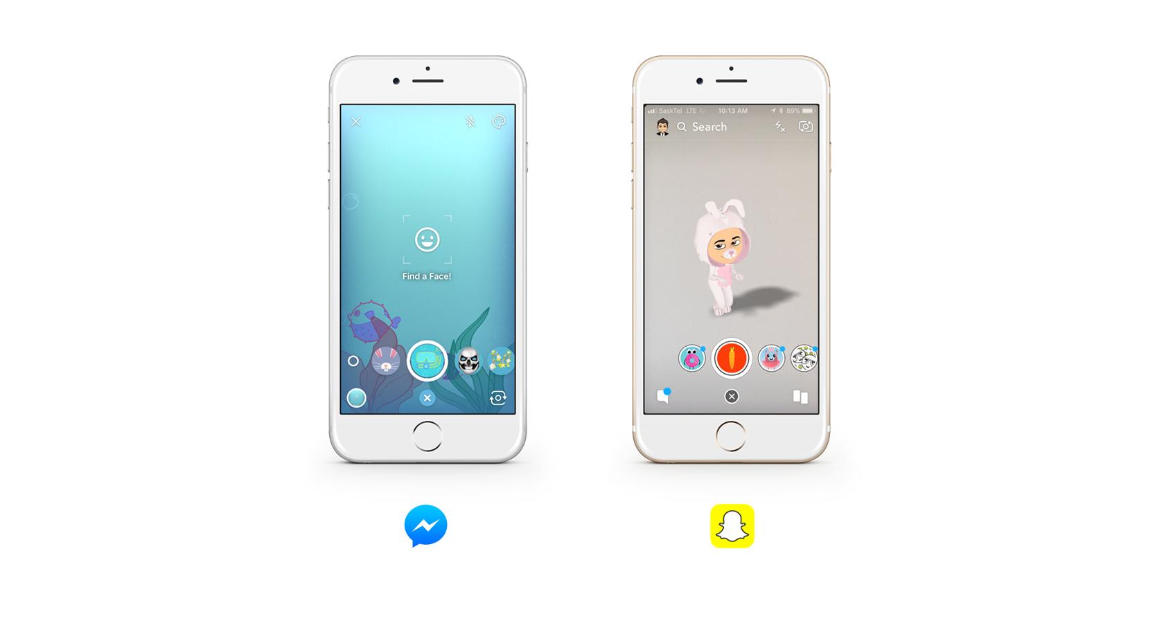
The world’s most popular apps are directly influenced by one another, and they regularly implement designs based on existing mental models. For example, Facebook introduced the interaction pattern of “Likes,” which were then copied by LinkedIn and Instagram.
Twitter introduced hashtags, which were then copied by Facebook and Instagram. Tagging was introduced by Twitter and then copied by Facebook, LinkedIn, Instagram, and others. Instagram introduced stories, and then Facebook implemented those. Snapchat introduced photo filters and manipulation, and then Facebook copied those.
In almost all of these instances, there is very little variation in the adoption of these features. Facebook and Twitter are very competitive, and they’re always looking to capitalize on each other’s success. Facebook is methodical at mirroring a competitor’s product experience, and when a new, successful app emerges, if they’re unable to acquire it, that is exactly what they will do.

Recent statistics show that Facebook has more than 2.2 billion monthly active users. The application is so popular that it has influenced many designs today because users have expectations around the paradigms that familiar products like Facebook have established.
For example, due to Facebook’s design influence today, it’s pretty standard to find the notification icon in the top right corner near the login area on many different desktop applications. Status updates, news feeds, and likes are also increasingly common patterns in other applications.
LinkedIn could have designed personal updates, news feeds, or notifications any way they wanted. However, capitalizing on their success, large user base, and users’ existing mental models, they chose to create an experience that directly mirrors Facebook.
Unless there is a specific reason to circumvent what the user has come to expect, referencing familiar patterns allows the designer to focus users on more important, unique features of the product. Even if someone has never used LinkedIn, their knowledge of Facebook will mean that everything is familiar.
Mental Models and Skeuomorphism
Skeuomorphism is a term that is used to describe interface objects that mirror real-world counterparts in how they appear and/or how the user can interact with them. This design concept capitalizes on users’ existing knowledge and mental models of an actual object so they don’t need to learn a new interface.
Many digital UI elements reflect real-world counterparts. This isn’t because designers lack imagination, but they realize a UI element detached from any analogs in the physical world means more effort on the user’s part in order to interpret what they are seeing. Incorporating a switch in a digital UI that looks and acts like a light switch that someone may find in their home dramatically cuts the cognitive load for that user. The visual metaphor is there, and they immediately know what it’s for.

This principle should be used in moderation, but can be quite effective for usability if applied properly. Skeuomorphism implies that the UI both looks and functions like its real-world counterpart. However, designers need to be careful with this mental model theory, as discrepancies in functionality or appearance can actually detract from a design’s usability.
Skeuomorphic design is common in professional audio production applications. Digital plugins often emulate analog gear, such as compressors, equalizers, and reverb units. In the image below, the digital plugin on the bottom left utilizes skeuomorphic design to emulate the top unit.
The use of skeuomorphic design elements enables users to apply mental models that exist from operating a real-world sound compressor. The image on the bottom right uses a unique design that isn’t based on any existing piece of gear. Because of this, even if they had used a real-world physical counterpart, users would have no foundational knowledge of the interface and would need to spend additional time and effort to learn it.

Foundational Creativity and Innovation
In order to maximize usability, it’s important to design on a foundation of mental models. Creating and innovating within existing mental models and standards can bring about new and exciting products that still align with user expectations. Violating those mental models should be done strategically and only when necessary.
For example, most people have developed a mental model of volume sliders. In the example below, the slider on the left represents the mental model that most people would have for a volume slider. The middle slider was designed as a joke, but it illustrates an important point.
The slider completely contradicts mental models and user expectations, as it appears like a vertical slider, but instead, it operates horizontally. The slider on the right is taken from Apple’s iOS. Apple used creativity and innovation to design something new and original, but it still respects the latticework of mental models that forms the shared expectation of how a volume slider operates.

Final Thoughts
Conducting UX research on established designs will help clarify existing mental models and enable designers to leverage those of their product users’. The findings, in turn, will help designers optimize the usability of any digital product.
Designers who ignore mental models do so at their peril. Leveraging existing mental models as a foundation for creativity and innovation could enable designers to improve existing products as well as help them design exciting new ones.
Further Reading on the Toptal Blog:
Understanding the basics
What is the mental model of the user?
The mental model of the user is what expectations the user forms around how a product or experience should behave. This mental model is usually formed through use of similar products or usage patterns or by engaging in similar experiences that help the user form an idea of how things are most likely to work.
What is a shared mental model?
Shared mental models are expectations that groups of people form around certain interactions, patterns, and experiences that are shared through a common culture or geographical location.
Why are mental models important in interface design?
Understanding users’ mental models is important in interface design because it helps designers empathize with how their audience expects things to work. This gives useful hints for designers to build experiences and interfaces that are intuitive, predictable, and therefore highly usable for their audience.
What is user research?
User research or UX research is the practice of investigating users’ needs, expectations, and pain points in order to design optimal experiences to help users achieve their goals. User research takes a variety of forms and may include observation, user interviews, surveys, and usability tests.
What is qualitative user research?
Qualitative user research is research that goes beyond quantitative research to explore the “whys” of user behavior. This research often incorporates qualitative capture methods such as contextual observation, user surveys, interviews, guided task completion, and usability testing.
Scott Benson
Moose Jaw, SK, Canada
Member since April 11, 2017
About the author
Scott has more than a decade of experience in UX/UI design and front-end development and is a Google Analytics certified professional.
PREVIOUSLY AT


