Mobile App Design Best Practices and Mistakes
Following some basic mobile app design best practices and avoiding the most common mistakes will help designers create apps that live past the crucial 90-day mark when 71% are abandoned.
Following some basic mobile app design best practices and avoiding the most common mistakes will help designers create apps that live past the crucial 90-day mark when 71% are abandoned.

Cameron Chapman
Cameron comes from a design background and is the author of two web design books: Color for Web Design and The Smashing Idea Book.
Expertise
Listen to the audio version of this article
In 2017, more than 91 billion apps were downloaded from the iOS App Store and Google Play (which doesn’t include all of the third-party app stores and app stores for other platforms). That’s a lot of apps—roughly 13 per person—on the entire planet. With so many apps being downloaded, it’s no wonder that the average app has a churn rate of 57% in the first month (users who don’t open the app more than once during the first 30 days after downloading it) and a whopping 71% after 90 days.
If any part of an app is undesirable, or slow to get the hang of, users will opt to install a new one rather than stick it out with the imperfect product. Nothing is wasted for the consumer when disposing of an app, other than possibly a few dollars (and they know they can download the app again at any time). The only loss is the time and effort of the designers and developers.

So, why is it that so many apps fail? Is this a predictable phenomenon that app designers and developers should accept? For clients, is this success rate acceptable? What does it take to prevent your apps from being deleted without a second thought?
The most common mistakes span from failing to maintain consistency throughout the lifespan of an app to difficulty attracting users in the first place. It’s challenging to design an app with intuitive simplicity without it becoming repetitive and boring. An app has to offer pleasing design and UX details without losing sight of a greater purpose.
Most apps live and die in the first few days, so following some basic mobile app design best practices and avoiding the most common mistakes will help designers create apps that live past that 90-day mark.
Common Mistake #1: A Poor First Impression
Often, the first use or first day with an app is the most critical period to hook a potential user. The first impression is so critical that it could be an umbrella point for all of the other mobile design best practices. If anything goes wrong, or appears confusing or boring, potential users are quickly disinterested.
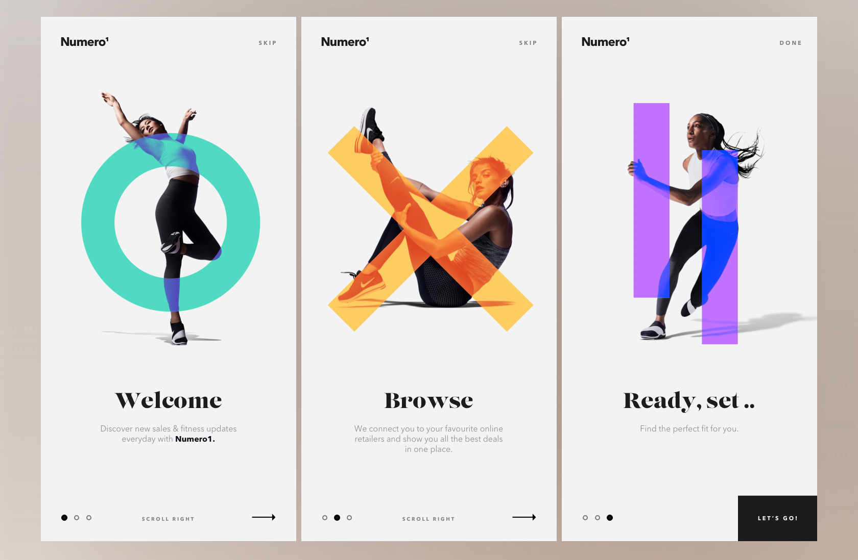
The proper balance for first impressions is tricky, though. In some cases, a lengthy onboarding process to discover necessary features can bore users. Yet without proper onboarding, some apps will just confuse users if they’re not instantly intuitive. Creating an app that is immediately intuitive while also introducing users to the most exciting, engaging features quickly is a delicate balancing act.
Although it can be a good way to get someone quickly oriented, drawn-out onboarding can also stand in the way of users doing what they want to do with the app. Often, these tutorials are too long and are swiped through blindly.
Keep in mind that when users first use an app, they don’t necessarily have any waypoints for how the app should function or what it can do. Proper beta testing process allows designers to learn how others perceive an app from the beginning. What seems obvious to the design team may not be for newcomers.
Common Mistake #2: Designing an App Without Purpose
Avoid entering the design process without clear intentions. Apps are too often designed and developed in order to follow trends rather than to solve a problem, fill a niche, or offer a distinct service.
For the designer and their team, the app’s purpose will affect every step of a project. It guides every decision, from the branding or marketing of an app to the wireframe format to the button aesthetic. If the purpose is clear, each piece of the app will communicate and function as a coherent whole.
Conveying this vision to potential users means that they will understand the value an app brings to their life. The vision needs to be clearly communicated from the user’s first impression. How quickly can the vision for the app be conveyed to users? How will it improve a person’s life or provide some sort of enjoyment or comfort? As long as an app’s usefulness is conveyed immediately to users, it’s likely to be part of the 21% of apps that make it past the first 90 days.
When entering an existing market, there are apps designed for that space designers can study as a baseline. They can improve upon what is already out there or provide a unique alternative in order to stand out. They shouldn’t thoughtlessly imitate.

Common Mistake #3: Failing to Optimize User Flow
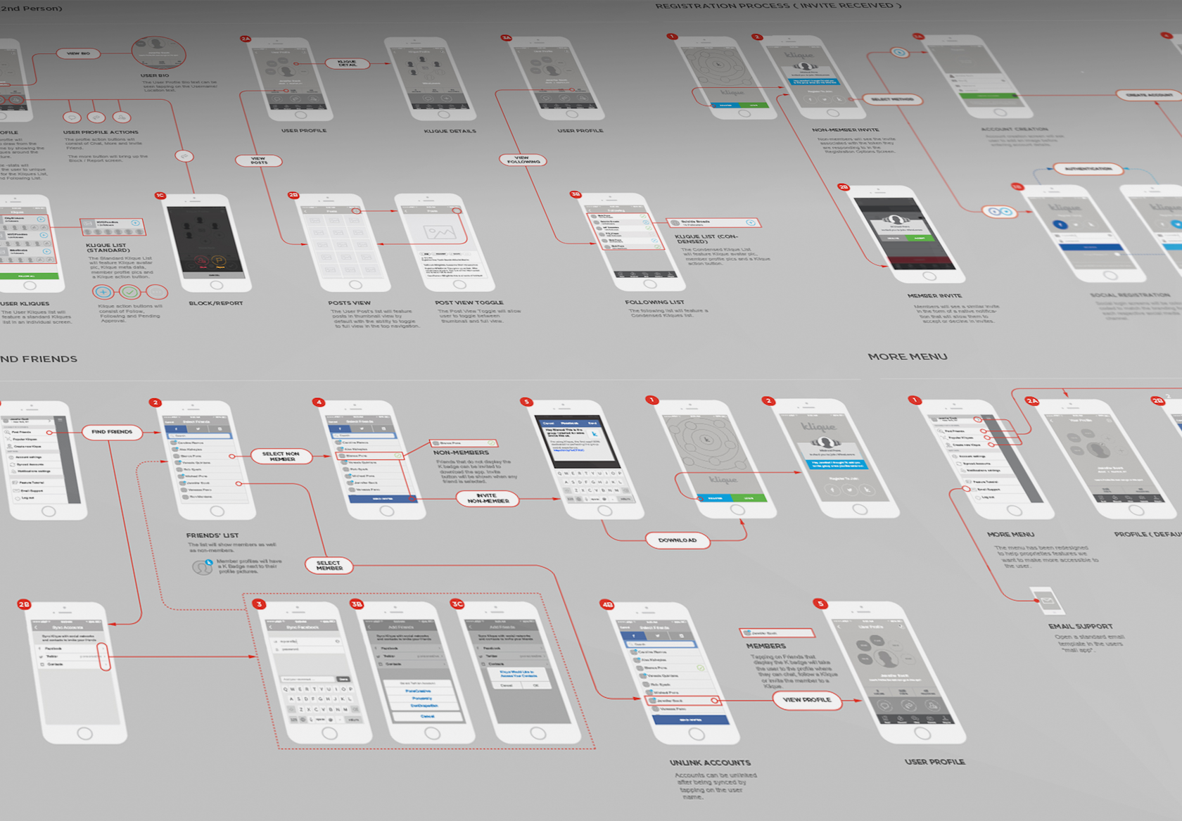
Designers should be careful not to skip over thoughtful planning of an app’s UX architecture before jumping into design work. Even before getting to a wireframing stage, the user flow and structure of an app should be mapped out. Designers are often too excited to produce aesthetics and details. This results in a culture of designers who generally under-appreciate UX and the necessary logic or navigation within an app.
Slow down. Sketch out the flow of the app first before worrying too much about the finer details. Apps often fail from a lack of flow and organization, rather than imperfect details. Once the design process takes off, always keep the big picture in mind. The details and aesthetic should then clearly evoke and reinforce the greater concept.
Common Mistake #4: Disregarding App Development Budget
As soon as the basic features and functions of an app are sketched, it’s a good time to talk about the budget with the development team. This prevents spending a ton of time designing features and UX patterns that end up needing to be cut when the development team doesn’t have the resources to implement them.
Learning the average costs of constructing particular concepts is a valuable addition to a designer’s toolkit, as it makes it easier to adapt design thinking to economic constraints. Budgets should be useful design constraints to work within, rather than viewed as frustrations.
Common Mistake #5: Cramming in Design Features
Hopefully, rigorous wireframing and prototyping will make the distinction between necessary and excessive functions clear. Each individual mobile platform is already the ultimate swiss army knife, so your app doesn’t need to be. Not only will cramming an app with features lead to a disorienting user experience, but an overloaded app will also be difficult to market.
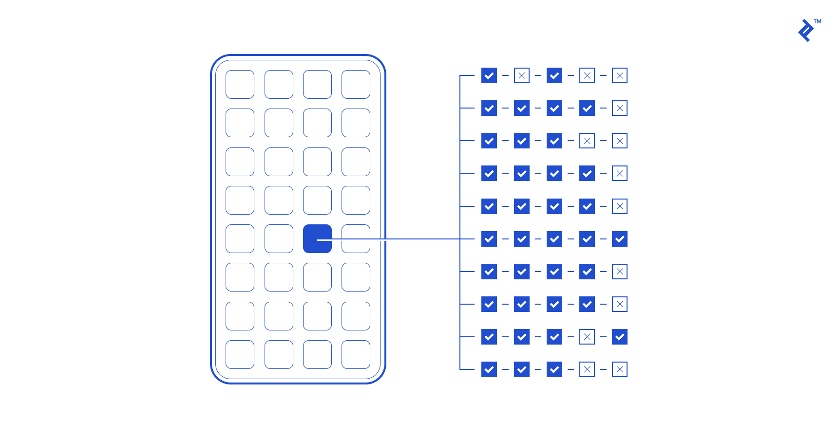
If the app can’t be explained in a concise way, it’s likely trying to do too much. Paring down features is always hard, but it’s necessary. The best strategy might be to gain users in the beginning with just one or two features before testing new additions in later releases to see what resonates with users. This way, the additional features are less likely to interfere with the crucial first few days of an app’s life.
Common Mistake #6: Dismissing App Context
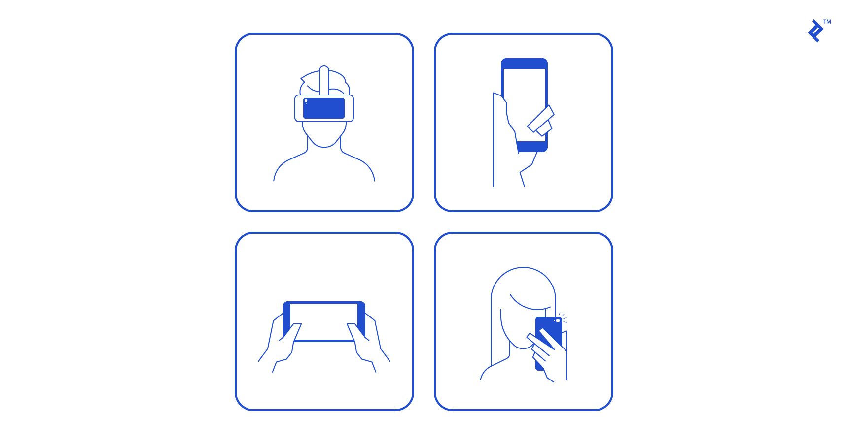
Although purpose and end goals are important, they become irrelevant if not directed within the proper context. The UI for a given app may seem obvious to the design team, but first-time users and users from different demographics may not find it as intuitive. For example, millennial users of an app might find certain functions intuitive, while retirees might find those same things confusing (or vice versa).
Consider the immediate context or situation in which the app is intended to be used. For example, Uber’s interface excels at being used very quickly. This is perfect because when a user is out with friends and needs to book a ride, they barely have to interrupt their conversation in the process. Uber hides a lot of support content deep within the app that only appears when the scenario calls for it.
Is your app meant to be accessed quickly and for a short period of time? Or, is this an app with lots of content that allows users to stay a while? How will the design convey this type of use? Consider these points carefully when mapping out your app’s UX flow.
Common Mistake #7: Abusing Notifications
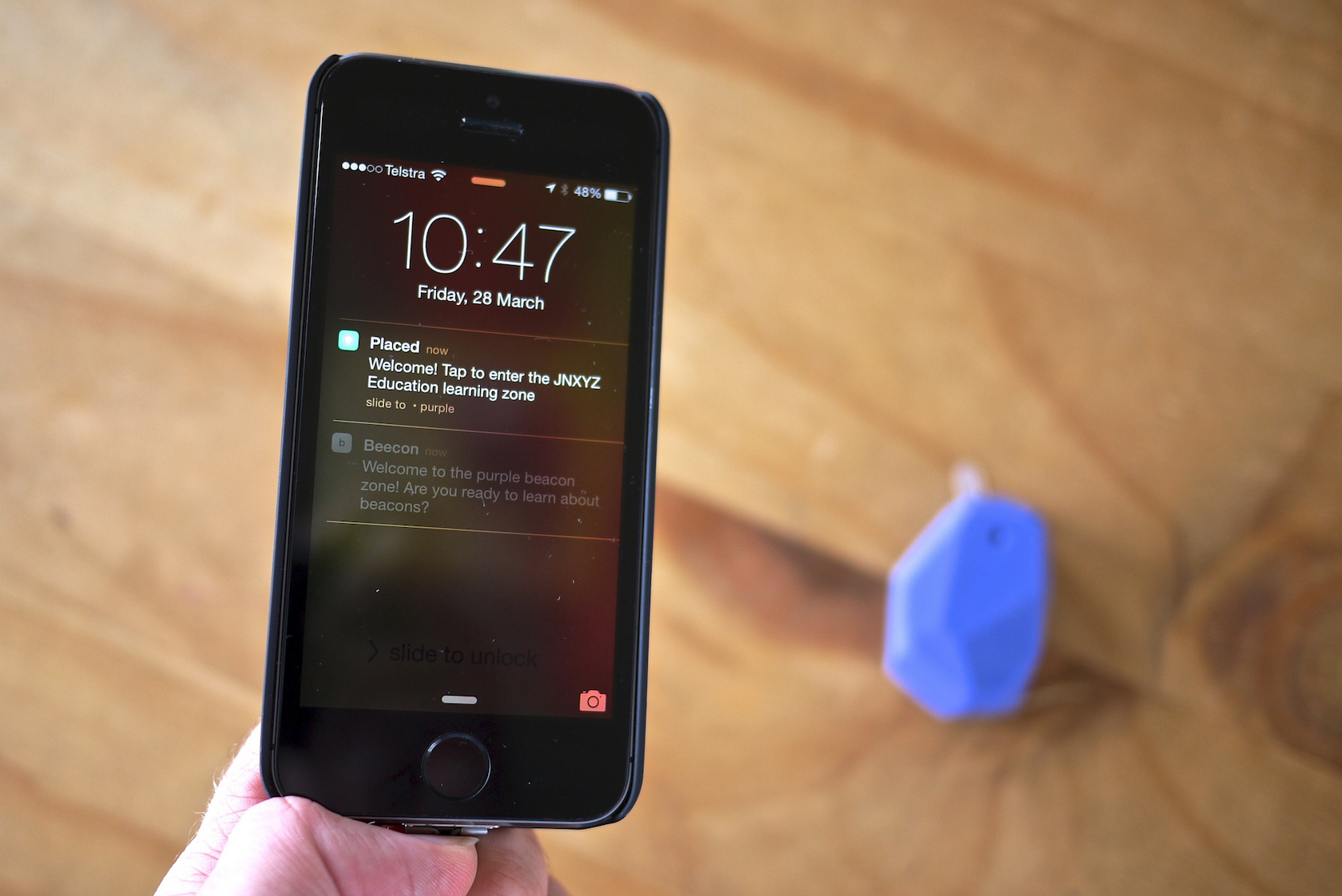
Push notifications are a finicky part of app design best practices. Too many, and users will turn them off entirely, risking the app being forgotten about. Too few, and the same fate occurs.
But it’s not just the frequency of notifications that can turn users on or off. It’s also the content. Useful notifications, such as those notifying users of a new message or reminding them to make a daily check-in, are seen as helpful and necessary. Apps that send seemingly random updates or notifications about news that doesn’t directly affect the user are more likely to see their notifications turned off completely.
Every notification is a microinteraction that can either enhance the user experience and reinforce the overall usefulness of the app or risk alienating users and, in extreme cases, prompting them to delete the app all together.
Common Mistake #8: Overcomplicating App Design
The famous architect Mies Van der Rohe once said, “It’s better to be good than to be unique.” It’s vital that the design meet the specs in the brief before designers start breaking the box or adding other flourishes.
Design elements added to make a composition more visually appealing still need to add value to the user experience. Continue to ask throughout the design process, how much can I remove? Design reductively instead of additively.
Over-complexity is often a result of unnecessarily breaking conventions. Will the app really benefit from reworking the standard symbols and interfaces within mobile visual and tactile language? Standard icons have proven themselves to be universally intuitive. Thus, they are often the quickest way to provide visual cues without cluttering a screen.
Don’t let design flourishes get in the way of the actual content or function of the app. Often, apps are not given enough white space. While it’s vital to good design in general, it’s especially important for mobile designs, as a cluttered interface isn’t particularly touch-friendly.

Common Mistake #9: Design Inconsistencies
If a design is going to introduce new standards, they have to at least be consistent across the app. Each new function or piece of content doesn’t necessarily have to be an opportunity to introduce a new design concept.
Is the text uniformly formatted? Do UI elements behave in predictable, yet pleasing ways throughout the app? Design consistency must find the balance between existing common visual language and avoiding being aesthetically stagnant. The balance between intuitive consistency and boredom is a fine line.
Common Mistake #10: Under-utilizing App Beta Testing
All designers should analyze the use of their apps with some sort of feedback loop in order to learn what is and isn’t working. A common mistake in testing is for a team to do their beta testing in-house. It’s imperative to bring in fresh eyes in order to really dig into the drafts of the app.
Send out an ad for beta testers and work with a select audience before going public, or use a testing service like UserZoom. This can be a great way to iron out details, edit down features, and find what’s missing. Beta testing can be time consuming, but it’s definitely a better alternative to developing an app that flops.
It’s important for design teams to recognize just how competitive the mobile app market is and to do whatever possible to differentiate their offering from the hundreds or thousands of other apps occupying the same space. To do this, they need to have a coherent vision of what the mobile app is hoping to achieve. Following mobile app design best practices and using an iterative design process that incorporates user feedback into the entire process is one of the best ways to do this, and will create an app that stands out.
Further Reading on the Toptal Blog:
Understanding the basics
How is beta testing done?
Beta testing is done by real users in a real environment as the final testing step before an app or product is released “live” to the public. Beta testing can be done via apps that record actual user behavior or in a more simplified way by using user interviews and surveys.
What is an onboarding experience?
The onboarding experience refers to help screens or tutorials users of an app are exposed to when they first use an app. Proper onboarding will help users acclimate to the app’s interface without interfering with their overall user experience.
What is a journey map?
A customer journey map outlines the user’s perspective as they use an app or product, including their mindset, thoughts, and emotions. It is used to pinpoint areas of the customer journey that cause negative or positive emotions so they can be used to make the overall experience better.
