Maximalist Design and the Problem with Minimalism
We live in an era that exalts minimalist design above all other forms of creative expression, especially maximalism. But what is the cost of our obsession with graphic simplicity?
We live in an era that exalts minimalist design above all other forms of creative expression, especially maximalism. But what is the cost of our obsession with graphic simplicity?
Danae is an experienced designer who has developed digital products for international clients such as the Cambridge Dictionary and Subway.
The current state of design encourages a strict adherence to severe simplicity, and it is hamstringing our creative evolution.
Many people think of the Japanese when they think of minimalism. Clean lines, zen simplicity, the careful, deliberate brushstrokes of a master. What people forget is that Japan is also the fount of arguably the most outrageous maximalist design in the world. For every Marie Kondo, there’s a Yayoi Kusama. For every zen garden, there’s a Hachikō Square.
This apparent contrast speaks to the natural balance between complexity and simplicity. According to history, one is an inevitable reply to the prevalence of the other. Too much chaos and one craves order. Too much order and one can feel stifled. To find out how we as designers came to conclude that minimalism is the better design discipline, it’s important to start at the beginning.
Tracing the History of Digital Minimalism
The Big eBang
In the early days of web design, there was nothing but chaos. The “design” part of creating websites was in its infancy, and site owners had yet to understand the value of an attractive composition. Indeed, what would make a website attractive was still mysterious. Websites were seen as nothing more than retail real estate, mere digital shopfronts on which to peddle one’s wares.

Soon, “design” was introduced, but the importance of user experience was not emphasized. The websites of the nineties and early naughts—particularly those created in Flash—were the playgrounds of their designers and owners, and it showed. Flashing animations, garish colors, slews of fonts—all lived alongside inscrutable information architecture and disguised navigational elements.


Perhaps to some, this looked like maximalist design. After all, it included many of the basic principles of maximalism: clashing colors and patterns, competing elements, bold layouts. But if a design is difficult to use, it can be neither maximalist nor minimalist. It is merely bad.
If minimalism is like wearing white briefs, then maximalism is like wearing neon pink pantaloons—not wearing underwear on your head. If a maximalist design fails to provide good user experience, it is simply poor design.
Order from Chaos
Over time, this primordial soup of web design developed a focus on experience principles. Some basic best practices emerged. Logical information architecture and page structure. Recognizable navigational elements. A universal iconographic language. We started to teach ourselves, and our users, how to get the best out of the online experience.


Out of this understanding, the first impulse of maximalism was felt. It was an impulse to exert maximal effort, to pour every ounce of knowledge and technical wizardry into our work. Skeuomorphism was the most famous example of this trend—realistic backgrounds and icons that were carefully, and with great skill, illustrated to represent physical objects. Anyone old enough in the industry will remember trying to perfectly replicate a wooden texture or the exact swirl of smoke or the shiny gloss of a gel button. None of this could be considered minimal.


Then, almost overnight: the rise of minimalism. One day, we were consumed with crafting touchable, 3D buttons, and the next we were actively repulsed by the sight of a drop-shadow. It was a fever, and it overtook us.
Order Becomes Obsession
Flat, simple, streamlined. These are the commandments of our craft today, but such mandates stifle the very creativity that makes designers essential to the development of digital products. This isn’t a novel observation—designers have been discussing it for some time. A cursory Google search will reveal acres of examples of perfectly lovely, yet perfectly identical layouts.


It is telling that many in the industry believe that minimalism is synonymous with good user experience and that maximalism will automatically impede that goal. Minimalism is often used as a shortcut to a good experience; its basic tenets of negative space and simplicity allows users (in the west at least) to more easily achieve their goals almost as a byproduct. Even a small, dull-grey button is hard to miss floating in an ocean of white.
It’s increasingly common to encounter clients that feel no need to pursue design after seeing sufficiently developed wireframes. Wireframes are the very definition of minimalism, and clients have been thoroughly briefed over the last half dozen years that less is always more. Such clients can be forgiven for reasoning that if it works, well: slap a logo on it, change some button colors, and job done!
The word “lazy” in reference to modern design (or designers) may be harsh, but a wake-up call is in order. The rigid rules and prefabricated layouts of minimalist design have made our creative muscles rather flabby.
Yes, good minimalist design may require careful consideration, but minimalism is easy to replicate once it has been mastered. It is also a doddle to emulate with relatively little skill. Consider the famous little black dress. So chic, so elegant. But it also takes very little effort or thought to buy and wear. You may look good—but you will also look like every other woman at the party.
I really don’t understand minimalism. It is so polite and boring. If you don’t want anyone to notice you, you should stay home and grow your own vegetables
Roberto Cavalli
Experience Does Not Equal Design
What Is UX?
Design (UI and layout) is not UX. It is a part of UX. According to the Nielsen Norman Group, the overarching discipline of UX encompasses all aspects of the end-users’ interaction with the company, its services, and its products including:
- Visual design
- Information architecture
- Content strategy
- Interaction design
- Usability
- User research
Maximalism should not negatively affect UX. UX is an overarching discipline, of which design (either minimal or maximal) is merely a part. UI and layout are important facets of a full experience, but they are small components in a larger machine. Design’s function is to support and uphold the best possible experience for the user and help successfully fulfill business goals. It is possible to implement maximalism without negatively affecting the overall experience.
Modern maximalist design examples consistently show adherence to current UX best practices. They have recognizable navigation and signposting, important goals are easy to achieve, users can find what they are looking for in the usual places, and content is presented in a coherent fashion.


What Is Maximalist Design?
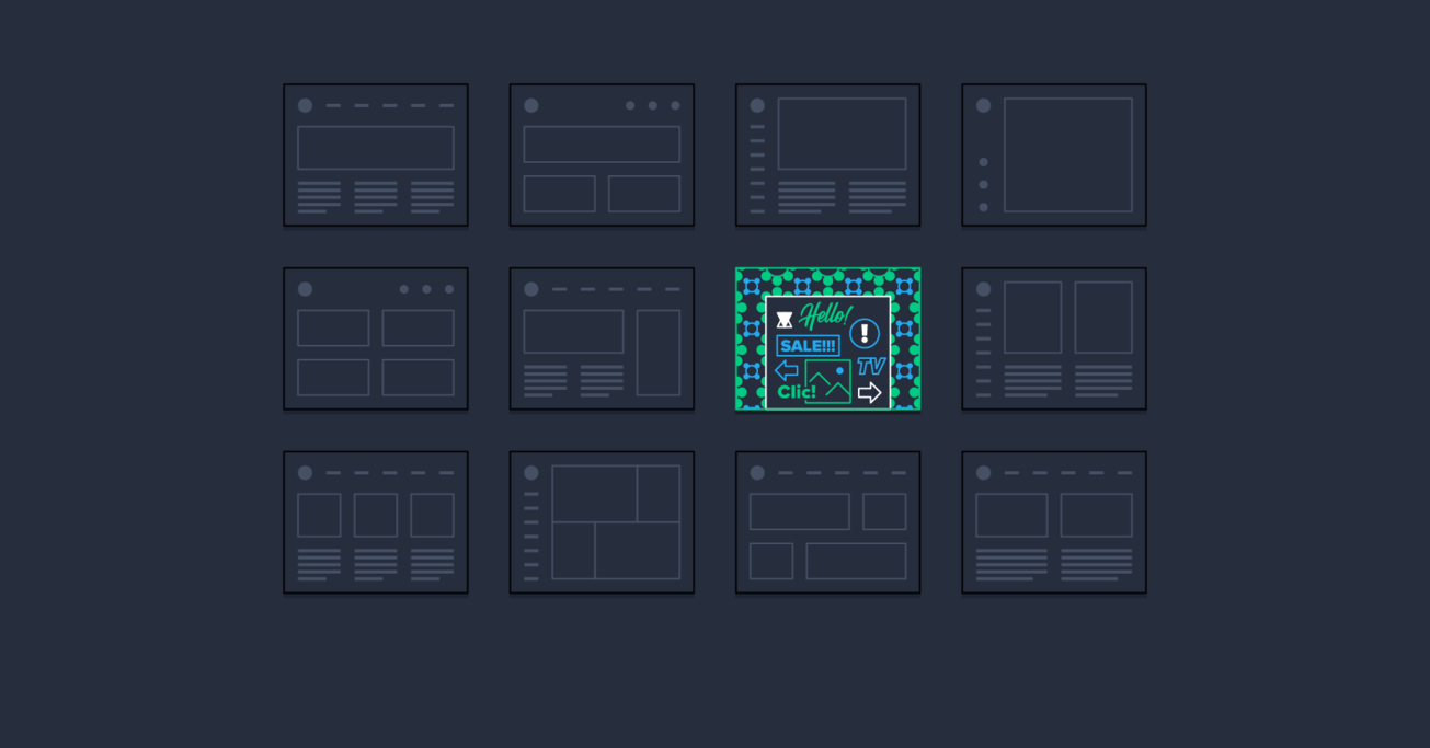
Maximalist design is defined by the following characteristics:
- Bold color combinations
- Contrasting patterns and motifs
- Repeated elements
- Little white space
- Layered images
- Dense text and multiple fonts
- Create fantasy
Maximalism, in contrast to minimalism, requires all of a designer’s wiles and knowledge of color theory, layout, UX, and content structure to effectively pull off. There’s nothing hard about putting a block of black text next to a slightly off-center floating image. But the degree of difficulty increases exponentially when there are five fonts, six colors, and treated images to manage. How do all these elements coexist in a design that is pleasing and unique but equally useable? The challenge is much steeper.
New designers know this all too well—the woes of a color palette crisis or the agony of implementing textures and patterns, both of which are virtually extinct in commercial design examples. More than three fonts can send even seasoned creatives into a tailspin. This reluctance to challenge ourselves, to experiment and risk failing, is responsible for the depressing homogeneity in modern design. Yes, everything is more beautiful than even five years ago, but it is also much less interesting.
The Evolution of Design
The unfortunate side effect of our fervent worship of minimalism is that we have trained our clients to be unwilling to be adventurous. We have stamped out the suggestion of many fonts, of crowded backgrounds—so that now we find ourselves having to fight for every scrap of individuality. Our clients—who used to be so brave with their flashing banners and undulating headings—have become afraid of breaking the mold, of making mistakes.
This is a shame. For clients, the advantages of standing out and being bold are self-evident. As designers, experimenting with maximalism leads us to push ourselves to the very limits of our abilities in order to advance our discipline as a whole. For users, it means more joy and willingness to engage.
Maximalism is the antidote to the sameness of modern design. If a scream is lost in a storm, so too is a sigh lost in a cacophony of whispers. Exploring maximalism is necessary for design as a discipline to evolve out of its current dependence on minimalism. If we can be brave enough to stand up for our freedom to experiment, perhaps the digital landscape can evolve into a more lush and interesting place.
Further Reading on the Toptal Blog:
Understanding the basics
What is the opposite of a minimalist?
The opposite of minimalist graphic design and minimalist website is maximalism. While minimalism is popular in contemporary design, it can be a limiting approach creatively speaking. Maximalism strives to communicate with the same clarity as minimalism, but with a greater range of graphic elements.
How do you know if you are a minimalist?
Many minimalist designers live by the motto, “Less is more.” If, as a designer, you find yourself striving to effectively communicate ideas with as little graphic embellishment as possible, you may be a minimalist. The problem with minimalism is that some designers cut all graphic variety from their work.
What is a maximalist and minimalist?
When it comes to minimalist vs. maximalist designers, core distinctions emerge. Minimalist designers attempt to communicate as much information as possible with as few visual elements as possible. Maximalist designers seek to cohesively implement a wide variety of graphic elements into their work.
What is maximalism in design?
Maximalist design is defined by the following characteristics: 1.) Bold color combinations; 2.) Contrasting patterns and motifs; 3.) Repeated graphic elements; 4.) Little to no white space; 5.) Layered images and illustrations; 6.) Dense text and multiple fonts; 7.) Create a sense of fantasy.
Why is minimalism popular?
Minimalism is popular in digital product design and web design because information is typically presented on small screens where excessive graphic variety confuses the user experience. By contrast, in the fields of fashion, interiors, and furniture, maximalist design still garners considerable attention.
Danae Botha
Cambridge, United Kingdom
Member since June 24, 2019
About the author
Danae is an experienced designer who has developed digital products for international clients such as the Cambridge Dictionary and Subway.


