Age Before Beauty – A Guide to Interface Design for Older Adults
As people age, there are certain physiological and cognitive changes that are almost inevitable. Designers need to understand these changes to effectively master interface design for older adults.
As people age, there are certain physiological and cognitive changes that are almost inevitable. Designers need to understand these changes to effectively master interface design for older adults.
Sergey has 4+ years of experience designing for mobile. Staying on top of design trends, he brings a fresh approach to all of his projects.
According to the 2017 World Demographic Perspectives: Revised Report, it is expected that the number of people over the age of sixty will more than double by 2050 (from 962 million to globally to 2.1 billion), and triple by 2100 (to 3.1 billion). Globally, the group of people over sixty is growing more rapidly than any other demographic.
As people age, there are certain physiological and cognitive changes that are almost inevitable. And while many who are over sixty have been around technology almost their entire adult lives, those physiological and cognitive changes need to be compensated for.
Nevertheless, there are also older adults who aren’t as comfortable or familiar with technology in general, or more specific things like mobile devices. They need incentives to engage and may have vastly different usage patterns for things like apps compared to their younger counterparts.
As the population ages, though, more “seniors” will be comfortable with technology and only need compensation for actual physiological and cognitive changes. UX and UI designers need to understand these changes in order to effectively master interface design for older adults.

Visual Elements for Users with Impaired Senses
Vision loss is the most common disability reported in adults in the United States, with an estimated one in six people over the age of 70 reporting vision impairment. It’s vital that UI designers consider visual accessibility when creating websites that are likely to be accessed by older adults. And considering that there are over 75 million baby boomers in the US (the youngest of which are turning 55 this year), it’s likely that at least some of them are visiting pretty much any website online.
As people age, a number of changes commonly happen to their vision. Many older adults use reading glasses or opt for much larger font sizes when given the option. Shades of blue can also appear faded to seniors, potentially reducing contrast when blue elements are used in a design. Overall, color contrast should be increased in websites and apps that cater to older adults.
Text and button sizes should be kept large. Basically, anything that’s meant to be read or clicked should be scaled up. Fonts should be a minimum of 16px (some sources report 12px is sufficient, but larger is better in this case). Although the ultimate solution is to make it easy for users to increase or decrease font sizes at will. Sans serif typefaces are often preferred for on-screen readability. And any website or web app should be tested with a screen reader before being made public.
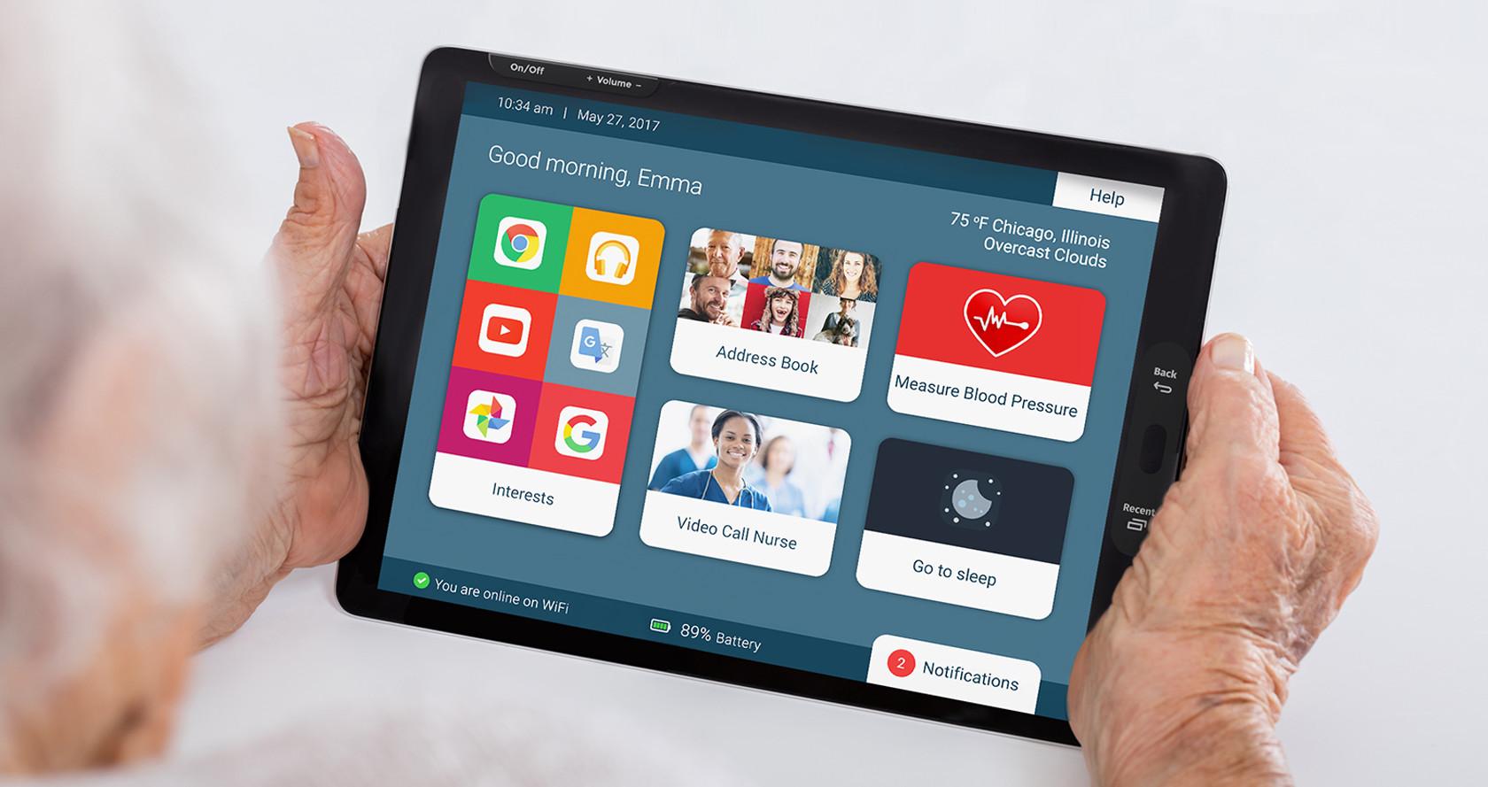
Icons are another area of special concern for older adults. Icons should be labeled with text whenever possible. This makes the purpose of the icons crystal clear for everyone. While many older adults are just as tech savvy as the generations that came after them, there are others who are not. Therefore, making sure that any and all text is easily interpreted is essential. Those who don’t need the helpful text aren’t likely to be offended by it, but those who need it might get lost if it’s not included.

When video or audio content is vital for interaction, it’s important to include subtitles. This is good practice anyway since people are often in situations where they want to access video or audio information without having to disturb those around them or use headphones.
Improving Interaction for Older Adults
Interaction is fundamental to the user experience. Visual cues are often vital to those interactions. For older adults, especially, visual cues need to be clear, easy to decipher, and easy to interact with. But it goes beyond just making sure visual cues are clear. Every part of the interaction needs to be kept easy to understand and complete. This is especially true as the target demographic age increases since motor skills tend to decline with age, making things like complex gestures more challenging.
Besides common UI design best practices, there are a few other areas designers should pay special attention to.
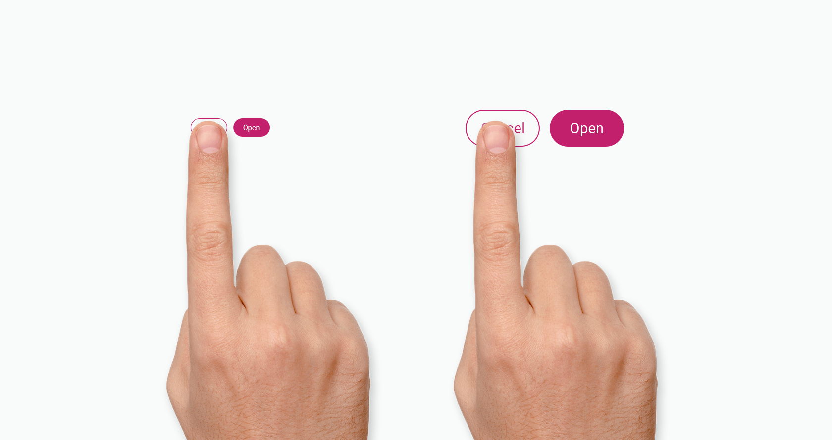
While Apple’s Human Interface Guidelines recommend that buttons be at least 9.6mm when measured diagonally (44 x 44 pixels on an iPad), increasing that size for apps and websites commonly used by older people improves usability. In general, wherever there is a “recommended” size or distance specified, designers should view that as the absolute bare minimum for any interface targeting older people.
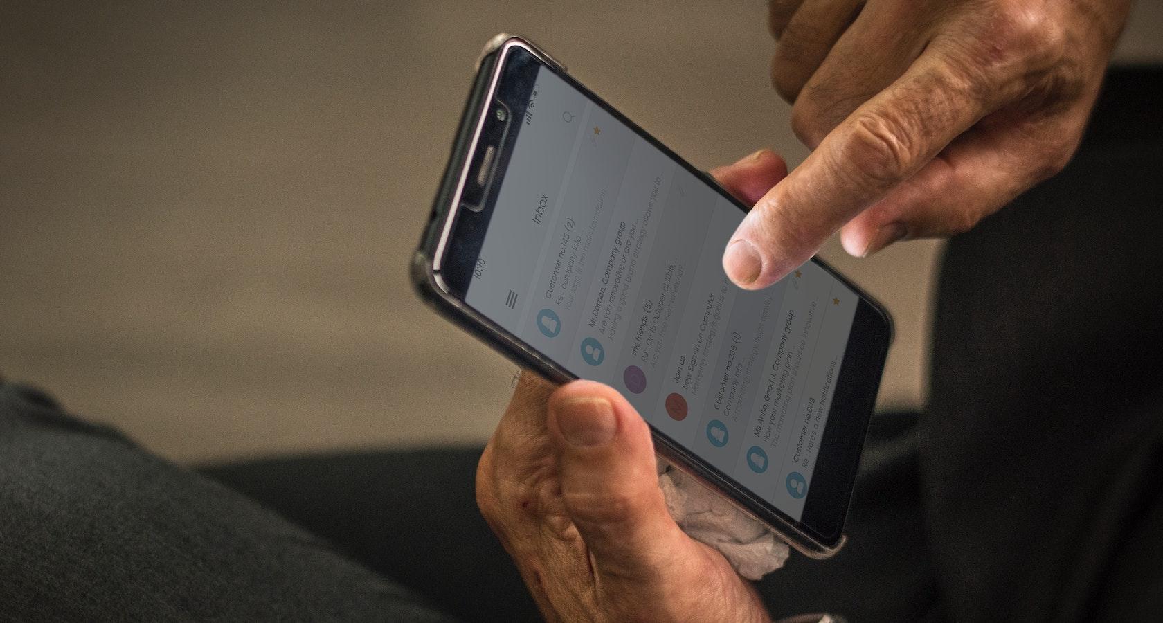
Gestures are another area where seniors can sometimes stumble, especially when they’re new to touchscreen technology. There are a number of interaction patterns seniors may have that aren’t common in younger generations. These include things like typing with one hand, particularly on a mobile device (don’t assume that older generations don’t know how to type on a regular keyboard; many took typing classes in school).
When designing for older adults, particularly those over the age of 70, keep gestures simple to perform. Forget complex gestures that require more than two fingers (those can be a pain to master regardless of age). Simple horizontal, vertical, or diagonal movement is fine, as these are all natural motions. But avoid incorporating gestures with quick movements, difficult positioning, or multiple gestures that require the use of both hands or more than two fingers. All of these can be frustrating to even tech-savvy older users as motor function declines.

Issues with Memory and Concentration
While not every older adult has issues with memory and concentration, there are cognitive declines that happen with age for many people. The speed at which seniors process information slows with age. They can still complete the same tasks, but it may take them a bit longer than it did when they were younger.
Because of this, older adults need a bit more time to absorb the information they’re presented with and take appropriate action. Where this becomes a real problem is when presented with complex tasks that require quick intake and processing of information in order to make decisions.
Different types of memory also decline with age, including the ability to remember to do things in the future (this is where app notifications can be really helpful), and their working memory (the ability to retain and recall information for a short period of time, like remembering a phone number long enough to dial it).
There are a few ways designers can take these limitations into account when designing for seniors to ensure that these shortfalls are compensated for.

Gradually introducing product characteristics—progressive disclosure and minimalist design—can help prevent cognitive overload from slower mental processing speeds in older adults. Designers should also ensure that older people’s attention isn’t being divided by multiple tasks or parts of a screen.
Memory issues can be overcome through things like providing clear feedback on progress and reminding users of the end goal. Avoiding splitting tasks into multiple screens if they require memory of previous actions is also helpful. Even familiar actions can be made more user-friendly by including reminders and tooltips.
Motivation
While younger generations often integrate technology seamlessly into their lives (they’ve grown up using it, so it’s a natural extension of their day-to-day activities), older adults use technology a bit differently.
Applications that aren’t useful are generally neglected by seniors. Even with notifications, if an older adult doesn’t find an application to be useful, they’re likely to ignore it for days, weeks, or even months.
However, if they see the benefits of using an app or website, they’ll be motivated to use it regularly and to respond to notifications. While gamification and similar motivators work well with younger adults, they are often not as effective on seniors. Instead, making sure an app is useful and easy to use is the best way to ensure that the app will be used by them consistently.

It’s important to note that older adults tend to prefer tablets to smartphones. It makes sense, considering the differences in screen sizes and ease of use. According to some studies, older adults are the primary users of tablets and adopted them earlier than younger users.
Social Factors
In general, older adults prefer to connect with smaller, more intimate groups of people. On social media, for example, they may limit connections to close friends and family members, rather than the large, sprawling connections many younger people have (like the friend-of-a-friend they’ve only ever talked to via Facebook comments). At the same time, isolation can be an issue, so making those smaller networks more meaningful is key.
Depending on the type of app being used, seniors may also have trepidations about privacy and security. For example, when talking about their health, they may be much more selective than younger people about who they share data with. They may be more open with sharing things like photos or news.
At the same time, privacy settings can be challenging if they’re not fully tested with users from all age groups and demographics. Seniors can end up sharing information publicly without realizing it or struggling to limit who can see things they share on sites like Facebook.
To best serve older adults, designers should make sure that privacy and security settings are easy to manage. They should also strive to be transparent in how information is used, and be forthcoming about any data breaches to ensure trust is maintained among older users.

Seniors and Technology Experience
In order for any user to comfortably use an application, they must be able to quickly and easily get from point A (entry point) to point B (where they perform their task). That is why simple navigation through the user interface is so important. Additionally, keeping the focus on the task at hand and limiting exposure to secondary functions improves usability.
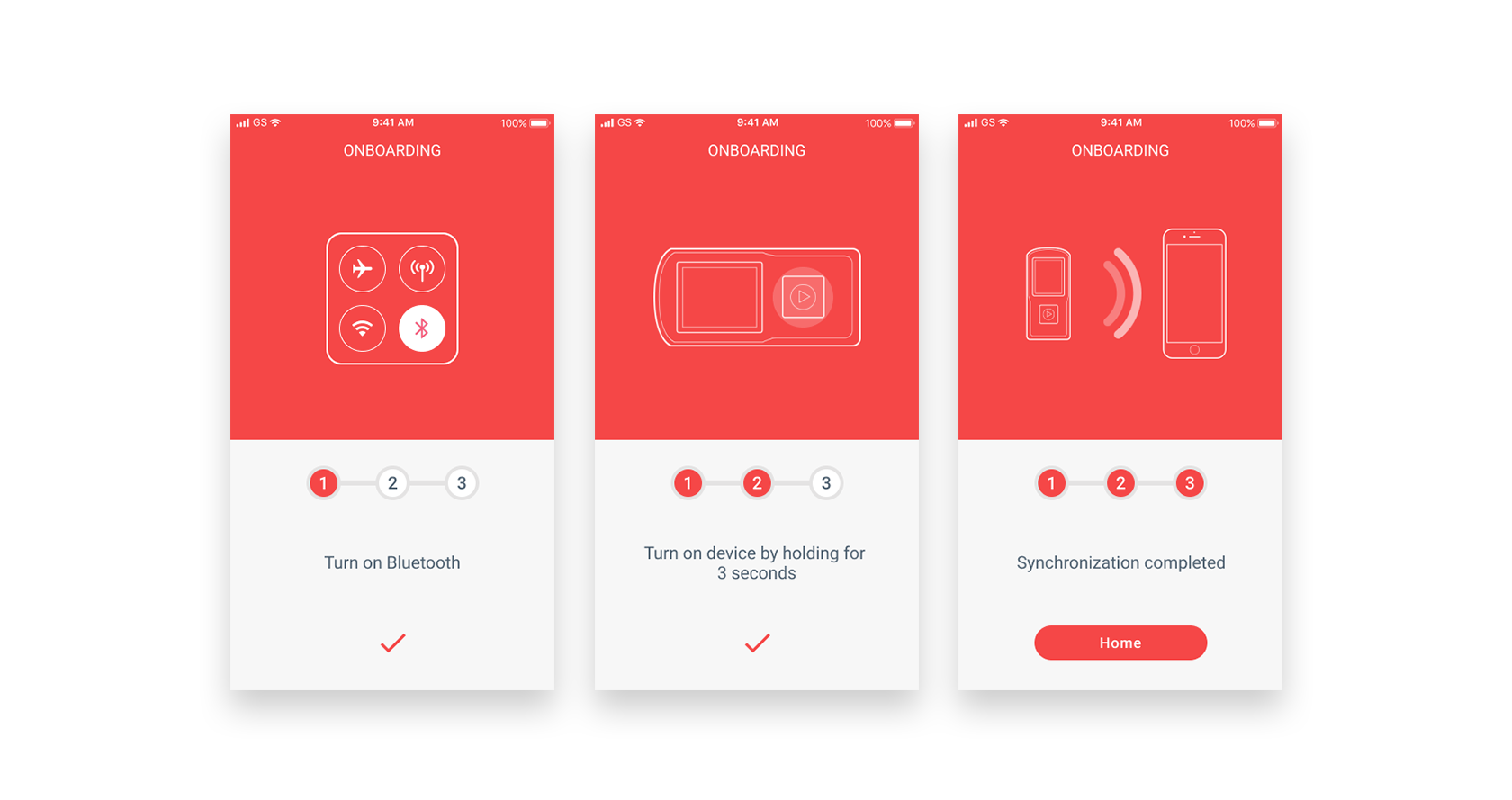
When designing for older adults, it’s important to make sure that navigation is not only simple to use, but that proper onboarding exists to introduce users to functions they might not be familiar with. While younger users who grew up with technology integrated into their daily lives might be more than willing to just dive in and start exploring an app or interface they’ve never seen before, many older users are hesitant to do the same.
In terms of UX, doing things like keeping the navigational structure simple is a good place to start. Strictly adhering to usability best practices—minimizing sublevels in navigation, keeping menus to a single function, etc.—is a good place to start when designing user interfaces for an aging population. Keeping the “return” function and the “home” navigation readily accessible serves as a sort of safe point on the interface, too.
Many of the things that make apps more usable for all users are particularly important for older adults. Following best practices and accessibility guidelines will go a long way toward making any app more senior-friendly.
Getting Help
Older adults may be more likely to turn to an app’s help functions or tutorials when they run into problems. Therefore, designers should make sure these features are easy for users to find.
While younger users may be more likely to skip onboarding screens, older users will likely pay more attention to them, reading all instructions before clicking. It is vital to include contextual tips throughout an app that are both automatically shown the first time a feature is accessed, and are available at later points when the user requests them.
One thing to keep in mind, particularly when designing apps specifically for older adults: be careful to use clear, objective, and educational language without being condescending or patronizing. Older users who aren’t familiar with technology often already feel insecure while using it; a condescending message will only cause further insecurity and may turn them off to using the app altogether.

Conclusion
Older adults don’t need a ton of compensation to feel comfortable using an application. Following best practices and usability guidelines, in general, will go a long way toward making products accessible to all users, regardless of age or any physical or cognitive impairments (age-related or otherwise).
Designers should make additional compensations for older adults in applications specifically geared toward them—things like larger fonts, more intuitive interface elements, clear wording, and helpful tips for functionality—it will only improve their user experience.
Further Reading on the Toptal Blog:
Understanding the basics
How does a screen reader work?
Screen readers convert digital text content from things like websites or apps into synthesized speech (or in some cases, braille). Screen readers are commonly used by those who have vision impairments and are an important consideration in accessible design.
What are mobile gestures?
Mobile gestures include everything from tapping a phone screen to more complicated multi-finger gestures, including multi-touch gestures that require different levels of pressure to achieve different ends. Gesture complexity is an important consideration when designing user interfaces for an aging population.
Why is UI important?
User interface design is a vital component of creating a digital product that provides a positive user experience. Without an effectively designed UI, users will struggle to complete actions a product was designed for. This results in increased abandonment of an app or website.
What is a user journey map?
A user journey map is a timeline of sorts showing how a user interacts with a product. It’s a visualization of all of the interactions a person will have with a specific product, from their perspective rather than the designer’s or brand’s.
Zaporizhya, Ukraine
Member since October 7, 2015
About the author
Sergey has 4+ years of experience designing for mobile. Staying on top of design trends, he brings a fresh approach to all of his projects.


