Brutalist Web Design, Minimalist Web Design, and the Future of Web UX
Web design is changing. Minimalist web design has been the reigning approach for years, but brutalist design is gaining in popularity. Despite its inelegant clutter and raw functionality, brutalist design may be taking over the web.
Web design is changing. Minimalist web design has been the reigning approach for years, but brutalist design is gaining in popularity. Despite its inelegant clutter and raw functionality, brutalist design may be taking over the web.
With 12 years in UI/UX and creative direction, Pascal has delivered immersive experiences, led design teams for Sony, Fox, Disney, and more.
PREVIOUSLY AT

Are websites becoming more chaotic, cluttered, and unrefined? Are the rules of good design being broken? Is the web turning ugly? Is this a new trend?
If you are like most designers and pay close attention to what is going on, you have heard the word brutalism being thrown around for a while. Brutalist websites are moving away from the user-friendly interfaces that have long been the industry’s best practice and instead focus on imperfect, hand-coded HTML sites. It seems designers are stripping away the rules of UX as we know them, leaving everything feeling a little chaotic.
The tenets of sleek, contemporary design are so commonplace that we hardly think about them as a stylistic choice. “Good” web design generally means one that obeys the rules of minimalism. Clean, simple, uncluttered interfaces—but this has not always been the case. Let’s wind the clock back a few decades.
The Birth of the Web
Web design has come a long way since 1991 when the first ever website was published. The internet revolution began with its first websites being exclusively text-based using the first generation of HTML.
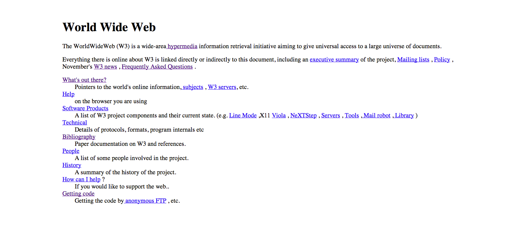
Then came Flash with all those crazy animated sites that everyone surely remembers. The development of CSS (Cascading Style Sheets) came along, providing web designers with even more control over enhancements like background color, text size, and text styles in code. JavaScript gave us drop-down menus, advanced navigation, and web forms with error-checking.
In the beginning, no one knew what “web design” really meant, and pioneers of the web established design patterns by trial and error. The early era of web design used layouts which paid little attention to formal semantics and accessibility, opting instead for aesthetics over structure.
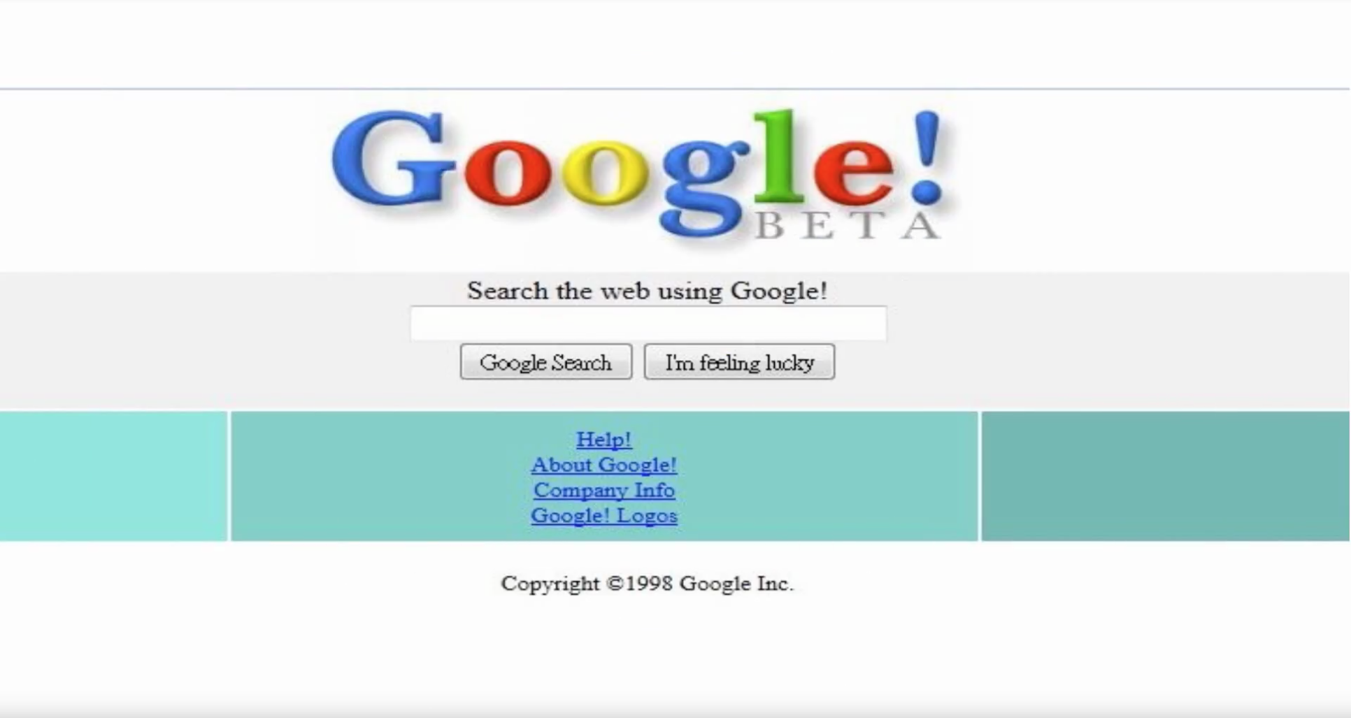
In order to build and structure their designs, designers relied heavily on HTML elements like tables, nested tables, and invisible 1-pixel spacer files, providing them with the ability to create more complicated, multi-column layouts. It made for some pretty dull interfaces.
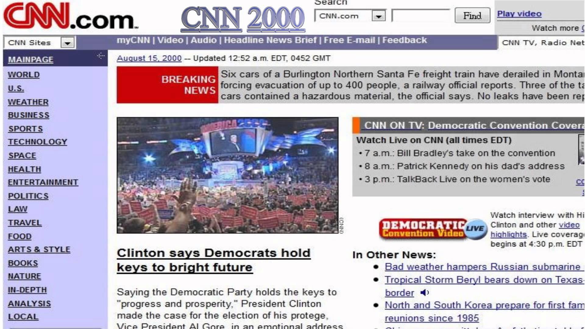

In the mid-2000s, websites were born with more careful thinking behind their structure. Navigation was on the top of your browser, and categories were placed on a left bar. Web pages were kept short and narrow, with content spread across many pages in order not to force users to scroll. Designers learned what worked and started to build better sites, establishing standards and best practices along the way.
With more and more layout options came a mix of noisy UIs replete with images and text everywhere. Some disciplined designers, however, still opted for minimalism.
The Minimalist Aesthetic
Design trends come and go; however, minimalism is a design language that has been present through time. It is a design philosophy that focuses on the simplification of form, achieved by making use of the simplest, most essential elements in a design.
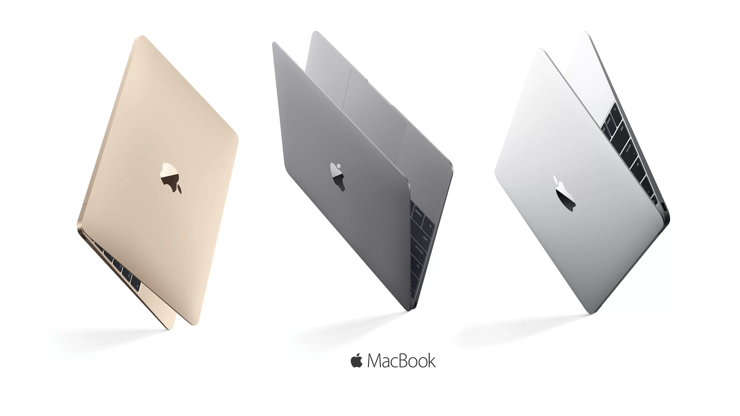
Minimalism is not exclusive to web design. Think of all the elements around you that encompass that design ideal; it is easy to connect minimalist designs with Nest, Apple, Herman Miller, and many others that have inspired many minimalist designers.

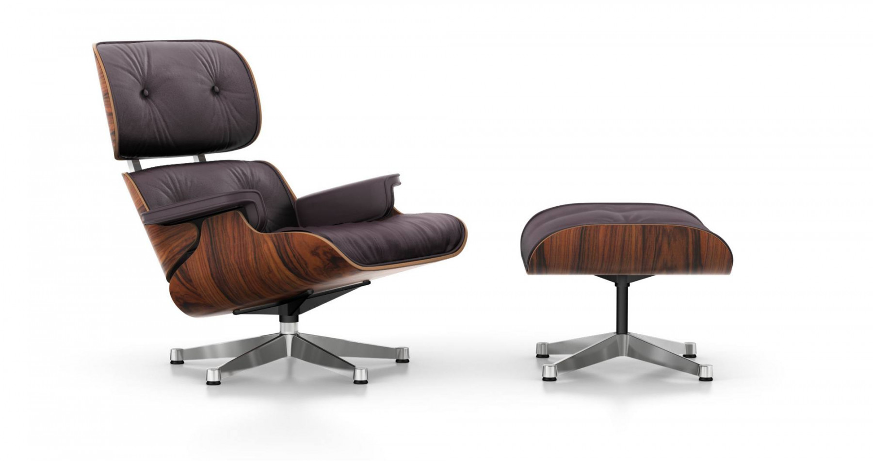
What makes design by Herman Miller still great today? They are simply well-designed objects with a timeless look. His designs sit very well in contemporary homes and interiors—they still feel fresh and modern today. Many of his pieces are designed with a minimalist look and can’t really be tied to a specific fad. They still stand the test of time.
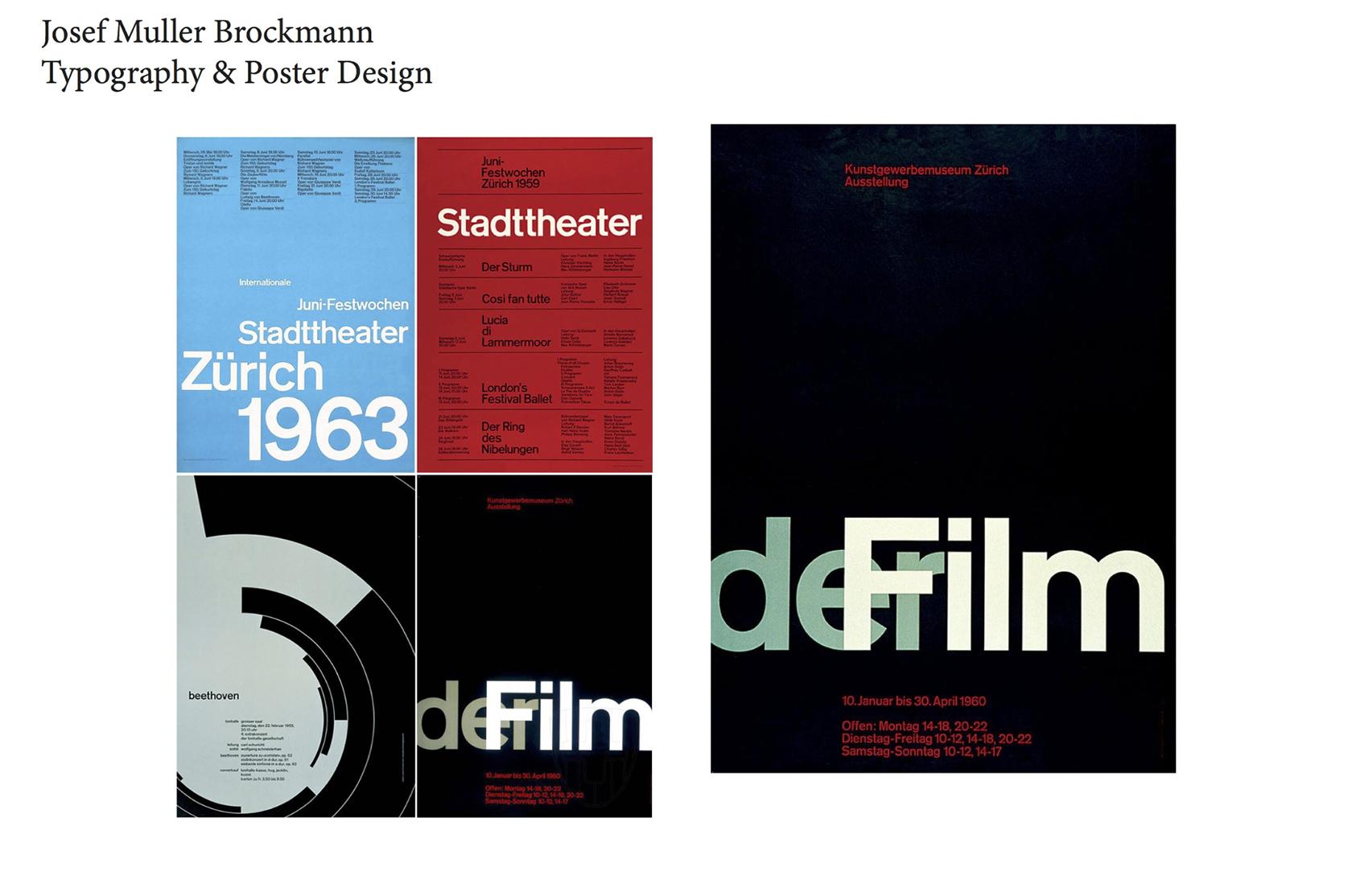
Minimalist designs from one of the most-renowned graphic designers of his era, Josef Müller-Brockmann, are very similar to those by Herman Miller: timeless. Müller-Brockmann embraced and mastered minimalism during the 1940s and 1950s in the form of the Swiss style of design.
Any extraneous or superfluous decoration was stripped from his graphic design; every element in his layouts had a purpose. The design thinking behind this approach is what makes minimalist digital designs work very well today.
How Minimalism Established Itself in the Digital Age
History always finds a way to catch up to us. As it did in print design, minimalism and the philosophy behind it caught up to web design and other digital artifacts. Think of how websites looked just a couple of years ago with their glossy buttons, lines and paragraphs of text, everything screaming for attention.
Then came the skeuomorphic trend where designers designed elements which mimicked real-life objects in digital space. Remember the leather padding in Apple’s iCal?
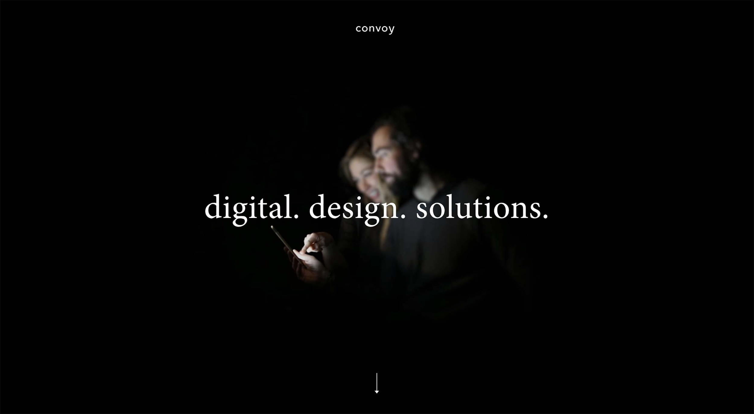
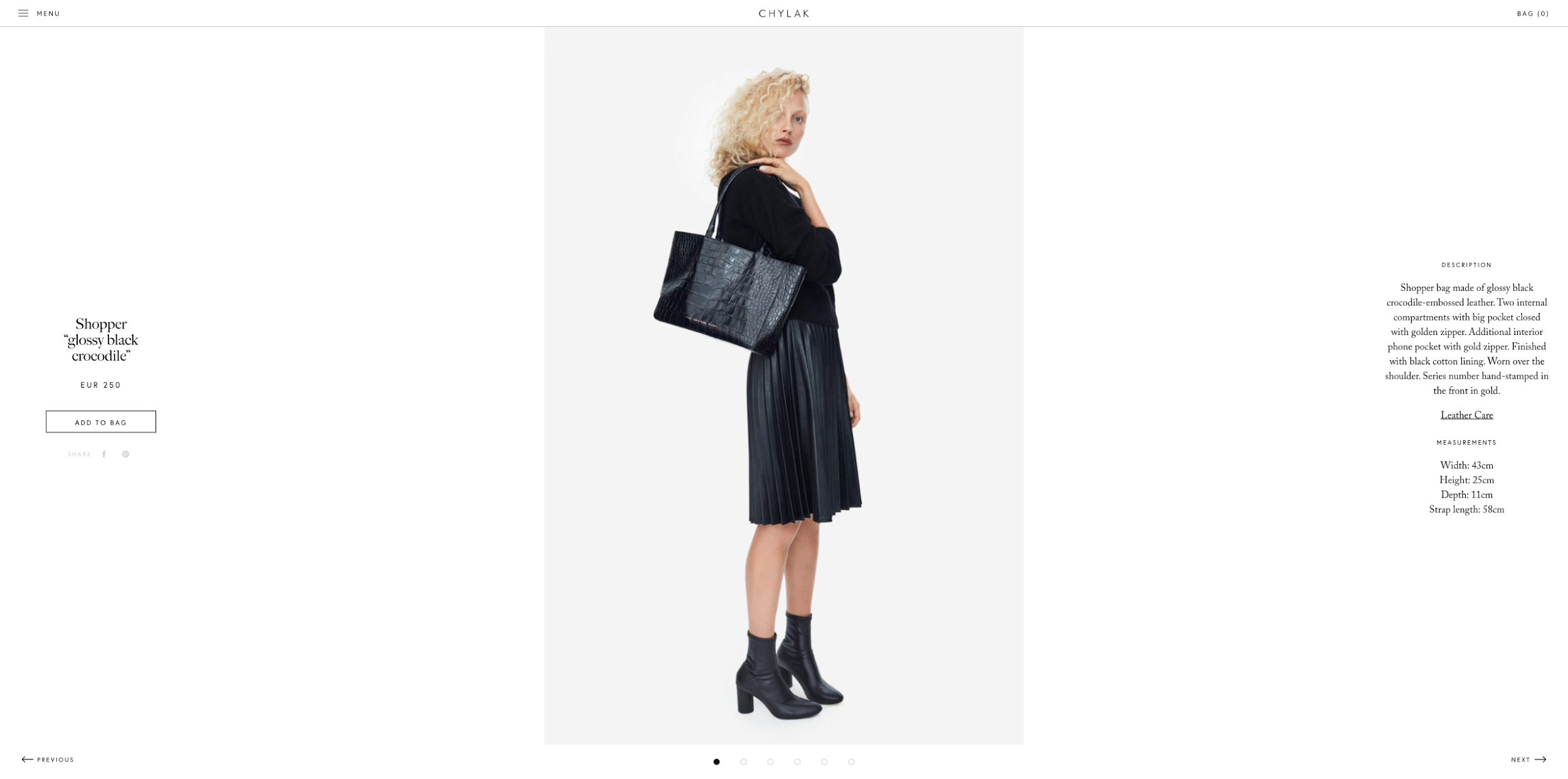
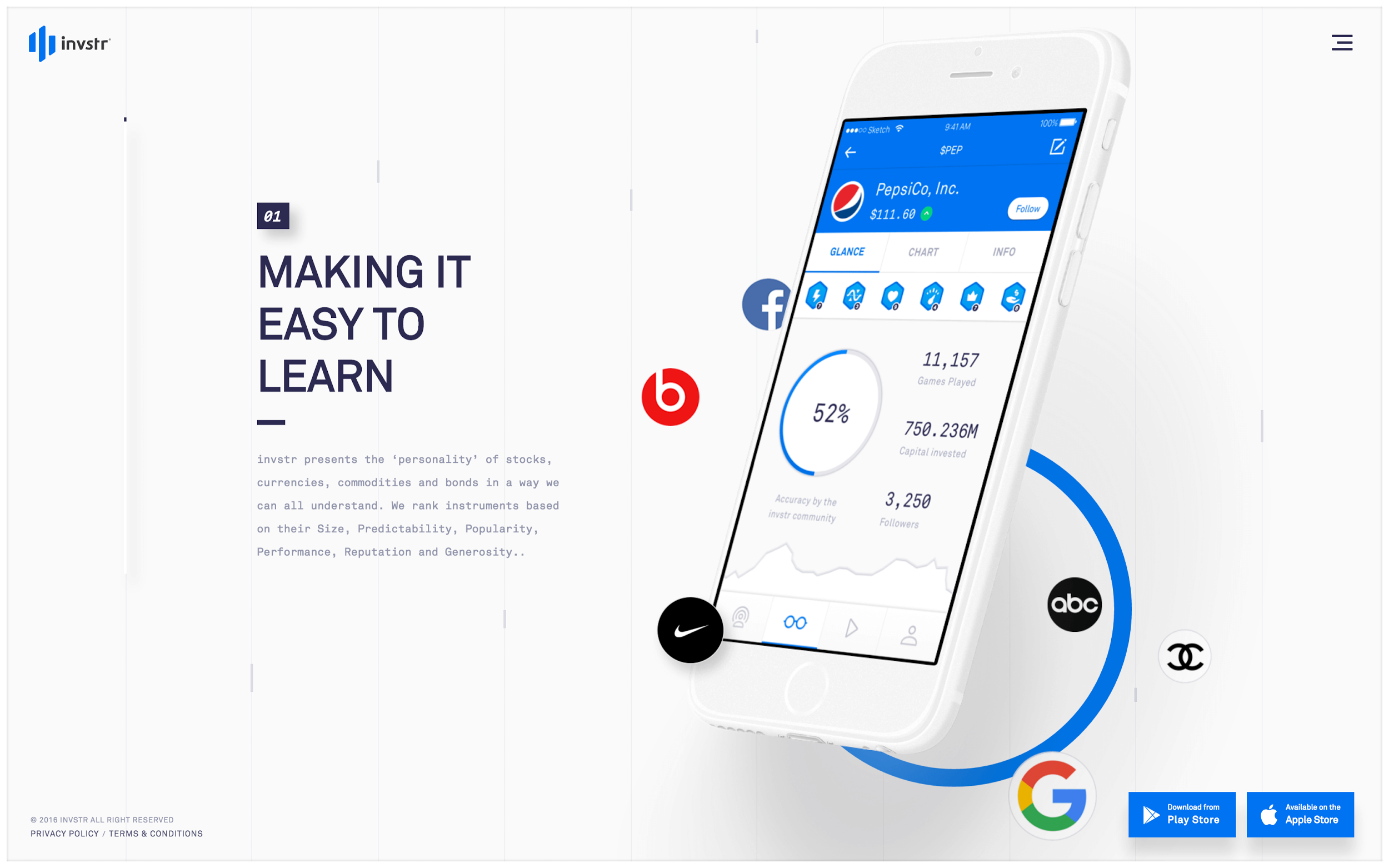
Minimal designs are actually intentional. It’s a design approach that strips away all that’s unnecessary and focuses on elements that are supposed to draw maximum attention—putting emphasis on content.
The Benefits of Minimalist Design
The minimalist design approach caught on for many more reasons than simply its look. Our increased understanding of user behaviors, design thinking processes, and the rise of content-first design processes have helped move this thinking forward. The recent massive growth of mobile users has been a strong acceleration point towards minimalism, with greater focus on UX and usability.
With users now accessing the internet on the go at all times, product designers must focus on providing what is absolutely essential in the context of the moment: the right things in the right way and at the right time, where the design is stripped down to its most fundamental features.
Mobile usage now accounts for more than half of all web visits, and this rate will only increase. Responsive design has been a game changer and has forced designers to “think different.” Today more than ever, responsive or adaptive design is a necessity in the mobile world where a minimalist design approach is of crucial importance.
To the average user, minimalism probably appears to be the easiest thing to design. Achieving perfect balance using the least amount of visual content and only focusing on the fundamental elements with utmost elegance is actually very, very difficult.
The Future of Minimalism
We should think of minimalism as a timeless concept, radiating elegance and sophistication, rather than an actual trend or a simple passing phase. Although timeless and classic, it will evolve and improve, as we’ve already seen since its implementation in the beginning of the 20th century.
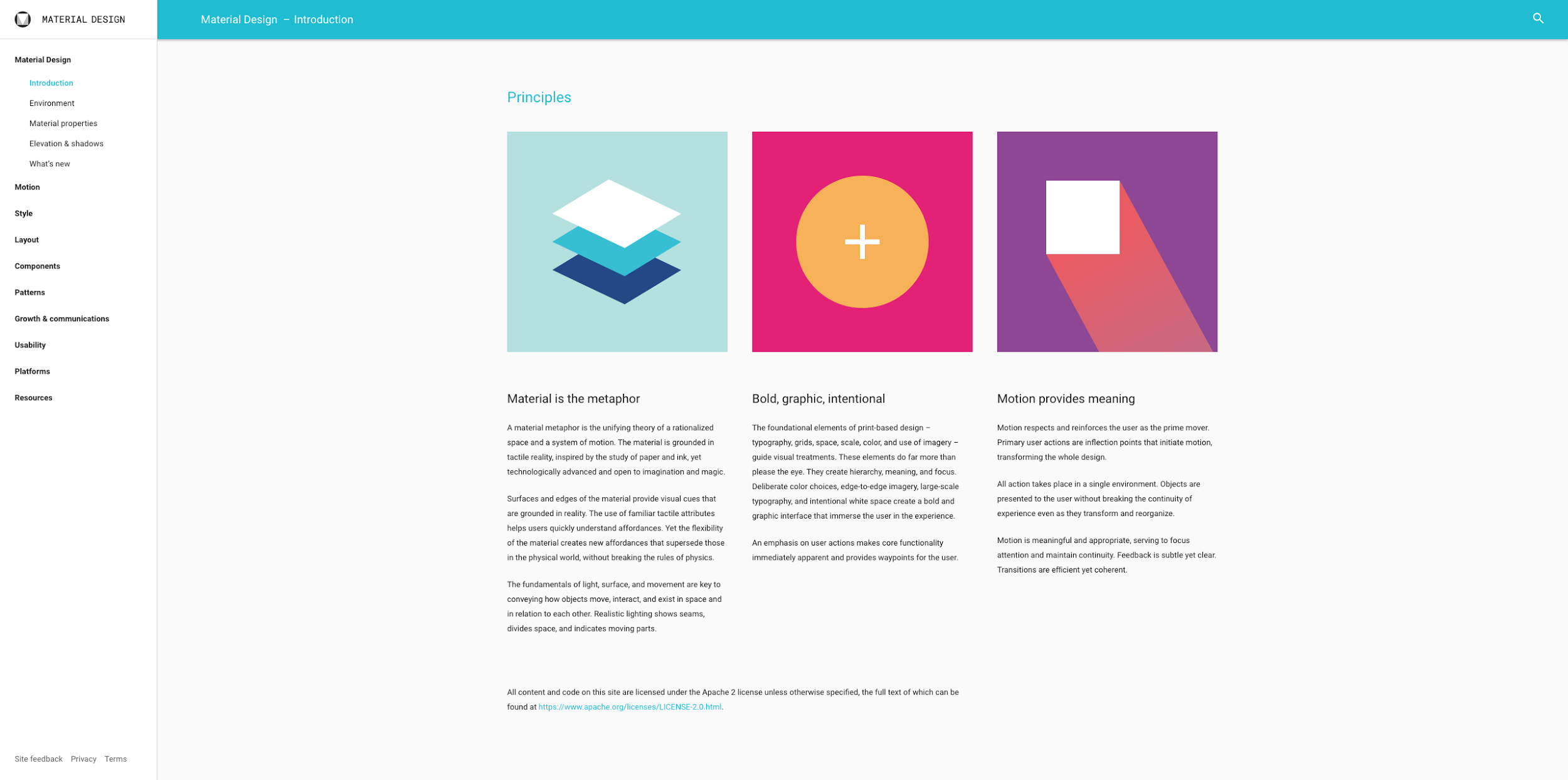
For example, Google’s Material Design was one of the first major evolutions in the minimalism-inspired “flat” design approach. Google’s designers kept things simple and minimalist but enhanced their design language with the use of shadow effects and the concepts of movement and depth. Material embraces flat design with a specific twist: mimicking real-world materials.
The Downside to Minimalism
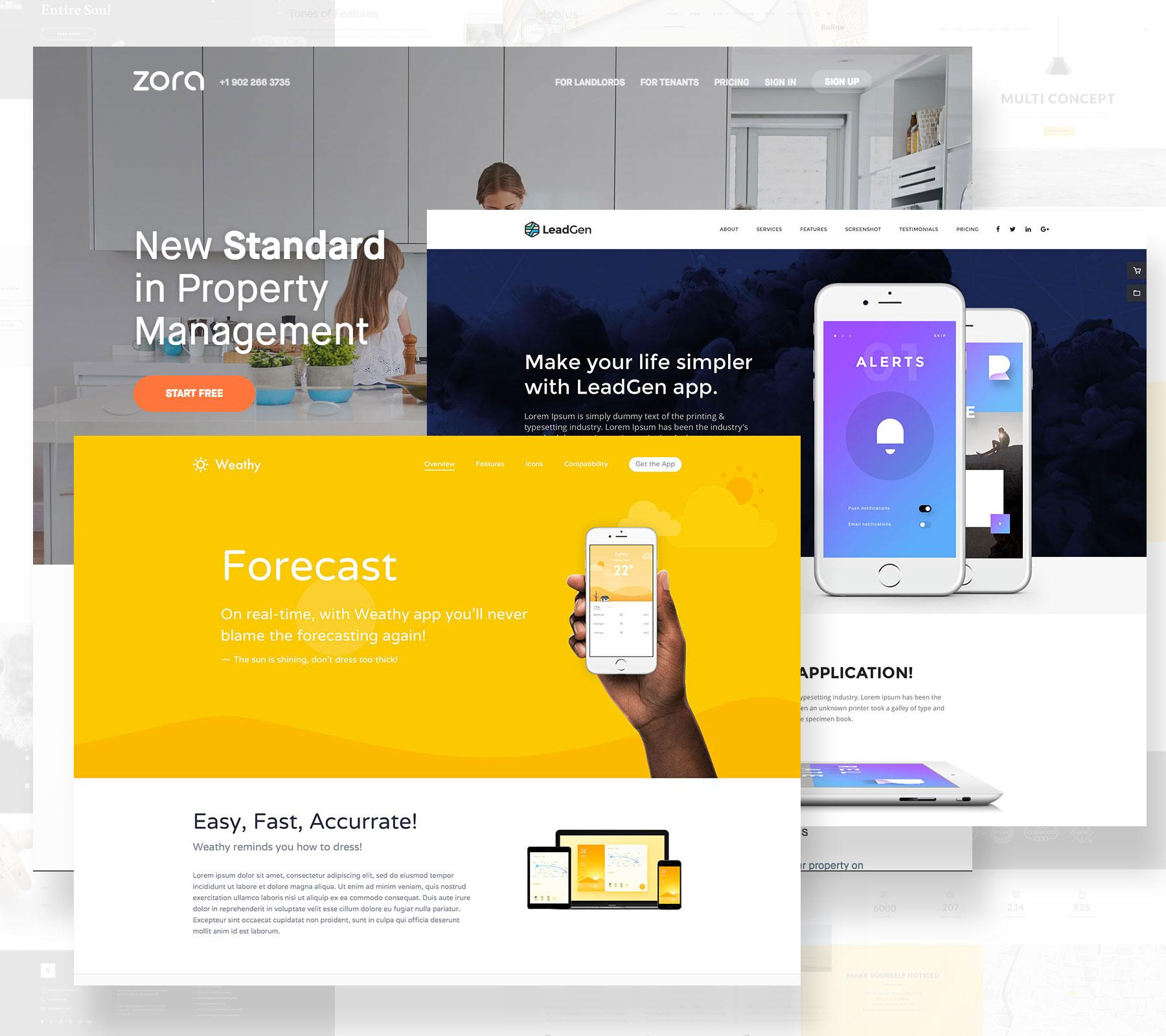
As with other elements in life, we always have to look at the pros as well as the cons. Many argue that websites today lack flavor and are mostly all alike. You know—a big hero image, or video with overlaying text, a row of icons with text, and so on. Anybody can take a couple of minutes of their time and come up with 10 sites that look very similar to each other. Is this the reflection of our constantly changing online behavior and preferences?
Design consistency and designing for common user behavior is extremely important in every design, but we can’t forget about the value of being unique. Have we become lazy or is it that we have shifted our thoughts away from uniqueness and towards a more effective user experience strategy?
Brutalism in Web Design
In its ruggedness and lack of concern to look comfortable or easy, brutalism can be seen as a reaction by a younger generation to the lightness, optimism, and frivolity of today’s omnipresent minimalist web design.
Some love it, some hate it, and many others simply just don’t get it: brutalist websites.
Take Craigslist as an example. Craigslist has to be considered the “granddaddy” of brutalist websites. It’s not aesthetically pleasing and would never be featured on www.awwwards.com. Black text, blue links, white background. It’s not pretty. It doesn’t have to be because it works—and it works really well. You find what you need to buy or sell without any fuss or muss, and without any extraneous moving parts.
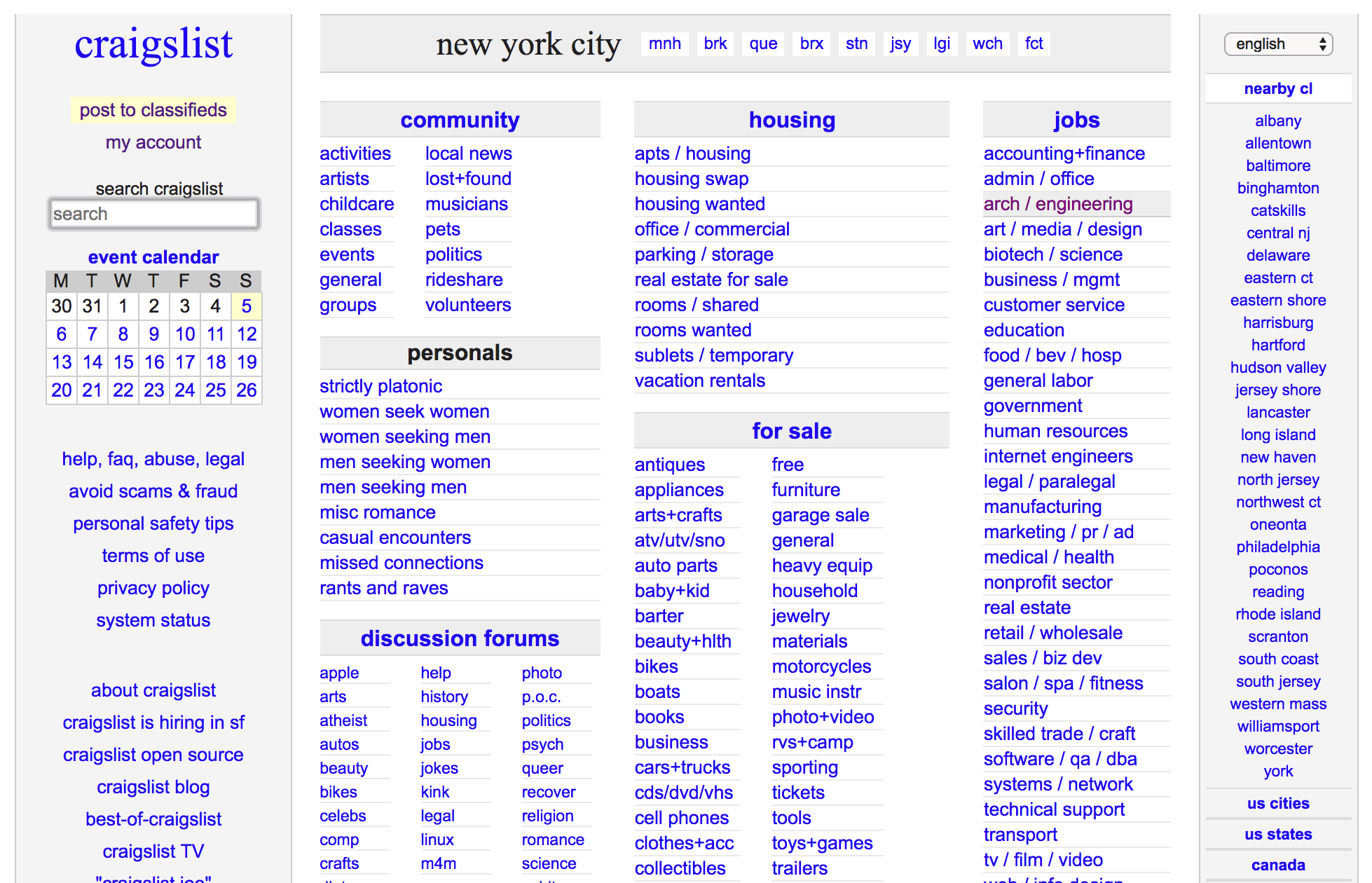
Since its founding in 1996, Craigslist has maintained its popularity despite—or maybe because of—its extremely utilitarian design. The design has not changed in any significant way over the last 20+ years.
Perhaps inspired by the example of Craigslist, the brutalist style is making a comeback. The following are great examples of well-executed designs using the brutalist style.
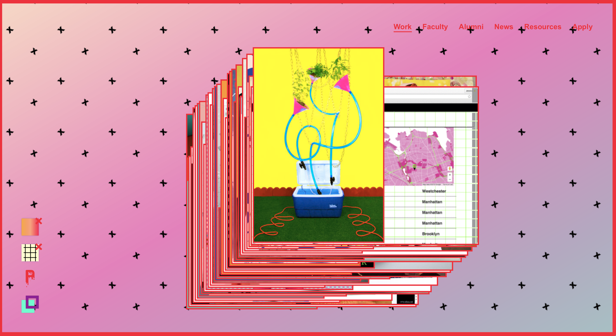
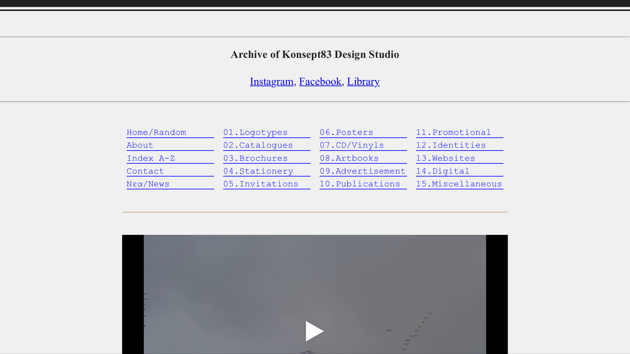
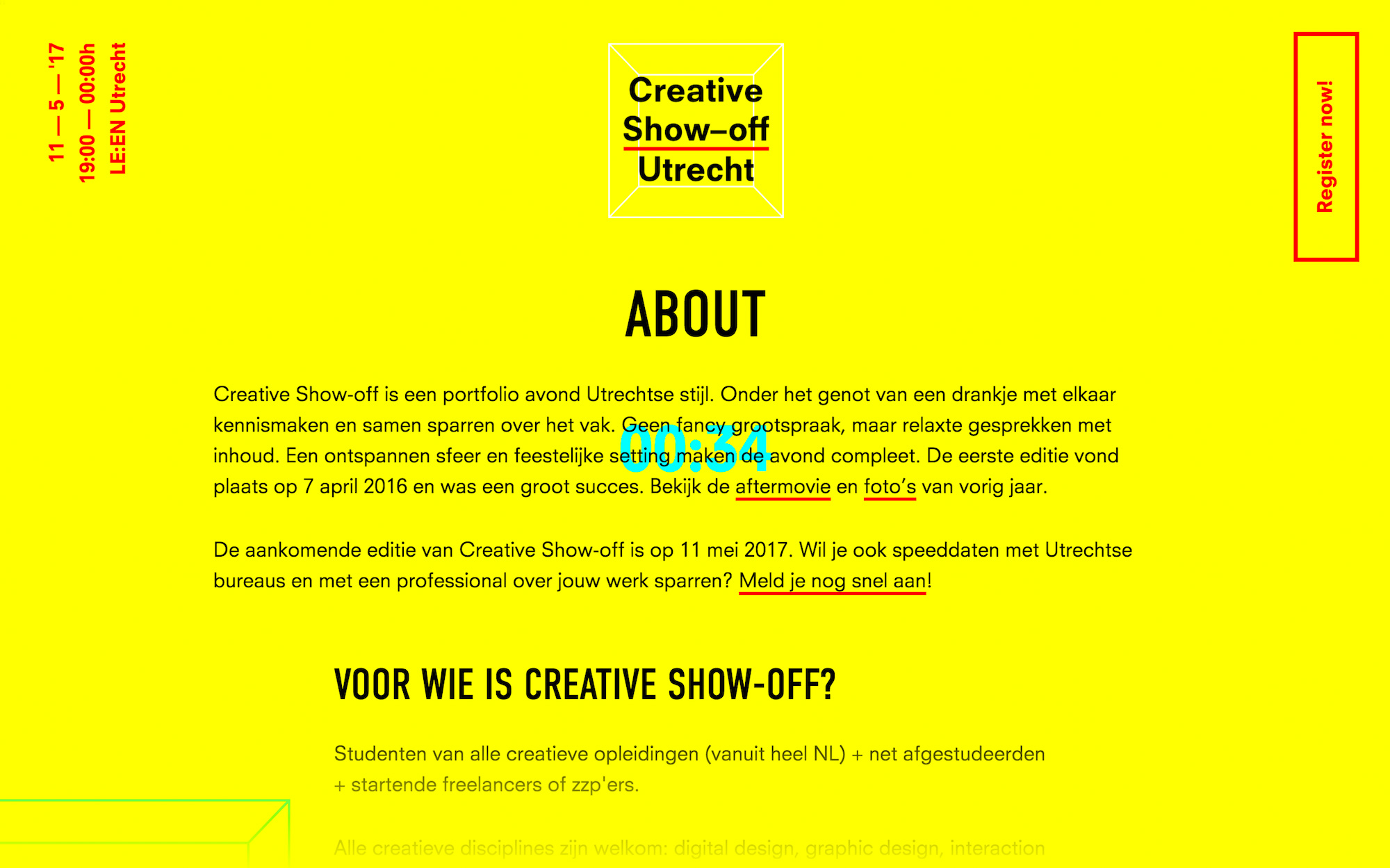
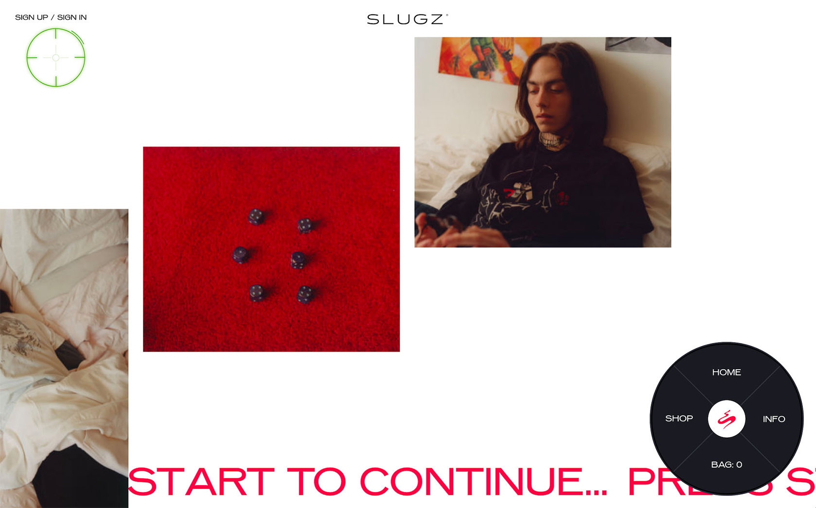
These brutalist websites are catching on in a big way. Why are these websites suddenly so popular? Is it because some designers just got tired of the homogenization of the web?
In the days where UX design is of primary importance, where user behavior and a content-first approach is king, the UX on these sites is bad (intentionally). Contrary to the principles of minimalism, these designs are in-your-face with collages of text and images where layout is all over the place (again, intentionally).
A Brief History of Brutalism
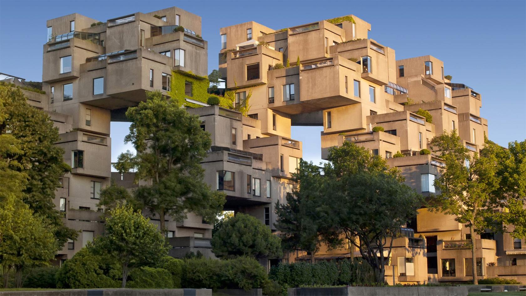
The brutalist design style is not new. A quick search on Wikipedia will tell you that the style actually comes from the brutalist architecture of the 1950s to the mid-1970s. Funny that brutalism was followed by the modernist architectural movement where minimalism was key.
Le Corbusier was one of the biggest pioneers of this movement. His career spanned five decades with buildings designed in Europe, Japan, India, and North and South America.
The term originates from the French word “brut” for “raw,” as Le Corbusier described his choice of material “béton brut,” raw concrete. The hyper-functionalist design seemed designed only to provide utility—not to please—as if giving the finger to modernism.
Brutalism tries to face up to a mass-production society, and drag a rough poetry out of the confused and powerful forces which are at work. Up to now Brutalism has been discussed stylistically, whereas its essence is ethical. –Alison & Peter Smithson, The New Brutalism, Architectural Design (April 1957)
Brutalist designs roundly reject appearance, opting for function over form. Brutalist designers pride themselves on executing designs with minimal effort and the cheapest materials available, to achieve a more honest, anti-bourgeois result.
Brutalism in the Digital Age
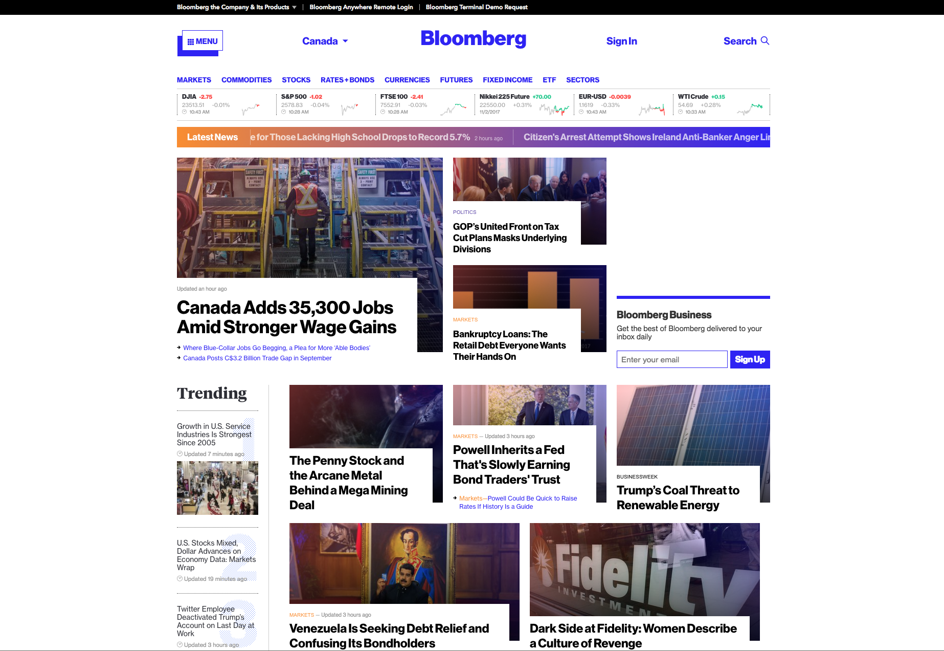
Bloomberg has adopted the style in its own way for its news site. The design is almost garish and clearly focuses on raw functionality.
Brutalism is making a solid comeback. Ugly, raw, breaking free of conventional design, crazy hover effects and superficial ornaments are everywhere. Many purists consider this trend harsh, rough, rugged, uncomfortable, confrontational, and cynical. It is. On purpose.
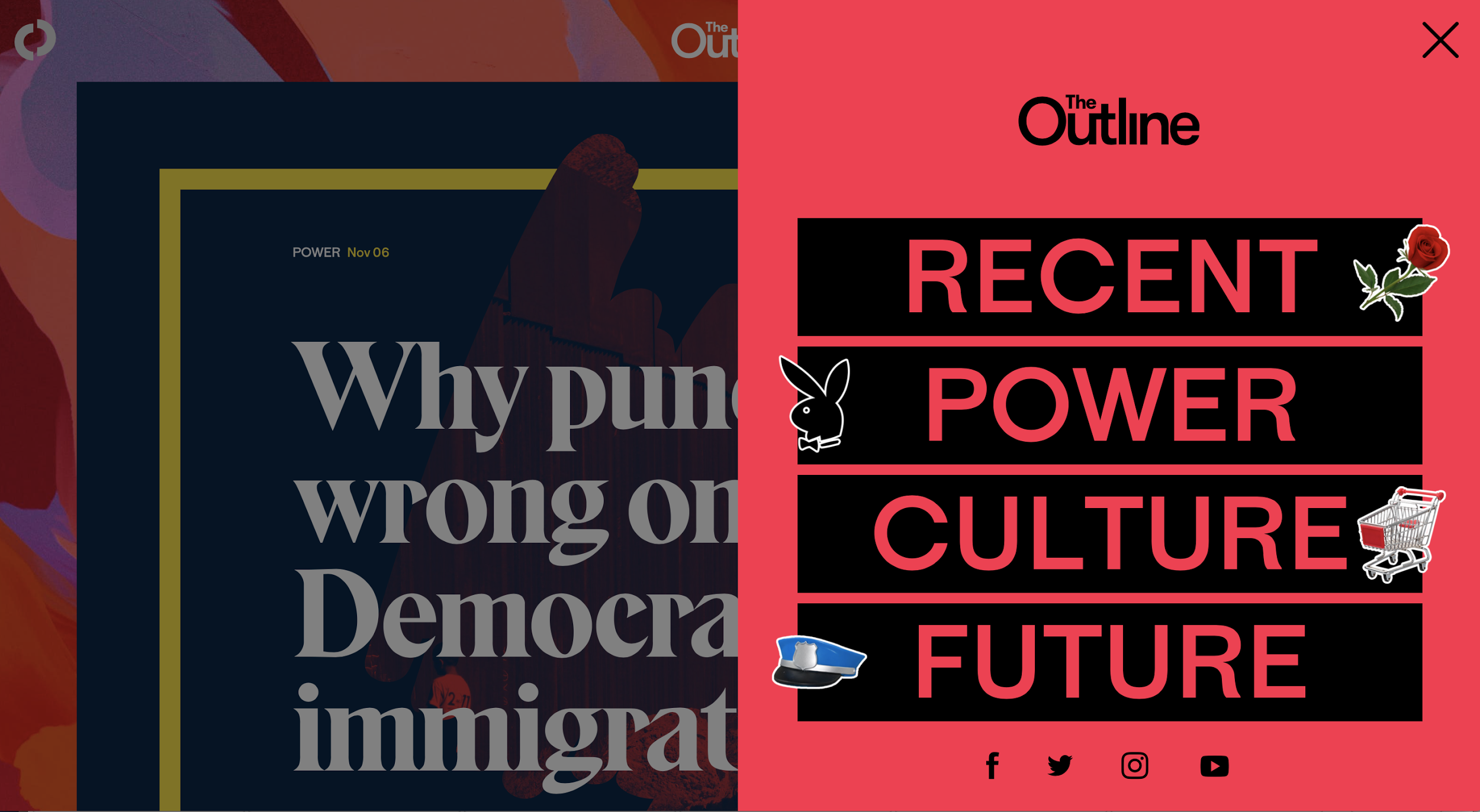
Brutalism has a more primitive approach to design and puts the focus back into the very core of web design: its code. Brutalism is often depicted as an “ugly” design trend, but we have to look past that. The philosophy behind the brutalist movement is not to make things “ugly,” but raw and unadorned.
We could say that today’s brutalist sites are based on the ’90s DIY web, focusing on an inside-out approach instead of hiding functionality behind a beautiful facade.
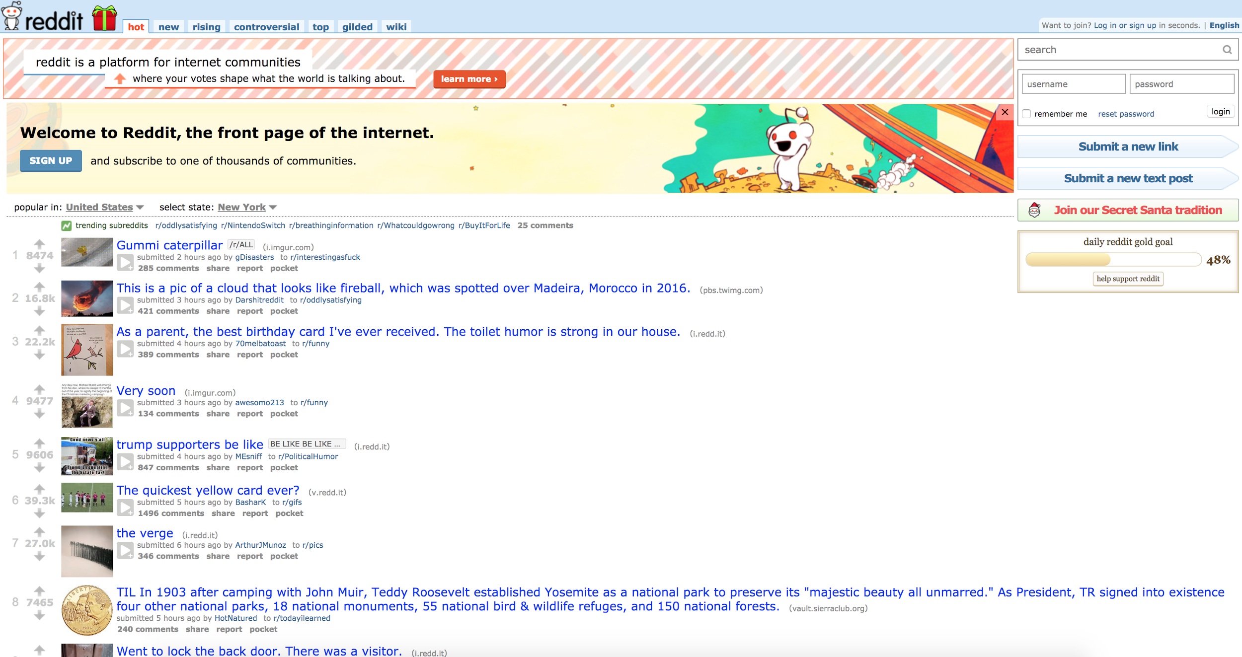
The UI design for the popular social sharing site Reddit is unapologetically raw and boxy, replete with late-90s web typography, unrefined heavy controls, and almost no vertical breathing room.
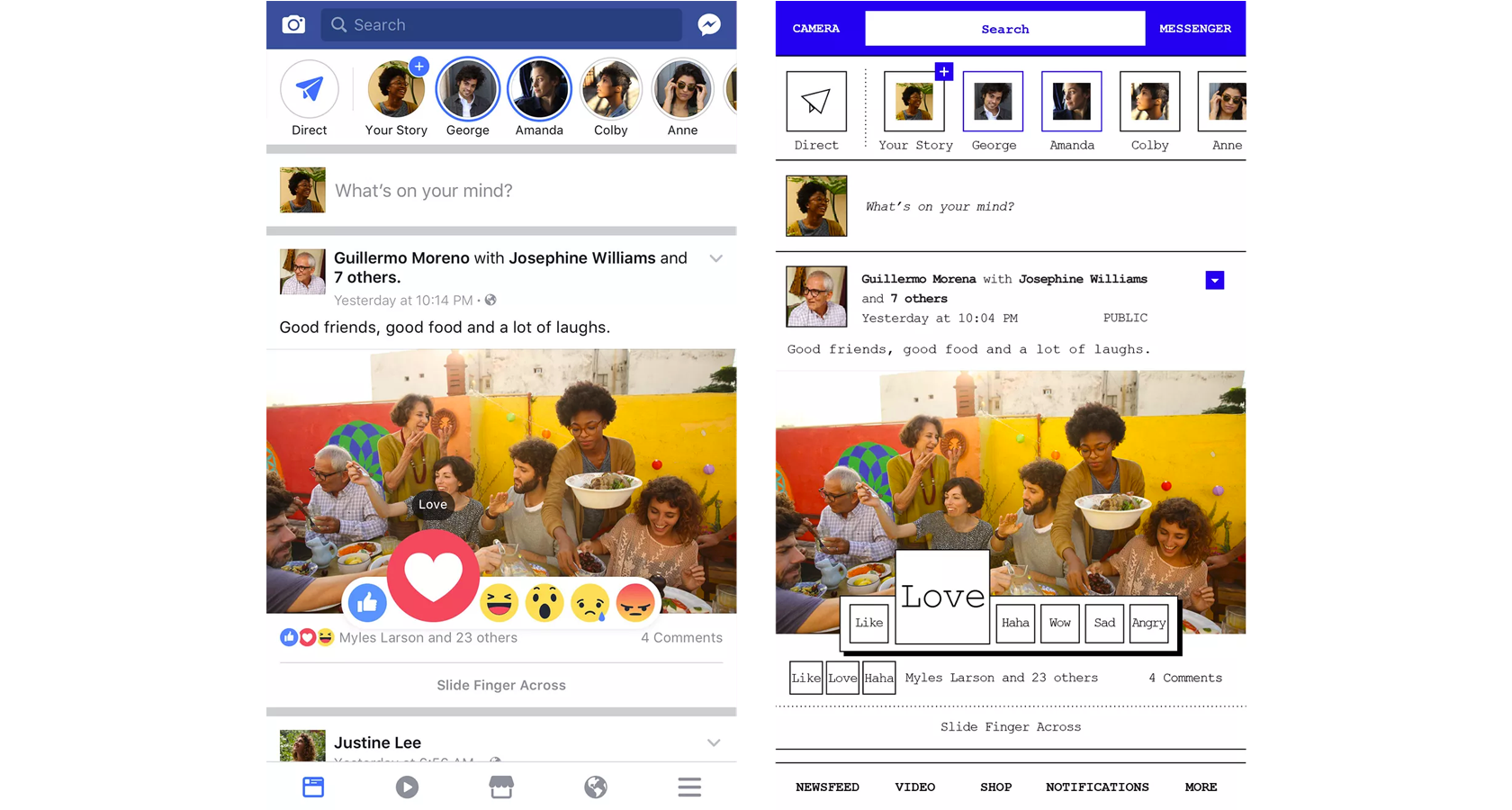
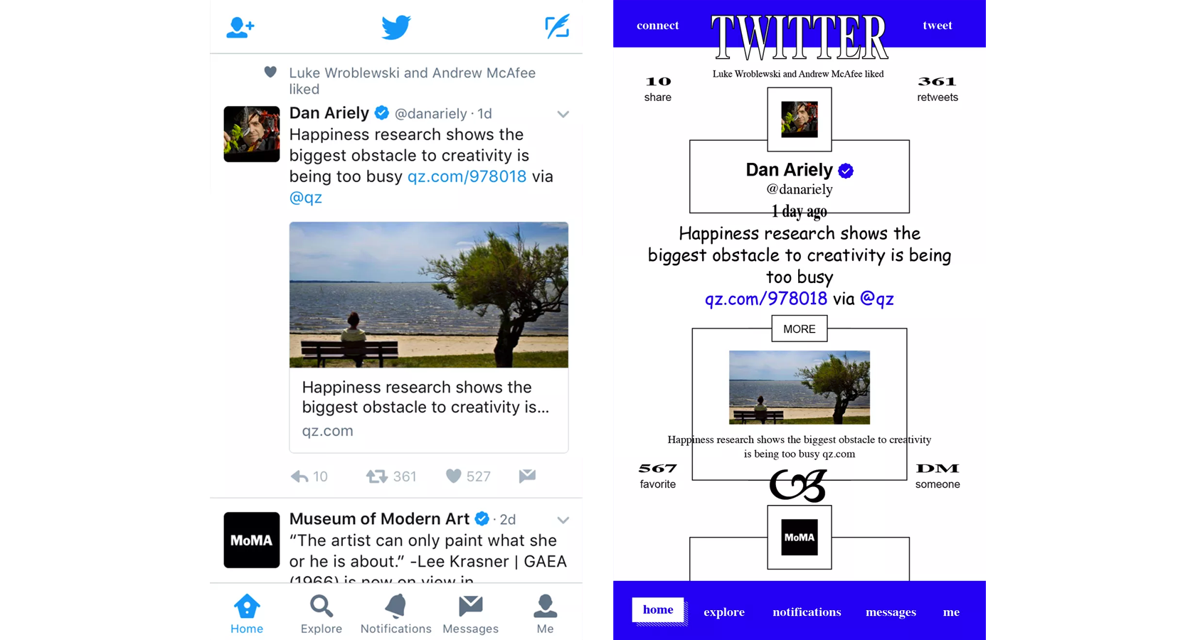
Designer Pierre Buttin has taken brutalism to a new extreme with a series of redesigned mobile apps. In his latest project, titled Brutalist redesigns, Buttin renders Facebook, Instagram, Twitter, and other popular apps in a brutalist style, with text-heavy layouts and flattened designs.
Brutalism vs. Minimalism
Brutalism and minimalism should not be viewed comparatively, but as a new way to see things and another approach to design. Brutalism is a push against the homogenization of today’s sites and apps, but before designers can even begin to design a website using the brutalist approach, they first must know which rules they are going to break.
Conventional, minimalist design is not going to be replaced by brutalism. We must look at brutalism as a design culture that’s challenging the status quo—a culture that is tired of being told what is “best.”
There is no right or wrong when choosing between these styles for your next project. Nevertheless, before you run out and design your next website or app in a brutalist design style, make sure you know your audience. Take the risk if you think the company and your audience will appreciate it.
Brutalist web design attracts attention and brand awareness is growing tremendously fast. Rules are made to be broken. Dare to let the web be the web. Dare to stand out and be a little daring, even if a little bit weird.
Let us know what you think! Please leave your thoughts, comments, and feedback below.
Further Reading on the Toptal Blog:
Pascal Potvin
Ottawa, ON, Canada
Member since October 31, 2016
About the author
With 12 years in UI/UX and creative direction, Pascal has delivered immersive experiences, led design teams for Sony, Fox, Disney, and more.
PREVIOUSLY AT


