The World Is Our Interface: The Evolution of UI Design
Today, computers are omnipresent. With the rapid advance in the evolution of UI design, an exploration into human interaction with objects, the environment, and technology has become essential.
Today, computers are omnipresent. With the rapid advance in the evolution of UI design, an exploration into human interaction with objects, the environment, and technology has become essential.
Danielle is a UI designer who has worked at large advertising and branding agencies. She is also a co-founder of two successful startups.
Today computers are omnipresent. You can’t escape them. We are living in an exciting age of design and evolving user interfaces; a new technological era where our clothes, accessories, homes, cars, and streets have become one massive user interface—dubbed by some as the “ambient intelligence world.”
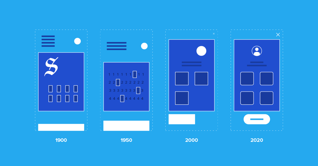
Examining the history of UI design improves our understanding of today’s interface design needs and practices. The evolution of UI design can be broken down into four periods: the age of tools, the age of the machine, the age of software, and the age of the self. With this rapid growth, an exploration into human interaction with objects, the environment, and technology has become essential.
The Age of Tools
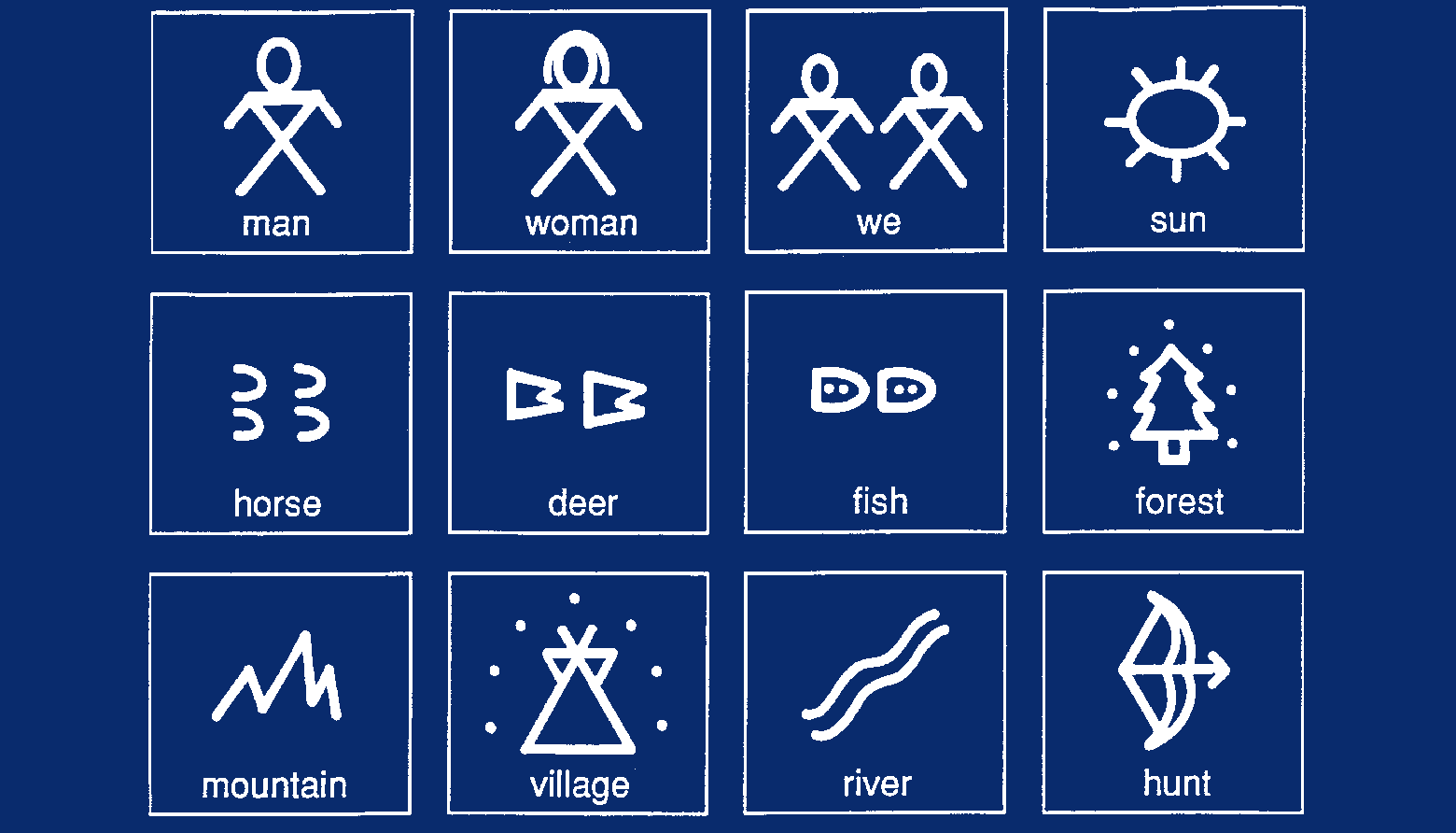
Using primitive tools, early humans began to communicate by drawing representations of animals and nature on stone surfaces. Hieroglyphs, which were highly symbolic, were one of the first methods used to communicate. This symbolism would later develop into art, writing, documentation, and story-telling.
Over time, the tools became more sophisticated, resulting in some (e.g., pens) still being in wide use today. We have come full circle and are once more using simple symbols and iconography, such as emojis, to signal emotions and communicate subtleties that go beyond words.
The Age of Machines
The industrial revolution emphasized productivity. During “the age of the machine,” we built objects at scale to help our lives become easier. It was a time when the hardware itself was still the main “user interface.”
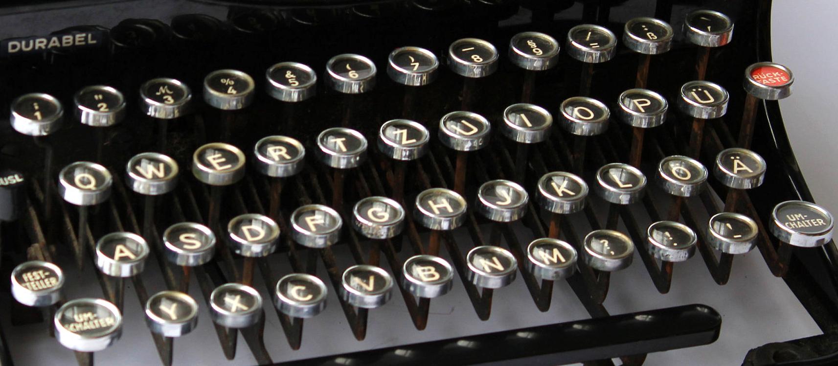
One example of this is the invention of the typewriter in 1868 by Christopher Latham Sholes. We began tapping physical keys to create words, still using our hands, but with the help of the typewriter as a replacement for the pen. It saved time and helped create a consistent and practical format that could be adopted quickly.
Machines were being mass-produced and the power shifted to them. The hardware as interface had arrived; the drawback, however, was that it was necessary to learn how to type before it could be used.
The Age of Software
Software needed a “user interface,” and searching for a model that would be easy for users to adopt, UI designers turned to people’s behavior and earlier hardware designs for inspiration.
People already had a mental model of a typewriter’s keyboard; they already knew how to type, so the natural progression was to begin interacting with text on digital screens the same way.
This also applies to mobile on-screen keypads that look like mini versions of the same keyboards and typewriters. With the movement toward touch, an entirely new way of interacting with our environment began to be defined.
UI design’s evolution has been influenced by common analogies, preceding hardware, and intuition (familiarity and mental models). Best practices for lowering the barriers to adoption (and good UI design in general) include a desire to align with people’s mental models, keep an open mind, and maintain a connection to the ambient world.
Enter skeuomorphism, which was an attempt to help users understand how to interact with a user interface by making UI elements on a two-dimensional screen appear similar to the three-dimensional world. Designers created user interfaces with digital controls that looked like their physical counterparts, such as a turning dial to control volume on a digital music player.
Apple famously led this trend under the direction of Steve Jobs. It wasn’t until Jonathan Ive became more influential at Apple that skeuomorphic design slowly evolved into a “flatter” style, marked by the release of iOS7 in 2013. The world was ready to make the leap to less literal cues and could now appreciate the simplicity of a minimalist interface.
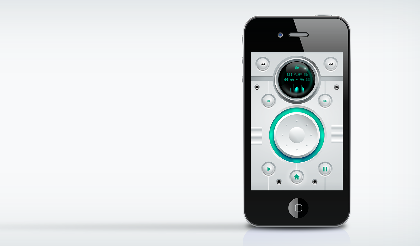
Apple’s iOS Human Interface Guidelines encouraged designers to shift the mindset from “bezels, gradients, and drop shadows” (which can lead to heavier-looking UI elements) and focus more on the content and allow the UI to play a supporting role.
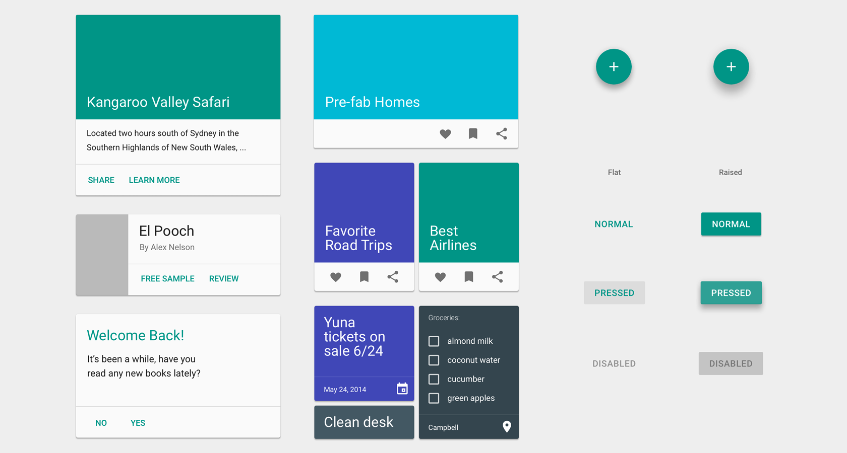
Google’s Material Design also shifted towards a different representation of the third dimension by giving the entire digital canvas depth with subtle layers and drop shadows, as opposed to individual UI elements as represented in skeuomorphism.
Material design depicts the “surfaces and edges of the material provide visual cues that are grounded in reality. The use of familiar tactile attributes helps users quickly understand affordances. The fundamentals of light, surface, and movement are key to conveying how objects move, interact, and exist in space and in relation to each other.”
Touch Is Human-Centric
With the rise of the touch-screen smartphone, people became familiar with a range of gestures. Everyone learned the difference between a pinch, a tap, a long tap, and got used to pinching in and pinching out as a way of zooming in and out of images and maps.
This behavior has become so natural that it’s pretty fair to assume at least 85% of the adult population have at some point tried to zoom in on a physical map or desktop screen. And babies using tablets have tried to interact with elements on TV screens by tapping on them.
Touching screens to interact with a user interface works because it’s intuitive, i.e., when people see it, they know exactly what to do. Humans are born to explore everything with their fingers; it’s innate and a reminder of where it all began.

Touch-Based UIs Came at a Price
Along the way, designers created some pretty obscure gestures that made it nearly impossible to find and use available interactions in a mobile UI. The user experience suffered because designers started hiding gestural interactions for aesthetic reasons.
But as any UX designer worth their salt knows, discoverability and obvious always wins. There is a saying among UX designers, “If people can’t find it, it doesn’t exist.”
In other words, touch-based UIs came at a price. Following trends, some UI designers hid a lot of essential functions and available interactions behind a sleek façade. The ubiquitous hamburger menu is one example; it has usability issues because it’s considered hidden navigation. They have low discoverability, therefore, less efficiency.
Exacerbating the problem was the heated competition between Android and iOS, where iOS initially led the way and significantly reduced its Human Interface Guidelines. The simplicity looked beautiful, but designers were hiding the ugly or complicated components, which often made interfaces more challenging to use. Android emulated many of the worst things Apple implemented, and it wasn’t until Material Design was introduced that UI consistency became a standard in Android design.
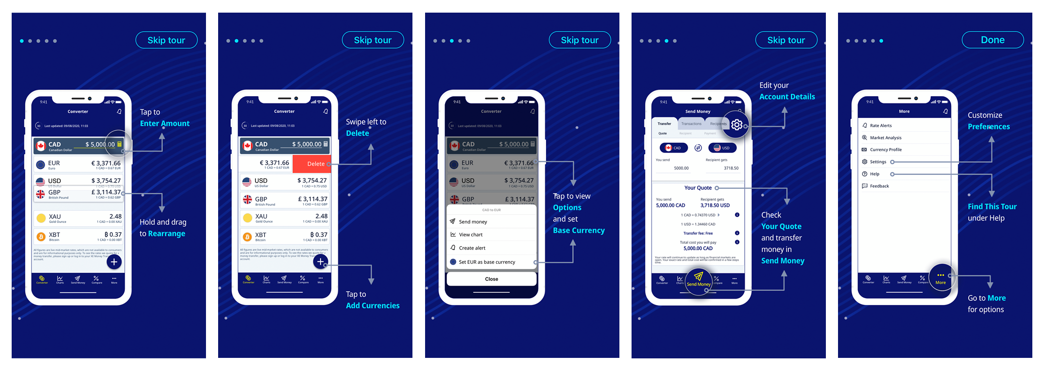
To make matters worse, designers started employing this trend more and more, becoming lazy with the overuse of hidden gestural interactions and relying on extensive onboarding sequences to show people how to use their mobile UIs.
A user interface is like a joke. If you have to explain it, it’s not that good. Martin Leblanc, iconfinder.com
Touch UIs Only Work on Sufficiently Big Screens
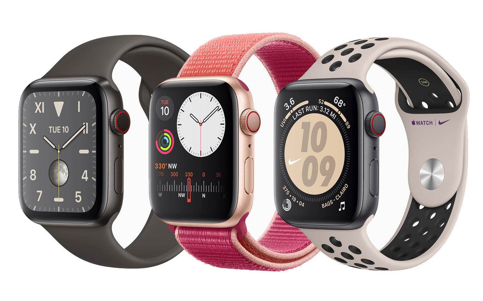
Today, wearable devices have such small screens interactions become difficult. It’s hard to navigate anything too complicated using hardware-centric features such as Apple’s Digital Crown. The design revisits the real-world behavior of watches but used in this scenario everything becomes time consuming and fiddly. Nevertheless, some smart devices do go in the right direction.
The Internet of Things (IoT) expands the use of our everyday devices into interactive environments and are great examples of real-world hardware mimicry done right, putting functionality in the forefront. Unlike the Digital Crown, larger dials are functional and sensible.

Taking visual cues from the original thermostat design and incorporating the way people typically use dials, the Nest Learning Thermostat is an example of a product that, while being simple to use, fits seamlessly into the home.
Force Touch, a technology first unveiled in 2014 during the introduction of the Apple Watch, was also deployed on the 6th generation iPhones and has rapidly expanded to all kinds of devices.
UIs Evolve Again To Mimic Ancient Approaches
The next level in the evolution of UI design illustrates how everything comes full circle. The Apple Pencil is both hardware and software technology at its best, helping users draw and write in the digital realm. While the Apple Pencil has now made this idea mainstream, it wasn’t so long ago (2007) that Jobs famously said, “Who Wants a Stylus?” before introducing the iPhone’s multi-touch technology.
Steve Jobs had a point about usability and the difficulty of using such a small stylus on a small mobile device screen; it ended up not working for Microsoft. Most early Windows Mobile devices came with a stylus, and the primary touch input technology were resistive touchscreens which often required a stylus for input. The tools were not right for the time, forcing people to use a pen-like device to operate a mobile UI. It didn’t feel natural.
When portable screens grew larger, the time was ripe to use a separate gadget for input (drawing and handwriting) that felt like a pen. It’s the reason why the Apple Pencil debuted on the oversized iPad Pro instead of the smaller 9.7- and 7.85-inch models.
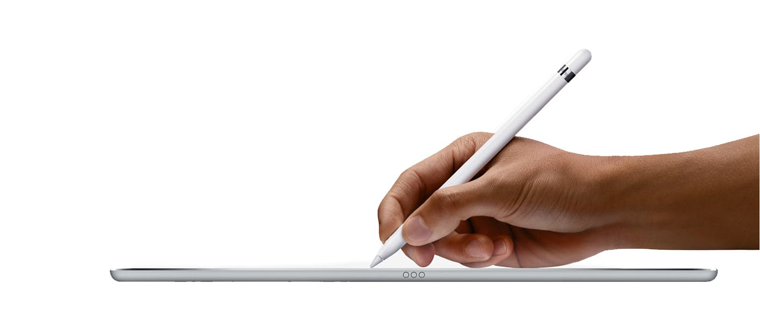
The Apple Pencil is human-centric because it employs two already familiar things: a pencil and a tablet. There is no need to learn anything new to use it. The human brain has been familiar with this form of writing since our ancestors pressed the blunt end of a reed stylus into wet clay tablets around 3,000 B.C.E.
Longterm, designers must become more human-centric in their design philosophy and design products that facilitate innate behaviors, rather than those that force people to learn new skills.
Moving Beyond Touch – VUIs
If small screens prompted designers to explore other ways of interacting with technology, new use cases in different contexts inspired them to think of different ways people could use technology.
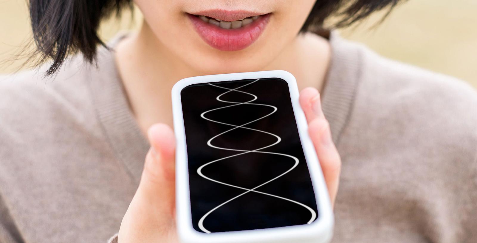
Voice user interfaces are helping to improve all kinds of user experiences, and some believe that voice will power 50% of all searches by 2020.
Voice can be passive or interactive and is a powerful way to interact with technology, one of its benefits being that it is hands-free.
The User Interface Is Becoming the World Around Us
To help the ambient world to become a user interface, Google’s Advanced Technologies and Projects (ATAP Lab) developed Project Soli, a new sensing technology that uses a miniature radar for motion tracking the human hand. Enabling touchless gesture interactions, the interactions feel physical and responsive because feedback is generated by the haptic sensation of fingers touching each other.
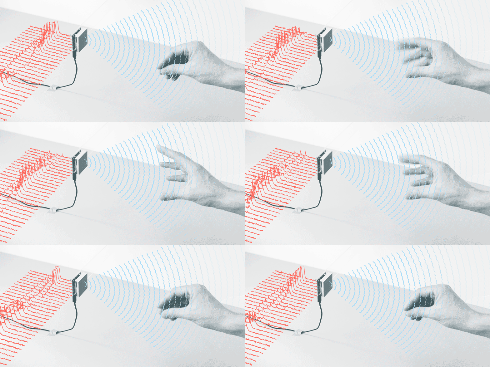
The technology and screens we use today are disappearing into our surroundings. IoT (Internet of Things) and AI with voice assistance is already here. In the evolution of user interface design, the age of “ambient intelligence” is dawning, where a multitude of devices work in concert to support people in carrying out their everyday life activities. As a consequence, screen-based UIs are slowly disappearing.
How will designers design for an AI-enabled, “ambient intelligence” world? What are the implications for the future evolution of UI design?
In this “new world,” it will be more about designing experiences, not UIs.
Further Reading on the Toptal Blog:
Understanding the basics
What are the 10 rules of good UI design?
The 10 heuristics for good UI design are: Match the real world; Consistency & Standards; Help and Documentation; User control & Freedom; Visibility of System Status; Flexibility & Efficiency of Use; Error Prevention; Recognition, Not Recall; Error reporting, Diagnosis, & Recovery; Aesthetic & Minimalist Design.
What is the difference between UX and UI design?
A UX designer focuses on people’s experience—what motivates/frustrates them; what they enjoy/don’t enjoy; what satisfies/brings them delight. A UI designer’s job is about aesthetics, interaction, and function; they focus on the visual elements (e.g., buttons, links, icons) of a UI, as well as its interactivity.
Why is UI design important?
As the evolution of UI design advances, end users have become more demanding and consequently so has the role of the UI designer. These five points highlight the importance of UI design: competitive advantage, brand loyalty, enhanced engagement, customer acquisition, and customer retention.
Does UI design require coding?
While it’s helpful, and definitely a competitive advantage for UI designers to have a good understanding of what can and can’t be done in the development phase of a project, UI coding skills are not absolutely necessary for UI designers.
Who invented UI?
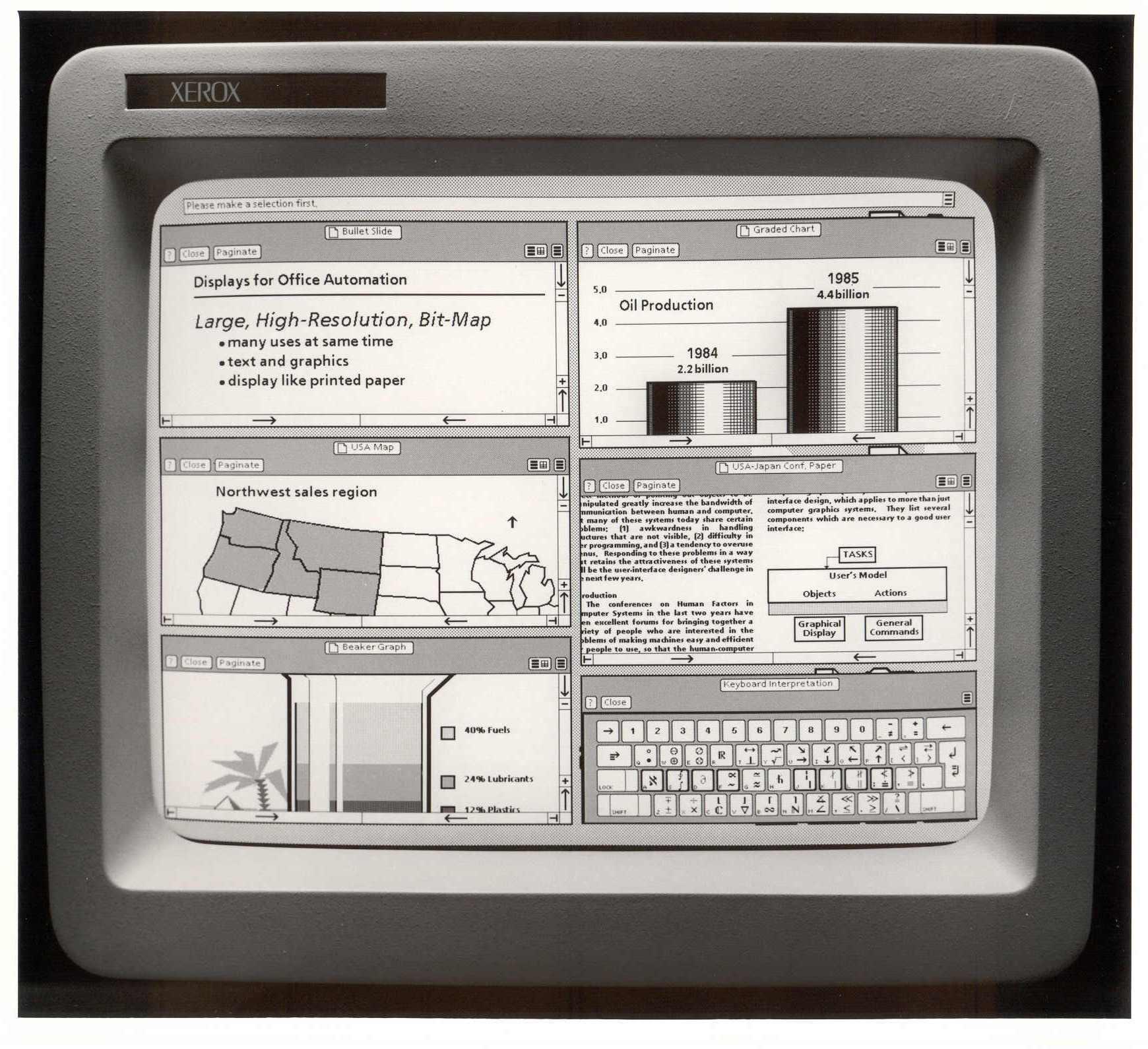
In 1981, Alan Kay, Douglas Engelbart, and other researchers at Xerox PARC developed the first UI, at that time called a GUI. In 1983, Apple introduced the Lisa, the first computer with a GUI—an important moment in UI design history, as the Lisa was also the first computer developed for personal use.
Who created the first user interface?
Often called the father of GUI, Douglas Engelbart worked with Alan Kay and other researchers at Xerox PARC to develop the first graphical user interface (GUI). Introduced in 1981, it is a seminal moment in the evolution of the user interface.
When was the first user interface made?
The history of user interfaces covers 50+ years. Originally known as a GUI (graphical user interface), the first personal computer that used a modern graphical user interface was the Xerox Alto, developed in 1973. It was not a commercial product and was intended mainly for research at universities.
About the author
Danielle is a UI designer who has worked at large advertising and branding agencies. She is also a co-founder of two successful startups.
