
Advanced PowerPoint Presentation Tips and Hacks
Many have a love-hate relationship with Microsoft’s PowerPoint. While super flexible, the tool can also be manual, tedious, and all-consuming, especially for the uninitiated. Authored by a management consultant for Fortune 500 companies, this article will help every user—from the beginner to the advanced operator—smooth out some of their points of friction and become an expert-level user of the application.

Many have a love-hate relationship with Microsoft’s PowerPoint. While super flexible, the tool can also be manual, tedious, and all-consuming, especially for the uninitiated. Authored by a management consultant for Fortune 500 companies, this article will help every user—from the beginner to the advanced operator—smooth out some of their points of friction and become an expert-level user of the application.

Melissa Lin
Melissa has worked in ECM, tech startups, and management consulting, advising Fortune 500 companies across multiple sectors.
Expertise
Key Highlights
Beginner PowerPoint Tips for Creating Effective Presentations
- Keep Your Presentations Simple: Minimize cluttered, distracting slide-decks that are overly saturated with content; they will lose or confuse your audience more often than not.
- Seek to Communicate One Takeaway per Slide: Streamline your message and its supporting content to one key takeaway per slide. Much more tends to reduce engagement, comprehension, and retention by your audience (think "diminishing economies of content").
- Leverage Illustrations in Place of Text: Prose-heavy presentations tend to induce content fatigue, which again induces a loss of engagement on the part of your audience. Relevant, high-quality images have proven themselves useful in maintaining engagement, especially for longer presentations.
- Understand That Formatting Is King: Clean, simple and consistent formatting, complete with discernible themes, colors, fonts, shapes and sizes perform wonders where creating a polished, professional, and finished product is concerned.
Advanced PowerPoint Tips for the Expert User
- Customize Your Quick Access Toolbar: The Quick Access Toolbar (QAT) is a customizable toolbar that sits above the PowerPoint ribbon, and where one can add frequently used commands. Effective use of the toolbar is a PowerPoint trick that eases friction for power users and saves hours in the long run.
- Use PowerPoint Shortcuts in Place of Your Mouse: Understand the functions that you use most frequently and memorize their keyboard shortcuts. This PowerPoint hack will cut hours of manual work from your PowerPoint experience.
- Create Your Own Go-to Templates: Using the "Slide Master" view in PowerPoint, you can create personal, pre-formatted, and pre-fabricated templates, complete with font choices, font sizes, color schemes, and more, that will minimize your formatting load in the "polishing" phase of your presentation.
How Can a Financial Consultant Help You/Your Business Prepare for a Pitch?
- Work alongside you as a thought partner to design, create, and deliver a polished and professional PowerPoint presentation/pitch ahead of your meeting.
- Draft and clean up the content (literary) that will be featured in your slide deck, including your personal speaking points and audience takeaways.
- Create the financials, models, infographics, and outputs that will be featured in your slide deck.
- Assist you with dry-runs, rehearsals, and other preparation assistance ahead of the presentation date, with expert feedback and tips regarding performance.
Love It or Hate It…
Love it or hate it, PowerPoint is ubiquitous when it comes to formal presentations. Perhaps you are pitching a new proposal. Or perhaps you’ve spent weeks number-crunching or conducting intensive research and it’s time to communicate your findings to the relevant stakeholders. Whatever your purpose, PowerPoint is arguably one of the most important components of your success.
When I was a management consultant I lived in Microsoft Excel and PowerPoint, toggling between the two programs every day. I loved that PowerPoint’s flexibility allowed me to illuminate and transform data into a story—a story of financials, an industry’s growth trajectory, or recommendations for restructuring a business process. However, especially as I was just starting out, this flexibility often proved to be a double-edged sword. It was frustrating how tedious slide design could be, and how long it took to aesthetically perfect a slide. I often found myself choosing between effective slides that took hours to create and a more basic deck that was quick to produce but less effective in communicating the data and the message. It wasn’t until I mastered some essential PowerPoint tips and tricks that I no longer experienced this dilemma.
This article showcases a selection of advanced PowerPoint hacks and presentation tips and tricks that will enable you to use the tool with ease. It will hopefully also prevent you from sacrificing effective messaging in an effort to save time. While many PowerPoint articles provide qualitative advice around effectively delivering a message, this piece focuses on the technical components of how to make an advanced PowerPoint presentation. It utilizes functionalities and commands in Microsoft 365 PowerPoint for PC. Let’s get started.
The Basics of Creating Effective PowerPoint Presentations
Though this article is designed for users with more advanced PowerPoint skills, it may be useful to kick off with a refresher of some basic do’s and don’ts for creating effective PowerPoint presentations. Subsequently, we may then delve into some of the nitty-gritty of PowerPoint’s more advanced features. Throughout my career, the following four rules have served me well:
Rule 1 - Keep Your Deck as Simple as Possible: Likely the most important PowerPoint rule, “less is always more” with great presentations. Avoid clutter; minimize flashy, complex slides with distracting clipart in motion; and always focus on delivering a clear and succinct message.
Rule 2 - Keep Each Slide to Just One Key Takeaway: Resist the temptation to throw the kitchen sink at your audience, in general, but especially on a per-slide basis. You will hold your audience’s attention far more easily and leave them with more tangible, digestible takeaways simply by limiting the scope of your content to just one key point per slide.
Rule 3 - Use Simple, High-Quality Graphics Often and in Place of Words: As an addendum to Rule 1, too many words on a page tend to be both tedious and a bore for your audience, often resulting in a loss of focus, or “content fatigue,” during your presentation. GIFs, graphs, charts, and other informative and relevant illustrations tend to be great ways to break up tedium and add dimension to your flow.
Rule 4 - Clean and Simple Formatting Will Take You Far: Clean bullet points, consistent color themes, soft font styles, and legible font sizes all go the distance in leaving a great, professional impression on your audience as you present a polished finished product. Calibri (font), in metallic grey (primary color), punctuated by sky-blues (secondary color) have worked wonders for me over my career. Feel free to adopt them.

Customizing the Quick Access Toolbar
The first step to becoming a PowerPoint expert is building your Quick Access Toolbar. It’s a customizable toolbar sitting above the ribbon, where you can add your favorite and most frequently used commands. Invest five minutes to set it up, and you won’t regret it—it’ll pay dividends each time you use PowerPoint thereafter. Here’s a quick lay of the land before we delve into the logistics:

To customize your toolbar’s functionality and ordering according to your preference, simply click the white downwards-facing arrow above your ribbon. Then click “More Commands” → Choose Commands from “All Commands” → Select and add your favorite commands. If you want to remove any commands, simply select the command and hit “Remove.”
My “must-haves” for the ultimate quick access toolbar (QAT):
Align: The alignment tool is hands-down my favorite tool in PowerPoint. Bypass the futile, manual effort and instead highlight the shapes you want to align, and choose which direction to align them. You can align objects to the middle, right, left, top, and bottom of each other. Keep in mind that the positions of the objects are all relative to each other.
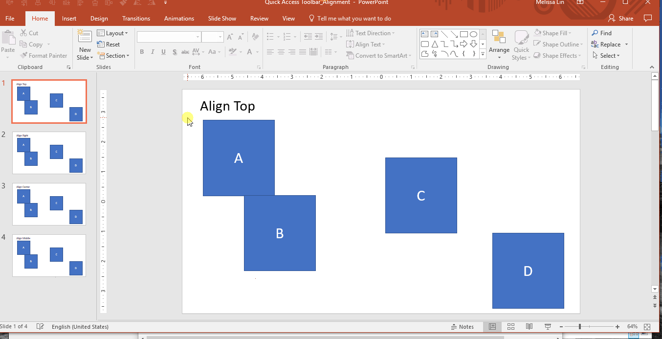
If you want to use this tool outside of your QAT: Highlight your desired objects → Format tab in the ribbon → Click Align → Select your preferred alignment direction → The objects will be aligned.
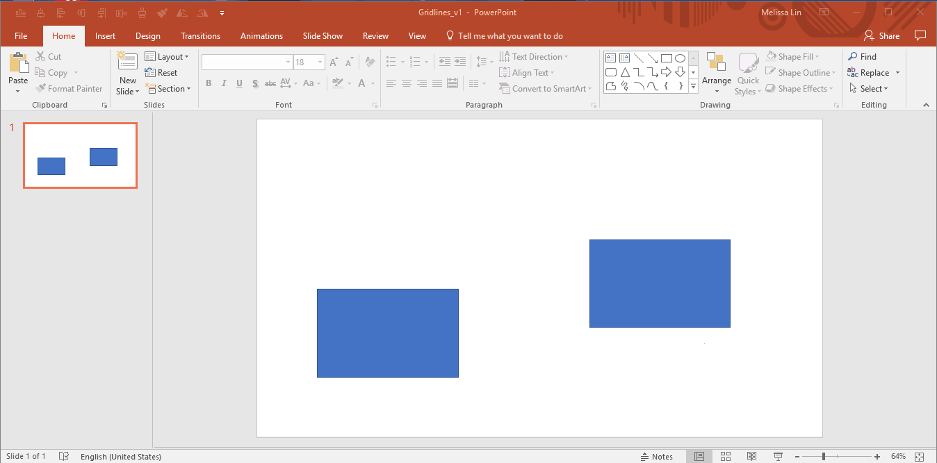
Distribute: If you have multiple objects or shapes that you want to make equidistant from each other, this tool will be your new best friend. Before distributing objects, it’s best to first align them. Then, to distribute, simply highlight the objects you want to distribute, and select “distribute horizontally” or “distribute vertically.”
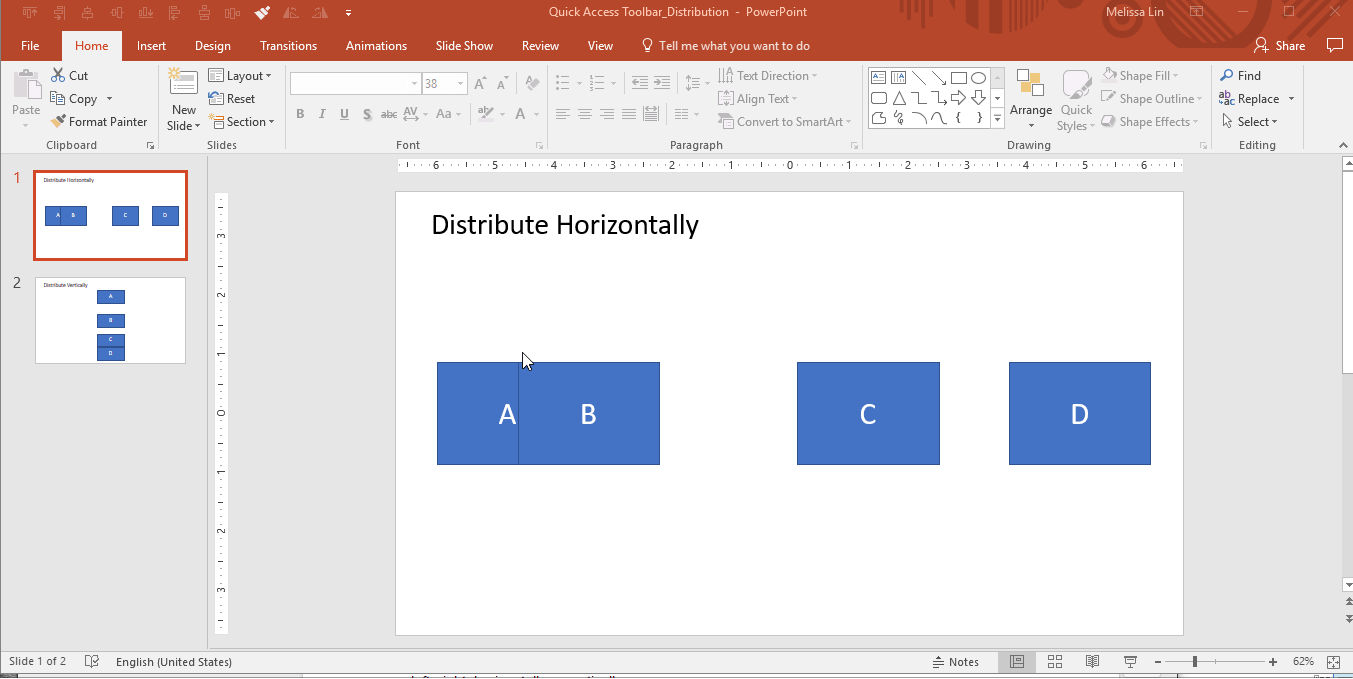
If you want to use this tool outside of your QAT: Highlight your desired objects → Format tab in the ribbon → Click Align → Select Distribute Horizontally or Distribute Vertically → The objects will be distributed.
Format painter: Allows you to copy the formatting from one object and apply it to another one. It is essentially copying and pasting, but for formatting and not content.
- One click on format painter: Applies the formatting from the original object to the next object you select/click on.
- Two clicks on format painter: Locks in the format painter. After double-clicking, any object you select will convert to the formatting of the first object. To unlock format painter, click on any white space on the slide (not an object).
If you want to use this tool outside of your QAT: Select the object you want to mimic → Click Format Painter once or twice in the Home tab in the ribbon → Click on the object you want to change → The formatting changes will be applied.
Rotate: As the name implies, this feature enables you to rotate objects, in increments of 90 or 180 degrees. You can rotate a text box, shape, WordArt, or picture. This includes rotations to the right 90 degrees, to the left 90 degrees, vertically, and horizontally.
If you want to use this tool outside of your QAT: Highlight your desired object(s) → Format tab in the ribbon → Click Rotate → Select your preferred rotation option → The objects will be rotated.
Life-changing PowerPoint Keyboard Shortcuts
You might think I’m exaggerating, but once you realize you don’t have to manually perform these actions, you won’t look back. Generally, utilizing PowerPoint does not require memorizing as many hot keys as Excel does, but there are a few that you should be aware of.
Easily change the order and indent level of bulleted text in text boxes:
- Change the order of bulleted text in text boxes: ALT + SHIFT + Up/Down Arrow Key
- Change the indent level of bulleted text in text boxes: ALT + SHIFT + Right/Left Arrow Key
Resize an object while keeping them regular and in proportion:
- Hold SHIFT while you’re resizing an object with your pointer/mouse
Micro-nudges (small nudges for your objects):
- Select the object and hold CTRL + Up/Down/Right/Left Arrow Key to move it
Duplicate your shape or object without copy & paste:
- CTRL + Drag the shape with your pointer/mouse
Ensure that your lines are actually straight:
- For vertical lines: Insert the shape → Right click → Format Shape → Size & Properties → Set “Height” to “0” → Perfectly straight line
- For horizontal lines: Insert the shape → Right click → Format Shape → Size & Properties → Set “Width” to “0” → Perfectly straight line
Transform a number into a footnote superscript:
- Type in the number of the footnote (e.g., 1, 2, 3) → Highlight the number → Hold CTRL + SHIFT + the equal sign (=) → Your number will now be a footnote superscript
Adjust the case of your text by toggling between text cases (lowercase, title case and all caps):
- Highlight the desired words and use the SHIFT + F3 shortcut. Each time you hit F3, the highlighted text will change to all lowercase, all caps, or title-style where only the first letter of a word is capitalized.
PowerPoint Design Tips for Common, Frustrating Situations
If you’ve worked in PowerPoint consistently, you’ve likely encountered the following conundrums. Instead of spending an unnecessary 15-30 minutes Googling the issue for a workaround, here’s how to navigate the situation every time:
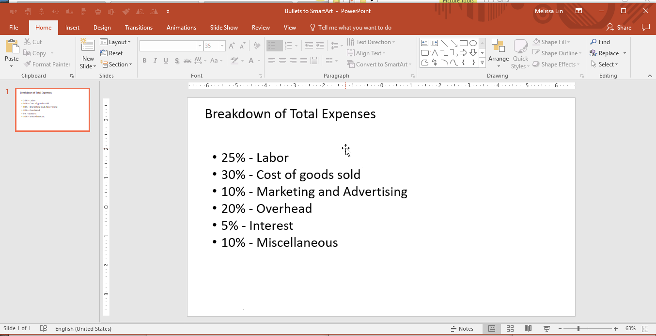
How to convert text to SmartArt
Example Situation: I’ve got a list of boring bullets and I need inspiration to make them more polished.
Solution: Leverage the “Convert to SmartArt” tool.
Select the text box with the bullets → Under “Home” in the ribbon, Select “Convert to SmartArt” → Hover over different SmartArt options to see your bullets transformed → Select whichever SmartArt strikes your fancy, and continue to edit from there
How to Resize Multiple Objects/Shapes at Once
Example Situation: I used multiple shapes/images in the slide and I want to change their collective size without messing up the proportions.
Solution: First, group all the objects together. To group, highlight all objects and either right click → Group, or highlight and hit ALT + G.
Then, adjust the size with your mouse while holding SHIFT to keep the proportion. This will help you resize and fit multiple objects without distorting the original proportions and shapes.
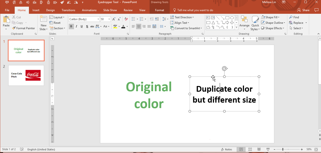
How to Identify and Match Exact Colors
Example Situation: You need to utilize a specific, custom color but you can’t seem to find it in the color palette.
Solution: The eyedropper tool quickly identifies the exact color you are looking to match, and applies it to the text or object you are trying to change. While format painter can be helpful for applying the exact same formatting (size, coloring, etc.) from one object to another, sometimes you might only be looking to apply the same color. In these cases, the eyedropper tool is very helpful.
A common use case for this tool is for pitch decks. If you are looking to match the theme of the deck to the potential client/partner’s logo, the eyedropper tool can prove invaluable.
- Select the text box you want to change → Click on the coloring format → Select the eyedropper tool → Using the eyedropper tool, hover over the color you want to mimic → When the color’s identification appears, click the color you want
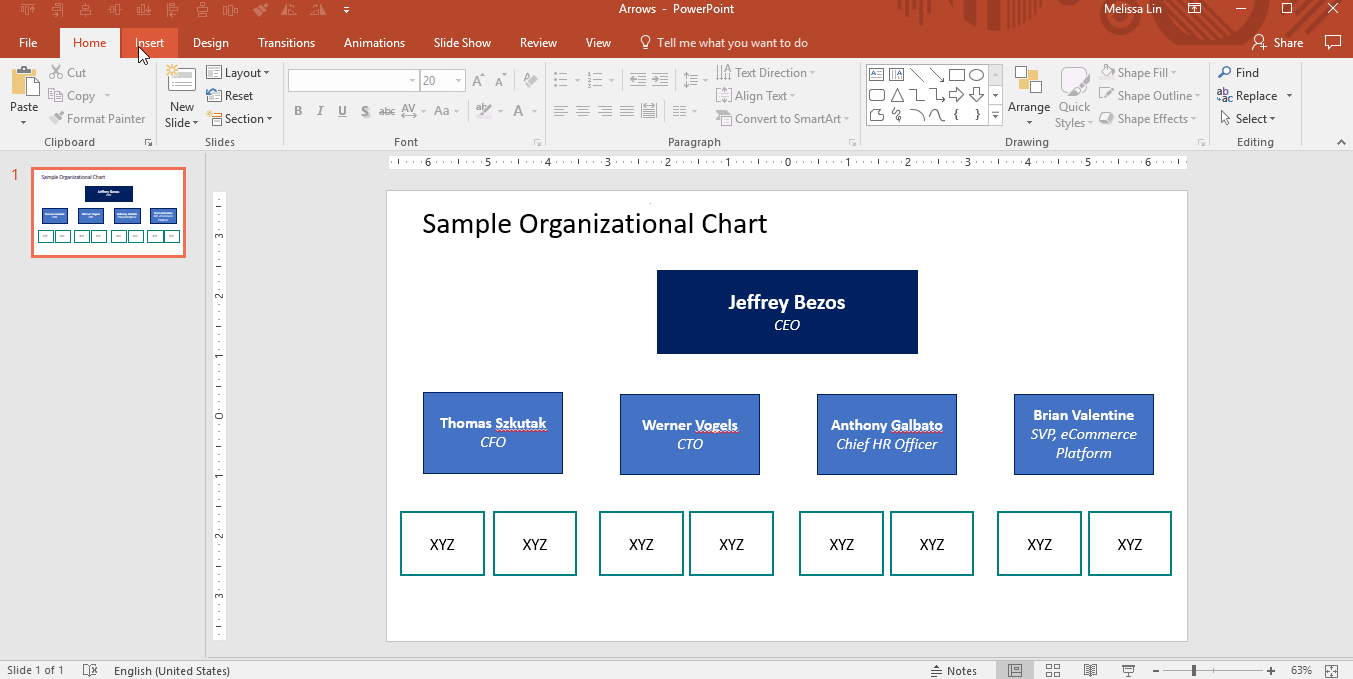
How to Leverage Arrows with Elbow Connectors
Example Situation: I’m trying to draw arrows from one shape to another, but the arrows are crooked and look unprofessional.
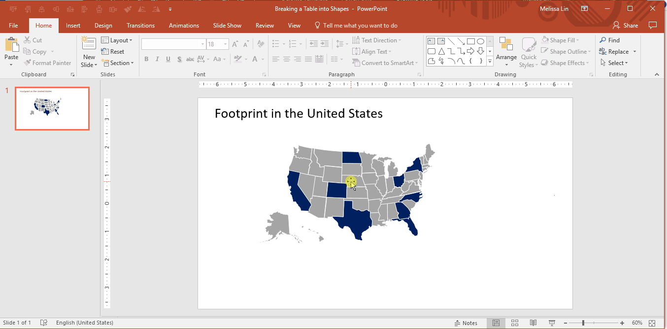
Solution: Use the arrows with an elbow connector (90-degree angles). They automatically snap to the center of an object and can be formatted in different colors and sizes. These are especially helpful when building organizational charts.
- Go to the Insert ribbon → Insert a shape → Under the “Lines” category, select the arrows with elbow connectors → Once selected, use the arrow to connect the center of one shape to the center of another shape → Repeat until completion
How to Fit Text into a Shape
Example Situation: I’m typing a text label into a shape, but the text doesn’t fit and breaks the word into two lines.
Solution: There are two ways to go about it:
- Option 1: Right-click the shape → “format the shape” → Change the text margins to “0” from the left, and “0” from the right. Nine times out of ten, this will solve your issue.
- Option 2: Forget about dealing with the original shape. Instead, insert a text box over the original shape (text box should use a transparent background) and type directly into the text box. The text will show up over the shape, but nobody will know it was a manual workaround.
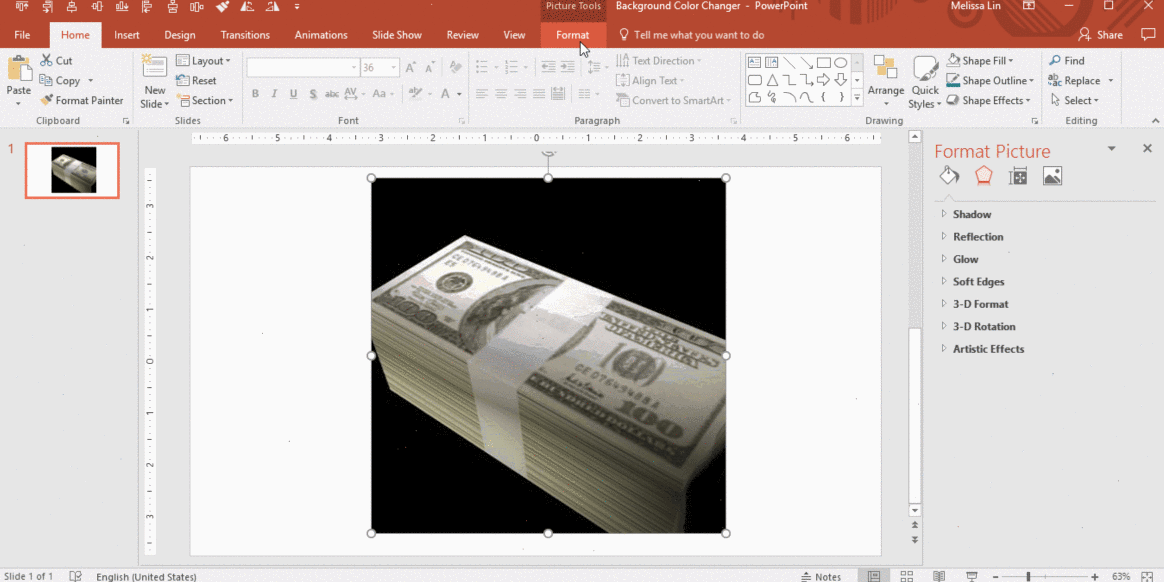
How to Remove the Background of a Picture
Example Situation: I used an image from the web in a slide and I want to change the background image color but can’t figure out how to do it.
Solution: This technique is most effective when used on images with high contrast.
- First, you must remove the original background color of the image. Click on the image you want to change → Select the “Format” tab in the ribbon → Click “Remove Background” → Fix any portions that were not perfectly removed → Click outside the image when you’re ready
- Next, you will want to add in the new background color of the image. As you can see, the perfect execution of this does require a steady hand (that I clearly do not quite have). Still, it’s a helpful trick to have in your back pocket.
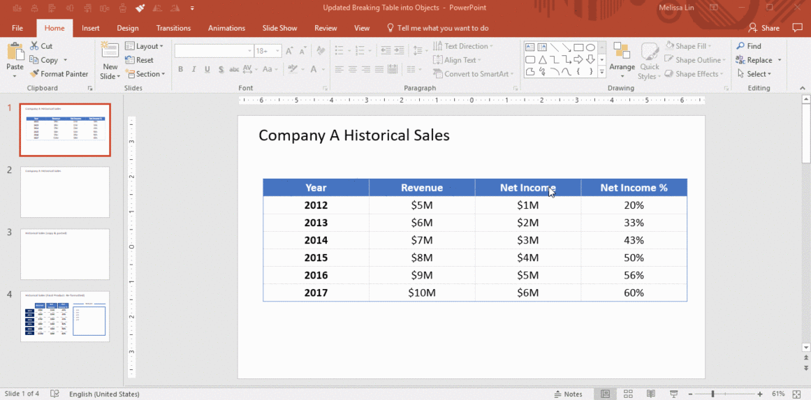
How to Convert a Table to Text Boxes
Example Situation: You want to convert a datatable into different formatting on another slide, but you don’t want to manually type the numbers in and risk a mistake.
Solution: Break your table into multiple text boxes and objects, which saves you the trouble of retyping the data and will be easier to manipulate
- Copy the entire table → Paste special (paste as picture enhanced metafile) → Ungroup it → Answer “yes” to the dialog box → Ungroup it again → Answer “yes” again.
- Voila, now your table has been broken into text boxes and shapes. You can now copy and paste the data you need into another slide and re-format as you like.
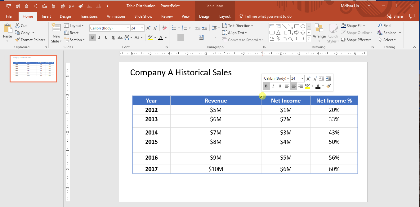
How to Make a Table’s Rows or Columns the Same Size
Example Situation: You’ve created and filled a table with data, but the size of some rows or columns do not match the others. Your OCD starts to kick in but you can’t figure out how to get them to match perfectly.
Solution: Use the “Distribute Rows” and “Distribute Columns” tools.
- Select the entire data table → “Layout” tab in the Ribbon → Click “Distribute Rows” and “Distribute columns.”
Other PowerPoint Features and Best Practices
Create custom deck templates using Slide Master, which can be found under the “View” tab in the ribbon. Slide Master allows you to quickly modify the slide design in your presentation. You can either customize the slide master, which will affect every slide in the presentation, or you can modify individual slide layouts, which will change any slides using those layouts.
Rely less on your eyesight when moving objects around with the Guides or Gridlines view. First, you should adjust your settings to utilize the “Snap-to-Grid” function. Here’s how to do so: “View” tab → Click on the “Grid Settings” next to the word “Show” → Enable “Snap objects to grid. If you’d like to view the actual guides or gridlines, you can select these options under the “View” tab in the ribbon; they can easily be turned on and off. Please note that you can move guides around, while gridlines are set.
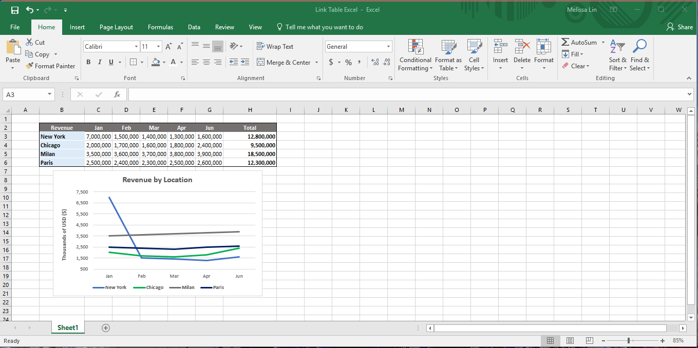
Link a chart from your Excel workbook to your PowerPoint presentation to enable dynamic updating of numbers.
- When your chart is ready in Excel, copy the chart → Toggle to PowerPoint → In the “Home” tab in the ribbon, click “Paste” → Select “Paste Special” → Select “Paste Link” and “Microsoft Excel Chart Object” → Now when you update the numbers in Excel, the chart in PowerPoint will update dynamically. This feature works best when both programs are open in tandem.
- If you close the Excel document and then update the figures in the table, remember to go back to your PowerPoint chart, right-click the chart, and select “Update link” to ensure that the data is refreshed.
On busy slides crowded with data, visually highlight your main takeaway at the bottom. A rectangular box (as shown below) is common.

Remember to include keys with your graphs and charts to help orient your audience.
Connecting Power BI to PowerPoint
Power BI, Microsoft’s business intelligence platform, integrates directly with PowerPoint through a dedicated add-in. Where the Excel chart linking technique above produces a snapshot that requires manual refreshing, embedded Power BI visuals stay connected to their underlying datasets and update automatically each time the presentation is opened. Viewers with appropriate permissions can also filter and interact with the data directly within the slide during a live presentation.
To embed a visual: open the Insert tab in PowerPoint → Click “Add-ins” → Search for and install the Power BI add-in → Select the report and visual you want → The visual will appear as a live, interactive frame on your slide. For presentations shared broadly, export a static snapshot to ensure consistent display regardless of viewer permissions.
Using Copilot in PowerPoint
Microsoft Copilot, available to Microsoft 365 subscribers, can significantly reduce the time it takes to get from raw content to a working draft. The most practical entry point is the “Create a presentation from file” feature: paste in a Word document, a PDF brief, or a set of structured notes, and Copilot will generate a slide deck organized around the source material, complete with placeholder content and a logical flow. It will not replace the editing and polishing pass, but it eliminates the blank-page problem that often consumes the first hour of any new deck.
Beyond initial generation, Copilot can suggest layouts for individual slides as you build, draft speaker notes from slide content, and reorganize the structure of an existing deck on request. For presentations where the underlying analysis lives in a document before it becomes a slide, the file-to-presentation workflow separates the thinking work from the production work in a way that saves real time on tight deadlines.
Slide Templates and Presentation Graphics for Common Concepts
Have you ever felt déjà vu when designing a new PowerPoint deck? It’s probably because we often create new slides to convey similar concepts, even if the content is different—be it a process, progress, or an organizational chart. At the end of the day, it makes sense to reuse a slide structure even if the actual content refreshes. To communicate these common concepts, many of the largest consulting firms repeatedly utilize the following slide components:
Project Schedule: Gantt Chart

Organizational Structure: Organizational chart

Process: Arrows leading into one another

Indicating the degree to which a particular item meets a criterion: Harvey Balls

Final Thoughts
Thus, As I began, so shall I finish. PowerPoint presentations don’t have to be painful. Like most personal and professional skills, practice, consistency, and attention will get you most of the way there. Once you become familiar with the application as a powerful productivity and storytelling tool, gain comfort with its nuances and logic/flow, and, dare I say, begin to leverage this article as a how-to companion, you might actually find yourself beginning to enjoy building PowerPoint presentations as you transition toward mastering them.
In the interim, if you are interested in reviewing some top consulting presentations that put a lot of my content into practice, feel free to browse 30 McKinsey presentations and a mix of Mckinsey, Boston Consulting Group and The Parthenon Group decks.
With that, happy building!
Understanding the basics
- Click the white downward-facing arrow above your ribbon; 2. Click “More Commands”; 3. Choose Commands from “All Commands”; 4. Select and add your favorite commands; 5. If you want to remove any commands, simply select the command and hit “Remove.”
Adhere to the following: (1) Err toward simplicity, in message and illustration; (2) Limit the use of prose (bullets are more succinct); (3) Use high-quality illustrations in place of text; (4) Use video or audio; and (5) Be sure you have a clear objective, point, and/or use-case for the end output.
- Copy your Excel chart; 2. In PowerPoint’s “Home” tab, click “Paste”; 3. Select “Paste Special”; 4. Select “Paste Link” and “Microsoft Excel Chart Object” → The numbers are dynamic; 5. If you close Excel and then update the raw data, right click the PowerPoint chart, and select “Update link” to refresh the data.