
Graph Data Science With Python/NetworkX
Data inundates us like never before—how can we hope to analyze it? Graphs (networks, not bar graphs) provide an elegant approach. Find out how to start with the Python NetworkX library to describe, visualize, and analyze “graph theory” datasets.

Data inundates us like never before—how can we hope to analyze it? Graphs (networks, not bar graphs) provide an elegant approach. Find out how to start with the Python NetworkX library to describe, visualize, and analyze “graph theory” datasets.

Federico is a developer and data scientist who has worked at Facebook, where he made machine learning model predictions. He is a Python expert and a university lecturer. His PhD research pertains to graph machine learning.
Expertise
Previously At

We’re inundated with data. Ever-expanding databases and spreadsheets are rife with hidden business insights. How can we analyze data and extract conclusions when there’s so much of it? Graphs (networks, not bar graphs) provide an elegant approach.
We often use tables to represent information generically. But graphs use a specialized data structure: Instead of a table row, a node represents an element. An edge connects two nodes to indicate their relationship.
This graph data structure enables us to observe data from unique angles, which is why graph data science is used in every field from molecular biology to the social sciences:
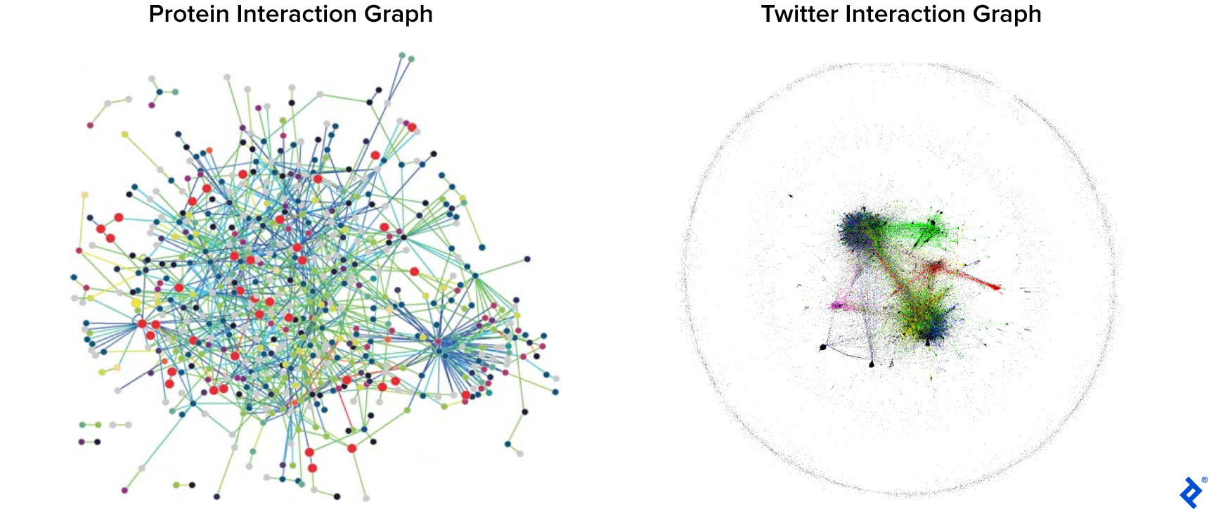
Right image credit: ALBANESE, Federico, et al. “Predicting Shifting Individuals Using Text Mining and Graph Machine Learning on Twitter.” (August 24, 2020): arXiv:2008.10749 [cs.SI]
So how can developers leverage graph data science? Let’s turn to the most-used data science programming language: Python.
Getting Started With “Graph Theory” Graphs in Python
Python developers have several graph data libraries available to them, such as NetworkX, igraph, SNAP, and graph-tool. Pros and cons aside, they have very similar interfaces for Python graph visualization and structure manipulation.
We’ll use the popular NetworkX library. It’s simple to install and use, and supports the community detection algorithm we’ll be using.
Creating a new NetworkX graph is straightforward:
import networkx as nx
G = nx.Graph()
But G isn’t much of a graph yet, being devoid of nodes and edges.
How to Add Nodes to a Graph
We can add a node to the network by chaining on the return value of Graph() with .add_node() (or .add_nodes_from() for multiple nodes in a list). We can also add arbitrary characteristics or attributes to the nodes by passing a dictionary as a parameter, as we show with node 4 and node 5:
G.add_node("node 1")
G.add_nodes_from(["node 2", "node 3"])
G.add_nodes_from([("node 4", {"abc": 123}), ("node 5", {"abc": 0})])
print(G.nodes)
print(G.nodes["node 4"]["abc"]) # accessed like a dictionary
This will output:
['node 1', 'node 2', 'node 3', 'node 4', 'node 5']
123
But without edges between nodes, they’re isolated, and the dataset is no better than a simple table.
How to Add Edges to a Graph
Similar to the technique for nodes, we can use .add_edge() with the names of two nodes as parameters (or .add_edges_from() for multiple edges in a list), and optionally include a dictionary of attributes:
G.add_edge("node 1", "node 2")
G.add_edge("node 1", "node 6")
G.add_edges_from([("node 1", "node 3"),
                  ("node 3", "node 4")])
G.add_edges_from([("node 1", "node 5", {"weight" : 3}),
                  ("node 2", "node 4", {"weight" : 5})])
The NetworkX library supports graphs like these, where each edge can have a weight. For example, in a social network graph where nodes are users and edges are interactions, weight could signify how many interactions happen between a given pair of users—a highly relevant metric.
NetworkX lists all edges when using G.edges, but it does not include their attributes. If we want edge attributes, we can use G[node_name] to get everything that’s connected to a node or G[node_name][connected_node_name] to get the attributes of a particular edge:
print(G.nodes)
print(G.edges)
print(G["node 1"])
print(G["node 1"]["node 5"])
This will output:
['node 1', 'node 2', 'node 3', 'node 4', 'node 5', 'node 6']
[('node 1', 'node 2'), ('node 1', 'node 6'), ('node 1', 'node 3'), ('node 1', 'node 5'), ('node 2', 'node 4'), ('node 3', 'node 4')]
{'node 2': {}, 'node 6': {}, 'node 3': {}, 'node 5': {'weight': 3}}
{'weight': 3}
But reading our first graph this way is impractical. Thankfully, there’s a much better representation.
How to Generate Images From Graphs (and Weighted Graphs)
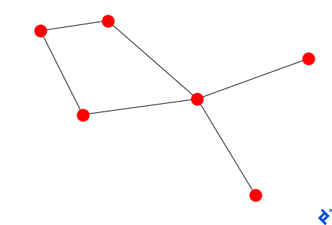
Visualizing a graph is essential: It lets us see the relationships between the nodes and the structure of the network quickly and clearly.
A quick call to nx.draw(G) is all it takes to produce a static image:
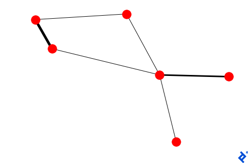
Let’s make weightier edges correspondingly thicker via our nx.draw() call:
weights = [1 if G[u][v] == {} else G[u][v]['weight'] for u,v in G.edges()]
nx.draw(G, width=weights)
We provided a default thickness for weightless edges, as seen in the result:
Our methods and graph algorithms are about to get more complex, so for our next NetworkX/Python example, we’ll use a better-known dataset.
Graph Data Science Using Data From the Movie Star Wars: Episode IV
To make it easier to interpret and understand our results, we’ll use this dataset. Nodes represent important characters, and edges (which aren’t weighted here) signify co-appearance in a scene.
Note: The dataset is from Gabasova, E. (2016). Star Wars social network. DOI: https://doi.org/10.5281/zenodo.1411479.
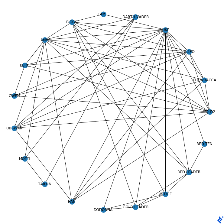
First, we’ll visualize the data with nx.draw(G_starWars, with_labels = True):
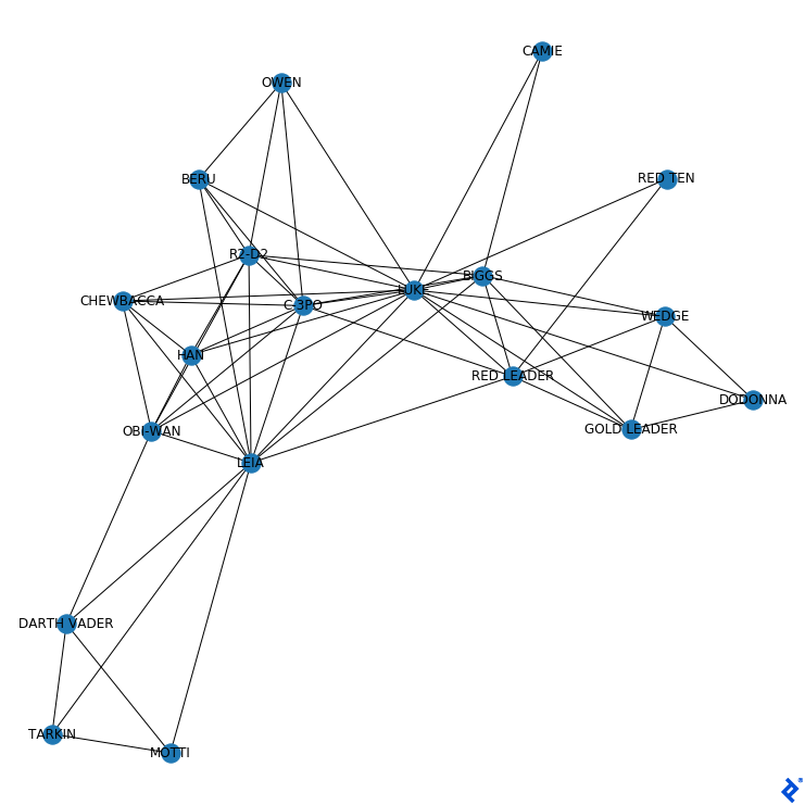
Characters that usually appear together, like R2-D2 and C-3PO, appear closely connected. In contrast, we can see that Darth Vader does not share scenes with Owen.
Python NetworkX Visualization Layouts
Why is each node located where it is in the previous graph?
It’s the result of the default spring_layout algorithm. It simulates the force of a spring, attracting connected nodes and repelling disconnected ones. This helps highlight well-connected nodes, which end up in the center.
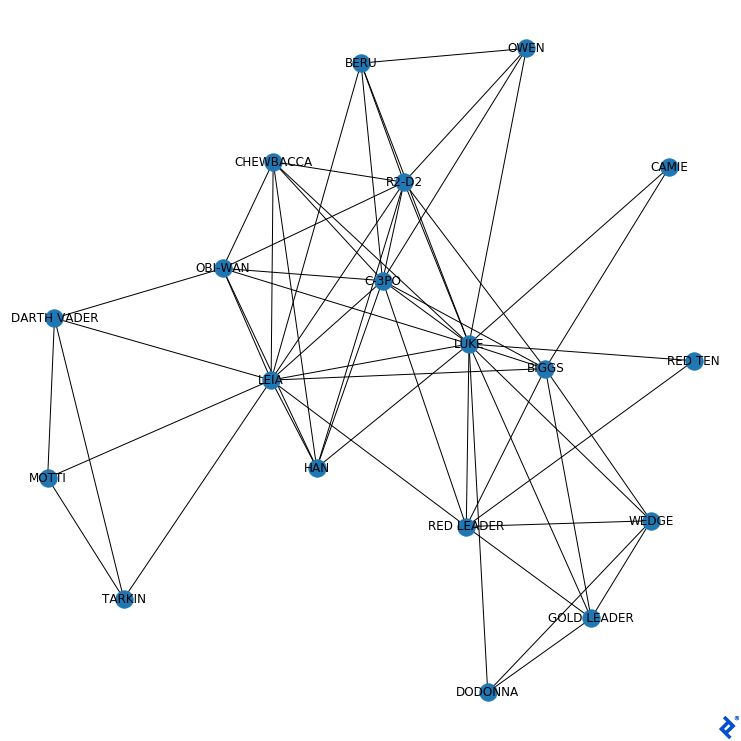
NetworkX has other layouts that use different criteria to position nodes, like circular_layout:
pos = nx.circular_layout(G_starWars)
nx.draw(G_starWars, pos=pos, with_labels = True)
The result:
This layout is neutral in the sense that the location of a node does not depend on its importance—all nodes are represented equally. (The circular layout could also help visualize separate connected components—subgraphs having a path between any two nodes—but here, the whole graph is one big connected component.)
Both of the layouts we’ve seen have a degree of visual clutter because edges are free to cross other edges. But Kamada-Kawai, another force-directed algorithm like spring_layout, positions the nodes so as to minimize the energy of the system.
This reduces edge-crossing but at a price: It’s slower than other layouts and therefore not highly recommended for graphs with many nodes.
This one has a specialized draw function:
nx.draw_kamada_kawai(G_starWars, with_labels = True)
That yields this shape instead:
Without any special intervention, the algorithm put main characters (like Luke, Leia, and C-3PO) in the center, and less prominent ones (like Camie and General Dodonna) by the border.
Visualizing the graph with a specific layout can give us some interesting qualitative results. Still, quantitative results are a vital part of any data science analysis, so we’ll need to define some metrics.
Static vs. Interactive Graph Visualization
The layouts we’ve explored provide useful static views of the graph. However, as graphs grow larger or more densely connected, static images can become difficult to interpret.
In these cases, interactive visualization tools can make exploration easier. Libraries like Pyvis or Plotly allow us to work directly with NetworkX graphs and explore them dynamically.
For example, we can render our Star Wars graph using Pyvis:
from pyvis.network import Network

net = Network()

net.from_nx(G_starWars)

net.show("starwars_graph.html")
Opening the generated file lets us explore the graph interactively. In many environments, this will open automatically in a browser; in notebook environments, behavior may vary depending on the Pyvis version, and additional parameters may be required.
Interactive visualization complements the static layouts we’ve seen. Static layouts help us understand overall structure, while interactive tools make it easier to explore specific relationships within the graph.
Node Analysis: Degree and PageRank
Now that we can visualize our network clearly, it may be of interest to us to characterize the nodes. There are multiple metrics that describe the characteristics of the nodes and, in our example, of the characters.
One basic metric for a node is its degree: how many edges it has. The degree of a Star Wars character’s node measures how many other characters they shared a scene with.
The degree() function can calculate the degree of a character or of the entire network:
print(G_starWars.degree["LUKE"])
print(G_starWars.degree)
The output of both commands:
15
[('R2-D2', 9), ('CHEWBACCA', 6), ('C-3PO', 10), ('LUKE', 15), ('DARTH VADER', 4), ('CAMIE', 2), ('BIGGS', 8), ('LEIA', 12), ('BERU', 5), ('OWEN', 4), ('OBI-WAN', 7), ('MOTTI', 3), ('TARKIN', 3), ('HAN', 6), ('DODONNA', 3), ('GOLD LEADER', 5), ('WEDGE', 5), ('RED LEADER', 7), ('RED TEN', 2)]
Sorting nodes from highest to lowest according to degree can be done with a single line of code:
print(sorted(G_starWars.degree, key=lambda x: x[1], reverse=True))
The output:
[('LUKE', 15), ('LEIA', 12), ('C-3PO', 10), ('R2-D2', 9), ('BIGGS', 8), ('OBI-WAN', 7), ('RED LEADER', 7), ('CHEWBACCA', 6), ('HAN', 6), ('BERU', 5), ('GOLD LEADER', 5), ('WEDGE', 5), ('DARTH VADER', 4), ('OWEN', 4), ('MOTTI', 3), ('TARKIN', 3), ('DODONNA', 3), ('CAMIE', 2), ('RED TEN', 2)]
Being just a total, the degree doesn’t take into account details of individual edges. Does a given edge connect to an otherwise isolated node or to a node that is connected with the entire network? Google’s PageRank algorithm aggregates this information to gauge how “important” a node is in a network.
The PageRank metric can be interpreted as an agent moving randomly from one node to another. Better-connected nodes have more paths leading through them, so the agent will tend to visit them more often.
Such nodes will have a higher PageRank, which we can calculate with the NetworkX library:
pageranks = nx.pagerank(G_starWars) # A dictionary
print(pageranks["LUKE"])
print(sorted(pageranks, key=lambda x: x[1], reverse=True))
This prints Luke’s rank and our characters sorted by rank:
0.12100659993223405
['OWEN', 'LUKE', 'MOTTI', 'DODONNA', 'GOLD LEADER', 'BIGGS', 'CHEWBACCA', 'LEIA', 'BERU', 'WEDGE', 'RED LEADER', 'RED TEN', 'OBI-WAN', 'DARTH VADER', 'CAMIE', 'TARKIN', 'HAN', 'R2-D2', 'C-3PO']
Owen is the character with the highest PageRank, surpassing Luke, who had the highest degree. The analysis: Although Owen is not the character who shares the most scenes with other characters, he is a character who shares scenes with many important characters such as Luke himself, R2-D2, and C-3PO.
In greater contrast, C-3PO, the character with the third-highest degree, is the one with the lowest PageRank. Despite C-3PO having many connections, a lot of them are with unimportant characters.
The takeaway: Using multiple metrics can give deeper insight into different characteristics of a graph’s nodes.
Community Detection Algorithms
When performing Python graph analysis on a network it may be important to separate communities: groups of nodes that are highly connected to each other but minimally connected with nodes outside their community.
There are multiple algorithms for this. Most of them are found within unsupervised machine learning algorithms because they assign a label to the nodes without the need for them to have been labeled previously.
One of the most famous is label propagation. In it, each node starts with a unique label, in a community of one. The labels of the nodes are iteratively updated according to the majority of the labels of the neighboring nodes.
The labels diffuse through the network until all nodes share a label with most of their neighbors. Groups of nodes closely connected to each other end up having the same label.
With the NetworkX library, running this algorithm takes a mere three lines of Python:
from networkx.algorithms.community.label_propagation import label_propagation_communities

communities = label_propagation_communities(G_starWars)
print([community for community in communities])
The output:
[{'R2-D2', 'CAMIE', 'RED TEN', 'RED LEADER', 'OBI-WAN', 'DODONNA', 'LEIA', 'WEDGE', 'HAN', 'OWEN', 'CHEWBACCA', 'GOLD LEADER', 'LUKE', 'BIGGS', 'C-3PO', 'BERU'}, {'DARTH VADER', 'TARKIN', 'MOTTI'}]
In this list of sets, each set represents a community. Readers familiar with the movie will notice the algorithm managed to perfectly separate the “good guys” from the “bad guys,” differentiating the characters meaningfully without using any true (community) label or metadata.
Intelligent Insights Using Graph Data Science in Python
We’ve seen that getting started with graph data science tools is more straightforward than it might sound. Once we represent data as a graph using the NetworkX library in Python, a few short lines of code can be illuminating. We can visualize our dataset, measure and compare node characteristics, and cluster nodes sensibly via community detection algorithms.
Having the skill to extract conclusions and insights from a network using Python enables developers to integrate with tools and methodologies commonly found in data science services pipelines. From search engines to flight scheduling to electrical engineering, these methods apply easily to a wide range of contexts.
Modern Graph Data Science
The tools and techniques we’ve explored provide a strong foundation for visualizing and analyzing graph data in Python. However, for larger datasets or more advanced use cases, developers often turn to additional tools.
For example, CPU-based libraries like NetworkX can become limiting at scale. GPU-accelerated libraries such as RAPIDS cuGraph make it possible to run many of the same algorithms (like centrality, clustering, and shortest paths) much more efficiently on very large graphs—often those with millions of nodes or edges, depending on the algorithm and available hardware. The centrality and community detection techniques we applied to the Star Wars graph, for instance, can be run at much larger scales using these tools with minimal changes.
Another important development is the use of graph neural networks (GNNs). Where cuGraph scales up the same kinds of analysis we’ve covered, libraries like PyTorch Geometric and Deep Graph Library extend deep learning to graph-structured data.
These models are often used for tasks such as classifying nodes, predicting new connections between nodes, or making predictions about entire graphs. In a network like the one we explored, for example, a GNN could be used to predict which characters are likely to share scenes in future data, based on the structure of the graph.
The foundational techniques in this article are a natural starting point for advancing in either direction, whether the next step is scaling up or moving into predictive modeling.
Recommended Reading on Graph Data Science
Community Detection Algorithms
Zhao Yang, René Algesheimer, and Claudio Tessone. “A Comparative Analysis of Community Detection Algorithms on Artificial Networks.” Scientific Reports, 6, no. 30750 (2016).
Graph Deep Learning
Thomas Kipf. “Graph Convolutional Networks.” September 30, 2016.
Applications of Graph Data Science
Albanese, Federico, Leandro Lombardi, Esteban Feuerstein, and Pablo Balenzuela. “Predicting Shifting Individuals Using Text Mining and Graph Machine Learning on Twitter.” (August 24, 2020): arXiv:2008.10749 [cs.SI].
Cohen, Elior. “PyData Tel Aviv Meetup: Node2vec.” YouTube. November 22, 2018. Video, 21:09. https://www.youtube.com/watch?v=828rZgV9t1g.
Further Reading on the Toptal Blog:
- Tree Kernels: Quantifying Similarity Among Tree-structured Data
- Data Mining for Predictive Social Network Analysis
- Identifying the Unknown With Clustering Metrics
- Ensemble Methods: Elegant Techniques to Produce Improved Machine Learning Results
- Social Network Analysis Using Power BI and R: A Custom Visuals Guide
Understanding the basics
Yes, it can. Python has multiple libraries for data visualization, such as the NetworkX library.
Python graph data visualization libraries like NetworkX, igraph, SNAP, and graph-tool have this functionality built in. The NetworkX library is useful for visualizing the nodes and edges of networks.
The Python NetworkX library provides different data graph types. The possible types, depending on graph characteristics, are Graph, DiGraph, MultiGraph, and MultiDiGraph.
Yes. The NetworkX library enables Python data scientists to easily leverage different graph theory-based algorithms like PageRank and label propagation.
NetworkX is a library for graph representation in Python. Developers can use it to create, manipulate, and visualize graphs, as well as for non-visual graph data science analysis.
The easy-to-use NetworkX library should be used for graph analysis; for example, when community detection algorithms or other particular features are needed. But its functionality is otherwise comparable to other graph libraries like igraph, SNAP, and graph-tool.
For many applications, NetworkX is fast enough, but other Python libraries might be faster for large-scale graph datasets, depending on the algorithm(s). The advantage of starting with NetworkX is its ease of use and extensive developer community.
A community detection algorithm seeks to cluster network nodes according to their connectivity. Label propagation is a widely used method for this and has an implementation in the Python NetworkX library.
Federico Albanese
Buenos Aires, Argentina
Member since January 9, 2019
About the author
Federico is a developer and data scientist who has worked at Facebook, where he made machine learning model predictions. He is a Python expert and a university lecturer. His PhD research pertains to graph machine learning.
Expertise
PREVIOUSLY AT