Millennial Branding for a Boomer Product: A Branding Case Study
Millennials are tough customers, especially for products they associate with their parents’ lifestyles. This branding case study shows how an old-school item can appeal to Generation Y in an authentic way.
Millennials are tough customers, especially for products they associate with their parents’ lifestyles. This branding case study shows how an old-school item can appeal to Generation Y in an authentic way.
Beatriz is a designer and art director with extensive experience in digital product design and leading global design teams. She specializes in leveraging user personas, customer journeys, and user story mapping to create products that resonate emotionally.
Expertise
Previous Role
UX/UI DesignerPREVIOUSLY AT

Millennials aren’t killing product categories. Entering adulthood during one of the most economically tumultuous decades since the Great Depression means they demand much better reasons from brands than their parents did to part with their hard-earned cash.
Millennials tend to have smaller homes than their parents and less disposable income. They tend to be more environmentally conscious and more waste-averse. They tend to prize experiences over possessions. Fine china and formal dinner parties for 12? They’ll pass.
That doesn’t mean millennials don’t entertain anymore, though, or don’t want nice things—just that their priorities have changed. Attracting them to a high-end housewares product they may not have even considered purchasing requires a deft touch.
Toptal designer Beatriz Garcia de Prado is an expert in UX/UI design, as well as an art director, and she brought all of these strengths to bear on her family’s tablecloth business based in Spain. The company, Prado y Barrio, manufactures and sells designer tablecloths aimed at younger adults who want to elevate their dinner-party game in an authentic-feeling way.
Toptal spoke with Garcia de Prado about how she created a branding strategy for her business with an eye toward the sophisticated millennial home entertainers the company aims to reach.
Let’s start by talking about the origins of the brand. Where did the idea come from?
My friends and I love to gather in each other’s homes to share good home-cooked food, good wine, and what we call in Spain the “sobremesa,” which means sitting around a table after a meal to talk and enjoy each other’s company. While some of us did choose to invest in nice tableware, nobody used tablecloths except me. There just aren’t a lot of choices that resonate with millennials.
That became our brand slogan: “Basta ya de manteles que no nos representan” or, in English, “No more tablecloths that don’t represent us.”
What was your branding strategy?
Our target audience is millennial consumers, but our research showed that the typical buyer of fine table linens is older and wealthier. Our challenge was to develop a bold, rebellious brand that appealed to Gen Y buyers without alienating these older buyers who might also like our designs.
The key to doing that successfully is contrast.
For example, consider Chanel’s decision to use the actress Kristen Stewart as a brand ambassador. The contrast between Chanel’s reputation as a classic, century-old luxury brand and Kristen Stewart’s reputation as a young Hollywood rebel makes Chanel feel relevant to today’s edgy young fashionistas.
By combining contrasting elements, we can create a more complex whole.
How did you apply this idea of contrast in the development of the brand?
We combined bold, sober typography with soft, youthful pastels. Fonts with thin, black letters evoke sophistication, elegance, and refinement, while the pale pastel backgrounds suggest childhood, playfulness, and a relaxed Mediterranean lifestyle. For even greater contrast, we use thick black-and-white border elements. Together they help tell the story that Prado y Barrio is the brand that young, chic home entertainers were missing.
This visual language not only appears throughout our website and e-commerce shop—as well as our social media assets—it is also reflected in the product itself.
Products are crucial carriers of the brand. How did you incorporate that visual language into your linens?
Our goal was to create a strong, consistent style that was recognizable without the need for a logo.
I work in UX and UI, so naturally, I applied design thinking to understand how our customers would use the tablecloths and what they would expect from it when they set their table. A tablecloth is rarely the only thing on the table, and people who are willing to pay for fine linens are likely to invest in good tableware, too. You want to make sure the tablecloth doesn’t compete with those other elements.
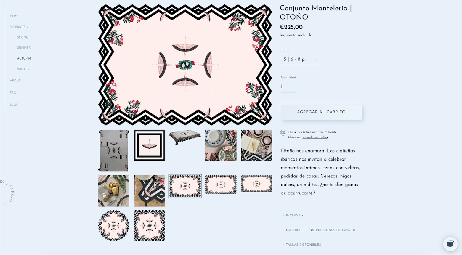
We currently offer four designs for our tablecloths and matching napkins, each reflecting a seasonal theme and featuring images of Spanish wildlife and culture. The Spring design evokes Seville’s Feria de Abril, with Andalusian horses and orange tree branches. The Summer pattern is inspired by the Mediterranean coast, featuring bougainvillaea, lobsters, and seashells. Fall is reflected by the Iberian stork and cherries, while Winter features the Iberian lynx and pine boughs.
Even though the main colors are different, each version features a distinctive black-and-white chevron pattern around the border and a unique animal emblem in the center, unifying the collection. The rest of the space is nearly solid, with just a subtle but noticeable pattern to create additional interest.
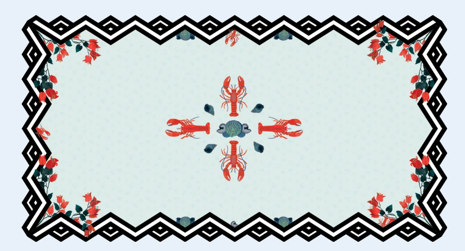
So we focus the bold design elements around the borders and in the center. The result is distinctive without overwhelming the rest of the table.
Sustainability is a core feature of the brand. We use organic and recycled materials for everything from the tablecloths to the stationery to the packaging, and all of the components are sourced right here in Spain, which reduces the carbon cost of transport.
We also strive to be a socially conscious brand. Another reason we source everything from Spain is because it’s easier for us to verify the ethical production of the materials we use. For the manufacturing of the linens, we contract with a Spanish workshop that employs women at risk of social exclusion due to past life challenges.
These are both very important to millennial consumers, as well.
How does the brand inform your social media strategy?
Our primary channel is Instagram, because that is where millennial women hang out. It’s also a great fit because it’s an ideal format to showcase well-crafted products with a strong visual language.
There’s often a temptation to style your Instagram grid with horizontal groups of three. But it’s very easy for those groupings to get unaligned when you add a new post, so we just alternate between a product display and an image framed by the bold black-and-white border. That makes it easier on us and keeps the grid looking great.
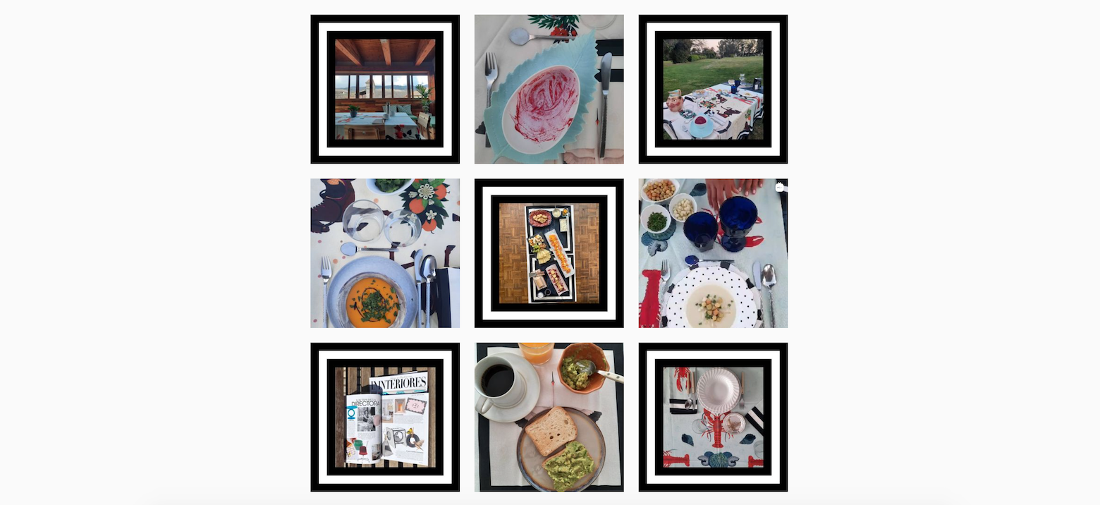
For the posts themselves, we keep using the same soft color palette, sophisticated typeface, and easygoing tone of voice that we use on our website—the same ingredients but in a different channel. We are making an extra effort to foster engagement, so once a month we go live on Instagram with recipes, design tips, and table-setting ideas.
What was your e-commerce branding strategy?
With such a limited product line, creating an enticing web storefront was quite a challenge. When we think of e-commerce, we typically think of pages full of different products or styles that you can sort and filter through. When you only have four designs of the same item, however, it becomes difficult to create a sense of abundance.
With our site, the hero image is a slideshow GIF showcasing each of the four designs in turn to avoid creating a hierarchy, along with the sentence “Manteles de Autor” (or “Designer Table Linen”). Below the image is a clear call to action and a price reference. This immediately gives the visitor everything they need to know about what is available.
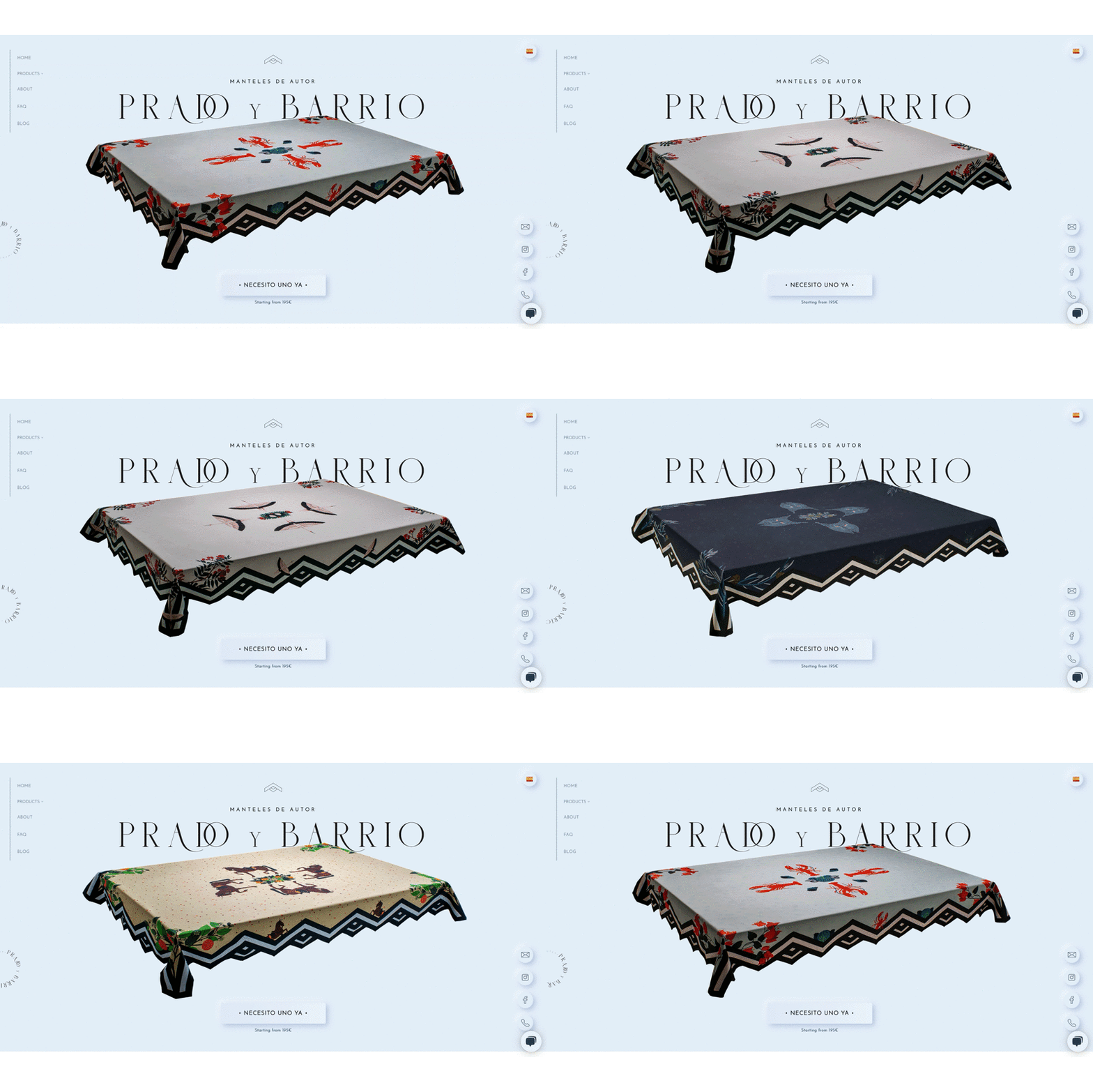
The site uses vertical scrolling. To display only four products with some interest, I’ve created a universe around each product and made them unique by setting them off with different colored backgrounds, which creates a sense of difference between them. Instead of watching the same product scroll by four times, each product is unique and interesting itself. I’ve alternated copy and images to create a dynamic feeling and strong storytelling that doesn’t just display the products but also enhances brand awareness.
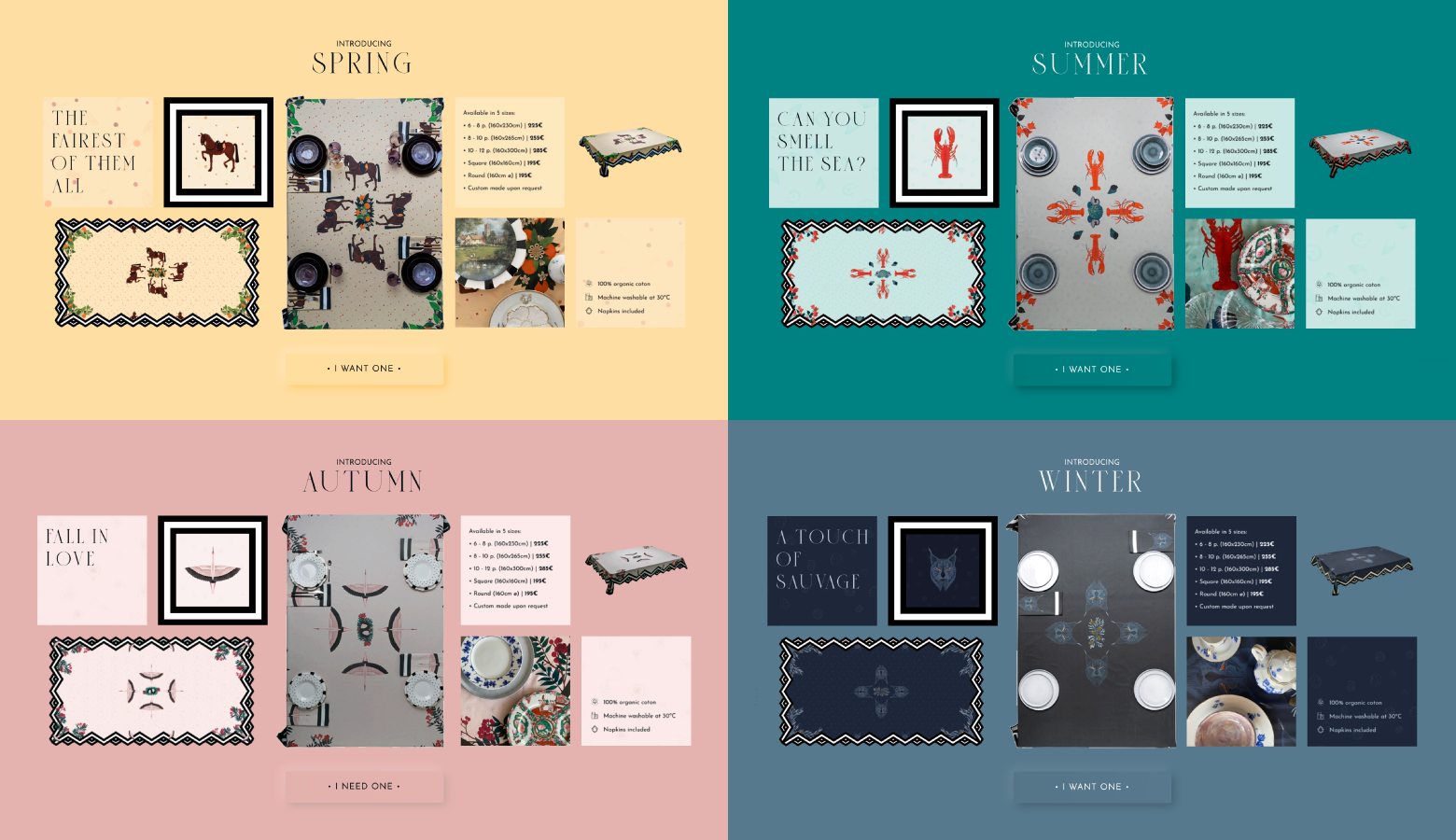
I use a collage style to create a sense of abundance. We have only one product, so I’ve mixed lifestyle images, product images, animated GIFs, and creative and informational microcontent. That together creates a dynamic view and makes each product more interesting. It tells a story.
Finally, the site is not only optimized for mobile, but it was designed mobile-first—a must for reaching millennial shoppers.
Remember: Lifestyle, values, identity matter
Millennials often get blamed for killing a product category, but the truth is that they’re just demanding a lot more from brands than the generations that came before them. Today’s brands need to show how their products are relevant to a variety of consumer profiles and how those products align with their values and identities. Embracing contrast can help businesses market products to millennials they might not have otherwise considered.
###
Further Reading on the Toptal Blog:
Understanding the basics
Why is brand development important?
A brand is the essential promise a company makes to its customers. It identifies the company, builds trust, conveys value, and inspires loyalty. Branding upholds that promise across all customer interactions: product, packaging, store, website, advertising, and more.
What are the four steps of branding?
To build your branding strategy: 1. Know your target audience. Look at demographics, research, and competitors. 2. Identify your unique selling proposition. 3. Define a company personality that resonates with your audience. 4. Make your brand easily recognizable and memorable with a logo or slogan.
What is important to know about e-commerce branding?
Your e-commerce branding strategy should mirror your other branding strategies. Keep the colors, typography, and voice consistent across all customer interactions. This will help build a strong brand-customer relationship.
Palma de Mallorca, Spain
Member since January 29, 2018
About the author
Beatriz is a designer and art director with extensive experience in digital product design and leading global design teams. She specializes in leveraging user personas, customer journeys, and user story mapping to create products that resonate emotionally.
Expertise
Previous Role
UX/UI DesignerPREVIOUSLY AT


