
Supporting Diverse Needs: A Rebranding Success Story
Brand designer Bari Keenam shares how he turned a tricky logo redesign into a brand overhaul that helped his client establish an emotional connection with its customers.
Brand designer Bari Keenam shares how he turned a tricky logo redesign into a brand overhaul that helped his client establish an emotional connection with its customers.

Bari is a brand designer with a user-centric approach to brand ideation. With a background in engineering and marketing, he excels at problem-solving and brings diverse perspectives to brand creation. Bari teaches typography and UX design at the Lagos Engineering Career Expo and the Àṣà Coterie design community.
Expertise
Previous Role
Lead DesignerWhen recrafting a company’s branding, the designer’s job is to make the company distinct, trustworthy, and memorable to its ideal customers. In this Q&A, brand designer Bari Keenam discusses how he overhauled the branding for Inclusive Lifestyle, a company that provides person-specific support and services for people with disabilities, by highlighting the company’s core values of empathy, trust, and inclusion. This interview has been edited for clarity and length.
Q: Tell us about yourself.
I’m a brand designer from Nigeria who helps companies speak to and connect with their customers. Before exploring brand design, I was a videographer and web developer and have also worked in marketing. Now I use my diverse skill set to help companies improve their image, attract and retain customers, and drive sales. One of the most rewarding aspects of my job is seeing a company grow as a result of my contributions.
Q: How do you define brand design?
People often think brand design boils down to the logo, but that's only part of it. One of my favorite brand designers and author of The Brand Gap, Marty Neumeier, says that a brand is “a person's gut feeling about a product, service, or organization. …It’s not what you say it is; it’s what they say it is.” I think, therefore, that brand design is about crafting consumer perception—and developing strategies and products that resonate with those consumers.
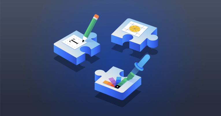
It’s like solving a puzzle. Branding elements—from logos, colors, and typography to illustration and photography—represent different puzzle pieces that need to be put together correctly. At every step of the design process, I reflect on how people will perceive and interact with a brand. It’s all about creating emotion and knowing precisely what the user’s response will be. I love this aspect of design because it applies to every company—be that nonprofit or private. No matter your organization, brand design is paramount.
Q: How did you become involved with your rebranding client, Inclusive Lifestyle?
I had just finished a job in South Australia, and Inclusive Lifestyle, another South Australia-based company, heard about the project and liked my work. They reached out to see if I would be interested in helping them refresh their branding. I hit it off immediately with Ayiba-Tare Raine, the CEO, who is also of Nigerian heritage. He was in charge of the marketing team and would be my primary contact. I think stakeholder involvement in high-level design decisions is critical to a project’s success. Tare was present at every marketing team meeting. If he wasn't able to be there, we rescheduled.
Q: What was the company’s fundamental branding challenge?
Inclusive Lifestyle’s branding obstacles began with its logo. The company provides support for independent living, mentoring, and mental health care services for people with physical, neurological, and intellectual disabilities in South Australia. With an emphasis on “person-specific,” the company’s mission is to offer personalized care to every participant.
The original logo icon, designed by the CEO, is a circle composed of peace signs set in rainbow colors. This icon is supposed to represent the organization’s values of empathy, trust, and inclusion. In reality, customers perceived the rainbow motif and color palette to be representative of the LGBTQ community. The message of supporting people with disabilities was getting lost.

To complicate matters further, there were technical issues that made the logo hard to use. It had been created in Photoshop as a raster file, with a limited resolution that was easily pixelated when resized. Switching to a vector file in Adobe Illustrator, I stripped the logo down to the basics and began working on an adaptation that would more clearly represent the company’s core values and mission.
Q: What was your thought process in adapting the logo?
The logo was trying to say too much. This reminded me of what world-renowned graphic designer Sagi Haviv says in this course about reducing the number of details in a logo to what's necessary for defining a company’s unique selling proposition. He encourages reducing the "responsibility" of the logo (in defining the company and properly representing it) and transferring it to other brand elements, such as the mission statement, tone, and tagline. I agree: We often expect too much of a logo. In many cases, the solution for a busy logo is to strip away the weight of that responsibility and let the rest of the brand identity do the heavy lifting.
Q: How did you adapt the logo?
I started by thinking about the primary audience: the families of the individuals needing disability services. Each family’s situation is unique, and yet they all need the same thing—solutions and support so that their loved ones can live comfortably and independently. I wanted to ensure that whatever their needs, they would see the logo and feel confident that Inclusive Lifestyle could help. This process involved several design iterations and careful selection of the logo design elements.

Q: How does the new logo differ from the old one?
The new logo is a simplified version of the original that stands out from the competition and resonates with the target audience. I started by homing in on the icon. The top left icon in the black and white image was an attempt at vectorizing the original logo icon. Tare didn’t want to lose the circular essence of the original icon that existing customers were familiar with. The bottom left icon is an abstract butterfly, an attempt to demonstrate the participants’ empowerment.

Ultimately, I chose the center icon, a final iteration on the icons on the right in the black and white image. I kept the circular motif, representing community and safety, but replaced the peace signs with flower petals. The flower represents the participants’ growth through their interaction with the company; the petals point inward to illustrate how the Inclusive Lifestyle teams focus on each participant’s individual needs.
Next, I worked on the color palette. I liked the original colors, but I needed to find a way to differentiate them from logos associated with LGBTQ service organizations. I experimented with different shades of purple (often thought of as the color of courage and bravery) and blue (often associated with calm and trust). I also toned down the logo’s color palette by slightly reducing its saturation. I wanted to create an iconic look that would give people a sense of tranquility and security. The wrong font or color scheme might make the logo appear somber or sterile—like a hospital—which could trigger bad memories and make potential customers look elsewhere for services.
With the icon simplified, I then shifted my focus to the typography. The primary font is Biennale, a sans serif with an airy feel. The letter spacing was designed to create a sense of serenity and calm.

Q: What other branding elements did you update?
Making a great first impression on multiple platforms, especially at fairs and trade shows, is critical to Inclusive Lifestyle’s brand strategy. The booth, banners, promotional swag pieces, and business cards all needed to tell a visual story that would evoke a sense of confidence and professionalism.

To help them tell their story and communicate the brand consistently, I produced a detailed brand style guide, a template from which to create all of their marketing and advertising materials, including print pieces, social media posts, billboards, and business cards. The language and narrative are also specified. For example, the brand voice should always be human, natural, and relatable. Visuals should be paired with uplifting narratives. We use phrases like “Because they can” to communicate the message that the clients can live independently with the company’s support.
With the logo redesigned and the style guide completed, the company then commissioned me to restyle the website following the rebranding guidelines, a project I’m working on now.

Q: Sounds like the client was happy. What were your key takeaways from this project?
I learned how to communicate with a diverse audience. Disability is a broad spectrum, and it’s often a challenge to communicate effectively when your audience has diverse needs. I relied on my research to help me empathize with the target audience throughout the design process. These are people who are going through a lot, so if my work contributes to improvements in their lives, I consider it a big win.
I also learned that it was important to be flexible when working across time zones. The nine-hour time difference with this client was challenging, but we made it work with some adjustments. I often had meetings between 11 PM and 2 AM, and sometimes I had to wake up at 5 AM to meet a deadline. And yes, I got some phone calls in the middle of the night! But this was all worth it in the end. The team was happy with the rebranding and loved displaying the banners with the new logo at their events. They felt more confident competing with their larger competitors and could communicate and connect with potential customers in a much more meaningful way. As for me, this project was an invaluable experience and even landed me some new leads with other Australian companies.
Understanding the basics
There are many reasons to rebrand, including: your internal brand perception doesn’t align with that of your customers’ perception, your target market isn’t well defined, or you’re losing relevance in the market and your brand needs revitalization.
Rebranding involves a company rethinking its marketing strategy through updates to its name, logo, and/or design in order to differentiate it from the competition and encourage existing and potential customers to engage.
A successful logo should be easy to understand and identify, distinctive enough to be memorable, timeless and able to survive changing trends, flexible and scalable across different platforms, and thoughtful, symbolizing the quality and usefulness of the brand.
Toronto, ON, Canada
Member since May 9, 2022
About the author
Bari is a brand designer with a user-centric approach to brand ideation. With a background in engineering and marketing, he excels at problem-solving and brings diverse perspectives to brand creation. Bari teaches typography and UX design at the Lagos Engineering Career Expo and the Àṣà Coterie design community.