How to Build CSS-only Smart Layouts With Flexbox
Although CSS was meant to deal with styling, creating extraordinary layouts on the web has always been a unique challenge and almost always required the developer to resort to JavaScript. However, Flexbox is here to change that.
In this article, Toptal Freelance Software Engineer Diego Díaz walks us through the basics of Flexbox and some cool examples of how Flexbox can be used to build smart CSS-only layouts.
Diego is an experienced web developer with a passion for UI and UX. He strives to create fluid layouts for any device and architecture.
PREVIOUSLY AT

Flexible box, or Flexbox in short, is a set of properties in CSS introduced in 2009 to provide a new, exceptional layout system. The Flexbox module is identified as a part of the third version of CSS (CSS3).
You are probably already using many of the new properties in CSS3, such as box-shadow, border-radius, background gradients, and so on. However, Flexbox has yet to see the widespread adoption that it deserves. This may be because of all the breaking changes it has suffered over the years, or because it is only partially supported in Internet Explorer 10, or just because Flexbox is a whole ecosystem while previous paradigms have been predominantly based on single, ready-to-go properties.
It is super powerful and offers a wide range of options to achieve CSS flex layouts that, previously, could only be dreamed of.
This article will walk you through the basics of Flexbox and how you can use it to achieve some really cool Flexbox layouts which would otherwise require complicated CSS hacks or even JavaScript.
Why Use Flexbox?
By default, HTML block-level elements stack, so if you want to align them in a row, you need to rely on CSS properties like float, or manipulate the display property with table-ish or inline-block settings.
If you choose to use float (left or right), you must clear the wrapper at some point to push it until the very last floated element, otherwise, they will overflow over anything coming after. However, with float, you are limited to organizing elements horizontally.
Alternatively, or in addition, you can manipulate the display property to try to achieve the layout you desire! But this often feels kludgy at best, not to mention tedious, and often results in a fairly fragile layout that won’t necessarily render consistently across browsers. This approach is particularly ineffective if you are targeting multiple devices of varying sizes—which is almost always the case nowadays.
Enter Flexbox!
With a simple rule applied to a parent element, you can easily control the layout behavior of all of its children.
With Flexbox, you can:
- Reverse the order of the elements inside a Flexbox parent.
- Wrap child elements in columns (number of columns can vary depending on child and parent height).
- Specify the rate at which elements grow or shrink while the viewport size changes.
- Control whether elements are shrinkable or not, regardless of the specified width unit type (relative or absolute).
- Change the order of elements with CSS (combine this with media queries and you will find limitless possibilities in your flow).
- Generate complex distributions of the elements to be equidistant with space around or just space between.
- Generate “renegade” elements that flow differently (everyone to the left but one to the right, top/bottom… it’s your call).
- And, most importantly, avoid the clear-fix hack for good!
I understand Flexbox can be tough in the beginning. I think it is easier to learn ten unrelated CSS properties than five with some inter-dependency. However, with your current CSS skills, and maybe a little help from this article, you will launch yourself into a new CSS universe.
The Basics of Flexbox
Display
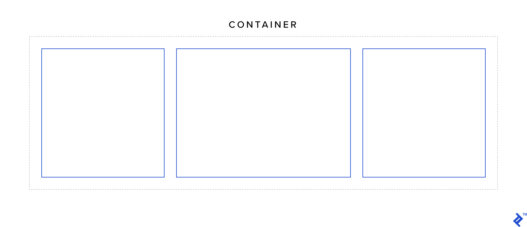
display is one of the most basic properties in CSS and is quite important in the context of Flexbox, as it is used to define a flex wrapper.
There are two possible flex wrapper values: flex and inline-flex.
The difference between the two is that a display: flex wrapper acts like a block element while a display: inline-flex wrapper acts like an inline-block. Also, inline-flex elements grow if there is not enough space to contain the children. But other than those differences, the behavior of the two would be the same.
Try the sample code below, reduce the viewport width when inline-flex is active and… scroll.
See the Pen Flexbox @Toptal - Parent - `display` property by DD (@Diegue) on CodePen.
.wrapper {
    display: flex || inline-flex;
}
Flex Direction
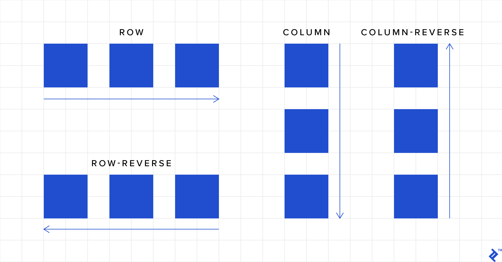
Now that you have seen the first sample, you can infer that the default behavior is to simply make a row of the elements. But there is more:
- row (default): Arranges the elements from left to right (but if RTL is set it would be backward).
- row-reverse: Reverses the order of elements in a row disposition
- column: Arranges the elements from top to bottom
- column-reverse: Reverses the orders of elements in a column disposition
Hint: The
columnandcolumn-reversevalues can be used to swap the axes, so the properties that would affect the horizontal axis would affect the vertical axis instead.
See the Pen Flexbox @Toptal - Parent - `flex-direction` property by DD (@Diegue) on CodePen.
.wrapper {
    flex-direction: row || row-reverse || column || column-reverse;
}
Flex Wrap
If you check the first code sample, you’ll figure out that the child elements don’t stack by default within a flex wrapper. This is where flex-wrap comes into play:
- nowrap (default): Prevents the items in a flex container from wrapping
-
wrap: Wraps items as needed into multiple rows (or columns, depending on
flex-direction) -
wrap-reverse: Just like
wrap, but the number of rows (or columns) grows in the opposite direction as items are wrapped
See the Pen Flexbox @Toptal - Parent - `flex-wrap` property by DD (@Diegue) on CodePen.
.wrapper {
    flex-wrap: nowrap || wrap || wrap-reverse;
}
Flex Flow
You can combine flex-direction and flex-wrap properties into a single property: flex-flow.
.wrapper {
    flex-flow: {flex-direction} {flex-wrap};
}
Justify Content
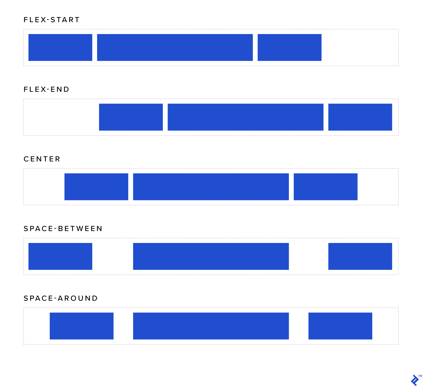
This property is used to control the horizontal alignment of the child elements:
-
flex-start (default): Elements are aligned to the left (similar to inline elements with
text-align: left) -
flex-end: Elements are aligned to the right (similar to inline elements with
text-align: right) -
center: Elements are centered (similar to inline elements with
text-align: center) - space-around (where the magic begins): Every element will be rendered with the same amount of space around each item. Note that the space between two sequential child elements will be double the space between the outermost elements and the sides of the wrapper.
-
space-between: Just like
space-around, except the elements will be separated by the same distance and there will be no space near either edge of the wrapper.
Note: Remember
flex-direction, when set tocolumnorcolumn-reverse, swaps the axis. If one of these is set,justify-contentwill affect vertical alignment, not horizontal.
See the Pen Flexbox @Toptal - Parent - `justify-content` property by DD (@Diegue) on CodePen.
Align Items
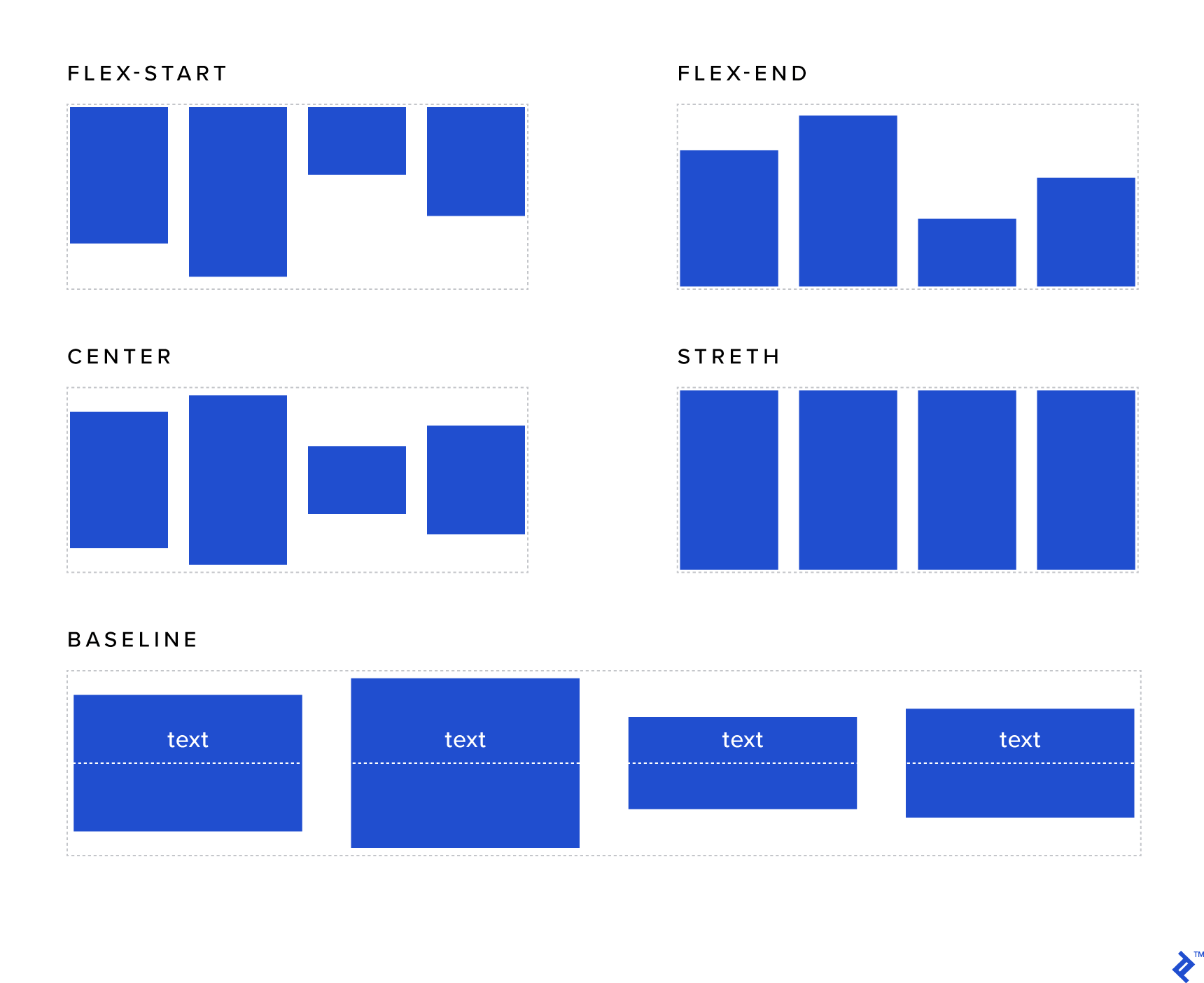
This property is similar to justify-content but the context of its effects is the rows instead of the wrapper itself:
- flex-start: Elements are vertically aligned to the top of the wrapper.
- flex-end: Elements are vertically aligned to the bottom of the wrapper.
- center: Elements are centered vertically within the wrapper (at last, a safe practice to achieve this).
- stretch (default): Forces the elements to occupy the full height (when applied to a row) and the full width (when applied to a column) of the wrapper.
- baseline: Vertically aligns the elements to their actual baselines.
See the Pen Flexbox @Toptal - Parent - `align-items` property by DD (@Diegue) on CodePen.
Align Content
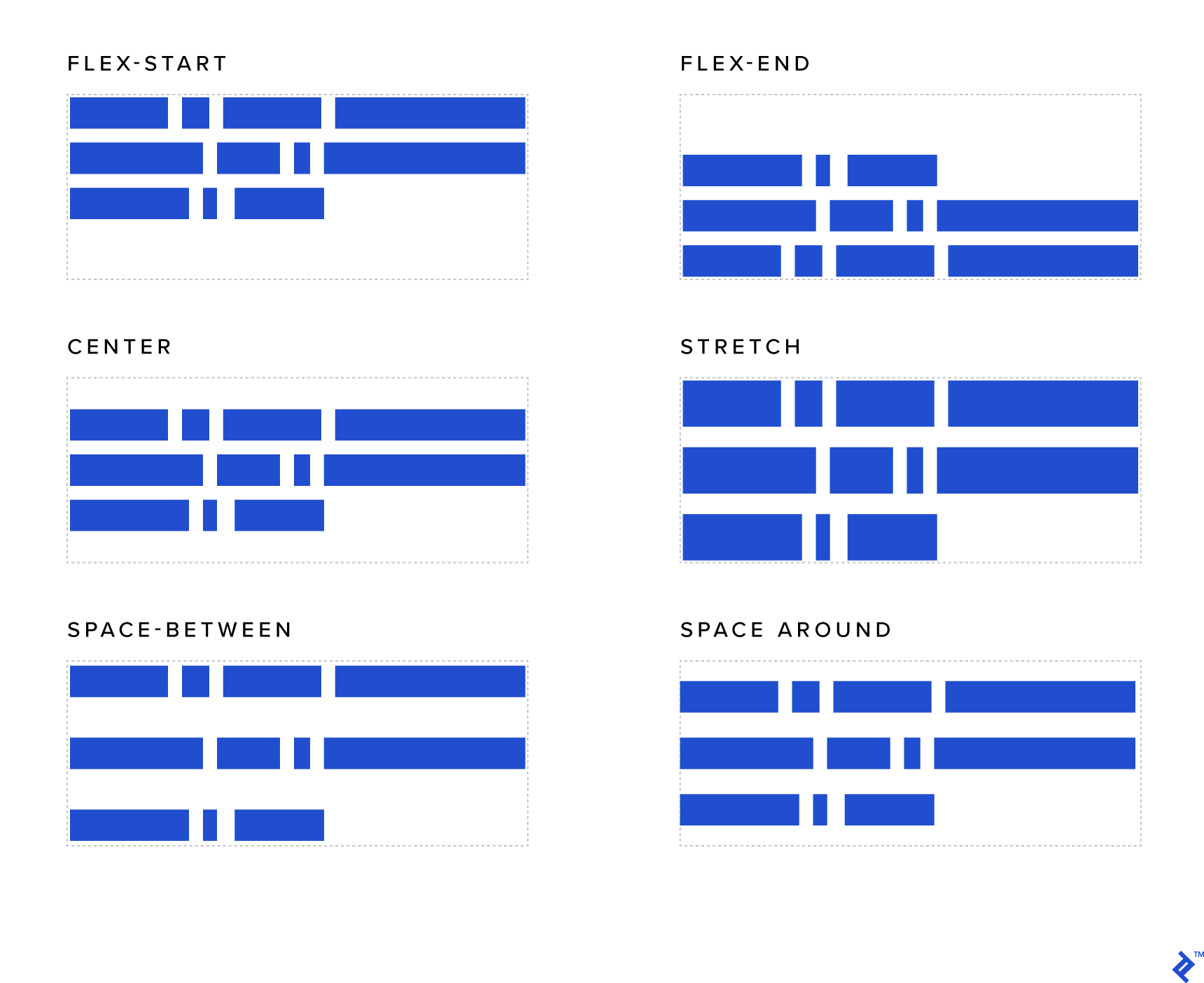
This property is similar to justify-content and align-items but it works in the vertical axis and the context is the entire wrapper (not the row like the previous example). To see its effects, you will need more than one row:
- flex-start: Rows are vertically aligned to the top (i.e., stacked from the top of the wrapper).
- flex-end: Rows are vertically aligned to the bottom (i.e., stacked from the bottom of the wrapper).
- center: Rows are centered in the wrapper vertically.
- stretch (default): In general, this property stretches the elements to utilize the entire vertical height of the wrapper. However, if you have set some specific height of the elements, that height will be honored and the remaining vertical space (in that row, below that element) will be empty.
- space-around: Every row will be rendered with the same amount of space around itself vertically (i.e., below and above itself). Note that the space between two rows will, therefore, be double the space between the top and bottom rows and the edges of the wrapper.
-
space-between: Just like
space-around, except the elements will be separated by the same distance and there will be no space on the top and bottom edges of the wrapper.
See the Pen Flexbox @Toptal - Parent - `align-content` property by DD (@Diegue) on CodePen.
Flex Grow
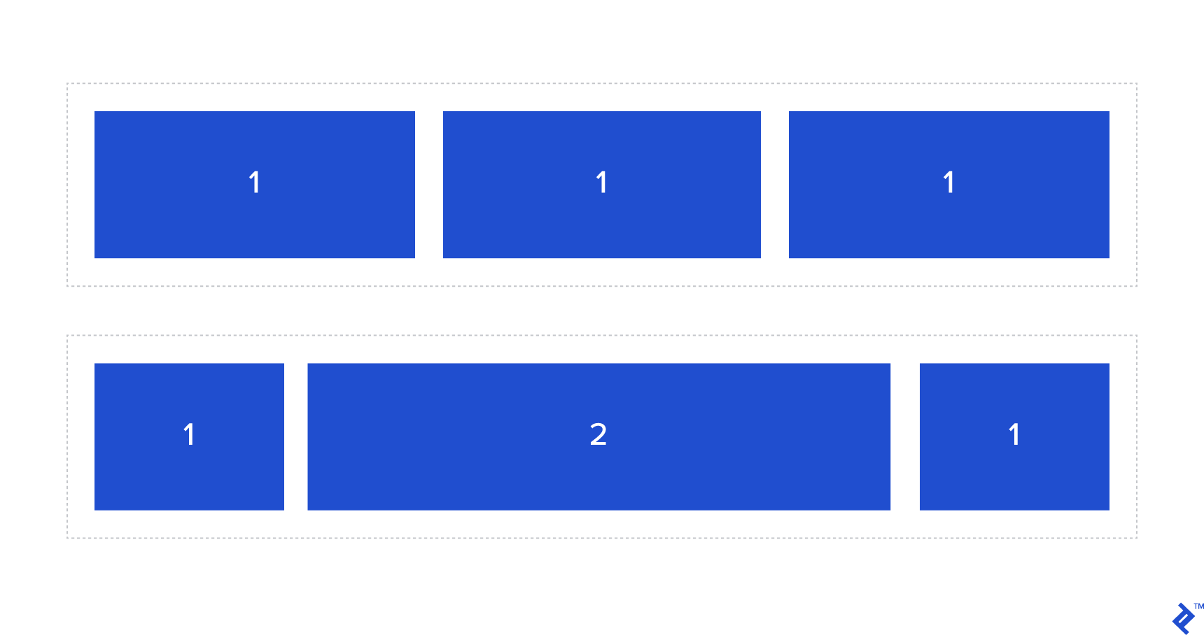
This property sets the relative proportion of the available space that the element should be using. The value should be an integer, where 0 is the default.
Let’s say you have two different elements into the same flex wrapper. If both have a flex-grow value of 1, they will grow equally to share the available space. But if one a flex-grow value of 1 and the other a flex-grow value of 2, as shown in the example below, this one with a flex-grow value of 2 will grow to take twice as much space as the first.
.wrapper .elements {
    flex-grow: 1; /* Default 0 */
}
.wrapper .elements:first-child {
    flex-grow: 2;
}
See the Pen Flexbox @Toptal - Children - `flex-grow` property by DD (@Diegue) on CodePen.
Flex Shrink
Similar to flex-grow, this property sets whether the element is “shrinkable” or not with an integer value. Similar to flex-grow, flex-shrink specifies the shrink factor of a flex item.
See the Pen Flexbox @Toptal - Children - `flex-shrink` property by DD (@Diegue) on CodePen.
.wrapper .element {
    flex-shrink: 1; /* Default 0 */
}
Flex Basis
This property is used to define the initial size of an element before available space is distributed and elements are adjusted accordingly.
Hint:
flex-basisdoes not supportcalc()andbox-sizing: border-boxin every browser, so I recommend usingwidthif you need to use one of these (note that you will also need to setflex-basis: auto;).
See the Pen Flexbox @Toptal - Children - `flex-basis` property by DD (@Diegue) on CodePen.
.wrapper .element {
    flex-basis: size || auto; /* Default auto */
}
Flex
You can combine flex-grow, flex-shrink, and flex-basis properties into a single property: flex as follows:
.wrapper {
    flex: {flex-grow} {flex-shrink} {flex-basis};
}
Hint: If you plan to use
flex, make sure to define every single value (even if you want to use default values) because some browsers might not recognize them (a common bug is related to not having defined theflex-growvalue).
Align Self
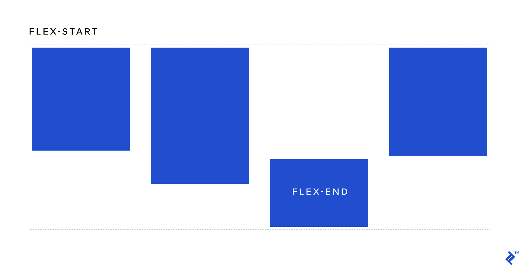
This property is similar to align-items but the effect is applied individually to each element. The possible values are:
- flex-start: Vertically aligns the element to the top of the wrapper.
- flex-end: Vertically aligns the element to the bottom of the wrapper.
- center: Vertically centers the element within the wrapper (at last a simple way to achieve this!).
- stretch (default): Stretches the element to occupy the full height of the wrapper (when applied to a row) or the full width of the wrapper (when applied to a column).
- baseline: Aligns the elements according to their actual baselines.
See the Pen Flexbox @Toptal - Children - `align-self` property by DD (@Diegue) on CodePen.
Order
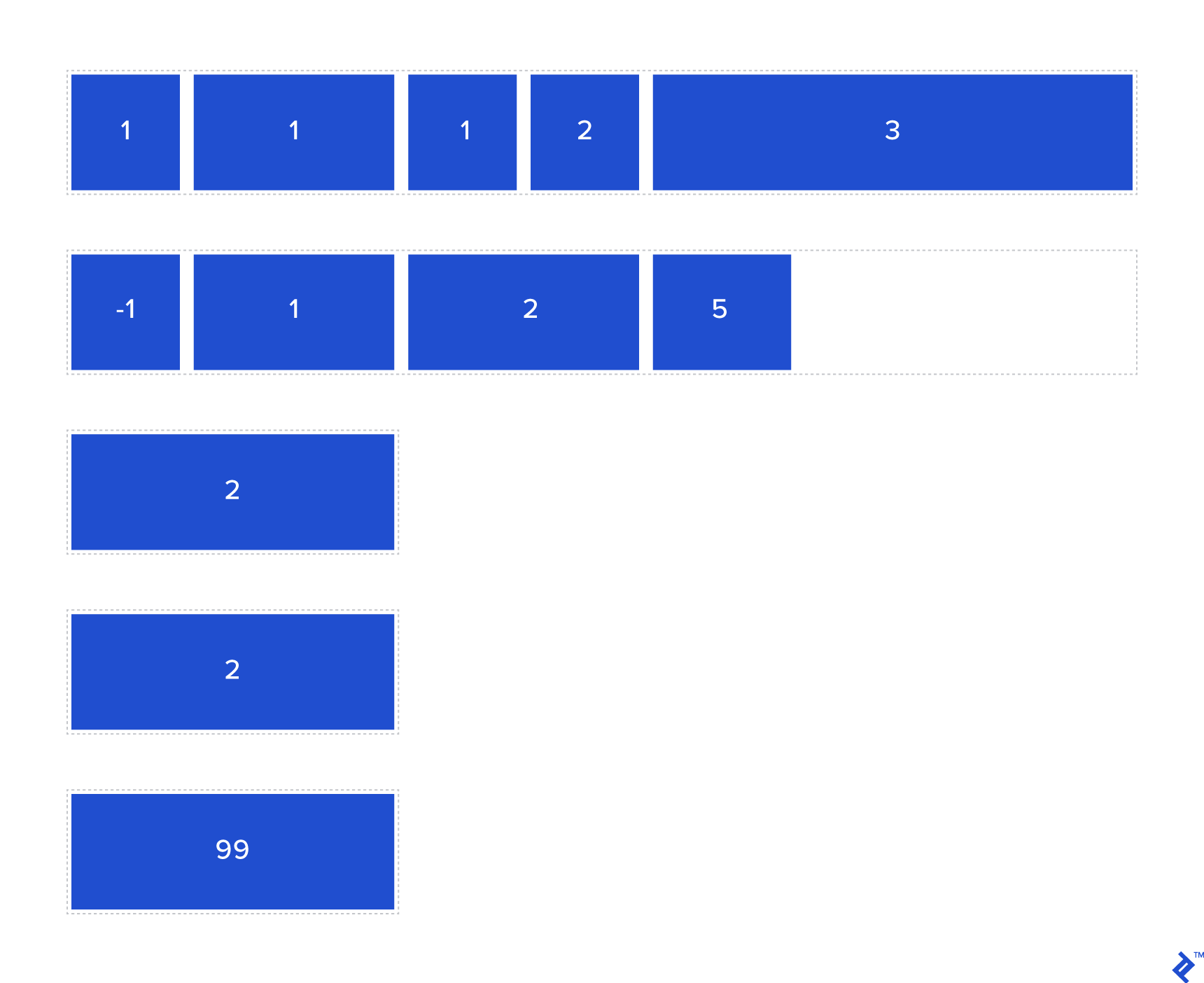
One of the best things included in Flexbox is the ability to reorder elements (using the order property) without needing to modify the DOM or use JavaScript. The way the order property works is super simple. In much the same way that z-index controls the order in which items are rendered, order controls the order in which elements are positioned within the wrapper; that is, elements with a lower order value (which can even be negative, by the way) are positioned before those with a higher order value.
See the Pen Flexbox @Toptal - Children - `order` property by DD (@Diegue) on CodePen.
.wrapper .elements {
    order: 1;   /* this one will be positioned second */
}
.wrapper .elements:last-child {
    order: -1;   /* this one will be positioned first */
}
Pulling it All Together: Flexbox Layout Examples
When it comes to designing layouts, Flexbox unleashes a world of possibilities. Below, you can find some example uses of Flexbox properties.
Vertical Alignment Component
With Flexbox, you can align anything vertically, including multiple elements at once. Without Flexbox, you needed to use positioning or table-ish techniques that required us to create one child to contain multiple elements. But with Flexbox, you can leave these tedious and fragile techniques behind, and simply define a few properties in the wrapper and that’s it, regardless of how many times the content inside the container changes or the type of change!
.wrapper {
    display: flex; /* always present for Flexbox practices */
    flex-direction: column; /* elements stack */
    justify-content: center; /* now that flex-direction is a column, the axis are swapped so this centers the content vertically */
    min-height: 100vh /* make sure wrapper is taller enough */
}
See the Pen Flexbox @Toptal - Real uses we can give - Vertical alignment by DD (@Diegue) on CodePen.
Half/half Layout
A “half/half” layout is a full height layout with two columns, each with its content centered vertically. It is usually implemented “above the fold” (i.e., before users have scrolled down after page loads).
Using more traditional techniques, you could create this layout with floated elements (of width 50% each), clearing the floats into the wrapper (“clearfix” :before and :after, overflow: hidden, or a whacky <div> with clear: both; in the end). Yet it is a lot of work and the result is not as stable as what Flexbox provides.
In the following code snippet, you will see how easy it is to set the layout using flexbox and also how the children become also Flexbox wrappers since everything is vertically aligned as well.
Outer wrapper:
.wrapper {
    display: flex;
    flex-direction: column; /* only for mobile */
}
Inner wrappers:
.inner-wrapper {
    flex-grow: 1; /* Allow the element to grow if there is available space */
    flex-shrink:  1; /* Elements shrink at the same rate */
    flex-basis:  100%; /* Elements will cover the same amount, if is possible the 100% of the width */
}
See the Pen Flexbox @Toptal - Real uses we can give - Half-bleed section by DD (@Diegue) on CodePen.
Full-width Navbar Buttons
A full-width navbar distributes the space equally in the same row of navbar items regardless of the number of elements.
In the sample below, there are also are some iconic buttons without this behavior, demonstrating that you can combine the two in any way you want. Without Flexbox, achieving these sorts of layouts would have required JavaScript code to calculate the available space and then distribute it programmatically depending on which buttons span and which don’t.
Flexbox makes this much simpler.
Wrapper properties:
.navbar {
    display: flex;
}
Spanning child properties:
.navbar-item {
    flex-grow: 1; /* They will grow */
}
Non-spanning child properties:
.navbar-other {
    flex-grow: 0; // They won’t grow
}
See the Pen Flexbox @Toptal - Real uses we can give - Full-bleed buttons navbar by DD (@Diegue) on CodePen.
Blurbs
How many times did you have to implement a set of information boxes with icons and text in different projects?
This distribution of elements is mostly useful in digital marketing but can have some other uses in software development. With the power of Flexbox, you can set a sort of grid and also align elements regardless of how many there are.
Wrapper properties:
.wrapper {
    display: flex;
    flex-wrap: wrap;
}
Child properties:
.blurb {
    flex-grow: 0; /* elements don’t grow */
    flex-shrink: 0; /* elements don’t shrink in a flexible way */
    flex-basis: auto; /* the width of the elements will be set by proportions in `width` due to flex-basis not support workaround */
    width: calc(33.33% - 60px); /* calculate proportional width without space taken by padding (workaround for IE 11) */
}
For tablet and mobile viewports, the width varies between 50% and 100%.
See the Pen Flexbox @Toptal - Real uses we can give - Blurbs by DD (@Diegue) on CodePen.
Enhancing Cross-browser Compatibility
The syntax for Flexbox has changed numerous times across different browser versions. This can be an issue when implementing a layout with Flexbox and trying to support older web browsers, especially older versions of Internet Explorer.
Fortunately, many techniques and workarounds for getting your code to work across the widest range of web browsers are listed in Flexbugs, which is a great resource. If you follow the information on that site, you will have better, consistent results across different web browsers.
Prefix tasks are particularly useful in this regard. To automate prefixing of CSS rules, you can pick one of the following tools:
Ruby:
Node.js:
Start Building Smart Layouts With Flexbox
Flexbox is a great tool to speed, polish, and scale our work. The limit is only in the imagination of the developer.
We hope you enjoyed our Flexbox layout examples, and if you need some visual aid to plan your next layout you can try this neat playground:
See the Pen Flexbox @Toptal - Flexbox playground by DD (@Diegue) on CodePen.
Open it in a new window.
With increasing adoption of modern web browsers by a majority of users, using Flexbox will allow you to create amazing layouts easily without the need to delve into messy JavaScript code or craft kludgy CSS. You can also try out various Flexbox templates and use them for inspiration or a starting point for your own layout.
Diego Díaz
Montevideo, Montevideo Department, Uruguay
Member since January 27, 2017
About the author
Diego is an experienced web developer with a passion for UI and UX. He strives to create fluid layouts for any device and architecture.
PREVIOUSLY AT

