
One Size Fits Some: A Guide to Responsive Web Design Image Solutions
As mobile and tablet devices come closer to achieving final world domination, web technology is in a race to accommodate the ever-growing number screen sizes. However, devising tools to meet the challenges of this phenomenon brings a whole new set of problems, with one of the latest buzzwords to emerge being “responsive web”.
As mobile and tablet devices come closer to achieving final world domination, web technology is in a race to accommodate the ever-growing number screen sizes. However, devising tools to meet the challenges of this phenomenon brings a whole new set of problems, with one of the latest buzzwords to emerge being “responsive web”.

Kado is a JavaScript developer with a keen interest in data and data visualizations. He is also a machine learning and data mining hobbyist, an interest rooted in his academic background, including a bachelor’s degree in economics. He focuses on building data-driven applications and turning complex information into clear, engaging visual experiences.
Expertise
Previously At

As mobile and tablet devices come closer to achieving final world domination, web design and technology is in a race to accommodate the ever-growing number of screen sizes. However, devising tools to meet the challenges of this phenomenon brings a whole new set of problems, with one of the latest buzzwords to emerge being “responsive web”. This is the challenge of making the web work on most, if not all, devices without degrading the user’s experience. Instead of designing content to fit desktop or laptops, information has to be available for mobile phones, tablets or any surface connected to the web. However, this responsive web design evolution has proven to be a difficult and sometimes painful one.
While it can be almost trivial to accommodate textual information, the tricky part comes when we put into consideration content like responsive images, infographics, videos, an so forth, which were once designed with only desktops in mind. This not only brings up the question of displaying the content correctly, but also how the content itself is consumed using different devices. Users on smart phones are different to users on desktops. Things like data plans and processing speed have to be considered as well. Google has started to highlight mobile-friendly sites on its search results, with some speculating that it will lead to a substantial pagerank boost to such sites. Earlier solutions addressed this by deploying mobile-only subdomains (and redirects) but this increased complexity and fell out of fashion quickly. (Not every site has the ability to afford this route.)
On the Quest for Responsive Web Images

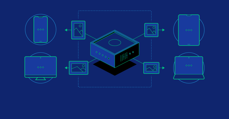
At this point, developers and designers have to ensure their website load is optimized to meet the users who are on mobile sites. Over 20% of web traffic is now mobile users, and the number is still rising. With images taking among the largest shares of page content data, it becomes a priority to reduce this load. Several attempts have been made to simplify responsive design image resizing, including, both server-side and front-end solutions. To discuss these responsive image solutions, we need to first understand the current image linking shortcomings.
The <img> tag has only the source attribute linking directly to the image itself. It has no way of determining the correct type of image needed without any add-ons.
Can’t we just have all the image sizes included in the HTML, and use CSS rules to display:none for all but the correct image? That is the most logical solution in a perfect logical world. This way the browser can ignore all the images not displayed and, in theory, not download them. However, browsers are optimized beyond common logic. To make the page render fast enough, the browser pre-fetches linked content before even the necessary stylesheets and JavaScript files are fully loaded. Instead of ignoring the large images intended for desktops, we end up having downloaded all images and resulting in an even larger page load. The CSS-only technique only works for images intended as background images because these can be set within the stylesheet (using media queries).
So, what’s a website to do?
Back-End Responsive Image Scaling Solutions

Barring mobile-only sites/sub-domains, we are left with sniffing user-agent (UA) and using it to serve the correctly sized images back to the user. However, any developer can attest how unreliable this solution can be. New UA strings keep popping up all the time, making it strenuous to maintain and update a comprehensive list. And of course, this doesn’t even take into account the unreliability of easily-spoofed UA strings in the first place.
Adaptive Images
However, some server-side solutions are worthy of consideration. Adaptive Images is a great solution for those preferring a back-end responsive image fix. It does not require any special markup but instead uses a small JavaScript file and does most of the heavy work in its back-end file. It uses a PHP and nginx configured server. It also does not rely on any UA sniffing but instead checks for the screen width. Adaptive Images works great for scaling down images, but it’s also handy for when large images need art direction, i.e. image reduction by techniques such as cropping and rotation - not merely scaling.
Sencha Touch
Sencha Touch is another back-end responsive design image solution, although it is better to refer to it as a third-party solution. Sencha Touch will resize the image accordingly by sniffing the UA. Below is a basic example of how the service works:
<img src="http://src.sencha.io/http://example.com/images/kitty_cat.jpg" alt="My Kitty Cat">
There is also an option to specify the image sizes, in case we do not want Sencha to resize the image automatically.
At the end of the day, server-side (and third party) solutions require resources to process the request before sending the correct image back. This takes precious time and in turn slows down the request-response trip. A better solution might be if the device itself determined which resources to request directly, and the server responding accordingly.
Front-End Solutions

In recent times, there have been great improvements on the browser side to address responsive images.
The <picture> element has been introduced and approved in the HTML5 specification by the W3C. It is currently not widely available on all browsers but it will not be long before it is natively available. Until then, we rely on JavaScript polyfills for the element. Polyfills are also a great solution for legacy browsers lacking the element.
There is also the case of the srcset attribute that is available for several webKit based browsers for the <img> element. This can used without any JavaScript and is a great solution if non-webKit browsers are to be ignored. It is a useful stop-gap for the odd case where other solutions fall short, but should not be considered a comprehensive solution.
Picturefill
Picturefill is a polyfill library for the <picture> element. It is one of the most popular libraries among the front-end solutions to responsive image sizing and scaling issues. There are two versions; Picturefill v1 mimics the <picture> element using span while Picturefill v2 uses the <picture> element among the browsers that already offer it and provides a polyfill for legacy ones (for example, for IE >= IE9). It has some limitations and work arounds, most notably for Android 2.3 - which incidentally is an example of where the img srcset attribute comes to the rescue. Below is a sample markup for using Picturefill v2:
<picture>
  <source srcset="/images/kitty_large.jpg" media="(min-width: 768px)">
  <source srcset="/images/kitty_medium.jpg" media="(max-width: 767px)">
  <img srcset="/images/kitty_small.jpg" alt="My Kitty Cat">
</picture>
To improve performance on users with limited data plans, Picturefill can be combined with lazy loading. However, the library could offer wider browser support and address the odd cases rather than relying on patches.
Imager.js
Imager.js is a library created by BBC News team to accomplish responsive images with a different approach to the one used by Picturefill. While Picturefill attempts to bring the <picture> element to unsupported browsers, Imager.js focuses on downloading only the appropriate images while also keeping an eye out for network speeds. It also incorporates lazy loading without relying on third-party libraries. It works by using placeholder elements and replacing them with <img> elements. The sample code below exhibits this behavior:
<div>
    <div class="image-load" data-src="http://example.com/images/kitty_{width}.jpg" data-alt="My Kitty Cat"></div>
</div>

<script>
    new Imager({ availableWidths: [480, 768, 1200] });
</script>
The rendered HTML will look like this:
<div>
    <img src="http://example.com/images/kitty_480.jpg" data-src="http://example.com/images/kitty_{width}.jpg" alt="My Kitty Cat" class="image-replace">
</div>
<script>
    new Imager({ availableWidths: [480, 768, 1200] });
</script>
Browser support is much better than that of Picturefill at the expense of being a more pragmatic solution than a forward thinking one.
Source Shuffling
Source Shuffling approaches the responsive image problem from a slightly different angle than the rest of front-end libraries. It resembles something out of the “mobile first” school of thought, whereby it serves the smallest resolution possible by default. Upon detecting that a device has a larger screen, it swaps the image source for a larger image. It feels like more of a hack and less of a full fledged library. This is a great solution for chiefly mobile sites but means double resource downloading for desktops and/or tablets is unavoidable.
Some other notable JavaScript libraries are:
- HiSRC - A jQuery plugin for responsive images. Dependency on jQuery might be an issue.
- Mobify.js - A more general library for responsive content, including images, stylesheets and even JavaScript. It ‘captures’ the DOM before resource loading. Mobify is a powerful comprehensive library, but may be overkill if the goal is just responsive images.
Summary
At the end of the day, it is up to the developer to decide which responsive web design image approach suits the user base. This means data collection and testing will give a better idea of the approach to take.
To wrap up, the list of questions below can be helpful to consider before deciding the appropriate responsive image solution.
- Are legacy browsers an issue? If not, consider using a more modern approach (e.g: Picturefill,
srcsetattribute) - Is the response time critical? If not, go for a third-party or back-end solution.
- Are the solutions supposed to be in-house? Third-party solutions will obviously be ruled out.
- Are there lots of images already on a site that is trying to transition to responsive images? Are there concerns about validation or semantic tags (or rather non-semantic tags)? This will require a back-end solution to route the image requests to something like Adaptive Images.
- Is art direction a problem (specifically for large images with a lot of information)? A library like Picturefill will be a better solution for such a scenario. Also, any of the back-end solutions will work as well.
- Is there a concern about lack of JavaScript? Any of the front-end solutions will be out of the question, which leaves the back-end or third-party options that rely on UA sniffing.
- Is there a priority for mobile response times over desktop response times? A library like Source Shuffling may be more appropriate.
- Is there a need to provide responsive behavior to every aspect of the site, not just images? Mobify.js might work better.
- Has the perfect world been achieved? Use CSS-only
display:noneapproach!
Further Reading on the Toptal Blog:
Kado Damball
Berlin, Germany
Member since August 5, 2014
About the author
Kado is a JavaScript developer with a keen interest in data and data visualizations. He is also a machine learning and data mining hobbyist, an interest rooted in his academic background, including a bachelor’s degree in economics. He focuses on building data-driven applications and turning complex information into clear, engaging visual experiences.
Expertise
PREVIOUSLY AT