
Building and Scaling a Design System in Figma: A Case Study
Building a design system for a multinational company means cataloging every component in meticulous detail. It’s a massive undertaking that calls for both a big-picture view and a focus on specifics. Here’s how one design system team leader accomplished it.

Building a design system for a multinational company means cataloging every component in meticulous detail. It’s a massive undertaking that calls for both a big-picture view and a focus on specifics. Here’s how one design system team leader accomplished it.

Abigail Beshkin
Abigail is a veteran of Pratt Institute and Columbia Business School, where she oversaw the design and production team for Columbia Business magazine. Her work has appeared in the New York Times and been heard on NPR.
Expertise
Determining how to build a design system for a multinational company means cataloging every component and pattern in meticulous detail. It’s a massive undertaking that calls for both a big-picture view and a focus on specifics. Here’s how one design system team leader accomplished it.
When Switzerland-based holding company ABB set out to create a design system, the goal was to knit together a consistent look and feel for hundreds of software products, many of which power the mechanical systems that keep factories, mines, and other industrial sites humming. It was no small task for a company with almost two dozen business units and nearly 150,000 employees around the world. For Abdul Sial, who served as the lead product designer on ABB’s 10-person design system team, scaling the library of components and patterns depended on maintaining openness and transparency, with an emphasis on extensive documentation.
The Role of a Design System Designer
Increasingly, large companies like ABB have teams dedicated exclusively to creating and maintaining design systems. “A design system allows for consistency, going to market in a fair time and not allowing production to get stuck on customizations that are not building value,” says Madrid-based designer Alejandro Velasco. Or, as Alexandre Brito, a designer in Lisbon, Portugal, explains, “Design systems come to provide structure whenever there are many people using the same set of tools. It’s like everyone having the same language.”
If a traditional style guide covers the design basics—fonts and colors, for instance—a design system has a much further reach. “A design system is a mix of a style guide, plus design components, design patterns, code components and, on top of it, documentation,” Sial says. When he worked on ABB’s design system, about 120 designers used it on a regular basis. The effort represented version 4.8 of the system, and the team dubbed it “Design Evolution.”
Design system designers play a different role than those who focus solely on individual products. “You have the bird’s-eye view of all the different products that a company is using,” Sial says.
Working in design operations also calls for communicating with stakeholders throughout a company. “Design system designers have to be social,” says Velasco. “A design system designer has to really like to work and talk with people who have different roles within an organization. They have to be able to distinguish what feedback to include in order to build the design system around the company’s needs.”
The Life Cycle of a Component
Working on ABB’s design system, Sial was guided by one overarching philosophy: “Documentation, documentation, documentation.” For every reusable element on ABB’s websites, mobile screens, or large stand-alone screens, Sial wanted to show what he calls the life cycle of a component. That meant extensive record-keeping for all components and patterns—breadcrumbs, headers, inputs, or buttons, to name just a few. “What are the journeys it went through? What decisions went into it? That way we’re not always recreating everything. Before trying something, you can read and see that someone already tested it,” Sial says.
In his experience, this philosophy is a departure from the typical approach to documentation. In the fast-paced world of product development, for example, documentation is often written at the end of the project or abandoned altogether. But for design systems, Sial says, documentation should be more than an afterthought. “A design system is never done; it needs continuous improvement,” he says. “Design system creators and consumers want to understand the thought processes and decisions in order to keep improving it.”
Documentation is especially important for a design system as large as ABB’s. “With such a large team you have to be able to scale,” he says. “How can we make sure that everybody who joins the team can quickly go to any component and understand how it started, how it was edited, and what version they are using?”
Finding the Right Tool
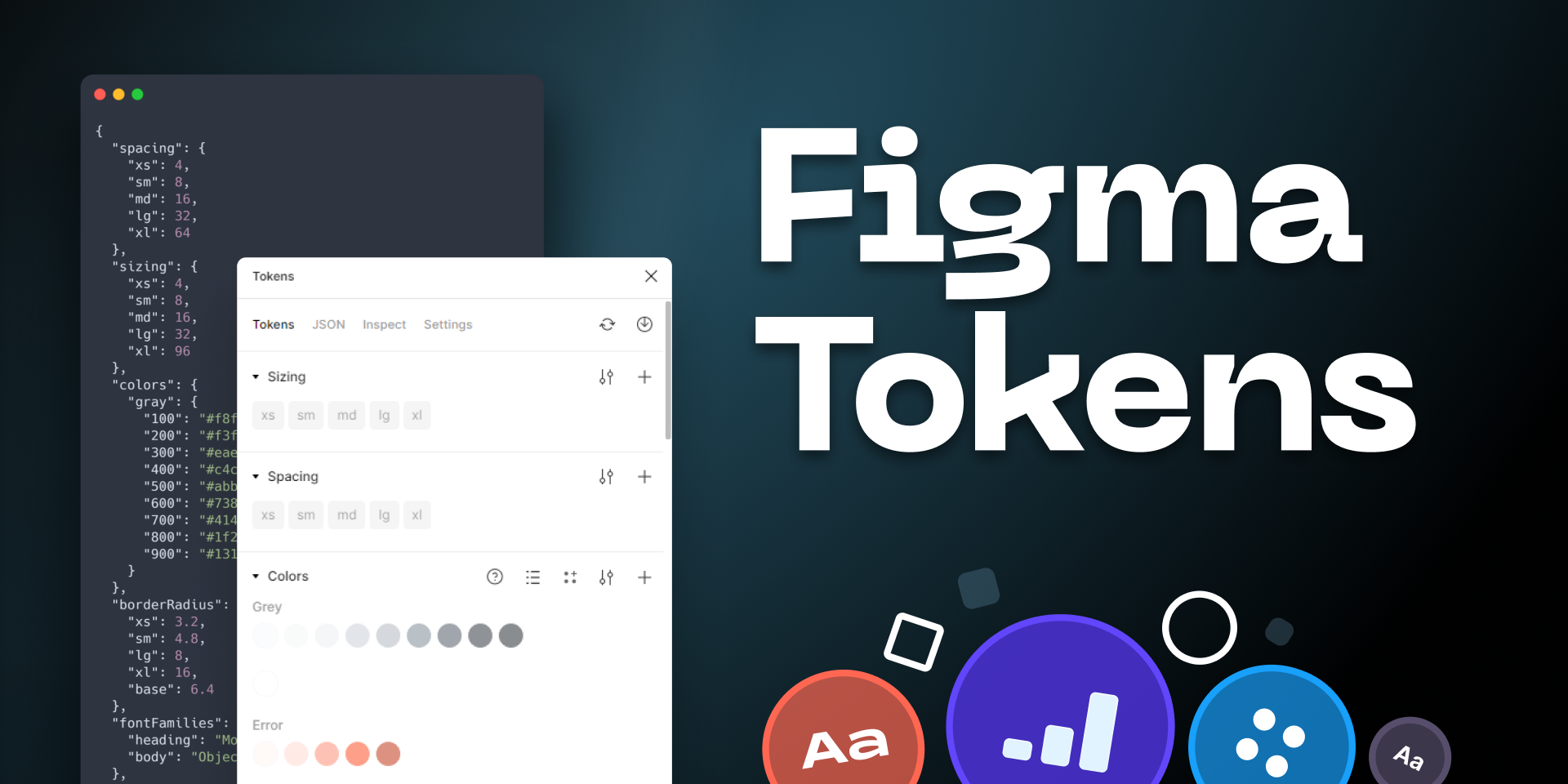
There are many tools out there for building design systems, including Figma, Sketch, and Adobe XD. Sial experimented with several, trying a mix of design and project management tools before settling on Figma, which offers ample space for documentation.
Sial and his team determined that every component should sit within its own file. “Most of the time, you’re working on one component at a time. If you put all the components in one file, it slows down Figma. By giving each component its own file, it’s quicker to open and you have the whole history and documentation in one place,” he says.
This approach worked well for ABB’s design system and documentation process. Improvements in Figma’s performance, however, have made library organization more flexible, enabling teams to choose between individual component files, larger shared libraries, or a hybrid approach, based on the size and needs of the organization.

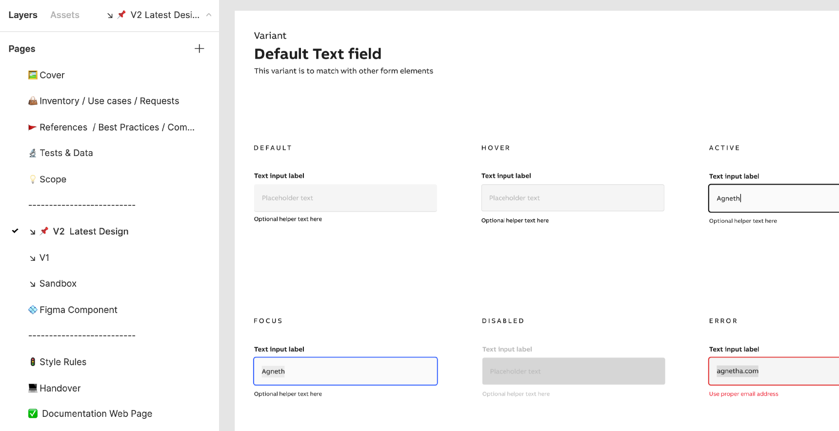
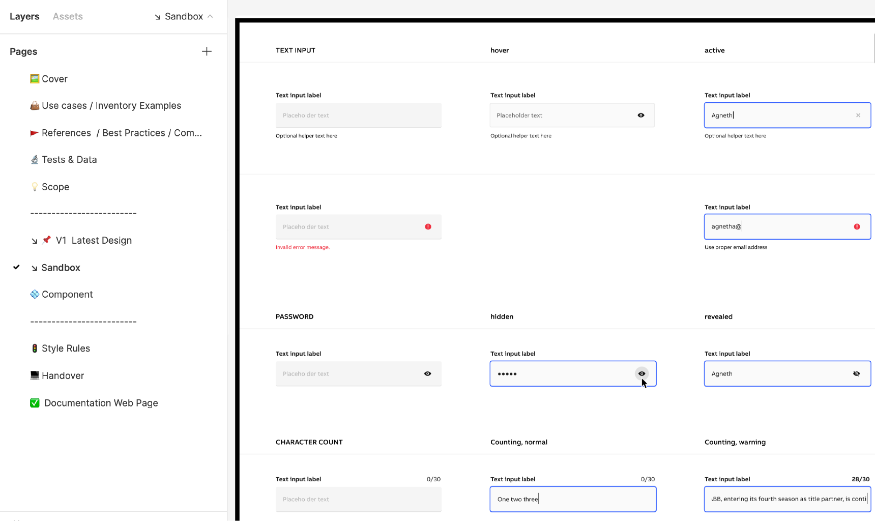
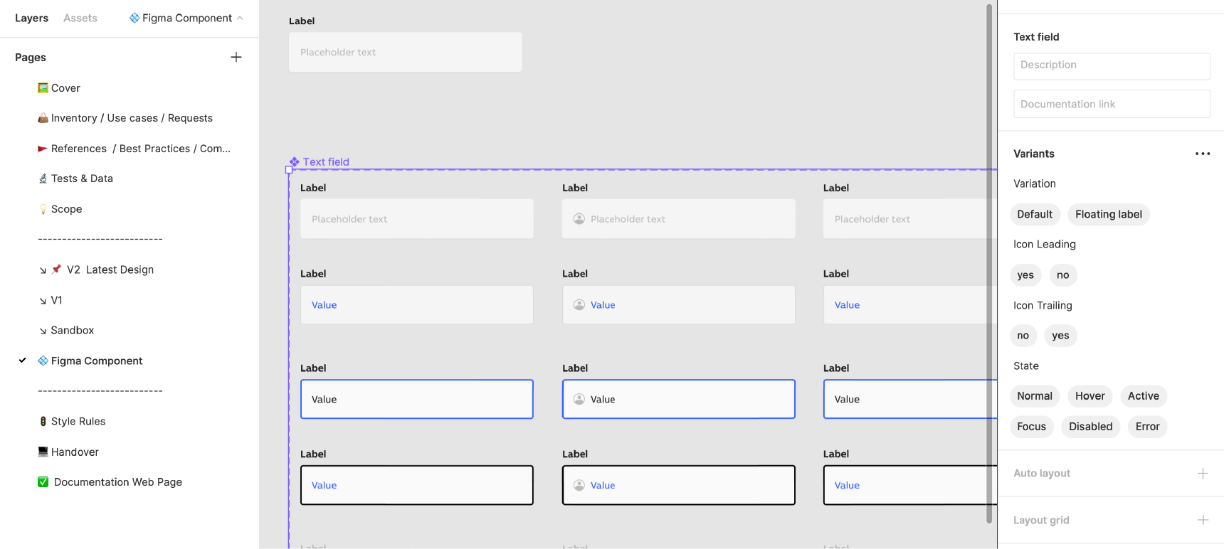
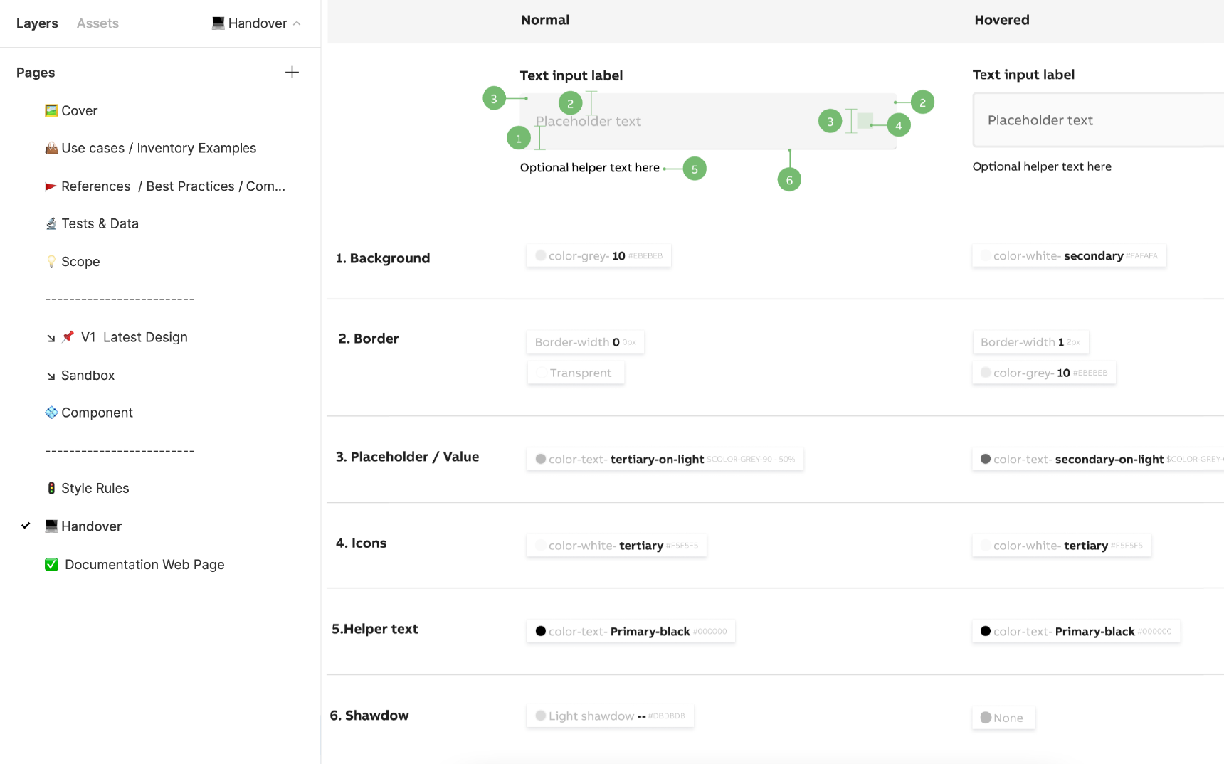
Setting the Hierarchy
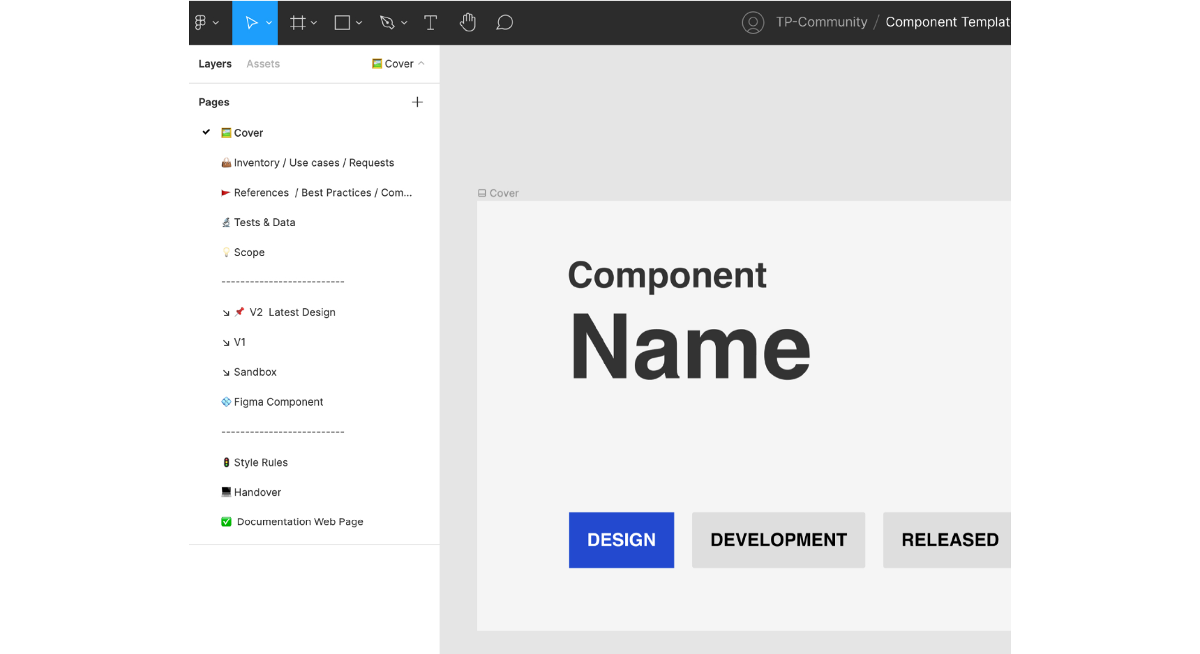
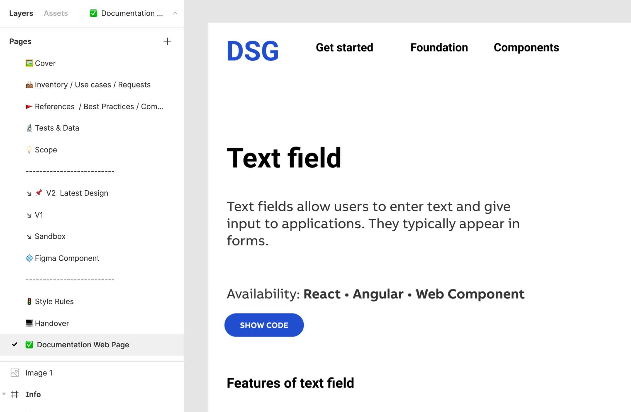
Sial set up the ABB design system so that the file for each component and pattern has the same pages. The images that follow detail what’s on each page.
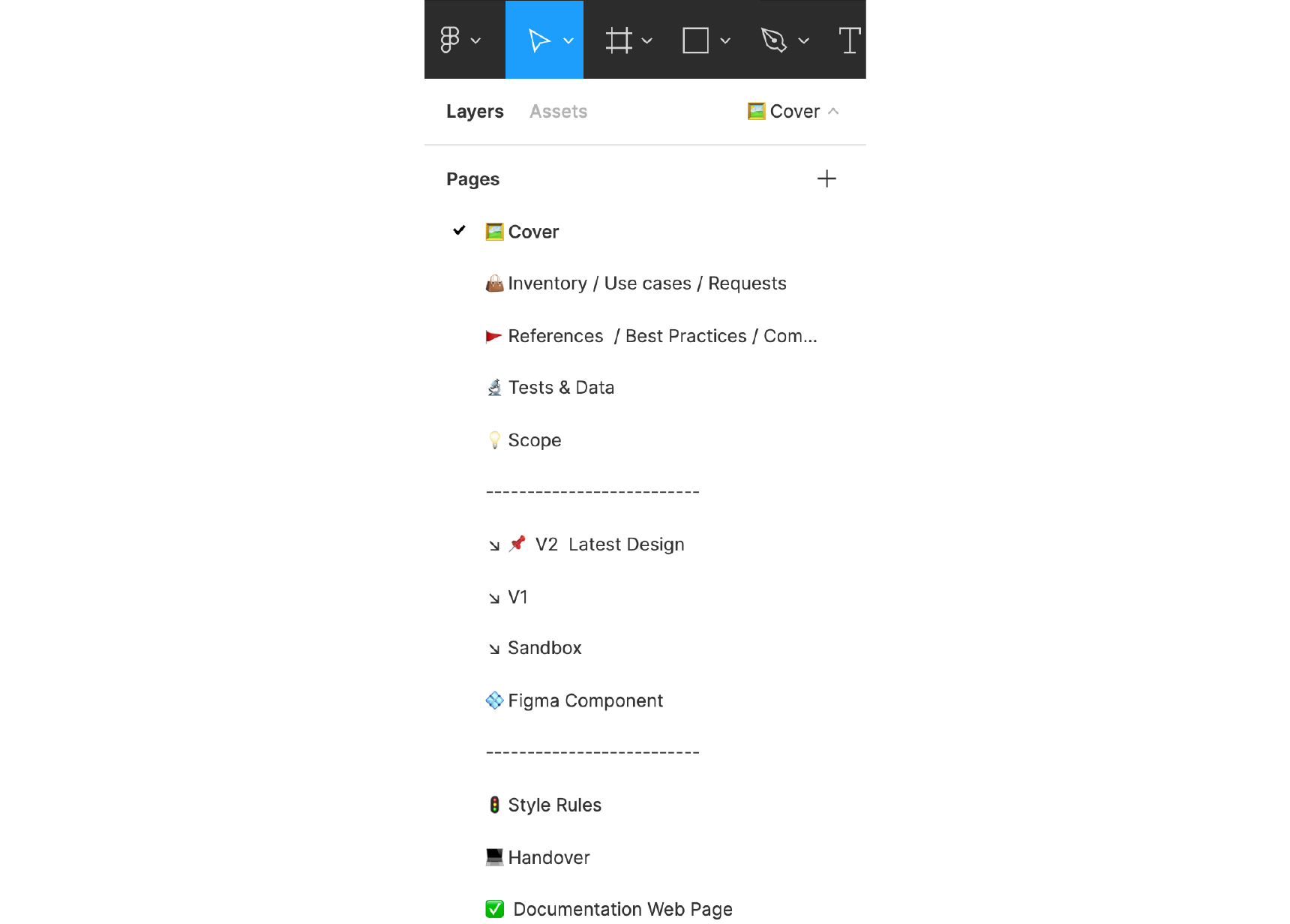
Cover
Sial recommends setting up a simple cover page for every component. In Figma, this enables a thumbnail preview of all the components and helps with the browsability of files. In the ABB setup, the cover page includes the component name and what phase it’s in: design, development, or released. The status can be easily updated when the component progresses.
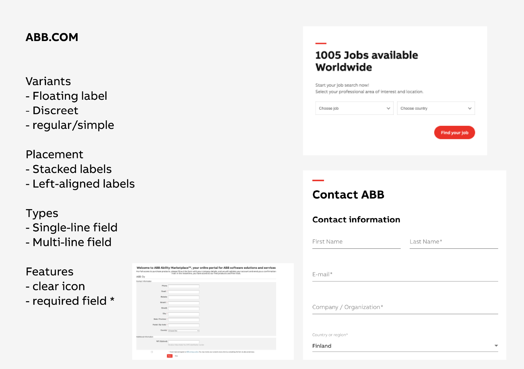
Inventory, Use Cases, and Requests
This page contains examples of the numerous ways that a component shows up in a company’s digital product. In the case of a text field component, for instance, the inventory page would show how the text field looks on abb.com compared to how it appears on an iPhone compared to how it shows up on an Android device. “The inventory allows us to understand clearly what’s already there,” says Sial.
This page should also show the ways the component is being used incorrectly. “This allows you to look at your products and see where there are alignments and misalignments,” Sial says. He advises teams launching a design system project to begin by cataloging what already exists. “Start with inventory and it will guide you as you’re creating the design,” he says.
References, Best Practices, and Competitive Analysis
Sial advises creating a section of each component file akin to a vision board, showing how other companies design comparable pieces. “As with anything else, best practice is to perform competitive analysis and see how other people are doing it,” he says. “Observe other products and see their learnings.”

Tests and Data
The test results data page aggregates all the data related to testing a component, including the results of A/B testing and feedback from users and stakeholders. In short, Sial says, “It’s the whole story of a component.” Perhaps the design team tried a new variation two years ago and found it didn’t work? “Maybe we worked on that variation and we discarded it for some reason,” he says. If so, this kind of history can save significant time by making sure that designers don’t try it again.
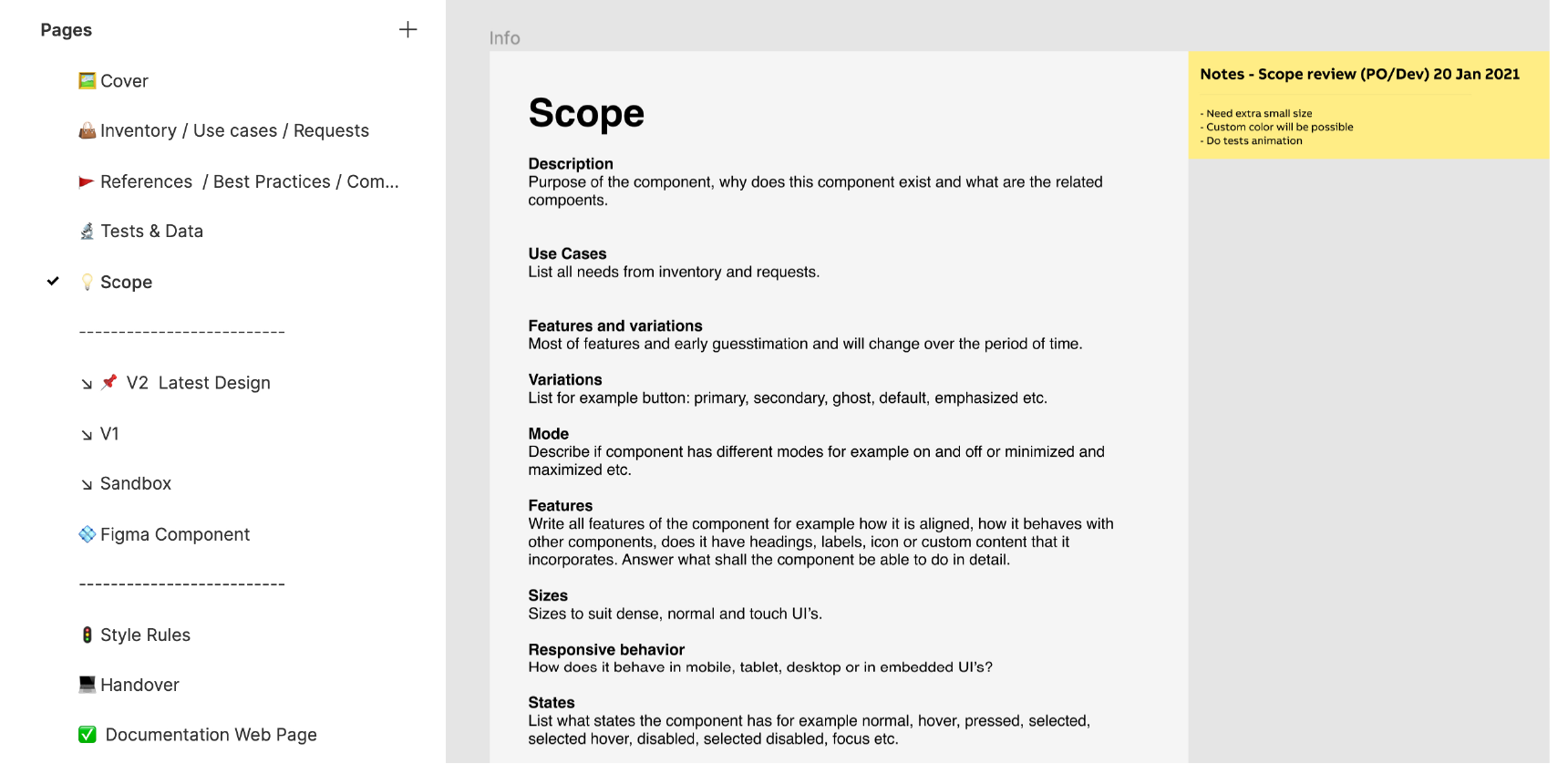
Scope
The next page lays out a component’s scope so designers can bring a design to fruition. By the time they arrive at the scope page, Sial says, “You have a story. You understand the inventory of all the products. You know what you need to build and you know the requirements. Now it’s time to write it down and make a brief out of it.” He adds that creating the scope should be a collaborative process with the product owners, developers, and designers.
Versions
Images of the final versions of the component are found here, with the latest iteration pinned on top. Other designers should be able to review and comment on it.
Sandbox
The sandbox enables designers to experiment with different iterations of a component or pattern directly in Figma. “It can be messy, and there’s no standardization,” Sial says. “It’s just a playground where a designer has the freedom to do anything.”
Figma Component
The file also contains a page for the Figma component itself, a UI element that is easily repeatable throughout the design system. The designer can make changes to the component, and that change will populate throughout all the instances of that component across the company, keeping everything consistent. This page will be exported to the Figma design system library, and any individual designer can drag and drop the Figma component into their design. If the design system team needs to make a change to the component, they can make it once and deploy it throughout the company.
Figma libraries also make extensive use of Variables, which allow teams to define and centrally manage reusable values such as colors, spacing, typography, and sizing. By connecting components to shared Variables, design system teams can update foundational styles in one place and propagate those changes consistently across products.
Style Rules
Next, the design system designers and developers create the style rules page, a kind of catch-all for elements that, Sial says, “are not visible in the design.” For example, how will the component render when you scroll down the page? It’s also where the design system team keeps track of unresolved questions or issues. He says he was surprised at how integral this page turned out to be: “At first, we thought this page was not that important, but now we realize we spend most of our time here.”

Handover
The handover notes are the instructions for developers on writing the code for the component. The handover document begins with the anatomy of the component, then includes its variations.
The ABB system handover documents also include design tokens. Becoming increasingly popular in large-scale design systems such as ABB’s, design tokens are pieces of platform-agnostic style information about UI elements, such as color, typeface, or font size. With design tokens, a designer can change a value—indicate that a call-to-action button should be orange instead of blue, for instance—and that change will populate everywhere the token is used, whether it is on a website, iOS, or Android platform.
Sial also created a Figma token plug-in to expand the scope of tokens designers can create in Figma. “Figma supports colors, typography, shadows, and grid styles,” he says. The plug-in will generate tokens for more variables, such as opacity and border width. It also creates a standardized naming convention, so designers don’t have to keep track of token names manually. “The plug-in bridges the gap between developers and designers. It allows both to work on a single source of truth for design; if one makes a change in one place, that change takes effect everywhere in the design and code,” he says.
Figma’s Dev Mode gives developers direct access to component specifications, measurements, Variables, and implementation details. This helps reduce ambiguity during handoff and gives designers and developers a shared view of the system as it evolves.
Sial stresses that in his system, developers take an active role throughout the creation of a component. “Early on, we would involve our developers when we had something ready to show them,” he says. “Then we realized that’s not working, and now we literally start kickoff sessions with them.”
Documentation Webpage
The last page of each file contains a webpage with the final design, showing how the component looks as a finished product. “We create a page that shows how the live example will look so the users, in this case our designers, can see how it will look at the end of the day on a real website,” Sial says.
Collaboration Is Key
The role of a design system designer is multifaceted. As Alejandro Velasco says, “Designing a design system involves so many roles, and if I’m leading that, I’m the glue for the project.”
It’s an enormous undertaking and not necessarily the right move for all companies. Startups, for instance, might do better to begin with an out-of-the-box system such as Google Material Design or the IBM Carbon Design System, rather than dedicating extensive resources to creating one. Still, the time might come when that won’t suffice, says Alexandre Brito: “As soon as you have multiple designers working together, you start to realize that there’s a need for someone to build rules that are more in line with the product or brand you’re building.”
Building a design system takes work and dedication; it also takes collaboration. Sial stresses that involving all stakeholders in the development of ABB’s system throughout the process was a priority. “It was really iterative work with my whole team. It was all about listening to them and we took the time to learn and test it thoroughly and develop this structure,” he says.
Having a structure that includes extensive documentation, including history and best practices, is at the core of the Figma design system. “It’s a success because people can read the documentation all in one place,” Sial says. “They can see everything, starting from the use case to the design and moving on to the handover and the final component page. People can see the whole life cycle of a component.”
You can browse Abdul Sial’s Figma file in its entirety here: Component Template.
Further Reading on the Toptal Blog:
Understanding the basics
While a traditional style guide covers the design basics—fonts and colors, for instance—a design system has a much further reach. The design system documentation for Switzerland-based holding company ABB, for example, contains design components, patterns, and code components.
Design system designers play a different role than designers who focus solely on individual products. They tend to have more of a bird’s-eye view of all the products a company is using. They also must interface and communicate with stakeholders throughout a company.
One approach is to organize it in Figma and give each component and pattern its own file. This design system case study demonstrates one approach: At ABB, each file has several pages with extensive documentation on all the ways the element is used throughout the product and all the iterations it went through. Showing the full life cycle of a component is key to building and scaling a design system.