
The Benefits of a Design System: Making Better Products, Faster
Design systems increase collaboration, ensure consistency, and accelerate design and development cycles. Toptal product designer Molham Bakir lays out how—and shares insights and tips from his experience building them.

Design systems increase collaboration, ensure consistency, and accelerate design and development cycles. Toptal product designer Molham Bakir lays out how—and shares insights and tips from his experience building them.

Molham Bakir
Molham is a product designer who specializes in building design systems. His clients include Snap Inc. and e-commerce websites Dubizzle and Mumzworld, the largest online baby shop in the Middle East.
Previously At

Technology leaders such as Google, IBM, and Salesforce rely on design systems to codify and scale design efforts across entire organizations. But design systems aren’t just for big-name brands: They’ve become standard practice across organizations of all sizes.
In essence, a design system is a set of patterns and practices that help teams across an organization—from designers to developers—create consistent, accessible digital products. There are different models, but most consist of a pattern library, design tokens, brand and style guidelines, and documentation on how to use the system.
The benefits of design systems are twofold. First, they speed up every stage of product development, from concept and design to production and testing. Figma has found that designers working with a system complete their tasks 34% faster than those without one. Second, design systems improve the customer experience by ensuring consistency, familiarity, and accessibility at every touchpoint.
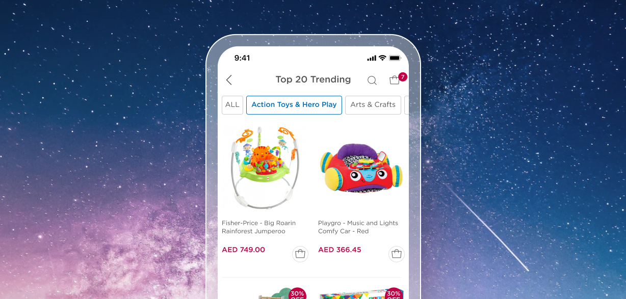
Recently another UI designer and I took a month to build a design system for a leading e-commerce site that provides baby products to mothers across the Middle East. Using insights from the experience of building a design system for this website and app–which I’ll refer to as “the baby product site” or “the baby product app”—I’ll lay out how design systems enable teams to improve products and increase efficiency.
Design Systems Speed Up Design and Development Cycles
Design systems save organizations time and money by codifying design decisions that can be replicated at scale. Let’s break down specifically how these systems support faster design and development cycles, and how to get the most of out of your design system.
A Streamlined Design-to-production Workflow
On the baby product site, before we implement a new design it goes through a series of stages. First, designers prototype and hand over a design to a UX researcher for validation, or alpha testing. Next, we share the prototype with stakeholders. Then we push the update to a small audience and track the results of the change with A/B testing. This learning cycle, also known as beta testing, repeats until we get a sufficiently high success metric. We may work on more than five variations of a design, discarding many of them throughout these stages to expedite finding the best solution.
These steps are crucial for ensuring that we only push quality work to our full audience. However, any process with multiple players and iterations is time consuming.
A design system streamlines various stages of this workflow. Designers can prototype screens in just minutes, instead of hours, because they can quickly search for components and patterns and then drag and drop them onto the screen. Designers across different teams can access shared components and styles in any new project. And engineers can quickly assemble new features without requiring a visual designer to lay out every single screen. For example, engineers can code patterns in a platform like Storybook, an open-source tool for building UI components and pages in isolation. Multiplying this efficiency across design and development teams in an organization can translate into real value for a business.

In your design system, linking each pattern with code that is performant and production-ready better facilitates experiments and updates. Developers should be involved in building design systems from the beginning and can create a variety of methods to distribute designs and patterns to teams. This resource offers a checklist for designers and developers to help them work together on creating a design system.
Streamlined product development means companies can launch, test, and iterate new features faster, which can be a huge competitive advantage.
Less Redundancy
Design solutions have to be prototyped, validated with users, approved by stakeholders, translated into code, and tested against existing designs—so any redundancy in the process wastes time, manpower, and money. Without a central repository for referencing past work, designers and developers must solve the same problems repeatedly and re-create solutions that already exist.
As Alla Kholmatova, author of Design Systems, notes: “Designers become frustrated always solving the same problems, or not being able to implement their designs properly. Developers are tired of custom styling every component and dealing with a messy codebase.”

A design system’s pattern library is cataloged by functionality. Each functionality should map to a single, production-ready pattern. Wherever that functionality appears in your product, that standardized pattern can be applied. Standardization eliminates the need for designers and developers to re-create similar solutions over and over, freeing their time to focus on new problems that do not yet have standardized solutions. We based our pattern library on atomic design, a well-known approach to creating design systems.

Once we implemented a design system for the baby product app, I could focus on more impactful design problems, such as creating new use cases, conducting user testing, and revisiting or creating new user scenarios.
A Shared Language From Code to Customer
When you have designers and developers working on products concurrently across an organization, a shared language for referring to design is critical for facilitating collaboration. A shared language consists of terms, phrases, and naming conventions that help cross-functional teams speak about a company’s product and streamline design decisions. The glossary in Google’s Material Design 3 is a great example of a shared language that’s easy for teams to access and understand.

Simply creating a language and imposing it on teams isn’t likely to succeed. Instead, it’s best to get input from all stakeholders. A shared language is most effective when contributions come from across an organization. For example, we relied heavily on input from product designers, UI designers, front-end developers, back-end developers, content designers, quality engineers, accessibility experts, and others.
You can encourage contribution to a design system in a number of creative ways. Atlassian's design principles and open-source contribution model offer effective examples for doing this. For instance, one of its principles focuses on facilitating collaboration across teams by prioritizing inclusion, accessibility, and openness in its products. A robust design system should contain and establish principles based on a company’s specific needs. For inspiration, check out these 195 examples of principles from well-known brands.
Design Systems Foster Higher Quality Products and Better User Experience
The process of building a design system allows you to consider how each pattern and practice helps achieve a product’s goal. To support the e-commerce UX in the baby product site and app, each element of the design system aims to decrease cognitive load for multitasking moms, make it as easy as possible to find and purchase items, and ensure that the products available to purchase are accessible and personalized to the user’s location.
A seamless and enjoyable user experience helps build customer trust and improve the likelihood that they’ll recommend products on a website or app to others. These are some of the design system benefits you can bring to your own customers, with examples from my own work on the baby product site.
A Familiar and Intuitive UI
Before creating a design system, the baby e-commerce site and app lacked standardized patterns and behaviors for each functionality. This meant users had to learn (or relearn) a new pattern each time they wanted to do the same thing, for example when selecting a category filter.
Below is an example of the filtering options for different baby product categories (such as “strollers,” “outdoor,” and “nursing”) on the app and mobile website. Each filter option looks and works a bit differently, creating a disjointed, inconsistent feel across these channels. For example, some of the filtering screens include buttons the user would press, others are tabs to toggle between. Some have images to represent the product categories whereas others have only text. The terms used for categories vary as well (for example “nursing” vs. “breastfeeding essentials”). It’s cognitively taxing for users to learn how new patterns behave, resulting in a frustrating experience.

We redesigned the pattern library based around UI standards found in Google’s original Material Design and IBM’s Carbon Design System. We chose Material and Carbon Design because they reflect our goal of showing users a simple and seamless interface to complete their tasks.
This approach allowed us to standardize each component’s behavior with globally recognized UI standards at the core. In addition to creating consistency across the site, implementing design patterns that behave in ways users are already familiar with reduces their cognitive load. As a result, when a user visits for the first time, the site feels predictable, familiar, and easy to use.
To create this intuitive UI experience, avoid reinventing the wheel. Although such standardization can seem limiting at first, it’s the way these components are combined and styled that offers competitive advantages.
Enhanced Product Quality
Before we developed a design system, the baby product site featured 184 unique colors and 299 total background colors. This created mixed visual messages and a scattered brand feel, which can reduce the perceived quality of a product. As Nielsen Norman Group notes: “A negative emotional reaction to some aspect of the design lowers the perceived value of the site and makes people abandon the site—often within a few seconds.”
A design system helps product teams define and standardize visual elements like color, typography, spacing, and imagery. These elements express the heart and soul of your brand and form a visual language. A well-defined visual language can enhance the perceived quality of your product.
Our goal for the baby products site is for it to be attractive and easy to use for busy moms, and we established a color palette that felt elegant, fresh, and inspired by nature. Creating our design system allowed us to select colors to shape how the product is perceived by customers in a reliable, scalable way. Of course, guidelines for how and when to use the colors in the palette—and how not to use them—are essential. This example from the University of Oxford’s digital style guide shows the level of detail that guidance can provide.

A well-defined visual language can also enhance the actual quality of your product, measured by speed and performance. I saw this firsthand: Each of the hundreds of unique colors on the old baby products site represented a piece of code that the browser had to load. Each one also introduced the possibility of a bug or error. Loading time and bugs affected the speed and performance of the site. After implementing the new design system, our checkout page went from a page load speed of four to six seconds to 2.8 seconds. When a design and its corresponding code are standardized, this can result in a lighter, faster-performing site, not to mention fewer bugs and breaks in the code.
Similarly, design systems improve the quality of interactive elements. Designing interactions outside a system makes it hard to replicate elsewhere in the product. In a design system, however, these interactions (and their corresponding animations and attributes) are defined and assigned to master components. So wherever you use a particular component or interaction within the product, it behaves the same. This way, developers and product managers can see how interactions work as you’re iterating. You don’t need to take time to explain the interaction for each use case to them.
This is particularly useful because some components have different sizes based on where they are in the templates and how they behave within a pattern. A design system allows you to easily see how the same component behaves and looks when it sits in different patterns.

Accessibility Prioritized From the Start
An estimated 15% of people worldwide have a disability. And even more experience temporary disabilities or situational limitations, such as not being able to see a screen in bright sunlight. Another part of accessibility for global products is localization—making sure that content is adapted for local contexts, including but not limited to language translation. A design system allows product teams to integrate accessible design and localization into each pattern.
It’s beneficial to first get to know your audience and the specific challenges they may face in using your product. For our audience of moms, we knew that 95% of users browse and shop from their phones. And they’re often shopping at 9 or 10 PM when their children are asleep, and the brightness on their phone is reduced. That’s why we built accessibility features like high color contrast into our design system.
A design system also helped us build in localization from the very beginning. We used internationalization best practices to ensure a genuinely cross-cultural experience, including flexible design for varying language length and font size, right-to-left language support, and support for local currencies, units, dates, times and address formats. Our UX writer ensured we had a consistent voice in each language with high-quality translations. In addition, we agreed that every team would contribute to supporting localization, and we built it into all new feature releases.
When building a design system, you should adhere patterns to the Web Content Accessibility Guidelines to ensure all designs prioritize accessibility from the start. For example, test to be sure your product works with assistive technologies. My team took inspiration from eBay MIND Patterns, which features guidelines on building accessible components for e-commerce websites.
The Lasting Benefits of a Design System
Design systems save organizations time and money by codifying design decisions that can be replicated at scale. A key goal of these systems is to prevent duplication of efforts, leading to quality work at efficient speeds. AI tools are also beginning to take on some of that maintenance burden, automating tasks like design token generation, documentation updates, and cross-component consistency checks. Improved efficiency creates a fulfilling work experience for designers and developers because they can focus on overcoming significant design challenges instead of repeatedly fixing the same issues. Design systems also improve the customer experience by ensuring consistency, familiarity, and accessibility at every touchpoint.
In my experience, creating e-commerce design systems is well worth the time and effort. With this particular app, the tangible benefits we saw—faster design and development cycles, page loading times, and checkout speeds—underscore its lasting value.
Further Reading on the Toptal Blog:
Understanding the basics
A design system is a set of patterns and practices that help teams across an organization—from designers to developers—collaborate to create consistent, accessible digital products. A key goal of these systems is to standardize design decisions and prevent duplication of efforts, leading to quality work at efficient speeds.
A design system consists of a pattern library, design tokens, brand guidelines, and documentation on how to use the system.
Design systems save organizations time and money by codifying design decisions that can be replicated at scale. They also improve the customer experience by ensuring consistency, familiarity, and accessibility at every touchpoint.