The Fundamental Guide to Mobile Usability
Mobile usability isn’t just about scaling a website or app to fit various devices. It’s about understanding how people use mobile devices and that the mobile experience is as unique as the user.
Mobile usability isn’t just about scaling a website or app to fit various devices. It’s about understanding how people use mobile devices and that the mobile experience is as unique as the user.
Christine is a UX/UI designer who specializes in data management, wellness products, and scaling UX teams for large organizations. She is the Director of UX and Product Design at CrowdStrike and has partnered with companies such as Dell, Lowe’s, and The Hershey Company.
Previous Role
Senior UX ManagerPREVIOUSLY AT

Mobile usability isn’t just shrinking a website to fit various devices. It’s about paying mindful attention to the ways people use mobile devices and understanding that the mobile experience is as unique as the user.
Usability design for mobile devices is as much about the way it feels as the way it looks and behaves. People use their fingers—or more specifically and more often, their thumbs—to interact with the screen, rather than the traditional desktop proxies of a mouse and keyboard. This means mobile design is a much more tactile experience than desktop. Users feel it as much as they see it.
For better or for worse, the barrier of the desktop proxies is gone, and mobile designers are faced with a new set of UX design principles for usability.
While there is no one-size-fits-all for mobile usability, simply because of the vast array of sizes in both screens and fingers, the following usability principles move things in the right direction:
- Know your users
- Understand context
- Follow the rule of thumb(s)
- Put content first
- Stay on (touch) target
- Echo the real world with gestures
- Use progressive disclosure
We’ll dive into these in more detail further down in this post, but first, let’s discuss some key points of mobile-friendly design as well as research findings and recommendations from prominent designers in the field.
Beyond Pixels – Mobile Design Meets Industrial Design
Because mobile design is so tactile, it moves beyond visual design and pixels on a screen. Mobile usability requires designers to consider elements of industrial design and human factors; that is, design for real, physical objects. While mobile UX designers aren’t actually designing the physical product itself, mobile interface designers should still have an understanding of how the user physically experiences an app.
Touch screens require UX designers to consider ergonomics, much in the same way designers of physical products do. Because people physically interact with mobile devices, comfort is important. No one wants to sit in an uncomfortable chair—in the same way, no one wants to use an app that causes pain or discomfort or just feels awkward to navigate.
Just as industrial designers spend large amounts of time researching and observing users, mobile UI designers should continually work to observe, understand, and build empathy to truly recognize how people use mobile devices before jumping straight into designing screens.
Understanding how people use devices involves two things—the literal, physical way they hold them and the context in which they use them. Both of these things are just as important to the usability of a mobile experience as the screen designs themselves.
Usability Research – How People Use Mobile Devices
One of the key figures in mobile research is Steven Hoober, UX designer and president of 4ourth Mobile. In 2013, he conducted extensive research on how people hold and use their phones and wrote about his findings in the article, How Do Users Really Hold Mobile Devices?
But he didn’t stop there. His research continued, and as the field grew more mature, he began pulling in other mobile research data as well.
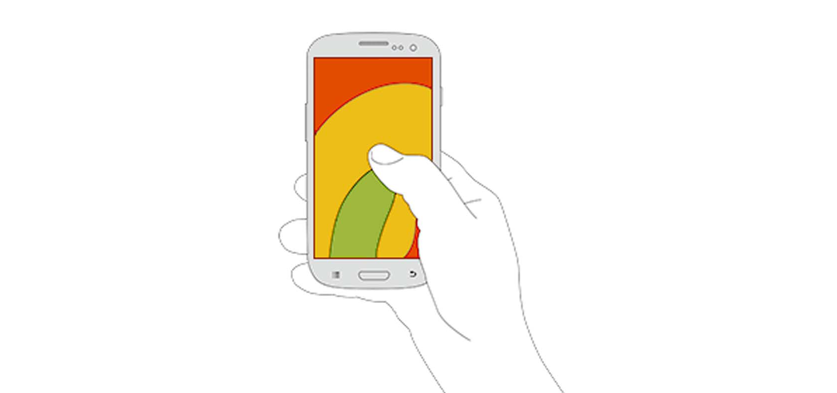
In 2017, he wrote a three-part series to update his initial findings, point out new key learnings, and emphatically plead with designers to stop referencing his oldest work as the standard. He says that one illustration in particular (shown below), continues to make the rounds as the standard for how users hold their phones, but it is not correct as the only standard.

In fact, as of his 2017 writings, there are six distinct ways users hold their phones, with 75% using just their thumb to touch the screen and fewer than 50% holding their phone with only one hand (Design for Fingers, Touch, and People, Part 1).

With these findings, it’s clear that the traditional desktop F-shape pattern in which users make two horizontal eye movements across the screen followed by one vertical eye movement down the left side, isn’t in sync with mobile design.

While most UX designers are deeply familiar with the F-shape pattern for reading web content in desktop design, it’s not a pattern that translates well to mobile.
The absence of the F-shape pattern in mobile is also one reason to avoid using the hamburger menu to collapse the main navigation or hide important content, and why mobile design should be handled differently than desktop.
If Not the F-pattern, Then What?
Mobile users tend to look at the center of the screen first. The center also represents the easiest place for them to reach and touch with thumbs on most smartphones. Touch accuracy decreases as users reach toward the outermost corners of the screen.

Of course, mobile doesn’t stop at phones. Users still tend to use their thumbs when holding a tablet but, typically, they aren’t holding the device the same way they hold a phone. Instead, they tend to hold tablets from the sides, with both hands, and use thumbs to touch the screen.

7 Guiding Principles for Mobile Devices
Because of the variations in size of mobile devices and the way people use them, there is not a “one size fits all” design standard. Rather, it’s a set of principles and concepts designers should understand in order to improve mobile usability.
The following principles help designers take into consideration touch and ergonomics to make mobile experiences more enjoyable and user-friendly:
1. Know Your Users
The first mistake a designer can make in mobile design is assuming everyone uses a device the same way they do or uses the same device they do. Try to avoid this assumption.
The next mistake is assuming all existing data from prior research, whether from secondary sources or previously conducted primary research, is true for users forever. Users change, technologies change, and user behavior can vary widely, so ongoing research is key in order to stay up to date.
In his research, Steven Hoober established six ways users a hold a smartphone, but your target users may primarily hold their phone in one of the less common ways. For example, an app that’s designed for elderly people to log information about their medications would likely have some unique requirements. This particular demographic may experience impairments that could affect the way they hold (and see) a mobile device—this is important to understand as a designer.
There are several ways to get information about users. A good place to start is with web analytics, if they’re available, and finding out what devices users are using. Another option is to survey users about their devices as well as the activities they use them for. Experience sampling is yet another option to catch users at set points in time. And the most powerful research of all: observing users in the wild actually using their devices.
Key takeaway: Research and observe users with their mobile devices to truly understand how to design for them.
2. Understand Context of Use
This is closely related to Know Your Users, but it’s worth its own call-out because it’s so important. Mobile literally means “able to move freely.” Most people are not sitting still or focusing 100 percent of their concentration on their device when using a mobile app. They’re often doing other things—walking through a store, watching TV, working out, sitting at a restaurant, or driving.
Where people use their devices is just as important as how they use them, and that could affect the overall design and experience. For example, a running app likely has very different use cases than a banking app.
Understanding where and how users interact with a mobile design as well as what else they’re doing while using their device can help designers create apps that work for their users.
Key takeaway: Users do all kinds of things while using their mobile devices and probably won’t give an app their undivided attention.
3. Follow the Rule of Thumb(s)
Because users navigate mobile devices mostly with their thumbs, mobile designs should be designed for thumbs instead of mouse clicks. This means everything a user needs to access on the screen should be within easy reaching distance of their thumbs without requiring them to stretch or contort their hands unnaturally.
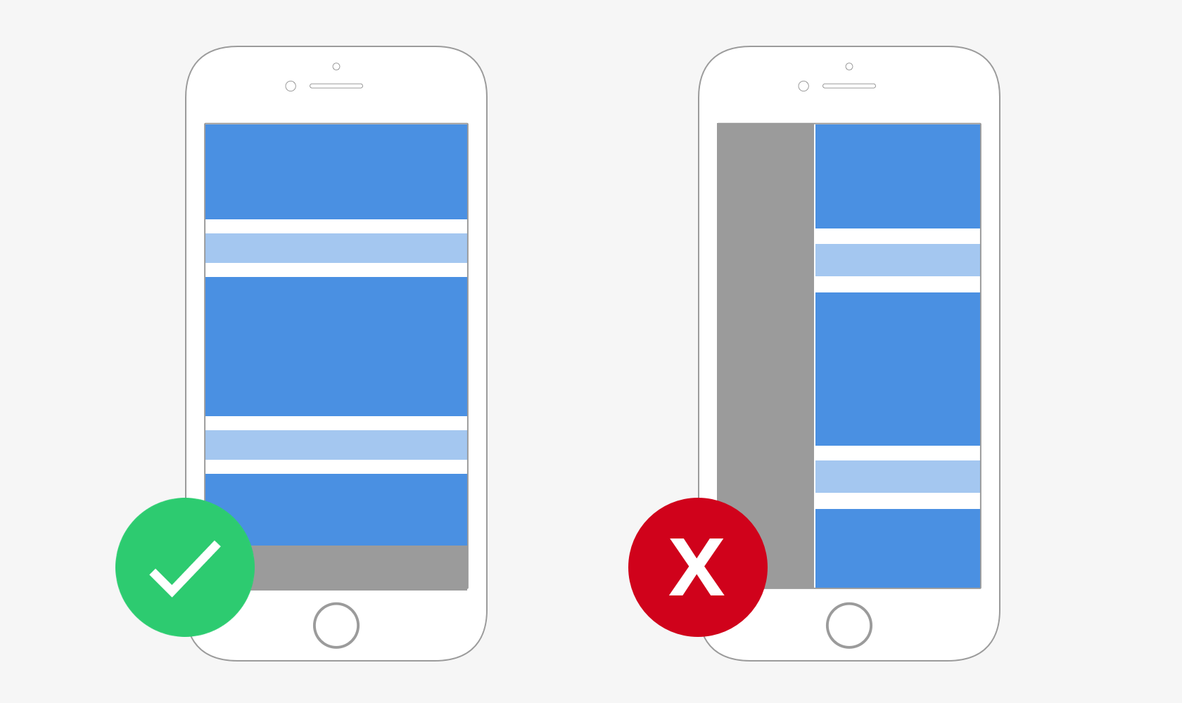
This is one reason why responsive design is so important and why a single-column layout on mobile is preferable to multiple columns. Using multiple columns automatically shrinks screen real estate and places some of the important content out of the thumb zone, making it harder for users to access.

Key takeaway: Make sure key content and navigation is within easy reach of thumbs.
4. Put Content First
This one has clear roots in industrial design. As Josh Clark points out in Designing for Touch, one of the main principles of industrial design is that content should always appear above controls so users’ hands don’t block their line of sight.
In traditional web design, navigation comes first at the top of the screen and content falls below it, but industrial design is the opposite and mobile design should follow suit.
Because of the way users view and touch screens, the most important content should be in the center of the screen with the other key navigation controls at the bottom.
In tablets, this advice changes just a bit, but it’s still focused on allowing the user to navigate by touching with their thumbs and keeping fingers from blocking the content. Important content and navigation controls should now move to the sides of the screen.
Key takeaway: Put the most important content in the center of the screen and place the main navigation controls in the spot that is most appropriate for the device and where fingers don’t block the view of the content.
5. Stay on (Touch) Target
No matter what the device, mobile requires designing for touch. But touch is imprecise. No two users have the exact same thumb size, and it’s not as simple as accounting for a mouse click.
According to Josh Clark, founder of the UX agency Big Medium and author of Designing for Touch, one number really matters in mobile usability: 44.
The optimal touch target is 7x7mm, which translated into pixels equals roughly 40. But in order to account for various viewing sizes, 44 pixels is the ideal space to cover touch zones and avoid user error.

Making touch targets a bit larger helps cover the contexts and circumstances in which users interact with their device, often not giving it their undivided attention (see Understand Context of Use).
Key takeaway: Touch is imprecise and unpredictable. Enlarge the touch target area to accommodate.
6. Echo Real-world Gestures and Movement
Let users swipe, flip, and pinch with appropriate microinteractions, but pay attention to the laws of physics, or more specifically the laws of motion. Keep in mind that the response of the design should make sense based on the action the user takes.
For example, if a user simply swipes a card on the screen, the motion of the card moving off the screen should seem proportional to the force applied, meaning it probably shouldn’t creep off slowly or fly off too fast.
Microinteractions in mobile help bring the app to life and give it additional context based on touch. For more information about improving experiences with microinteractions, read designer Ondřej Dostál’s article, Better UX Through Microinteractions.
Key takeaway: Gestures and interactions make a mobile UI feel more natural for touch, but don’t overdo it.
7. Use Progressive Disclosure
This means giving the user the right content, as well as the right amount of content, at the right time and the affordances to get more when they need it.
In practice, that means designers should avoid bombarding the user with all the content at once, but at the same time, the most important information shouldn’t hide behind navigation. Ensure that the main user needs are met with the main content reveal, and then add controls to allow the user to dig deeper if they want to.
The Fresh Air app handles progressive disclosure elegantly and intuitively by only showing the current temperature and precipitation on its main screen, then allowing the user to scroll horizontally (using relevant gestures and actions) for hour-by-hour weather info.
Key takeaway: Display only what matters most to users and give them the controls they need to find the rest as they need it.
Putting It Together
Mobile design is broader and more complicated than one screen or one device, and mobile experiences are not universal. By following some general usability principles and thinking a bit like an industrial designer, mobile designers can adhere to basic ergonomic standards and make the mobile experience comfortable and enjoyable for users, no matter what device they’re using or where they’re using it.
• • •
References and Further Reading
Below is a list of sources used in this article and recommendations for additional reading to learn more about improving mobile usability.
Stephen Hoober’s articles on UX Matters cover a wide range of the research and science behind designing for mobile usability:
Design for Fingers, Touch, and People Part 1
Design for Fingers, Touch, and People Part 2
Design for Fingers, Touch, and People Part 3
For an in-depth look at mobile usability and designing for various screen types, read Josh Clark’s book, Designing for Touch as well as an overview of his An Event Apart: Designing for Touch presentation.
The Scientific World Journal published a research article, Heuristic Evaluation on Mobile Interfaces: A New Checklist, with a very detailed PDF of mobile-specific guidelines based on Jakob Nielsen’s 10 Usability Heuristics for User Interface Design.
Further Reading on the Toptal Blog:
Understanding the basics
What are the goals of mobile usability?
Designing for mobile usability is as much about the way it feels as the way it looks and behaves. People use their thumbs to interact with the screen, making mobile design a tactile experience. Usability for mobile includes user comfort and physical ease of use as much as intuitive visual designs.
What are the different types of touch screen?
There is no one-size-fits-all in mobile design. Screens and experience vary by user, which makes it even more important to research and understand your specific users before jumping into screen designs.
Why is usability so important?
In mobile design, usability isn’t only about ease of use through an interface. Mobile usability also encompasses a user’s physical comfort when holding a device and using an app. An app that’s uncomfortable and unnatural to use will be abandoned.
Melbourne, Victoria, Australia
Member since March 14, 2016
About the author
Christine is a UX/UI designer who specializes in data management, wellness products, and scaling UX teams for large organizations. She is the Director of UX and Product Design at CrowdStrike and has partnered with companies such as Dell, Lowe’s, and The Hershey Company.
Previous Role
Senior UX ManagerPREVIOUSLY AT


