Rebrand Case Study: More Than Just a New Logo
When a simple logo refresh turned into a full-scale rebrand process, Toptal designer Rehan Saiyed took inspiration from ancient concepts of the number three—and a colorful parrot.
When a simple logo refresh turned into a full-scale rebrand process, Toptal designer Rehan Saiyed took inspiration from ancient concepts of the number three—and a colorful parrot.
Rehan is a multidisciplinary designer who specializes in branding, UX, and customer experience design. Past clients include Target, Volkswagen, and the Commercial Bank of Qatar. He’s won more than 45 awards, and his work has appeared in international design publications.
Expertise
Previous Role
Senior Brand Experience DesignerPREVIOUSLY AT


When I was invited to discuss a logo refresh with the leadership of the Victoria branch of the Institute of Public Administration Australia (IPAA), we didn’t know it at the time, but a much bigger transformation was in store. What began as a discussion about designing a single asset for one division led to a comprehensive rebranding framework for the entire organization.
IPAA is Australia’s professional association for civil servants and others working toward the public good in the nonprofit and academic sectors. The parent organization has one branch for each of Australia’s eight territorial divisions. IPAA’s core mission requires communicating effectively about events and services that support their members’ work in civil service.
One of my favorite parts of any project is digging in to discover what is and isn’t working. It’s always enlightening to learn about challenges from those who interact with the brand every day. In this case, taking the time to acquire a deep understanding of the brand enabled me to bring IPAA’s entire visual identity into the future.
How a Logo Refresh Led to a Full Rebrand
When I first met with IPAA leaders, there was no question that the organization needed a new logo. The existing one was dated and didn’t make the dynamic, forward-thinking impression that IPAA leadership wanted. There were functional issues as well: For instance, the logotype became illegible when sized for smaller applications such as favicons and social media avatars.
However, my initial meeting about modernizing the logo led to wider discussions about brand architecture and cohesion across eight territorial divisions. Subsequent brand discovery workshops with leaders at the other branches revealed significant inconsistencies in IPAA’s visual identity and brand positioning.
The branches worked independently of each other, and each had come to use different typefaces, colors, and communication styles across their respective platforms. This resulted in poor visual cohesion and made it impossible for IPAA to define its subbrands and offerings in a clear, intuitive way.
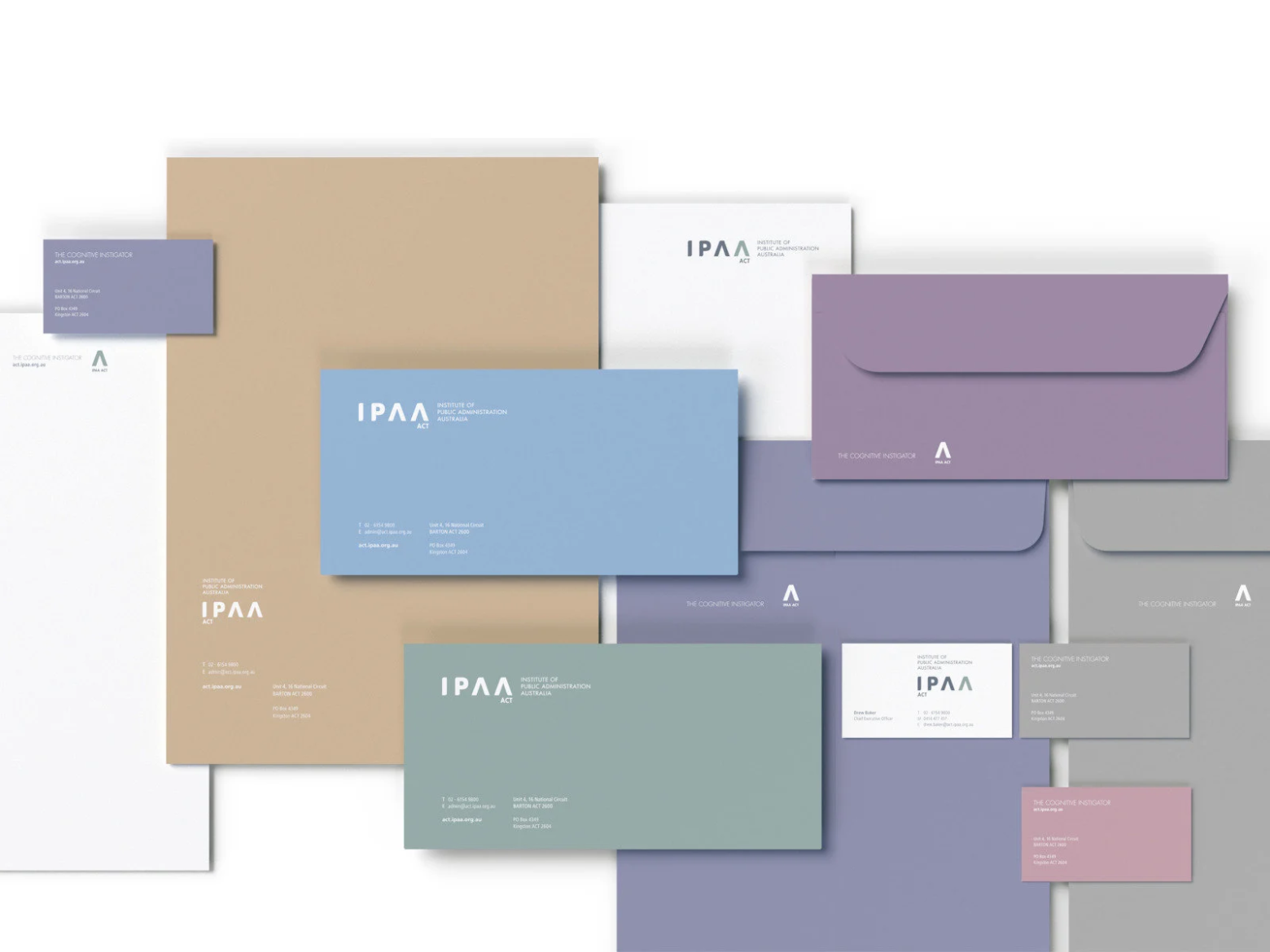
I realized that simply updating IPAA Victoria’s logo would only exacerbate the confusion. What IPAA needed was a new brand ecosystem—an integrated framework of names, symbols, colors, and typography, and a visual vocabulary for the master brand and its subbrands to provide a consistent look and feel for all print, digital, and physical touchpoints. IPAA leadership agreed. Ultimately our collaboration resulted in a cohesive brand identity for the entire organization, for everything from business cards to interior design.
A Meaningful Logo
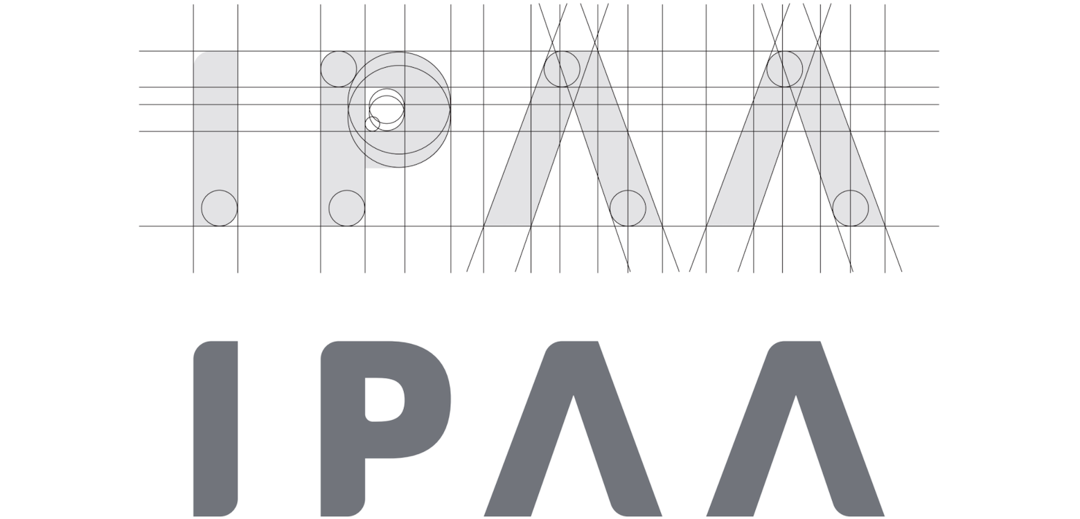
A logo is typically the most recognizable brand asset for an organization, so it was essential that I bring IPAA’s up to standard. I created a bespoke logotype (the acronym IPAA) that conveyed strength, unity, and longevity. I wanted it to be inherently powerful and serve as a master brand on which the entire visual identity would be anchored.
The two capital A’s in the logotype were designed to mimic triangles. I built horizontal and vertical iterations for digital and print deliverables as well as an icon iteration (the triangulated “A” with the acronym beneath it) for platforms that require a subtle brand presence, like a mobile app.
The triangle nods to progress in a number of ways. Early philosophers and scientists recognized the number three as an expression of a complete cycle—past, present, and future. An upward-pointing triangle visually signals a positive, upward trajectory and a solid foundation. The three points of the triangle are also a subtle homage to the three points in IPAA’s mission statement: to promote good governance; encourage excellence in the provision of public services across Australia; and contribute to the development of public policy and management practices that will enhance the performance of the public sector.
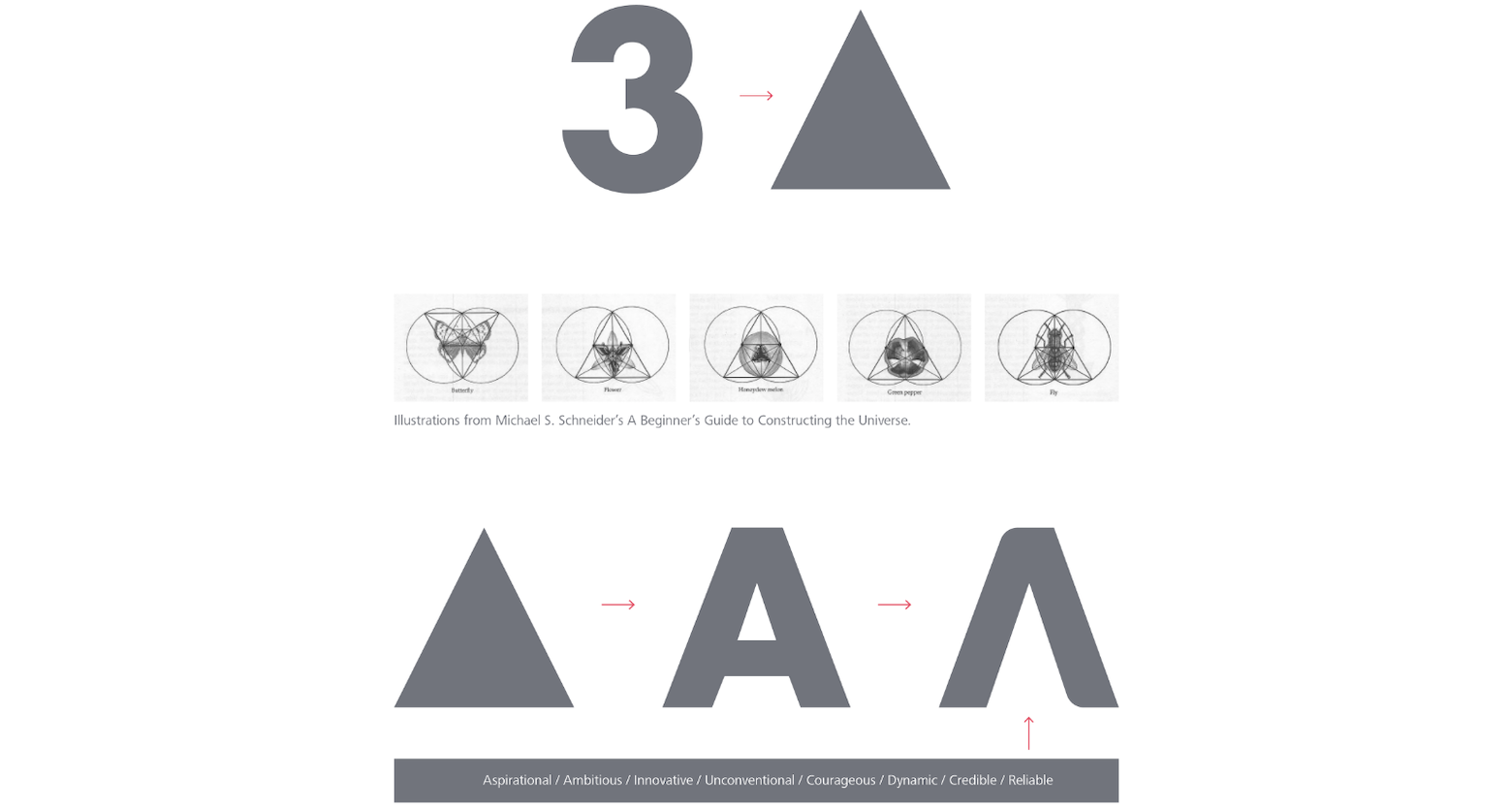
While some may not read this much into it, I firmly believe incorporating such symbolism is integral to great design.
The Right Typeface
While few will consciously notice a great typeface, they will certainly notice a bad one. Choosing the right typeface is among the key identifiers for a brand, and it helps build familiarity and trust.
I selected the Open Sans family for digital communications and Frutiger Next Pro and Futura STD as the primary typeface for print products. Prior to the rebrand, IPAA had used an inconsistent mix of Arial and Times New Roman. I chose the new typefaces because they provide good readability and gray value, which make the text more pleasing to look at and legible at different sizes across all touchpoints.
Territorial Distinctions Inspired by Nature
IPAA has eight territory divisions from the Northern Territory to Tasmania. To establish a visual identity for each, I developed a color palette that reflects the diversity and beauty of Australia. I spent considerable time looking at nature, plants and animals for inspiration, and ultimately settled on the rosella, a type of parrot native to Australia.
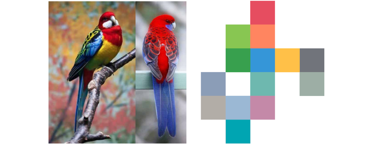
The rosella’s feather formations of vibrant red and gold, vivid blues and greens, and shades of gray, white, and black are quite stunning to see up close, inspiring a striking yet balanced color palette. Each territory was assigned its own color and signature secondary accent color.
Brand Architecture and Hierarchy
IPAA’s brand architecture enables the organization to segment messaging and services so that each target audience hears what it needs to hear. It was vital to follow a clear brand hierarchy when presenting IPAA alongside its products and services so the master brand was never compromised.

Each tier represents a level in the hierarchy. The pictured logo lockup—a standardized combination of a logo with other brand elements—shows the partitions for the master IPAA brand, the territorial branch acronym (ACT), the service category (soft gold, for conferences), the conference’s main headline (“Thinking Differently”), and the conference’s subhead (“Building Trust”). Hewing to this template keeps the visual identity intuitive and coherent.
Strict guidelines were set to maintain the integrity of the tiers in the hierarchy across all events and services.
A Clear, Friendly Voice
A uniform brand voice was also instituted to ensure that messaging was disseminated consistently. IPAA’s house style requires all communications to be straightforward and accessible; motivational and imaginative; relatable and engaging; and reflective of its dedication to its members. These principles boiled down to four overarching qualities: clear, inspiring, human, and committed.
In practice, that means all copy should be structured in a hierarchical way, with the most important information prioritized and additional detail disclosed as needed. It should be distinctive—free of clichés and timeworn jargon. It should also be approachable, using everyday language instead of formal legal or academic prose.
For example, the preview text for a story on the IPAA website reads: “The vast majority of public servants behave respectfully and civilly to their colleagues. But surveys show bullying is significantly more widespread than codes of conduct or workers’ compensation claims suggest. Dr. Gordon de Brouwer explores bullying and harassment in public sector workplaces across Australia.” While research communications can take on a dry tone, this text signals that the article will clarify a thorny issue that is likely to impact the majority of IPAA’s members.
Bold Black-and-white Photography
I chose a black-and-white photographic style for digital and print communications that is simple, bold, and iconic. The monochromatic images contrast nicely against the color palette, creating visual balance and hierarchy on the page or screen. The images themselves relate symbolically to the content and reflect IPAA’s dynamic but reliable brand personality.
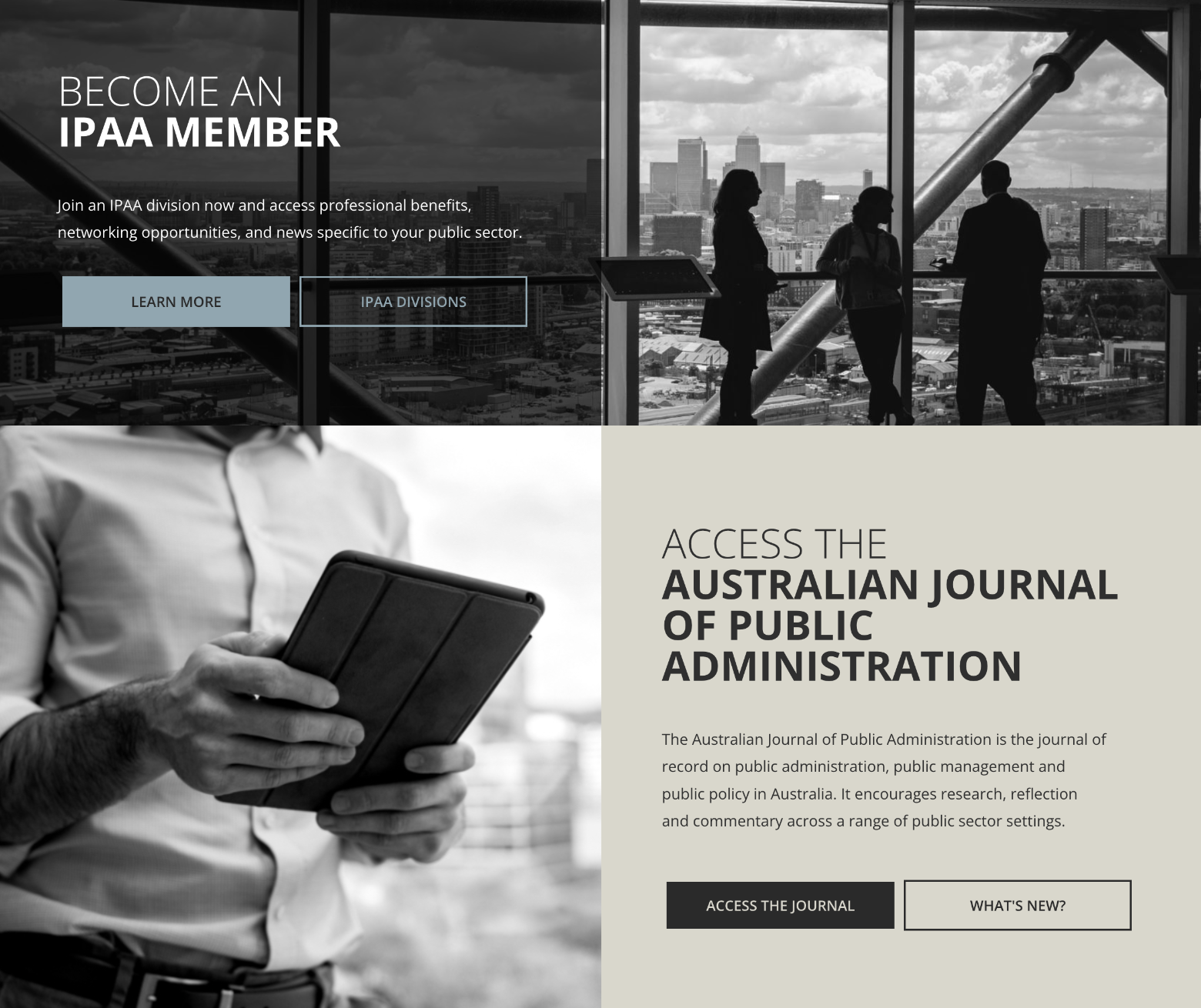
Together with the typeface, color palette, and logomark, the photographic style provides a cohesive and compelling aesthetic that is not only beautiful but effective in its mission to communicate and inspire. This visual effect is used across digital and print platforms as well as in headers for social media accounts.
Workspaces That Inspire and Promote Brand Identity
The IPAA’s Victoria office is a significant touchpoint not only for members and visitors, but also for employees. The visual aesthetic of an office space sends a message about your brand identity to anyone who enters. As a multidisciplinary designer, I also have experience in architectural design, and this allowed me to create a new space that communicates the organization’s values to visitors while meeting the needs of employees.
Because the existing space was relatively small for the number of employees using it, it was a challenge to make it look spacious, organized, and uncluttered. I opted for an open-office arrangement with most of the employees seated in two central pods to make the space feel lighter and less cramped, while still promoting collaboration.
The walls are painted white to make the space appear larger. To reflect the brand’s forward-looking positioning, the furniture is modern in style, with clean, simple lines in shades of white and gray. Some of the surfaces are textured to create a subtle contrast.
The brand’s primary and secondary territorial colors appear on accent walls, soft furnishings, and tabletop accessories. These colors are used sparingly to keep the space feeling modern and light, but not sterile.
Bold environmental graphics reinforce IPAA’s brand to employees and foster greater connection to the mission. Some visuals feature signature IPAA slogans and concepts, including “The Cultural Instigator,” “Leadership with IPAA,” and “Innovate with IPAA.” Other graphics feature black-and-white photography of work by emerging Aboriginal artists.
Protecting the Brand
I created a style guide to maintain the integrity of logos and wordmarks for all uses. It was my role as a designer to define what deliverables IPAA would need across all customer journey touchpoints. The style guide included examples of every deliverable, from grid comps to final comps.
I even designed a bespoke 3D trophy to replace the simple etched plaques the organization used to present for achievement awards. I created the mockups using 3D software—namely, Cinema 4D and Adobe Dimensions with Adobe Illustrator using the Origami plugin.
A Rebranding Success
After eight months of working closely with IPAA leadership, program managers, and marketing teams, the project was complete. My work received great feedback from IPAA’s territorial divisions, and executives were excited about the energy this redesign brought to their work. The process of collaborating to develop the rebrand—all the thought, analysis, and experimentation that went into it—was a powerful team-building exercise for IPAA leadership as well. They emerged from the experience more focused on their mission and better equipped to serve and empower members.
Building a brand ecosystem requires creativity, logic, and persistence. It can be a maddening and complex experience, but also a rewarding one. There were times it took a bit of persuading to get stakeholder buy-in, and there were many late nights spent grappling with how to make all the pieces fit. But at one of our final meetings, an IPAA executive said, “This is a great legacy Rehan is leaving behind.” I was humbled, and it was hard to believe it all started with the simple idea of redesigning a logo.
Further Reading on the Toptal Blog:
Understanding the basics
What is the purpose of a rebrand?
A rebrand is a way of reintroducing an organization through its visual identity. In some cases it may be necessary to rebrand a company in order to update an older design that no longer connects with the intended audience. In others, a rebrand may reflect a significant change in a company or product.
What is involved in a rebrand?
The rebrand process is an extensive overhaul of an organization or a product’s entire visual identity. While a new logo may be the most prominent change, a rebranding project touches nearly every part of the business’s physical and virtual presence, including typeface, color, and graphic design.
What makes rebranding successful?
Rebranding success depends on a clear, well-defined strategy that all stakeholders understand. It can be measured by quantitative and qualitative metrics, including brand awareness, digital performance, sales performance, and more.
Tags
Melbourne, Victoria, Australia
Member since May 24, 2019
About the author
Rehan is a multidisciplinary designer who specializes in branding, UX, and customer experience design. Past clients include Target, Volkswagen, and the Commercial Bank of Qatar. He’s won more than 45 awards, and his work has appeared in international design publications.
Expertise
Previous Role
Senior Brand Experience DesignerPREVIOUSLY AT


