Tips and Considerations When Choosing a Typeface (with Infographic)
The right typeface can make a design, while the wrong one can definitely break it. There are a few things designers can keep in mind to make typeface selection easier and more focused.
The right typeface can make a design, while the wrong one can definitely break it. There are a few things designers can keep in mind to make typeface selection easier and more focused.

Cameron Chapman
Cameron comes from a design background and is the author of two web design books: Color for Web Design and The Smashing Idea Book.
Expertise
Choosing a typeface for any design project can be stressful. Some designers default to using the same handful of fonts they’re comfortable with for every project. Others spend hours trying to figure out the right typeface for the job without ever really feeling confident in their final choice. Not surprising considering there are more than half a million fonts in existence.
The right typeface can make a design, while the wrong one can definitely break it. Experimentation and practice are both important to mastering typeface selection. But there are a few things designers can keep in mind to make typeface selection easier and more focused.
Scope
The scope of the project or projects in which a font will be used is one of the first things designers should consider when choosing a typeface. A font that will only be used for a limited scope, such as a slide deck, will need to be less flexible than one that will be used across a brand’s entire visual presence.
Designers should think through whether the typeface will be used only for digital projects or also in print. They should also think about whether the fonts will be used for a limited time or indefinitely. It can be helpful to make a list of all the potential projects a typeface will be used for at the outset of choosing a new font.
Mood
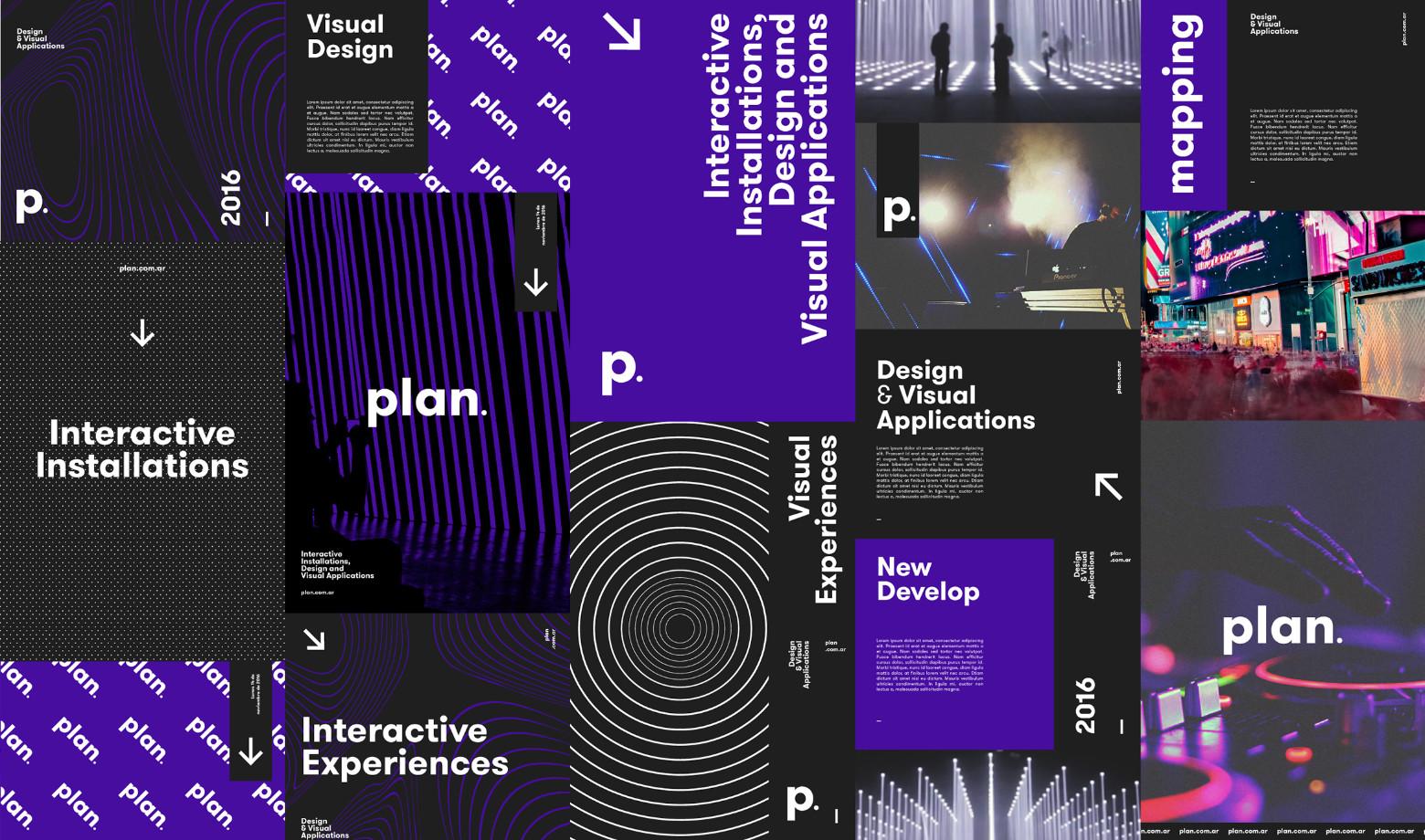
Every project has a mood. Whether that mood is formal or informal, fun or serious, modern or classic, or something else entirely. And like every project, every typeface has a mood.
It’s important for designers to consider the mood of the project and how the typefaces they’re considering reinforce or clash with that mood. For example, using Comic Sans on a website for a law firm would clash. Something like Crimson Text or Helvetica would work much better.
Functionality
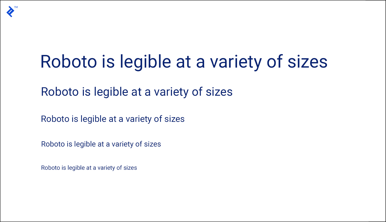
Not every typeface looks good at every weight and size. Display fonts that look amazing in larger sizes can become illegible at smaller sizes. Typefaces that look great at small sizes in body text can sometimes look too plain or even boring when used at display sizes.
Some typefaces can look good at virtually any size, though. Designers should test fonts they’re considering at each size they may use those fonts to be sure they’re readable and don’t negatively impact UX.
Versatility
Fonts that are perfect for use on the web might not translate well to use in print, and vice versa. Fonts like Georgia that were designed specifically for readability on low-resolution screens aren’t as well-suited to print work as a font like Book Antiqua might be.
If a font will only be used for a single project, then it’s easy to determine whether print or screen functionality is most important. But for fonts that might be used over multiple projects, designers should make sure the font will work in every medium in which it may be used.
Message
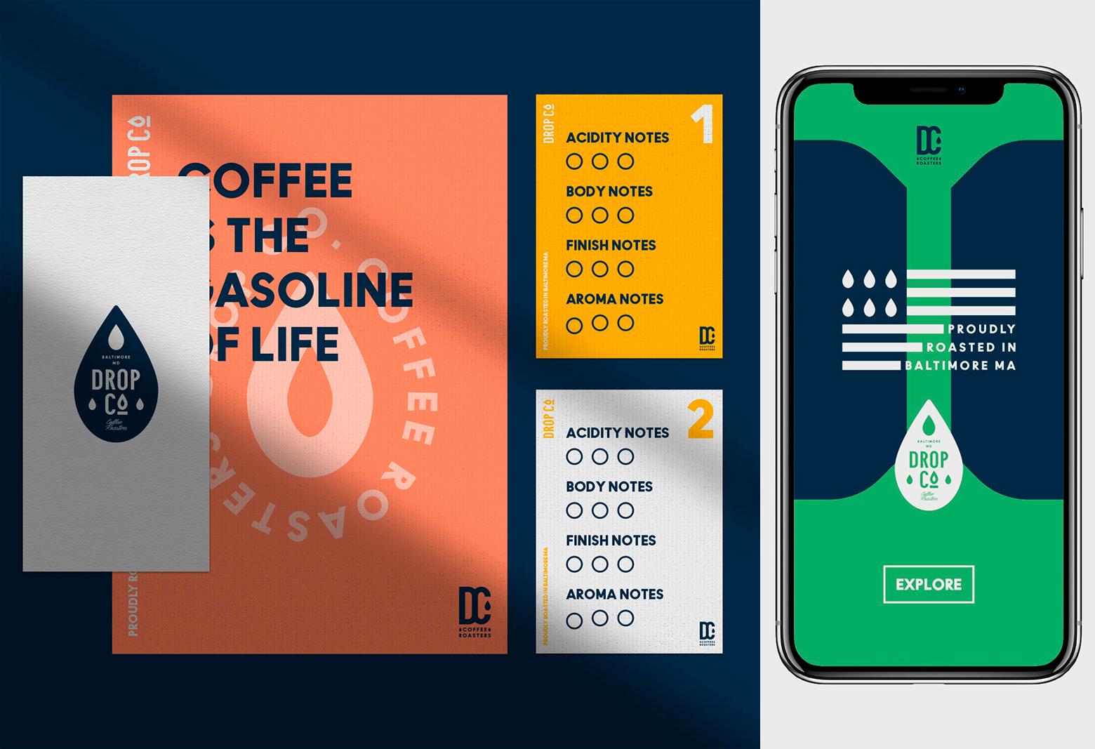
The message of the project—whether it’s a slide deck or a brand’s visual identity—is vital to determining the best font to use. If the message is serious, the font should also be serious, and vice versa.
The wrong font can completely derail the message a brand is trying to send. For example, using something modern like Open Sans on a design for a historical society website doesn’t really reinforce the message. A font like Crimson Text would work much better.
Readability
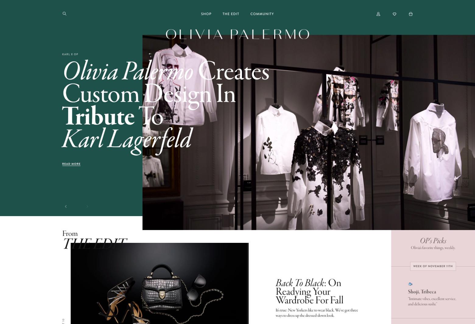
Readability is arguably the most important feature of a typeface. Since type is used to communicate a message, if that message can’t be read, the typeface has failed its job.
Readability and legibility aren’t exactly the same. Legibility refers to how easy it is to distinguish letterforms within a font. Readability takes that one step further and refers to how easily different words can be distinguished and read.
Readability and legibility can both be impacted dramatically by the size of the font being used. A font that looks great at 18 pixels might be illegible at 10 pixels. That’s not necessarily a deal-breaker unless the designer knows the font will need to be used at smaller sizes.

Languages
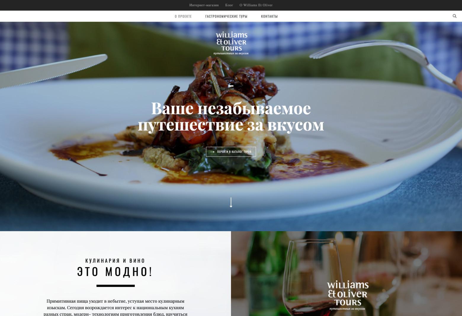
Not every website or design project will be translated into multiple languages. But it’s a good idea to determine at the start of a project whether translation is likely. Not all typefaces support special characters (like those that are accented), let alone alphabets like Cyrillic and Greek.
In almost all projects, it’s important for the typeface being used to at least support extended Latin characters, like accents and umlauts. Not being able to spell words or names because accents aren’t supported can make a project look unprofessional at best.
Style
There are four basic fonts styles: serif, sans serif, display, and script. Serif fonts are often viewed as more traditional and formal (though not all are). Sans serif typefaces can be seen as more modern and minimalist. Display fonts are unsuitable for use at small sizes, but their appearance varies widely. Script fonts resemble handwriting or calligraphy. Both script and display fonts are used primarily for short blocks of text or things like headlines and titles.
For readability, serif fonts were once viewed as more reader-friendly in print, while sans serif fonts as more reader-friendly on screen. But most modern typefaces in both styles can work well in either medium, especially with advances in screen resolutions.
Designers should consider whether they want to use display or script fonts for their headlines and titles, and decide whether serif or sans serif typefaces better suit their message and the project’s brand. Deciding this narrows down the font choices for a designer, which can make settling on a final selection easier.
Brand
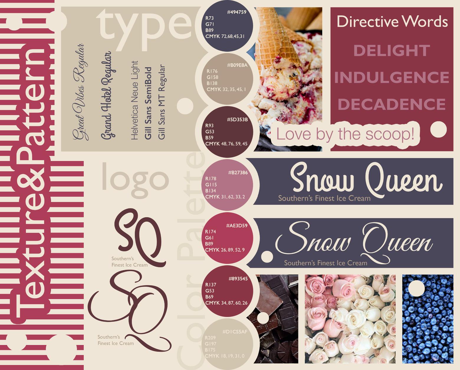
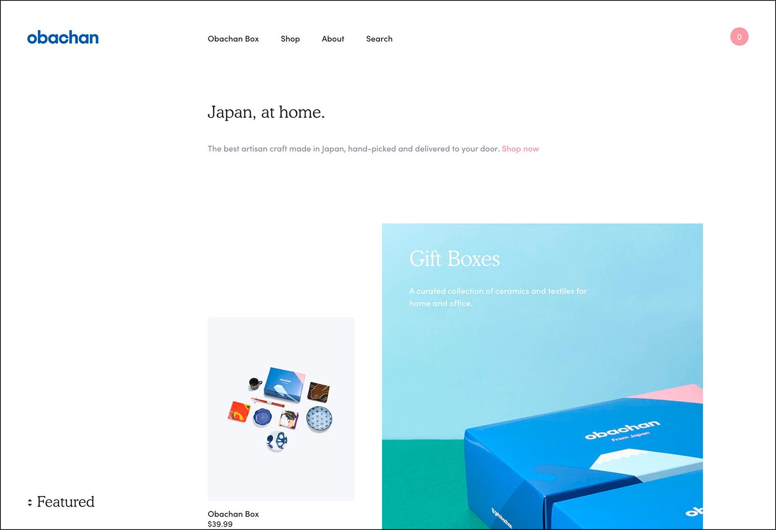
Every brand has a mood and a message. It’s important that all visual elements—not just typefaces—match and support the impression the brand wants to give to the public.
Narrowing down typeface choices based on brand suitability can start with making a list of keywords that represent the brand. From there, designers can search for fonts that include those keywords or synonyms.
For example, if a brand is formal and traditional, a font like Garamond or Caslon would be a good fit. If a brand is modern and cutting edge, the designer might choose something like Roboto or Raleway.

Licensing
While many fonts have general licenses that allow for use in virtually any situation, others do not. Some licenses only allow for use in one medium or another. Others allow for use in promotional materials but might now allow for use on a product being sold.
Another consideration is that if multiple designers are working on a single project, they might each need a licensed version of the font. Designers should be sure they understand the licensing of any fonts they’re considering using and what limitations those licenses might impose.
Combinations
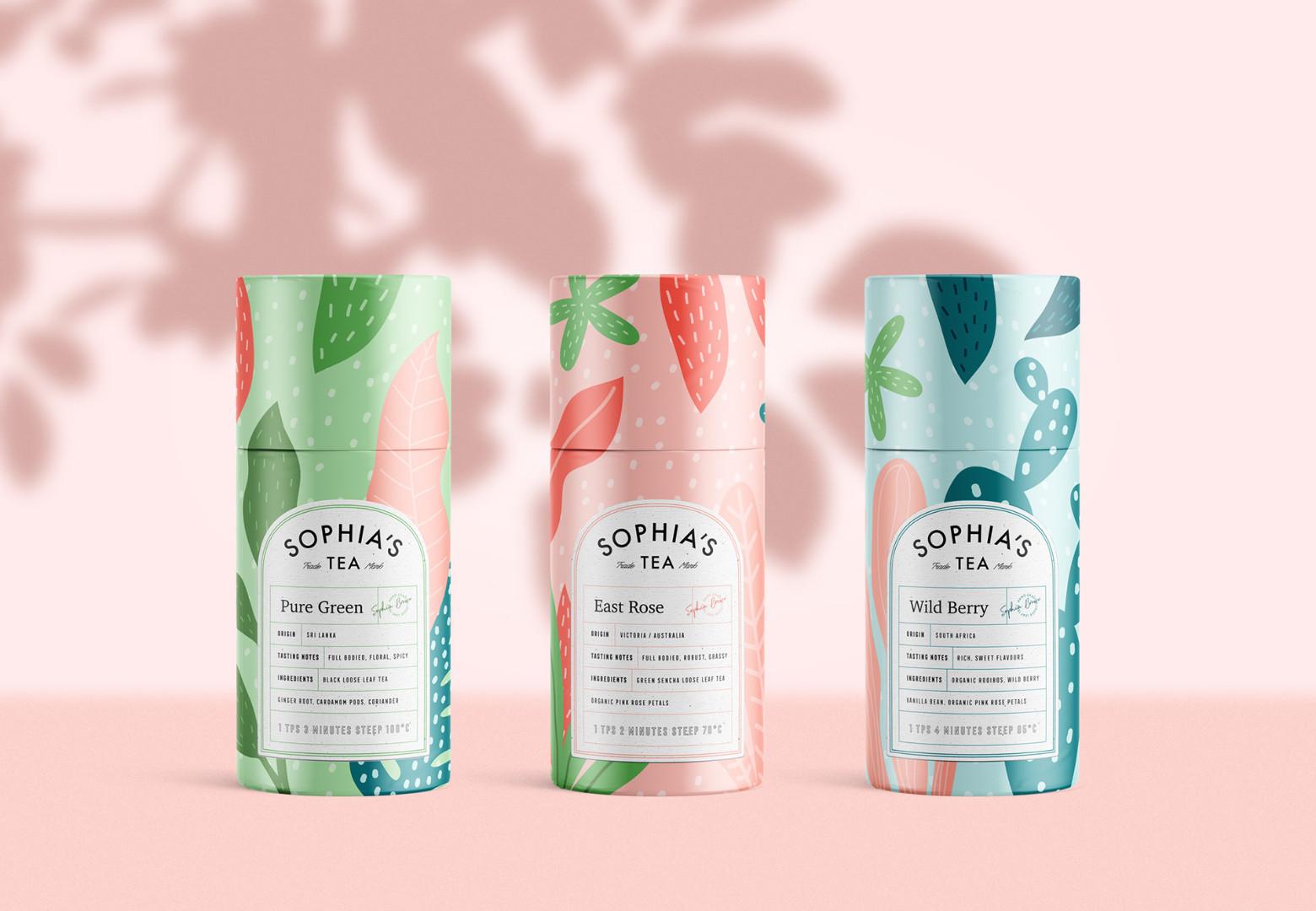
Not all fonts play well with others. Some typefaces are neutral enough that they can be paired with hundreds of other fonts. But others have such unique character that suitable combinations are limited.
There are advantages to both. Limited combinations can make finding a suitable one faster, since designers might only have a dozen to choose from. But having wider options can offer up more flexibility on future projects. Choosing font combinations is both an art and a science and takes a fair amount of experimentation and practice for designers to master.
Large Font Families
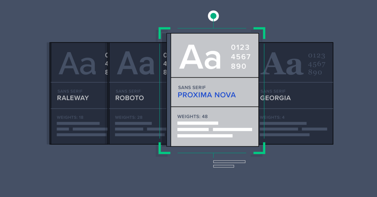
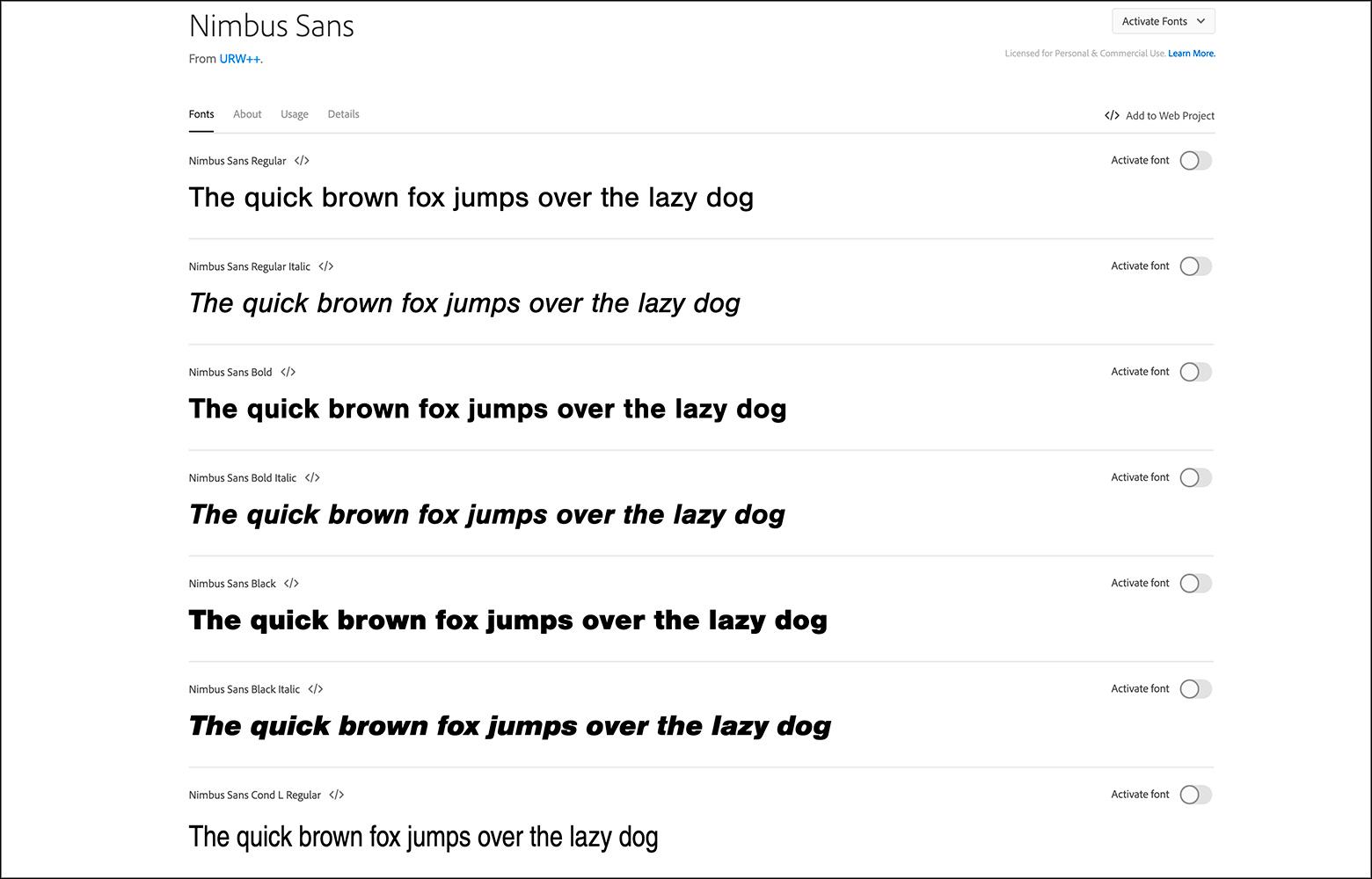
Large font families, such as Roboto or Baskerville, that have multiple weights and styles can make it easier for designers to create complex typographic designs without the stress of figuring out which typefaces work well together. Some large font families even include both serif and sans serif versions, which offers even more flexibility to the designer.
On long-term projects like a brand’s visual identity, larger font families also offer more versatility. Being able to switch between multiple weights or styles based on the exact project needs offers designers more flexibility without having to deviate from the brand’s established identity.
How To Choose the Right Typeface
Keeping these tips in mind for any design project can make choosing a typeface a much smoother process. Designers who want to refine their type selection skills can work on practice projects, such as choosing a new typeface for a well-known brand or a fictional project. Then, when faced with real-world projects, they’ll be more confident in their skills and choices.
A thorough grasp of what each project entails allows designers to better understand which typeface will best suit those needs. Once the scope of the project has been defined, the other considerations—such as mood, versatility, message, and brand—can guide designers toward the best font choices. Other considerations like readability, functionality, and language support can help designers further refine those choices to find the perfect font for their design work.

Further Reading on the Toptal Blog:
Understanding the basics
What is the difference between a font and a typeface?
A font is a specific size, weight, and style of a typeface, such as Helvetica. This dates to when type was set by hand and typesetters stored each “font” separately. In practice, these terms are often used interchangeably, especially in digital design.
What is typography and why is it important?
Typography is the practice of arranging type in order to convey a message. It encompasses more than just selecting a font and extends to all of the visual properties of the text presented. Good typography reinforces the message being conveyed in a way that improves UX.
What fonts are most readable?
Well-designed serif and sans serif fonts are both usually highly readable on screen and in print. Some of the most readable fonts include Garamond, Georgia, Helvetica, and Lucida. But how fonts are laid out on the page (including line length and height) also has a high impact on the readability of text.
How important is legibility in a typeface?
For functional typography that aims to convey a message, the legibility of the typefaces being used is arguably the most important aspect. Type exists to convey a written message, and if that message isn’t legible or readable, then the typeface (or typographer) has failed.
What are the 7 typeface classifications?
7 is an arbitrary number, as there are multiple ways to classify typefaces, each resulting in a different number. Common typeface classifications include serif, sans serif, display, and script. Within those, there are sub-classifications like humanist sans serif, slab serif, transitional serif, and brush script.
