
A Complete Overview of the Best Data Visualization Tools
When dealing with data sets that include hundreds of thousands or millions of data points, automating the process of data visualization makes a designer’s job significantly easier.

When dealing with data sets that include hundreds of thousands or millions of data points, automating the process of data visualization makes a designer’s job significantly easier.

Cameron Chapman
Cameron is the former Head of Content at Uxcel, where she was an instructional designer of UX design courses, skill assessments, and other educational design content. She has more than 20 years experience in the design education space, contributing to Toptal’s Design blog, Smashing Magazine, Web Designer News, CodeVisually, and Webdesigner Depot.
Expertise
Previously At

Consuming large sets of data isn’t always straightforward. Sometimes, data sets are so large that it’s downright impossible to discern anything useful from them. That’s where data visualizations come in.
Creating data visualizations is rarely straightforward. It’s not as if designers can simply take a data set with thousands of entries and create a visualization from scratch. Sure, it’s possible, but who wants to spend dozens or hundreds of hours plotting dots on a scatter chart? That’s where data visualization tools come in.
What Are Data Visualization Tools?
Data visualization tools provide data visualization designers with an easier way to create visual representations of large data sets. When dealing with data sets that include hundreds of thousands or millions of data points, automating the process of creating a visualization, at least in part, makes a designer’s job significantly easier.
These data visualizations can then be used for a variety of purposes: dashboards, annual reports, sales and marketing materials, investor slide decks, and virtually anywhere else information needs to be interpreted immediately.
What Do the Best Data Visualization Tools Have in Common?
The best data visualization tools on the market have a few things in common. First is their ease of use. There are some incredibly complicated apps available for visualizing data. Some have excellent documentation and tutorials and are designed in ways that feel intuitive to the user. Others are lacking in those areas, eliminating them from any list of “best” tools, regardless of their other capabilities.
The best tools can also handle huge sets of data. In fact, the very best can even handle multiple sets of data in a single visualization.
The best tools also can output an array of different chart, graph, and map types. Most of the tools below can output both images and interactive graphs. There are exceptions to the variety of output criteria, though. Some data visualization tools focus on a specific type of chart or map and do it very well. Those tools also have a place among the “best” tools out there.
Finally, there are cost considerations. While a higher price tag doesn’t necessarily disqualify a tool, the higher price tag has to be justified in terms of better support, better features, and better overall value.
Data Visualization Tools Comparison
There are dozens, if not hundreds, of applications, tools, and scripts available to create visualizations of large data sets. Many are very basic and have a lot of overlapping features.
But there are standouts that either have more capability for the types of visualizations they can create or are significantly easier to use than the other options out there.
Tableau (and Tableau Public)
Tableau has a variety of options available, including a desktop app, server and hosted online versions, and a free public option. There are hundreds of data import options available, from CSV files to Google Ads and Analytics data to Salesforce data.
Output options include multiple chart formats as well as mapping capability. That means designers can create color-coded maps that showcase geographically important data in a format that’s much easier to digest than a table or chart could ever be.
The public version of Tableau is free to use for anyone looking for a powerful way to create data visualizations that can be used in a variety of settings. From journalists to political junkies to those who just want to quantify the data of their own lives, there are tons of potential uses for Tableau Public. They have an extensive gallery of infographics and visualizations that have been created with the public version to serve as inspiration for those who are interested in creating their own.
Pros
- Hundreds of data import options
- Mapping capability
- Free public version available
- Lots of video tutorials to walk you through how to use Tableau
Cons
- Non-free versions are expensive ($70/month/user for the Tableau Creator software)
- Public version doesn’t allow you to keep data analyses private
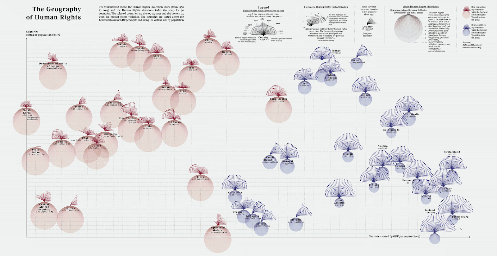
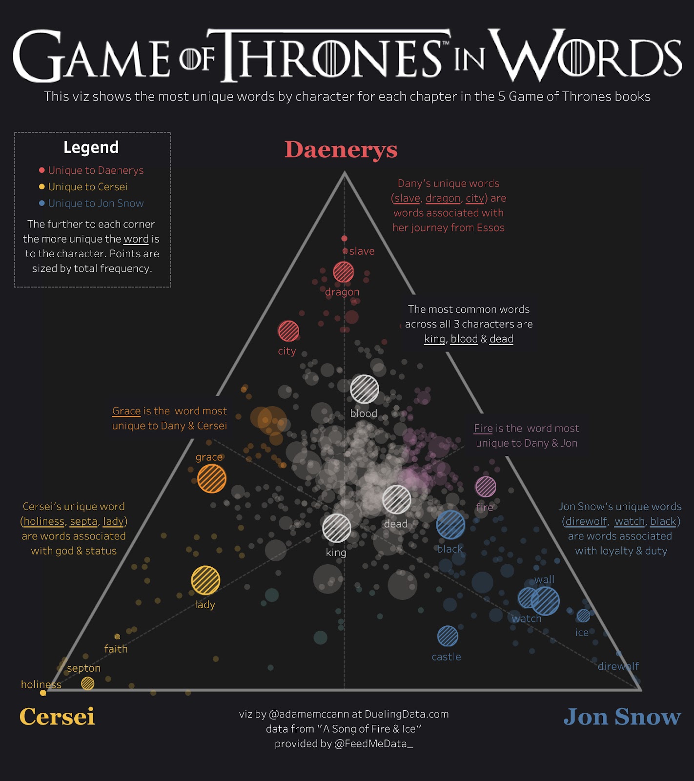
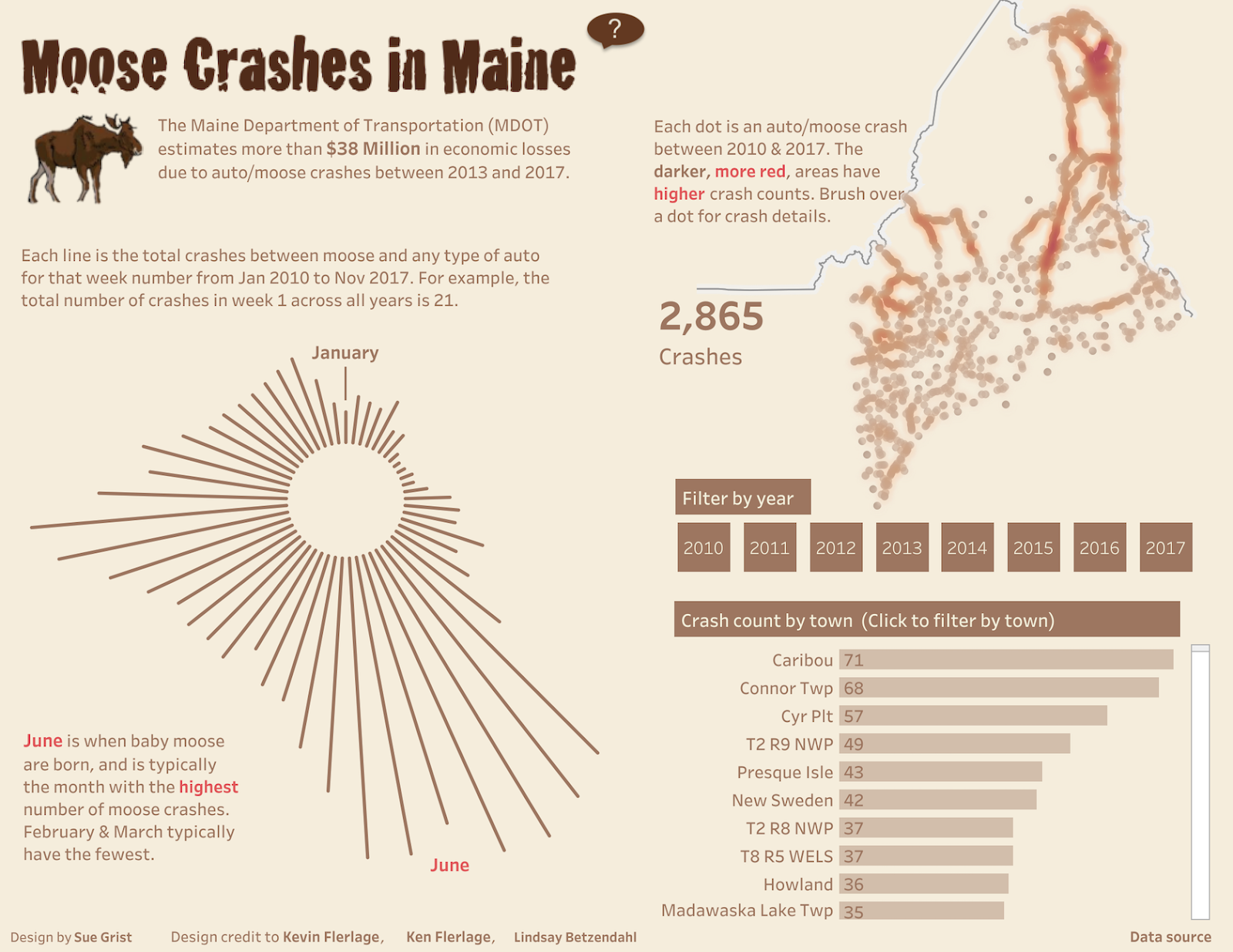
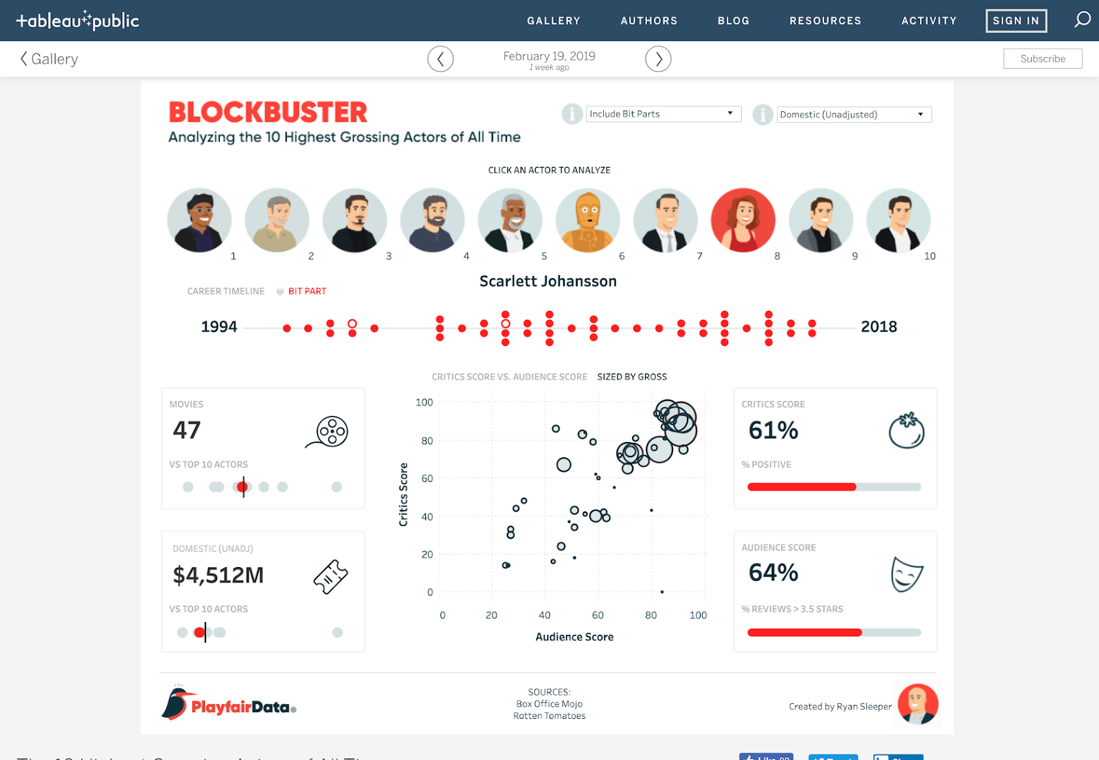
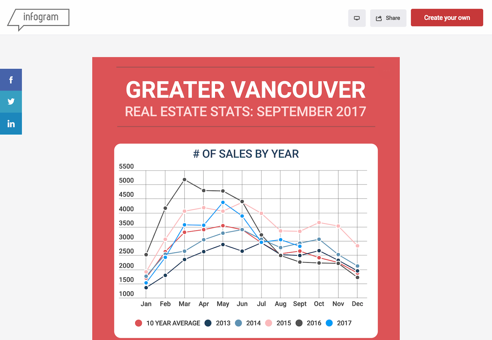
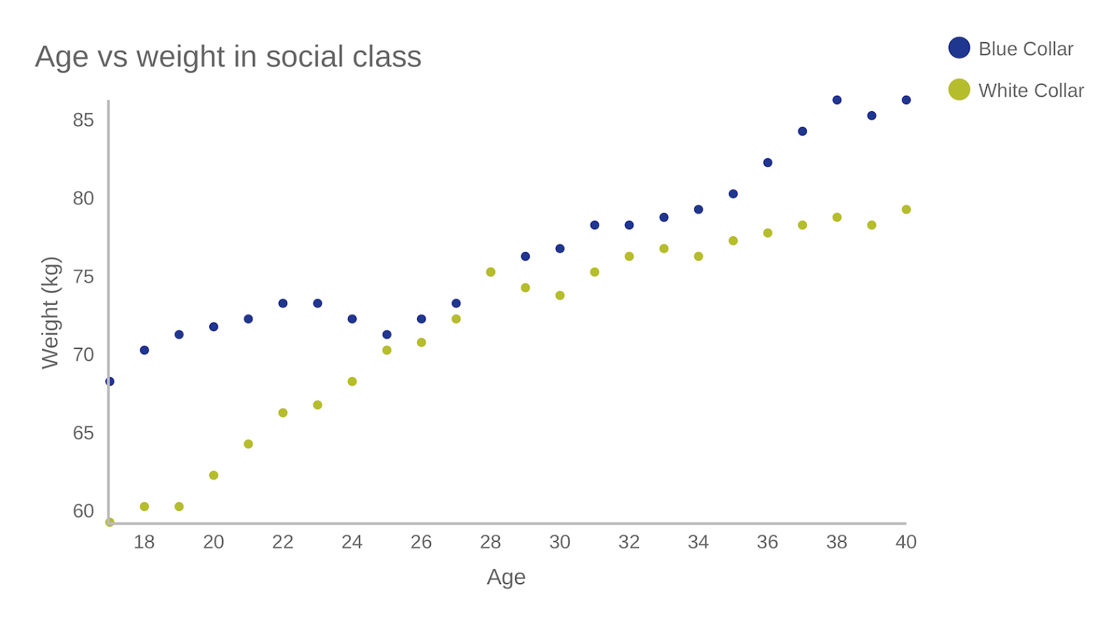
Data Visualization Examples
Bottom Line
Tableau is a great option for those who need to create maps in addition to other types of charts. Tableau Public is also a great option for anyone who wants to create public-facing visualizations.
Infogram
Infogram is a fully-featured drag-and-drop visualization tool that allows even non-designers to create effective visualizations of data for marketing reports, infographics, social media posts, maps, dashboards, and more.
Finished visualizations can be exported into a number of formats: .PNG, .JPG, .GIF, .PDF, and .HTML. Interactive visualizations are also possible, perfect for embedding into websites or apps. Infogram also offers a WordPress plugin that makes embedding visualizations even easier for WordPress users.
Pros
- Tiered pricing, including a free plan with basic features
- Includes 35+ chart types and 550+ map types
- Drag and drop editor
- API for importing additional data sources
Cons
- Significantly fewer built-in data sources than some other apps
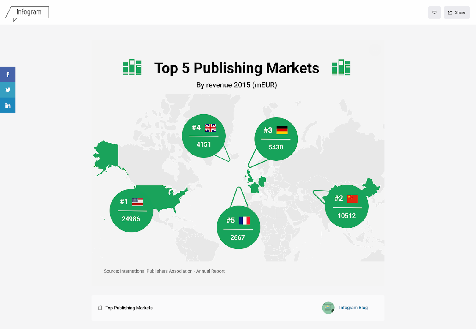
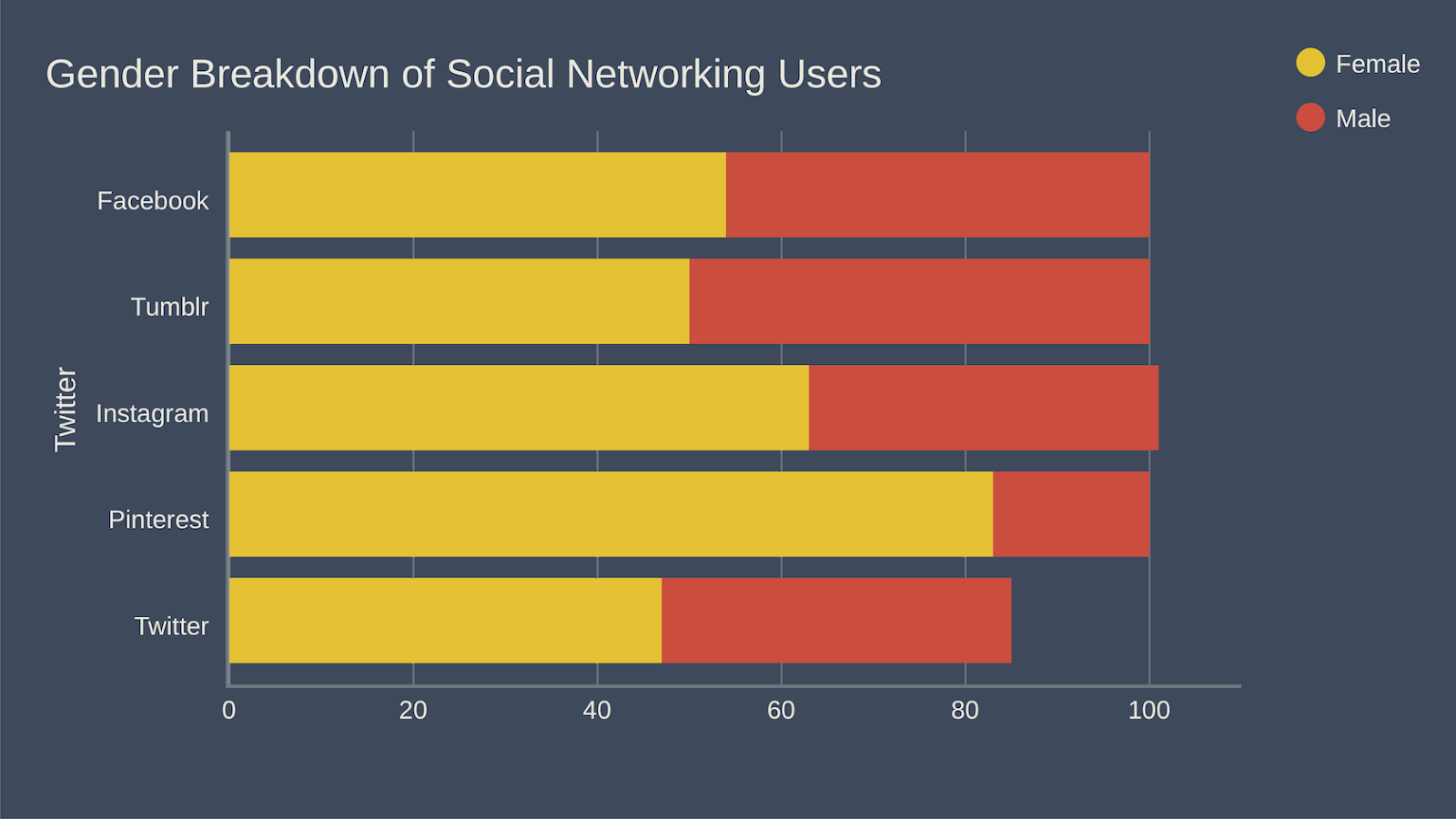
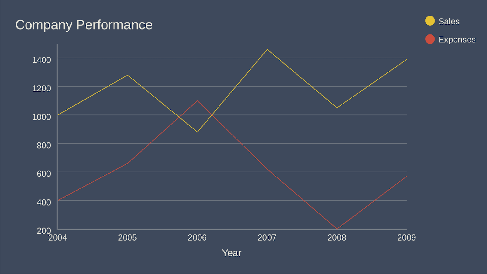
Examples
Bottom Line
Infogram is a great option for non-designers as well as designers. The drag-and-drop editor makes it easy to create professional-looking designs without a lot of visual design skill.
ChartBlocks
ChartBlocks claims that data can be imported from “anywhere” using their API, including from live feeds. While they say that importing data from any source can be done in “just a few clicks,” it’s bound to be more complex than other apps that have automated modules or extensions for specific data sources.
The app allows for extensive customization of the final visualization created, and the chart building wizard helps users pick exactly the right data for their charts before importing the data.
Designers can create virtually any kind of chart, and the output is responsive—a big advantage for data visualization designers who want to embed charts into websites that are likely to be viewed on a variety of devices.
Pros
- Free and reasonably priced paid plans are available
- Easy to use wizard for importing the necessary data
Cons
- Unclear how robust their API is
- Doesn’t appear to have any mapping capability
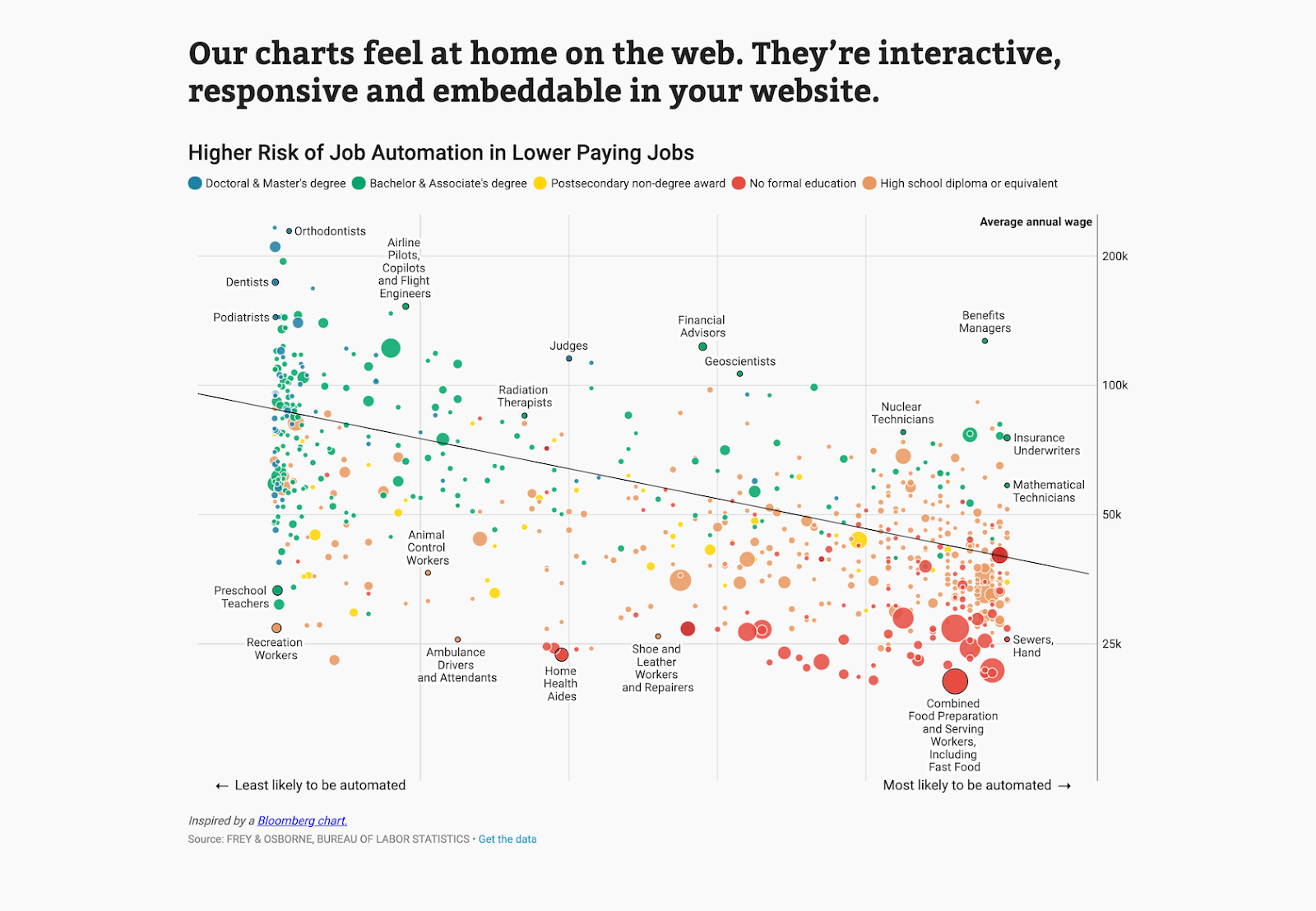
Examples
Bottom Line
ChartBlocks has an excellent free plan, which is a big plus. The ease of use for creating basic charts and graphs is also outstanding.
Datawrapper
Datawrapper was created specifically for adding charts and maps to news stories. The charts and maps created are interactive and made for embedding on news websites. Their data sources are limited, though, with the primary method being copying and pasting data into the tool.
Once data is imported, charts can be created with a single click. Their visualization types include column, line, and bar charts, election donuts, area charts, scatter plots, choropleth and symbol maps, and locator maps, among others. The finished visualizations are reminiscent of those seen on sites like the New York Times or Boston Globe. In fact, their charts are used by publications like Mother Jones, Fortune, and The Times.
The free plan is perfect for embedding graphics on smaller sites with limited traffic, but paid plans are on the expensive side, starting at $39/month.
Pros
- Specifically designed for newsroom data visualization
- Free plan is a good fit for smaller sites
- Tool includes a built-in color blindness checker
Cons
- Limited data sources
- Paid plans are on the expensive side
Example
Bottom Line
Datawrapper is an excellent choice for data visualizations for news sites. Despite the price tag, the features Datawrapper includes for news-specific visualization make it worth it.
D3.js
D3.js is a JavaScript library for manipulating documents using data. D3.js requires at least some JS knowledge, though there are apps out there that allow non-programming users to utilize the library.
Those apps include NVD3, which offers reusable charts for D3.js; Plotly’s Chart Studio, which also allows designers to create WebGL and other charts; and Ember Charts, which also uses the Ember.js framework.
Pros
- Very powerful and customizable
- Huge number of chart types possible
- A focus on web standards
- Tools available to let non-programmers create visualizations
- Free and open source
Cons
- Requires programming knowledge to use alone
- Less support available than with paid tools
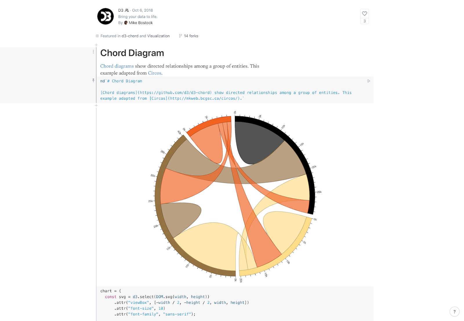
Examples
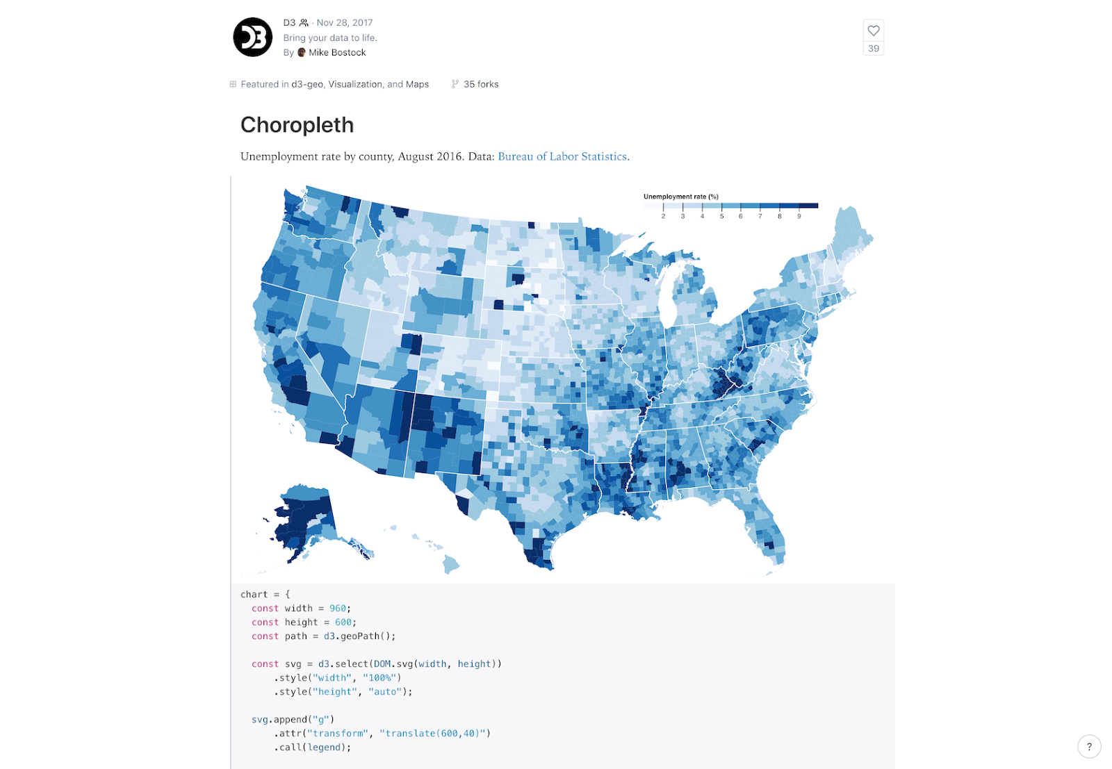
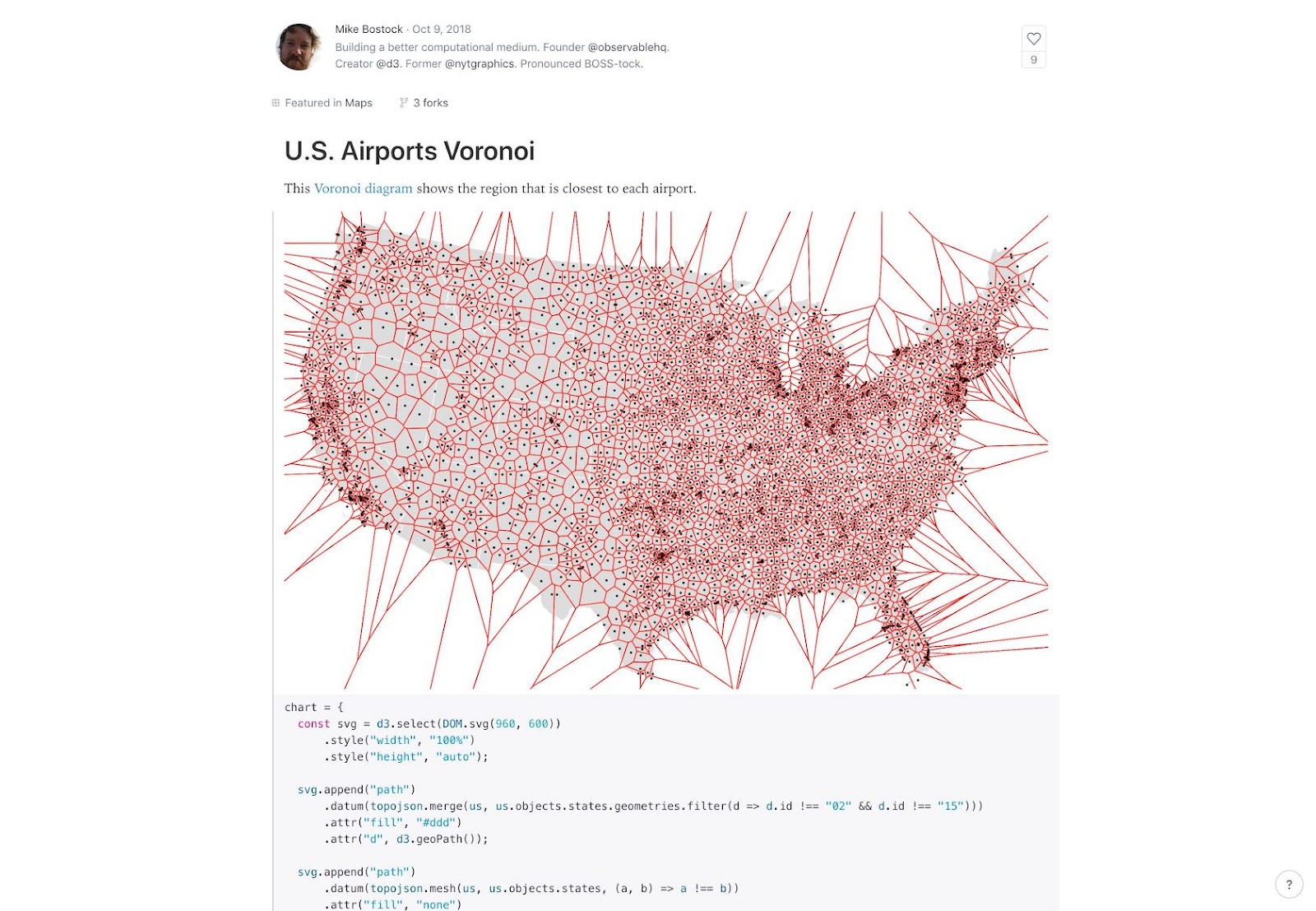
Bottom Line
D3.js is only suitable for those designers who either have access to a programmer for help, or have programming knowledge themselves.
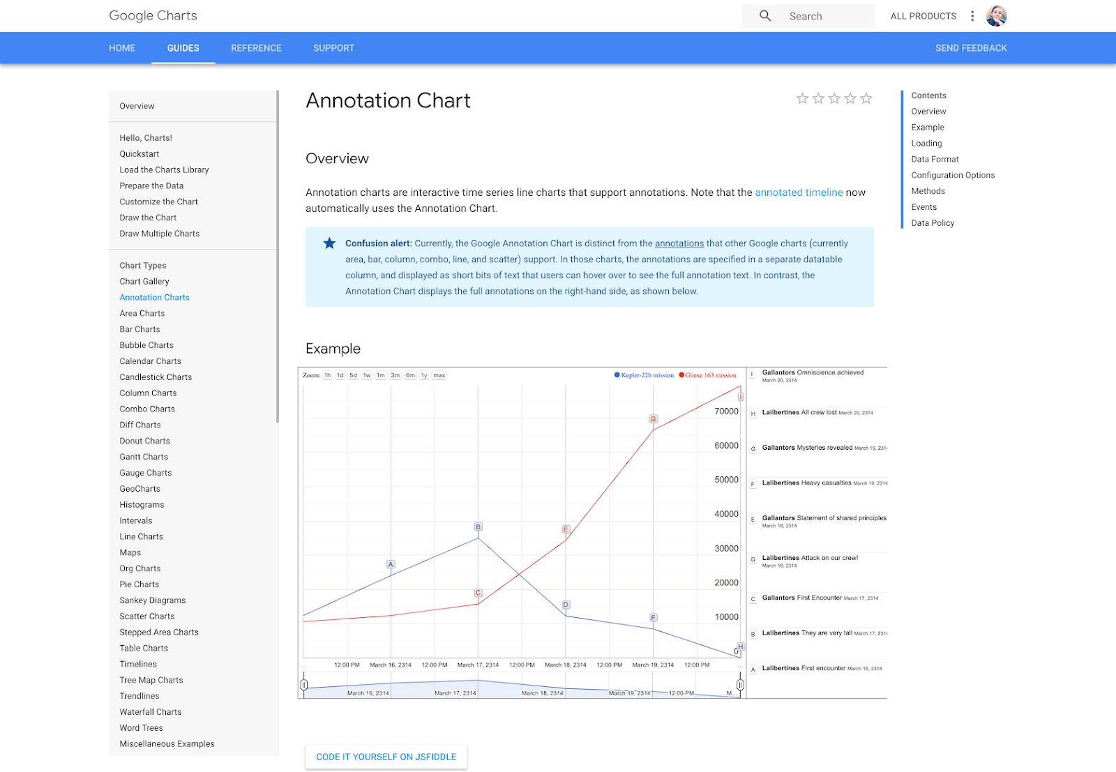
Google Charts
Google Charts is a powerful, free data visualization tool that is specifically for creating interactive charts for embedding online. It works with dynamic data and the outputs are based purely on HTML5 and SVG, so they work in browsers without the use of additional plugins. Data sources include Google Spreadsheets, Google Fusion Tables, Salesforce, and other SQL databases.
There are a variety of chart types, including maps, scatter charts, column and bar charts, histograms, area charts, pie charts, treemaps, timelines, gauges, and many others. These charts can be customized completely, via simple CSS editing.
Pros
- Free
- Wide variety of chart formats available
- Cross-browser compatible since it uses HTML5/SVG
- Works with dynamic data
Cons
- Beyond the tutorials and forum available, there’s limited support
Examples
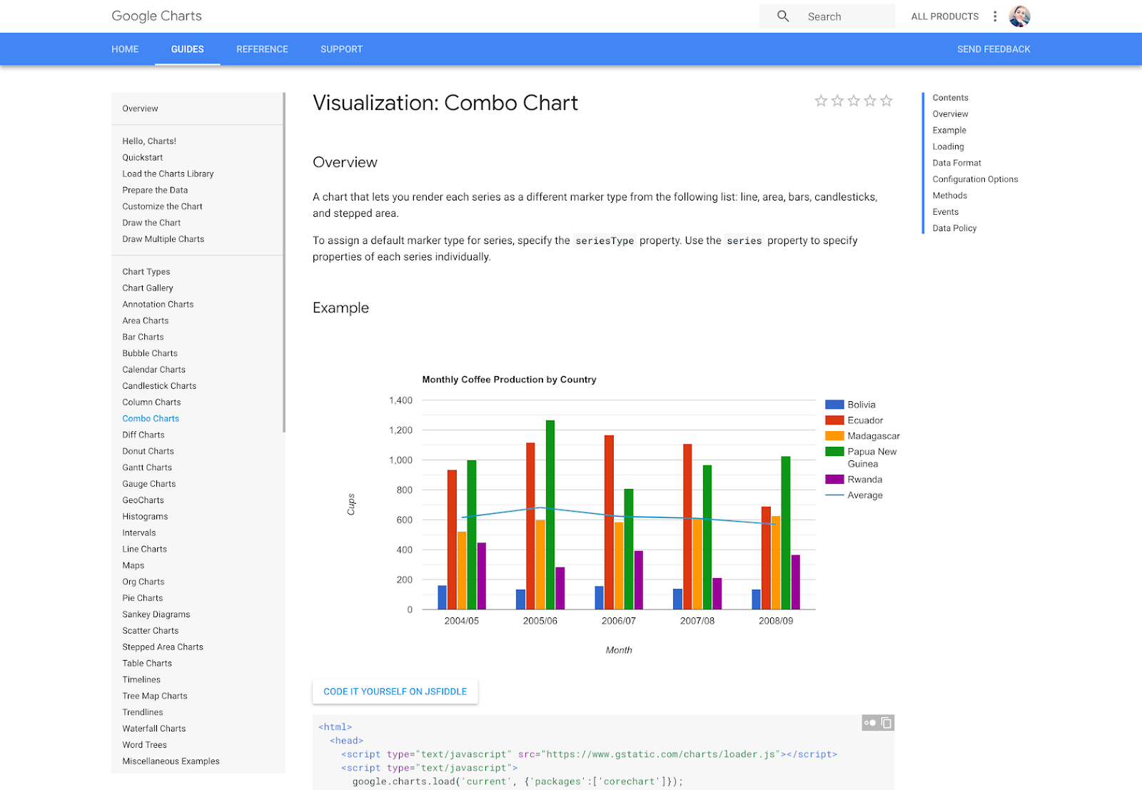
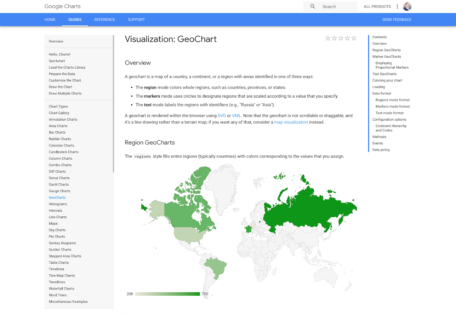
Bottom Line
Google Charts is a great option if a designer is somewhat comfortable with coding and wants a powerful, free solution. Being able to use any SQL database as a data source makes it a good option for large data sets, too.
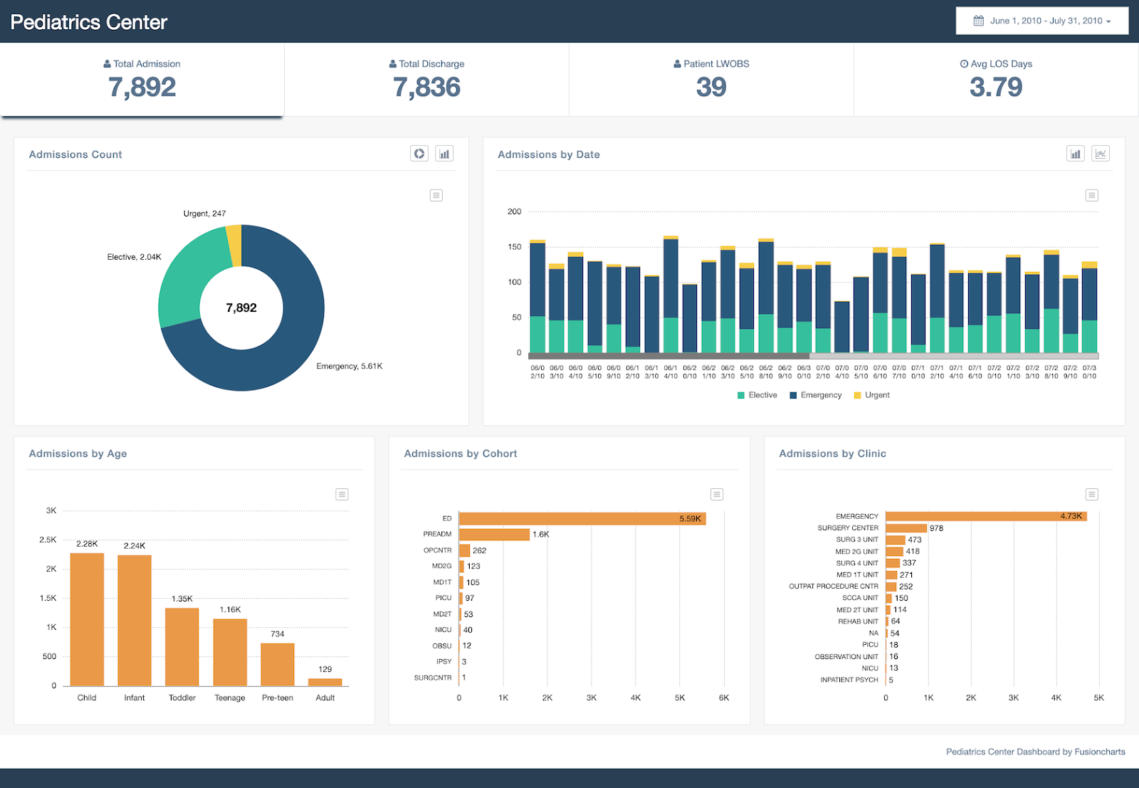
FusionCharts
FusionCharts is another JavaScript-based option for creating web and mobile dashboards. It includes over 150 chart types and 1,000 map types. It can integrate with popular JS frameworks (including React, jQuery, React, Ember, and Angular) as well as with server-side programming languages (including PHP, Java, Django, and Ruby on Rails).
FusionCharts gives ready-to-use code for all of the chart and map variations, making it easier to embed in websites even for those designers with limited programming knowledge. Because FusionCharts is aimed at creating dashboards rather than just straightforward data visualizations it’s one of the most expensive options included in this article. But it’s also one of the most powerful.
Pros
- Huge number of chart and map format options
- More features than most other visualization tools
- Integrates with a number of different frameworks and programming languages
Cons
- Expensive (starts at almost $500 for one developer license)
- Overkill for simple visualizations outside of a dashboard environment
Examples
Bottom Line
For creating dashboards, nothing else in this article really compares to FusionCharts. If that’s the project at hand, this is undoubtedly the most powerful choice.
Chart.js
Chart.js is a simple but flexible JavaScript charting library. It’s open source, provides a good variety of chart types (eight total), and allows for animation and interaction.
Chart.js uses HTML5 Canvas for output, so it renders charts well across all modern browsers. Charts created are also responsive, so it’s great for creating visualizations that are mobile-friendly.
Pros
- Free and open source
- Responsive and cross-browser compatible output
Cons
- Very limited chart types compared to other tools
- Limited support outside of the official documentation
Examples
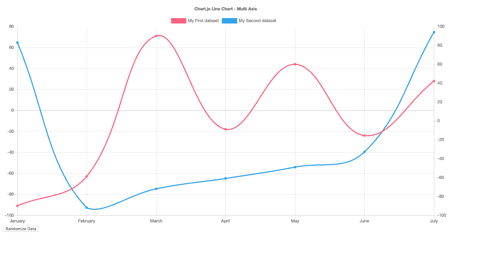
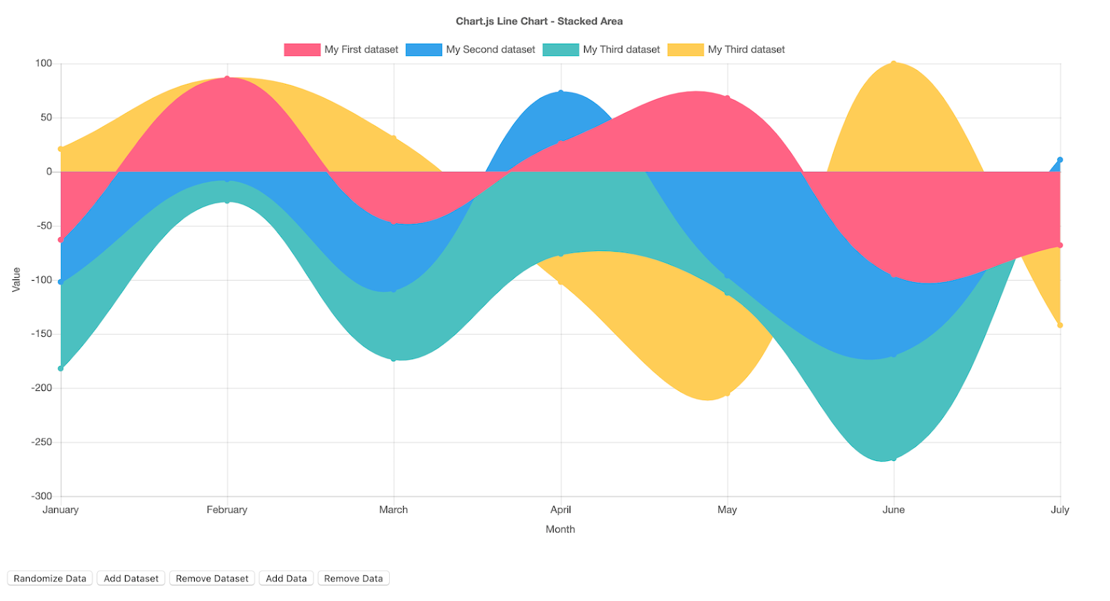
Bottom Line
Chart.js is a good option for designers who need a simple, customizable, interactive visualization option. Its biggest selling points are that it’s free and open source.
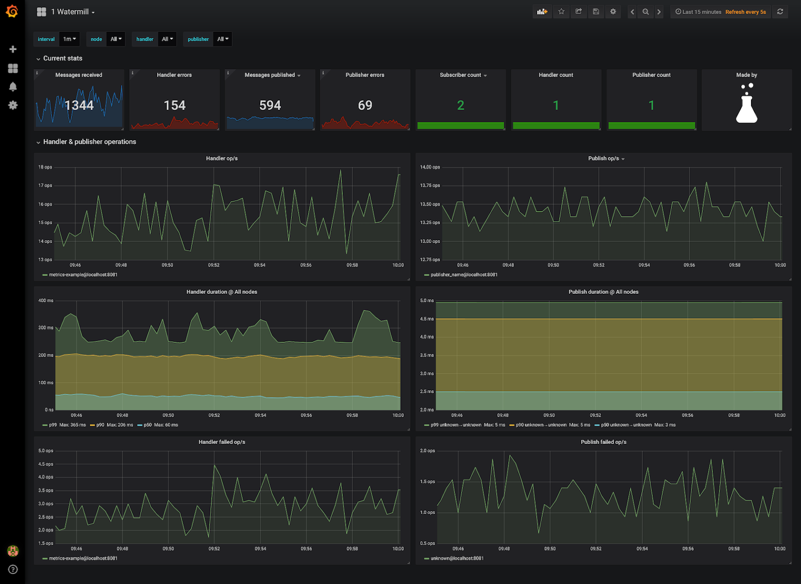
Grafana
Grafana is open-source visualization software that lets users create dynamic dashboards and other visualizations. It supports mixed data sources, annotations, and customizable alert functions, and it can be extended via hundreds of available plugins. That makes it one of the most powerful visualization tools available.
Export functions allow designers to share snapshots of dashboards as well as invite other users to collaborate. Grafana supports over 50 data sources via plugins. It’s free to download, or there’s a cloud-hosted version for $49/month. (There’s also a very limited free hosted version.) The downloadable version also has support plans available, something a lot of other open-source tools don’t offer.
Pros
- Open source, with free and paid options available
- Large selection of data sources available
- Variety of chart types available
- Makes creating dynamic dashboards simple
- Can work with mixed data feeds
Cons
- Overkill for creating simple visualizations
- Doesn’t offer as many visual customization options as some other tools
- Not the best option for creating visualization images
- Not able to embed dashboards in websites, though possible for individual panels
Examples
Bottom Line
Grafana is one of the best options for creating dashboards for internal use, especially for mixed or large data sources.
Chartist.js
Chartist.js is a free, open-source JavaScript library that allows for creating simple responsive charts that are highly customizable and cross-browser compatible. The entire JavaScript library is only 10KB when GZIPped. Charts created with Chartist.js can also be animated, and plugins allow it to be extended.
Pros
- Free and open source
- Tiny file size
- Charts can be animated
Cons
- Not the widest selection of chart types available
- No mapping capabilities
- Limited support outside of developer community
Examples
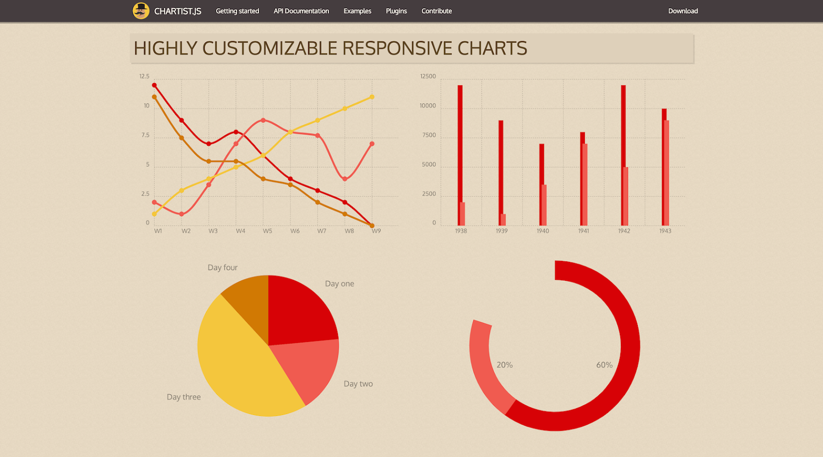
Bottom Line
Chartist.js is a good option for designers who want simple, embeddable, responsive charts with a small file size.
Observable Plot
Observable Plot is a JavaScript library for creating statistical charts with relatively little code. Developed by the creators of D3.js, it focuses on simplifying the process of building expressive visualizations while still supporting modern web standards.
The library integrates well with Observable notebooks, making it useful for exploratory analysis, collaborative data storytelling, and embedding interactive charts into web applications.
Pros
- Concise syntax for creating complex charts
- Strong defaults that simplify chart design
- Free and open source
Cons
- Requires JavaScript knowledge
- Smaller ecosystem that older libraries
Bottom line
Observable Plot works well for projects that require sophisticated charts with a lighter coding approach.
Plotly
Plotly is a platform for creating interactive charts, dashboards, and data applications. Its visualization libraries support a wide range of chart types and can be used to embed interactive graphics into web interfaces and analytics tools.
Recent updates have introduced AI-assisted capabilities that can recommend chart types and generate visualizations from prompts, helping designers move from raw data to charts more quickly.
Pros
- Supports multiple programming languages
- Large ecosystem and strong documentation
- AI-assisted chart suggestions and generation
Cons
- Some features require paid tools
- Customization can become complex for large projects
Bottom line
Plotly is best suited for projects that require a broad range of chart types and flexible integration across multiple programming environments.
ThoughtSpot
ThoughtSpot is an analytics platform that focuses on AI-assisted data exploration and visualization using a search-style interface. Instead of manually configuring a visualization, users type a prompt, such as “revenue by region” or “monthly sales trend,” and the platform automatically creates the corresponding chart.
This approach can make exploratory analysis simpler, and is particularly useful when working with large datasets or when users want to quickly test multiple ways of visualizing the same information.
Pros
- Natural-language queries generate charts automatically
- AI surfaces patterns and trends in data
- Enables fast exploration of large datasets
Cons
- Enterprise platform with relatively high pricing
- Less control over visual customization than code-based tools
Bottom line
ThoughtSpot is useful for teams that want a fast, low-code way to generate charts and dashboards.
Mapbox GL JS
Mapbox GL JS is a JavaScript library for creating interactive maps on the web. It renders vector maps directly in the browser using WebGL, allowing designers and developers to build responsive, highly customizable map interfaces.
For teams designing location-based interfaces, such as travel apps, delivery platforms, or geographic dashboards, it provides extensive control over map styling and interactive behavior.
Pros
- Highly customizable map styles and layers
- Smooth performance for interactive maps
- Strong documentation and design tools
Cons
- Requires coding knowledge to implement
- Some advanced features require paid services
Bottom line
Mapbox GL JS is best suited to projects where maps are a central part of the user experience.
Deck.gl
Deck.gl is a WebGL-powered framework for visualizing large geospatial datasets in the browser. It renders spatial data using GPU acceleration, allowing maps and geographic visualizations to display hundreds of thousands, or even millions, of data points smoothly.
It’s often used alongside mapping libraries such as Mapbox GL JS to add advanced visualization layers, including heatmaps, point clouds, and animated spatial data.
Pros
- Handles large spatial datasets efficiently
- Supports advanced geospatial visualization layers
- Works well with other mapping tools
Cons
- Requires significant JavaScript knowledge
- More complex than most visualization tools
Bottom line
Deck.gl is a strong choice for teams building data-heavy mapping applications or complex geographic data interfaces.
Accessibility Standards for Interactive Charts
The growing presence of interactive charts and dashboards in digital products has introduced new accessibility challenges to modern data visualization design. Visualizations that rely heavily on color, motion, or mouse-based interaction can create barriers for users with visual or motor impairments.
The Web Content Accessibility Guidelines 2.2 (WCAG) provide guidance on how interactive content, including charts and graphs, should be designed to remain usable for the widest possible audience. When designing interactive visualizations, teams should consider the following accessibility requirements:
- Sufficient color contrast: Text, labels, and chart elements should meet WCAG contrast ratios so they are legible for users with low vision. Designers should also avoid relying on color alone to distinguish categories, as this can make charts difficult to interpret for users with color vision deficiencies.
- Keyboard navigation: Interactive chart elements must be accessible using the keyboard. Users should be able to move between controls, data points, and tooltips without relying on a mouse.
- Screen reader compatibility: Charts should include accessible labels, ARIA attributes, or descriptive summaries so screen readers can communicate the information contained in the visualization.
- Alternative data representations: Providing a table or downloadable dataset alongside a visualization allows users who rely on assistive technologies to access the same information in a format that may be easier to interpret.
Conclusion
There is such a huge variety of visualization tools available to designers that it can be hard to decide which one to use. Data visualization designers should keep in mind things like ease of use and whether a tool has the features they need.
Selecting the most powerful tool available isn’t always the best idea: Learning curves can be steep, requiring more resources just to get up and running, while a simpler tool might be able to create exactly what’s needed in a fraction of the time. Remember, though, that the tool is only part of the equation in creating a data visualization; designers also need to consider what else goes into making a great data visualization.
Most data visualization tools include free trials (if the entire tool isn’t free), so it’s worth taking the time to try out a few before deciding on a single solution.
Further Reading on the Toptal Blog:
Understanding the basics
The best data visualization tools include Google Charts, Tableau, Grafana, Chartist.js, FusionCharts, Datawrapper, Infogram, ChartBlocks, and D3.js. The best tools offer a variety of visualization styles, are easy to use, and can handle large data sets.
Data visualization tools provide designers with an easier way to create visual representations of large data sets. When dealing with data sets that include hundreds of thousands or millions of data points, automating the process of creating a visualization makes a designer’s job significantly easier.
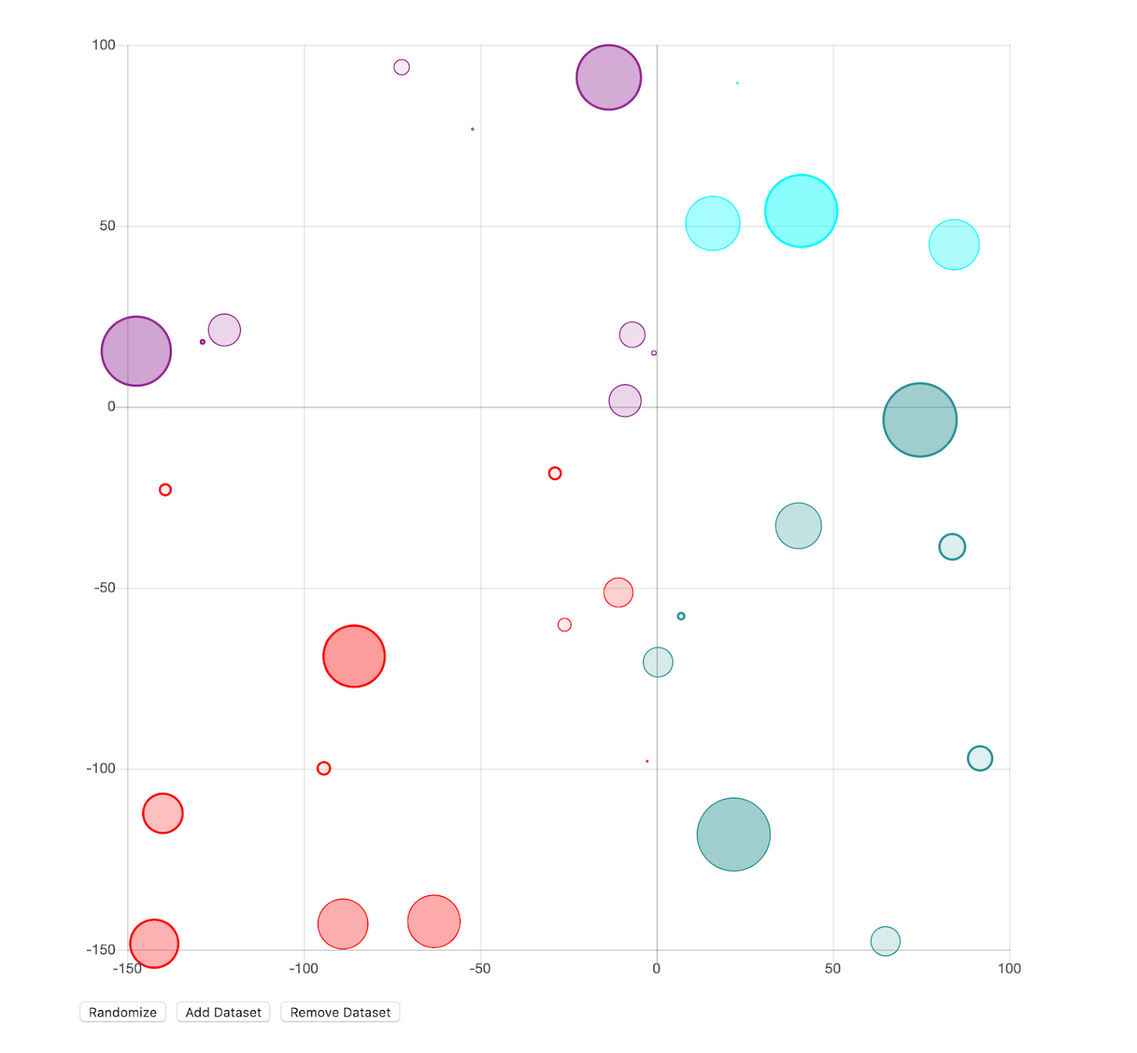
Data visualization techniques include charts (line, bar, or pie), plots (bubble or scatter), diagrams, maps (heat maps, geographic maps, etc.), and matrices. There are many variations on these specific techniques that designers can use to meet specific visualization needs based on the data they’re working with.
It is almost impossible to discern information from large data sets with millions of data points unless some kind of visualization is employed, such as a basic graph or an interactive dashboard.
Without data visualization, drawing conclusions from large data sets is almost impossible. Data visualization methods make information understandable for stakeholders.