Strength in Numbers – An Overview of Data-driven Design
Data-driven UI design is both art and science. Understanding how to collect and analyze data and implement designs based on it is an important skill for beginner and expert designers alike.
Data-driven UI design is both art and science. Understanding how to collect and analyze data and implement designs based on it is an important skill for beginner and expert designers alike.

Cameron Chapman
Cameron comes from a design background and is the author of two web design books: Color for Web Design and The Smashing Idea Book.
Expertise
Design is often looked at as an art rather than a science. In reality, it’s both. The art of design should be influenced by the science of data and information. Collecting and analyzing data is key to creating better designs and user experiences.
Data-driven design can be intimidating to designers who aren’t familiar with it. Some designers don’t even see why it’s necessary, or only tap into data on a limited basis. Understanding the process demystifies it and makes it accessible to designers at all levels of experience.
Why Use Data in the Design Process?
Many designers think they know what users want without needing to do any kind of user research. They also have a tendency to be infatuated with their own designs. But in the vast majority of cases, designers aren’t users. Without data to back up the decisions made about how to create the best user experience, designers are really just stabbing in the dark.
Data gives insight to designers so they can create the best possible designs for the people who use their products. This data can come in multiple forms, from primary and secondary sources. The important thing for designers is to figure out which datasets are worth using to base their designs, and which ones to disregard.
What Data to Use
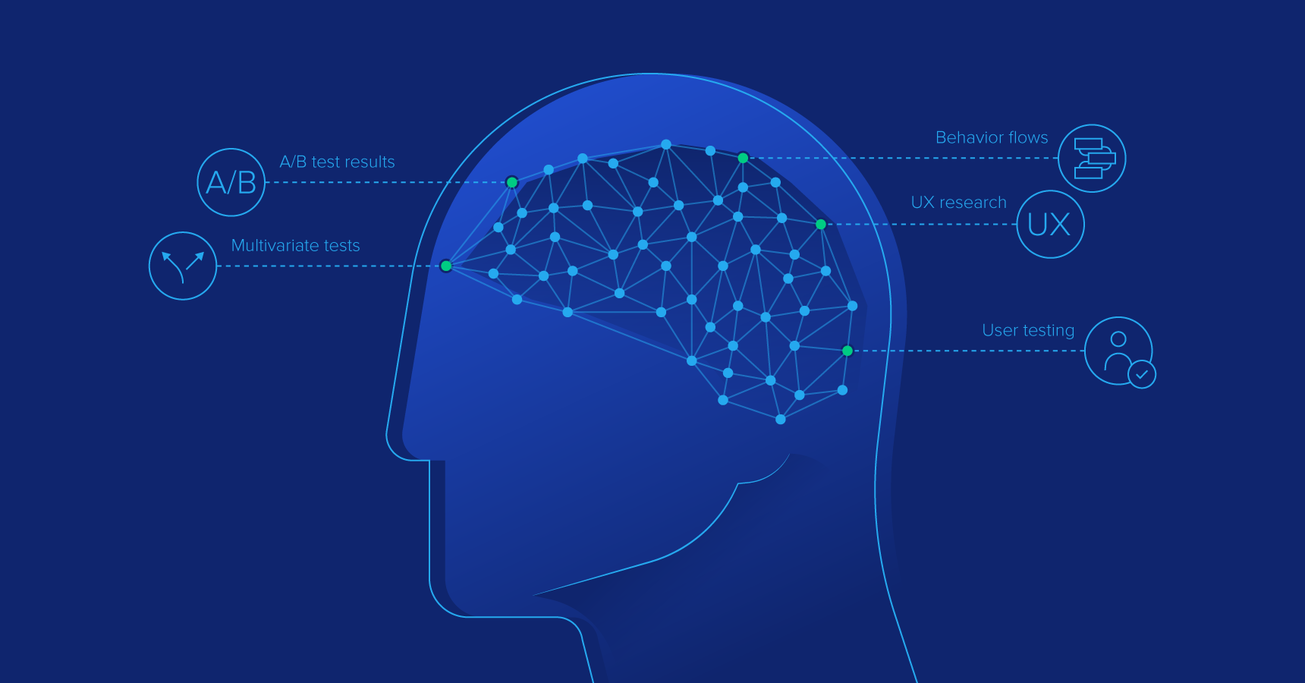
Data-driven UI design can require a variety of different kinds of data to determine the best way to create an optimal user experience. This data can include things like website or app analytics on an existing iteration of a product, user interviews, A/B and multivariate test results, behavior flows, and other types of UX research.

The more data designers gather up front, the better early iterations of a design will be. Granted, for some types of data gathering, a prototype is generally required (such as for A/B or multivariate testing). But even those early prototypes can rely on industry data or data from similar projects (case studies can be an invaluable resource in this regard).
Using Design Analytics
Analytics can be some of the richest data sources for designers. If a site or app is being redesigned rather than designed from scratch, designers can tap into existing analytics information to determine what’s working and what’s not.

Looking at the pages on a site that are popular, have higher average time-on-page statistics, or have lower bounce rates is a good way to get an idea of what’s working. But looking at those pages that have high exit and bounce rates or lower average time on page give insight into the pages that need some help.
High exit and bounce rates can indicate that a page doesn’t contain the information a person visiting the page is looking for. Or if the information is there, it could indicate that it’s not easy to find or understand.
Paying attention to UX analytics as changes are made to a design is also key. If a page is performing well before a redesign, pay attention to how it performs after. An improvement in positive indicators means the redesign is on the right track, and vice versa.
Finally, industry analytics benchmarks can provide vital information about how a site or app is performing in comparison to others in the same industry. It’s often difficult to know whether 2 minutes average time on a page is good or bad when looked at alone. But being able to compare that and see that the industry average is 3 minutes average time on page means that the current site design or content could be improved. Google Analytics has built-in benchmarking tools that make it simple to see how a site is doing when compared to the industry average.
Using A/B and Multivariate Test Results
A/B and multivariate testing are closely related ways to see how different versions of a website or app perform against one another. They can be used to make huge improvements in user experience and user behavior.
A/B tests change one element in a design (such as the color of a button or the text of a headline) between two versions to see which one performs better. Multivariate tests change more than one element (like an entire header or all of the copy on a page). In both varieties of tests, visitors to a site or app are randomly shown the different versions of the page, and analytics data is recorded.
Continuously running A/B or multivariate tests to improve a design can result in huge conversion increases. 37Signals, for example, has run a variety of A/B tests on its homepage in order to determine the optimal design (sometimes seeing differences of more than 100% between the two versions).
Using Behavior Flows
Behavior flows are the way users travel through a site, from the page they first land on to the last page they view before exiting the site. In most cases, UX experts have a certain flow they’d like users to take through a site. If the actual behavior flows differ greatly from that, it indicates a problem with the user experience.
Google Analytics has built-in tools for exploring user behavior flows. Exploring this data compared to the ideal behavior flow the UX designer has created for a project gives valuable insight into whether the design actually accomplishes the user experience and behavior goals.
User Research
There are a variety of user research methods designers can employ to collect data that can assist in the design process of creating a better user experience and influence user behavior more effectively.

These methods include card sorting, contextual interviews with actual users, focus groups, surveys, and heuristic analysis, among others. User research also includes things like creating personas and use cases.
User research is one of the more resource-heavy methods of data collection, but can also be the most valuable—especially for new projects and products without existing primary data sources. There are a variety of ways to conduct effective user research, each of which can add its own unique value to the process.
User testing is one aspect of the user research process, which often includes usability testing as well as the previously mentioned A/B and multivariate testing. Cost-effective user testing is a vital part of the design process and should be done at each step along the way.
How to Analyze Data
Collecting data is only one aspect of the data driven design process. Quantitative data, such as design and UX analytics, is vital, but qualitative data, like that collected from user interviews, is just as important, if not more so.
Quantitative data gives designers an idea of what is happening on a website or app. But qualitative data is needed to shed light on why users do what they do. Figuring out why users behave in certain ways is a large part of UX theory and the psychology of design.
Once both qualitative and quantitative data has been collected, designers should look for trends in the data as well as outliers. Outliers can give insight into potential problems that users may run into, that could become significant as traffic numbers increase.
Creating data visualizations can be useful in working with large datasets. Even simple charts and graphs can make it easier to analyze the information available. This is why most analytics programs, including Google Analytics, display data visually rather than just as raw data.
Data should be analyzed on a continuous basis, as new data is collected. Design changes, content changes, changes in search engine algorithms, and other developments can all affect user experience and user behavior. Designers can analyze this data to constantly improve and make new iterations of their products.
Presenting Data to Stakeholders
In addition to analyzing data, presenting it to stakeholders in a project is often important to getting them to buy into the best design solutions. Displaying data visually is one of the best ways to present information.

Creating a slide deck with charts and graphs can often make the difference between getting a client or manager to approve a project and facing resistance at every step along the way. Data can back up a designer’s “intuition” about the right design choices to make.
Making Decisions with Data
One of the best parts about data is that it’s almost always possible to collect more. The data-driven design decision process is circular: designers should collect and analyze data, make decisions based on it, and then test those decisions by collecting and analyzing more data.
Constantly designing new iterations of a product with improvements made based on data rather than intuition or hunches allows designers to create better experiences for the people using their products. Staying on top of the data available lets designers head off problems with user experience and behavior changes before they impact the bottom line.
Conclusion
Understanding the data-driven design process is an important career skill for designers. Diving into the user research and testing process, and understanding how data analytics works, gives designers additional tools to get support for their ideas. It also allows them to create the best possible products, with the data to back up that assertion.
Data-driven UI design is both art and science. Understanding how to collect and analyze data and implement designs based on it is an important skill for beginner and expert designers alike.
Further Reading on the Toptal Blog:
Understanding the basics
What is the role of data analytics?
The role of data and design analytics is to give quantitative information to designers and other decision-makers to allow them to make better design choices, improve user experience, and influence user behavior.
What counts as quantitative data?
Quantitative data is numerical. It can be counted. Most data gathered from design and UX analytics programs counts as quantitative data. Quantitative data is an important aspect of data driven decision making.
What is usability testing in UX?
Usability testing is the process of figuring out how easy a site or product is for actual people to use. Test subjects are often observed by researchers while they’re using a site or app, and the data collected is then used to make data driven UX decisions.
What is a UX persona?
UX personas are representations of specific types of users, often an “ideal” user. Their creation is often driven by data available to the UX designer based on analytics and other sources. Personas help designers make better design decisions.
Why is a persona important?
Personas are important because they help designers make better data-driven design decisions. Personas bring common user needs to the forefront of design decisions, assisting in creating a better-finished product that meets people’s needs better.
