
A Step-by-step Guide to Designing Custom Illustrations Without Any Drawing Skills
Many designers shy away from making their own illustrations because they don’t have conventional drawing skills. We show you how to make custom illustrations, no sketching skills needed.

Many designers shy away from making their own illustrations because they don’t have conventional drawing skills. We show you how to make custom illustrations, no sketching skills needed.
Tidjane Tall
Tidjane is a UX/UI design leader who connects user’s needs and goals to deliver strategic solutions for companies like Adobe and Google.
I see many businesses today use stock illustrations or images. Although these options are cheap, the brand message is diluted because the visuals are not exclusive to the product.
In a world where 74 percent of social media and B2B marketers use visuals in their promotions, how you set yourself apart visually is critical.
If your brand is prolific, people will learn the visual language associated with your brand. As soon as they see the same stock illustration design associated with another product, your brand identity will weaken.
With custom illustrations, the elements of a brand’s identity can coalesce around a shared perspective and personality. They communicate to customers on an intuitive level and help brands tell their story in an enduring way.
However, many designers shy away from working as illustrators for the fear that they don’t have drawing skills. We’re here to show you how to create illustrations, no drawing required.
We’ll look at how to make illustrations, using three popular styles as inspiration, and apply very simple steps to develop our own artwork from scratch. You can follow along, and apply what you learn to create great looking pieces for your next project.
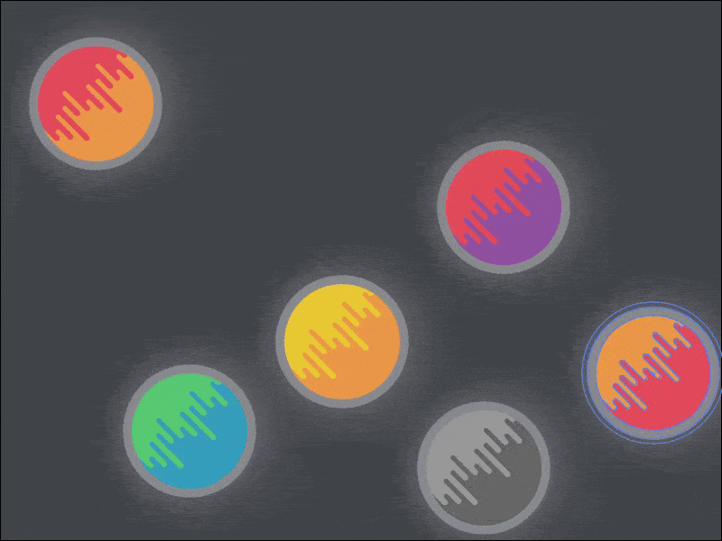
Recreate the famous space illustration.

Designer and Illustrator Nina Georgieva is the trailblazer behind this piece, and now the style has become a trend of its own.
Stealing inspiration from Georgieva, we’ll create our own space illustration drawing, following a few easy steps.
This is what you’ll get in the end.

1. Start with the stars.
Using Illustrator’s “star tool,” create a four-point star. Then make it 75 percent transparent.
While selected, duplicate it in place by pressing Ctrl+C, then Ctrl+F.
Scale down the shape in front.
Next, add a glowing effect; select the bigger shape; and apply a “Gaussian Blur” effect from the “Appearance” panel.
Finally, you can store your star shape inside the “Symbols” panel to use it later in the composition.
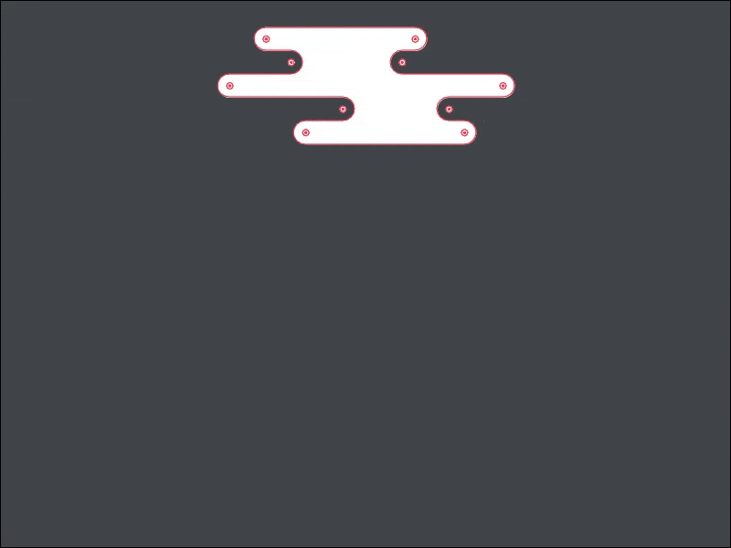
2. Create the cloud’s shape.

Stack rectangles together with various widths.
Merge them together with the “Pathfinder” panel.
Finish up by giving the entire shape a high “corner radius” value.
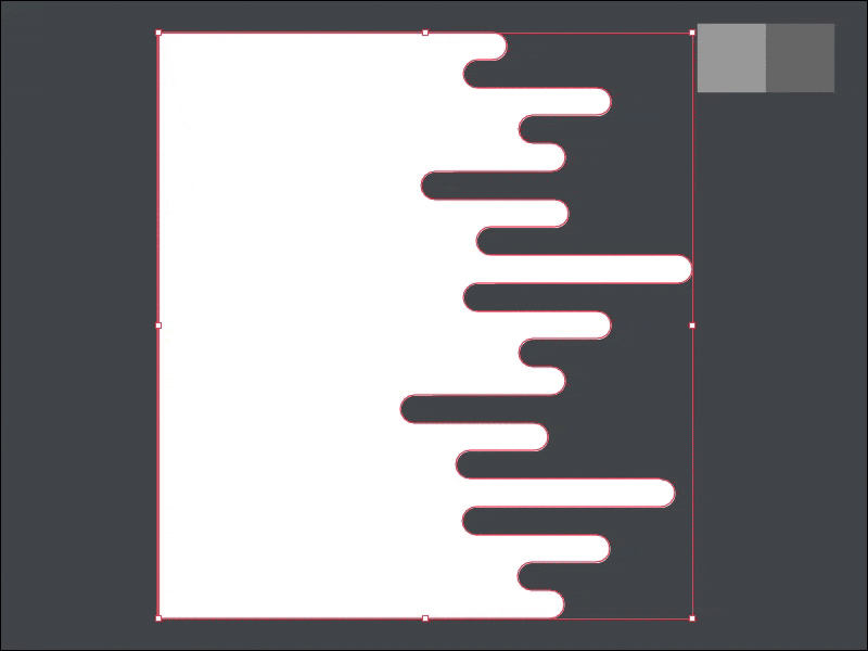
3. Make the planet texture from the clouds
Starting with the cloud shape, create the planet texture effect as shown above.
Stack many cloud shapes together, and make sure you have a succession of outward and inward curves to create a wavy pattern.
4. Tweak the texture.

Simplify the wavy pattern before applying it to the planet shape.
Remove extra points on one side of the texture and flatten it.
5. Create a textured planet.
Overlap the wavy pattern with a circle, and create a division by using the “Divide” option within the “Pathfinder” panel.
Delete the extra shape created outside of the circle, and create a lighting effect by applying different gray values to each side of the planet.
6. Add an atmosphere to the planet.

Create two bigger circles, and paste them behind the planet with Ctrl+X then Ctrl+B.
Align them properly.
Add transparency to the new circles and a blur effect to the third circle (within the “Appearance” panel).
Group (Ctrl+G), and store the result inside the “Symbol” panel.
7. Duplicate and color the planets.

Copy several planet shapes from the ”Symbols” panel, and recolor them using two different colors for each side.
Use the “Direct Selection Tool (A)” to select and the “Eyedropper Tool (I)” to pick, and apply a color.
8. Scale and position your planets
Move the planets in different positions with the “Selection Tool (V),” and give them various sizes by dragging the white corners that appear when selected (maintain the “Shift” key for proportional scaling).
9. Add the rings.

Draw a few line circles around the planets to make the rings.
To paste smaller planets in front of the rings, select them, then press Ctrl+X (cut) and Ctrl+F (paste in front).
10. Add some clouds and stars in the sky.

Going back to the “Symbol” panel, drag-and-drop some clouds and stars shapes.
Duplicate, scale, and position them as you wish across your space.
Here’s the final result.
Play around with scale, position, and colors to really make it your own.
Add some typography, and voila, you have a new, customized desktop background.

Recreate the Toptal blog illustrations style

The Toptal blog is a valuable source of insights and inspiration created by top talents around the world. Just like the one you’re reading right now, most articles feature illustrations to support the content. We use simple illustrations and geometric shapes, as well as bright colors to depict objects.
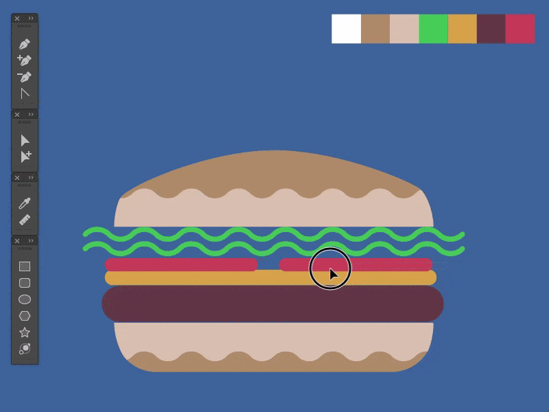
Let’s see how you can apply this style to create some food illustrations of your own.
This is what you’ll get in the end.

1. Draw a simple fry.

To create a fry, start with a long rectangle, and add multiple points across the edges with the “Pen Tool (P).”
Tweak the shape by moving the points around, using the “Direct Selection Tool (A).”
2. Create the mayonnaise container.

Create three circles with decreasing sizes, from the back to front.
The outer circle is the container, the middle one (in white) is the mayo, and the inner, smaller circle (with a colored stroke) is for the lighting effect.
Cut the inner circle in half, and make sure the “Cap” and “Corner” from the “Stroke” panel are round.
3. Make the ketchup and mustard.

Duplicate the mayo cup to create mustard and ketchup.
Simply apply different colors to the sauce and light, as suggested above.
4. Add in the wave-shaped lettuce.
With the “Pen Tool (P),” trace a straight line, and add several points to it.
Distribute their horizontal spacing from the “Align” panel.
Drag down altering points, and round out every corner to the max, until it’s completely smooth.
5. Create a bread slice.

Create a long oval; overlap it with the wave shape, and create a division by using the “Divide” option from the “Pathfinder” panel.
Remove the extra shape that you get from the “Divide” tool, then recolor the bread slice.
6. Make the burger bread.

Mirror the bread slice vertically, and add a tipping point to the top layer.
Round up that edge to make a smooth burger bun.
7. Finish the burger.

Color the lettuce in green.
Then create different “Rounded Rectangles” for meat, cheese, and tomatoes, using brown, yellow, and red colors respectively.
Move things around to properly layer your burger.
8. Create a hot dog from the burger.
Starting with your burger illustration, remove the tomatoes and cheese, recolor lettuce to mayo and mustard, and duplicate the lower bread for a more symmetric hot dog.
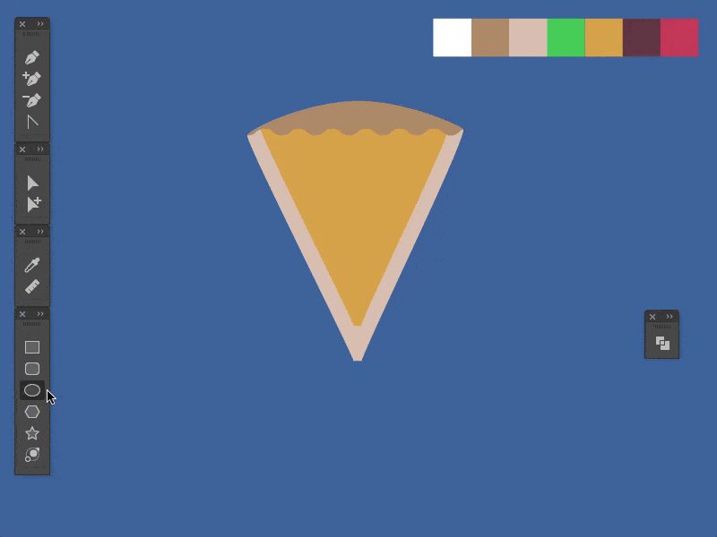
9. Design the pizza shape.
Start with the burger’s top layer, move the lower points down, and bring them closer together.
Duplicate the triangle shape, scale it down, and make it yellow for a cheesy base.
10. Add the tomatoes shapes.
Overlap a big red circle with smaller inner circles, and use the “Minus Front” option from the ”Pathfinder” panel.
Place multiple tomato slices with different sizes and positions on the pizza shape.
11. Create some meat slices.

Draw an organic brown shape with the “Pen tool (P),” duplicate, and scale it on top of your pizza.
12. Add extra toppings.
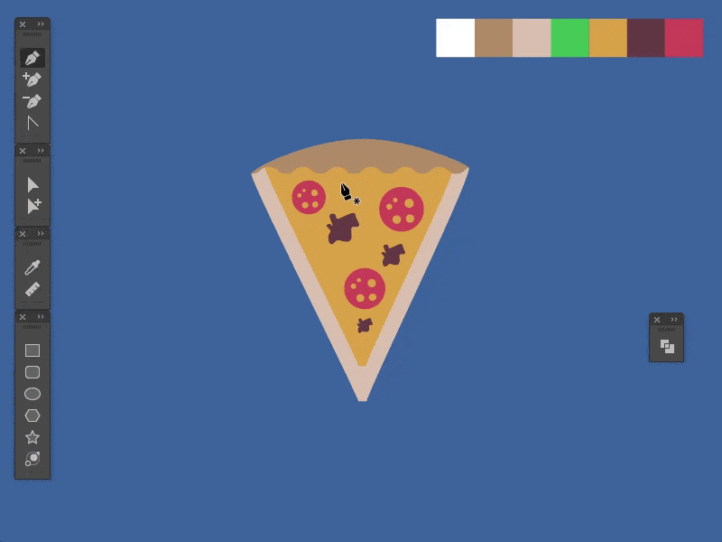
Add smaller, colored, rounded strokes in empty spaces to finish your pizza toppings.
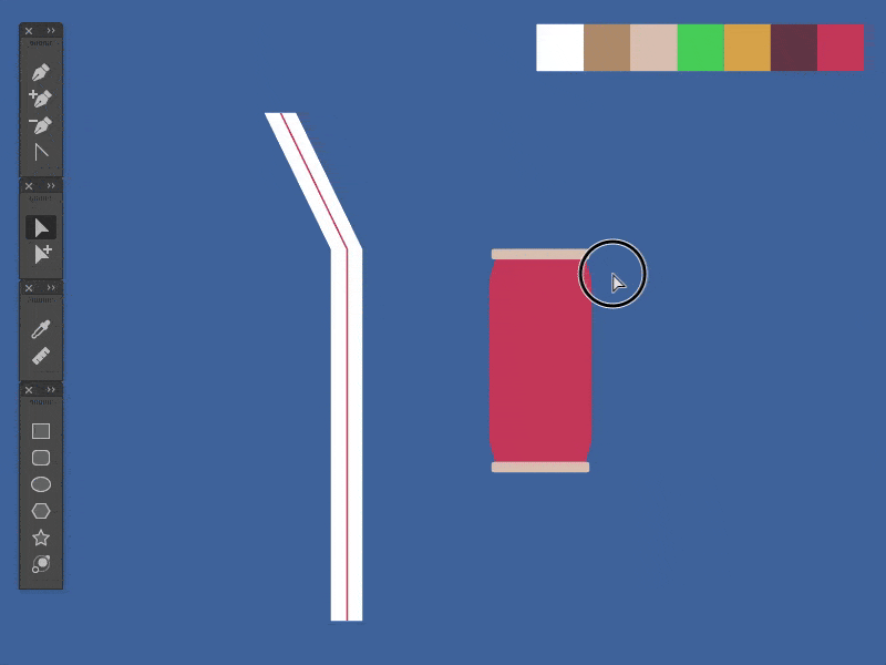
13. Create the straw.
Star with a long white rectangle.
Add two points with the “Pen Tool (P),” and move the top edges to bend the straw.
Copy and paste the middle point on the right edge, then apply a red stroke, and no fill to it.
Move the red line in the middle of the white rectangle.
14. Create the soda can shape.

Draw an eight-sided polygon; add the can; move the top four points upwards; and scale (S) the upper and lower edges outward to make it look more like a can.
Add rounded rectangles on the top and bottom to create the rims.
15. Tweak the can shape, and scale the straw.

Move points around to tweak the shapes, then scale the can and straw into relatable proportions.
16. Finish with the wave design on the can.
Draw an organic and wavy shape for the design on the can.
Then create a division with the “Pathfinder” panel, and delete the extra outer shapes.
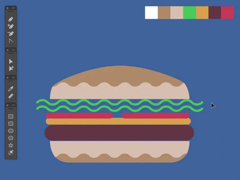
Here’s the final result.
Recreate an illustration inspired by the Monument Valley game

Monument Valley is a best selling game created by UsTwo studio. It won dozens of awards, including Apple’s best iPad game of 2014, and its illustration style is inspired by Escher’s beautiful geometric artwork.
Now you’ll learn how to easily create the same visual style that made this game such a huge success.
This is what you’ll get in the end.

You will only use planes and cubes as building blocks for the entire illustration.
The color palette has four colors for the water, grass, wood and building – each in three shades to simulate natural light.
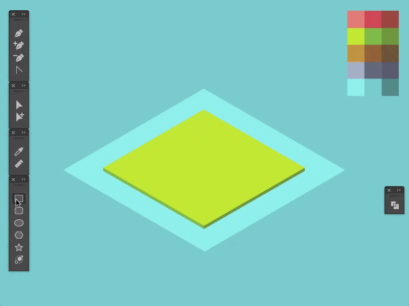
1. Create an isometric plane.

Start with a square, then follow these three steps to create an isometric shape. Pay attention because you’ll repeat this process every time you need to another isometric shape.
We’ll call it the “Isometric Effect:”
Go to Effect > 3D > Extrude & Bevel Select “Isometric Top” inside the “Position” dropdown - within the option panel that appears. Set “Extrude Depth” to zero under “Extrude & Bevel” first option.
You now have an isometric plane.
To better play around with the shape, go to Object > Expand Appearance.
This will let you change the plane’s color and freely move points.
We’ll call it the “Expand Effect.”
2. Trace the faces for the island.

To create the three faces of the island shape, create a square and two elongated rectangles.
Repeat the “Isometric Effect” on each.
For step two, apply “Isometric Top,” “Isometric Left,” and “Isometric Right” respectively.
3. Complete and color the island base.

Apply the “Expand Effect,” and color each face with different shades of green, with the brightest always on top.
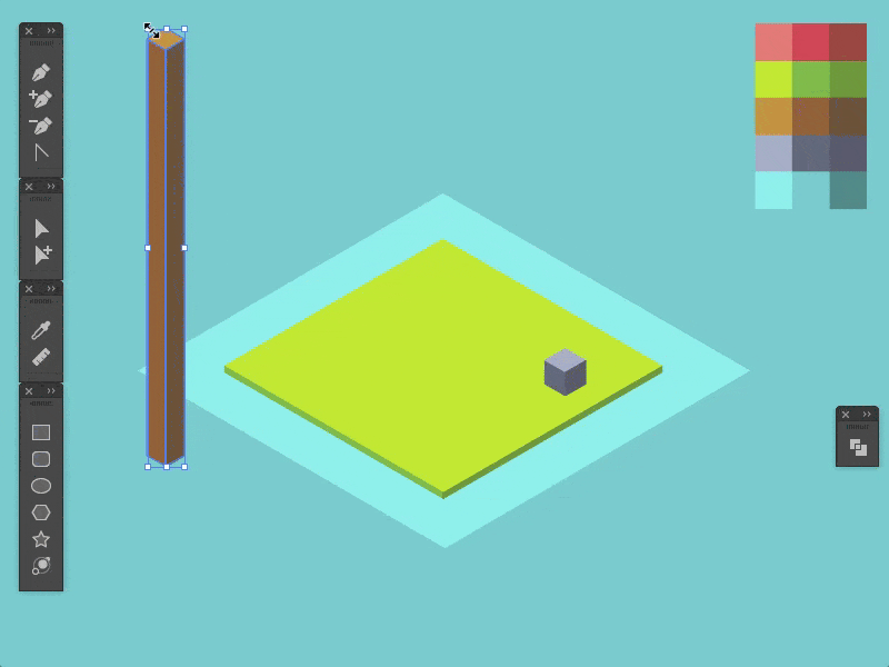
4. Create cube faces in perspective.
Apply the “Isometric Effect” on three squares, with isometric left, top, and right on step two. This gives you the three faces you’ll need to get an isometric cube.
Note that every object in your illustration will only use three faces. That’s the beauty of the isometric perspective.
5. Compose a cube.

Release the shapes with the “Expand Effect,” bring the faces together, and apply three shades of gray to simulate lighting.
Tip: The lightest shade is always on top; the darkest, to the right; and the mid tone, to the left. Applying this to every shape within your illustration will create an impression of natural light.
6. Start the tree base.

Follow the same steps as the isometric cube, and this time, elongate the left and right faces before connecting the whole.
Then apply three shades of brown to represent wood.
7. Finish the tree.
Scale down the tree bark; duplicate a cube; and color its faces just like the land shape in green.
8. Use a cube to create the building blocks

Duplicate a cube, and color it in pink for the building material.
Play with scale; move lower points down to create a tower base; and scale it down to create a pillar.
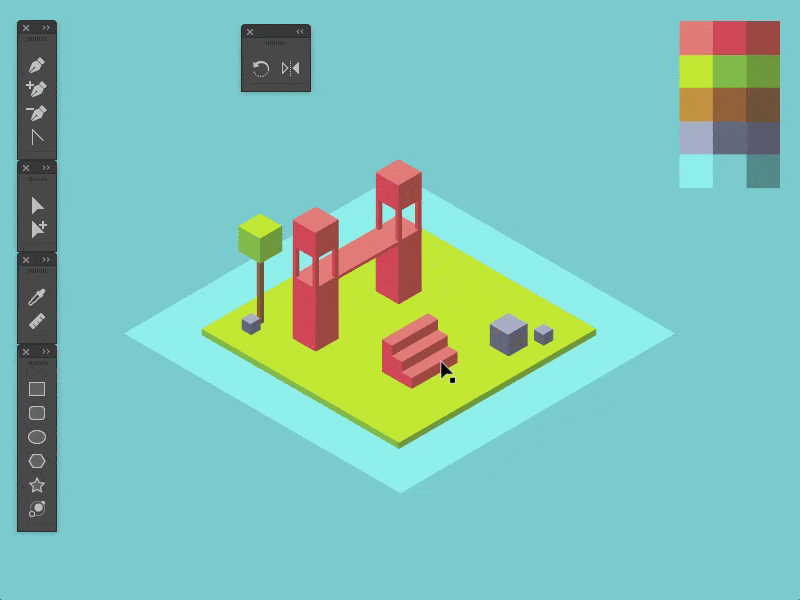
9. Assemble the towers.

Align the tower base and the pink cube.
Leave some space between them, and position three pillars within that gap.
For perfect alignment, make sure you set “Snap to Point” and “Smart Guides” in the “View” menu option.
10. Bridge the towers.

Select the top and right point from a top plane, and snap to points with the equivalent plane in the twin tower.
Simply duplicate and resize a right-side plane to create an edge for the tower bridge.
11. Create stairs.

Copy and paste three faces from a tower; align the edges to create a bloc; and then move the lower points to create a one-stair step.
Duplicate and position the steps several times.
12. Close the stairs.

Align the points from the left sides to close the gaps from the stairs.
13. Flip the stairs.
Select your completed stairs, and use the “Reflect Tool (O)” to create a second block that faces left.
Make sure you change the colors of the left and right faces to respect the lighting effect – darker shade to the right, mid-shade to the left and lighter shade on top.
14. Link the stairs.

Attach some cubes to the stairs to create stepping stones, and link them with the towers.
15. Create a water-depth effect.
Duplicate, and scale down the light blue surface.
Place it in various positions, and add an even darker shade of blue to finish the sea depth effect.
16. Start the deck by using existing planes

Just like with the stairs and tower bridge, start from existing faces, then align points properly to close up the shape, and finish by applying brown wood shades.
17. Add pillars to the deck.

Select the tree bark, then duplicate, scale down and position to create the deck pillars.
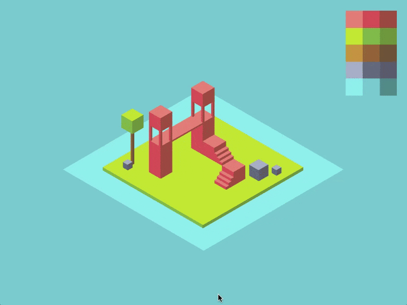
Here’s the final result.

You can add bigger, dark spots on the sea, or smaller, colored isometric squares on the island plane to simulate grass and flowers.
Overall, have fun, move things around, and build some cool towers, using the simple building blocks you just learned.
Applying These Techniques in Modern Design Tools
While these examples use Adobe Illustrator, the same geometric approach works well in interface tools such as Figma. Many UI and product teams prefer to create illustrations in the same environment where they build layouts, prototypes, and design systems.
Simple shape tools, layering controls, and vector editing features in Figma make it possible to recreate many of the techniques shown throughout this guide without switching applications. Reusable components and styles can also help designers keep illustration systems visually consistent across larger projects.
Some designers now use AI-assisted vector tools such as Adobe Firefly to generate rough concepts or composition ideas before refining them manually. The geometric techniques covered in this guide can help transform generated assets into more polished and distinctive illustrations.
Best Practices for Web
Once illustrations move into production, technical decisions can affect load times, rendering quality, and accessibility across devices and browsers. Planning for these considerations can help illustrations remain lightweight and easy to integrate into digital products.
A few practical guidelines can improve how custom illustrations perform on the web:
- Export illustrations as SVG to maintain sharp rendering across different screen sizes and resolutions.
- Test illustrations in both light and dark interfaces, as well as across mobile and desktop layouts, to confirm readability.
- Add descriptive alternative text for illustrations that communicate information or support surrounding content.
- Maintain sufficient contrast between foreground and background elements so important details are distinguishable for a wider range of users.
- Optimize files before export by simplifying vector paths and removing hidden layers to improve file size and browser rendering performance.
In conclusion
As we saw with these three guides, you don’t need much drawing skills to create some good looking illustrations.
All you need to keep in mind are these 3 principles:
- Start with a clear idea or concept in mind - what are you depicting?
- Get inspired with existing artwork and styles - steal like an artist.
- Observe and translate complex elements into basic geometric shapes you can work from - keep it simple.