
Mastering Another Dimension: An Isometric Illustration Tutorial
Isometric illustrations improve user experience and engagement—but they’re time-consuming to create. This tutorial teaches designers an easier, faster way.

Isometric illustrations improve user experience and engagement—but they’re time-consuming to create. This tutorial teaches designers an easier, faster way.

Majo is a digital product designer who has worked with clients such as Fantasy Interactive, Zypsy, and Studio Echt. He specializes in UI design for apps, motion graphics, and illustration.
Expertise
Previous Role
Lead Visual DesignerPreviously At

Featured Experts


Isometric illustrations—two-dimensional figures that appear three-dimensional—add depth and emphasis to app and web graphics, improving user experience and engagement. For example, isometric spot icons, which tend to be larger than interface icons, can be used to emphasize microcopy and calls to action. Other isometric images, such as infographics, diagrams, and product renderings, offer clarity when users need detailed product information or a bird’s-eye view of a process. For instance, a car manufacturer’s website might display an exploded isometric rendering to showcase the precision engineering of its parts, or a real estate company might provide an isometric illustration to highlight important milestones for prospective homebuyers.
Isometric illustrations can be tricky and time-intensive to produce. However, I’ve spent several years creating isometric vector illustrations for clients and have discovered a quicker way to make them. In this isometric illustration tutorial for UI designers, I explain how to use Adobe Illustrator’s 3D Revolve (Classic) effect to create isometric objects in six simple steps.
How to Create an Isometric Illustration in Adobe Illustrator
Adobe Illustrator offers two 3D workflows: the modern 3D and Materials panel, which supports advanced rendering, lighting, and Adobe Substance materials, and the legacy 3D (Classic) effects. When you don’t need the extra lighting and material controls of the modern 3D and Materials tools, Illustrator’s legacy 3D effects are a simple and fast way to build basic vector-style images. In this tutorial, we’ll use the Revolve (Classic) effect to make a simple isometric drawing of a bottle.
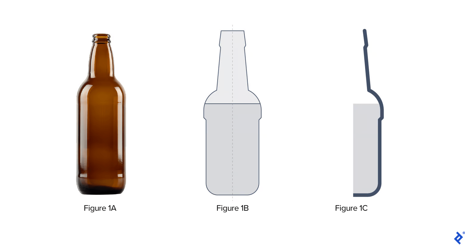
Step 1: Draw the Bottle and Liquid
Create a new Adobe Illustrator document, and add an image reference of a bottle to the document. Draw an outline of the bottle and the liquid inside. Split the bottle and liquid in half. The stroke thickness of the bottle’s contour will define the glass thickness.
Pro tip: Copy and paste the artwork outside the artboard as a backup.
Step 2: Apply the Revolve Effect
As its name suggests, the Revolve effect turns the path in a circular direction around its global y-axis (revolve axis) to create a 3D object. In Adobe Illustrator, the position of the Revolve axis is fixed vertically. (This is why we outlined the bottle and split it in half.)
Pro tip: Don’t use gradients as fill colors for either the bottle outline or the liquid object. You’ll have a chance to add gradients, highlights, and other visual effects at the end of the tutorial.
To find the Revolve effect, go to Effect > 3D and Materials > 3D (Classics) > Revolve (Classic). At the top of the dialog window, you’ll see a field labeled Position. Choose Isometric Left. Under Revolve, tweak the following revolve and surface shading options:
- Angle: This defines the degree of rotation around the object’s axis. If set to 180°, the bottle will be split in half vertically. Set the angle to 360° to create an entire bottle.
- Offset: This controls the offset distance from the object’s vertical axis. Enter 0.
- Surface: This sets the object’s material and lighting properties. Choose No Shading.
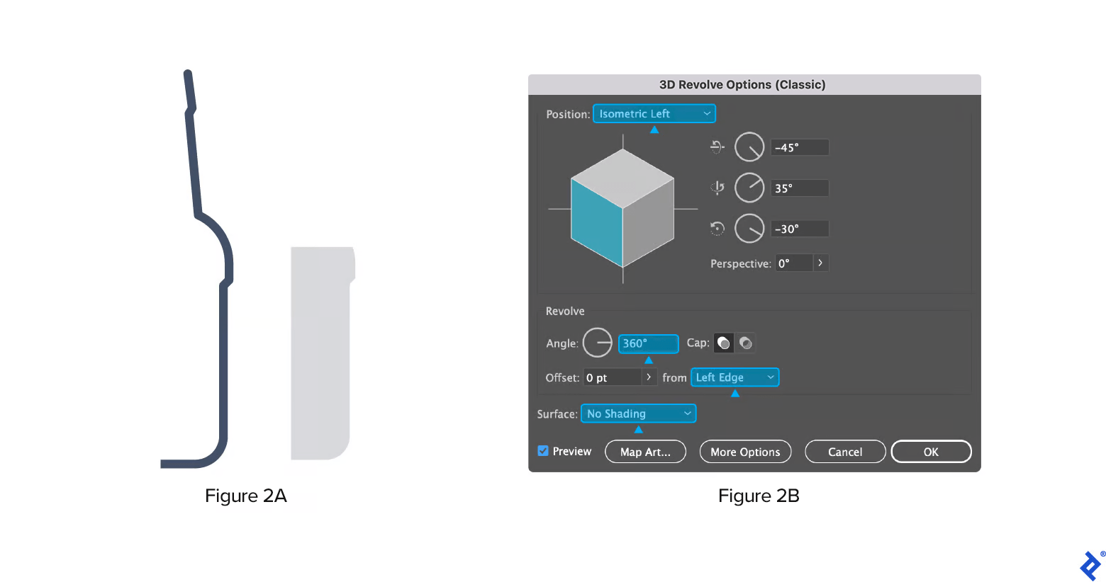
You have created an isometric bottle with liquid. Now it’s time to add labels.
Pro tip: You may be tempted to apply the Expand Appearance effect at this point, but don’t do that until we create the labels.
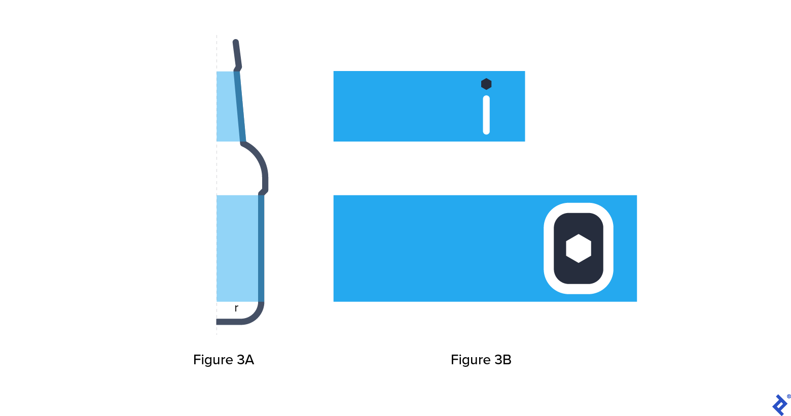
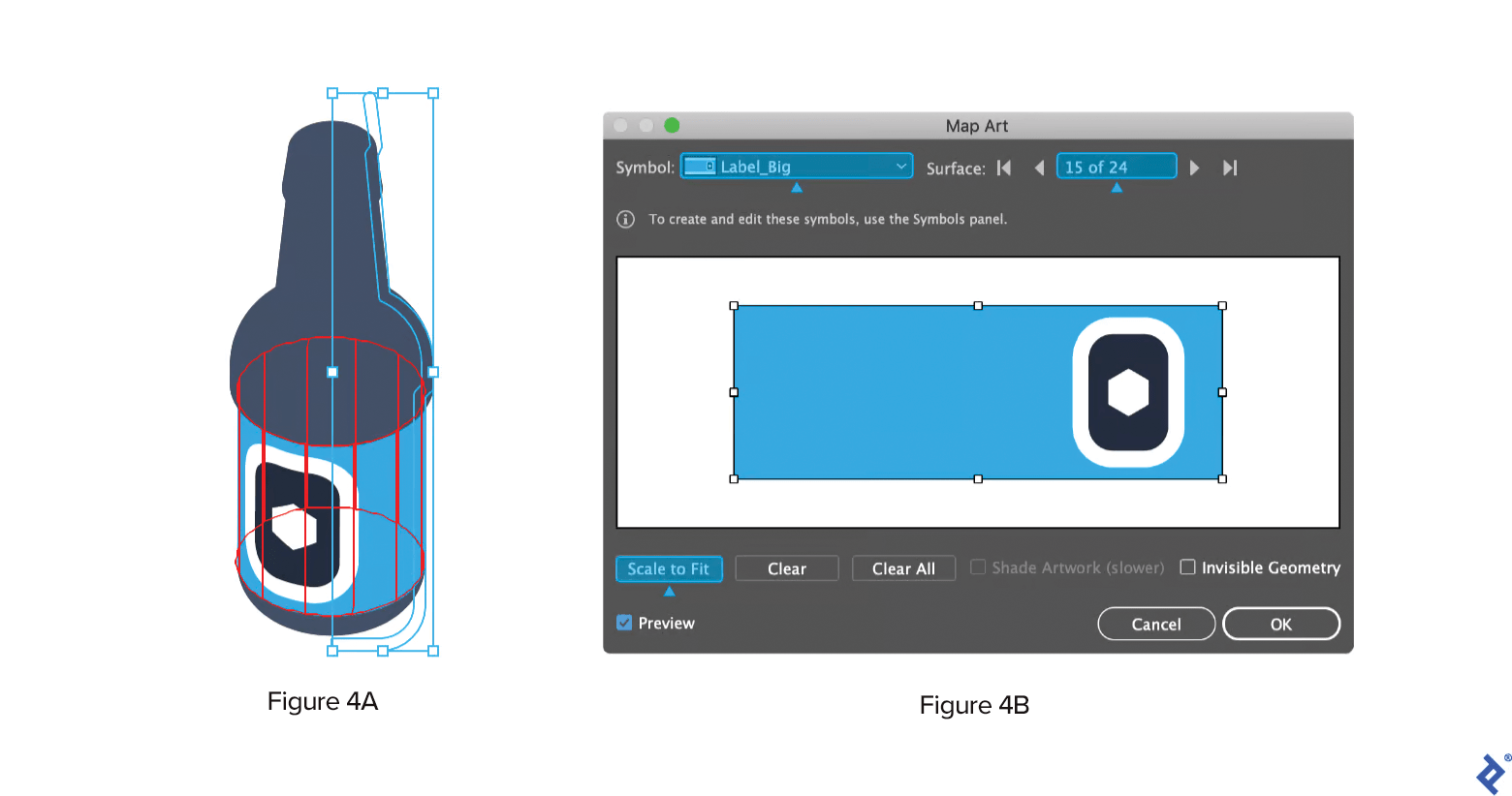
Step 3: Prepare the Bottle Label
Use the bottle to define the label dimensions. In the example image below, the height of the body label is apparent, but the height of the neck label isn’t clear because the surface isn’t parallel to the axis. An approximate height will suffice. The label length is calculated using the circle circumference formula 2πr.
When you’re happy with your label design, convert both labels to symbols. The Symbols panel is found under Window > Symbols. Individually drag and drop the label designs into the panel to create symbols.
Pro tip: Symbols in Adobe Illustrator are reusable master assets, similar to Figma components.
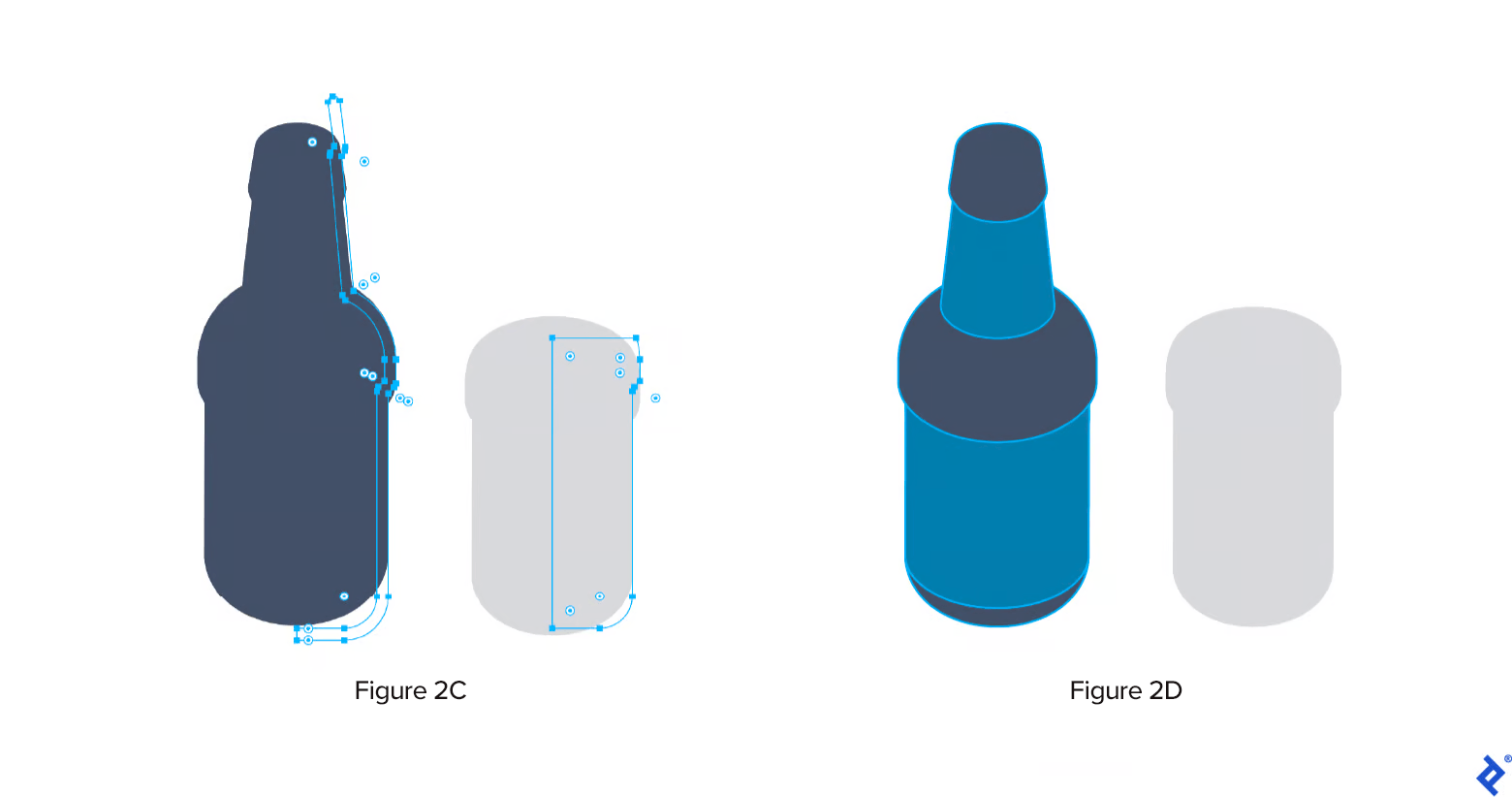
Step 4: Map the Label Onto the Bottle
As long as the bottle hasn’t been vectorized using the Expand Appearance effect, it is fully editable. Select the bottle and then navigate to Window > Appearance > 3D Revolve.
To map the label design to the bottle, click the Map Art option at the bottom left of the 3D Revolve panel. This will allow you to select and adjust the symbol for the bottle. Make sure to match the symbol to the correct surface. Click Scale to Fit, and the label will map to the bottle.
Follow the same steps for the neck label.
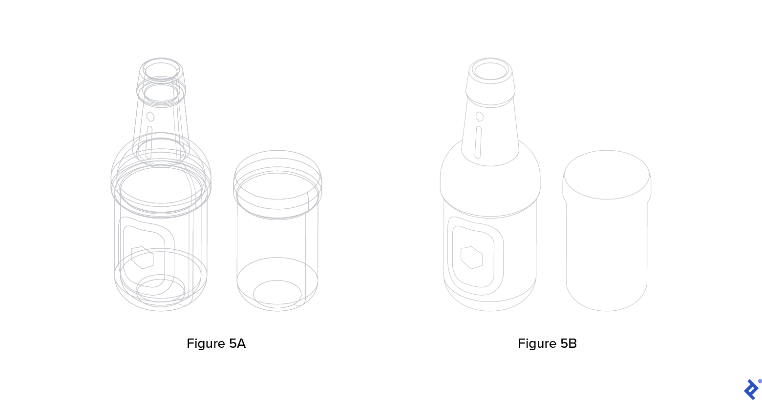
Step 5: Clean Up the File
Now it’s time to apply Bezier curves—used in computer graphics to produce continuous curves which appear smooth at all scales—to your bottle. Select Object > Expand Appearance.
Expanding an object’s appearance creates a grouped collection of minor elements that give the illusion of a 3D object. Combine the elements with either the Pathfinder or Shape Builder tools to keep things tidy.
Joining objects will create unwanted anchor points. Reduce them by selecting Object > Path > Simplify. (For more precise cleanup, you can try VectorScribe’s Smart Remove Brush; but the plugin requires a paid subscription.)
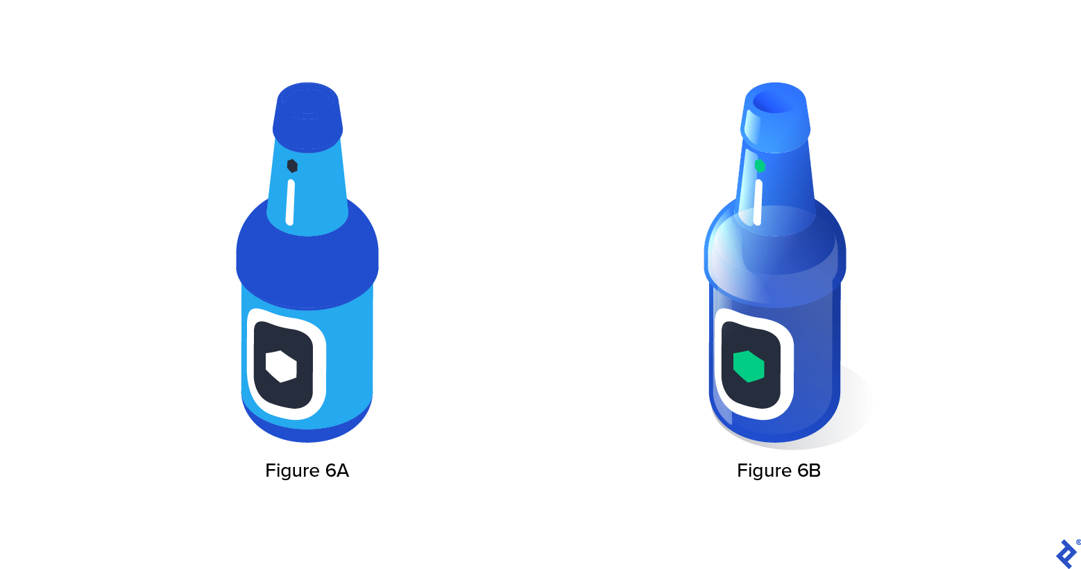
Step 6: Refine Your Illustration With Colors and Gradients
Once you’ve created your isometric illustration, you may want to add colors and gradients to help bring the bottle to life. Add reflections, highlights, and shadows (organized in separate layers) for a realistic look, or use strokes and a simplified color palette for a more graphic vibe. If you’re unsure where to begin, explore different color combinations with Illustrator’s palette generator. With a solid isometric illustration foundation, the design possibilities are endless.
Examples of Isometric Illustrations in UI Design
Now that you have a fast and easy way to create isometric illustrations, take a look at some examples from three Toptal other designers to get your creative juices flowing.
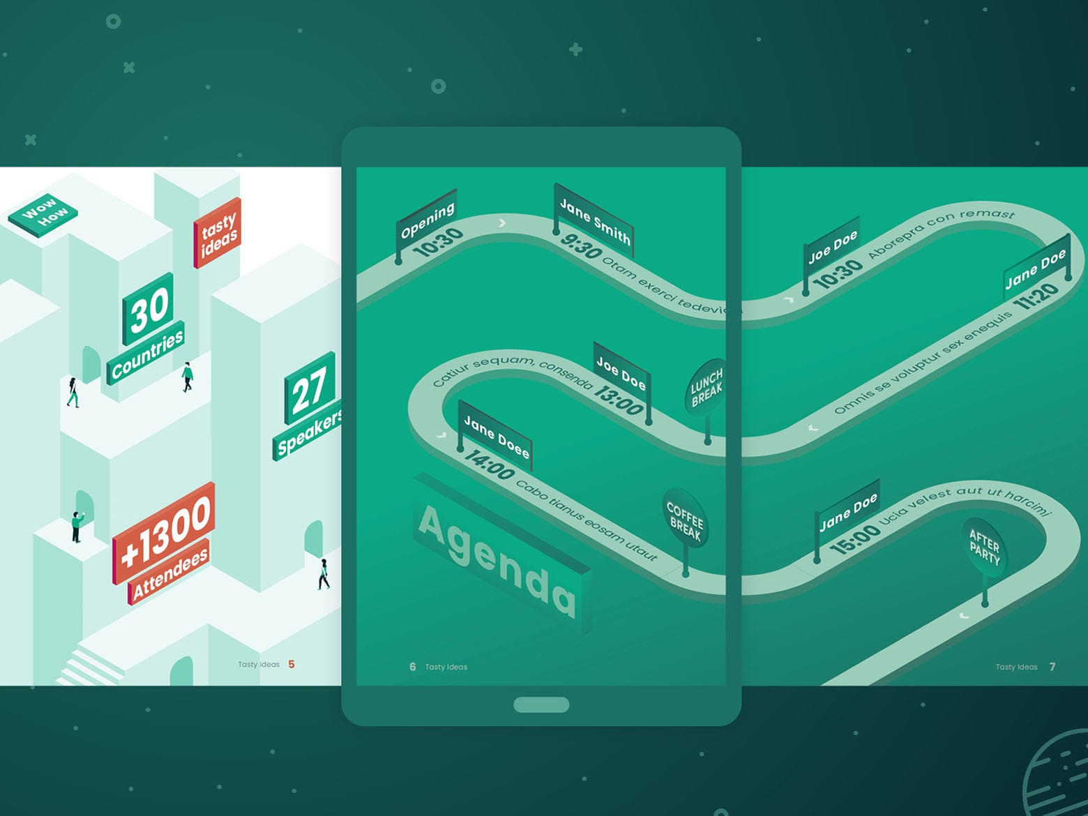
Digital Conference Brochure
Štefan Kováč is a template designer for the Adobe Stock marketplace. This example is a digital conference brochure template he created using simple strokes, shapes, text frames, and monochromatic gradients. To compose these drawings, Štefan used InDesign’s Rotation +/- 30° and Skew +/-30° effects to achieve isometric distortion.
Digital Office Guide
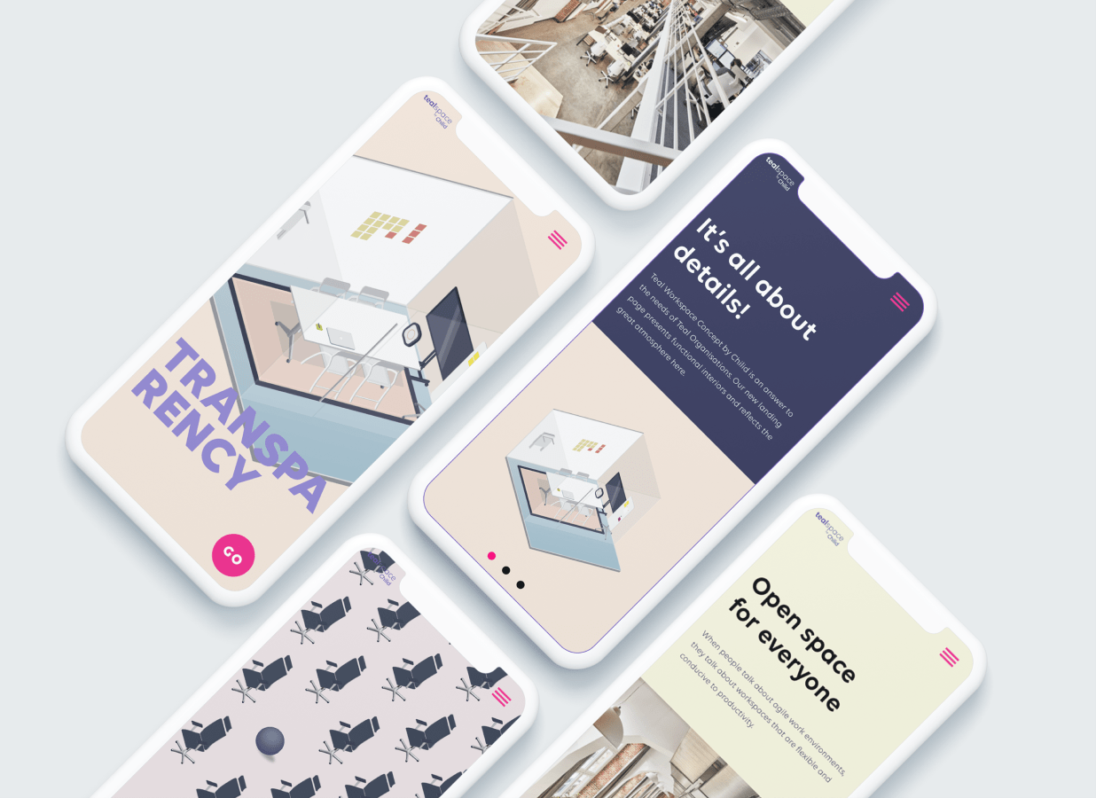
Paulina Jozwik used isometric illustrations to create a digital office-space guide for Teal Space. She chose this technique due to its prevalence in architectural drawings and because she felt that the three-dimensional nature of isometric images would help her renderings stand out on Teal Space’s website, which primarily employs flat design elements.
Instagram Campaign
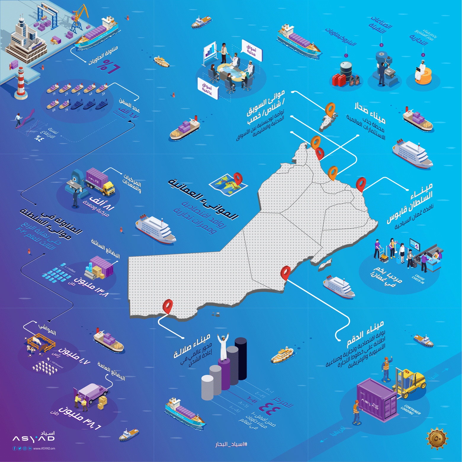
To celebrate the 50th National Day of Oman, Wafa’ Babasail was commissioned to create a unique Instagram campaign for Asyad Group, a logistics company in the Middle East. Wafa’ used isometric illustration techniques and exaggerated scale relationships to design a map showing the company’s widespread impact on Oman’s seaports.
Bring Your UI Designs to Life With Isometric Illustrations
Isometric illustrations help designers bring depth, dimension, and personality to their UI design projects. Traditionally, creating isometric illustrations has been a time-consuming task, but it doesn’t have to be. Whether you’re working on a map, product rendering, or infographic, isometric drawing is a great way to add richness and perspective to web and mobile illustrations.
By following the fast and easy method outlined in this tutorial, you can create stunning isometric artwork in no time.
Further Reading on the Toptal Blog:
Understanding the basics
Isometric images depict 3D objects in 2D space. They are created with a projection drawing technique that eschews vanishing points and uses 30-degree angles and parallel lines to represent an object’s form and edges. Isometric illustrations are very effective in data visualizations, instructions, infographics tutorials, and spot iconography.
Isometric drawing is a technique used to render 3D objects in a flat space. Isometric drawings are a useful way to represent an object’s overall dimensions—and the scale of its various features—without distortion. They are particularly helpful in manufacturing, industrial design, and engineering.
Bratislava, Bratislava Region, Slovakia
Member since January 24, 2020
About the author
Majo is a digital product designer who has worked with clients such as Fantasy Interactive, Zypsy, and Studio Echt. He specializes in UI design for apps, motion graphics, and illustration.
Expertise
Previous Role
Lead Visual DesignerPREVIOUSLY AT