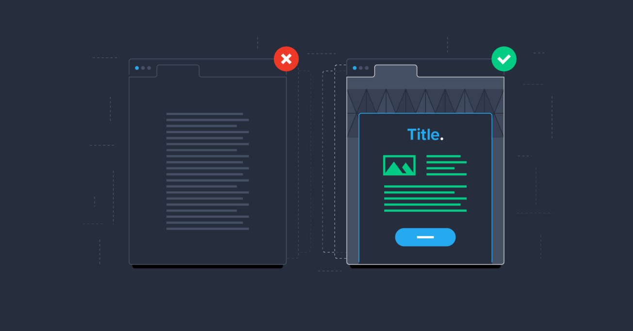
Subject Line: How to Approach Email Design
Email design is an important area of expertise for designers, especially those who want to work with larger brands, creative companies, and others who shy away from ready-made templates.
Email design is an important area of expertise for designers, especially those who want to work with larger brands, creative companies, and others who shy away from ready-made templates.
A significant percentage of consumers—99%—check their email every day. Some demographics, including millennials, prefer email communications from companies over other forms of communication, such as phone calls or texts. And with more than 5 billion email accounts active around the world, email is an essential part of any digital product strategy.
While there are thousands of email template designs available for marketers, email design is an important area of expertise for web designers. This is especially true for those who want to work with larger brands, creative companies, and others who shy away from templates.
There are several things designers should keep in mind when designing emails, from the limitations of most email platforms (with limited support for things like web fonts from one of the biggest—Gmail), as well as what consumers expect when opening an email from a company they might already do business with.
The Importance of Mobile Email Design
With at least half of all emails now being opened and read on mobile devices, it’s irresponsible for designers to ignore mobile-friendly email designs. Especially considering that mobile email conversion rates tend to be significantly higher than desktop rates.
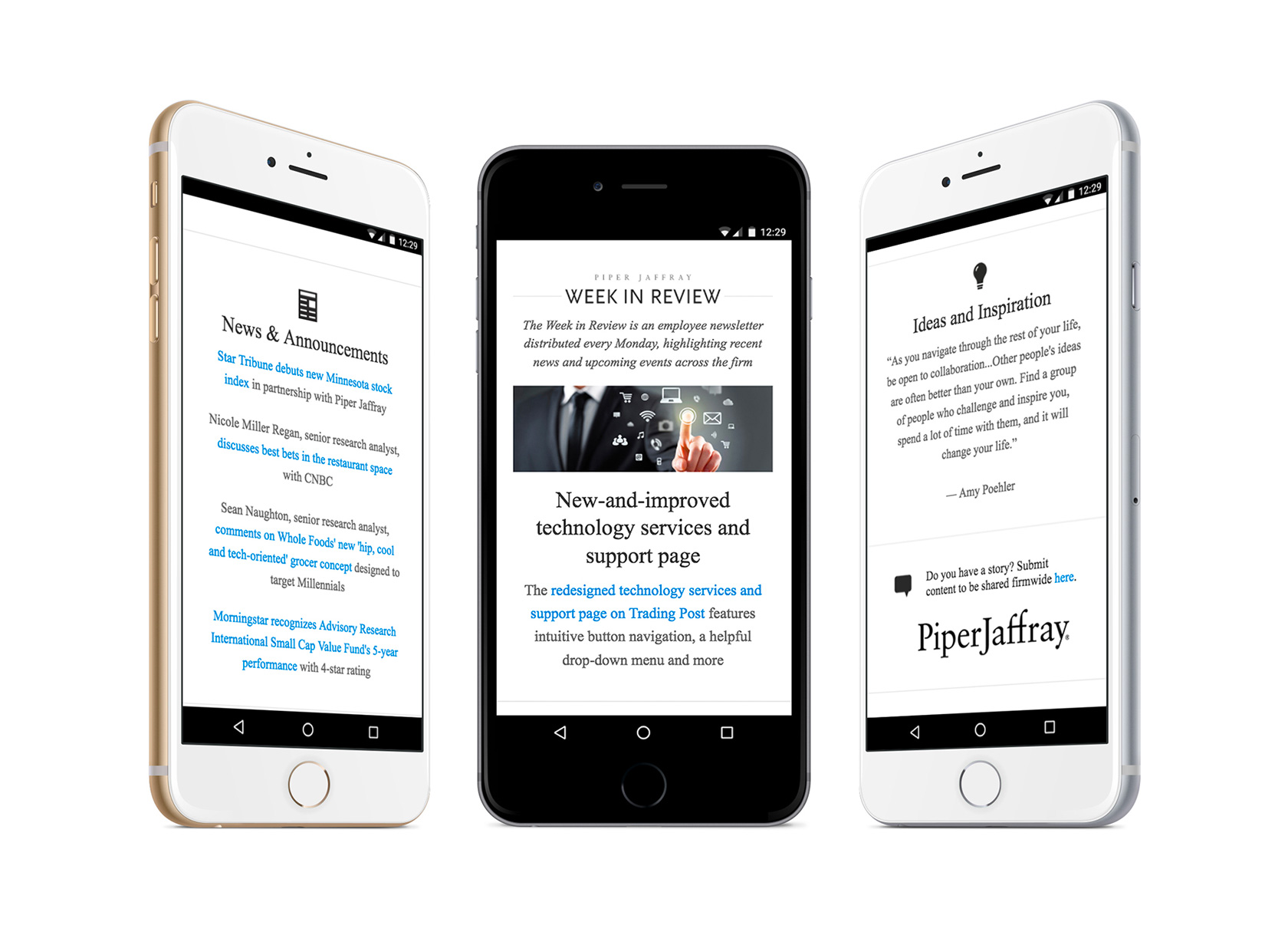
This mobile email design from PiperJaffray keeps things simple and elegant. It’s easy to read on a mobile device, with clean links and subtle branding. It puts the user’s needs first, improving the overall user experience and perception of the company.
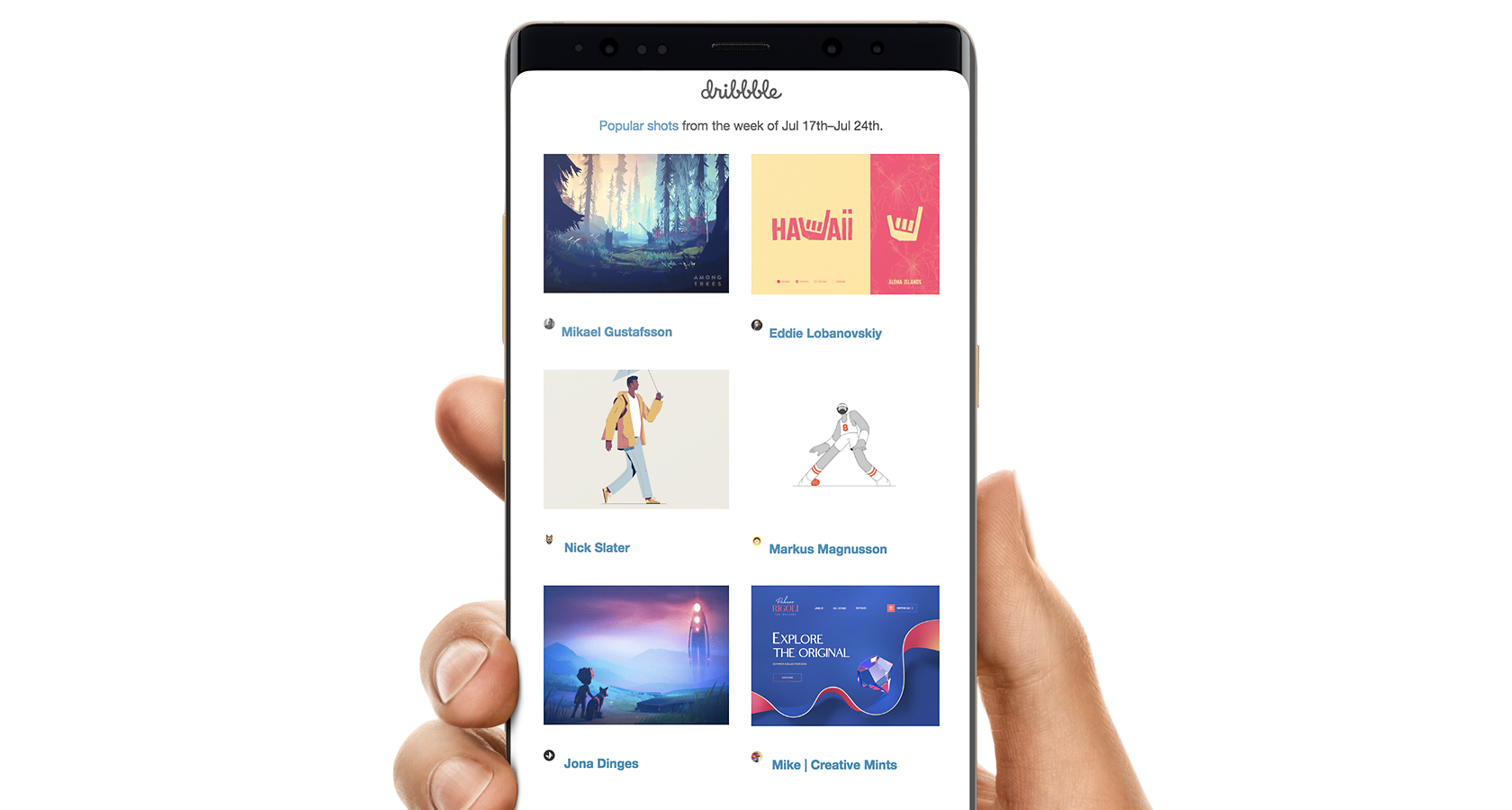
Dribbble keeps their “Popular shots” email to the point, focusing entirely on the content. This focus makes the email easy to navigate on mobile devices. While a simple layout that focuses on content is a good idea for many types of emails, it’s particularly well-suited to mobile emails where it makes it easier to both consume the content and to interact with it.
Focusing on Content
As a best practice, whether designing emails or other digital products, designers should always focus on content. Some email designs take this best practice to the extreme with minimalist design where the content is the design.
When working on most email designs, designers benefit from having the content created first before diving into the design. However, in minimalist designs particularly, it’s even more important to know what the content will be up front.
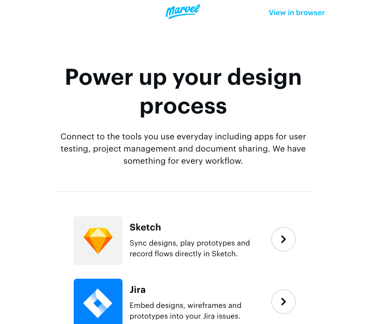
Marvel puts the focus squarely on their content with a minimalist design. The white background and images that only support the text on the page make the content really stand out.
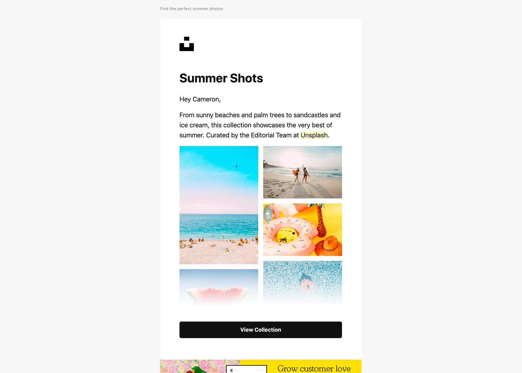
All of Unsplash’s emails focus squarely on the images they’re promoting. The “View Collection” button and fade on the bottom of the images can increase click-throughs to the site, as it leaves people wanting to see more.
Reinforcing Branding
When a visitor arrives on a website, it’s (ideally) an immersive branding experience. Everything is under the control of the website’s designer. But email design is different. The user is viewing the emails within another app, and not all email apps render all emails equally.
Because of this, branding in email designs is vital to creating the right experience for the user reading the email. However, branding often needs to be kept simple to render effectively on various devices and email clients to the highest percentage of users.
A simple logo at the top of the email, using the same header images across multiple images, and keeping as many elements consistent from the brand’s other digital products goes a long way toward supporting and reinforcing the brand’s perception to consumers.

Everlane’s branding is inherently simple across their emails and website. Their logo displayed prominently at the top of this email reinforces that branding.
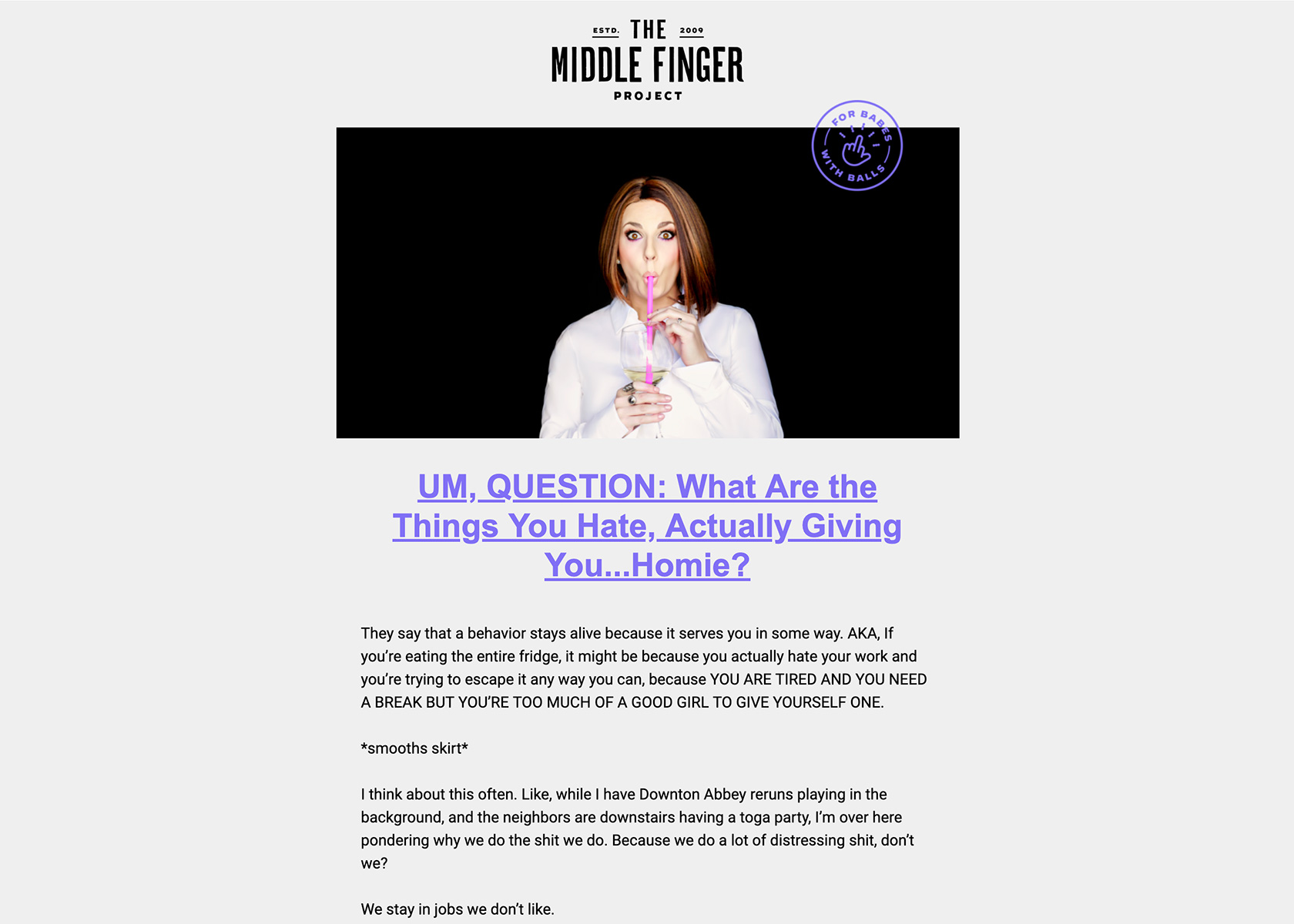
The Middle Finger Project uses a consistent header image across all of their emails, along with the bright purple accent color. This makes their emails immediately recognizable to anyone who subscribes, and the branding is continued on the website.
Drawing Attention with Color
Color has a strong impact on the human mind, with the ability to influence emotions, perceptions, and even behavior. Using color effectively in emails can increase click-through and conversion rates. In some tests, the difference in button color can make more than a 20% difference in conversion rates.
But it’s not just calls to action that benefit from using color. Creating a colorful email can be a departure from what’s expected and create an entirely different look and feel from other emails in a person’s inbox.
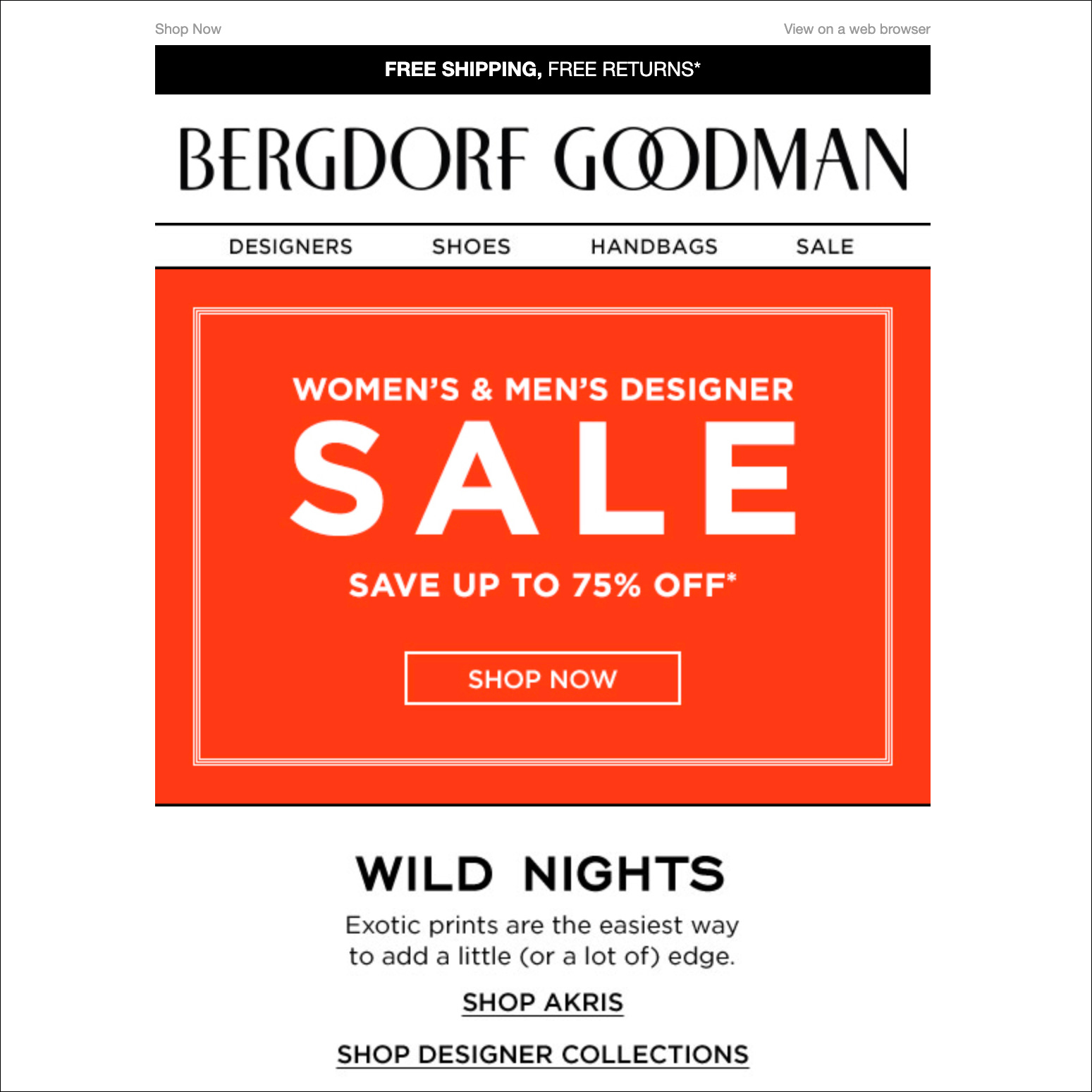
Drawing attention to a sale banner with bright red is reminiscent of real-life sale signs, which are often also done in the same color. The reader’s eye is immediately drawn to red.
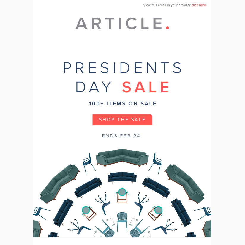
Article, a Scandinavian furniture eCommerce site, employs a muted red and green color scheme, with the red bringing attention to the most important part—the sale call-to-action button.

While some email designs use color as a way to draw attention to a particular part of the content, this email from the Houston Zoo uses bright colors to create a fun and energetic design. The bright orange and hot pink color scheme is immediately eye-catching and draws the reader in.
Using Stunning Images
Humans are visual creatures and stunning images can elevate an email and grab the reader’s attention. Images can also reinforce the email’s message and the company’s brand.
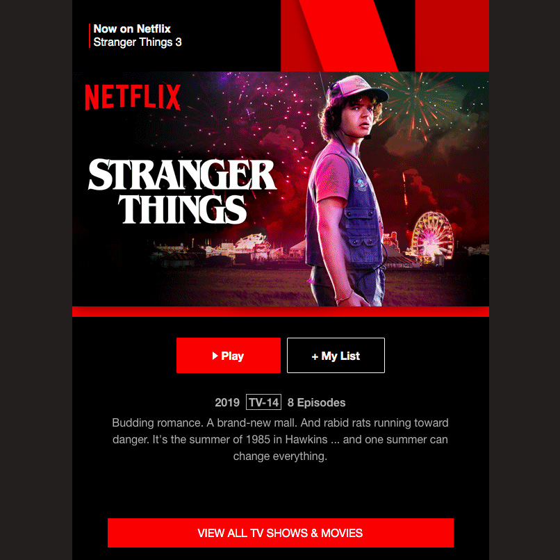
TV shows seem to have an edge in the “stunning images” category, with this Netflix email using a vibrant yet mysterious still from Stranger Things. Combining the eye-catching image with the “Play” call to action immediately below it makes sense from a UX perspective, as it makes it simple for readers to immediately watch the promoted show.
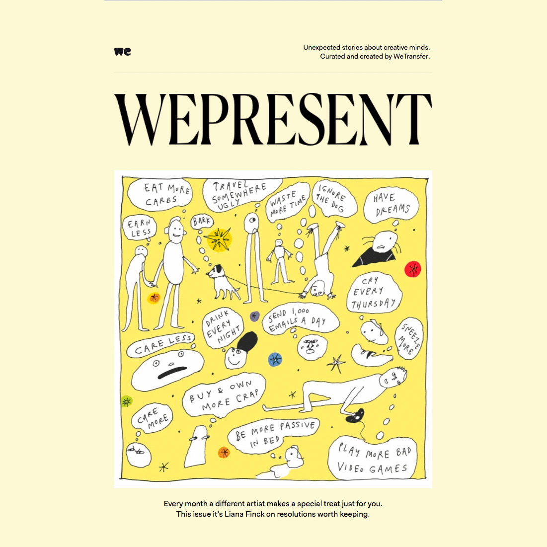
Stunning images aren’t restricted just to photos. A cartoon or illustration like those that WePresent uses in their emails is just as eye-catching as a photo, and can help draw readers into the content.

This Deadliest Catch email, promoting the Discovery Channel documentary series, displays a stunning header image that melds into the content below it. This is a useful technique that encourages the viewer to keep reading.
Experimenting with Unconventional Layouts
Many email designs have a pretty standard format: header at the top, single column content, with calls to action near the top and bottom. But there’s no rule that says designers have to follow that particular pattern.
Unconventional layouts are a great way to grab the reader’s attention and make them want to read the content. There are a variety of ways to create unusual designs. One popular method is to use images to create email layouts that wouldn’t necessarily be compatible with many email platforms.
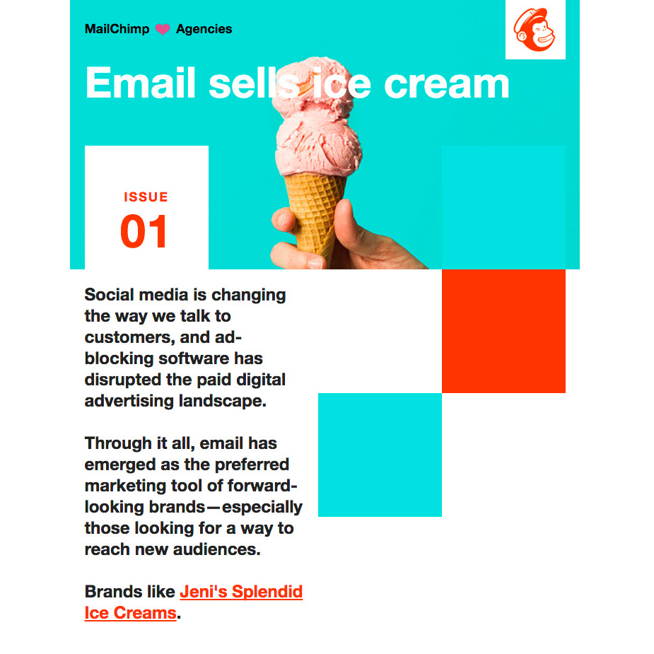
Unconventional layouts don’t necessarily need to be off the wall. This one, from Mailchimp, uses a two-column design with one column taken up by color blocks. What makes it memorable is that it’s visually appealing and unexpected.
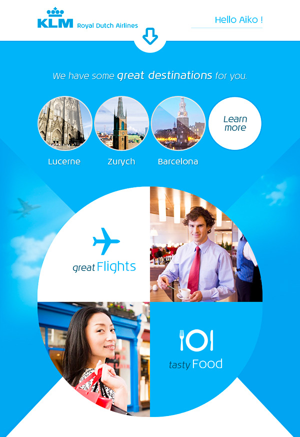
Using images allows for more unexpected email layouts like this one for KLM. Designers just need to keep in mind that some email clients will still block images from automatically loading, making it necessary to have fallback text that still gets the gist of the message across.
Working with Fonts
Most popular email clients support web fonts, but unfortunately, not all do—Gmail being the most notable exception (though Gmail does support Roboto and Google Sans as part of the Gmail interface). However, designers can still make use of web fonts as long as they keep in mind that a large number of email clients will use fallback fonts.
The alternative to using web fonts, of course, is to use images that include the fonts. That’s what many email designers opt to do, especially in headers where fallback fonts would likely look out of place.
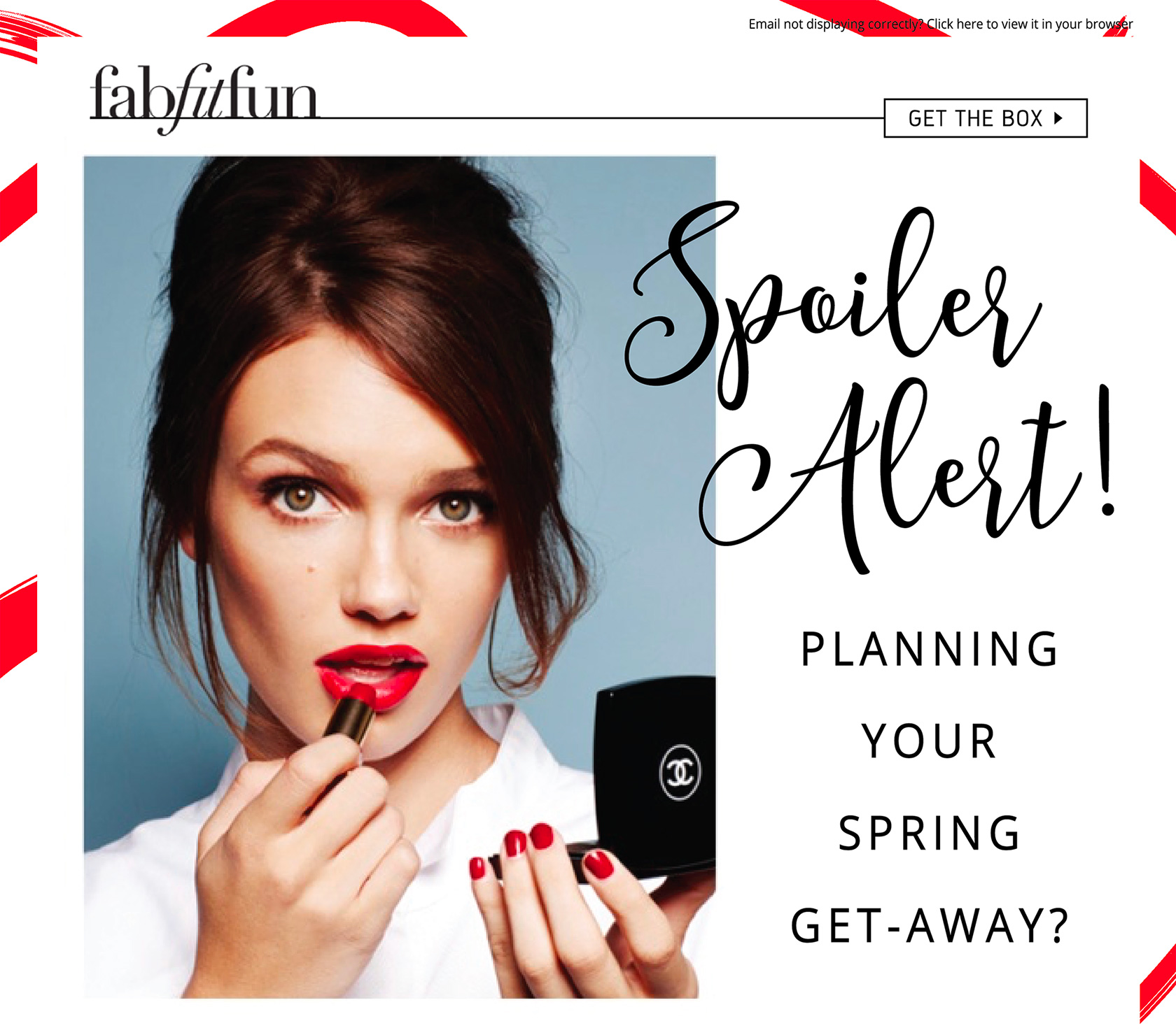
This FabFitFun newsletter uses a fun script font to draw attention to the content, while pairing it with a highly legible sans serif typeface. Experimenting with font combinations in email designs is a great idea, and can even be used as a trial run before changing typefaces on a website or using them in other branded materials.

Sickbubble uses a variety of fonts in their email design, which can be tricky. But in this case, because they set apart each section, it works. The display font in the header has a very edgy feel, while the main body text is an easy-to-read sans serif. The handwritten fonts in the product promo section works since it’s offset from the body of the email.
Having Fun with Animations
Animations add extra visual interest to emails, and immediately draw the reader’s eye. Animated GIFs are a popular choice for adding movement to emails and are supported by most email clients.
Designers should be sure to keep file sizes in mind when embedding any animations, since so many people read emails on mobile devices. They should also ensure that the animations support the content and aren’t just filler.

Using animated GIFs to drive a point home or better illustrate the content presented in a fun way is a fantastic addition to an email design, as in this email example from Product Hunt.

The Hustle uses an animated GIF in their emails to both illustrate the point of the message and to add visual interest to an otherwise minimalist email design.
Calls to Action
The call to action is arguably the most important part of almost any email a company sends. Most emails are sent to prompt action, whether that action is reading an article, buying a product, or performing some other behavior.
Designers are well-served to pay close attention to the design of their calls to action, as well as to perform A/B testing on them to ensure they’re optimized for performance.

Using a bright color for the call to action, as Litmus has done here, makes it stand out from the rest of the content. Designers should consider experimenting with different colors to see which ones work best for their audience by employing A/B tests when sending out email campaigns.
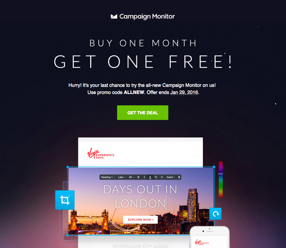
Using a color that’s entirely different from the rest of the content of an email for the call to action makes it stand out. Because the lime green in Campaign Monitor’s email is a split complementary color to the purple that makes up the background, it stands out without clashing.
Pay Heed to Email Design Best Practices
While there’s plenty of room for creativity and experimentation in email design, designers also need to keep in mind the best practices and limitations of the medium.
One of the most important steps in email design is to test emails in a variety of email platforms before sending them. While there are likely to be small variations between them, and there are always people who will use less common platforms that render designs differently, it’s smart to make sure emails will show up acceptably for most users.
There are several email testing services designers can use to see how their emails will look across a variety of email platforms. Litmus is one of the most popular, but other options like Mailgun, Email on Acid, Mailtrap, and Preview My Email are also worth checking out to see which one best meets the needs of each project.
Beyond that, keeping in mind image sizes and bandwidth usage is essential due to the number of emails opened on mobile devices. Responsive designs are virtually a necessity for the same reason.
The best email designs will be easy for people to read on any device and—most importantly—will prompt them to click on the call to action in the email (or otherwise perform whatever action is requested). Following these email design best practices gives web designers an edge in creating emails that do this effectively.
Further Reading on the Toptal Blog:
Understanding the basics
What is the best width for an email?
People read emails on a variety of devices, so the best option is to create a responsive email design that will adapt to each screen. But it’s smart to have a maximum width (the average width of a computer screen is 1366px, and most email apps have sidebars taking up some space, so 1024px is a good choice).
How do you design an email?
Designing an email isn’t very different from designing a web page. It’s made up of HTML and CSS, and most web design best practices are similar to email design best practices, with a few additional things to consider, such as the number of emails opened on mobile devices (at least half) and simplified designs.
What size should images be for email?
The biggest thing to consider when adding images to email designs is file size, rather than actual pixel size. Since over half of emails are opened on mobile devices, keeping file sizes small to allow for faster loading is a key component of email usability.
What is an email designer?
An email designer is similar to a web designer, except instead of websites, they design emails and email templates. “Email designer” might also refer to an app for designing emails, often used by non-designers.
How do I make an email template?
Creating an email template design is similar to creating a web page template. Designers often start with a wireframe or mockup, create the HTML and CSS code for the template, and then import it into their email marketing platform of choice. From there, the template can be used for multiple future emails.
