
Why Startups Need a Styleguide
The top five reasons why creating a styleguide early is especially important for startups in spite of the inherent challenges.
The top five reasons why creating a styleguide early is especially important for startups in spite of the inherent challenges.

Benoît creates digital apps. He helps startups create unified design systems and acquire new users through new product designs.
Previously At

Even for a seasoned designer, creating a new styleguide for a given product is hard—there are a lot of possible design directions, and the process can quickly become overwhelming. Startup life is hectic, fast, and filled with clichés such as “perfect is the enemy of done,” “move fast and break things,” or “launch it now, fix it later.”
Coming up with a styleguide under such slogans and fluctuating priorities is challenging, but a must if a product’s design is to succeed in the long run.

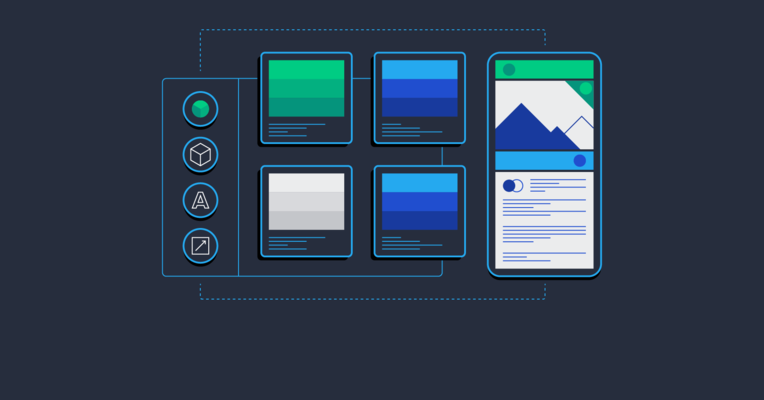
In recent years, we’ve heard a lot about design systems, styleguides, pattern libraries, and atomic design. While these tools are very useful, using them can seem like overkill when you only want to create a few screens for an MVP or to demo an app. However, having a styleguide will not only improve your design process in general, but will make your app more solid and consistent.
Let’s first talk about the main benefits of a styleguide, and then touch upon the challenging startup environment. Finally, we’ll discuss how a styleguide is always evolving as a living document.
Top Five Reasons Why a Styleguide Is a Good Idea
1. A Styleguide Makes Designs Concrete and Branding Clear
As a lone designer at a startup—which is often the case—there aren’t many opportunities to review and challenge design decisions made by others on the team. Although everyone might be working in collaboration, designs are not necessarily shared with others. This means there is only one person validating final designs.
A styleguide will provide a startup with guidance and documentation for reference. It will challenge some of the design choices made by the designer or the team because they’ll have to be validated in the global context of the app. Designing a UI component because it works well on one screen will not cut it. A well thought-out design should solve a single design problem in one situation, as well as a pervasive problem that is found on other screens of your app.

A styleguide makes the overall design style, brand guidelines, specifications, and rules available to everyone at your company. It’s only a click away. They can go to a URL to easily access an online styleguide or download a PDF. Design becomes everyone’s job—it is no longer the sole responsibility of the design team. It’s a prudent approach that will improve your product’s user interface.

2. A Styleguide Makes Your Design More Consistent
It provides a dictionary of sorts for your UI design language. You can use the same terminology when you want to communicate something you’ve already expressed. Imagine if we had slightly different words to express the same thing:
- “It’s raining; I need my umbrella.”
- “It’s raining, I need my umbrellol”
- “It’s raining, I need my umbrellala”
It may make a language poetic, but hard to understand. Fundamentally, it’s the same idea with the UI of a site or an app. For ease of use, you should only invent a new “word” when you’re really creating something new. This way, you’re bound by a strict rule that says, “Only components which solve a design problem repeatedly throughout the product are allowed into the product and subsequently the styleguide.”
Consistency makes your product more user-friendly; a highly usable product can translate into more engagement and sales.

3. Reusing the Same System Components Makes Your App Easier to Use
As in the language example, consistency is key. Once each component is understood by the user, when used again in a different context, people will already be familiar with its behavior. When it comes to user interactions, this consistency improves the overall usability of the product.

Working with a component-based design system saves money and also makes a product easier to update. If there’s a usability issue with a component in a certain situation, it can be fixed once and all the other potential issues with that component will also be updated.
4. A Styleguide Makes Your App Faster to Develop in the Long Run
When your team is developing a common component for a screen, they’re developing a solution that they will also be using elsewhere. This saves development time—a lot of it. When your company scales, this could mean saving as much as 10x the man hours required to build a new screen.
5. A Styleguide Facilitates Production Efficiencies and Innovation
Creating a styleguide makes designs more accessible and readily available to the rest of the company. Developers and designers can prototype an idea faster and more easily. Bootstrap is often praised for making it easy for developers to create a working prototype—your styleguide serves the same purpose. It provides a reference foundation for a new UI that will be built by developers, without the design team having to create the screen first (even though the design team should QA the final screens).

The Challenges of a Startup, a Styleguide in Flux
Creating a design system in a startup environment is not as linear as it might be at a more mature company where they’re used to a more streamlined process. At a more traditional company, the design team performs UX research, ideation, and experimentation, and then comes up with the final brand styleguide. This process does not suit all companies. Startups work in an environment where their vision and the requirements for the product are always in flux. They work with MVPs (minimum viable products), incomplete versions of their apps that are used to test their idea and show its potential to users.
When it comes to creating a styleguide, this can become an issue.
In an environment that’s always evolving, a designer is usually struggling to create a styleguide that’s supposed to be somewhat ‘fixed.’ A designer might not have the time to thoroughly think through all of the components being created, even though they might still end up in the next release of the app. Facebook famously swapped their hamburger menu for a tab navigation when they matured a bit. Do you think whoever put the hamburger menu there in the first place also added it to Facebook styleguide?
You might even consider that it’s not yet time to create a styleguide. You may realize that in the long term you’re going to need one, but right now it’s more important to crank out screens for the app’s usability testing. What’s more, you’ll also need some marketing pages to promote your app. Suddenly, your design needs to ramp up, and as you’re creating screens, you begin to see the value of having a styleguide that can keep your designs and the company brand consistent.
The problem is that you don’t know exactly when it’s the right time to trade flexibility for stability. You have to decide when you should start the styleguide and when you should just focus on creating screens. An optimal approach may be to produce a styleguide at the same time you’re delivering screens—this way you may be able to have the best of both worlds.
Start with Some UI Inspiration
A good way to start, especially if you’re not a designer, is to collect examples of design styles you like, or more importantly, what you think users will respond to. Collect as many examples as possible, and put them in a folder/InVision board/Niice board/etc. They can be used as reference and inspiration along with your design sensibility. You can build on them later to create a pattern library.
For instance, when I was working on a styleguide for a company promoting artists in the entertainment industry, we wondered whether light or dark backgrounds would have a greater impact on our users. I looked at hundreds of different websites in games/movies/visual production to see how they used dark and light backgrounds.

I made a reference sheet where I highlighted the most common patterns. One pattern I identified was that companies in that industry tended to use darker backgrounds when presenting their products, but used white backgrounds in their marketing efforts, eCommerce, and shops.
You don’t have to go as deep as that, but I found having visual references helps, not only in creating a styleguide, but also in remembering some of the use cases you might need to design for. Once you feel good about the references you collected, you can start working on the visual design.

Design Solid UI Components
While working at startups, it’s harder to create components than it is to create pages—at least at the beginning. When you design a page, you often have an idea of how it’s going to be used. That’s not necessarily the case when you design a component. You’re trying to design for a specific use case, but you want it to be part of a universal design system, and you need to approach it that way. For instance, you may want to create a sub-navigation component with three buttons. You may also need it to work with four, five, or ten buttons, and it will need to work on mobile, tablet and desktop. You need to think ahead.

You want a certain level of persistence or staying power in a component. Common components shouldn’t change often, and they must be reusable in many places throughout your product. For example, if you’re only interested in an iOS app, then you want to test your component based on the number of options or the length of the content, not necessarily the screen size. The idea is that if it’s viable in the UI in many places in your app, then you know it’s a component that has the potential to be part of your styleguide.

A startup needs to start from practically nothing and then move quickly. Your boss might want a screen designed by the end of the day. That means you can’t really develop an entire styleguide and then come up with the screen. Even worse, you might be designing a styleguide with components that will never see the light of day because the vision of the company has changed. Like they say, it’s better to ship now.

Creating a great styleguide takes time, and because it will become the foundation of your design system, you want to get it right. In a startup environment, you need to work on your styleguide with everything in tandem.
The Styleguide as a Living Document
You should think about your styleguide as a work in progress. Like a startup figuring out its strategy, you’re going to figure out your styleguide as you go along. You’ll edit it and adjust it over time until it becomes the foundation of your UI. One useful approach is to start the first mockup at the same time you start your styleguide. Open two files with your favorite software (in my case, Sketch); one called page name and the other one styleguide. As you’re working on your screen design, you can start seeding your styleguide with the elements that make up your design.

As you start doing more of these, you’ll notice early on that some components are prime candidates for inclusion in the styleguide. For instance, if you’ve settled on an icon style, then all of your icons can go into the styleguide right from the start.
I usually create a section called ‘icons done so far.’ If at one point someone needs an icon, they first have to check through this section before creating a new one.

Other obvious items to consider are colors, buttons, selectors, titles, headers, body text, etc. If you’re using a style especially for marketing, you can consider putting it in your styleguide and labeling it appropriately. It’s okay if you’re not completely settled on a particular item. You can refine the UI elements in your design system later when the opportunity arises, and update the guide appropriately. Don’t forget, the styleguide is a living document, especially at a startup.

Eventually, when I start putting layouts in the guide, I know that I’m beginning to reach a point where all components should be close to their final state. This part marks the tipping point in the styleguide creation process—now you can celebrate! A good way to celebrate such a milestone is to create a logo or icon (consider naming it) for the 1.0 version of the styleguide.
Some people go as far as printing the logo/icon as a sticker so the team has a sort of trophy. That’s also the point where I usually go back to the more traditional way of working with the guide by opening that styleguide first, and then creating a new file for whatever interface needs to be done.
Conclusion
As a designer, by creating a styleguide as early as possible, you’re making sure that your startup adheres to a higher standard of quality. It may be challenging, but it’s well worth the effort. A solid, well-rounded styleguide is not only going to help you have a better product, it will also help you reduce the cost of development.
There is a way to make it happen even in a fast-paced environment where quick decisions are made and sometimes designs need to change rapidly. Hopefully, the process described above will help designers at any startup cope with the challenges of complexity and speed while also creating a sturdy styleguide for the benefit of the product.
Further Reading on the Toptal Blog:
Benoît Chabert
Miami, FL, United States
Member since February 16, 2016
About the author
Benoît creates digital apps. He helps startups create unified design systems and acquire new users through new product designs.
PREVIOUSLY AT