
How to Create a Sketch Style Guide, Library, and UI Kit
Sketch is a valuable, time-saving resource for any designer’s toolbox. Though not every designer chooses to do so, creating style guides in Sketch can make it even more of a time-saver.

Sketch is a valuable, time-saving resource for any designer’s toolbox. Though not every designer chooses to do so, creating style guides in Sketch can make it even more of a time-saver.

Yvette has experience in print, web, branding, and UX design. She has a minimal, clean aesthetic while pushing creative boundaries.
Previously At

Every design project can benefit from a well-thought-out style guide. Use this tutorial to build out a UI kit and simultaneously create a custom (and reusable) library for rapid prototyping.
Whether a Sketch expert or new to Sketch, designers will find that creating style guides in Sketch can be a valuable resource for their design toolbox that can save a lot of time.
A style guide not only helps keep things consistent but also allows updates to elements like colors and icons across multiple documents with a lot less hassle. This tutorial walks through the step-by-step process of creating a style guide and UI kit and will give designers a better understanding of Sketch symbols, referencing a Sketch library for their designs, and confidence in the organization of their design assets.
Creating Your Sketch Style Guide
“A style guide is a comprehensive ‘living document’ that keeps track of all the repeating elements for a project, from branding rules down to the amount of beveling for call-to-action buttons,” according to UXPin. A style guide can include anything from simple visual elements to vocabulary and approved imagery. This tutorial covers organization, colors, icons, fonts, text styles, and assets.
Step One: Organization
- Create a master folder to hold sketch files, plugins, and other necessary assets like fonts and iconography. (Plugins will be discussed at the end of the tutorial.)
- Start a new Sketch file and name it “Clientname Library.” For example, if your client is Toptal then your file should be named “Toptal Library.”

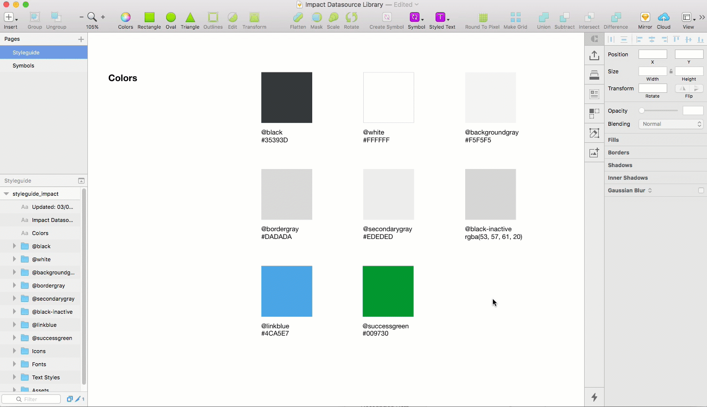
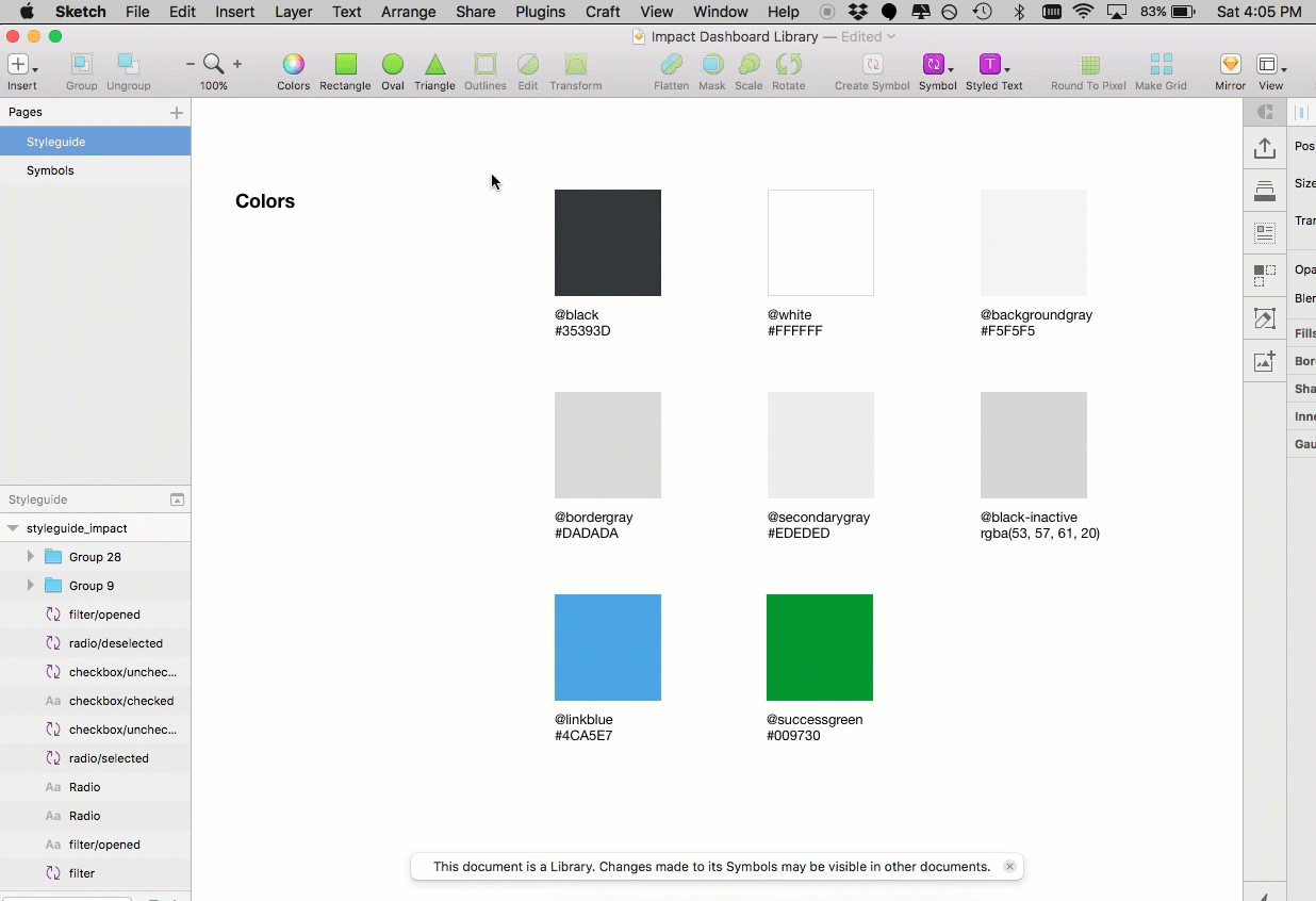
Step Two: Colors
If colors have been already selected, the next step is to convert your colors into symbols.
- To do this, make squares of the same size and change their colors accordingly. Click “Create Symbol” and save these elements using the color/@color-name labeling system. Color/@pink, color/@background-gray, or color/@FFFFF are examples of proper labels. Naming conventions are important in keeping a style guide organized, so a format for everything should be established and adhered to from the start.
- Once complete, add them to the style guide page.
- Save the color swatch in the documents section of your color palette.
Helpful shortcuts: R - rectangle tool, T - text tool, alt - measure distance.

Step Three: Icons
Turning icons into dynamic symbols allows their color to be easily changed to any of the colors saved in Step Two above. This means that after an icon is placed into a design, the color can be changed through a simple dropdown menu, called an ‘override,’ using the ‘Inspector’ to the right of the canvas.
- Save the icon as a symbol (stick to .svg for the asset type if possible).
- Go into the symbol page, find the icon, and mask it with a default color from the colors previously saved. To do this, overlay the color symbol on top of the icon and click “Mask” in the toolbar (or right-click and select “Mask” from the pop-up menu).
- After the icon is masked, remove the fill by unchecking the checkbox under the “Fills” section in the Inspector.
- Organize the icons in the style guide page. In the same section, it’s helpful to specify the color for active and inactive icons, plus any other important color specifications.


Step Four: Text Styles
Once fonts have been chosen, it’s time to specify text styles: H1, H2, H3, H4, H5, body, links, captions, labels, etc. A good reference for web typography is this blog post by Typecast.
- Choose the size, weight, character, and line spacing for as many styles as necessary.
- Write out a word (“Type Something” automatically appears when you press T, the text tool) and format it to reflect the style details chosen.
- Click “Create new Text Style.”
- Organize the text styles in the style guide page.


Step Five: Assets
Now for the fun part. It’s time to combine all the previous steps to create some assets. If assets have already been created, for consistency, it’s best to recreate them using the text styles, icons, and colors you have already chosen. For example, there could be many different colors of gray within the working design document that a design hasn’t accounted for, so recreating the asset will guarantee the consistency of the chosen color. Don’t forget to keep naming consistent, and be sure to add assets into the style guide page as they are created.
Here are some suggested assets to work on:
Buttons
- Make these dynamic symbols, just like the icons, by masking the button in the default color and removing the fill.
- To keep the text centered at all times, span the width of the text box to be the same as the button and center the text.
- To ensure consistency, be sure to use the saved text styles.
- Save these elements as symbols using the button/button-name naming system.
- Use the override feature to change labels and colors.
Search Bars
- Apply resizing constraints to the search field, and icons and text used within the field itself.
- Don’t forget about applying text styles and colors previously saved in your document color palette.
- Save this element as a symbol using search as the title, or if you have different types of search, adhere to the labeling system such as search/standard and search/no-icon.
Radio Buttons and Checkboxes
- It’s possible to have a symbol within a symbol, and a good way to test it out is to create intelligent radio button and checkbox assets.
- First, make the button asset itself. Save this element as a symbol using the checkbox/selected and checkbox/deselected as an example labeling.
- Now create the input. Add placeholder text next to the checkbox symbol and then convert the entire asset to a symbol. Since this is now an input, it is suggested saving the asset as such, so a good label would be input/checkbox/selected and input/checkbox/deselected.
Step Six: Use the Style Guide!
Doing all of this work to create a style guide is only useful if it actually makes a project run more smoothly. Once all the assets have been created, it’s time to apply the library to the document being designed. In Sketch, go to “Preferences ‐> Add Library…” and add the library document.

Once you’ve added a library to your project design file, you can access the library and its symbols in the symbols section. You’ll notice the iOS UI Design library that comes with Sketch as a library option, as well as the library that was recently imported.
If you want to update a symbol, double-click on the symbol itself and your library document should appear. Once you’ve made the changes, go back to the design document and click the update button in the top right corner.


Bonus: Importing/Exporting Text Styles
Text styles don’t get saved with a library, but the Shared Text Styles plugin for Sketch solves that. Once you’ve downloaded the plugin, go to the library document and then to the menu: “Plugins ‐> Shared Text Styles ‐> Export…” Save this file in the same folder as your library document. Then, in your design document go to the menu again: “Plugins ‐> Shared Text Styles ‐> Import Text Styles…” and import the file you just saved. Your text styles will appear.
Bonus: Importing/Exporting Color Palettes
Similar to text styles, document colors don’t save over with a Sketch library, but the Sketch Palettes plugin solves that. Much the same as above, export the palette using “Plugins ‐> Sketch Palette ‐> Document Colors ‐> Save Palette” and import it with “Plugins ‐> Sketch Palette ‐> Document Colors ‐> Load Palette.” Remember to save it in the same folder as your other library documents.
Bonus: Fonts
Craft by InVision is a suite of plugins that take the Sketch software to the next level. Craft allows you to replace images with stock photos, prototype and sync to InVision, create libraries, and more. If Craft is downloaded, hit “cmd-shift-c” in the document and a stylesheet will generate. The fonts will be listed here.

Following the six steps outlined above will make both large and small design projects run more smoothly and the end result will be more polished. If they’re unique or very specific, the style guide, Library, and UI kit can be used for one client, or for many projects if standard UI elements are being constantly created, such as wireframes and prototypes. Devoting time, in the beginning, to create these Sketch UI components properly will save a lot of time down the line, and potentially across many projects.
Further Reading on the Toptal Blog:
Understanding the basics
A brand identity is built around the values of a brand, translated into visual form through the choice of colors, iconography, images, typography, and other elements.
A living document is iterative and is continuously edited and updated, either with or without a formal process for making changes.
A branding style guide serves as a reference for any design assets created for a particular brand in terms of visual design elements (fonts, colors, logos, icons, etc.) to keep things consistent across designs.
A style guide has two main purposes: to serve as a quick reference for designers creating assets for a brand and to ensure consistency in designs across different assets (websites, ads, brochures, etc.) and different designers and design teams.
Yvette Solorzano
New York, NY, United States
Member since May 25, 2017
About the author
Yvette has experience in print, web, branding, and UX design. She has a minimal, clean aesthetic while pushing creative boundaries.
PREVIOUSLY AT