
How to Create Custom Fonts: 7 Steps and 3 Case Studies
Designers love to hate some fonts. We’re introducing a simple process and seven easy steps that can quickly transform a typeface into something better and can turn a font into a beautiful logotype.

Designers love to hate some fonts. We’re introducing a simple process and seven easy steps that can quickly transform a typeface into something better and can turn a font into a beautiful logotype.

Micah helps businesses craft meaningful engagement through branding, illustration, and design.
Expertise
Let’s face it; there are typefaces that we designers love to hate. Actually, the word “hate” might not be strong enough. Scourge? Curse? Plague? Excrement? I’ve heard each used to insult the inanimate letters, numbers, and symbols we use to communicate ideas, and I totally get it. I’ve seen (and committed) type crimes so bad that even the most outlandish office bulletin would be embarrassed.
But what if I told you that the most reviled typefaces of our generation could actually be a brand designer’s best friend? What if I showed you how to turn lackluster letterforms into luscious logotypes that clients will love (and pay good money for)? Would you be willing to radically change the way you look at type and open yourself to an infinitely expanding universe of creative options? Ready to make your own font?
If so, keep reading, because I’m about to introduce a simple process that you can use to immediately transform any typeface for the better to create a font. And, to show how effective the process is, I’ll demonstrate each step using three typefaces that are passionately despised by designers everywhere.
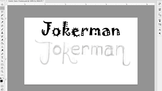
First up, Jokerman, a wacky collection of clown-like characters usually found on birthday banners and “whimsical” business cards.

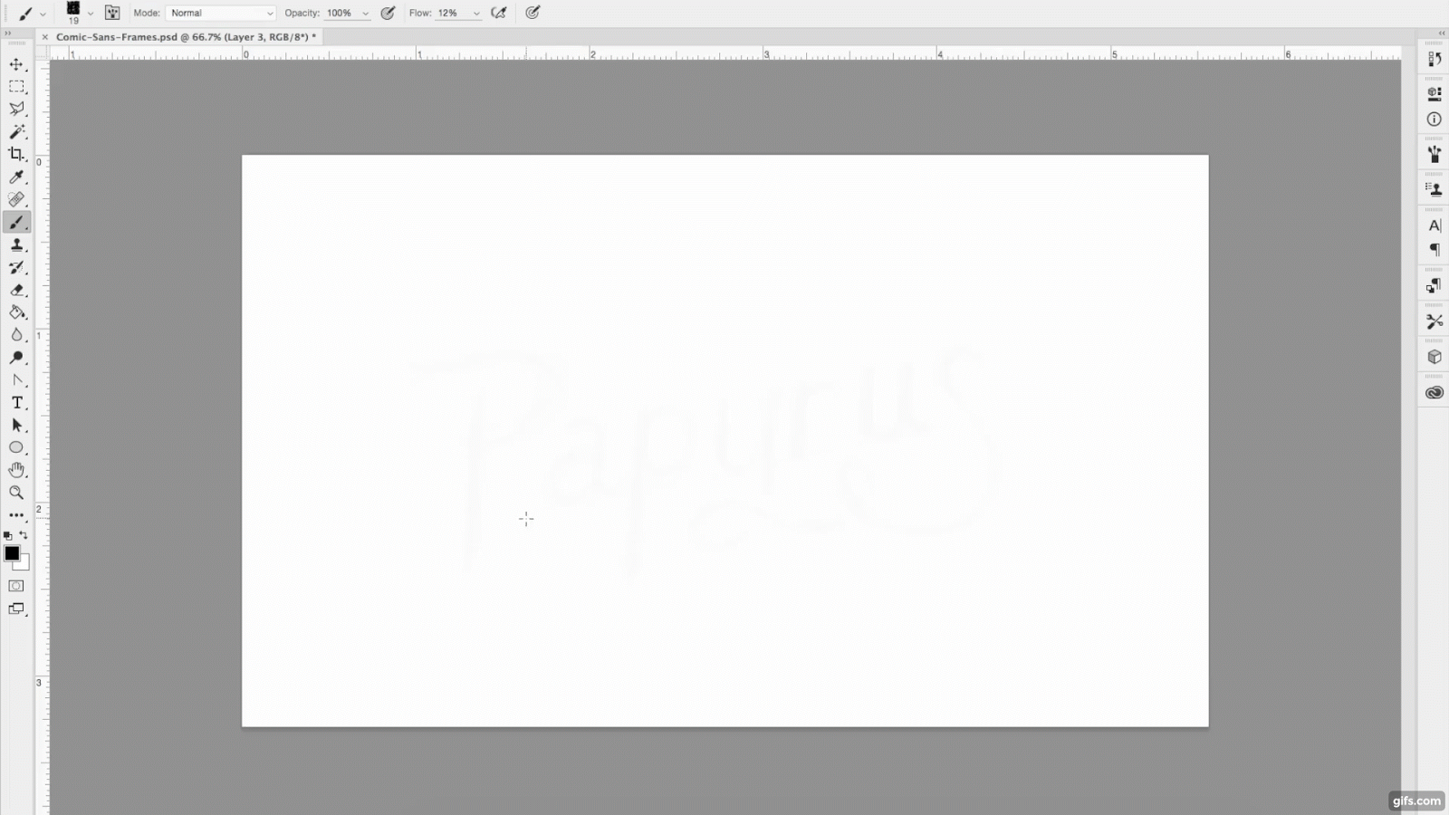
Next, we have Papyrus, painstakingly copied from the walls of King Tut’s tomb and the preferred choice of coffee shop menus, serious artists, and James Cameron.

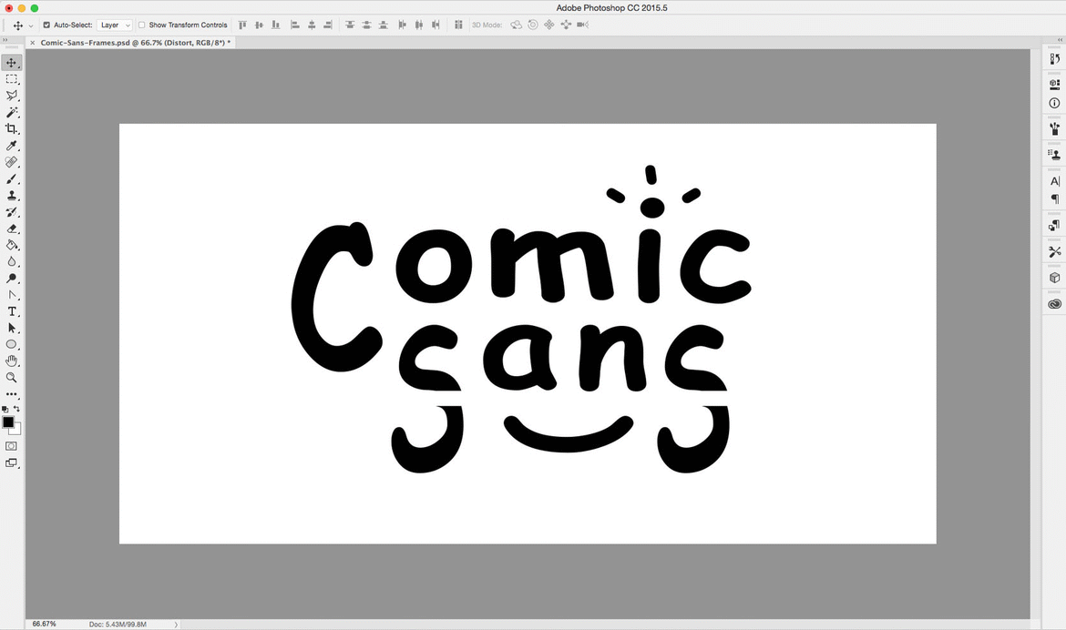
Finally, a cool and unshakably casual typographic outlaw in no need of an introduction—the one, the only, Comic Sans.

From this unlikely grouping, I’ll teach you to see treasure where others cry “trash!” and create custom logotypes of the highest caliber.
A Simple and Reliable Process
Let’s go on a journey from hideous typeface to stunning logotype and learn how to make a font. We’ll start with something bad, end with something good, and follow the same seven steps each and every time. What are the seven steps? I’ll discuss the details in a bit, but first, a few notes about the tools you’ll need for this sort of work.
Recommended Setup
Visual designers have access to a plethora of new and affordable design tools. Touchscreen devices and advanced styluses like the Apple pencil make capturing ideas and moving to a digital workflow easier than ever. Experiment freely, and hold on to whatever works for you. That said, I prefer a tried and true approach with trusty tools from Adobe and Wacom:
- Photoshop — Used to manipulate typefaces and create layered refinement sketches.
- Illustrator — Used to vector trace final refinement sketches and quickly add elements of style like colors, gradients, textures, patterns, etc.
- Wacom Tablet — Used for digital drawing within Photoshop.

Jokerman — From Crass to Classy
Jokerman is the Jim Carrey of typefaces: never subtle, loud at every angle, yet strangely appealing to the masses. It’s ridiculous and over the top and exactly the kind of typeface that this tutorial was made for. Wacky typefaces like Jokerman are jam-packed with curious design elements but lack the restraint required for a tasteful logotype. As designers, we need to exercise good judgement, and that often means forgoing details for the sake of clearer communication.
It’s a simple seven-step process that takes us from undesirable typeface to high-end logotype. There is some simple drawing involved, but if you can write your name and trace a picture, you’ve got all the skill you’ll need to learn how to make your own font. Let’s begin.
1. Review Typeface

In Photoshop, choose a typeface (in this case, Jokerman), type the business name you need for your logotype, and quickly examine each letter to get a feel for design possibilities like scale, proportion, letter weight, etc.
2. Ideate

Using your Wacom tablet, make a loose sketch of your logotype. No need to be exact here. Just sketch something quick and easy to serve as a skeleton for your design.
3. Distort Typeface
Using your selected typeface, scale, stretch, skew, and squish each letter over the top of your ideation sketch. No need to make things perfect on this step. You’ll refine it later on, so just keep going.
4. Correction Sketch

Now, make a quick sketch over the top of your distorted letters. This is where you begin to improve the shortcomings of the original typeface and add your own design details.
5. Refinement Sketch

This is the last phase of sketching and refinement in Photoshop. Clean up anything that isn’t working, and fill your letters in so you can get a better idea of form and the relationship of spaces between letters.
6. Vector Trace

Drop your refinement sketch into Illustrator, break out the pen tool, and carefully click your way to beautiful bezier curves.
7. Finishing Touches


Once you’ve finished vector tracing, add visual impact with thoughtful details like colors, shadows, highlights, outlines, etc.
Papyrus — A Subtle Transformation
Confession: I like Papyrus, and I don’t care who knows. Seriously, not all typefaces that we designers enjoy bashing are actually that bad. Overused? Maybe. Kitschy? OK, yeah. But just because a typeface makes someone feel like her amature design document has dignity doesn’t mean it’s bad. And that’s how I feel about Papyrus. It’s like the dress shirt I bought at Old Navy: It fits well and makes me presentable for special occasions.
That said, my dress shirt doesn’t have intentionally frayed edges. So, let’s see if we can keep the nice parts of Papyrus’ letterforms while making the overall look and feel a bit more contemporary.
1. Review Typeface

Again, we start in Photoshop. Select your typeface (Papyrus), and enter the logotype name. Take a look at each letter, making notes of potential design details.
2. Ideate
Break out your Wacom tablet and quickly sketch some composition ideas. Don’t overthink this step. It’s like doodling your name in a notebook.
3. Distort Typeface
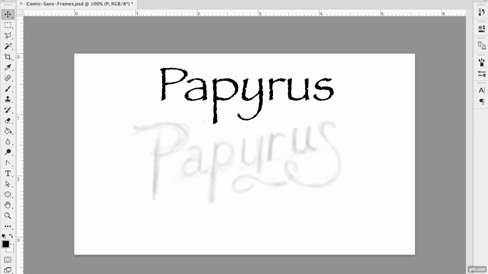
Just like we did for Jokerman, scale, stretch, skew, and squish each letter over the top of the ideation sketch you created. It’s gonna get messy, but don’t worry!
4. Correction Sketch

Of all the steps, this may feel like the most daunting, but don’t stress it.
You’re not building from scratch. You’re using the structure of the original typeface while adding your own improvements as you go.
This sketch can be super awful and ugly. The beauty of layers in Photoshop is the ability to take multiple passes, with each coming closer to your true design intentions.
5. Refinement Sketch

This is our last step in Photoshop. Be honest with yourself about parts of your design that aren’t working. It also helps to color your letters so you can see how they look next to one another and uncover any irregularities in form.
6. Vector Trace

Place the refinement sketch inside Illustrator and begin your vector trace with the pen tool.
7. Finishing Touches


With your vector trace complete, bring your logotype to life by adding details like colors, shadows, highlights, and outlines.
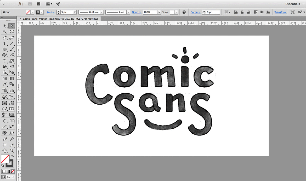
Comic Sans — Like Ironing a Wrinkly Shirt
I refuse to ridicule Comic Sans. Sure, it shows up at inappropriate times, looking a little disheveled like it just woke from a nap. But, it met a design brief and may just be the most well known typeface in the world.
From a purely aesthetic point of view, there’s not much to like about Comic Sans. It’s dumpy, frumpy, and the little kinks and knobs in the letters are quite distracting. Still, it has some interesting quirks that could work well for a logotype, and its general perception as the worst typeface of all time makes it the perfect challenge for our seven step refinement technique.
This time through, I’ll focus less on mechanics and give you a bit more insight into my creative thought process at each step.
1. Review Typeface

For this step, think of yourself as the parent of an awkward adolescent boy. There’s no denying that he’s a gangly looking goofball, but you’re able to see past all that to a day when he’ll be a strapping, well-rounded young man.
2. Ideate

Ideation is the time to release your risk-taking artistic side. You can ruthlessly edit yourself later, but for now, take chances.
When I was reviewing Comic Sans, I noticed a sort of bouncy playfulness that I tried to incorporate into my ideation sketches.
3. Distort Typeface

Maybe you’re like me…somewhat obsessive about organizing layers and utilizing non-destructive editing techniques in Photoshop. Don’t be like that for this step!
Type your word, rasterize the font, and distort the heck out of those letters.
4. Correction Sketch
Like I said, Comic Sans’ little irregularities are maddening, so for this step, I focused on straightening lines and smoothing curves.
5. Refinement Sketch

For the longest time, I went directly from the Correction Sketch step in Photoshop to Vector Trace in Illustrator. But, once I saw my vector letters filled in for the first time, they always looked a little weird.
This refinement step is a great way to make sure your letters are well spaced. After all, the shapes formed between letters are equally as important as the letters themselves.
6. Vector Trace
It can be easy to shut your brain off when using the pen tool. You start pointing, clicking, and dragging handles and stop looking for ways to improve your design.
Don’t do that! When you sketch by hand, you’re constantly making split-second decisions and corrections. You should use the pen tool in a similar fashion.
7. Finishing Touches


I was pleased with the way the vector trace turned out, so I opted to go with a simple block shadow and a few interior accent lines.
Ideally, your letterforms will be able to stand on their own without any embellishment. Finishing Touches are meant to make your design pop, but you should guard against adding too many special effects.
The Opportunity of Unwanted Things
We designers are wise to stay plugged into the trends, tools, and modes of thought existing in our profession. We learn and grow as a community, and if a large segment of our field views something poorly, we should seek to understand why.
However, we should also resist the urge to reject design practices outright, especially at the whim of popular opinion. When we run up against something that’s viewed as bad, like using Jokerman, it’s good to learn why other designers feel this way, but it’s shortsighted to toss a potentially valuable resource into the trash heap.
Instead, keep as much as you can on file in your mind. Take mental notes, make observations, categorize things you like and dislike, and store a diverse selection of opinions from other designers.
You never know, one day you may do the unthinkable and risk design community ridicule by using Comic sans as the foundation for your client’s beautiful new logotype.
Further Reading on the Toptal Blog:
Micah Bowers
Vancouver, WA, United States
Member since March 30, 2016
About the author
Micah helps businesses craft meaningful engagement through branding, illustration, and design.