
CMS Web Design: A Guide to Dynamic Content Applications
A lion’s share of websites and apps in the online media space are powered by content management systems (CMS). The optimal way to design for these applications is putting content first, style second.
A lion’s share of websites and apps in the online media space are powered by content management systems (CMS). The optimal way to design for these applications is putting content first, style second.

Ian has served as a designer and creative technologist, with a refined skill set in designing dynamic, content-driven web applications.
Expertise
Previously At

UI/UX techniques for the dynamic content-driven world of online media.
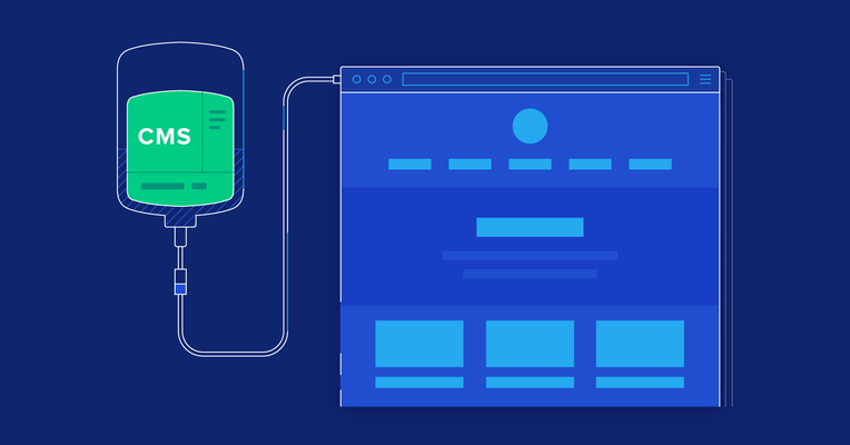
A large majority of web applications and mobile apps, especially in the online media space, are powered by content management systems (CMS) such as WordPress, Drupal, and others. These systems have come into existence to meet the needs of an internet age where content is king and dynamic—changing continuously and frequently.
In the past, most websites were static—not built to evolve and grow seamlessly. Now they are considered to be living systems, and there is an optimal way to design for them.
The following is a guide for digital designers looking to expand their repertoire beyond static websites and landing pages, and to start designing effectively for dynamic content-driven applications such as news sites, blogs, or even social networks where users publish content regularly. In order to make this transition, designers will need to understand how these types of applications are typically structured as well as to adopt a “content-first” mindset in the design process.
CMS Web Design IA Patterns in CMS-driven Applications
Designers should have a mental model of the common information architecture patterns in a CMS-driven application, especially if working on the UX (user experience) and designing it from the ground up. There are several page types that are common and integral to these applications, and they often connect together in a predictable fashion where the “post” functions as the core component. There is generally no theoretical limit to the number of posts that an application can contain.

Front Page
This is the formal point of entry and is often synonymous with the home page. It is highly common, especially when there is a lot of content to access because it helps to highlight or feature what is most important. This page typically shows abbreviated versions of posts without revealing too many details.
Post Page
If the “post” is the core unit of a CMS-driven application, then the post page is where all public details about a post are displayed. It is probably the only truly critical page in the application, and it could be an article page or an informational page about a particular event, person, group, product, etc. In some larger applications, there may be multiple types of posts and post pages designated.
List/Category Page
This type of page is helpful for allowing users to navigate through all of the available posts, and filter them by category, attributes, or other criteria. A sort option is also common when the amount of content to scroll through is substantial.
Search Page
A dedicated page for search is not essential for smaller applications, but is always helpful. Sometimes, it can be merged or integrated with the category/list page.
User/Author Profile
This page is dedicated to each author or user that creates one or more posts. It is sometimes forgone on small news sites and single-author blogs, but is critical for large multi-author news sites, content-driven social networks, and other user-generated applications. A common and helpful practice is to include a listing of all of the user’s posts on this page.
User Home or Dashboard
This page shows information (including posts) relevant to the logged-in user, often in the form of a personal newsfeed or recommended content, recent activity, and statuses. The user home is essential for gated apps and social network applications, but optional or irrelevant for others.
Content-driven UI Design for Dynamic Content
Content precedes design. Design in the absence of content is not design, it’s decoration. – Jeffrey Zeldman
When it’s time to design the user interface of a CMS-driven application, it is important to remember that content always drives the design, not the other way around. A content-first approach has been adopted by more and more media companies in recent years with proven results. With this in mind, here is a list of recommendations for UI designers to bear in mind when getting their feet wet in these types of projects.
Consider the Content Before Defining a Style
In a content-driven application, the visual style should support the content as a whole. Though the nature of these types of applications usually implies that content will be variable and not entirely predictable, more often than not it will fit within an overall theme. So when developing the brand’s aesthetic, actual content can be a great source of inspiration. At the same time, it can also be a liability if the designer becomes too attached to specific pieces of content and develops an overly targeted style.


DO get to know who will be creating the content on a regular basis.
In a CMS-driven application, content is largely determined by content creators, not designers. Hence, it is usually expected that the designer will relinquish some control of the look of the product to people who publish content on a regular basis—namely editors, authors, administrators, or even random users who input content through public forms.
Depending on the process that is agreed to, the designer can set some standards and guidelines for choosing images, preparing and cropping them, and even put some parameters on text styling. However, overall, it is the responsibility of the designer to shape the front-end of the application in such a way that subpar work on the part of the content creator, such as a poor photograph or very long headline, does not lower the quality of the design to a significant degree.
DO design with real content where possible.
Because the type of content can vary widely in a CMS-driven application, it makes sense to spend time looking at a large sampling of it. Ideally, in the case of a news site or blog, the designer would collaborate with content creators at the very beginning of the design process and request story examples, product images, videos, or anything else that can help make the design mockups feel as real as possible.
Designing with real content is preferable to using stock photos and dummy text and can even be done in parallel with wireframing or prototyping, as it helps to limit any surprises that may occur.
It’s not uncommon for a design to look stunning when a designer fills it with carefully pre-selected or photoshopped imagery and perfectly tailored headlines, and then see it descend into the doldrums once it rolls into production.
DON’T get overly specific with the style.
When setting a visual style, don’t pigeonhole the content by reflecting only a single mood, genre, story, or subject. Instead, keep it simple and universal with respect to the entire range of tones that might come into play in the content.
A very specific look and feel is acceptable at times for an application that caters to a niche audience, but can often come across as outdated and lacking in mass appeal in today’s market. Further, it can potentially limit prospects for growth and expansion to new verticals in the future.
To ensure that a design works for a wide range of content, it is usually a good idea to test it by mocking up an additional version or two of the same page with markedly different subject matter still within the thematic range of what’s publishable.

Design Each Page as a Template for Varying Content
Think of each type of page in the application as a template or blueprint for various media items (images, widgets, videos, blocks of text, etc.) to fill, and know which items will be subject to change and which ones can remain fixed.
DO establish a clear set of rules and consistencies.
Just because content may vary widely from one page to the next does not mean that there should not be a consistent set of formats in which the content gets presented.
Keeping headers and image sizes predictable and observing a logical information hierarchy from top to bottom within a page has many benefits, one being that it creates a sense of harmony throughout the application and keeps the user properly oriented.
To achieve this more easily, develop a modular, reusable set of style components for as many parts of the interface as possible, including headings, dividers, buttons, widgets, and other elements within a design program. Use these components repeatedly and in a logical scheme, keeping the variations to a minimum. Many teams maintain these components within shared design systems to improve consistency and simplify collaboration between designers and developers.
Accessibility requirements should also be incorporated into shared design systems and reusable components. News feeds, notifications, search results, and other content that updates dynamically should communicate those changes to assistive technologies. WCAG 2.2 recommends providing appropriate status messages for dynamic updates, often through techniques such as ARIA live regions, so screen reader users can remain aware of new or changed content.
DON’T give individualized design treatments to posts.
Try to avoid giving posts within the same section of a page too many differences in style and format. This includes changing up image dimensions, adding special text layouts or fonts, or puffing up individual images with customized adornments or graphics. This not only tends to kill visual harmony, but is generally a waste of resources and a drag on performance and maintenance from a developer or content manager’s standpoint.

DON’T assume that content will always fit within a designated area.
One of the inevitable results of the dynamic nature of a CMS-driven application is that the amount of text that appears in a given display area can vary in length. Often, character limits can be placed on text in the CMS to keep things reasonable, but the designer should never blindly assume that a block of text will always fit on a certain number of lines.
Not only do individual character widths vary, but it is also not customary to heavily restrict the creativity of writers by enforcing a very low character limit. This is why it is always good to test a design with real content as discussed above, and to vet each area with different samples of text.
To be sure about a worst case scenario, temporarily insert a sequence of wide alphabetical characters (such as “w” if the content is in English) up until an agreed-upon character limit is reached.

Allow the Content to Stand Out
In a content-driven application, content should be kept front and center at all times, and stylistic branding elements should generally recede.
DO surround dynamic content with clean, light, neutral background colors.
White or off-white is usually preferable. This allows for many different types of images, light and dark, to pop off the page without being overshadowed.
DO make images large and commanding.
Big images, especially photos, grab the visitor’s attention more effectively than anything else.
DO keep headlines and body text large and highly readable.
For text-heavy pages, choose web fonts that are highly legible, and deploy them at a large, comfortable size across all devices—desktop, mobile, and tablet.

DON’T over-design.
Often, digital and print designers like to deploy creative embellishments or give branding elements free rein in their designs. In general, while certain visual effects can sometimes enhance a content-driven design, they can also easily distract from the content, which is what really interests users when they visit a news site or blog.
Such effects can also make the application’s appearance less predictable as images change. It is generally a best practice to put a check on decorative fonts, bold patterns, illustrations, overlapping images, semi-transparent images, and fancy frames around images. Lastly, keep the logo relatively small compared to featured content.

DON’T use colored backgrounds near dynamic images.
Bold, bright colors are in right now, but it is usually best to avoid applying large amounts of saturated color, or a colored background, around images that are subject to change as this can yield unpredictable results, including color clashes and over-stimulation, distracting from the content.

DON’T use dark backgrounds to cover whole pages of text.
Studies show that light text against a dark background is more stressful on the eyes than dark text on a light background in content-heavy applications. A dark background may work nicely for a special section of a page or a slideshow area where there is a limited amount of text, but is not well suited to cover long blocks of text.
Understand How Images and Other Media Work on the Back End
Content management systems can vary in how they handle media, such as images, videos, and animation files, and sometimes a developer will purposefully set constraints on the media for efficiency purposes.
For instance, there may be limitations on how images are scaled and cropped and on the number of sizes and crops that can be generated and displayed. Thus, it’s important to consult with the application developer or content managers to determine what’s practical (and what they are willing to put extra development resources into) before forging ahead with a design.
DO find out what media formats are supported.
While it’s usually a given that an application will support images, it’s a good idea to consult with the content managers about what types of video, audio, and other multimedia files can be stored and displayed and the degree to which they can be customized visually.
For instance, it helps to find out if a custom video player will be built or if embedding a YouTube or Vimeo video on a page is the only option. In the case of YouTube, there are specific standards and limitations in how videos can be embedded, scaled, and skinned.
DON’T designate many different crops and sizes for images.
While it it is often technically feasible to create a lot of separate crops for an image, there is usually a negative impact in doing so. For instance, by default, the WordPress CMS automatically generates several sizes of an uploaded image in a single ratio, but only provides an option for one separately cropped thumbnail to be created.
Cropping each image to additional ratios not only requires a special plugin to be installed or a dedicated tool to be developed up front, but also places extra demands on editors as it requires them to do additional work for every image uploaded. Sometimes this also makes choosing a viable image more difficult, further slowing down workflow.

DO determine whether legacy content needs to be supported.
When redesigning a legacy application, there are sometimes even fewer options available than when starting a new application from scratch. This is because there is already an existing repository of media, and migrating all of it a new format can often be an expensive or impractical operation from a development standpoint.
Provide Content Editors with a Variety of Ways to Style Text
Text content is a key element of a CMS-driven application, and in a news site or blog in particular, one will find that editors or writers, when left to their own devices, look for ways to style and format text to provide emphasis for certain points, break up content, add quotations, create lists, link to other content, and accomplish a number of other tasks.
Many popular CMS platforms like WordPress provide text formatting options by default, but if the designer fails to plan for how these styles will be customized to their design, the outcome will be something random, plain, or undesirable.
DO design for all of the common ways text can be formatted.
Especially for blogs and news sites, it pays to take the time to provide the developer with style rules for all of the common ways that text can be formatted including: bold and italicized text, headings and subheadings, numbered and bulleted lists, blockquotes, captions, and hyperlinks.

DON’T give content creators too much stylistic control.
It’s generally not a good idea to open up too much design control to editors. Allowing them to do such things as build their own layouts within pages or color text in more than one way can be daunting or time-consuming for some people and produce ugly, inconsistent results in the hands of others.
Future Patterns of Content-driven Design
As spatial computing technologies continue to mature, new paradigms for content-driven design are emerging. CMS applications are beginning to support immersive experiences that combine traditional content with three-dimensional environments, mixed reality interfaces, and other extended reality (XR) technologies.
In these environments, content must adapt to more than screen size alone. Physical spaces, viewing angles, lighting conditions, and user interactions can all influence how text, images, video, and 3D objects are experienced. This adds new considerations for content organization and presentation.
The continued development of web-based XR standards such as WebXR is making immersive experiences more accessible across devices and platforms. As these technologies evolve, content-driven applications will need to accommodate a wider range of formats and contexts while maintaining a flexible, content-first approach.

CMS Web Design Is a Little Different
Designing for CMS-driven applications means putting content first, style second. It also means planning for and embracing variability and unpredictability in the content that one is designing around. The ability to accommodate myriad potential outcomes will become even more critical in CMS web design as emerging technologies transform the nature of content itself.
Understanding the basics
CMS stands for content management system. These systems have come into existence to meet the needs of an internet age where content is king and dynamic—changing continuously and frequently. Online media sites are not static; they are considered living systems, and there is an optimal way to design for them.
A CMS platform is where content is managed and generated for display dynamically from a repository of content, such as images, videos, text, etc. CMSes are typically used for enterprise content management (ECM) and web content management (WCM).
Yes, WordPress is an online, open source website creation tool. It’s probably the easiest and most powerful blogging and website content management system (or CMS) in existence today.
A static website is where all content that is displayed on the site is coded into its pages, all images, text, videos, etc. A dynamic website on the other hand is where pages are simply placeholders for various content and that content is generated on the fly (dynamically) from databases.
A dynamic website displays content generated on the fly from various databases of content. It’s driven by a content management system (CMS) which is typically a front-end user interface that allows an authorized user to add, modify, and remove content from a website without the intervention of a webmaster.
Ian Spangler
New York, NY, United States
Member since January 4, 2018
About the author
Ian has served as a designer and creative technologist, with a refined skill set in designing dynamic, content-driven web applications.
Expertise
PREVIOUSLY AT