
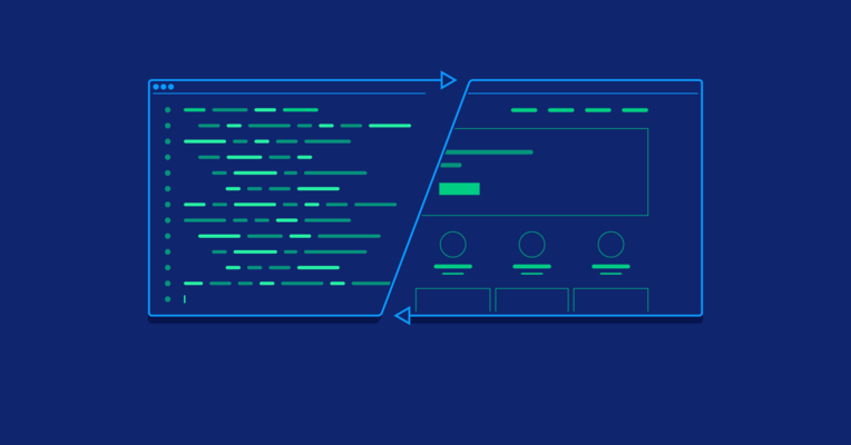
How to Approach Design for Developers
Developers often think of design as less important than functionality. But time developers spend learning design principles is saved in the future when working with designers or on their own products.
Developers often think of design as less important than functionality. But time developers spend learning design principles is saved in the future when working with designers or on their own products.

David is a passionate front-end web developer who excels at creating pixel-perfect web interfaces.
Expertise
Even though they may be working on the same projects and products, developers and designers often work apart from one another in silos. Design is often considered by developers as a secondary thing, unimportant when compared with the functionality of a product.
That kind of thinking can be detrimental to the developer-designer relationship. Not having a basic grasp of design can hold developers back in their careers, or prevent them from pursuing projects just because they don’t have a designer on board.
Why Developers Should Learn Design
While design and development are often thought of as separate disciplines, there are people out there who have mastered both. Even if someone is only interested in being a designer or a developer—not both—it’s valuable to learn at least the basics of the other discipline.
There are a couple of reasons developers might want to learn design, or at least develop a basic foundation of design knowledge.
First of all, small teams might not have a dedicated designer. Further, there are developers out there who want to tackle projects entirely on their own, who can’t afford to hire a designer (or want to spend the money elsewhere). Learning to design their own products, at least well enough to get by until a designer can be hired is an invaluable resource.
The other big reason for developers to learn design is so they can work more effectively with designers. It’s incredibly frustrating for a designer to hand over a fully-designed file for a website or app that they expect to be pixel-perfect in the finished product, only to find that their design has been changed significantly by the developer coding it.
If developers don’t understand the basics of design they may overlook small details that make a UI particularly user-friendly and unintentionally sabotage the project’s user experience. When designers send back tons of corrections, it can strain the developer-designer relationship, not to mention slow down the completion of a project.
In order to improve relationships and teamwork between interdisciplinary teams, developers would do themselves a favor by learning to see designs through a “designer’s eyes” rather than looking at it purely from a development perspective—mastering that skill will greatly improve their projects.

Crafting a Design Mindset
Too often, developers learning to design focus too much on the aesthetics of designs they like and want to emulate, rather than the underlying principles that support those designs. They see things like the color and size of a button, a specific font, or the way borders are used without understanding the reasons behind those choices.
They start spraying paint on the walls and decorating the space without understanding the purpose of the spaces they’re decorating (or even making sure things like plumbing and electrical work are finished), so to speak.
It’s important to understand and respect the principles behind why designers make the decisions they do. Anyone new to design needs a firm grasp of the principles and theories that make up a good design—things like Gestalt Principles and basic visual hierarchy—before they just dive in and start spraying paint everywhere.
That said, it’s also common for new designers, whether they have a background in development or not, to get bogged down in theory. They spend so much time learning and thinking about things that they never get to actually apply what they’re learning.
Both designers and developers tend to be perfectionists. But pushing out designs before they’re perfect (since they likely never will be) is important to the process. New designers especially, need to push past their insecurities, put their work out there, and learn from the feedback they receive.
One of the best ways to really learn design is to try to recreate the designs of others. Picking apart what works and what doesn’t, and figuring out why a particular design is appealing is one of the most valuable skills a new designer or a developer can learn. Putting a unique spin on an existing design is common in the industry (evidenced by Dribbble’s “Rebound” feature).

Designing in the Browser
A lot of designers resist designing directly in the browser, as it generally means they need to be comfortable writing at least basic HTML and CSS code. That’s the exact reason why it’s often a great fit for developers getting into design—they’re already comfortable writing code.
There are tools that can help with designing in the browser and can make both designers’ and developers’ lives easier. Simple browser plugins are available for everything from selecting color palettes to exploring another site’s CSS and HTML code.
There are also more complex tools like Figma that act like a fully-featured design tool right in the browser. Figma allows designers to collaborate, send assets to stakeholders (and even let them make changes to the content and copy of designs), and lets developers have access to the actual designs in real-time. It’s a great option for developer-designers who want to create designs and design systems that can scale over time.
Webflow is another option for designing in the browser that developers might love. While the design interface is visual, the code exported is clean, semantic CSS and HTML that developers will appreciate (not all visual design tools export clean code). Webflow includes tools for design and layout, as well as CMS and eCommerce tools built in, as well as hosting options.

Use of Color, Typography, and Layout
Before diving into the visual principles of color, typography, and layout, it’s important to talk about basic usability. The most aesthetically pleasing design in the world is useless if it’s not usable.
One of the most important usability principles is the idea of consistency or predictability. Designs should be predictable enough that users are able to intuitively understand how to use them. For example, blue underlined text for clickable links, navigation menus that are complete and well-labeled, etc. Spacing between elements, typography, and color scheme should also be consistent.
Other usability principles that should be considered in every design project include things like error prevention (and informative error messages when errors do occur), familiar language (use the language people are used to, rather than “cute” or creative alternatives that might be unclear), flexibility and efficiency, and easily available help. Nielsen Norman Group has additional usability heuristics that should also be kept in mind.
Usability evaluations should be conducted throughout the design and development process to make sure the product functions the way the design and development team intended, and that users are not confused. Heuristic evaluations involve comparing a list of predefined design principles that a product should be following with the actual product to see where deviations occur (and then fixing those deviations).
Once usability has been thoroughly understood in relation to the product at hand, designer-developers can move on to the more visual aspects of the design.

Basic Color Theory
Color theory is one of the most complex aspects of visual design. Changing shades slightly can completely shift the visual impact and emotional effect of a color. It’s one reason many designers who have been in the industry for years still struggle with color.
While many books have been written about color theory, there are some very basic principles that designer-developers can learn to get started. Combine those with any of the multitude of color design tools available, and a pleasing color palette can be created fairly easily.
First, the difference between warm colors, cool colors, and neutrals. Warm colors include red, orange, and yellow. Warm colors will generally be vibrant and energizing. Cool colors include green, blue, and purple. These colors are usually calmer and relaxing.

Neutrals include white, black, gray, brown, and beige. Adding white, black, or gray to warm or cool colors alters their meaning and impact. White will lighten colors and generally make their effect less intense or more positive (for example, purple is considered a mysterious, regal color, while lilac is often associated with spring and happiness). Gray will mute colors and can lessen their impact. Black darkens colors and can make them appear more conservative (consider the different impact of a color like bright blue vs navy blue).
Once a designer has a basic understanding of color meanings, they can use tools like Coolors, Design Seeds, or Colormind to come up with a final, coordinated palette for their design.
Using HSL Color
When a designer thinks of web colors, they often think in terms of hex values. While this has become the industry standard in terms of web colors, developers may find that working with HSL color values make more sense.
To most people (designers included), hex values seemingly have no correlation to one another. Two colors that look very similar might have completely different hex values. For example, #68B4D4 and #92C8E0 are fairly similar shades of blue (one is simply a little brighter and lighter than the other) and yet their hex values have no apparent correlation.

Their HSL values, however, show how closely related they are: #68B4D4 becomes HSL (198, 58%, 62%) and #92C8E0 becomes HSL (198, 56%, 73%). The first number in the sequence (198 in this case) indicates the particular hue. The second number is the percent of saturation (how bright or vibrant the color is). The third number is the percent of lightness (or added white) of the color.

Because the correlations between color values are so easily seen with HSL vs hex, developers often find that manipulating colors via code with HSL is significantly easier.
Typography Principles
Typography is another area that can trip up even experienced designers. But like color theory, there are some great tools out there that can help.
Typographic hierarchy is one of the first things a designer-developer should learn. The relationship between different type elements in a design is vital to making that design more usable.
At the very least, a design should have three levels of typographic hierarchy: titles, subtitles, and body fonts. The title should be the most visually prominent, the subtitles come next, and then the body font, which should be highly readable.
Many new designers focus too much on font size in creating their hierarchy, and not enough on font style. Sometimes, rather than making a title significantly larger than a subtitle, for example, a title could be made bold or capitalized, while the subtitle is left in title case and normal weight. Color can also be used to differentiate between subtitles and titles, and between those elements and body text.
Combining different fonts can also confuse many designers, and yet it’s a common way to create a visual hierarchy. They include choosing complementary fonts (opposites often attract, but to an extent, how well fonts combine has to be determined based on gut feeling that is honed over time), choosing appropriate fonts (don’t use Comic Sans on a legal document, for example, or a display font for body type that won’t be legible at smaller sizes), and creating contrast between typefaces (don’t use two that are very similar).

Another simple way to combine fonts is to pick fonts from large font families. There are even families out there that include display, serif, and sans serif versions that work well together (like Mrs Eaves and Mr Eaves, Fedra, or Museo and Museo Sans). This can be the easiest way to start really experimenting with combining fonts since they’re designed to look good together.
When working with larger typographic hierarchies (such as adding in H1, H2, H3, H4, etc.), it’s important to follow some kind of reason in the typographic scale. The Fibonacci sequence is one possible scale to start with, although there are other established typographic scales.
One common scale that’s used in both typography (and generally in design layouts) consists of 4, 8, 16, 24, 36, 48, 72, 108, etc. These figures can be combined in various ways to create a design with pleasing visual proportions (for example, a 24 pixel font combined with a 36 pixel line height).
Basic Layout Principles
Since the beginning of the web, there are certain layout patterns that have emerged as “standards.” Examples include the main navigation at the top, left or right sidebar with additional information or navigation options, and body content taking up the remainder of the space.
While there are definite deviations from this basic layout (not top navigation, no sidebar, two sidebars, etc.), this is often a fairly safe bet when creating a new layout. Deviation from this basic pattern should only be done with a purpose, especially by new and inexperienced designer-developers.
Creating a design that is predictable—this usually means consistent—does a lot for the usability of a product. Deviating from what a user expects to see when using a product should only be done when the usability gains are greater than the losses.

It’s best not to use 72 pixel bold blue titles on one page and then 36 pixel red titles on another for the same type of content—as layout consistency is key. Similarly, spacing (padding) between title and body text that’s 36 pixels in one section and then 32 pixels in another will create visual inconsistency. While a person might not immediately understand why the difference is jarring, they will feel it.
Similar to the typographic scale mentioned above, spacing elements on a scale of 4, 8, 16, 24, 36, 48, 72, or 108 pixels will create a visually pleasing design. It’s a good idea to use enough space between elements, give them room to breathe; newer designers often avoid white space and can end up with designs that look cluttered and overwhelming.
Some may question why the scale is spaced the way it is. Why is there only a 4 pixel difference between the first two numbers, but a 36 pixel jump between the last two? The reason is simple: at small scales, a 4-pixel increase is easily identifiable (8 pixels is twice as large as 4, which can easily be discerned). But with larger numbers, the difference between 72 pixels and 76 pixels isn’t easily seen. Larger differences are easier to see as sizes increase.
Consistent spacing is one reason grid-based approaches to design have become so popular. Starting with a grid (generally 12-, 16-, or 24-columns) gives designers a framework in which to work that will keep everything consistent. Built-in gutters between columns also help to ensure that different design elements and the content within them have some breathing room.
Conclusion
Designers and developers alike should focus on expanding their skill set in order to further their careers. The time developers spend learning the basic principles of design will save time in the future when they are working with designers, or creating their own products.
An understanding of the basic principles of design—usability principles, color theory, typography, layout, and UX—will also make developers better at development. When they can see why designers make the choices they make, developers can work better with designers to create truly stellar products.
Further Reading on the Toptal Blog:
Understanding the basics
The principles of design can be thought of as best practices in creating a design that is user-friendly, provides a great user experience, and functions the way the designer intends. It’s important for designers and developers to have a grasp of at least basic design principles.
One of the best ways that developers can improve their careers is to master additional skills. This can include things like learning new programming languages or development methodologies, as well as learning adjacent skills like design.
In color theory, HSL stands for “hue, saturation, lightness.” Hue refers to the specific color, saturation is how bright it is, and lightness is how light or dark it is. HSL color codes are easy to understand, and therefore easier to manipulate via code than other color values (like hex values).
Good developers are constantly improving and expanding on their skillset. They stay up to date on best practices within their given specialties and understand adjacent disciplines like web design and information architecture. They also push themselves to improve and challenge their existing skill set.
Website design is important because it adds to the functionality and overall user experience of the site when done well. Good design is vital to the overall perception of a website or other digital product. Without it, retaining users becomes difficult, regardless of how well a product functions otherwise.
Linden, United States
Member since March 27, 2017
About the author
David is a passionate front-end web developer who excels at creating pixel-perfect web interfaces.