
Medical Billing Reimagined: A UI/UX Case Study
Toptal designer Beatriz Garcia de Prado explains how she built a digital product to replace the outdated paper forms doctors were sending to insurance companies.

Toptal designer Beatriz Garcia de Prado explains how she built a digital product to replace the outdated paper forms doctors were sending to insurance companies.

Beatriz Garcia de Prado is a UI/UX designer and branding expert who has worked for clients such as ABN AMRO, Ahold Delhaize, Dutch transport company Broshuis, and aperitif maker Haus. She is the former creative director of EMN & OLLA The Agency, and former managing director and art director of EMN in Bahrain. She is also the co-founder and art director of the luxury table linen brand Prado y Barrio.
Expertise
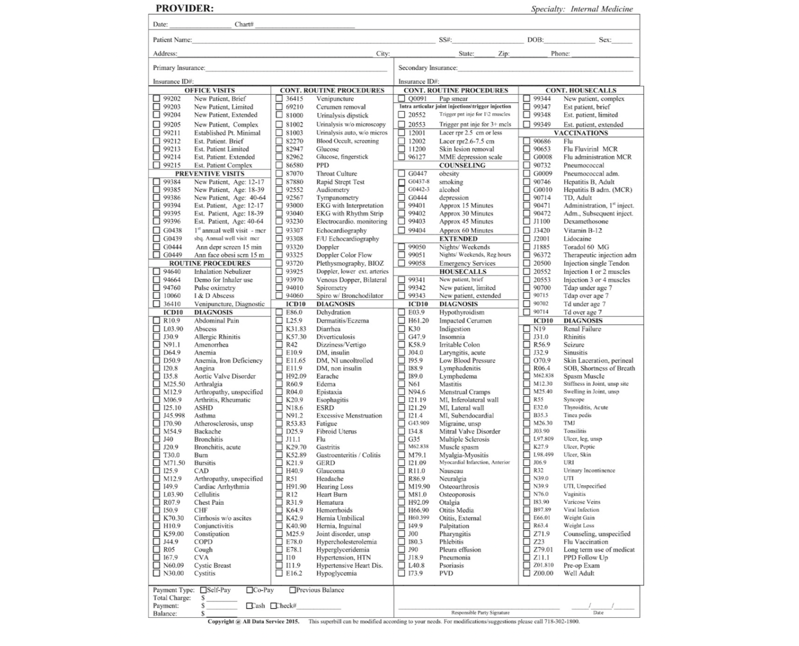
All Data Health, a company that collects medical billing information from physicians and sends it to insurers for payment, hired me to redesign its billing experience in late 2020. At the time, its physician clients were accustomed to filling out paper superbills—comprehensive forms that include diagnoses, procedures, and insurance claim codes.
To increase the speed and accuracy of its claims process, company leaders wanted to entice physicians to submit online superbills (called e-superbills) through an existing physician portal, but the physicians resisted. They continued mailing paper forms to All Data Health, where billing specialists entered the data manually before submitting claims to insurers.
Doctors are notoriously wary of new technology. Security, productivity, and affordability concerns cause physicians to cling to familiar methods and tools. My mission was to reimagine the existing medical billing software and make it so user-friendly that physicians would happily abandon their paper superbills.
The Approach: Researching, Wireframing, Prototyping
As a UI/UX designer and art director who has worked on many consumer-facing products, I specialize in humanizing digital experiences. Over three months, I worked with All Data Health to update the billing system, and build a component library and style guide to accompany it.
I began, as I always do, with research and brainstorming. Then, I created an information architecture and designed a low-fidelity prototype using wireframes before moving to high-fidelity prototyping. I worked closely with the client’s developer team, updating them on my progress daily.
UX Research: Identifying How Physicians Work
Every project starts with understanding the users. First, I met with All Data Health’s CTO and managing director to learn the needs of the doctors and the company’s data-entry specialists. I have a degree in journalism from University Carlos III of Madrid and worked for four years as a journalist, so I excel at this type of fact-finding.
Together, we created three detailed personas:
- Dr. Solo: This doctor works in a big organization and often fills out forms with the same handful of diagnoses and procedures. On the e-superbill, he must have easy access to his most commonly performed procedures. Forms need to be mobile-friendly, as Dr. Solo spends a lot of time traveling between hospital floors and medical facilities, and is often without computer access.
- Dr. Office: This physician runs a small office and usually works with a nurse or an assistant. In his analog workflow, an assistant prepares the forms with the patient information, and he only has to fill in the procedures performed during the visit.
- Dr. With a Team: This doctor is akin to a small-business owner; she runs a medical office and employs additional physicians. A staff doctor fills out a portion of the paperwork, but Dr. With a Team is ultimately responsible for collecting payments from insurance companies.

Feature Analysis: Noting Best Practices
I knew that All Data Health’s billing UX had to be so intuitive that users would view it as a timesaver—or at least recognize that it didn’t add time to billing. I examined programs that broke down large projects into manageable tasks and was inspired by several aspects of TurboTax’s website:
- It keeps users focused on one task at a time. For instance, it typically asks only one question per page, such as “Did you sell any stocks, bonds, mutual fund shares, or other investments?” and provides simple “Yes,” “No,” and “I don’t know” buttons.
- Rather than overwhelm users with a lengthy form, TurboTax’s workflow is divided into categories, such as wages/income and deductions/credits. It also shows progress and sets expectations for what’s next—for instance, letting users know that upcoming questions will deal with annual earnings.
- It provides side-by-side views. Users fill out a working area on one side of the screen while seeing an overview on the other side. The overview also serves as a menu so users can navigate to various sections.
Information Architecture: Designing a Hierarchy
I wanted the billing UI to mimic the layout of the physicians’ paper form as closely as possible so it would feel familiar and help ease the transition from paper to digital. I began by breaking down the users’ process of filling out the superbill into smaller steps.
Mind Map
I used Miro to make a mind map of All Data Health’s physician portal in order to visualize how information was structured. Building a mind map enabled me to find flaws in the portal’s information architecture. For instance, the portal had a single drop-down menu of report options, but the list was long, which slows down decision-making. I proposed creating a handful of high-level topics and subtopics—a cleaner and more effective way to navigate. I also made a mind map of the existing e-superbill and identified areas that needed to be simplified.

Wireframe
I often hand-sketch wireframes before creating digital versions. This time, however, I had a clear picture of what I wanted to create, so I continued using Miro. My first iteration of the revised desktop UI had a menu at the top with four categories: Create e-superbill, Reports, Patients, and Profile. It had a dynamic navigation on the left, which changed depending on where the user was in the e-superbill.
In my proposal, the initial fill form was simple: It asked users to fill in the facility, provider, date, procedure, diagnosis, and modifiers, which offer more information about a procedure. I also implemented a visualization of the paper bill in order to orient users relative to their previous way of working.
On the mobile app, I hid the menu and created two screens, enabling users to toggle between the full form and an image of the paper bill so they know where they are in the process.
When I presented the initial wireframes, the CTO mentioned that we needed to allow for additional procedures to be added and that everything had to be linked to a diagnosis, which insurance companies require, so I create a component that enables this functionality.

Mock-ups: Defining User Flows
When we were happy with the overall look and feel of the software, we started to mock up user flows; we created one for new patients and a separate one for existing patients. In the mock-ups, we covered ideal states and basic scenarios, including patients receiving multiple diagnoses and having more than one procedure, and doctors working at different facilities. It was crucial to get client feedback at this point in the project, so I presented the mock-ups at daily stand-ups.
Final Touches: Refining Components and Aesthetics
The project’s goal was to create a product that felt similar to the paper bill and was easier for doctors to submit electronically. For instance, doctors often fill out part of a paper bill and then complete it later. For the redesigned e-superbill, I preserved that convenience by incorporating the ability to save and print when the bill is incomplete and to retrieve an unfinished bill under a Drafts tab.
In addition, I wanted to reduce the need for doctors to enter the same data repeatedly—as they would when filling out multiple paper bills. So I created a Preferences feature that auto-fills frequently performed procedures. I also included fields that use predictive text. For instance, as doctors type the patient name “Mary,” the software presents the last names of Marys in the database.
High-fidelity Prototypes
For prototypes, I shifted from Miro to Figma, which is better for design refinements. The client was far less interested in aesthetics than usability and did not want me to spend much time on visual design. I browsed the Figma community for a design system that had the essential components I needed: forms, buttons, pagination, toggles, and check boxes.
At the time, All Data Health had no in-house designer or visual guidelines, but I wanted the updated billing experience to be consistent with the company’s other brand assets, so I pulled fonts and colors from the company’s homepage. I kept my visual language light, including as little text as possible.

Key Learnings
My work on this project confirmed that it is worth the extra time and money to validate a product with the end user. In this case, the doctors did not have a chance to test the new e-superbill before it went live, which led to several fixes after release. Additionally, I learned the value of waiting until the design is complete to begin development. Although developing fast allows for a quicker product release, it can cost more in the long run as systems have to be rebuilt.
I was also able to educate All Data Health about Agile, and we even incorporated some Agile routines, such as daily stand-ups, into our process. The company’s leaders have indicated that they plan to include more Agile methodology in the future, and have asked me to design another feature that will launch in a second phase.
Overall, All Data Health considered the project a success, reporting that the time to process insurance claims was reduced by half, and errors were virtually eliminated. By transitioning physicians from a cumbersome paper bill to an electronic one, All Data Health established an efficient, effective system for its clients.
Take a look at the final e-superbill in action.
Further Reading on the Toptal Blog:
- The Best UX Designer Portfolios: Inspiring Case Studies and Examples
- The True ROI of UX: B2B Redesign Case Studies
- Haptics in Healthcare: An Opportunity for Designers to Help Revolutionize Telemedicine
- COVID-19: The Ultimate Design Thinking Use Case
- Kinder Tools: How to Improve Enterprise UX Design for Mental Health
Understanding the basics
Healthcare UX can streamline the medical billing process for physicians, billing companies, and insurers. Good UX is especially important for doctors because it allows them to spend less time on administrative tasks and more time providing patient care. It also reduces digital fatigue and burnout among providers.
A mind map is the most common type of cognitive map. It shows how information is organized within an existing product. It is a useful tool when creating a billing UI because it lets designers see where improvements can be made in the existing structure.
UX research focuses on who will be using a particular digital product, as well as when and how they will use it. Good UX research provides insights to developers and designers, allowing them to create the information architecture and user flow for a website or app.
Palma de Mallorca, Spain
Member since July 27, 2018
About the author
Beatriz Garcia de Prado is a UI/UX designer and branding expert who has worked for clients such as ABN AMRO, Ahold Delhaize, Dutch transport company Broshuis, and aperitif maker Haus. She is the former creative director of EMN & OLLA The Agency, and former managing director and art director of EMN in Bahrain. She is also the co-founder and art director of the luxury table linen brand Prado y Barrio.