
The Principles of Design (With Examples and Infographic)
Understanding the principles of design and how they interact is vital for both new and expert designers. Implementing them purposefully is key to creating visually appealing, functional designs.

Understanding the principles of design and how they interact is vital for both new and expert designers. Implementing them purposefully is key to creating visually appealing, functional designs.

Adel is a UI/UX designer who helps teams turn complex technology into clear, usable products. He has worked with early-stage startups and partnered with teams at Airbnb, Colgate, Supercell, and a range of emerging AI-focused companies. His work centers on shaping practical, user-centered interfaces.
Previous Role
Senior UI/UX DesignerPreviously At

The Principles of Design:
- Contrast
- Balance
- Emphasis
- Proportion
- Hierarchy
- Repetition
- Rhythm
- Pattern
- White Space
- Movement
- Variety
- Unity
One of the most difficult parts of talking about the principles of design is figuring out just how many principles there actually are (are there five? 10?). And once that’s been figured out, which of these supposed design fundamentals should be included?
Search for “principles of design,” and Google will return results for articles that include from five to more than a dozen individual visual design principles. Even the articles that agree on the number don’t necessarily agree on which ones should be included in that number.
In reality, there are roughly a dozen basic principles of design that beginning and expert designers alike should keep in mind when working on their projects. In addition, there are another dozen or so “secondary” design principles that are sometimes included as basics (for example, the Gestalt Principles, typography, color, and framing). The main design principles are explained below, with examples—and then summarized in an infographic. (Jump to the downloadable Principles of Design Infographic.)
Throughout my career as a product designer for startups and companies like Airbnb and Colgate, I’ve learned to never stray too far from the fundamental principles of design. My work focuses on making information-dense UI’s easy to understand and navigate, and core design principles guide virtually every creative decision I make. In this article, we’ll explore principles like contrast and unity—and see how mastering them is the key to compelling user experiences.
Basic Visual Design Principles
As already mentioned, there is no real consensus in the design community about what the main principles of design actually are. That said, the following twelve principles of visual design are those mentioned most often in articles and books on the subject.
Contrast
One of the most common complaints designers have about client feedback often revolves around clients who say a design needs to “pop” more. While that sounds like a completely arbitrary term, what the client generally means is that the design needs more contrast.
Contrast refers to how different elements are in a design, particularly adjacent elements. These differences make various elements stand out. Contrast is also a very important aspect of creating accessible designs. Insufficient contrast can make text content in particular very difficult to read, especially for people with visual impairments.
Balance
All design elements and principles—typography, colors, images, shapes, patterns, etc.—carry a visual weight. Some elements are heavy and draw the eye, while others are lighter. The way these elements are laid out on a page should create a feeling of balance.
There are two basic types of balance: symmetrical and asymmetrical. Symmetrical designs lay out elements of equal weight on either side of an imaginary center line. Asymmetrical balance uses elements of differing weights, often arranged in relation to a line that is not centered within the overall design.
Emphasis
Emphasis deals with the parts of a design that are meant to stand out. In most cases, this refers to the most important information the design is meant to convey.
Emphasis can also be used to reduce the impact of certain information. This is most apparent in instances where “fine print” is used for ancillary information in a design. Tiny typography tucked away at the bottom of a page carries much less weight than almost anything else in a design, and is therefore deemphasized.
Proportion
Proportion is one of the easier principles of graphic design to understand. Simply put, it’s the size of elements in relation to one another. Proportion signals what’s important in a design and what isn’t. Larger elements are more important, smaller elements less.
Hierarchy
Visual hierarchy is another principle of design that directly relates to how well content can be processed by people using a website. It refers to the importance of elements within a design. The most important elements (or content) should appear to be the most important.
Hierarchy is most easily illustrated through the use of titles and headings in a design. The title of a page should be given the most importance, and therefore should be immediately recognizable as the most important element on a page. Headings and subheadings should be formatted in a way that shows their importance in relation to each other as well as in relation to the title and body copy.
Repetition
Repetition is a great way to reinforce an idea. It’s also a great way to unify a design that brings together a lot of different elements. Repetition can be done in a number of ways: via repeating the same colors, typefaces, shapes, or other elements of a design.
This article, for example, uses repetition in the format of the headings. Each design principle is formatted the same as the others in this section, signaling to readers that they’re all of equal importance and that they’re all related. Consistent headings unify these elements across the page.
Rhythm
The spaces between repeating elements can cause a sense of rhythm to form, similar to the way the space between notes in a musical composition creates a rhythm. There are five basic types of visual rhythm that designers can create: random, regular, alternating, flowing, and progressive.
Random rhythms have no discernible pattern. Regular rhythms follow the same spacing between each element with no variation. Alternating rhythms follow a set pattern that repeats, but there is variation between the actual elements (such as a 1-2-3-1-2-3 pattern). Flowing rhythms follow bends and curves, similar to the way sand dunes undulate or waves flow. Progressive rhythms change as they go along, with each change adding to the previous iterations.
Rhythms can be used to create a number of feelings. They can create excitement (particularly flowing and progressive rhythms) or create reassurance and consistency. It all depends on the way they are implemented.
Pattern
Patterns are nothing more than a repetition of multiple design elements working together. Wallpaper patterns are the most ubiquitous example of patterns that virtually everyone is familiar with.
In design, however, patterns can also refer to set standards for how certain elements are designed. For example, top navigation is a design pattern that the majority of internet users have interacted with.
White Space
White space—also referred to as “negative space”—is the area of a design that does not include any design elements. The space is, effectively, empty.
Many beginning designers feel the need to pack every pixel with some type of “design” and overlook the value of white space. But white space serves many important purposes in a design, foremost being giving elements of the design room to breathe. Negative space can also help highlight specific content or specific parts of a design.
It can also make elements of a design easier to discern. This is why typography is more legible when upper and lowercase letters are used since negative space is more varied around lowercase letters, which allows people to interpret them more quickly.
In some cases, negative space is used to create secondary images that may not be immediately apparent to the viewer. This can be a valuable part of branding that can delight customers. Take the hidden arrow in the FedEx logo, for just one example.

Movement
Movement refers to the way the viewer’s eye travels over a design. The most important element in a composition should lead to the next most important, and so on. Designers achieve this by controlling spatial relationships, visual weight, and contrast to influence where the eye lands first and how it moves afterward. Movement is an essential principle to master because it dictates how quickly an audience comprehends a composition.
Effective movement also guides users to key messaging points, allowing them to navigate complex visuals without confusion or fatigue. People tend to scan in predictable patterns (such as the F- or Z-pattern), and skilled designers use that predictability to control movement. Subtle gradients, motion lines, or differences in scale create perceived motion in static layouts, and many digital interfaces use animation and motion graphics to direct users to sign-ups, CTAs, and other crucial interaction points.
Variety
Variety in design creates intrigue and emphasis. Without it, a composition feels monotonous and causes viewers to lose interest. Designers introduce variety through attention-grabbing elements like patterns, irregular shapes, illustrations, and photographs that convey mood or energy. Variety also prevents often-used elements, like typefaces and colors, from feeling dull by introducing small but intentional differences like shifts in spacing or hue.
While variety brings freshness to a design, it demands intentionality. Too many variations can weaken a composition unless they highlight important details or connect key parts. With careful use, variety emphasizes hierarchy and shapes a design’s tone and message. At its best, variety shows the designer’s ability to add just enough change to keep things interesting while maintaining order. When each difference seems planned, the design feels both unified and dynamic.
Unity
At its core, unity is about controlling design elements and managing complexity so that a composition doesn’t spiral into chaos. It describes how well the parts of a design relate to one another and form a coherent whole as opposed to a collection of disparate components. Designers achieve unity through alignment, proportion, rhythm, and consistent use of elements like type, color, and spacing.
When a design is unified, it communicates with clarity and intentionality. The viewer doesn’t have to interpret each element individually because the relationships between them are intuitive. Every part feels like it belongs to the same system and contributes to the same idea. A unified design also looks professional and reliable—factors which help build brand trust.
Downloadable Principles of Design Infographic
Download a PDF version of this infographic.
Other Important Elements of Design
In addition to the 12 main principles, other elements like typography and color play a prominent role in good design. Some of these elements are basic systems that help organize a layout, while others are creative tools that affect how people see and interpret the design. By mastering these elements, designers can create work that looks great and connects with people.
Typography
Typography shapes how people read and interpret text. It affects the legibility of words and how quickly meaning is grasped. The choice of typeface establishes whether a design feels serious, playful, modern, or traditional. Size, spacing, and alignment determine rhythm and flow. Good typography creates a sense of visual hierarchy that guides the viewer’s eye, indicating where to look first and how to navigate the content. When typography is done well, the design feels effortless to read, but lackluster typography can make even the strongest ideas feel confusing.
Color
Color is one of the most emotionally impactful elements in design. It shapes a composition’s mood, focus, and legibility and guides users through content. Effective color use draws on color theory, accessibility standards, and proven psychological associations. For example, blues often convey trust and calm, whereas reds signal urgency or excitement. Strategic color palettes create consistency, emphasize calls to action, and evoke emotional responses that align with brand intent.
Gestalt Principles
Gestalt principles, such as similarity, proximity, and closure, explain how the brain organizes visual information into patterns and unified forms. Instead of seeing visual elements as isolated parts, people naturally group things that look alike, sit close together, or follow a continuous line. This is why a cluster of shapes can feel like a single object or why text blocks read as one idea. Designers use these natural instincts to control perception and determine which elements belong together in a composition.
Grid and Alignment
Grids provide the underlying framework that brings order and consistency to design. They organize space, create proportional relationships, and ensure that elements are intentionally spaced. Alignment guides the eye through a design, allowing viewers to make sense of even the most complex composition. Experienced designers who have mastered grid systems and alignment sometimes break away from these structures to create emphasis and energy, but doing so requires a careful hand.
Framing
Framing is about deciding what the viewer sees and how they see it. It’s the designer’s way of choosing which parts of a composition are emphasized and which are minimized. A strong frame gives a design focus and helps the viewer understand where to look first and how different elements relate to each other. Changing the frame, even slightly, can shift the entire message. For instance, a close crop can make something feel personal or intense, while wider spacing creates an open or distant feeling. In this way, framing shapes both the meaning and emotion of a design.
Shape
Shape is one of the most direct ways design communicates meaning. Every shape carries an association. Circles feel organic and inviting, squares feel structured and reliable, and triangles feel sharp or active. These signals help viewers sense the tone of a design before reading a single word of content. Shapes work in conjunction with color, scale, and spacing to create rhythm and balance throughout a layout. The overall arrangement of shapes guides how the viewer’s eye travels and determines whether the design feels cohesive or disjointed.
Tips for Implementing the Principles of Design
Tip 1: Create Emphasis With Contrast
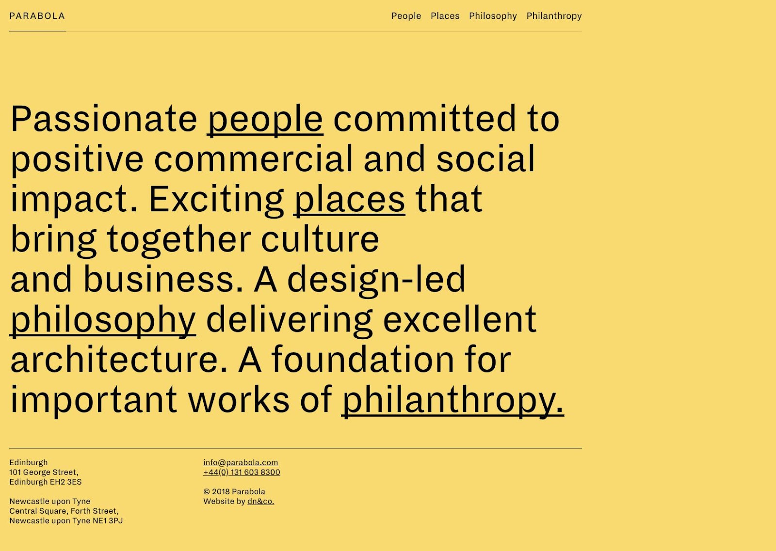
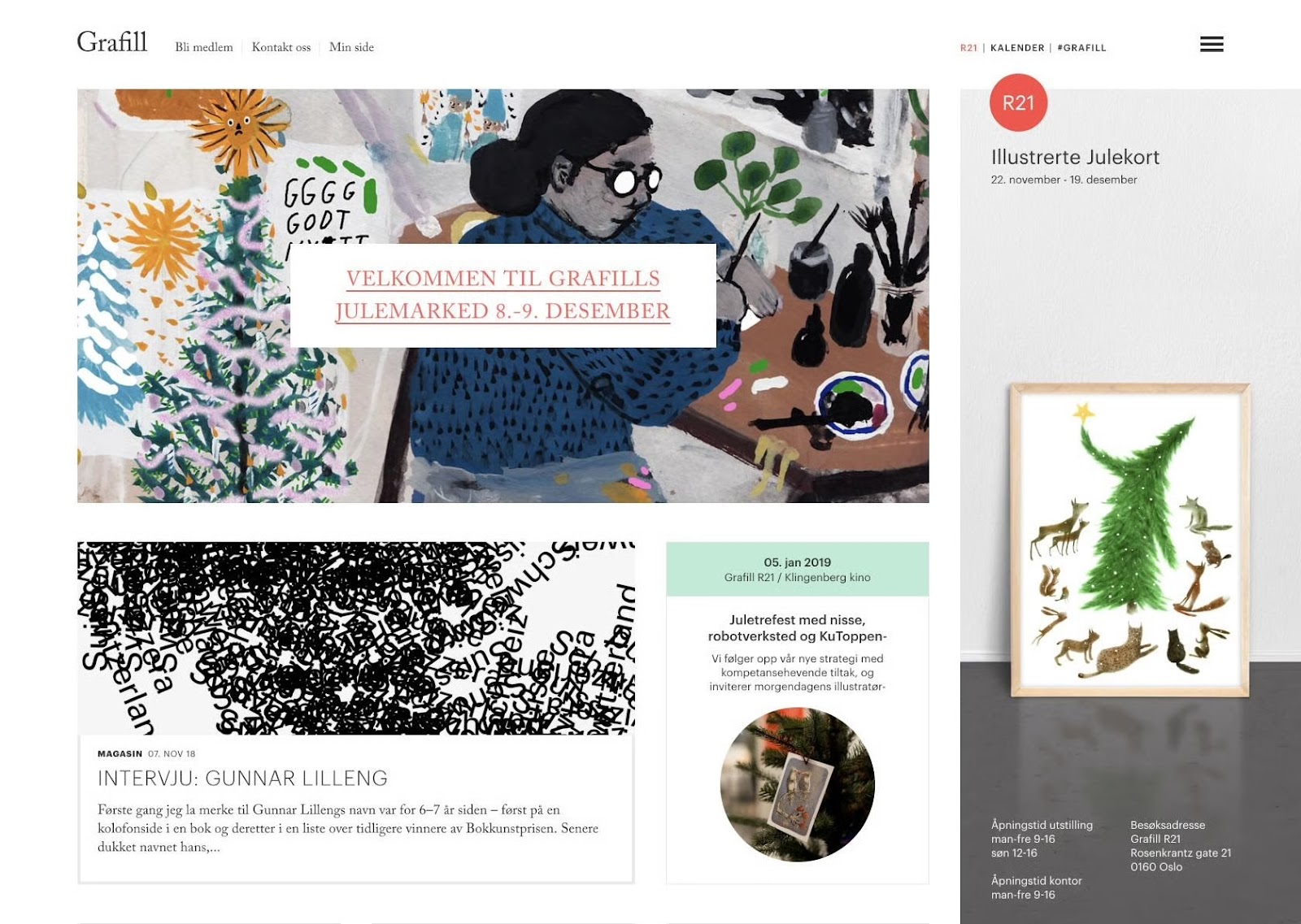
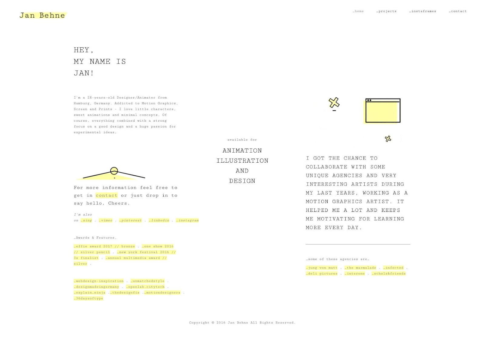
Contrast draws the viewer’s eye by showing clear differences—for instance, light and dark, thick and thin, or big and small. When two things are obviously different, one will stand out and take priority. You can use design elements like color, size, and spacing to create contrast and highlight key parts of your composition. In this example, the designer emphasized a key phrase by highlighting it with a contrasting hue that stands out against the black background, making it easier to read.
Tip 2: Scale Key Elements to Reinforce Hierarchy
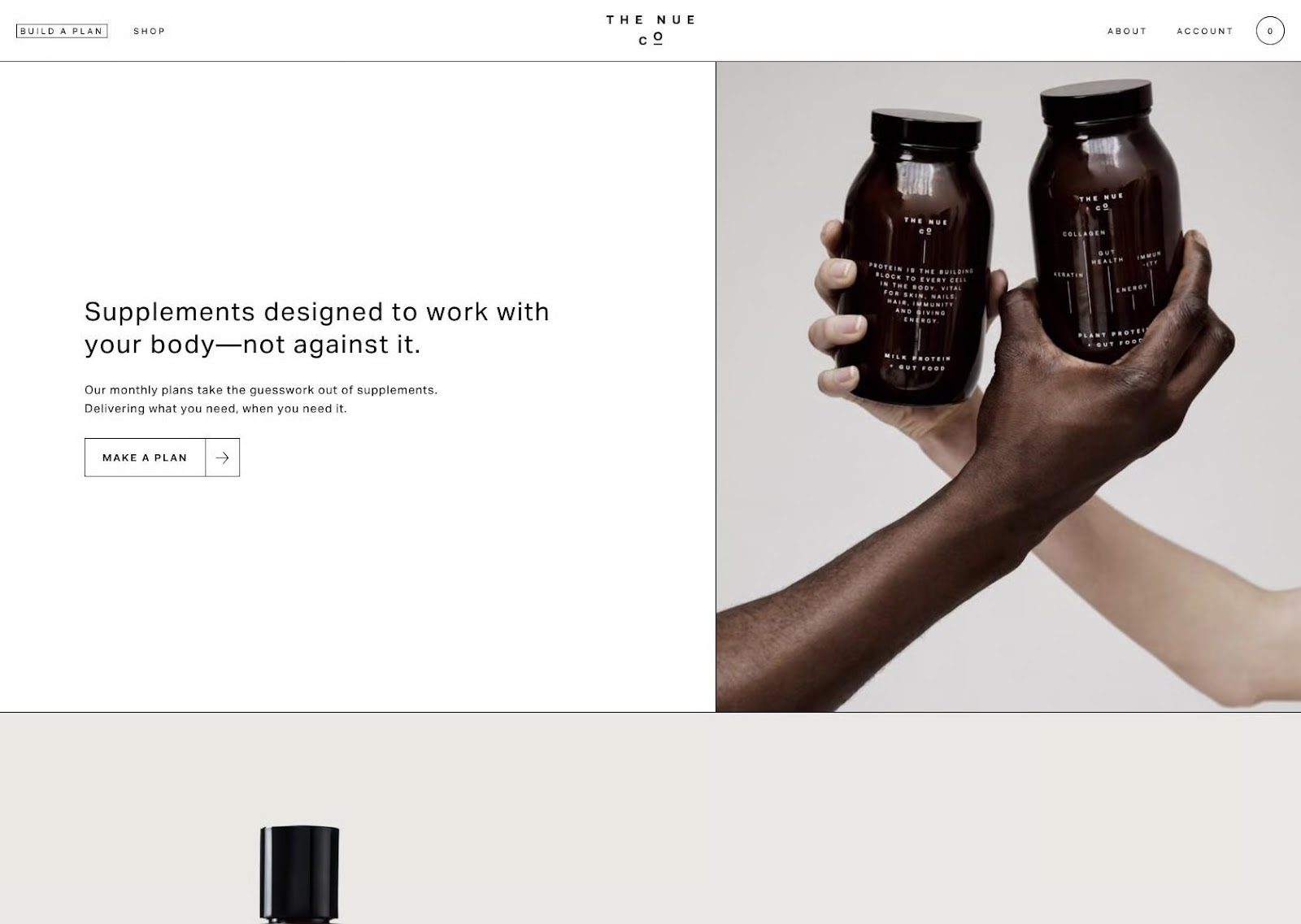
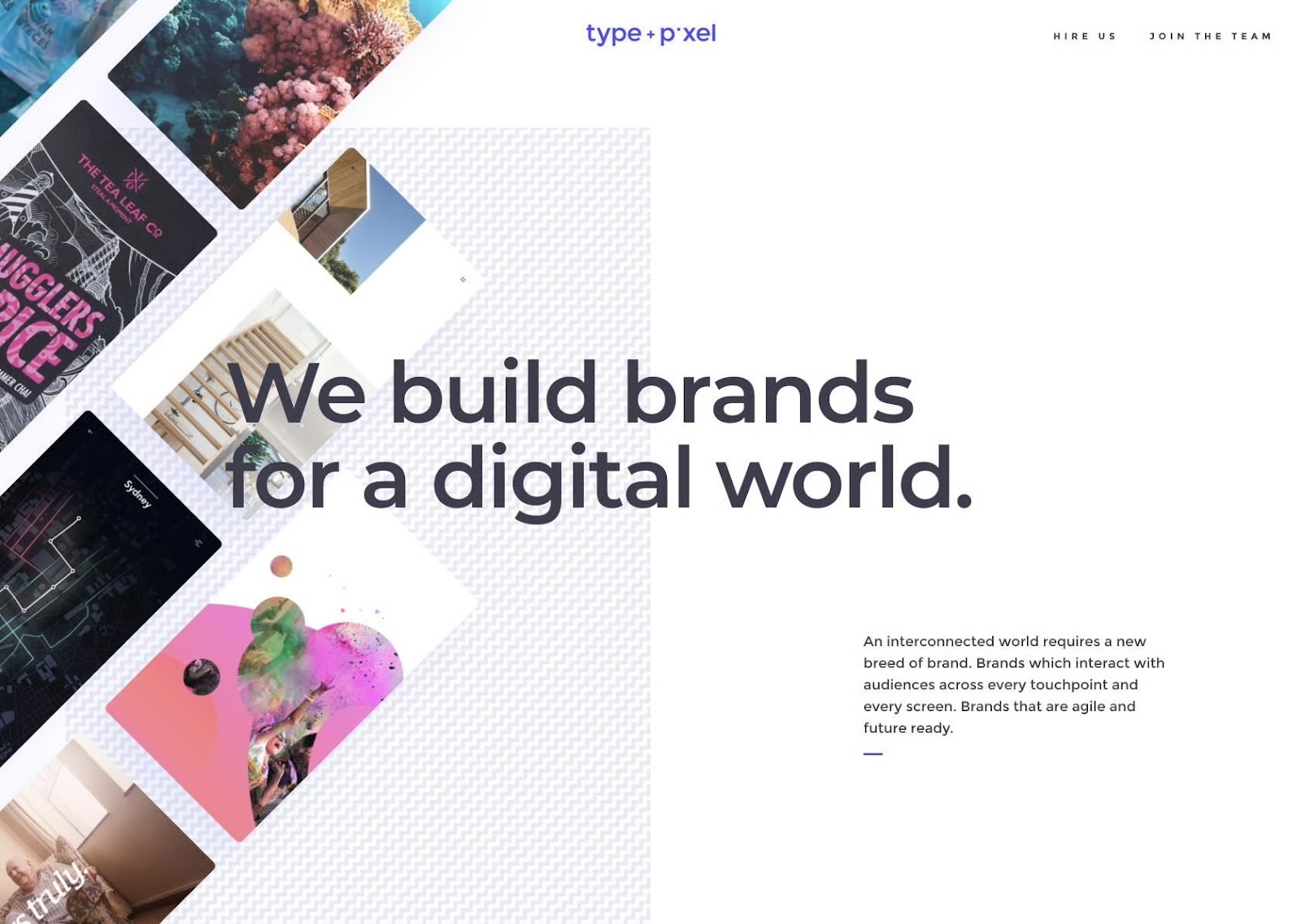
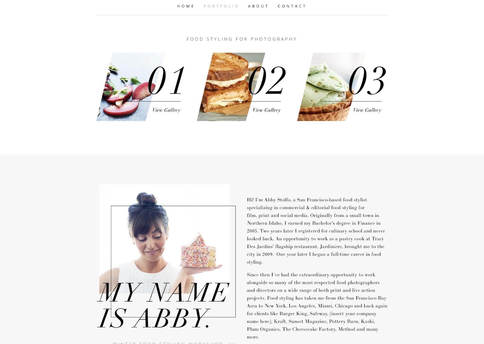
Scale is one of the most effective ways to establish hierarchy in a composition. Enlarging an element makes it more prominent, communicates importance, and helps the viewer determine what to look at first. When used correctly, proportion leads viewers through the entire composition, first to the main messaging point, then to supporting details. For example, the image below has an oversized headline that commands focus before the viewer’s eye moves to smaller text and images.
Tip 3: Use Repetition to Build Rhythm
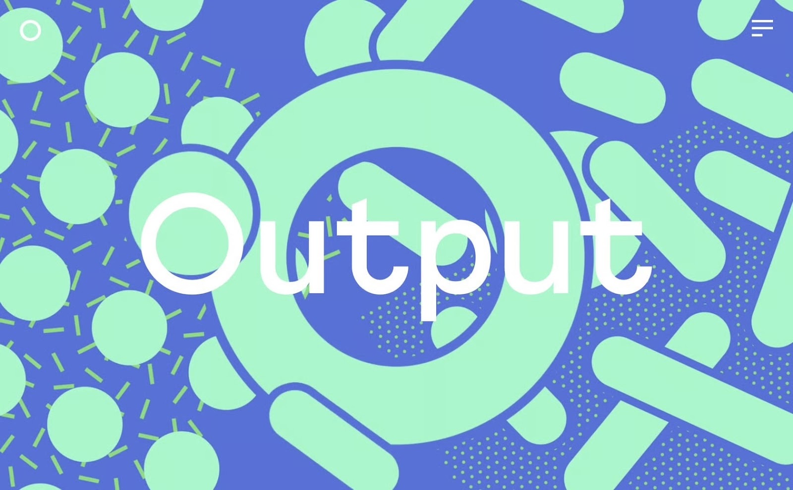
Repetition connects elements and helps viewers understand compositional structure. When shapes, colors, or patterns repeat, they establish a sense of rhythm that can be used to highlight important message points. For instance, in the image below, repeated arcs focus attention on the center of the screen and guide the viewer’s eye between the blue sphere and the headline.
Tip 4: Add White Space to Improve Clarity
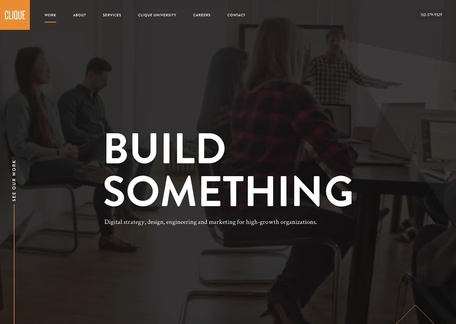
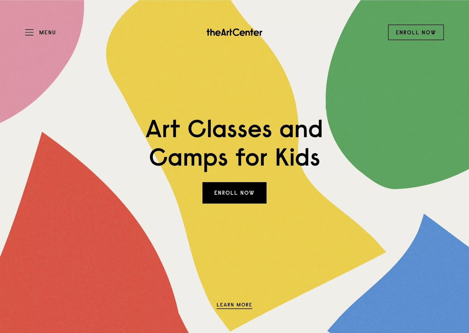
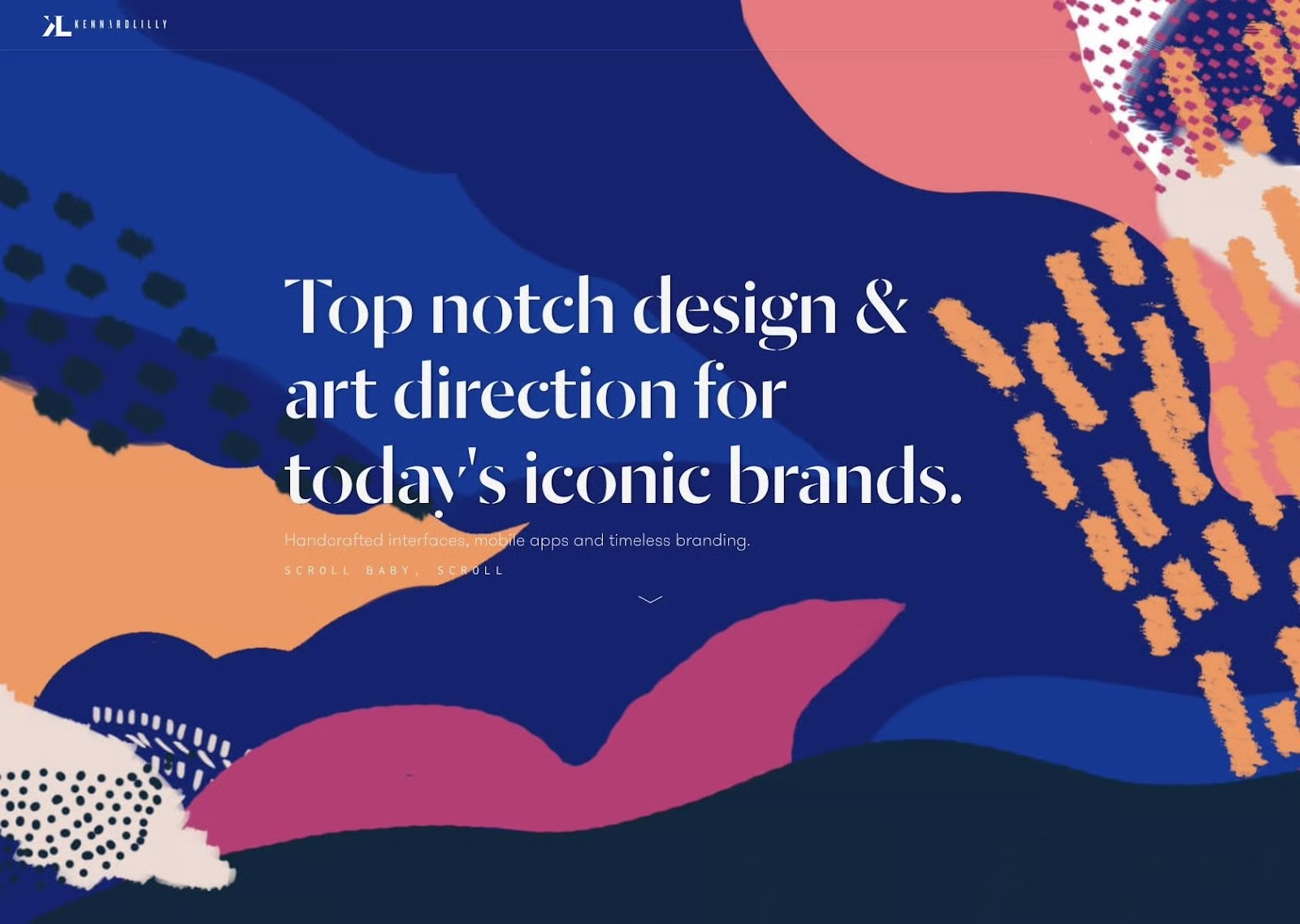
White space is simply empty or lightly patterned space that gives a design room to breathe. It helps separate content, prevents visual fatigue, and draws focus to the most important elements. Inexperienced designers often fear empty areas and seek to fill compositions with information, but white space actually aids comprehension and signals confidence to viewers. In the composition below, the illustrations are vibrant and lively, but they don’t feel chaotic or overwhelm the screen because the designer surrounded them with ample white space.

Tip 5: Use Variety to Generate Movement
Variety energizes a composition. When shapes or textures differ, it creates contrast, and the eye begins to seek relationships among elements. Used carefully, variety creates visual motion and emotional intensity without sacrificing message clarity. In this example, irregular shapes, contrasting colors, and scattered patterns actually pull the eye toward the header in the composition’s center.
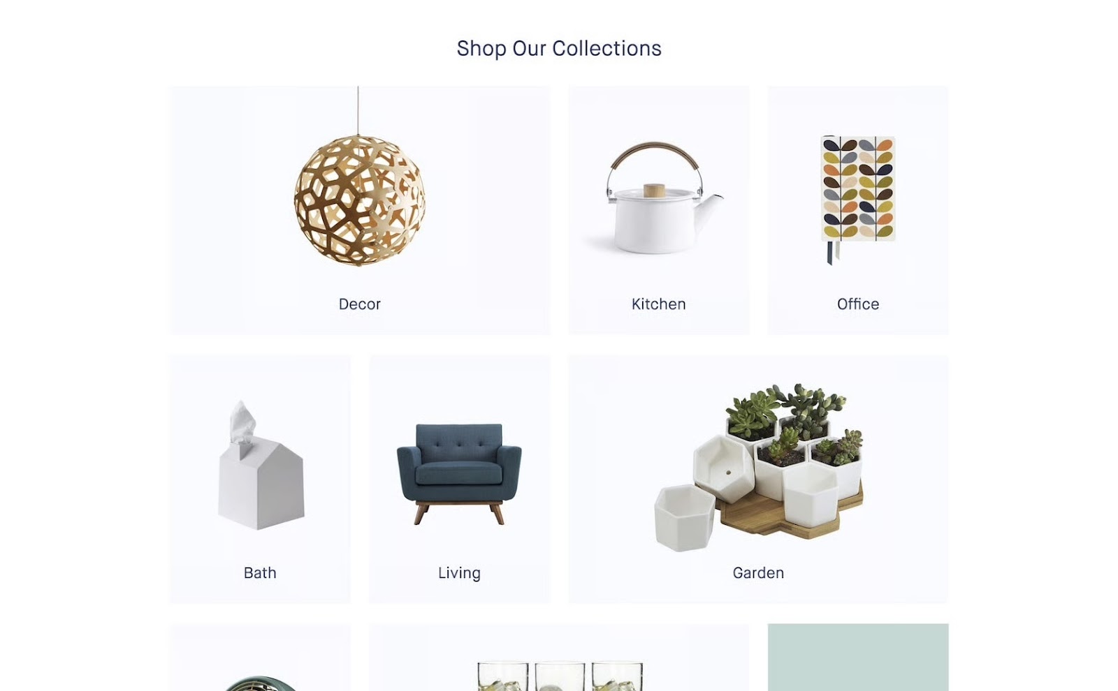
Tip 6: Repeat Core Elements to Build Unity
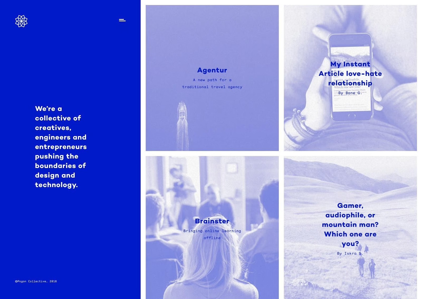
Repetition is a connective thread that transforms distinct parts into a cohesive visual language. When compositional elements are repeated or linked through principles like alignment, color, scale, or texture, it creates harmony and order. In this example, off-white backgrounds, uniform image sizes, equal white space, and minimal typography create cohesion that makes the product categories feel part of a unified whole.
Use Multiple Design Principles for Maximum Impact
Combining design principles isn’t just limited to two at a time. Most truly great designs combine at least half of these elements, and sometimes more.
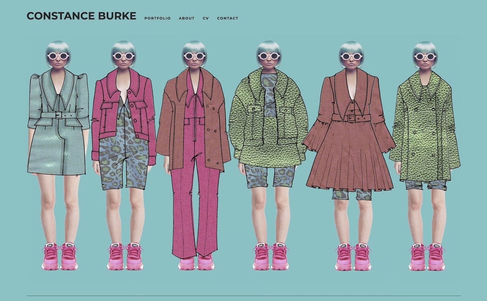
For example, the website homepage below uses a variety of principles: contrast between the hot pink and green; repetition in the patterns and consistent shoes, haircut, and sunglasses; unity among the various outfits (which is further reinforced by the repeating patterns); and variety in the styles of outfits. It’s a strong design statement that follows multiple principles to create a visually appealing and eye-catching website.
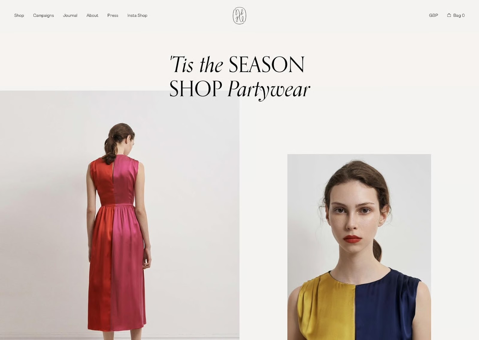
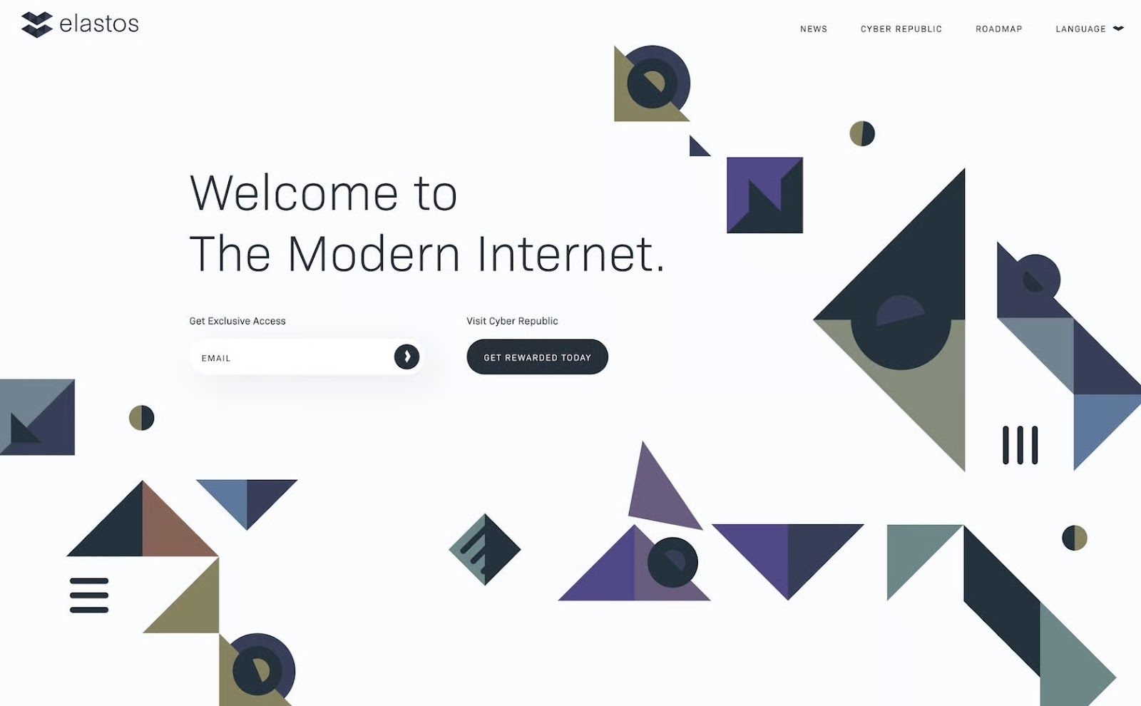
Here’s another example of a design that uses multiple principles effectively. The large header creates emphasis on that particular text, while the smaller type appears less important due to proportion. The shapes in the background create a sense of random rhythm and movement, while the similar color scheme between them creates unity. Stronger and larger shapes on the right balance the text and white space on the left.
Some designers follow these principles without even realizing they’re doing it. Other times, a designer can’t quite put their finger on why a design isn’t working, but when they consult these principles, they can often find the solution.
Understanding elements and principles of design and how they interact with one another is of paramount importance for both new and expert designers. Implementing them purposefully and intentionally in design projects is key to creating visually appealing and functional designs.
Montreal, QC, Canada
Member since November 4, 2022
About the author
Adel is a UI/UX designer who helps teams turn complex technology into clear, usable products. He has worked with early-stage startups and partnered with teams at Airbnb, Colgate, Supercell, and a range of emerging AI-focused companies. His work centers on shaping practical, user-centered interfaces.
Previous Role
Senior UI/UX DesignerPREVIOUSLY AT