
The Fundamentals of Website Redesign – A Case Study
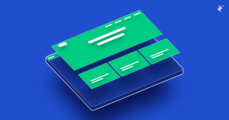
Polished design wireframes are great but don’t reveal the work that goes into research and content organization. See how a thorough approach to early project planning leads to successful website redesign.
Polished design wireframes are great but don’t reveal the work that goes into research and content organization. See how a thorough approach to early project planning leads to successful website redesign.
Alex has led a design agency that provided UX/UI design, branding, marketing, and development services for clients in various industries.
Expertise
Previously At

It’s not uncommon to finish a website redesign project only to look back and think, “I would have done things differently if I’d known what I know today.”
We’ve all been there. We get excited about a new project, banter with the client, sign contracts, and start mocking up prototypes. Life is looking good, but the project foundations are shaky.
Inevitably, revisions and scope creep start sneaking in as soon as the first design concept is presented, and it’s downhill from there. Communication falls apart, nothing goes as planned, and ultimately, the newly designed website resembles the monstrosity you were hired to fix.

World-class design and user experience doesn’t begin with a pretty mockup—it’s founded on strategic planning and a design vision that focuses on company goals. The primary objective cannot be, “Let’s make a prettier website.”
Website designers are responsible for user experience (UX), user interface (UI), and accessibility. It’s our job to make sure that users have an optimal experience interacting with the interfaces we design. This requires thorough planning right from a project’s conception.
This article outlines a dependable process that will help ensure your next website redesign is built on a solid foundation.
The Value of Website Redesign Pre-project Research
To demonstrate the process, let’s walk through the phases of a website redesign completed for Archaeology Southwest, a nonprofit organization that explores and protects archaeological sites in the southwestern United States.
After a preliminary investigation of the client’s field and competition, closely inspect every website asset that’s available. This analysis is billed separately and takes place before a project quote is ever written. Working this way prevents ambiguous or inflated estimates that result when web designers try to account for issues that might crawl to the surface later in a project.
In the case of Archaeology Southwest, I was faced with a site in dire need of attention—mountains and mountains of cluttered content inside an ancient CMS portal. It was bad, so I set out to create order.
Step 1: Become Familiar with the Content
When remodeling a house, it’s important to try and salvage valuable materials before demolition day. The same principle applies to website design. You need to walk through the site page by page and pull out all the content. As designers, we must figure out what content deserves to be a unique post type and what pages are static.

Once this is accomplished, craft a strategy for how to organize everything, but don’t decide what content should stay and what should be removed. Why not?
When dealing with real-world businesses and organizations, there are a number of different people responsible for a site’s content, and the amount of content that exists can be staggering. The best approach is to classify everything first.
I typically start with the main navigation and go page by page. This way, I’ll have the information architecture and the sitemap down before the first client meeting.
Unfortunately, Archaeology Southwest’s site was not typical. Most links were not accessible through top navigation and were hidden within the content. I’d have been in for a nasty surprise if I’d quoted the project based on navigation alone.
By talking to various people on the client’s team, I was able to get a better picture of the project’s scope, and after a meeting with the client, I was able to identify their website focus, workflow, content, and features. From there, we came up with the following core types of content (some new, some existing):

Most homeowners working on a remodel would want to fix any problems that discourage visitors or create risks, and website redesign clients are the same. Accessibility standards like the Web Content Accessibility Guidelines (WCAG 2.1+) and others dovetail with user experience best practices, improving usability not only for visitors with assistive devices, but everyone. Accessible websites also help prevent long-term business risks associated with ADA noncompliance and extend the client’s customer reach.
Conducting a simple accessibility audit as you familiarize yourself with the content equips you to discuss accessibility needs with your client and understand how they fit in the project plan.
At this stage, think high level: Use automated tools for a wide-lens view of accessibility issues across the existing site, and do manual testing to dig deeper.
The automated check will quickly identify and report on technical problems, such as missing alt text or improper semantic HTML But accessibility is really about user experience. Hands-on testing surfaces not just if alt text exists, but more importantly if it’s useful for a customer who relies on a screen reader.
Document key findings from both your automated and manual audit and share with your client, as the client may want to prioritize or outsource some portions of the accessibility work. Your research and discussions with your client during this stage should give you a clear picture of your tasks and help you avoid surprises as the project progresses.
Step 2: Create Focus. Simplify. Organize.
Once all the content is organized into labeled boxes, it’s time to develop the blueprint for a new structure, one that will showcase the content in its best form. But first, we need to create focus.
According to Archaeology Southwest, people visit their website to research information about ongoing projects, learn about upcoming events, and read a monthly magazine. These activities answer the question, “What do people do on the site?” but do not reveal why people visit the site in the first place.
The “why” is the website’s focus. In order to find the focus, look to the organization’s core.
In this case, I identified “location” to be the heart of Archaeology Southwest. Without location, there would be no archaeological sites, no ruins, and certainly no museums or exhibits. Everything in archaeology relates back to location.
With a focus identified, we can simplify and organize. For Archaeology Southwest, I started by breaking the content into categories that were not related to locations, such as team pages and annual reports. After a little tidying, I ended up with this rough map:

The image above represents the two core areas that emerged: Things to Do and Locations. Things to Do (left) covers activities that a visitor to the site can learn about and do. Locations (right) focuses on site content that’s related to specific locations. Why structure it this way?
The idea is that an average user might not know the name of a video or project but will likely know the name of a location. In this way, visitors can find content as it relates to location.
Additionally, each color block in Locations represents a unique post type. From an organizational perspective, exhibits, classes, and online exhibits are all events of a different nature.
In the old Archaeology Southwest site, there were separate static pages for a magazine and an online store where visitors could purchase the magazine. To make purchasing simpler, I integrated a buying option within the magazine template.
The remaining organizational structure was straightforward:
- An “About” page to learn more about the organization
- A direct link to the “Store” page
- A “Donation” page
- A new “Updates” page
The store and donation pages are money makers, so it was essential they be included in the main navigation.
Once the organizational blueprint is complete, it’s time to connect actual content.
Step 3: Get the Client Involved
The sitemap includes page types, but it does not include the mapping of content. Seasoned web designers know that most issues occur when a client starts adding content to their site. To avoid this problem, keep the client looped in from the start.
For Archaeology Southwest, I created a Google Doc that included the sitemap, and I asked the client to map its old content with the new structure.
If something didn’t quite fit, we addressed it later. This is a critical step. Why? Besides getting the client involved in the process, it uncovers issues with structure before implementation begins.
In this case, some of the sitemap menu items were changed, and since the client had multiple donation pages, it made sense to create a unique post type just for that.
Create Visual Structure Through Wireframing
In this step, I begin to give the work a visual structure. Figma is typically the go-to tool for wireframing and prototyping, and it’s great for real-time collaboration with clients. To have the system function well and successfully integrate the notion that “everything is related to location,” I created a bidirectional relationship between post types.
Here’s the basic idea: When visitors come to the Archaeology Southwest website and select the Grand Canyon, they will see information about that location, but they will also find information related to projects, events, exhibits, and everything else site administrators mark as location-specific.
Since the link is bidirectional, visitors can also get to the Grand Canyon by visiting a project page. Ultimately, I ended up with this:

The locations index page showcases all locations with the most recent at the top. The search bar is the first thing the user sees upon arriving at the page. The Google map will take up around 80 percent of the screen. This allows users to pick points on the map, and as they scroll or search, the list grid will come into view.
On a single location page, the main body is on the left since it’s the most important information. Related meta information is secondary, so it’s on the right. To achieve a well-balanced layout, it’s crucial to have a distinct hierarchy between the first, second, and third element blocks. This allows the eye to move effortlessly between sections.
In the Archaeology Southwest layout, the user’s eye starts with the header, then moves to the content block, and finally tracks to the right sidebar. Each piece of related content is displayed in order of relevance. For instance, if the user is reading about the Grand Canyon, this content will likely be followed by photos and a map.
Since this is chiefly an educational site, it’s important to have a “Related to This Location” option. However, there isn’t much content that is uniquely associated with each location, so I combined seldom used (but related) content into a single block under the body.
Placing magazine and video thumbs under related content adds additional visual elements and directs users to the “Buy” page. The page is completed by showing related locations. This is a great way to entice users to further explore the site. The next step is to continue this structure for other post types.
Provide the Homepage with a Clear Goal
With a general model for post types in place, I can focus on the homepage. The first step is coming up with the goal for the homepage—this is an important part of UI design. The client’s research showed that many users stumble upon the site without fully understanding what it is. Therefore, an introduction and welcoming text needs to be the first thing users see.
The new core focus revolves around the secondary block of locations. This is followed by everything that’s happening at archaeologysouthwest.org (the current magazine, blog, events, newsletter, and so on). Here is the iteration of the layout process:

With V1 (left), I designed a basic layout that resembles the original homepage. There isn’t much hierarchy. The first thing users see is the featured location, but from there, they will likely get lost in the columns.
For V2 (center), I created a separate column that is easier for the eye to follow. However, it can still be improved. This is where knowledge of the content plays a major role. I know that Archaeology Southwest never has more than two events going on at a time, so it doesn’t make sense to have space for several events on the homepage.
In V3 (right), I focused on the upcoming events. If, for some reason, there are more than two events, the user can click a “More” button and see the rest. I also put additional emphasis on the current magazine since it’s the client’s moneymaker. Users start at the top and work their way down in an F-pattern. The eye flow is:
Featured Location > Welcome > Magazine > Events > News
With a visual wireframe and the site’s structure in place, it’s much easier to solidify features and how things will work. At this point, I have another meeting with client to go over functionality and flow of user interaction, both of which are much clearer at this stage.
Will there still be revisions later down the road? Yes, but they will be tweaks, not entire process changes. Most importantly, there will be no surprises.
Incorporate the Brand Style Guide
Now comes the exciting part—converting the wireframes into something people will use and experience. For this project, I aimed to make written content easy to digest by implementing brand colors and typography.

Experiment with Typography Combinations
Typography is integral to good web design, so we must figure out our type scheme early. Most of the Archaeology Southwest identity uses Univers Condensed Light and Adobe Caslon font. There were no rules for when Adobe Caslon was to be used, but I noticed that it wasn’t utilized as often as Univers.
I conducted a small font study to see what pairings create the best feel for a professional nonprofit organization. However, I also didn’t want my type scheme looking too different from the client’s marketing collateral.

After doing font comparisons, it became clear that Adobe Caslon should be the title font and Univers would be used for subtitles. Setting the main titles in sentence case gives the brand a more personal feel, whereas all caps creates more of a corporate vibe.
Polish the Look and Feel of the Website
I set out to create a light and open experience so that users would feel that Archaeology Southwest is both approachable and highly competent. Although most website redesign projects take a mobile-first approach, analytics data for the existing website showed that the majority of Archaeology Southwest’s visitors use desktop browsers (probably because most people visit the site for research). Therefore, my **initial** focus was designing for desktop users.
When coming from desktops, I wanted visitors to immediately see the featured location, welcome text, and upcoming events followed by part of the magazine title. This way, people first see what the company is about and what they are promoting.

On mobile devices, the priorities are a little different. Since users are accessing information on the go, events are more important, so they are placed higher on the list.

I also updated the donation button in the footer to be more friendly by changing it from a button into a sentence.
Finishing Strong: Mind the Details
There are two reasons that users come to the details page—either they want to learn more about a landmark, or they already know about a location and are looking for additional information (directions, phone numbers, etc). Therefore, it’s important to present both options right away so users don’t have to go searching.

I decided to break the details column out of the content area to give it more weight and make the page more interesting. This helps create compositional hierarchy, so when a visitor comes to the page, they will first see the page title followed by a small gallery of images and then the details column.
This type of design ensures that users will notice the additional details of a location right away. A little extra padding surrounding the column keeps the eyes focused and makes it easier to scan through the information.
The mobile view collapses as one would expect. The content wipes first, and the meta information follows. I placed videos and magazines last on the mobile page since they are least important for mobile users. Other pages follow the same structure to create a consistent flow and experience.
Web Redesign Is Built on a Foundation of Careful Planning
Looking back at the website redesign process, it’s apparent that the majority of time was dedicated to organizing and planning. Only 30 percent of the project was spent designing the site.
Often, when designers show their work, they fail to convey how much time is devoted to the nuts and bolts of communication, leading inexperienced designers to jump straight into mockups. The outcome? Derailed projects and unhappy clients.
Detailed planning must be done in order for a website redesign to be successful. Taking the time to perform pre-project research, become familiar with existing content, and involve the client are crucial steps.
Ultimately, there’s no way around it; the path to amazing website redesigns and professional confidence is paved by a methodical approach to project organization.
Further Reading on the Toptal Blog:
Understanding the basics
Website design is focused on arranging written, graphic, and visual content into well organized web pages. The best website design makes this content easy to access, navigate, and understand.
Web designers are responsible for the aesthetic, or visual experience, of a website. They work with text, images, and graphics and create informational hierarchy through design elements like scale, balance, color, and shape.
Businesses use websites to provide information, promote services, and sell products. Needs vary, so a well-considered website strategy is an important part of the website planning and design process.
Alex Gurevich
Phoenix, AZ, United States
Member since February 1, 2016
About the author
Alex has led a design agency that provided UX/UI design, branding, marketing, and development services for clients in various industries.
Expertise
PREVIOUSLY AT